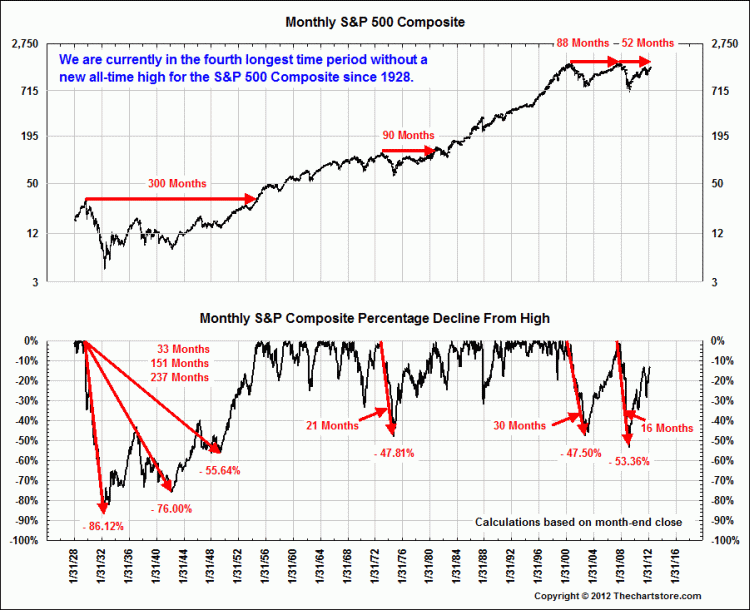
These four charts below are just the sort of Big Picture, long cycle perspective that so many investors overlook or simply have no knowledge about. These charts are not about making predictions, but rather, are about putting market action into some broader historical context. What has happened in the past? What is typical? Aberrational?