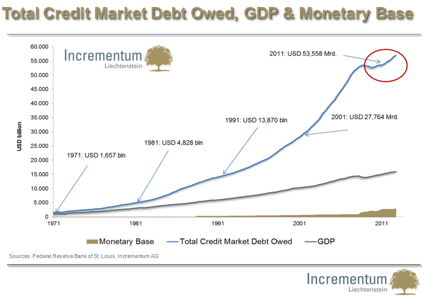
In an excellent collection of 50 charts, Ronald Stoeferle presents all fundamental data related to gold’s bull market and the too-big-to-fail debt bubble. Stoeferle is Managing Director at Incrementum Liechtenstein and writer of the famous In Gold We Trust reports.
The charts cover three major themes: gold, debt and economy, currency debasement. In this article, we highlight the ten most powerful charts. They tell the complete fundamental story and lay out the most likely scenario going forward. The full presentation is mandatory study material.
The debt bubble keeps on growing. The nominal amounts are beyond imagination. The key take-away here is the diminishing rate of return of a marginal unit of debt. In other words, central planners need to create increasingly more debt for less economic growth. That is worrisome, to say the least. By the way, did you know how much debt has been created per citizen (on average)? Please don’t try to imagine this figure also applies to yourself. It is no information for the faint-hearted.


