
Bonds & Interest Rates
Forget about NAFTA or OPEC or TPP or crowd size or hand size or any other acronym or stat or concept that obsesses the financial press these days. Only two numbers actually matter.
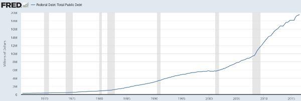
The first is $20 trillion, which is the level the US federal debt will exceed sometime around June of this year. Here’s the current total as measured by the US Debt Clock:

To put $20 trillion into perspective, it’s about $160,000 per US taxpayer, and exists in addition to the mortgage, credit card, auto, and student debt that our hypothetical taxpayer probably carries. It is in short, way too much for the average wage slave to manage without some kind of existential crisis.
It’s also way more than it used to be. During his tenure, president George W. Bush (2000 – 2008) nearly doubled the government’s debt, which is to say his administration borrowed as much as all its predecessors from Washington through Clinton combined. At the time this seemed like a never-to-be-duplicated feat of governmental profligacy. But the very next administration topped it, taking the federal debt from $10 trillion to the soon-to-be-achieved $20 trillion. And the incoming administration apparently sees no problem with continuing the pattern.
The other meaningful number is 6.620. That’s the average interest rate the US government paid on its various debts in 2000, the year before the great monetary experiment of QE, ZIRP and all the rest began. When talking heads at the Fed and elsewhere refer to “normalizing” interest rates they’re proposing a return to this 6% average rate.
But of course the last time that rate prevailed our debts were just a little lower. Run the numbers on today’s obligations and you get, well, let’s see:
$20 trillion x 6% = $1.2 trillion a year in interest expense. To put that in perspective…
- It’s $15,000 a year per family of four, or about a fourth of what the typical American family earns.
- It’s 31% of the federal budget, which would mean massive cuts in every other spending program.
The conclusion: It can’t happen without causing one of the following:
- Government spending cuts and/or tax increases that impose Greek-style austerity on Americans who won’t respond well to their sudden demotion to Third World status.
- A new round of monetary experiments involving the “forgiveness” of the government’s debts, financed with newly-created dollars. This will work – as long as dollars remain universally accepted as a store of value. History offers no examples of such a thing.
- An overt effort to devalue the dollar, with the goal of paying the interest in full, but (again) with newly- created, much-less-valuable currency.
The resulting dilemma: If we hope to live within our means interest rates can never be allowed to rise. But if interest rates don’t rise, the Fed is forced to create a tsunami of new dollars to keep rates low, and must take its chances with inflation, currency war, crack-up boom, and all the other black swans that live in the land of monetary excess.
Which is why the sound money community keeps harping on gold. All the politically-acceptable policy options have inflation/devaluation at their core, and those things are always and everywhere great for real assets.
…related: Bill Gross: Bond Fundamentals Confusing

“Happiness has dominated risk markets since early November and despair has characterized global bond markets.”
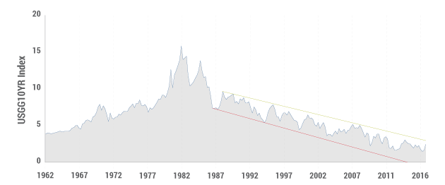
“For 10-year Treasuries, a multiple of influences obscure a rational conclusion that yields must inevitably move higher during Trump’s first year in office. When the fundamentals are confusing, however, technical indicators may come to the rescue and it’s there where a super three decade downward sloping trend line for 10-year yields could be critical. Shown in the chart below, it’s obvious to most observers that 10-year yields have been moving downward since their secular peak in the early 1980s, and at a rather linear rate. 30 basis point declines on average for the past 30 years have lowered the 10-year from 10% in 1987 to the current 2.40%.”
…reading Bill Gross Investment Outlook January 2017

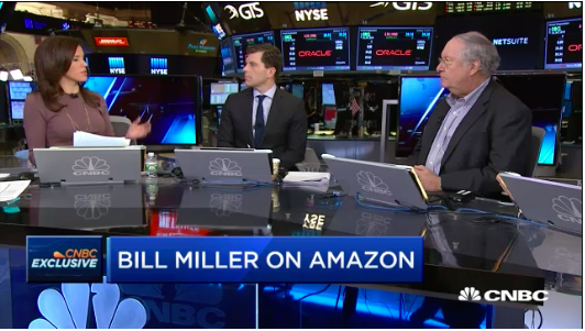 … which should help banks, investor Bill Miller says.
The bull market in bonds is over and that should benefit financials, legendary investor Bill Miller told CNBC on Wednesday.
“We’re at the beginning of a long bear market in bonds that will last for who knows how long,” he said in an interview with “Closing Bell.”
…. continue reading/listening HERE
…related:


All around the world, lawmakers are making an urgent push to eliminate the use of physical cash.
It’s not only the recent demonetization in India – it’s also the Western nations that want to eliminate big denomination bills, including the U.S. and Europe.
See who declared war – and who is going to get caught in the crossfire – in today’s “can’t miss” infographic for The Money Project.

….also from Martin Armstrong:
I was planning to write an article today about the shape of the yield curve. Since the Global Financial Crisis, the Treasury curve has been very steep – in early 2010 the 2y/10y spread reached almost 300bps, which is not only unprecedented in absolute terms but especially in relative terms: a 300bp spread when 2-year yields are below 1% is much more significant than a 300bp spread when 2-year yields are at 10%.

But what I had planned to write about was the phenomenon – well-known when I was a cub interest-rate strategist – that the yield curve steepens in rallies and flattens in selloffs. The chart below shows this tendency. The 5-year yield is on the left axis and inverted high-to-low. The 2y/10y spread is on the right axis. Note that there is substantial co-movement for the recession of the early 1990s, throughout the ensuing expansion (albeit with a general drift to lower yields), in the recession of the early 2000s, the ensuing expansion, and the lead-up to the GFC.

I was ready to point out that the steepening and flattening trends tend to be steady, and I was going to illustrate that they feed on themselves partly for this technical reason: that when the curve is steep, steepening trades (selling 10-year notes and buying duration-weighted 2-year notes, financing both in repo) tend to be positive carry and therefore easier to maintain, while on the other hand when the curve is flat the opposite tends to be true. So the actual causality of the relationship between steepening and rallies is more complex than it seems at first blush.
It would have made a very good article, but then I noticed that since 2010 or so the tendency has in fact reversed!
Specifically, from 1987-1995 the correlation of the level of the 5-year spread to the level of the 2s/10s spread was -0.78. From 1995-1999, the correlation flipped to +0.48 (but I didn’t bother to de-trend the data and I suspect that correlation stems more from the strong, 350bp decline in interest rates from 1995-1999). From 1999-2009, the correlation was -0.81. Since 2010, the correlation is +0.60: the curve has tended to flatten in rallies and steepen in selloffs. And, in the recent bond market selloff, the curve steepened as long rates rose further than short rates.
This is interesting. Clearly, carry dynamics cannot explain why the relationship is inverted. I think the answer, though, is this: since 2010, the overnight has been anchored. That isn’t different than in the past – from late 1992 to early 1994, the Fed funds target was anchored at 3%. But the difference is that back then, traders acted as if the Fed might eventually move the overnight rate in a meaningful way. Since 2010, investors and traders have attributed no credibility to the Fed, with virtually no chance of a substantial move over a short period of time. Accordingly, while short interest rates historically have tended to be the tail wagging the dog, while longer-term interest rates move around less as investors assume the Fed will remain ahead of the curve and keep longer-term inflation and interest rates in a reasonable range…in the current case, short term rates don’t move while longer-term rates reflect the market belief that rates will eventually reach an equilibrium but over a much longer period than 2 years as the Federal Reserve is dragged kicking and screaming.
I happen to agree, but it isn’t a great sign. I suppose it was destined, in a way – “open mouth” operations can only work in the long run if the Fed is credible, and the Fed can only be credible in the long run if it delivers on its promises. But it hasn’t. This is probably because the Fed’s forecast have been worse than abysmal, meaning its promises were based on bad forecasts. In such a case, changing one’s mind when the data changes is the right thing to do. But even more important, if your forecasts are frequently wrong, is to shut up and stop trying to move markets where you want them with “open mouth” operations. I have said it for 20 years: the worst thing Greenspan ever did was to make “transparency” a goal of the Fed. They’re just not good enough at what they do to make their activities transparent…at least, if they want to maintain credibility.
Administrative Note: On Monday I will be conducting the third and final in a series of webinars on inflation and inflation investing. This series will be done on the Shindig platform, sponsored by Enduring Investments, in cooperation with Investing.com. This webinar is on “Inflation-Aware Investing.” You can sign up directly with Shindig here, or find the webinar link at Investing.com.
P.S. Don’t forget to buy my book! What’s Wrong with Money: The Biggest Bubble of All. Thanks!

-
I know Mike is a very solid investor and respect his opinions very much. So if he says pay attention to this or that - I will.
~ Dale G.
-
I've started managing my own investments so view Michael's site as a one-stop shop from which to get information and perspectives.
~ Dave E.
-
Michael offers easy reading, honest, common sense information that anyone can use in a practical manner.
~ der_al.
-
A sane voice in a scrambled investment world.
~ Ed R.
Inside Edge Pro Contributors

Greg Weldon

Josef Schachter

Tyler Bollhorn

Ryan Irvine

Paul Beattie

Martin Straith

Patrick Ceresna

Mark Leibovit

James Thorne

Victor Adair