ABOUT PETER GRANDICH
Founder, Grandich Publications, LLC. and Grandich.com
home of the internationally-followed blog, The Grandich Letter
Founder, Trinity Financial Sports & Entertainment Management Co., LLC

Wealth Maintenance and Creation in the “New” World. The coming Turn of the Tides will occur in the next 5 to 10 years as the dollar demise increases. You will have to learn how to handle investments in an entirely different way if you plan to create and maintian your wealth.
The Confluence of 4 Factors Dictates a MAJOR, NEAR-TERM TURN of the Tide
1. Demise of the U.S. Dollar, at least in its current role.
2. Government polarization and intrusion in the economy.
3. The post war evolution of American consumerism.
4. The digitally connected world driving lifestyle convergence.
…….read it all HERE

Gold roller coaster seems to go on and on without an end. But what we saw last week was more of a bungee jumping. However, at this time there seems to be no more room for further declines, as major support lines have been reached already or are about to be reached. Does this mean that we are close to the final bottom and that a strong rally will emerge soon? Let us jump straight into the technical part of today’s essay to find out – we’ll start with the yellow metal’s long-term chart:
(click on chart for larger image)

The most interesting point in this chart is not that prices moved to the long-term support line and reversed but rather the current RSI level, based on weekly closing prices. It is the most oversold since the beginning of the bull market and is now more oversold than after the 2008 plunge.
This is a huge deal. Even based on the above alone, the bottom could be in for gold prices. Since the long-term support line has been reached, the medium-term bottom is probably in, and prices are likely to rally in the months ahead. It seems that perhaps a major top will be seen close to mid-2013.
Let’s see how the situation looks like from the non-USD perspective.
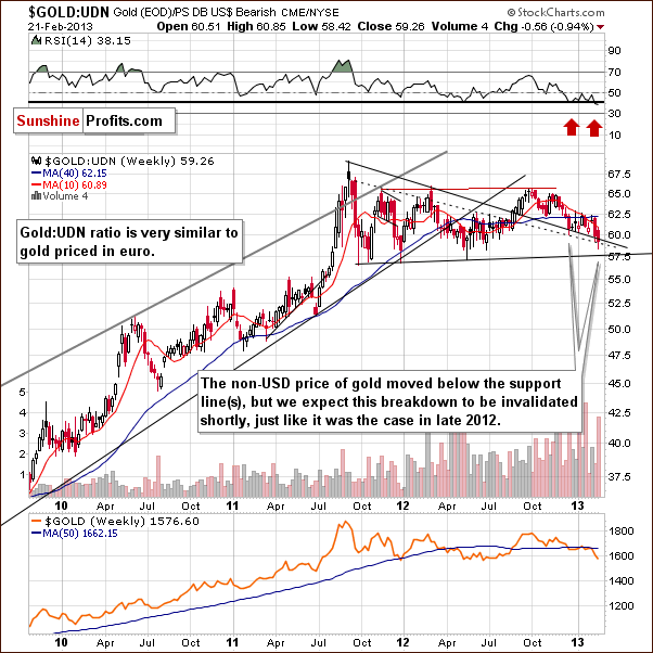
We continue to see a somewhat bullish picture here. Extensive consolidation has been seen after the 2012 breakout. Gold moved below the declining support line this week and while the situation looks a bit discouraging, we expect the recent breakdown to be invalidated – likely today. The support line currently in play has held declines for several months now with only one previous quick dip below it which was invalidated towards the end of 2012.
Now, let’s take the Canadian Dollar perspective which yields yet another encouraging analogy with 2008.
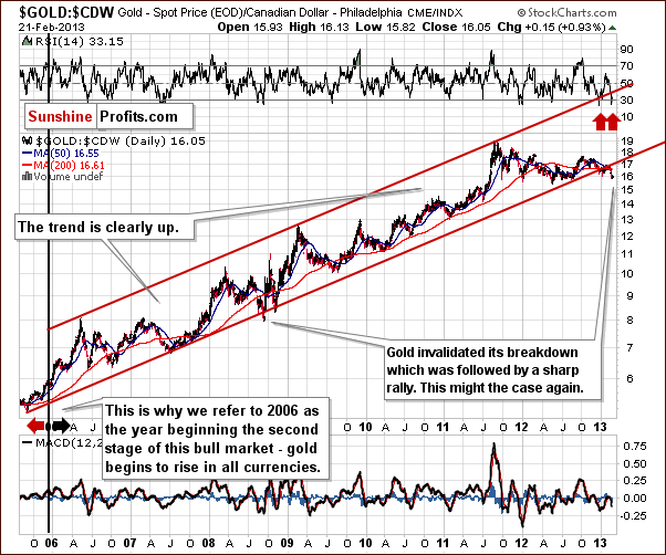
In this chart, we see that prices are now below the trading channel, much the same as was seen in 2008. That move was followed by a strong move to the upside, and with the situation heavily oversold here today, we expect prices to move back into the trading channel and rally sharply as we saw in 2008. Note the extremely oversold RSI levels – see the red arrows in our chart.
Finally, we would like to address one of our subscriber’s questions regarding a death cross technical formation on the gold market. Supposedly, it is a herald of doom for gold investors, but we would like to confront this belief with cold facts.
Q: Could you please address whether we need to be concerned about the recent golden death cross technical formation. Thanks.
Thanks for the daily market alerts! They are very helpful, especially during these trying times!
A: We discussed the death cross in gold in April, 2012 and here’s a quote:
Yes, we do have something to say about the death cross in the precious metals market. Something quite to-the-point:
It doesn’t work.
To be precise, in our opinion, it doesn’t work as signaling a good moment to sell gold or silver. Actually, in most cases it was a very reliable buy (!) signal. Here are the moments where the death cross was seen in gold during this bull market:
End of Q2 2004 – right after a major bottom and before a big rally (lower prices were never seen after that bottom); Mid-2005 – right before a major bottom and before a huge rally (lower prices were never seen after that bottom); Beginning of Q4 2006 – right after a major bottom (lower prices were never seen after that bottom); Q3 2008 – in the middle of the 2008 plunge.
Which of these four scenarios is the odd one? The last one marked neither a good buying point nor a good exit point – it was right in the middle of the extraordinary decline. In all other cases the death cross was a bullish development.
Summing up, 3 out of 4 cases where the death cross was seen were great moments to buy and the 4th one was neither a good nor bad moment to buy.
Therefore, the implications of a death cross are actually bullish.
In reality, gold did move lower in the weeks following the above comment despite the bullish impact of the death cross (it sounds weird, but that’s how it used to work), so we now have 3 out of 5 moments that were great times to buy gold, one average moment and one before a not-so-deep decline. It’s still not bearish.
By the way, please keep in mind that we have a search function on our website (top right part of the page) that works very well — it breaks the results into sections and can you can also filter them by dates. We will happily reply to questions in this section of updates and the Q&A Panel, but we are naturally not able to provide answers 24/7, and our search engine can do it instantly. You can try searching for “death cross” and you will find, for instance, similar comments for the silver market.
Summing up, support lines are in play for two out of three of this article’s gold charts and it’s likely that a local bottom has indeed formed. Additionally, RSI levels indicate an oversold situation. The outlook for gold from here is bullish.
Thank you for reading. Have a great and profitable week!
Mining and exploration stocks have been brutalized…..

First and foremost, I want to thank the “Silent Majority” of readers who wrote some very nice emails in the last 24 hours. It has help ease the pain considerably.
Speaking of pain, gold and mining shares have been badly beaten up and there’s no immediate relief in sight. The only positive is the bearishness has become overwhelming and if support can hold in the coming weeks, we should get a compelling contrarian situation not seen in years.


You have come a long way baby


Lumber prices getting slightly ahead of themselves?


EconMatters is made up of a team of financial and market analysts who research, analyze, and write articles devoted to the discussion of important economic and market specific issues relevant to our readers and global strategic investing.
In addition to the EconMatters staff, we are fortunate to have a global network of guest authors who contribute regularly to the site, and we value their contributions. If you would like to contribute to the website as a guest author, then send your request via the contact link below.
Thanks for visiting our site, and if you have any comments, questions or media requests be sure to send us a message.
The World Gold Council published a report last week that raises a few important questions and quite a few eyebrows, so let’s examine it.
You can access the report here. We recommend that you read it, but if you’re not going to go through the entire report, please just take a look at its first page and the chart with total demand for gold from 2003 to 2012.
The thing that got people concerned is the decline in demand and in particular the decline in the investment demand. First, let’s take a closer look at the decline in total demand. The key point here is that it’s not the first time that we see a y-o-y decline in demand. We saw the same in 2006 and in 2009. Guess what price did in the following years – 2007 and 2010? It rallied strongly in both cases. In 2007 gold rallied 31% and in 2010 gold rallied 29%. If gold is to close 2013 30% higher than it closed 2012, then the price for the end of this year would be $2,176.
To measure the investment demand we summed up two columns: “total bar and coin investment” and “ETFs and similar” (source: World Gold Council).

The sum of the two has actually decreased for the first time since this bull market began over 10 years ago. Should this be surprising? Investment demand is very different from regular demand for any good. Normal demand decreases with prices as people don’t want to buy things that are getting expensive. With investment goods, it’s the other way around because investors that see higher prices tend to extrapolate the trend and buy the expensive asset believing that the price will move even higher in the future. Gold price didn’t do much in the second half of 2011 and throughout the whole 2012 – it seems natural to expect investors to be discouraged and thus to invest less.
The dip in demand would likely be bigger this year because of the increased demand in India in 2012 due to expected tariffs increase on gold imports this year. Without this “early demand” we would be likely looking at even lower values.
Is that a bad thing? Not necessarily, because this is something that shows that investors’ optimism has declined. In the Feb 8 gold article we wrote the following:
We would like to add that the time factor may make this consolidation significant. Less than 40 years ago the correction took gold much lower – about half of the previous high – before the final rally in gold materialized. At this time we think that the prolonged consolidation might have been enough and gold doesn’t have to move even lower – the lack of a rally might have been enough to make people throw in the towel.
Lower investment demand indicates just that – lower levels of investor optimism. The data shows that the correction is actually more discouraging and profound than it seems if you take a look at the price only. The decline in investment demand simply confirms that the price may NOT have to move much lower because the damage to the investor sentiment has already been done. Consequently, it’s not a bearish piece of information.
Another important thing visible in the report is what we’ve been writing about for quite some time – that the official sector is now buying gold instead of selling it. While this makes us a bit concerned as the governments tend to be the worst investors, it is a very positive factor for gold in the years to come. Governments may say what they have to say (just what they have always done) but the money will flow in tune with what they really think. And it’s flowing into gold and countries are either demanding their gold back (Germany) or seriously considering it.
Since we analyzed the gold charts themselves in our last gold article, today we would like to focus on the currency markets as they seem to exert the most influence on precious metals in the medium- and long term. We’ll start with the Euro Index short-term chart (charts courtesy by http://stockcharts.com)

We see that the index declined on Thursday and also earlier this month. These declines appear to be a verification of the reverse head-and-shoulders pattern and the implications remain bullish at this time.
The same can be said about the implications of the short-term trend – the currency remains above the short-term support line.
Let us now move on to the U.S. dollar with the USD Index serving as a proxy here.

In the medium-term USD Index chart, we see that significant declines followed the 2012 top. Since then, a prolonged consolidation period has been seen and the period of declines ahead after such a lengthy consolidation could very well continue and complete the head-and-shoulders pattern in the coming weeks. This would have very negative consequences for the dollar.
Now, we’ll have a look at the short-term picture of the USD market.

Many investors may now be asking themselves, “Will a breakdown be seen anytime soon?” In the short-term USD Index chart, the fact is that we see that a cyclical turning point is coming very soon. With the preceding move to the upside, we could very well see the long awaited medium-term decline begin. With each consecutive attempt to break down below the support line (neck level of the head-and-shoulders pattern), the odds of success increase slightly. It once again seems that a successful breakdown will be seen soon, and the head-and-shoulders pattern will be completed.
Summing up, current situation in the gold market – as indicated by the abovementioned World Gold Council report – seems to be a good foundation for the substantial rally that we believe will materialize in the coming months. Investor’s optimism has clearly cooled off and the institutional part of the market carries on buying more and more of the yellow metal.
The overall situation remains bearish for the USD Index even though the index has rallied a bit this month. The weeks ahead will likely see the index level move to the downside. Once the index reverses direction, a bigger rally will likely be seen in the precious metals sector.
Thank you for reading. Have a great and profitable week!
Przemyslaw Radomski, CFA
Founder, Editor-in-chief
Gold Investment & Trading Website – SunshineProfits.com
* * * * *
Disclaimer
All essays, research and information found above represent analyses and opinions of Przemyslaw Radomski, CFA and Sunshine Profits’ associates only. As such, it may prove wrong and be a subject to change without notice. Opinions and analyses were based on data available to authors of respective essays at the time of writing. Although the information provided above is based on careful research and sources that are believed to be accurate, Przemyslaw Radomski, CFA and his associates do not guarantee the accuracy or thoroughness of the data or information reported. The opinions published above are neither an offer nor a recommendation to purchase or sell any securities. Mr. Radomski is not a Registered Securities Advisor. By reading Przemyslaw Radomski’s, CFA reports you fully agree that he will not be held responsible or liable for any decisions you make regarding any information provided in these reports. Investing, trading and speculation in any financial markets may involve high risk of loss. Przemyslaw Radomski, CFA, Sunshine Profits’ employees and affiliates as well as members of their families may have a short or long position in any securities, including those mentioned in any of the reports or essays, and may make additional purchases and/or sales of those securities without notice.

I know Mike is a very solid investor and respect his opinions very much. So if he says pay attention to this or that - I will.
~ Dale G.
I've started managing my own investments so view Michael's site as a one-stop shop from which to get information and perspectives.
~ Dave E.
Michael offers easy reading, honest, common sense information that anyone can use in a practical manner.
~ der_al.
A sane voice in a scrambled investment world.
~ Ed R.

Greg Weldon

Josef Schachter

Tyler Bollhorn

Ryan Irvine

Paul Beattie

Martin Straith

Patrick Ceresna

Mark Leibovit

James Thorne

Victor Adair