
Energy & Commodities
Tonight I would like to update some charts for the commodities complex as we are starting to see some action in this sector. Back in the summer months when we first started to get long some of the different commodities sectors, we got many breakouts from some very nice H&S bases. After the initial move up came the first consolidation phase that has been going on for nearly four months or so. We are now starting to see some of these consolidation patterns breaking out which should lead to the next impulse move higher in most cases.
Lets start with BHP, one of the biggest miners on the planet, that shows a good example of where we are at in the bull market. Today the price action broke out with a gap above the top rail of an almost 5 month triangle consolidation pattern. A backtest to the top rail would come in around the 43.50 area.
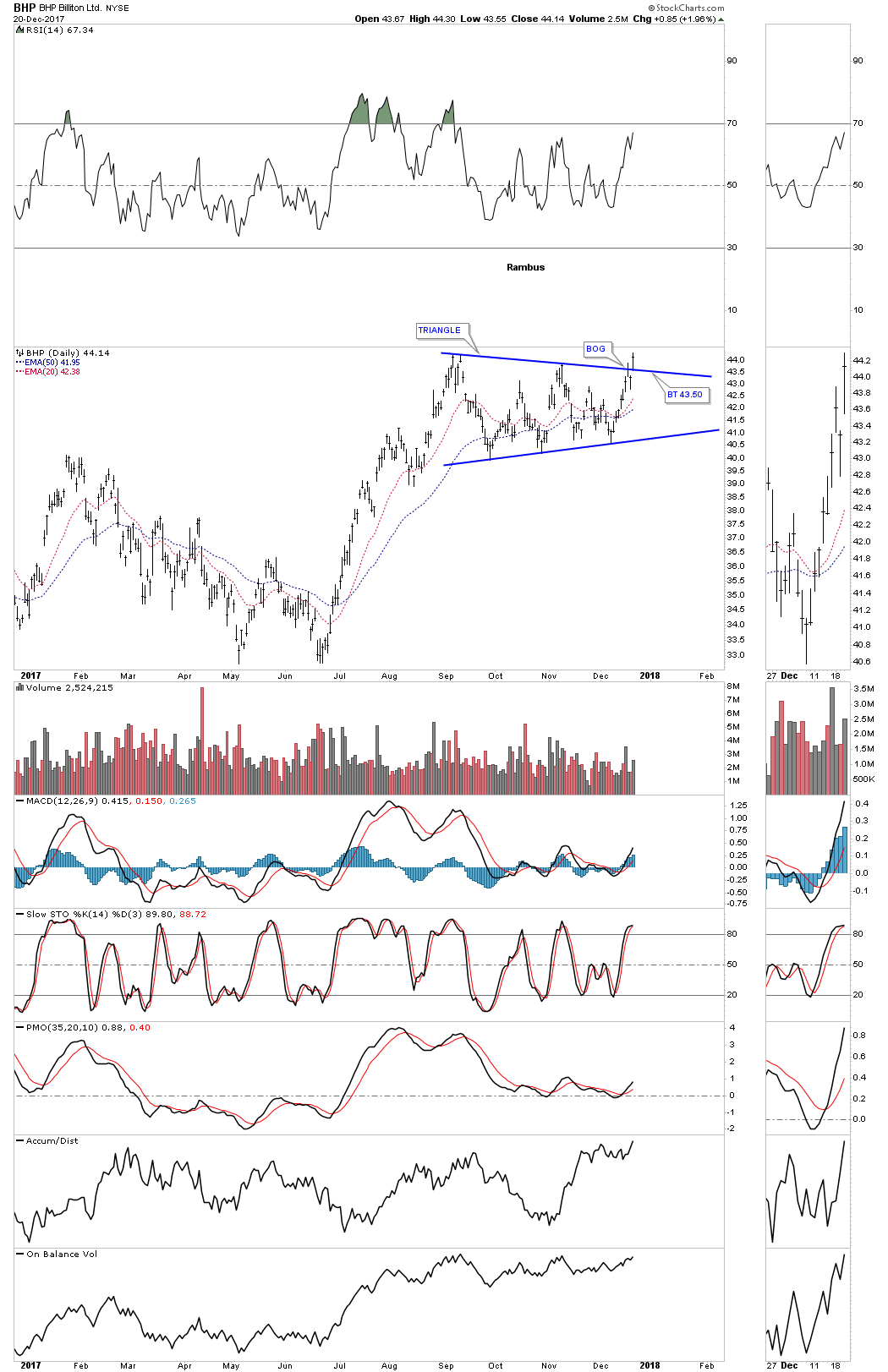
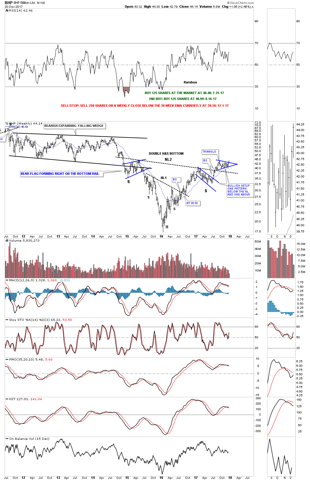
Now lets look at a long term weekly chart which shows some classic Chartology. We have discussed many times in the past when you see a small consolidation pattern form just below an important trendline, in this case the neckline, and one above, that is usually a very bullish setup which BHP is now showing.
Also keep in mind the size of that double H&S bottom that took three years to buildout. Big patterns lead to big moves. The minimum price objective of that double H&S bottom is measured from the head straight up to the neckline # two. Add that distance to the breakout point to get your minimum price objective.
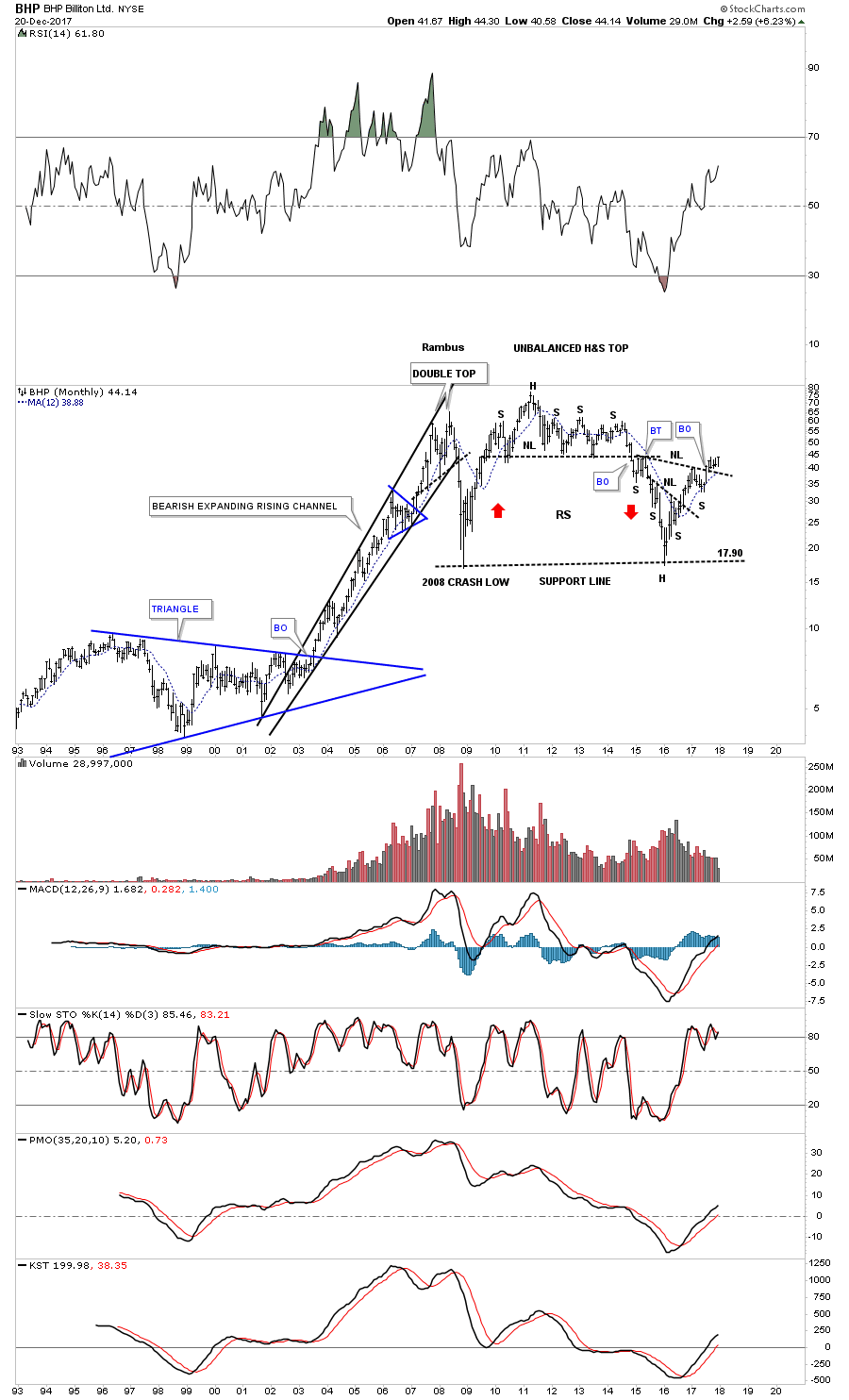
This monthly chart put the double H&S bottom in perspective.
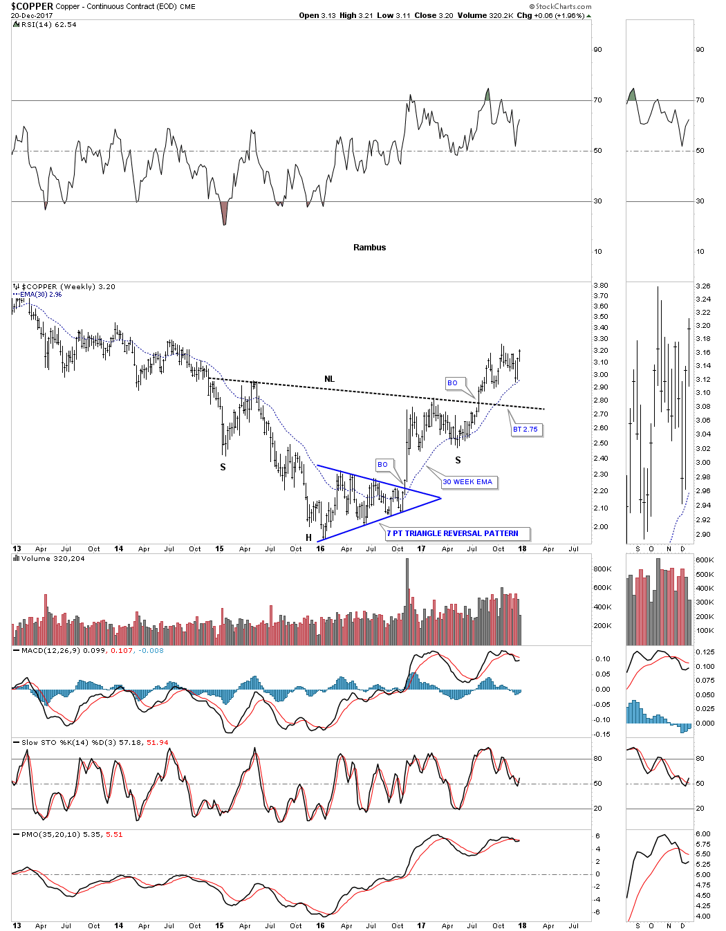
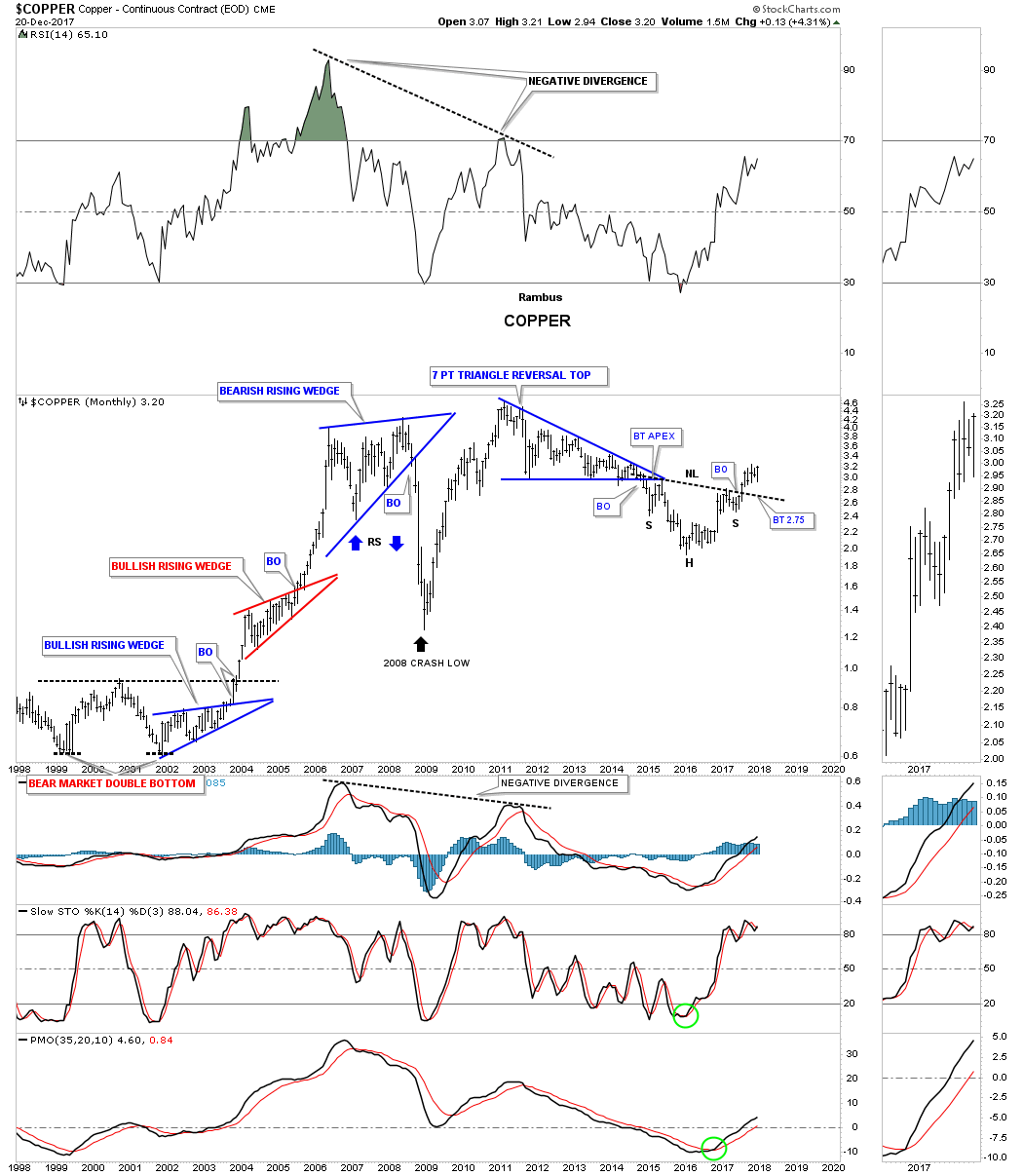
Copper is an important commodity as it can show the strength or weakness of the economy which is why it’s called Dr. Copper. This weekly chart shows copper’s big H&S bottom with the breakout in the summer. The head formed a 7 point triangle reversal pattern which actually reversed the bear market. Here is a case where we didn’t see a backtest to the neckline when the breakout took place. The 30 week ema has done a good job of holding support so far during Coppers new bull market.
This 20 year monthly chart shows how the H&S fits into the very big picture.
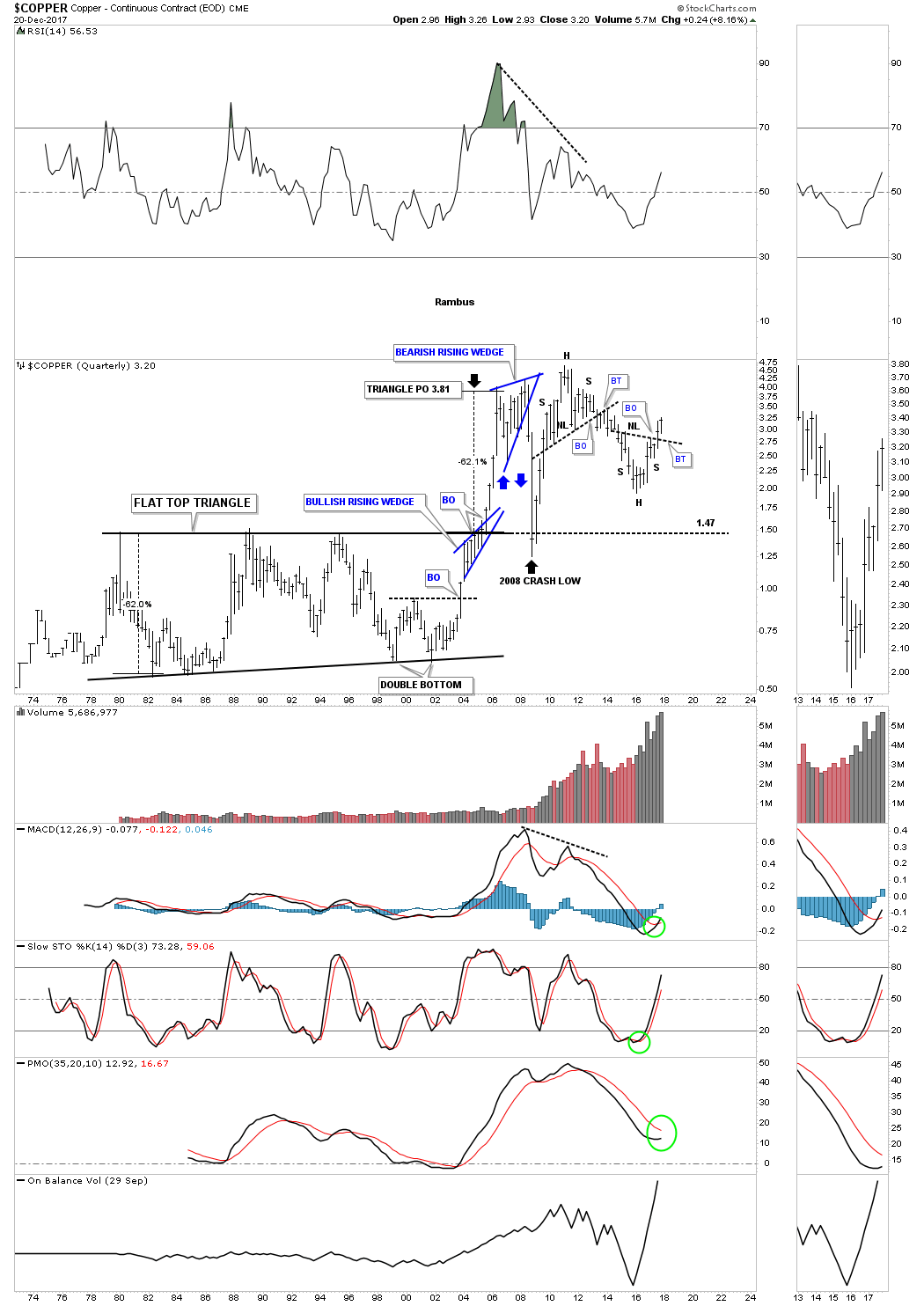
Below is the quarterly chart which shows some nice Chartology especially that 24 year flat top triangle’s price objective.
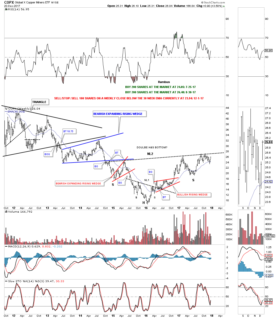
I originally took two positions, one in July and one in August of this year for the COPX, Copper Miners etf, in anticipation of the eventual breakout above the neckline which so far hasn’t happened just yet. It’s close but no cigar.
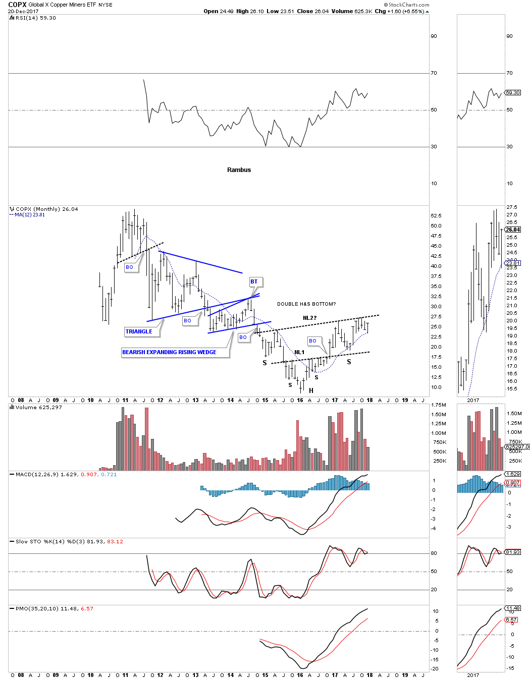
This monthly chart shows a double H&S bottom which many of the different commodities are showing. The 12 month simple moving average has done a good job of showing support during the new bull market.
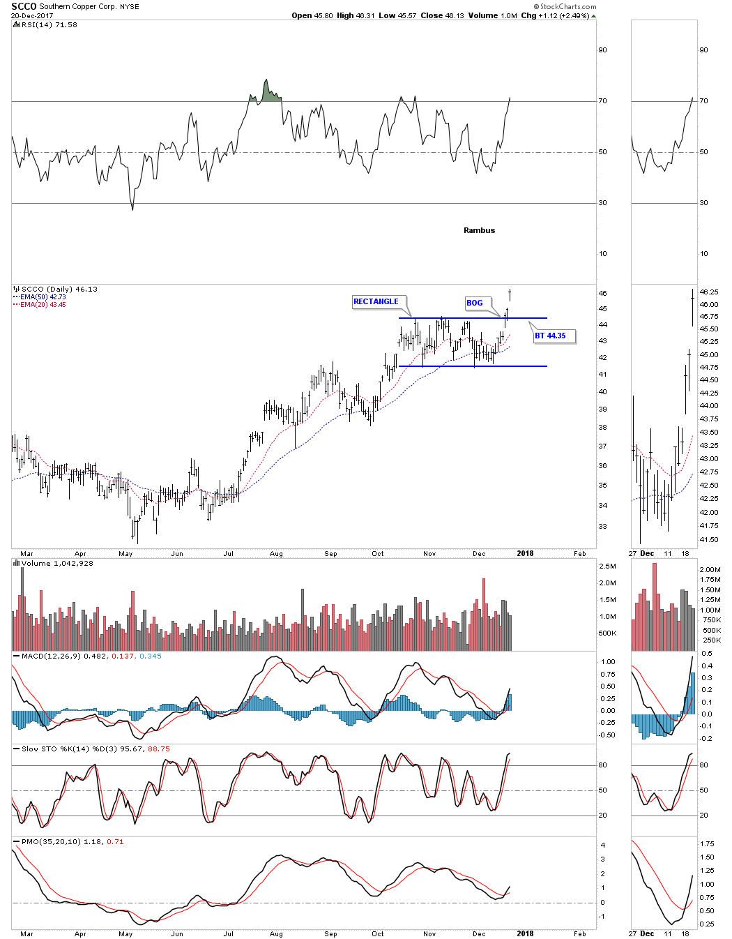
SCCO, Southern Copper, is the strongest stock in this sector. The daily chart below shows it has just broken out from a rectangle consolidation pattern with a breakout gap.
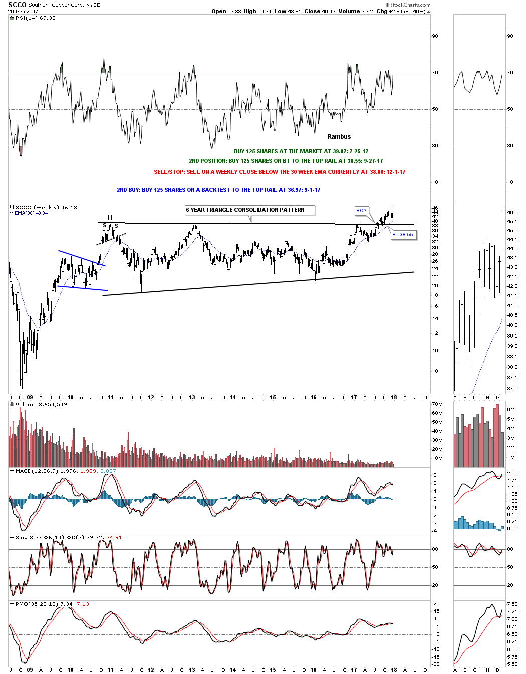
If big patterns lead to big moves then this weekly chart for SCCO says we should expect a very large impulse move higher as it’s trading at a new all time high after breaking out from a six year triangle consolidation pattern.
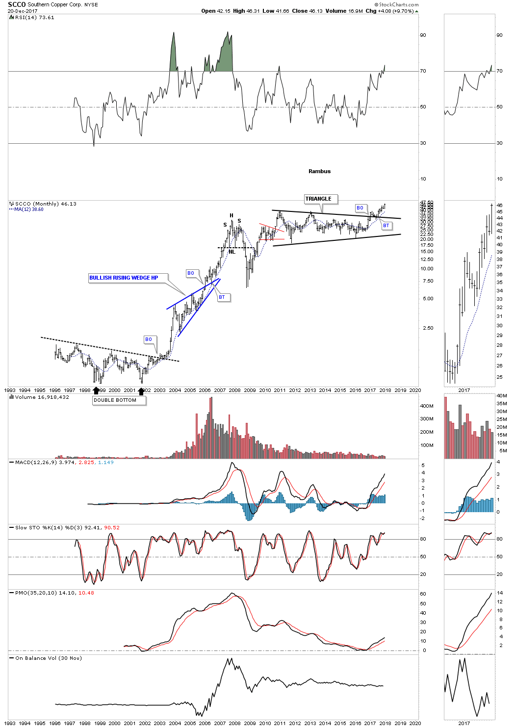
This 25 YEAR monthly chart below shows the breakout taking place above the six year triangle consolidation pattern which is now making new all time highs. Note the blue bullish rising wedge that formed as a halfway pattern back in the early 2000’s.
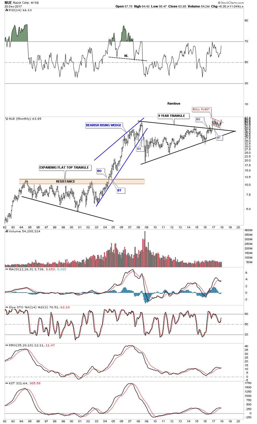
Some of the steel stocks are starting to show their pent-up bullishness as they are breaking out from major consolidation patterns. This monthly chart for NUE shows it broke out from its 9 year triangle consolidation pattern in 2016 and has been consolidating that breakout move by forming a second consolidation pattern just above the top rail which is the Red Bull flag.
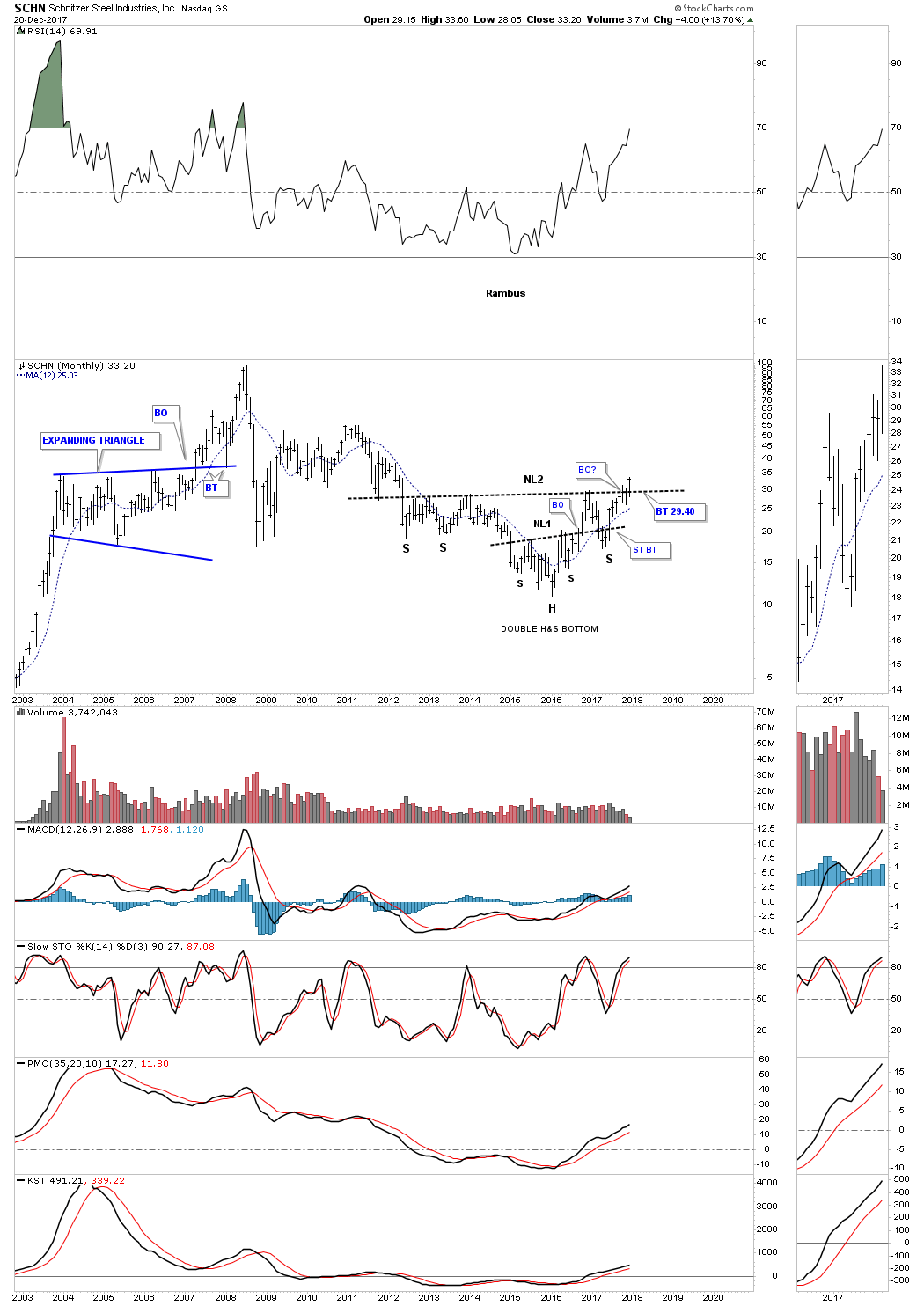
This week SCHN is breaking out from a six year double H&S bottom. You would have to go all the way back to 2011 to equal today’s high.
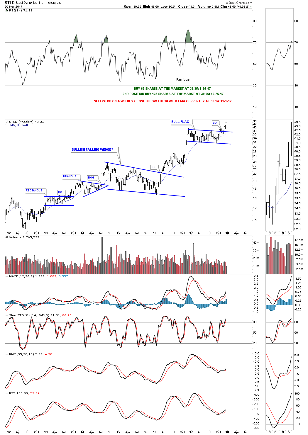
This weekly chart for STLD shows it broke out from a one year bull flag three weeks ago.
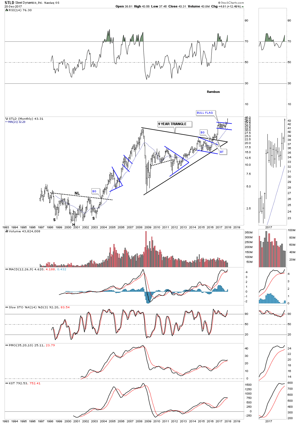
This 20 year monthly chart shows the entire history for STLD. This chart also has some nice Chartology on it. Note the 2000 H&S bottom which launched STLD on its first bull market which produced several consolidation patterns along the way. When that bull market ended in 2008 it took 9 years to build out the massive triangle consolidation pattern which is now launching STLD on its next bull market leg higher. If you stand back and look at this chart from a distance you can almost see the beginnings of a parabolic move taking place.
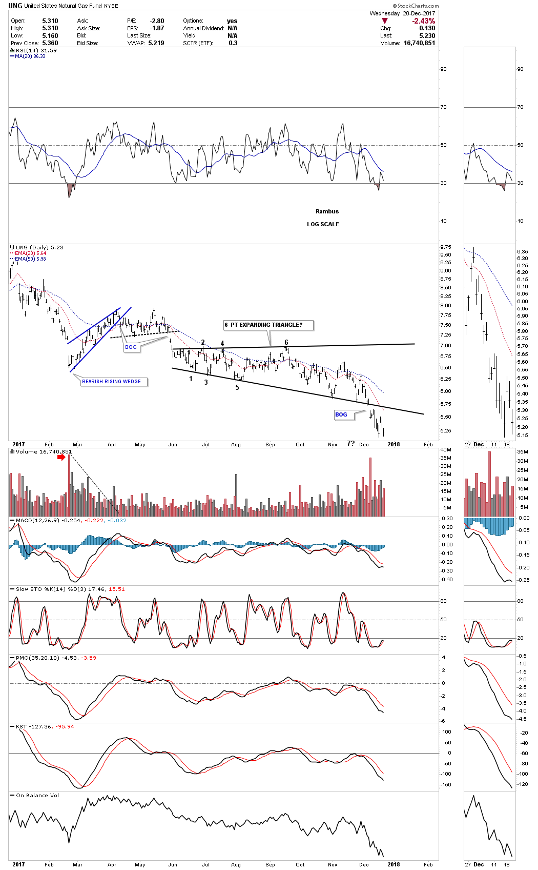
Before I run out of time I would like to show you one of the weakest areas in the commodities complex which is $NATGAS. Last week it finally broke down from a year and a half H&S top. We now have a clean line in the sand, above the neckline is bullish and below is bearish.
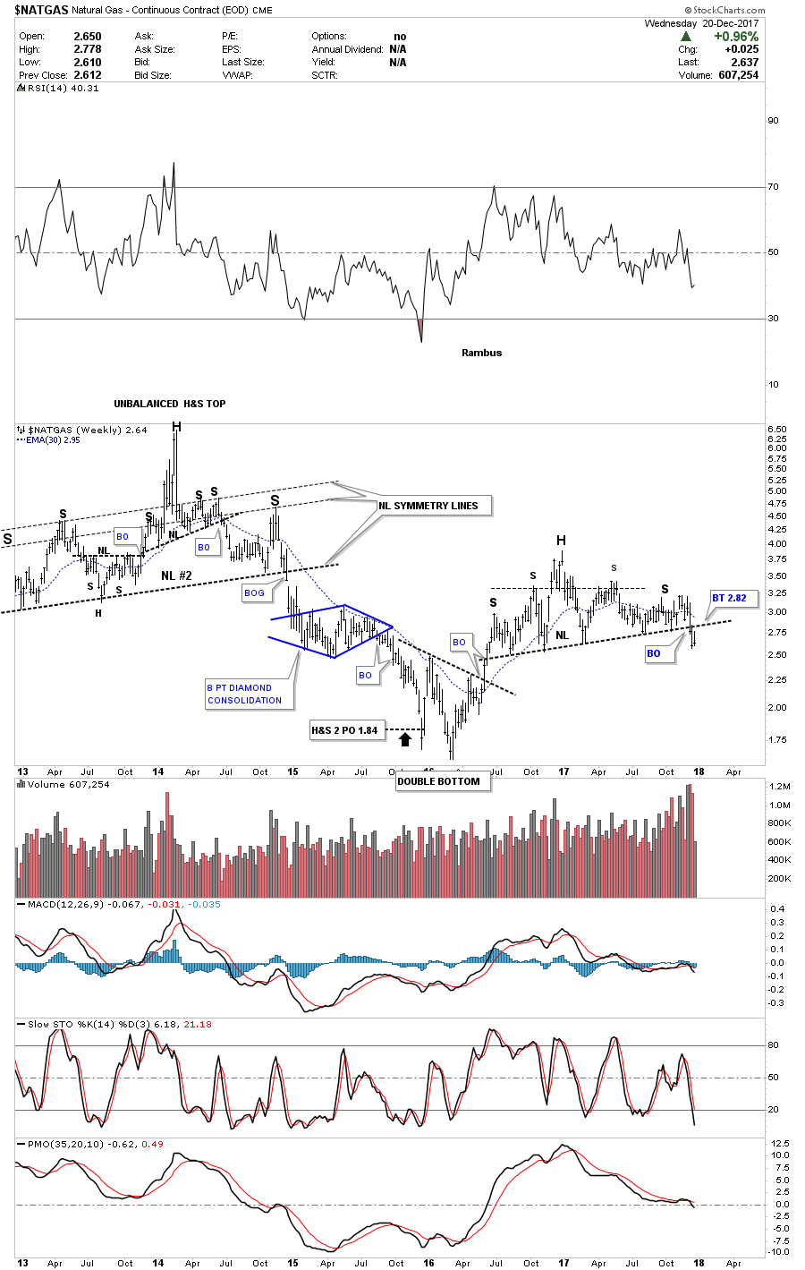
Several weeks ago I tried to go long UNG as it was testing the bottom rail of an expanding triangle. After five touches of the bottom rail I thought it would hold one last time, but that wasn’t the case. After getting a decent pop off the last touch the price action reversed straight down and then gapped the bottom trendline where I exited the trade. Again UNG is bullish above the bottom rail and bearish below.
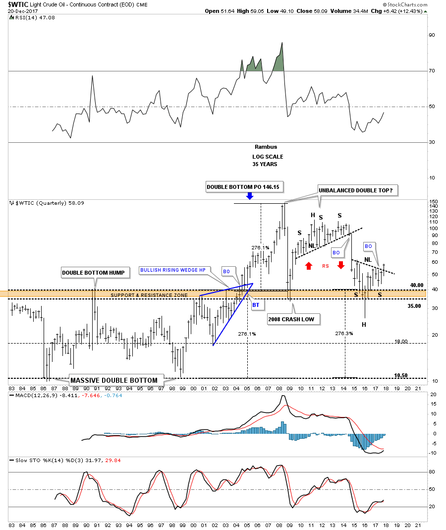
There are two patterns I’m keeping a close eye on for $WTIC. This first pattern is a rising flag formation which has just completed its fourth reversal point at the top rail. I would view the rising flag as a halfway pattern if the price action can take out the top rail.
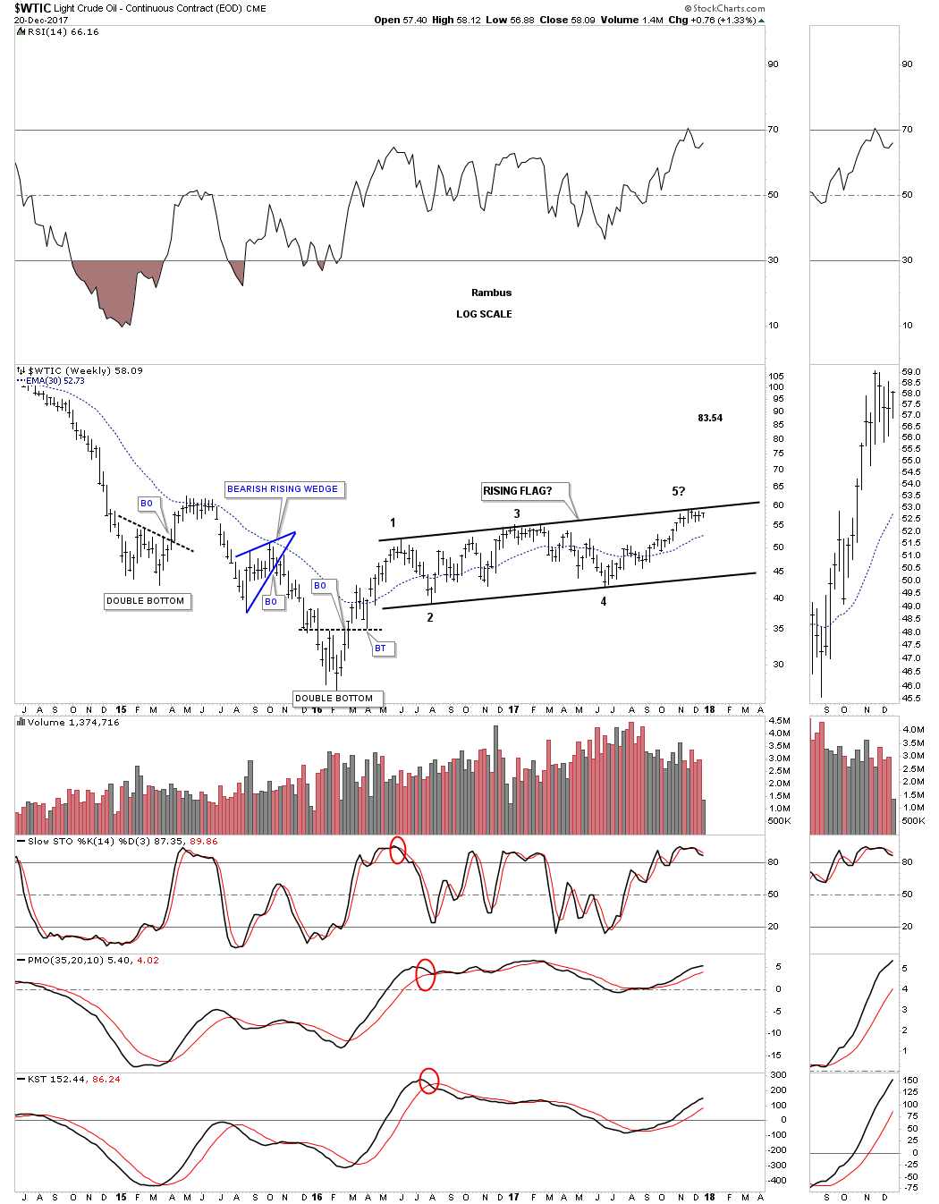
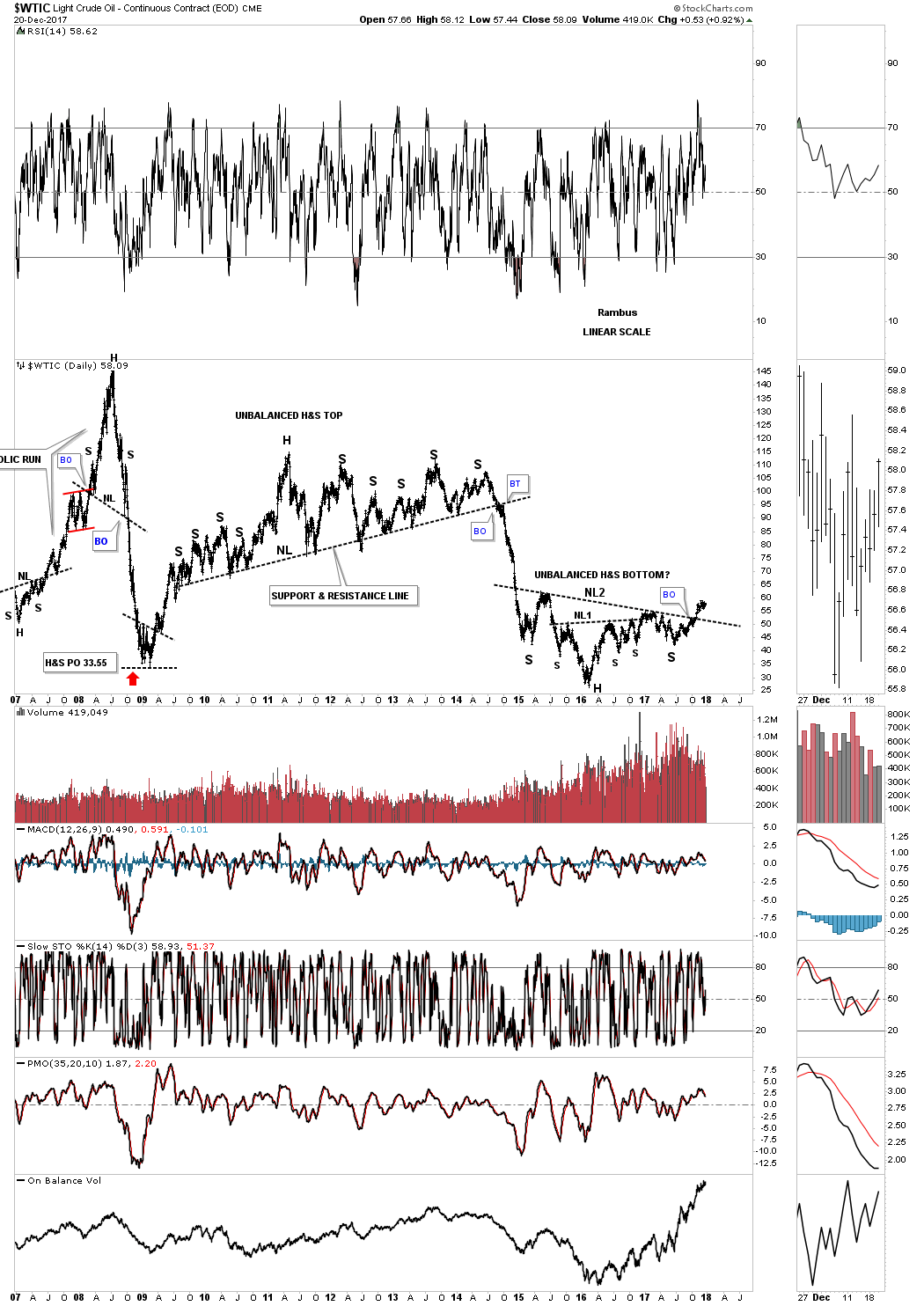
As we’ve seen with some of the other commodity related stocks tonight many have formed a double H&S bottom reversal pattern. This 10 year daily chart for $WTIC shows it too has a double H&S pattern in play with a breakout above the neckline. The last time we looked at this chart I suggested it looked similarly inverse to that massive unbalanced H&S top, only on a smaller time frame.
This 20 year monthly chart shows how the double H&S bottom fits into the big picture.
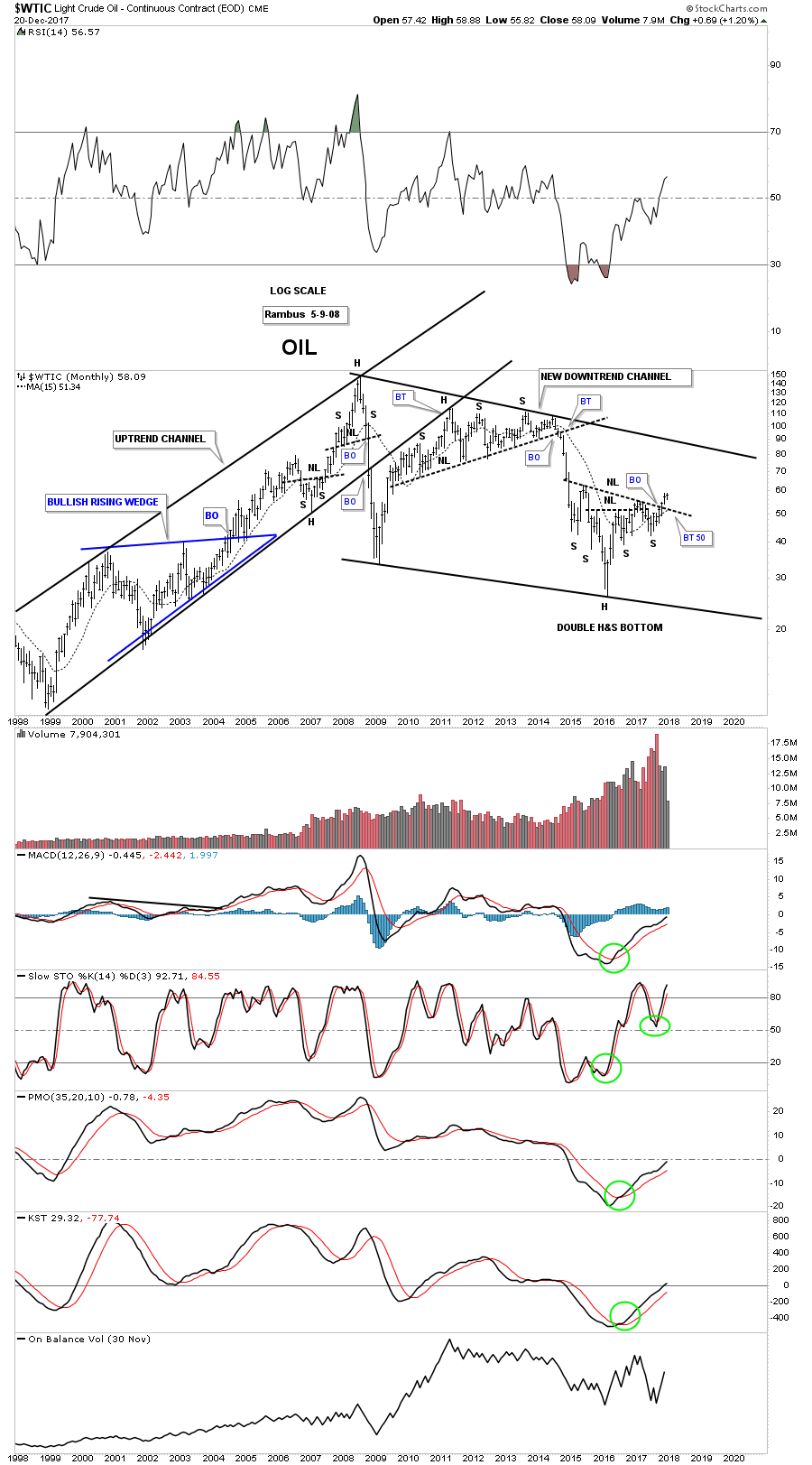
This last chart for tonight is a 35 year quarterly chart which puts everything in perspective. Keep in mind the measured move for a H&S pattern when you look at this chart. Time to get this posted. All the best…Rambus

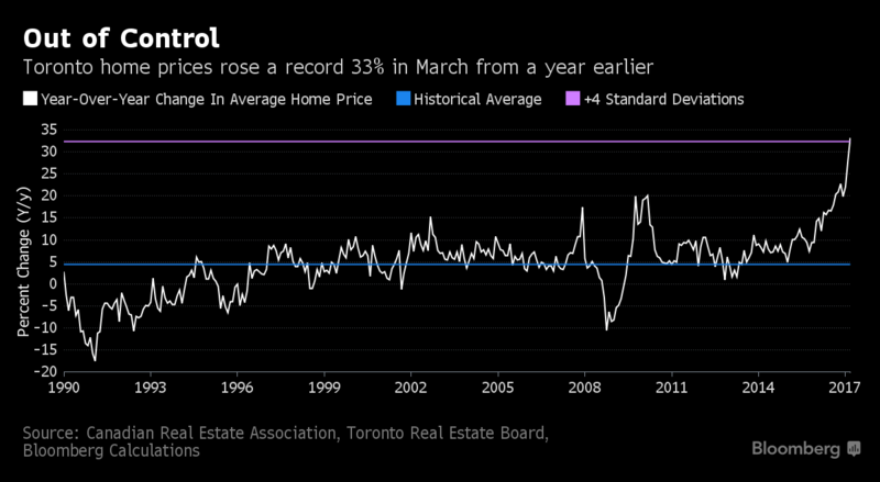
The Canadian dollar could be about to take a plunge. Not only did the Bank of Canada recently pour cold water on further rate hike prospects, but there is also the problem of crude oil. The black stuff got sold off today in response to the latest U.S. oil inventories data which showed a big rise in stocks of gasoline. But that’s not even half of the problem. The problem is actually in Canada itself, where crude oil is being sold at a significant discount to the rest of the world. Canada’s benchmark oil, called the Western Canada Select is trading at a $26.50 discount to WTI. That’s almost a 50% discount given the current price of WTI being about $62.50 per barrel. Canada has its oil production concentrated in Alberta and there are no pipelines to ship the oil to the cost. Consequently, nearly all its crude is piped to its only customer – the U.S. – where it is refined into various oil products. But thanks to the shale oil revolution, the US is fast becoming self-sufficient in its energy needs. So it relies increasingly less on crude imports. As a result, a huge glut has been built up in Canada. This could prove very costly for the Canadian economy and therefore its currency.
….also from Michael Campbell: Paucity of Pipelines Cost Canada $72 Million a Day
AUD/CAD about to stage a significant comeback? Given the recent bounce in the Aussie/U.S. dollar (AUD/USD) currency pair from a long-term support around the 0.75 area, the Canadian dollar could fall faster against the Australian than the US dollar – assuming Thursday’s release of Aussie employment data will not be significantly lower than expectations. In fact, the Aussie/Canadian dollar (AUD/CAD) currency pair has already broken its most recent high after forming a false breakout reversal pattern around the January 2017 low of 0.9605 area last Wednesday. With a higher high in place, the path of least resistance for AUD/CAD is now to the upside. Consequently, I expect it to rise towards the next swing high at 0.9915 over the coming days – possibly a lot higher over time if the oil problem for Canada persists.


There is good news for natural resource investors out there. The Baltic Dry Index (BDI), which is a benchmark of shipping rates around the world, hit a four-year high.
The BDI tracks shipping of grains, oil seeds, coal and iron ore. These are fundamental components of the global economy. So, when the cost to ship those goods goes up, it means the global economy is improving.
And that’s great news for natural resources.
The Global Economy
You can see what I mean in the chart below:

The BDI hit its highest point since 2014 on a strong move up since July 2017.
The BDI tracks the recent moves in commodities as well. Base metals like copper and zinc are moving higher too. When the price of the commodities moves higher, as well as the cost to move them, we know demand is rising.
That’s great news.
The entire commodity space hit bottom in early 2016. The recovery is less than two years old today. There is plenty of room for it to move higher.
The rapid climb of the BDI isn’t a guarantee for the whole sector. However, it is a strong signal that the recovery has momentum.
That means we could see a great 2018 for natural resources.
Plenty of Options for Natural Resource Investors
If you are looking to put money to work in this trend, you have plenty of options. You could invest in the Claymore/Delta Global Shipping ETF (NYSE: SEA). However, this small ($131 million) fund has not tracked BDI this year.
Instead, we want to invest in the broader bull market in commodities in general. If you’d like exposure to a basket of commodities, here are a few good general funds:

These should do well as the overall natural resource sector continues to climb into 2018.
Good investing,
Matt Badiali
Editor, Real Wealth Strategist
The rate at which global silver production increased over the past century is quite astonishing. When Columbus arrived in America (1492), the world was only producing 7 million oz of silver a year. Today, the world’s largest primary silver mine, Fresnillo’s Sauicto Mine, produced three times that amount in just one year (22 million oz, 2016). Yes, we have come along way in 500 years.
Just think about that for a minute. One silver mine last year produced three times the global amount in 1493. According to the U.S. Bureau of Mines 1930 Report on Summarized Data of Silver Production, the average annual silver production in the world from 1493 to 1600 was 6.9 million oz (Moz). If we look at the following chart, we can see how world silver production increased over the past 500+ years:

As we can see, average annual world silver production increased from 6.9 Moz during 1493-1600, to 13 Moz from 1600-1700, 18 Moz from 1700-1800, 51 Moz from 1800-1900, 274 Moz from 1900-2000 and a stunning 722 Moz from 2000-2017. Again, these figures represent the average annual silver production for each time period.
In the current period, 2000-2017, the world has produced 103 times more silver per year than from 1493-1600. However, the next chart shows the total silver production for each period. From 1493-1600, the world produced a total of 747 Moz of silver, compared to 13,000 Moz (13 billion oz) in just 18 years from 2000-2017:

Now, the reason the last silver bar on the right of the chart is lower than the previous one has to do with comparing 18 years worth of silver production (2000-2017) versus 50 years (1950-2000). It took 50 years to produce 17,061 Moz during 1950-2000 versus 13,000 Moz in the 18 years from 2000-2017.
If we compare world silver production from the different periods, here is the result:
Percentage Of World Silver Production (1493-2017)
2000-2017 = 26.4%
1950-2017 = 61%
1900-2017 = 82%
While a little more than a quarter of all world silver production (1493-2017) was produced in the past 18 years, 82% were produced since 1900. That is a lot of silver. It turns out that 40.4 billion oz was produced from 1900-2017 out of the total 49.3 billion oz produced since 1493. Interestingly, more than half of that silver was consumed in industrial silver applications. I will be writing more about that in future articles.
The last chart I find quite interesting. If we go back a little more than a century, the United States was the largest silver producer in the world. In 1915, the U.S. produced 75 Moz of silver out of the total 189 Moz mined in the world that year:

Thus, in 1915, the U.S. produced 40% of all world silver production. Mexico came in second in 1915 by producing 39.3 Moz. However, U.S. silver production in 2017 will only be 34 Moz versus the estimated 870 Moz globally. Thus, U.S. silver production only accounts for 4% of world mine supply versus 40% back in 1915. What a change in 100 years.
Lastly, the U.S. imports approximately 22% of world mine production each year. That is 193 Moz of the total 870 Moz in 2017. While domestic mine supply is only 34 Moz, the United States has to import more than a fifth of global mine production to meet its silver market demand.
Josef Schachter has made and saved MoneyTalks listeners a ton of money in the last four years with incredibly good forecasts on oil and gas prices, and with well timed buy and sell recommendations on energy stocks. Become a subscriber to his Schachter Energy Report and get his latest Action Alerts, including nine brand new recommendations. This service is one of our favourite reads right now.
SPECIAL OFFER – get $50 off the annual subscription fee for Schachter Energy Report and $75 off the Black Gold Service. Just use the respective promo codes below. CLICK HERE to ORDER:
SER50
BG75
** Remember to enter the code and click the APPLY COUPON button before proceeding to checkout.


-
I know Mike is a very solid investor and respect his opinions very much. So if he says pay attention to this or that - I will.
~ Dale G.
-
I've started managing my own investments so view Michael's site as a one-stop shop from which to get information and perspectives.
~ Dave E.
-
Michael offers easy reading, honest, common sense information that anyone can use in a practical manner.
~ der_al.
-
A sane voice in a scrambled investment world.
~ Ed R.
Inside Edge Pro Contributors

Greg Weldon

Josef Schachter

Tyler Bollhorn

Ryan Irvine

Paul Beattie

Martin Straith

Patrick Ceresna

Mark Leibovit

James Thorne

Victor Adair