Gold & Precious Metals

Gold Stocks: Extended but More Upside Potential

What a move in the gold stocks! The sector has refused to correct for more than a few days at a time. All weakness has been bought as a wall of worry has been built and the sector emerges from a historic low that could be on par with the 1942 low in the stock market. I thought the Federal Reserve statement or reaction to it (along with the market’s overbought condition) might cause the sector to correct this week. Instead, GDX and GDXJ powered higher and have gained roughly 13% for the week.

The weekly candle chart (below) shows both GDXJ and GDX are in breakout mode. GDXJ moved beyond previous resistance at $32-$33 and has upside targets at $43-$45 and even $50. Meanwhile, GDX has surpassed resistance at $22-$23 and now has upside to $27-$28 and $30. Furthermore, the 38% retracement of the entire bear in GDX is at $32. Do note that the miners have gapped higher in each of the past two days. For the sake of the bulls on the sideline, I hope to see an immediate pullback in the days ahead. 

Apr292016goldstocksw

The gold stocks are already very overbought and if they continue higher unabated then we will have to worry about a potential sizeable correction. The chart below shows GDX’s parent index (GDM) along with two oscillators which plot its distance from its 100-day and 200-day exponential moving averages. The oscillators show the gold stocks are the second most overbought they have been in the past 22 years. The most overbought point was early 2002 when GDM corrected 37% before climbing much higher.   

Apr292016GDMob

Before we worry about a sizeable correction, let me point out some very important data. The 2002 correction began when GDM and HUI rebounded 212% and 311% respectively from the major low in 2000. Thus far, the two have rallied 100% and 128% respectively.

Furthermore, the gold stocks are only three months removed from what could be the greatest buying opportunity of all time in the sector! While this is a sensational statement, it is rooted in data and facts and not your typical gold bug doomer porn. In short, there are three major similarities between the recent bottom in the gold stocks and the 1942 low in the stock market which arguably proved to be the greatest buying opportunity ever. I discuss and analyze the similarities in this video.  

To conclude, the gold stocks have emerged from a historic bottom, have more upside but will eventually correct. How much they correct and when depends on how fast they reach their upside targets and what specific levels they reach. My current guess is anywhere from 25% to 35%. 

Jordan Roy-Byrne, CMT

Jordan@TheDailyGold.com

Consider learning more about our premium service including our favorite junior miners which we expect to outperform in 2016.

PRECIOUS METALS INVESTOR: Must See Important Charts and Data

The U.S. and world economies are in serious trouble.  Unfortunately, the majority of analysts continue to put out increasingly worthless forecasts as they fail to understand the true nature of the problem… or rather, the predicament we are facing.

We must remember, problems have solutions while a predicament may be too difficult to solve.  According to the Cambridge definition of Predicament:

Predicament: noun[c] /prɪˈdɪk·ə·mənt/: an unpleasant or confusing situation that is difficult to get out of or solve.

With no money and no job, he found himself in a real predicament.

Mankind enjoys slapping itself on the back when it comes up with new technologies to solve problems.  However, solving problems with technology in the short run creates even larger problems in the longer run.  For example, how does the U.S. Federal Government maintain the massive infrastructure that technology help to create if there aren’t available funds to do so???

You see this is very similar to the example given above in the predicament definition.  With no money and no job, he found himself in a real predicament.  Some individuals would just scoff at the unemployed person and tell him to get a job at McDonalds or some other high-class establishment.  But, what if there were no jobs to be found as was true during the Great Depression?

Furthermore, the employment situation in the United States is much worse than the official estimates put out by the Bureau Of Labor Statistics.  If we go by the unemployment measures we used a few decades ago, true U.S. unemployment is closer to 25%.  It is just impossible to get all of the 25% of unemployed Americans a job today.  So, this is a serious chronic unemployment predicament with no real solution.

Why?  Because it all has to do with ENERGY.  The following charts and data will provide the precious metals investor the critical reason to own gold and silver.

The United States Is In Serious Trouble… And Most Americans Don’t Realize It

EROI-Square-Icon


If you look at the SRSrocco Report Icon on the top left corner of the site, you will see this EROI Red Square with a silhouette of the United States in it.  There is a very good reason I designed that graphic to be included in my icon.  According to my analysis of the top minds who study the EROI – Energy Returned On Invested, this is the most important factor that controls life as we know it.

The collapse of the Ancient Roman Empire was attributed to many factors, but the overriding reason was due to the Falling EROI.  The Roman Empire grew by acquiring lands and their resources.  Some of these resources were stolen wealth from the rich families in the lands the Romans had conquered.  However, as the years went by, the Romans conquered less lands, but spent an increasing amount of wealth (energy) to defend what they had.

The collapse of the Roman Empire came as the wealth (energy) needed to keep foreign invaders out as well as the masses happy, exceeded the wealth (energy) the empire could acquire.  Thus, the Falling EROI of the Roman Empire (as well as most empires in the past) was the number one cause of its demise.

This will also be true for the U.S. Empire.  I am not proud to say that, but this is no secret if you read those who research and study the EROI.   The following chart was taken from the 8020vision.com website based on a white paper, A New Long Term Assessment of Energy Return on Investment (EROI) for U.S. Oil and Gas Discovery and Production, from scientists Megan Guilford, Charles Hall, Pete O’ Conner, and Cutler Cleveland:

EROI-U.S-Oil-Discoveries-1910-2007

This chart shows the falling EROI – Energy Returned On Invested of U.S. oil and gas discoveries.  In 1910, the U.S oil industry was finding more than 1,200 barrels of oil for each barrel of oil (energy equivalent) consumed in the process.  The small EROI insert chart shows the huge decline since the 1950’s.  At last count in 2007, the U.S. oil and gas industry was discovering five barrels of oil for the cost of one barrel (5/1 EROI) versus the 60+/1 EROI during the 1950’s.

This next chart shows the Falling EROI of U.S. oil and gas production.  It peaked in 1950 at an EROI of 23/1 and trended downward to the 5/1 EROI for Shale Oil production today:

EROI-U.S.-Oil-Gas-Production

The data for the chart ended in 2007.  I added the dashed line showing the EROI of U.S. shale oil production.  The reason the EROI declined so much in the 1980’s was due to huge increase in drilling activity as the price of oil surged during the 1970’s.  Regardless, the EROI of U.S. oil and gas production has experienced a downward trend since the peak in 1950.

Simply put, as the EROI falls, there are less profitable barrels to run the U.S. economy.  Charles Hall recently stated that a modern society needed at least a 12/1 EROI of energy to sustain itself.  The Shale Oil Industry has provided a much needed liquid energy supply, but the 5/1 EROI of shale oil does not meet the minimum requirements of a modern society.

If we look at these two charts, we can see that EROI of U.S. oil discovery and production fell significantly since the 1950’s.  This had a profound impact on the U.S. economy and outstanding debt.  Ever since the 1970’s, top paying U.S. manufacturing jobs have been exported overseas.  It’s no coincidence that this occurred right at the same time as the U.S. oil discovery and production EROI rapidly declined.  Again, please check the small EROI insert chart in the U.S. oil and gas discoveries graph.  You can see the collapse of the EROI more readily.

How did the Falling EROI impact the outstanding debt of the United States?  Please look at the following chart:

Total-U.S.-Debt

You will notice that the total U.S. debt started to increase in the 1970’s and picked up considerably in the following decades.  I labeled the FRED chart as “ENERGY DEBT” because this is exactly what all financial debt should be called.  Energy has to be burned to create economic activity to pay back debt.  So, all financial debt is actually “ENERGY DEBT.”

Why did U.S. ENERGY DEBT increase so much since the 1970’s??  This was due to the falling EROI of U.S. oil discoveries and production.  Basically, the United States economy and system could no longer sustain itself as a commercially viable enterprise with the Falling EROI and declining domestic oil production, so it increased the amount of outstanding debt.  Thus, the increased debt is an inverse relationship to the Falling EROI and production of U.S. energy.

It’s that simple folks.  However, most analysts don’t understand this as they create all sorts of complicated models and charts showing how the U.S. will continue to grow well into the 22nd Century (2100).

Precious Metals Investors Are Mislead By Faulty Superficial Analysis

One of my readers forwarded the link to a recent article, Getting It Wrong On Silver by Keith Weiner.  Mr. Weiner is famous for his gold-silver basis charts which describes the inherent tightness or abundance of metal in the market.  While this is a valuable tool for traders who have a half a dozen monitors in front of them looking to scalp profits on short-term movements in the precious metals, it will be worthless for Americans who will be trying to survive as the U.S. oil supply contracts by 70-75% over the next decade.

Here is a chart of the largest shale oil field in the United States, the Eagle Ford by Tad Patzek.  You can read more about it in my previous article, THE REAL REASON TO INVEST IN PRECIOUS METALS… It’s The Fundamentals.

Eagle-Ford-Tad-Patzek

As you can see, Mr. Patzek forecasts Eagle Ford oil production to collapse back to very little by 2020.  This is only four years away.  Again, if you check out the link above you can read his vast experience and background in Petroleum Geology.

Unfortunately, Mr. Weiner’s gold-silver basis charting analysis wont put food on the table when the complex supply chain system disintegrates due to the collapse of U.S. energy production.  However, owning physical gold and silver at this time could help considerably.

Mr. Weiner brings up several NO-NO’s written about silver in a Bloomberg article that is no longer available at the link he provided.   One of the items Mr. Weiner tries to debunk in his article is the subject of “STOCK to FLOWS.”  Here is his commentary:

Mankind has been accumulating silver for many thousands of years. Unlike gold, some of it is consumed. Unlike any ordinary commodity, most of it is not. Economists call this the ratio of stocks to flows — inventories divided by annual production.

In gold and silver, stocks to flows is measured in decades. In ordinary commodities, it’s months. In wheat, crude oil, or lithium if inventories build up too much, that is called a glut. The price crashes until the glut is worked off.

There is no such thing as a glut in gold or silver, nor a shortage. This is part of what makes them money.

Mr. Weiner is making the point that there is no real shortage of silver or gold.  He states that the analysis showing a decline in global silver production is meaningless because there is so much above-ground available silver.  As he states, “Mankind has been accumulating silver for many thousands of years.”

While Mr. Weiner is correct that Mankind has been accumulating a lot of silver for thousands of years, it has also been accumulating a massive amount of debt over the past 40 years.  When the Roman Empire collapsed, it may have debased its currency to continue business as usual as best it could, but it didn’t have much debt.

This is much different scenario for the U.S. and world today.  Here is a chart of total World debt:

Total-World-Debt-1950-2014

Unfortunately, Keith Weiner doesn’t factor in this debt when he produces his gold-silver basis charts.  I imagine Mr. Weiner believes this debt will continue to head exponentially until it reaches Mars or Pluto.

Think about this for a minute.  Gold and silver are real stores of wealth, while paper assets and debt’s are ENERGY IOU’s.  Moreover, most assets are really debts to be paid in the future.  Think about all the Pension Plans we are now hearing about that are underfunded.  How about the viability of Social Security in 5-10-20 years??  Or how about all the 401K’s that Americans believe are going to be fully funded when they retire in say five or ten years??

How on earth do Americans think they will receive their monthly payment from a 401k, Pension plan, IRA or etc if U.S. energy production declines by 70- 75% in the next decade.  And don’t forget about the falling EROI.

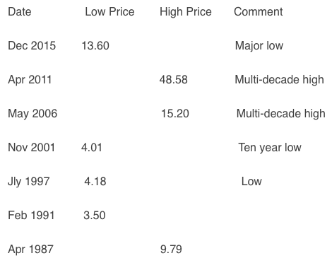
Okay, let’s get back to silver.  Here is a chart I just made to show how much silver came on the market each year due to scrap supply and net Govt sales:

Global-Silver-Scrap-Supply-Net-Govt-SalesNEW

You will notice a few interesting trends in the chart above.  First, total supply from these two sources peaked in 2003 at 285 million oz (Moz) and has been trending lower.  The majority of Government Silver sales came from China, Russia and India since 2000 (ironic aye, the very same countries acquring the most gold today).  However, Official Govt silver sales were ZIP in 2014 and 2015.

Secondly, even though the high silver price in 2011 and 2012 brought about a larger scrap supply, the total for those years didn’t surpass 273 Moz.  In regards to total global above ground silver stocks, I have seen the following estimates by the CPM Group:

3 billion oz Silver bullion & coins

24 billion oz Jewelry, Decorative & Religious

27 billion oz Total

So, if we assume the 27 billion oz figure is correct of all the public and private held silver in the world, then in 2011 only 273 Moz of silver came into the market when the price nearly touched $50.  Thus, only 1% of total world STOCKS came into the market when the price of silver reached $50.  That is not an impressive figure at all if we are discussing silver stock to flows.

Of course there are likely other silver stocks we don’t know about that have been supplementing the one billion oz cumulative global supply deficit since 2004.

Global-Annual-Silver-Net-Balance-2004-2015

However, those stocks are likely declining as Central Banks are no longer dumping silver on the market.  This is also true for gold as well.

Truth be told, the STOCKS to FLOWS factor will become totally meaningless when investors start moving out of increasing worthless paper assets and into physical gold and silver to protect wealth due to the decline of U.S. and world energy production.

As I explained above, the Falling EROI has been creating havoc on the U.S. economy since the 1970’s.  Americans have enjoyed a 40 year reprieve due to the U.S. Petro-Dollar arrangement and the exporting of high-paying manufacturing jobs overseas.  Unfortunately, this is not a sustainable business model.  Either is the $19+ trillion in debt.

Precious metals investors need to understand the difference between short-term superficial analysis that provides traders with scalping profits versus the mid to longer term fundamentals that suggest owning physical precious metals in the troubling times ahead.

As more investors wake up to the upcoming economic and financial collapse, the need to analyze the gold-silver basis will no longer be necessary or relevant.  Shortages of the precious metals will occur in the future (even though Mr. Weiner may disagree) as investors move into physical gold and silver to protect wealth.

Lastly, the days of earning interest, dividends or scalping profits are growing short.  Keep an eye on the Falling EROI and world energy production for the key going forward.

Please check back for new articles and updates at the SRSrocco Report

related:

Silver: The “Five Year Plan” and the Great Leap Forward

How to Use the CoT Report in Gold Investing?

The CoT report enables investors to peek behind the scenes of the gold futures market and to better understand the psychology of the marketplace and, thus, get a better idea of futures moves on the market. This is because the COT report shows the net long or short positions of different types of traders. The knowledge of how traders are positioned is useful, but what really matters are changes in their positions. Knowing that, for example, non-commercials have 175,000 contracts long is meaningless without the supplementary information whether they are accumulating more or starting to unload contracts over time.

Therefore, let’s analyze the long-term trends in traders’ positioning and the link between them and the gold prices. The chart below shows the historical price of gold and the net (i.e., long minus short) positions of gold traders in Comex taken from the legacy version of the report. 

Figure 1: The price of gold (yellow line, right axis, London P.M. fixing), the net position of commercials (red line, left axis), the net position of non-commercials (green line, left axis) and the net position of non-reportables (orange line, left axis) from 1986 to March 8, 2016.

41278 a


What immediately strikes us is that commercials (red line) are usually net short – they are mostly hedging – while non-commercials (green line) are usually long, because they use their positions for speculative purposes and take the opposite sides of the trades (they offset the price hedging requirements of commercials). Actually, the line reflecting the non-commercials’ net positions mirror the line representing the commercials’ net position. Therefore, the non-commercials are positively correlated with the gold prices, while the commercials move inversely with the price of gold. The former are trend-followers. They increase their net long position when prices rise and scale it back when prices decrease. For example, when a 2000s bull market continued, non-commercials were adding more net long trades. Consequently, close to the end of that rally, they had their most bullish positions. In other words, non-commercials are generally on the right side of the market, but they tend to become overextended near peaks and bottoms.

Conversely, commercials actively buy (reducing their short positions) when the market goes down and actively sell when the market goes up (increasing their short positions). For example, commercials were systematically adding short contracts during the 2000s bull market.

Regarding non-reportables, or small speculators, they typically move together with non-commercials, or large speculators (and, just like them, tend to be wrong at critical turning points) – this is why they often form one category of “speculators”. Given their relative weak position on the market (low number of open contracts) we will not analyze their behavior in a more detailed way. Instead, we will take a look at the chart showing the price of gold and disaggregated trading positions in the Comex.

Figure 2: The price of gold (yellow line, right axis, London P.M. fixing), the net position of producers (red line, left axis), the net position of money managers (green line, left axis), the net position of swap dealers (purple line, left axis) and the net position of other reportables (blue line, left axis) from 2006 to March 8, 2016.

41278 b

As one can see, the money managers (green line) and other reportables (blue line) are usually net long and tend to follow gold prices (although it is more clearly visible in the case of money managers), while the producers (red line) and swap dealers (purple line) are generally net short and move in the opposite direction to the gold prices (although it is more clearly visible in case of producers).

How to use the CoT report for trading purposes? Investors can, for example, monitor speculators (either large or small, but large should be better), as they tend to be most bullish just prior to significant price tops and most bearish before the significant price bottoms. Given that the net positions of commercials reflects net positions of non-commercials, investors may also watch them, as they tend to be most bearish just prior to significant price tops and most bullish just prior to significant price bottoms. This is why data from the CoT reports can be used as a sentiment indicator in the gold market. However, investors should use it just as such, not as a timing indicator, as there are no absolute benchmarks of bullishness or bearishness which could trigger investment decisions (for example, commercials are often on the long side of the market before a major rally begins). Moreover, the correlation between commercials, non-commercials and gold prices may break down during the small lag, so there is a risk of significant changes in positioning between the period covered by the report and the date of its publication. Moreover, there is another – much simpler – way to see when gold is overbought or oversold without examining the CoT numbers. Therefore, using them might be helpful, but not necessary when using tools that help detecting the same situations.

Thank you.

related: 

Gold Stocks Climbing Epic Wall of Worry


If you enjoyed the above analysis and would you like to know more about the CoT Report and gold trading mechanics at Comex, we invite you to read the April Market Overview report. If you’re interested in the detailed price analysis and price projections with targets, we invite you to sign up for our Gold & Silver Trading Alerts. If you’re not ready to subscribe at this time, we invite you to sign up for our gold newsletter and stay up-to-date with our latest free articles. It’s free and you can unsubscribe anytime.

What’s Up With Gold and Mining Shares?

Almost everyone thinks gold has bottomed. That it’s going to keep on heading literally straight up.

And almost everyone also thinks I’m dead wrong on gold. 

But the facts of the matter are these:

A. Although I did not issue a buy signal, I nailed the bottom in gold again, at the $1,044 level in late November/early December last year.

B. I’ve nailed the recent trading range, the recent sideways action between roughly $1,220 and $1,280. A $60 range that no one in their right mind, except day traders, should try to trade or invest in.

C. And soon, you will realize that my short-term forecast will bring gold back down to below $1,200, the $1,160 to $1,180 level … 

D. That when you see those price levels for gold, you should start backing up the truck!

E. Furthermore, there is nothing, and I mean nothing, that yet convinces me that my long-term forecasts for gold will be wrong and that gold will hit at least $5,000 by the year 2020.

Keep in mind my models on gold have never, and I mean never, missed one single major turning point since 1978. Not one. 

chart1s

For the short-term downward bias in gold right now, keep your eyes on the $1,206 level, then $1,191.50. 

A close below the second figure should result in a test of what should now be major long-term support at the $1,160 level, with worst case support coming in at $1,120.00.

Silver, platinum and palladium will all generally follow gold’s lead.

On the upside, gold MUST close above $1.307.75 on a weekly basis, at a minimum to suggest further immediate upside action. Anything short of that would be just another massive failure.

All figures quoted are basis the nearby June futures contract.

Now, let me discuss with you for a moment the mining sector. Here too, I caught the bottom, although I was not aggressive in issuing buy signals. With the exception of two senior miners I recommended for my Real Wealth Report members — who just yesterday grabbed gains of 46.4 and 61.3% …

Like gold, I have been waiting for what I call the truth serum to come … that first major pullback that shakes out all the initial weak long positions …

And where the savvy investors back up the trucks to pile the precious metals on, and, the very best of the best mining shares.

That day is coming. Gold and the other precious metals noted above are now in pullback and consolidation modes. Their next legs up are going to be like a three-stage rocket, blasting gold, for example, to well above $1,400.

And for mining shares: Mark my words: If you think the recent rally was strong, you haven’t seen anything. Once miners pullback and hold support per my neural net artificial intelligence forecast model here of the GDX …

chart2s

Then the next leg up for miners will unfold, and I expect it to triple the index’s value from the lows, more than tripling your money — in a short period of time, as little as three months. 

Longer-term, miners will outperform gold, silver, oil, tech stocks, blue chips … and just about any other sector or asset class you can imagine. 

It is and will be by far, the most profitable sector to trade and invest in, going forward.

More money, no, more FORTUNES, will be made in miners than any other sector. 

But wait for my signals. Do not buy now. Instead, trade like a pro and buy the first major pullback. That’s how you slash your risk and dramatically multiply your profit potential. 

Best wishes and stay tuned …

Larry

related:

How to Use the CoT Report in Gold Investing?    


Larry Edelson

Larry Edelson, one of the world’s foremost experts on gold and precious metals, is the editor of Real Wealth Report and Supercycle Trader.

Larry has called the ups and downs in the gold market time and again. As a result, he is often called upon by the media for his investing views. Larry has been featured on Bloomberg, Reuters and CNBC as well as The New York Times and New York Sun.

P.S. This rare, once-in-a-lifetime opportunity is only possible because western governments, the world’s biggest banks and Internet billionaires are all doing their level best to eliminate cash from the global economy … and FORCE all business transactions to be conducted electronically with bank debit cards, Paypal, Google Wallet, Apple Pay, and other electronic payment systems. I am calling this the War on CashClick here now to see how you can profit from this trend! 

Silver: The “Five Year Plan” and the Great Leap Forward

Five years ago paper silver contracts on the COMEX hit a multi-decade high over $48 on April 29, 2011.

At the end of April 2016 the silver price is bouncing around $17, down about 65% from its April 2011 high.  The low occurred at about $13.60 in December of last year, when paper silver prices were down about 70% from their April 2011 high.

Let’s review significant prices roughly every five years back for 30 years:

Screen Shot 2016-04-28 at 7.47.36 AM

Examine the following log-scale graph of COMEX silver.  The red lines are 4.75 years apart.  The green line shows a long term exponential trend upward.


K-silver-30-yr-550x474

What this tells us:

  • Silver prices trend upward exponentially, in the long term, just like debt, military expenses, prices for potatoes, cigarettes, devaluation of fiat currencies, the S&P 500 Index, and expenditures to purchase a Presidency.
  • An important high occurred in 2011, and an equally significant low occurred in December 2015.
  • The December low was about half the exponential trend price and the April 2011 high was about double the exponential trend price. Silver prices rise to extremes, and then fall to crazy lows.
  • The December 2015 low may have been the lowest silver price for a very long time, given the ongoing devaluation of currencies, Chinese physical markets that will compete with the COMEX, the incredible debt that doubles about every eight years, the increasing investment demand for silver and weakening supply, and the price suppression during the past three years.

WHAT WE KNOW FOR CERTAIN:

  1. Central banks want inflation and devaluation of their currencies. One way or another they are likely to create price inflation since they own multiple “printing presses.”  The results, for all but the elite, will be ugly.
  2. Central banks abhor deflation. They will do whatever is necessary to avoid deflation.  They are likely to succeed, thanks to their “printing presses.”
  3. Governments want inflation and higher taxes. They hate deflation and lower taxes.  Governments exist to spend money  –  more and more money.  The US national debt has increased from $3 billion in 1913 to nearly $20,000 billion today.  Expect government deficit spending and dollar devaluation to continue, along with higher prices for what we need to live.
  4. The inevitable consequences of deficit spending, currency devaluations, central bank “printing,” and politicians being politicians is higher prices – exponentially higher prices. Look at the exponential trend line in silver prices that runs from about $3.50 in 1991 to about $30 in 2016.

CONCLUSIONS:

  • Silver prices hit an important low in December 2015. Expect a “great leap forward” in prices during the next five years.
  • Silver prices are “managed” by several powerful groups. Expect volatility.  In simple terms, the sequence is:  Run prices up, suck in investors near the top, increase margins, crash prices by selling heavily with paper contracts, disillusion the “amateurs,” Goldman announces “research” that indicates silver and gold will fall for several years, allow a small rally, force prices down again, big traders cover shorts, margins are reduced, more “bad” news is distributed on silver, and the large players begin buying while small investors are disgusted and beaten down by silver “management,” …  and the cycle repeats.
  • Central bankers will do what they do – devalue the currencies and “print” as much as possible to benefit themselves and the financial and political elite. This will increase silver prices. 
  • Politicians will do what they do – spend money and increase debt. This will increase silver prices.
  • Large traders will do what they do – push prices higher and then crash them lower. The low occurred in December 2015 – expect higher silver prices for several, probably many years.
  • Stackers will do what they do – buy, stack, and wait. They see the big picture.  Silver prices (kitco.com) during the past 100 years:

Screen Shot 2016-04-28 at 7.48.30 AM

  • Silver prices will move upward to $50 and eventually to $100. Depending upon the degree of dollar devaluation, how much “money printing” occurs, the loss of dollar reserve currency status, hyperinflation, importance of the Chinese physical exchanges, and much more … silver prices could race far higher than $100.  We shall see …

Read:  Nine Meals from Anarchy.

Read:  The Real Reason to Invest in Silver

Gary Christenson

The Deviant Investor

I discuss long term silver prices in my book, “Who Killed Doctor Silver Cartwheel.”  Amazon or gechristenson.com