
Gold & Precious Metals
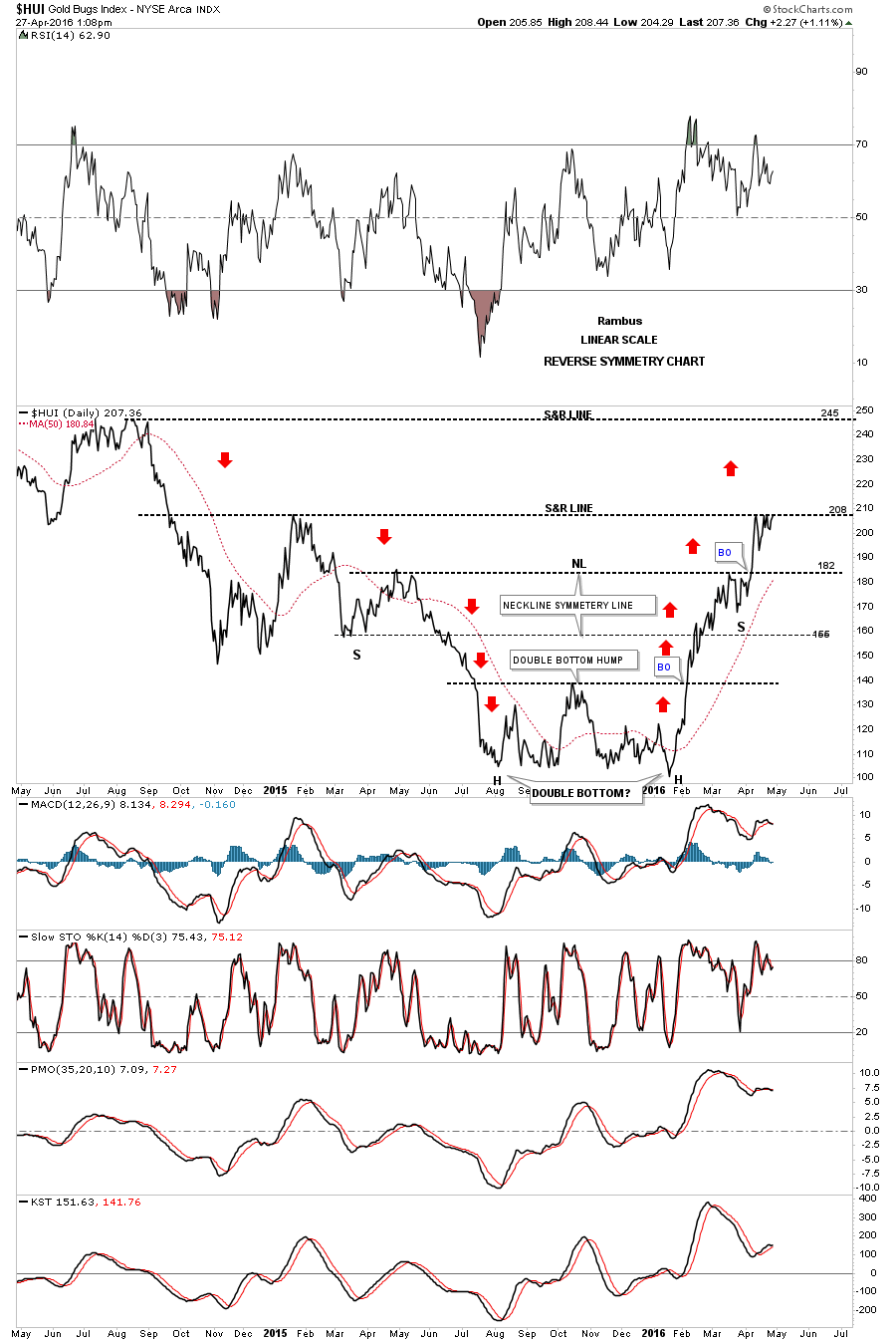
Below is a two year daily chart for the HUI which I first showed you when the HUI broke above the double bottom hump to start its bull market. I call this chart the reverse symmetry chart as shown by the red arrows. How a stock comes down, especially in a strong move, will reverse symmetry back up over the same area. It’s more of an art than a science. You can see the rally off of the mid January low found a little resistance at 182 before it broke through. Now it’s testing the next overhead resistance line at the 208 area and has been finding some resistance which we should initial expect. Today is the fourth time that the HUI has tested the 208 area from below. A breakout above the 208 area will put the next area of resistance on the map at 250 or so which would happen fairly quickly as the decline back in 2014 was pretty steep. If the HUI fails to breakout right here at 208 then support will show up at the previous high at 182 or so.
For much Larger Image double click chart
related:

 A Lifestyle blog that offers some poignant springtime insights. The music video ain’t bad either! ~ Ed.
The other morning one of the dogs was waiting for me at the door with a muzzle full of porcupine quills. The look on his face, a mix of pain and humiliation almost broke my heart. He’d done it before and I was certain he’d learned his lesson, but a male that hasn’t been neutered is a wild card. I dressed quickly and grabbed a pair of work gloves then took him into the shop with me and set to work with a pair of hemostats and patience. There is no easy way to remove quills but if you grasp them firmly about a half inch from where they protrude in order to get a good grip on each one and pull in the opposite direction of where it entered, you stand a fair chance of extracting them intact… CLICK HERE for the complete blog entry
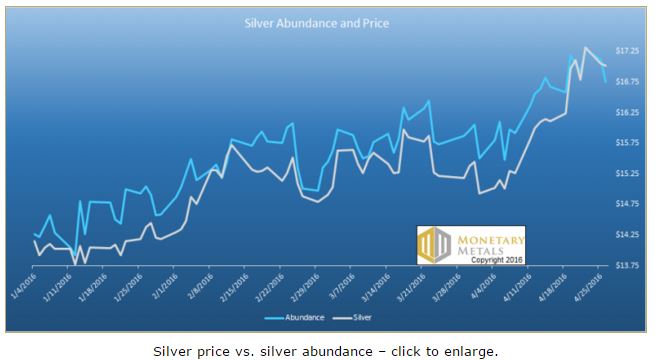 We came across an article at Bloomberg today, talking about silver supply troubles. We get it. The price of silver has rallied quite a lot, so the press needs to cover the story. They need to explain why. Must be a shortage developing, right?
At first, we thought to just put out a short Soggy Dollars post highlighting the error.
Then we thought we would go deeper. Here’s a graph showing the price action in silver since the beginning of the year, overlaid with our abundance indicator… CLICK HERE to read the complete article
Another interesting week, in that the price of silver separated from the price of gold. The former went no nowhere, while the latter gained over 4.5%.
We get the trading thesis, that if the precious metals are in a bull market, then silver should go upmore than gold. Silver is the high-beta gold. It’s a smaller market, less liquid, and at the same time it’s the preferred vehicle for betting on a rising price.
We don’t quite get the thesis that gold is going nowhere or even down, and bet on silver which is going to $50. Yet that is now our market reality. Excited silver bulls have watched as pushed silver up from $14 in late January to $17. Meanwhile the price of gold went from $1,100 to $1,260 and then back down to $1,230. The gold silver ratio initially rose from 78.5 to over 83, and down so far to 72.7.
The growing consensus is bullish. As always, we’re more interested in the fundamentals than in opinions. Let’s look at the only true picture of supply and demand fundamentals. But first, here’s the graph of the metals’ prices.
The Prices of Gold and Silver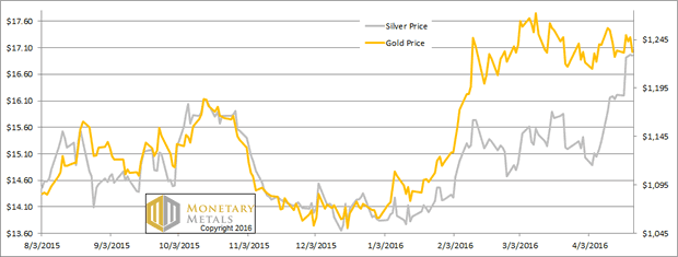
Next, this is a graph of the gold price measured in silver, otherwise known as the gold to silver ratio. The ratio was down sharply again this week.
The Ratio of the Gold Price to the Silver Price 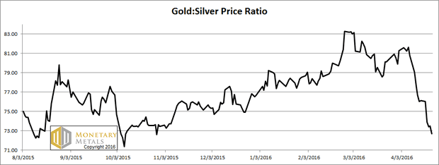
For each metal, we will look at a graph of the basis and cobasis overlaid with the price of the dollar in terms of the respective metal. It will make it easier to provide brief commentary. The dollar will be represented in green, the basis in blue and cobasis in red.
Here is the gold graph.
The Gold Basis and Cobasis and the Dollar Price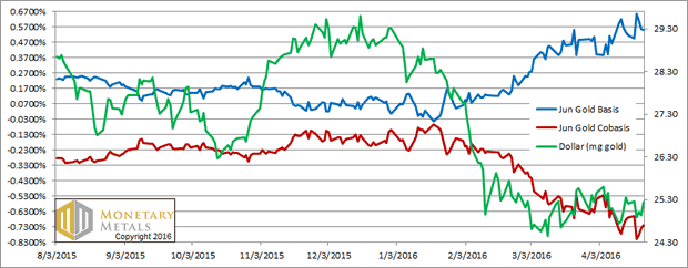
Look at that. Carrying gold for June delivery is now even more profitable, over 55 basis points. This is up from last week at 51bps. The increase tells us something. However much gold was carried last week, it became incrementally more attractive to carry this week.
A positive basis is a measure of abundance. This is because it tells us about the profitability of buying metal to warehouse in carry trades. If profitability is rising, then that means the marginal demand for metal is to put into the warehouse.
Not a bullish sign, with a flat to falling price. Indeed our fundamental price for gold is still sagging, down another six Federal Reserve Notes this week.
Now let’s turn to silver.
The Silver Basis and Cobasis and the Dollar Price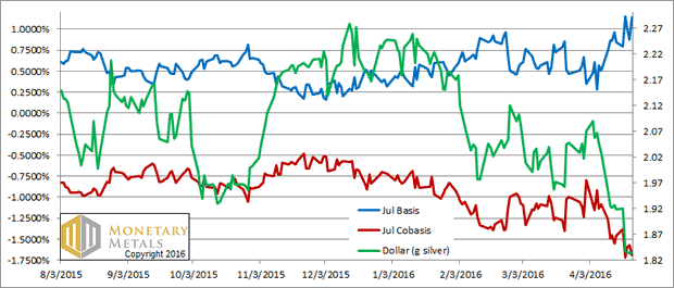
How much higher can the price of silver go? One talk show host appealed to the “silver faithful” with a promise of a price to skyrocket to levels even they will find “stunning”.
Our response is to point to the basis (blue line). Note that we switched from May to July.
If gold is showing some signs of abundance, silver is practically lying about in the marketscape. To carry silver for July delivery yields an annualized profit of over 1.1%. The flow of metal into the carry trade must be a torrent. If anything occurs that will stun the silver faithful, it will be the epic drop in the silver price. This will be decried as a smashdown.
Our calculated fundamental price did rise a dime this week, but it’s more than two fiat units below the market price.
There are times when the basis analysis does not predict a price move. We certainly did not call for the price of silver to jump. It’s speculation, or “animal spirits” if you will. However, then the basis can predict the reversal of the speculative move.
To be conservative — though this risks missing a quick collapse — one should wait to see the momentum peter out. As we often say at times of bearishness, we NEVER RECOMMEND NAKED SHORTING a monetary metal. The way to play this move would be to go long gold and short silver. If the gold silver ratio is 70, short 70 ounces of silver for every ounce of gold you buy.
70 would be an attractive entry point (assuming momentum dies by then). If the ratio rises to 83, then you have a gain of over 18.5%. For example, if you buy 100oz gold and short 7,000 oz silver, you will pick up over 15.6 ounces of gold.
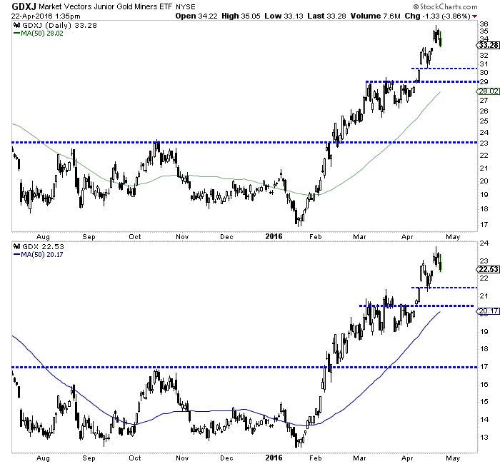
The gold stocks have had a tremendous rally in recent months that has left most investors and even gold bulls on the sidelines. From low tick to high tick GDXJ has more than doubled while GDX has nearly doubled. Indices such as the HUI and XAU have more than doubled. It has been a fantastic rally yet both anecdotal and actual data suggests there has been a major wall of worry building. Although gold stocks may be starting a correction, the presence of a strong wall of worry provides further confirmation of a major trend change.
In recent weeks readers and followers of various gold centric websites have been bombarded with bearish commentaries from pundits and analysts forecasting a correction. More than a month ago the reasoning was the commitment of traders (CoT) report. More recently, the reasoning revolved around an alleged “parabolic move” in the gold stocks and a budding head and shoulders top in Gold.
Today Bloomberg published an excellent article calling the rally one of a lifetime yet also noting that investors have completely missed it. GDX is up more than 65% year to date but gold miner ETFs have seen half a billion in outflows. According to SentimenTrader, the majority of the outflows occurred after February 19 yet GDX has climbed since then. Furthermore, and I’m not sure how actionable this is but on February 19 StockTwits sentiment for GDX showed only 19% bears. A few days ago bears were at 52%. Most investors have grown more bearish even as miners have continued to rally!
The fact is when a devastating bear market finally gives way to a new bull most investors and even those with a bullish bias are either outright incredulous or simply decide to wait for the inevitable correction. The problem is the correction never comes or when it does come, it is smaller than expected and the buying opportunity evaporates quickly and instantly. For those who are incredulous, their mindset is simply stuck in the previous bear as they have not accepted the new bull market.
Take a look at our chart of the HUI bull analogs. Does the recent rebound look like a bear market rally to you?
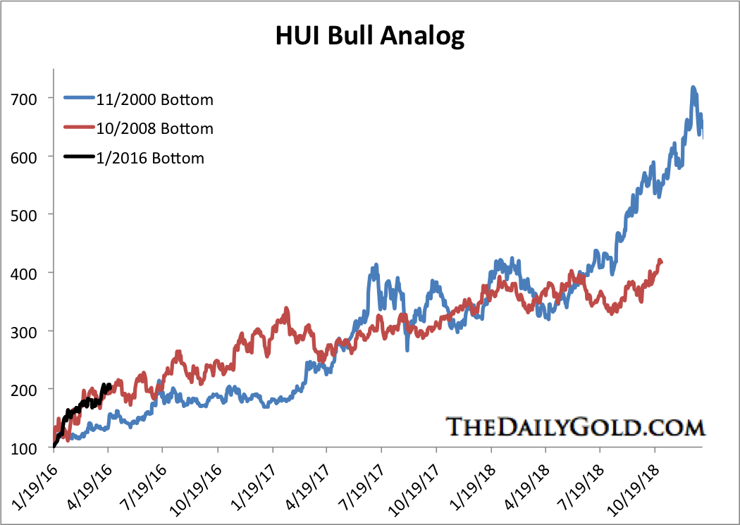
HUI Bull Analog
Turning to the present, it appears that those who have called for a correction could finally be correct. Both GDX and GDXJ appear to have completed an interim top in recent days. The miners are filling Tuesday’s gap and should test lower levels in the weeks ahead. GDXJ has initial support below $31 with strong support at $29 while GDX has initial support at $21.50 with strong support near $20.50.
If this weakness continues in the days and weeks ahead then it will only cause the already building wall of worry to grow. As the analog chart shows the gold stocks have had a very strong rally and are due for some correction. Better now rather than later when the correction would be much larger. The data shows a clear wall of worry has been building. That is no surprise considering gold stocks are only a few months removed from their worst bear market in 90 years! Readers are advised to carefully accumulate positions on weakness as forthcoming weakness may be your last chance at reasonable prices.
Jordan Roy-Byrne, CMT
also:


-
I know Mike is a very solid investor and respect his opinions very much. So if he says pay attention to this or that - I will.
~ Dale G.
-
I've started managing my own investments so view Michael's site as a one-stop shop from which to get information and perspectives.
~ Dave E.
-
Michael offers easy reading, honest, common sense information that anyone can use in a practical manner.
~ der_al.
-
A sane voice in a scrambled investment world.
~ Ed R.
Inside Edge Pro Contributors

Greg Weldon

Josef Schachter

Tyler Bollhorn

Ryan Irvine

Paul Beattie

Martin Straith

Patrick Ceresna

Mark Leibovit

James Thorne

Victor Adair