
Gold & Precious Metals
In this Weekend Report I would like to look under the hood of some of the precious metals stocks indexes to see what is really taking place. We’ll look at a bunch of PM stocks to get a feel for where we are in the short, intermediate and long term pictures. When one just observes an index you really don’t get to see, in detail, the stocks that make up that index that could be showing some important clues to the overall big picture. For instance, there are just three or four of the biggest of the big cap precious metals stocks that account for a large percentage move for say the HUI. There are many more stocks in the index but they don’t carry as much weight.
Before we look at some of the precious metals stocks I want to show you a combo chart that puts everything into perspective and gives you a feel for where we are in the intermediate term time frame. This combo chart has the HUI on top, GLD in the middle and SLV on the bottom. First I want you to look at the left hand side of the chart where you see that the HUI and silver each formed a blue triangle while gold formed a bullish rising wedge. Each consolidation pattern took the same amount of time to build and all three broke out together, first purple vertical dashed line. Note the impulse move out of the blue patterns that show SLV leading the way higher as GLD and the HUI had a backtest while SLV didn’t. Here’s where it gets interesting. As you can see SLV rallied straight up to its bull market top way ahead of the HUI and gold that were lagging behind, second thin purple vertical dashed line. After a few months of consolidation it was gold’s turn to go parabolic and make its bull market high in September of 2011. The heavy purple dashed line shows where all three topped out together with the HUI and gold making their bull market highs while SLV was already in correction by falling way short of reaching its bull market top that it made back in April.
What was so frustrating for those of us that were holding precious metals stocks is that they hardly moved when gold and silver had their parabolic moves higher. As you can see the HUI did in fact make its bull market high at the same time gold did but the HUI had no parabolic move up. As you can see it was more of a slightly rising horizontal type move. That had to be one of the worst times to be a gold bug, to see gold and silver go parabolic and the precious metals stocks hardly budging. I’ll post this chart here so you can see the blue consolidation patterns on the left side of the chart then we’ll discuss the red consolidation patterns on the right side of the chart.
**To get larger images & read without having to click each chart go HERE – Editor Money Talks
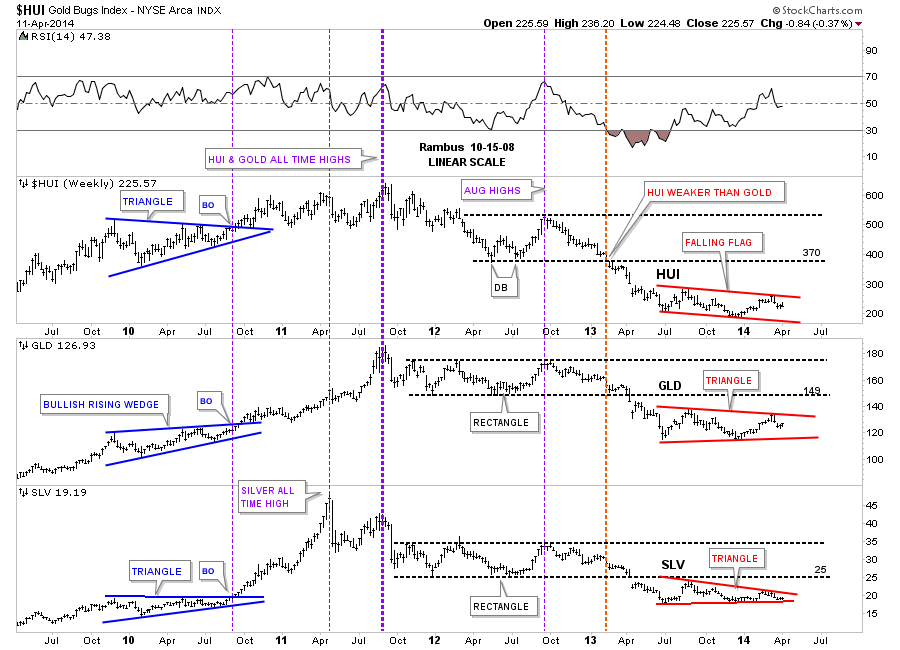
Let’s not fast forward to the heavy red dashed vertical line that shows how the HUI was the first of the three to really show weakness by breaking below its horizontal black dashed line first. The precious metals stocks were leading he way down. It took about another 12 weeks or so before GLD and SLV joined the party to the downside when they finally broke out of their nearly 22 month consolidation patterns with a breakout gap. As with the blue consolidation patterns on the left side of the chart our current red consolidation patterns all bottomed at the same time, late June of 2013, and have been chopping out their respective chart patterns ever since. As you can see all three are working on their fourth reversal points right now. Even though the HUI is building out a falling flag formation, which will be pretty bearish if it breaks through the bottom rail, the SLV is trading the closest to its bottom rail of its red triangle. This chart gives you the big picture look and lets you know where we stand and what to look for.
One last comment before we move on. As you know reverse symmetry plays a big role in how I interpret the price action. Until something changes, I’m viewing the blue consolidation patterns, that formed on the left side of the chart with the price action going up, equal to the red triangles on the right side of the chart with the price action going down as reverse symmetry. Since the bull market top in 2011 you can see a series of lower lows and lower highs all the way down to our current price which is just the complete opposite of what we seen in the bull market years. Until we can see a higher low and a higher high the downtrend remains intact.
Lets take a quick peek at our red consolidation patterns starting with the HUI. Here we see the blue falling flag that is working on its fourth reversal point down. As you can see we had an important test of horizontal resistance last week at the 236 area. Also note the big impulse move down that has led to the formation of our current consolidation pattern that I will view as a halfway pattern if the bottom rail is broken to the downside. The HUI should show a similar move that led into our current blue falling flag when the price action leaves, thus this pattern will show up between the two impulse legs down.
Below is gold’s blue triangle that is showing the most strength right now between the three. It to is working on its fourth reversal point to the downside. Keep in mind these potential consolidation patterns won’t be complete until their bottom rails are decisively broken to the downside. I expect there will be a very big down day once the possible breakouts occurs that will leaves no doubt as to what just happened.
Below is silver’s potential blue triangle that is trading the closest to the bottom blue rail. The 18.50 area on the bottom blue rail will be critical support.

Lets now put our blue consolidation patterns in perspective so you can see how they fit into the big picture. This first chart is for the HUI, which is a long term weekly line chart, that goes all the way back to the beginning of the bull market. Keep in mind a line chart only uses the closing price so the patterns will look slightly different. There is a lot of good information on this chart that we can use to help us understand where we are in the big picture. First notice all the blue consolidation patterns that formed during the bull market years, one on top of the other. That’s a bull market folks. Next notice our massive H&S top that reversed the bull market and has led to our current price. We are now reversing symmetry down and what I believe is our first consolidation pattern to the downside with its blue counterpart on the left side of the chart. Next lets look at the fanlines which is a chart pattern. The rule of thumb is when the 3rd fanline is broken to the downside is when you get your big move. Note fanline #1 and #2 that have the green circle around where the fanline and the neckline intersect. Once that area was broken to the downside the HUI wasted little time declining in earnest. Some of our long term subscribers may remember this chart as I was showing it as we were watching the neckline and fanline #2 breaking down. A daily bar chart will show there was a small backtest to the underside of the neckline before the impulse move began.
Lets now look at gold’s potential triangle and how it may fit into the bigger picture. Gold’s potential triangle has formed on top of the neckline extension rail that is taken off of the 2008 H&S consolidation pattern in which I extended all the way to the right hand side of the chart. Are we seeing reverse symmetry with our current red triangle vs the red bullish rising wedge that formed in the uptrend on opposite side of the chart?

If someone can look at this weekly chart for silver and tell me silver is in an uptrend I would have to call them crazy. Just look at the price action on the left side of the chart when silver was going parabolic creating a series of higher highs and higher lows all the way up to its bull market top. Now compare that price action to the right hand side of the chart since silver topped out just under 50 in April of 2011. Silver has now completed three years of its bear market, this month, by creating lower lows and lower highs. This is basic elementary Chartology. Maybe something will happen to create a new higher high and higher low but until that happens the major trend is down and that is the best direction to trade unless you’re a day trader. It’s always the easiest to trade in the same direction of the major trend as it can fix a mistake if you bought at the wrong time. Just the opposite in a bull market.

So far we looked at the HUI, gold and silver potential consolidation patterns on the short term to longer term look charts. Now we need to look under the hood and see what some of the precious metals stocks are showing us to help bolster these possible consolidation patterns as having some validity. What we have forming on some of the precious metals stocks are several different consolidation patterns ranging from triangles. expanding triangles, rectangles and rising wedges
………………………..
Editors Note :
This Portion of tonight’s Weekend Report engaging the Chartology of 10 Individual Stocks is for Subscribers .
……………………….
In Summary
There are many more charts I could post but I think you get the picture of what I’m trying to show you. By looking under the hood you can get a totally different perspective than just looking at an index. These charts give me the confidence to hang on to our game play when I know many are in doubt. So far nothing is broken from a Chartology perspective which is why we are still short. Until something changes, this is the way I will stay and hopefully we will be able to catch another big impulse move down. I believe we are positioned very well especially if these fourth reversal points hold on these nine month consolidation patterns.
All the best…Rambus

Does Greece returning to the sovereign debt markets indicate the worst of the euro crisis is now behind us? That question cannot be answered with any certainty. But does the fact that this country was unable to go to the public debt markets since 2010, and now has auctioned 5 year notes below 5 per cent bear any long-term implications? The answer is a resounding no.
To start with background, Greece had their first public debt auction since March of 2010 last week. Only a meager 3 billion euros were auctioned, but demand was so strong the Greek Treasury was able to do fill the orders at a lower than anticipated yield. Some sources had demand at more than 20 billion euros. As interest rates in North America continue to see upward momentum, it might still be safe to suggest that the bull market in bonds isn’t over in Europe.
The Eurozone has advanced significantly from the dark period referred to as the Euro Crises. So much of this is attributed to those oft-quoted words of the European Central Bank President Mario Draghi, insisting to do whatever it takes to save the euro. And to the dismay of many pundits, confidence has been restored in the Eurozone without any market intervention or extraordinary monetary stimulus.
What is also astonishing about the relatively low yields (compared to 4 years prior) of peripheral euro nations’ debt is the unpriced risk in depreciation of the euro measured against the US dollar. The debate still continues as to whether a monetary union of that size and cultural divergence is actually sustainable in the long term. And given a forecasted dire outcome by many that would be associated with a collapse of the currency, the euro continues to defy forecasts and even appreciate in this tepid economic growth environment.
Beyond a low growth environment, there are a myriad of additional factors why Greek debt is attracting such high demand. Foremost, it’s because interest rates will more likely see downward pressure in the Eurozone. The euro denominated countries still sees disinflationary characteristics in many of its markets, and bizarrely it is in tandem with an appreciating euro currency. Both factors contribute to or are associated with downward moves in interest rates.
Importantly, investors are convinced that Mario Draghi and the European Central Bank stand ready, and potentially will act in the near future to unleash their own version of Quantitative Easing. Should this be the case, a weaker euro will ultimately prevail and create the sudden selloff many are anticipating, but the mere fact that investors are still convinced the ECB will act and be effective means there is already some level of assistance being provided to the markets through instilled confidence.
The final factor is all about austerity. The euro crises was about debt, and governments are all implementing policy with the focus of fiscal rebalancing and restraining public spending. This is not a bullish call on Europe, but highlighting that EU member governments are relatively sounder from a fiscal standpoint (thus, this is damning with faint praise given recent history).
Greece’s return to the bond market was extremely well welcomed, but for the investment opportunity in an environment that will continue to see downward pressure in European interest rates. This is not to minimize that Greece still has a painful road ahead. Following six straight years of recession, the Greek economy now produces 25 per cent less output. Public debt is still 175 per cent of GDP, which essentially requires Greece to seek outside funding should their economy hit another speed bump. And not forgetting a tragic scene of unemployed youth, there’s no reason to believe they’re close to being back to normal just yet.
 Robert Levy
Border Gold Corp | www.bordergold.com
15234 North Bluff Road, White Rock, BC V4B 3E6
(Tel) 1-604-535-3287
(TF) 1-888-312-2288
(Fax) 1-604-535-3259
The Fed minutes were dovish and this helped push Gold above $1310 to $1320. However, the miners, which usually lead the metals did little to confirm the rise. In fact, the miners have been relatively weak in recent days and had a bearish reversal on Thursday. Their rebound from an oversold condition has petered out. Another point is Gold, during this rebound has made no progress against foreign currencies. It’s starting to show some strength against the equity market but it needs to show strength against all currencies and not function only as the inverse of the US Dollar. Be on alert as the short-term trend for precious metals (especially the miners) could resume to the downside.
Looking further out, forthcoming weakness shouldn’t last that long in the big picture. The miners have been basing for quite a while and started to gain traction in Q1. The next low at worst could be a double bottom or otherwise would mark the first higher low in this bottoming process. In the chart below we plot GDX (large caps), GDXJ (juniors), SIL (silver stocks) and GLDX (explorers). We note how much each would have to decline to test its December low.

Our gold stock bear analogs chart, which helped us call the June 2013 low and anticipate the December 2013 low, makes a strong argument that the final low (on a weekly basis) occurred in December. The low is circled but we kept the plot going for further comparison. Compared to the present, there are only two bears that lasted longer and at present both were down less than 50%. Note that at the December low when gold stocks were down 64%, the three bears which lasted longer were off no more than 50%.

The 1996-1999 bear which ended at this time down 69% is an interesting case. It did reach lower levels in 2000 before the current secular bull started. However, after the 1999 low gold stocks exploded led by the GDM index (forerunner to GDX) which surged 75% in a few months. Then the stocks consolidated for many months before popping again. During this brief 14-month respite the GDM gained 90%, the XAU 83% and the HUI 68%. After the bottom in 1999, GDM and XAU broke to new lows two years and two months later. The HUI, which was more attached to the epic junior bubble of the mid 1990s, reached new lows one year and nine months later.
Considering this history, even the most bearish person would have to admit that the market needs to consolidate for a while (as in way more than a year) to have any chance to reach new sustained lows. Gold stocks enjoyed a huge short covering rally shortly after the 1999 low. Yet even after the short covering ended the preceding bear market low wasn’t breached for roughly two years!
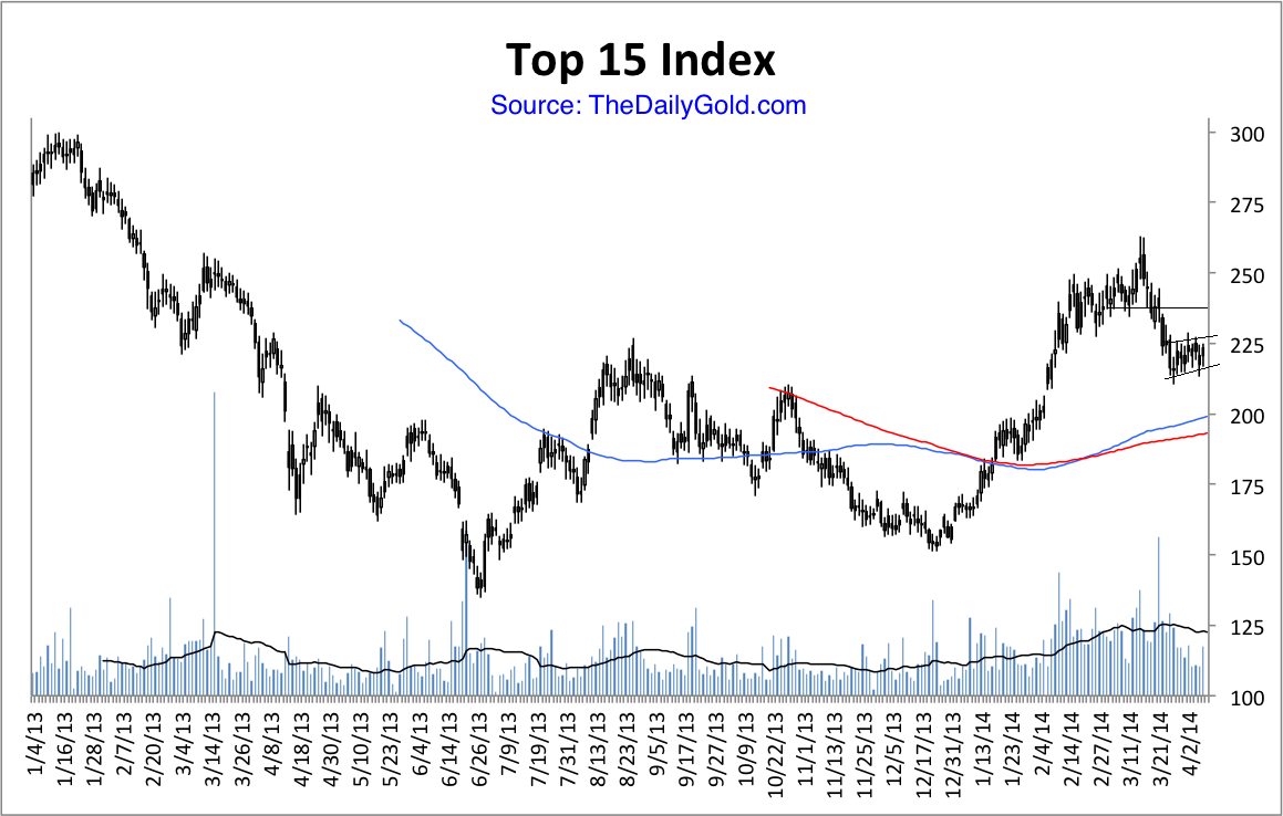
Why is this bottom taking so long? A few weeks ago we posited that it could be because of the extended topping process in 2011-2012. Perhaps that unusual topping process is giving way to an unusual bottoming process. In any event, the best plan is to wait patiently for the next oversold condition or in case we are wrong, wait for the next breakout. I don’t expect a breakout anytime soon. The indices look weak and TheDailyGold Top 15 Index (15 of our favorite companies) also appears to have downside potential in the coming days and weeks. Nevertheless, I am actively researching companies as well as watching their price action. The coming months could be your last best chance to accumulate the companies poised to benefit from the coming revival in precious metals. If you’d be interested in learning about the companies poised to outperform, then we invite you to learn more about our premium service.
Good Luck!
Jordan Roy-Byrne, CMT

There is a stark difference between the states of the markets for the monetary metals. The number of open futures contracts in gold is low, while in silver it’s high. First, let’s look at the data and then we’ll discuss what it means.
Here is the graph showing the open interest.

The picture is clear enough. Since the beginning of fall, the number of gold contracts has blipped up and down and now there are somewhat fewer (-3.7%). Meanwhile, the number of silver contracts has gone up substantially (+39%).
Now let’s look at the ratio of gold contracts to silver contracts, going back to 2010.
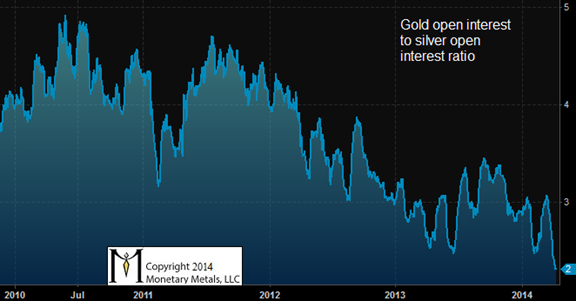
There is an unmistakable downward trend since the middle of 2010, almost 4 years ago. Then, there were about five gold contracts for every silver contract. Today, the ratio is down to two.
OK, but what does this mean?
Open interest is a proxy for speculative interest. This is not simply because contracts are created by buying, and destroyed by selling. You can’t assume that contracts are created and destroyed as the price moves. To see why it doesn’t work that way, look at the stock market. The price of a stock can move all over the place, but there need not be any change to the number of shares outstanding.
In the futures market (unlike in the stock market), the number of contracts changes continually. Contracts are added or removed by the computer software that operates the market. When you buy or sell, an existing contract may be transferred from one party to another, or a new one may be created.
It’s complex, but in essence if you want to buy a contract just when else wants to sell, the contract will change hands. It works similarly if you want to sell short, right when someone who is already short wants to buy.
By contrast, if there is no current owner of a contract to sell it to you, when you want to buy, then a new contract must be created. Who sells, who takes the short side of this contract? It can certainly be someone else wants to speculate on a falling price. There are always (well, usually) traders who go short silver. However, I don’t think that this is the full explanation of the data shown in these two graphs.
I favor a theory of arbitrage. If it’s profitable to buy metal in the spot market and sell a future against it, then someone will take this trade. This short seller is a source of unlimited contract creation, if it’s profitable.
It’s called carrying the metal. If you carry, then you make a small spread—without price risk. This spread is called the basis—the price of the future minus the price of spot metal. Or, more precisely, basis = Future(bid) – Spot(ask), because you must pay the ask when you buy the metal, and accept the bid when you sell the future.
Let’s take a look at the gold basis and silver basis for the Dec 2014 contract, from early fall through today.
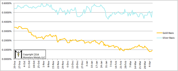
The profit to carry gold has been steadily falling. It began at 0.35% (annualized), when the duration was 15 months. It was hardly the stuff of legends—or getting rich quick—even last October. That meager margin has been steadily eroding, and is now 0.1% for 8 months. Suffice to say that gold carry has offered little or no opportunity to make money. Therefore the gold carry trade has not been a big source of contract creation.
The profit to carry silver, by contrast, has not much changed. It’s still around 0.5% (annualized) or more. This is far more attractive than gold, and probably more attractive than other opportunities in our zero-interest world. Therefore, the silver carry trade has created many silver contracts.
What drives the basis spread? Speculators, when they buy a future, drive up its price just a little bit. This is the inducement to the arbitrager to buy a bar of metal and sell the future to the speculator. The arbitrager carries metal, to provide a service to the speculator. He is the one who “converts” (I use this term carefully, in the full context defined here) metal to paper, a bar to a contract. He’s ready, willing, and able to deliver that bar should the speculator have the cash to demand delivery.
The long and short of it (to make a tired cliché into a dreadful pun) is that in gold, there just is not much speculation, and therefore no profit to be made carrying the metal, and therefore when a buyer occasionally comes to the market his demand can be satisfied by a previous buyer who is selling a contract.
However, in silver buyers are running at a much more torrid pace. They’re too numerous to be satisfied by the occasional seller. They bid up the price of the futures, which makes it attractive for arbitragers to carry silver and sell them the contracts they desire.
Incredible as it may seem, at the low price of $20, speculation in silver is rampant. Market participants are trying to front-run a big price move. Due to rumors or gut feel or for whatever reason, they are expecting not only that silver will outperform gold, but that the silver price will rocket to a much higher price. Their frenetic buying of futures has pulled a lot of silver into carry trades.
Maybe hoarders will all of a sudden increase their appetite for silver metal that they will take off the market and bury. If so, the silver futures speculators will be proven right, and they will make a lot of dollars (money is a different story entirely).
I would not recommend that anyone bet his hard-earned money on a maybe. The data—both open interest and basis—show that the buying in the silver market is primarily speculators. They cannot sustain a higher price forever. They are merely trying to front run a higher price driven by hoarders. If hoarders don’t come in, the speculators will be forced to capitulate. When that happens, watch out below.
The neutral price of silver is in the $16’s today. If the price overshoots as far to the downside as it is now stretched to the upside, we could see silver with a 12 handle.
© 2014 Monetary Metals.

-
I know Mike is a very solid investor and respect his opinions very much. So if he says pay attention to this or that - I will.
~ Dale G.
-
I've started managing my own investments so view Michael's site as a one-stop shop from which to get information and perspectives.
~ Dave E.
-
Michael offers easy reading, honest, common sense information that anyone can use in a practical manner.
~ der_al.
-
A sane voice in a scrambled investment world.
~ Ed R.
Inside Edge Pro Contributors

Greg Weldon

Josef Schachter

Tyler Bollhorn

Ryan Irvine

Paul Beattie

Martin Straith

Patrick Ceresna

Mark Leibovit

James Thorne

Victor Adair