Timing & trends

Three Key Take-Aways From Today’s Headlines

“Markets are going in the opposite direction of the world economy. If you’re positioned fundamentally, you’re positioned against these clowns.”

– John Burbank, Passport Capital, on the latest news from Europe’s central bank

Three headline events each tell us something important about global markets. More and more, government is a big player in markets — creating distortions, along with pitfalls and opportunities.

Item No. 1: The market says one thing. Earnings say something different.

The stock market rallied last week on news that the European Central Bank will “save the euro.” Basically, the ECB said it stands ready to buy bonds in unlimited quantities. To finance this, the ECB will essentially print money. This follows talk about how the US Federal Reserve stands ready to goose markets further — by printing more money.

In essence, the actions and chatter of central bankers are what are driving the rally since that little bottom we had in June after the market sold off about 9%.

Earnings are not driving the rally, that’s for sure.

The S&P 500 just registered a 0.8% growth rate in earnings for the second quarter, according to today’s Financial Times. The consensus for the third quarter is negative for the first time in three years. The ratio of companies saying they’d miss third-quarter forecasts versus those that that said they’d meet them was 3-to-1. That is the worst ratio since the fourth quarter of 2008, which came on the heels of the Lehman Bros. bust. “Historically, we have only seen numbers like this during times of recession,” says Christine Short of S&P Capital IQ (which tracks earnings) in today’s FT.

Yet the market hits a four-year high.

Take-away: Trust earnings. The market can go only so far on the gas of central banking. Don’t believe prices reflect what’s happening with the underlying companies. The market is too optimistic.

Item No. 2: Gloom spreads in China despite the best efforts of officials.

The FT reports that a third of publicly traded Chinese companies reported cash outflows for the second quarter. One headline seems to say it all, “Cash Squeeze Tightens Abroad Sections of China.” Another says, “Fragile China.”

Local governments have amassed piles of debt. The FT says these debts represent one-quarter of Chinese output. Yet China continues to announce ambitious plans to build railways and highways.

But one of the most-damning things I’ve come across on China hit my desk over the weekend. I seldom link to other articles in full, but this one is worth a read when you get a chance:

“In China, Silvercorp Critic Caught in Campaign by Police”

It is the story of a researcher in China who police arrested — and detained — because he works for a fund manager who writes negative reports on Chinese companies. (The researcher is a Canadian citizen, by the way, yet sits in a Chinese jail on flimsy evidence and no due process whatsoever. I can’t believe the Canadian government lets that stand.)

Chinese companies have had lots of fraud issues, as you may know. Investors have uncovered discrepancies and outright frauds in US-listed Chinese companies. This sent the stock of many such companies tumbling.

This in turn, hurt these companies’ ability to tap Western markets for more money, which hurts their ability to pay local taxes. And that hurts the local governments who labor under a pile of debt. It’s all an ugly, corrupt circle.

Take-away: If you are in China, you have to write positive reports or you get arrested. That’s the message here. There is no respect for independent research in China. There is no value on transparency. In fact, the organs of the state work against such things.

So in a reversal of my normal preference for “boots on the ground” research, I say you can’t trust anything coming out of China. Oh, and if you own Silvercorp, dump it. Avoid China as a general rule.

Of course, this has broader implications, as we’ve talked about before, especially for commodity markets (because China is such a large consumer of commodities). If the Chinese market is really propped up by government stimulus, then commodity markets are too.

This warning does not apply to precious metals, which I think are moving higher.

Item No. 3: The US government is selling its AIG stake.

Front page on The Wall Street Journal: The US government says it is going to sell $18 billion in AIG stock. This will cut its stake in the big insurer by half.

This is a reminder that the US government is still in the business of owning major stakes in big companies. It still owns stakes in Fannie Mae and Freddie Mac — which the government spent $188 billion on. It still owns big stakes in GM and in Ally Financial, which it spent $68 billion on.

These are companies that would have otherwise gone through the bankruptcy process — as would have a long list of institutions. What the bailouts did was preserve the same bad actors that got us into trouble in the first place. The corrective tonic of bankruptcy never got to do its full work.

I’m not going to get into the politics of it, or even the economics of it. I’m a practical man in these pages. We have to take the world as it is, not how we wish it would be. We have to do the best we can with the markets we find ourselves in.

So as unseemly as it sounds, my take-away from this story is one of opportunity.

Even after its rally, AIG still trades for about 56% of book value. Bruce Berkowitz at Fairholme owns a big chunk of it and calls it his best idea. Berkowitz is not immortal. He’s taken some licks and his reputation is not what it was. But I think he makes a good argument for AIG.

Here is what he wrote in his second-quarter letter:

“Our best idea remains AIG common (35% of the fund) with a reported book value of $57 per share. There are few occasions when systemically important franchises sell for half of book value and are profitable. This is one of those times.”

Book value is now $60 per share. On the Fairholme Funds website is a 21-slide case study on AIG from February. Though a bit dated, it still holds. AIG sells for less than 60% of book today. Yet peers trade for 80-100% of book. And the long-term average for the sector is 130% of book.

AIG is solidly profitable now. What’s holding it back, at least in part, is the fact that the government is looking to sell. As the market absorbs $18 billion-plus in sales, this will probably tamp down AIG’s share price.

Take-away: The US government still has large stakes in several financial companies. It is still a source of great distortions. However, as it sells these stakes, the overhang from its ownership will disappear. So too might the discounts these stocks trade for. AIG looks like a double as these things sort themselves out. (Ed Note:  Do not consider this a Money Talks recommendation. Money Talks does not make stock recommendations on this unpaid portion of our website because we don’t know the financial make-up of those reading the information).  

It’s a weird market we’re in. I can’t recall a time when government actions seemed to drive prices as much as now. I don’t like it. But there are ways to navigate your portfolio through the mess.

Regards,

Chris Mayer
for The Daily Reckoning

About Chris Mayer
Chris Mayer is managing editor of the Capital and Crisis and Mayer’s Special Situations newsletters. Graduating magna cum laude with a degree in finance and an MBA from the University of Maryland, he began his business career as a corporate banker. Mayer left the banking industry after ten years and signed on with Agora Financial. His book, Invest Like a Dealmaker, Secrets of a Former Banking Insider, documents his ability to analyze macro issues and micro investment opportunities to produce an exceptional long-term track record of winning ideas. In April 2012 Chris will release his newest book World Right Side Up: Investing Across Six Continents
Special Report: Wait until you see what could happen in America next… An unbelievable phenomenon is set to sweep the nation… The railroad, steel, and technology age – this phenomenon triggered them all. And now it’s taking shape again! Watch this special, time-sensitive presentation now for full details on how it could affect your job… your lifestyle… and your wallet. Here’s How…


Huge Sales Resistance, Sellers Rush The Exits, Prices Drop – Plunge in Vancouver

In Aug 2012 buyers retreated to the sidelines and huge sales resistance across Canada continued (Scorecard) with double digit M/M combined residential sales drops of 11-21% depending on locale. Pricing power continues to erode (Plunge-O-Meter) as sellers rush the exits. In 4 months since their peaks, average SFDs in Toronto have dropped 6.6% and in Vancouver they have plunged 11.5%

6323206 orig

Vancouver average single family detached prices in August 2012 dropped again for a four month plunge of 11.5% and a loss of of $122,700 which is a 69% retracement of the $177,329 gain since the beginning of the year (Vancouver Chart).The Chickens are Coming Home to Roost

Click HERE to view the extended summary of Vancouver Housing Changes as well as the Housing Price Changes for Calgary, Edmonton, Toronto, Ottawa & Montreal for August 2012

That second or third condo you bought after standing in line with the herd, or the big house with the lucky address you agreed to bid over the top for in the bidding war is now looking like an unlucky (dead) albatross around your neck.

Now you are faced with the tedium of having to do the math and make the tough decision. 

Do you cut and run with whatever is left of your equity or stick around and subsidize the negative yield and for how long? 

Suddenly cash in a savings account looks good to you when compared to the vigorish you are obliged to pay.


Why the Fed Will Fail in All Its Efforts

“Most of you reading this expect inflation in the years ahead, right? Well, I don’t. In fact, I am firmly in the deflation camp.”

A Decade of Volatility: Demographics, Debt, and Deflation

Just think about it. What has happened after every major debt bubble in history? What happened after the 1873-74 bubble? Or after the 1929-32 bubble? Did prices inflate or deflate?

We got deflation in prices… every time.

This time around, with the latest bubble peaking in 2007/08, the outcome will be exactly the same. There is deflation ahead. Expect it. Prepare for it.

But the bubble-bust cycle that history has allowed us to see is not the only reason I’m so certain we’re heading for deflation and a great crash ahead. I have other, irrefutable evidence…

For one, there is the most powerful economic force on Earth: demographics. More specifically, the power of the number 46. You see, that’s the age at which the average household peaks in spending.

When the average kid is born, the average parent is 28. They buy their first home when they’re 31… after they had those kids. When the kids age into nasty teenagers, the parents buy a bigger house so they can have space. They do this between the ages of 37 and 42. Their mortgage debt peaks at age 41. And like I said, their spending peaks at around 46.

From cradle to grave, people do predictable things… and we can see these trends clearly in different sectors of our economy, from housing to investing, borrowing and spending, decades in advance.

To watch a video version of this presentation by Harry Dent,
please click HERE:

091012-01

This demographic cycle made the crash in the ’30s and the slowdown in the ’70s unavoidable. Now it is happening again… with the biggest generation in history – the Baby Boomers.

Consumer spending makes up more than two-thirds of our gross domestic product (GDP). So knowing when people are going to spend more or less is an incredibly powerful tool to have. It tells you, with uncanny accuracy, when economies will grow or slow.

Why Deflation Is the Endgame

Think of it this way: the government is hellbent on inflating. It’s doing so by creating debt through its quantitative easing programs (just for starters). But what’s the private sector doing? It’s deflating.

And the private sector is definitely the elephant in the room. How much private debt did we have at the top of the bubble? $42 trillion. How much public debt did we have back then? $14 trillion.

That looks like a no-brainer to me. Private outweighs public three to one. And the private sector is deleveraging as fast as it can, just like what happened in the 1870s and 1930s. History shows us that the private sector always ends up winning the inflation-deflation fight.

Now, I will concede that this is an unprecedented time. Today governments around the world have both the tools and the determination to fight deflation. And they are desperate to keep it at bay because they know how nasty it is (they, too, are students of history).

How bad is it? Think of deflation like what your body would do with bad sushi. It would flush it out as fast as possible. That’s what our system is trying to do with all the debt we accumulated during the boom years. It’s what the system did in the 1930s. Back then we went from almost 200% debt-to-GDP to just 50% in three years. It hurt like hell. The government doesn’t want this painful deleveraging.

The problem is, the longer the government tries to fight this bad sushi, the sicklier the system becomes. I know this because it’s what happened to Japan…

Japan’s bubble peaked in the ’80s. When the unavoidable deleveraging process began, the country did everything in its power to stop it. How is Japan doing today, 20 years after its crash? It is still at rock bottom. Its stock market is still down 75%.

Japan has gone through everything we’ll go through in the next few years. Does Japan have an inflation problem? That’s a rhetorical question. Did its central bank stimulate frantically? Also a rhetorical question.

Think of it another way: what is the biggest single cost of living today? Is it gold? Oil? Food? It’s none of these. It is housing. And what is housing doing? Dropping like a rock. It can’t muster a bounce, despite the lowest mortgage rates in history and the strongest stimulus programs anywhere… ever.

The Fed is fighting deflation purposely. It will fail.

Why the Fed Will Fail in All Its Efforts

There is simply no way the Fed can win the battle it’s currently waging against deflation, because there are 76 million Baby Boomers who increasingly want to save, not spend. Old people don’t buy houses!

At the top of the housing boom in recent years, we had the typical upper-middle-class family living in a 4,000-square-foot McMansion. About ten years from now, what will they do? They’ll downsize to a 2,000-square-foot townhouse. What do they need all those bedrooms for? The kids are gone. They don’t visit anymore. Ten years after that, where are they? They’re in 200-square-foot nursing home. Ten years later, where are they? They’re in a 20-square-foot grave plot.

That’s the future of real estate. That’s why real estate has not bounced in Japan after 21 years. That’s why it won’t bounce here in the US either. For every young couple that gets married, has babies, and buys a house, there’s an older couple moving into a nursing home or dying.

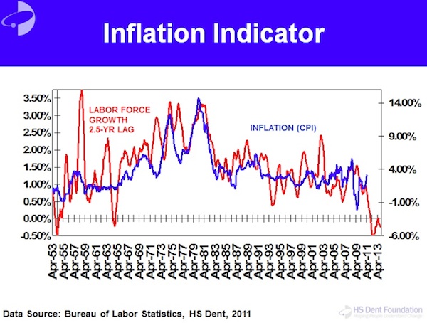
I watch this same demographic force move through and affect every other sector of the economy. The tool I use to do so is my Spending Wave. This is a 46-year leading indicator with a predictable peak in spending of the average household.

091012-02

Here’s how it works: the red background in the chart above is the Dow, adjusted for inflation. The blue line is the spending wave, including immigration-adjusted births and lagged by 46 years to indicate peak spending. If you ask me, that correlation is striking.

The Baby Boom birth index above started to rise in 1937. It continued to rise until 1961 before it fell. Add 46 to 1937, and you get a boom that starts in 1983. Add 46 to 61, and you get a boom that ends in 2007.

Today demographics matters more than ever because of the 76 million Baby Boomers moving through the economy. That’s why I don’t watch governments until they start reacting in desperation. Then I adjust my forecasts accordingly.

Don’t Hold Your Breath for the Echo Boomer Generation

But all this talk about Baby Boomers inevitably births the question: “Surely the Echo Boom generation is coming up right behind their parents. They’ll fill the holes, right?”

Let me make this clear. If I hear one more nutcase on CNBC say, “The Echo Boom generation is bigger than the Baby Boom,” I might go ballistic. They are wrong. The Echo Boomer generation is NOT bigger than the Baby Boom generation. In fact, it’s the first generation in history that’s not larger than its predecessor is, even when accounting for immigrants.

It’s not all doom and gloom, though. We will see another boom around 2020-23. But for now, all the Western countries will slow, thanks to the downward demographic trend sweeping the world. Some are slowing faster than others are. For example, Japan is slowing the fastest (it actually committed demographic kamikaze, but that’s a discussion for another day). Southern Europe is next along in its decline. Eastern Europe, Russia, and Asia are following quickly behind.

Which brings me back to my point: there is no threat of serious inflation ahead. Rather, deflation is the order of the day. The Fed thinks it can prevent a crash by getting people to spend. To that I say, “Good luck.” Old people don’t spend money. They bribe the grandkids, and they go on cruises where they just stuff themselves with food and booze.

Do you know how to tell if you’re buying a car from an older person? It’s going to be ten years old and have only 40,000 miles on it. They drive 4,000 miles a year. They just go down the street to get a Starbucks coffee and a newspaper. Then they go back home. How do you know you’re buying a car from a soccer mom? It’s driven 20,000 miles a year, carting the kids around all day… to school, soccer practice, whatever. This is the power of demographics.

So let me tell you what causes inflation. It’s young people. Young people cause inflation. They cost everything and produce nothing. That’s inflation in people terms.

Why did we have high inflation in the ’70s? Because Baby Boomers were in school, drinking, spending their parents’ money. While this was going on, we experienced the lowest-productivity decade in the last century.

Do you remember the 1970s? We had worsening recessions as the old Bob Hope generation began to save more while the Baby Boomers entered the economy en masse… at great expense. It costs a lot of money to incorporate young people, raise them, and put them into the workforce.

Then suddenly, in the early ’80s, like some political genius did something brilliant, the economy started growing like crazy, and inflation fell. You know what that was? That was the largest generation in history transitioning en masse from being expensive, rebellious, young people to highly productive yuppies with young new families. It was the move from cocaine to Rogaine.

The correlation between labor force growth and inflation is crystal clear…

091012-03

When lots of young people come into the labor force, it’s inflationary. When lots of old people move out of the labor force and into retirement, it’s deflationary. Right now, where is the highest inflation in the world? It’s in emerging countries. Do they have more old people or young people? They have more young people.

We saw it in the 1970s, we see it in emerging markets, and we’ll see it ahead as the Baby Boomers head off into the sunset. First, there was inflation. Ahead is deflation. No doubt about it.

Harry Dent, the editor of Boom & Bust, has put together a free report for John Mauldin’s readers, called: Survive and Prosper in This Winter Season: Take These Steps Now… Before Dow 3,300 Arrives. You can access this free report by clicking on this link:http://www.boomandbustinvestor.com/reports/current/BoomandBustInvestor_WinterSeason.pdf

Like Outside the Box? Then we think you’ll love John’s premium product, Over My Shoulder. Each week John Mauldin sends his Over My Shoulder subscribers the most interesting items that he personally cherry picks from the dozens of books, reports, and articles he reads each week as part of his research.

Learn More About Over My Shoulder

Share Your Thoughts on This Article


Gold Stocks: History Argues for More Upside

Gold and silver stocks are not only the most volatile sector but the highest beta sector. Therefore the percentage moves can be quite exaggerated relative to the market. Currently, the shares have emerged from a W bottoming pattern. They have gained substantially (in percentage terms) in just the past month. I wanted to consult history and in particular the rebounds following the bottoms in 2000, 2005 and 2008 to get a sense of the reasonable upside potential over the coming months. Judging from history, one should not be alarmed about the recent gains because these rebounds tend to run much longer and higher.

Below we chart the HUI in weekly form dating back to 2000. We also plot the HUI’s rate of change for 18 weeks and 26 weeks (equivalent to four and six months) and we note the length of time it took the HUI to break to a new high following the start of the cyclical bears. The market typically rebounds 50%-70% four months following a bottom and roughly 75% six months after a bottom.

sep10huied

If the HUI rebounds 50% from the May 2012 low then we are looking at a target of 558 by or in October. That target is essentially on par with the Q1 2012 high of 555. Secondly, a six month rebound of 65% would take the HUI to 615 (exactly the level of the red line) by or in December. Even if these targets are hit a month or two later, we still would experience a bullish outcome. Keep these targets in mind as we move to short-term analysis.

Next we chart GDX, GDXJ and SIL. In recent days these markets achieved significant breakouts on ‘gap up’ moves. Monday’s action is a strong signal that these markets could fill their open gaps (see circles) and then retest previous resistance which is now support. GDX is very comparable to the HUI. The initial rebound target for the HUI (558) is equivalent to GDX $57. Furthermore, $57 is the 62% retracement (from the 2011 high to 2012 low) and the target from the length of the W bottoming pattern ($48-$39 = $9, $9+$48=$57).

sep10edall

While gold and silver equities have had a strong run, they have only broken out from their multi-month bottoming patterns. A retreat and fill of the gaps would alleviate the current overbought condition, temper sentiment a bit and facilitate another strong leg higher. Moreover, judging from history, this rebound still carries substantial upside potential in the coming months. Traders and investors should look to take advantage if the miners fill their gaps and retest the breakout. If you’d be interested in professional guidance in uncovering the producers and explorers poised to outperform then we invite you to learn more about our service.

Good Luck!

Jordan Roy-Byrne, CMT
Jordan@TheDailyGold.com

The Daily Gold

Twitter: TheDailyGold

Skype: Trendsman

Silver Price Forecast: The Great Silver Chart

A reader asked me to update a previous long-term silver chart of mine. Below, is the updated long- term chart for silver:

9-10-12-hgm-silver-long-term-chart1

silver chart analysis

Since the last chart, silver has broken out of the pennant formation (on the short-term chart), and is looking really good.

On the chart, I have highlighted two fractals (or patterns), marked 1 to 3, which appear similar. What makes these two fractals so special, is the similarity of the circumstances in which they exist.

There was a significant peak in the Dow (1973 and 2007) between point 1 and 2 of both fractals. Also, point 1 on both fractals represents a significant bottom for silver after the peak of the Dow/Gold ratio. After point 2, on both fractals, the oil price made a significant peak (1974 and 2008), about eight years after the peak in the Dow/Gold ratio.

Thanks to this similarity in events, as well as the similarity in sequence, I was able to identify the great possibility for significantly higher silver prices, back in October of 2010. This was a very clear signal that higher silver prices were coming, and that is exactly what we got, when silver moved to $49. However, this run is not over yet. The move from $17, when silver broke out of thetriangle (at point 3 of the second fractal) to $49 was just the first part of the move. In my opinion the biggest and best part of this move is still ahead. In my long-term fractal analysis report on silver, I have presented a lot of technical and fundamental evidence to support my opinion for higher silver prices over the coming years.

….read page 2