Stocks & Equities

Row or Sail? Time to Think About Absolute Returns

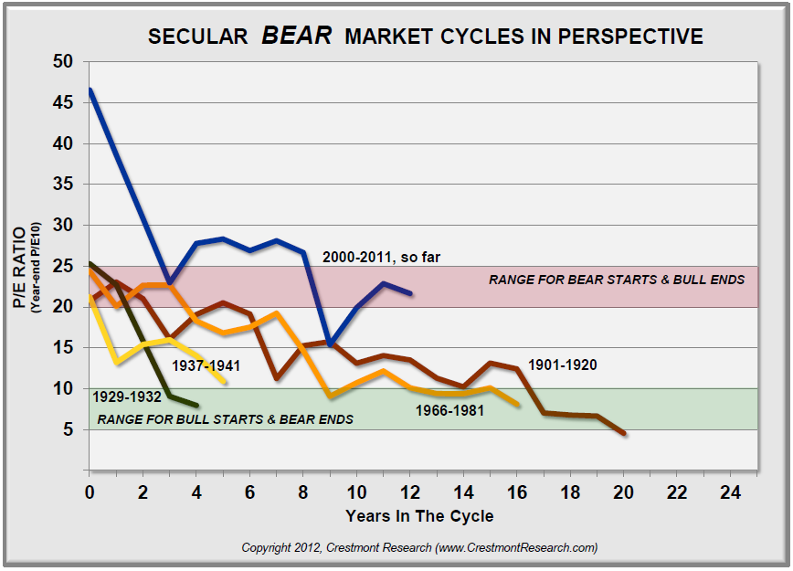
A few weeks ago, Ed Easterling and I updated the work we published almost ten years ago about secular bear and bull markets in chapters 5 and 6 of Bull’s Eye Investing. This week I am in Maine at the annual Shadow Fed fishing trip (for those of us whose invitation to Jackson Hole keeps getting lost in the mail). Ed has graciously agreed to do another piece with me on the earnings, or business, cycle, which is different in timing than the secular stock market cycle but is part of the total warp and woof of the markets. When you combine them, you get a much clearer picture of the markets.

Earnings are a topic of great debate. At any given time, you can hear someone on TV talking about how “cheap” the market is, while the person on the next channel goes on about how expensive the market is. Today we look at the cycle of earnings, rather than a specific point in time. Let me give you a little preview. In terms of time, this earnings cycle is already longer than average, and in terms of magnitude it is projected to go to all-time highs. Which makes one want to think about whether current projections are realistic. So let’s jump right in. (Note: This letter sets the Thoughts from the Frontline record for the number of charts, so it will print longer than usual, but the number of words is about average.)

But let me note that this week is the start of the 13th year of Thoughts from the Frontline. I started in August of 2000, talking about how the US would be in recession in 2001, analyzing the yield curve, which was beginning to seriously invert and which was also the signal for the recession call for 2007. I began with about 2,000 email addresses, gathered from readers of a previous print letter for another publisher and the readers of my first best-seller; and for whatever reason the list began to grow, and within a few years my entire business model changed, thanks to you, the readers and friends of this letter. The list has now grown to around 1 million of my closest friends and is posted on more websites than I ever imagined it would be. Who knew, 13 years ago, that this thing called the internet would be so cool? I am very grateful for your support.

I started Thoughts from the Frontline as a free service and hope to continue writing it for free for many years, as long are there are a few close friends who will still read my musings. My writing and thinking have evolved over the years, but I still sit down each Friday, wherever I am, and write about what I found interesting in all the reading I did the past week. I still find it exhilarating to hit the send button at the end of the process, every Friday night, and I relish the connection I feel with and the feedback I get from my readers.

And so, with an appreciative heart, here is this week’s letter, as we kick off another year. And what a year it promises to be!

Time to Row, or Sail?

In April 2007, while forecasters predicted at least two more years of increases, the first “Beyond The Horizon” article stated:

“Earnings have increased at double-digit growth rates for five consecutive years – although many agree that earnings growth may be slowing, it’s beyond almost everyone’s foreseeable horizon that earnings might actually experience a decline.”

By the end of 2007, earnings per share (EPS) for the S&P 500 declined versus 2006.

By the end of 2008, after an 80%+ decline in reported earnings, it was beyond almost everyone’s horizon that reported net earnings would recover to more than $90 per share over the subsequent several years … yet this year’s forecast is now $93 and next year is expected to top $103 per share.

Since the fundamental principles of the business cycle cause history to repeat itself, a decline in EPS should not be beyond your horizon!

Currently, profit margins are cyclically high, near historical highs, and already at unsustainable levels, with projected further increases over the next two years. Beware.

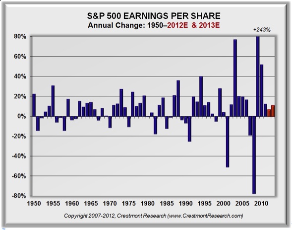
A look back at history provides insights about the earnings cycle and what is considered to be normal. Despite the statistics about average earnings growth, the business cycle drives periods of surge and stall. And the stall is generally a year or two of outright retreat, rather than smoothly slower growth. As reflected in Figure 1, earnings typically grow handsomely for three to five years, and then decline for a year or two before again growing. That’s usually all that it takes to restore the balance.

Figure 1. S&P 500 Earnings Per Share Growth: 1950–2011

080312-01

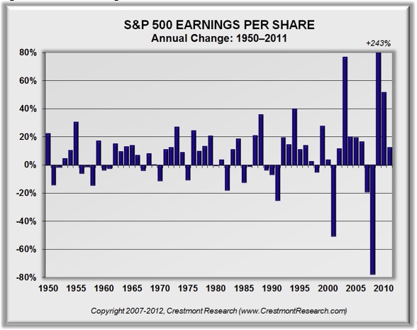
This choppy, irregular pattern has endured across periods of war, technological and business innovation, political issues, and other sorts of change. Yet the business cycle is not short; it does not run its course within a year. To more accurately see the trends, we can extend the period a few years to present the cycle as a multi-year average.

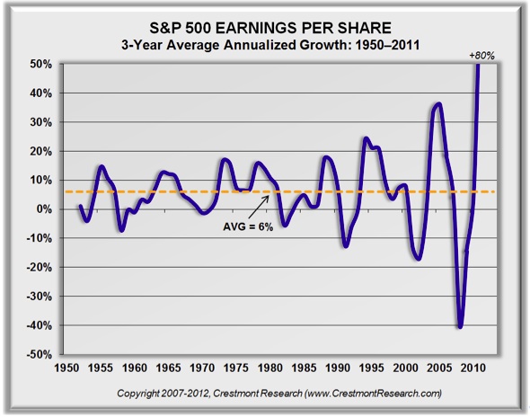
Figure 2 presents the three-year average growth rate for earnings. The cycle, while still somewhat erratic, begins to show its more cyclical nature – and the tendency for it to return to a baseline growth rate.

Figure 2. S&P 500 EPS 3-Yr. Average Growth: 1950–2011

080312-02

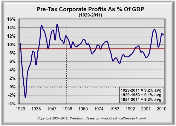
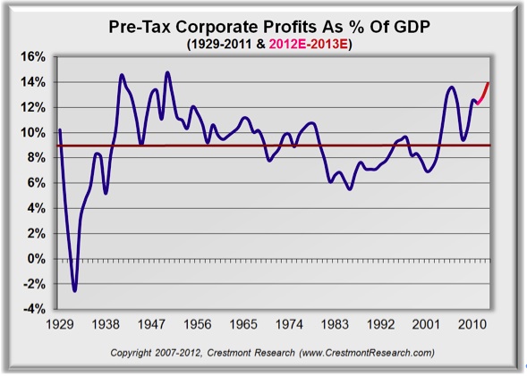
Profits not only grow and decline in dollar terms; they also change in relation to the amount of sales that it takes to generate the profits. Described in more detail, profits are the portion of sales that companies keep after all costs and expenses. When profits are compared to sales, the resulting ratio is known as the profit margin. As economists will acknowledge, the business cycle tends to push profit margins around a base level. When the sales of all companies are consolidated together, the result is essentially gross domestic product (GDP). Therefore, the aggregate profits of all companies can be compared to GDP, as a measure of profit margins and relative profitability.

Figure 3 presents the profit margin relationship since 1929, when the data was first readily available. The relationship has not been smooth, yet it has been fairly consistent. During the Great Depression, profit margins were low and negative. That underperforming period was followed by an extended era of above-average profit margins. The average for the entire period of over eighty years from 1929 to 2011 is approximately 9%. Interestingly, the average for the first twenty-five years (1929-1953), with its extremes, also averages almost 9%.

The extremes in both directions during the early part of the last century counterbalanced each other, as would have been expected in order to achieve the “normal” average. Following 1953, the average has also been near 9%; yet with less-extreme cycles. (Note: 1953 was used as the cutoff year to reflect a twenty-five year period and to encompass all of the more extreme years during the first half of the past century.)

Figure 3. Pre-Tax Corporate Profits as a Percentage of GDP: 1929–2011

080312-03

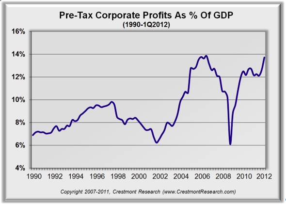
Today, as highlighted in Figure 4, using quarterly data, profit margins have moved well above the historical baseline near 9% and are vulnerable to being restored again toward the average. It does not necessarily have to happen immediately, as these cycles are slow-moving. It is likely, however, to be forthcoming.

Figure 4. Pre-Tax Corporate Profits as a Percentage of GDP: Quarterly 1990–1Q2012

080312-04

nalyst forecasts remain optimistic despite recent indications of weakness. As of July 31, the forecast by Standard & Poor’s for this year and next year reflects continued earnings gains – to more than $103 per share. Figure 5 adds the percentage increases for the next two years to Figure 1. This puts into perspective the notion that we’re supposedly on track for one of the longest runs ever of earnings increases.

Figure 5. The Analysts’ Forecast: S&P Outlook – Percentages

080312-05

How can we put the level of earnings into perspective? There are two methods to normalize earnings described in Ed’s most recent book, Probable Outcomes. The first is a method popularized by Robert Shiller at Yale and the other is a methodology used by Crestmont Research. The blue line in Figure 6 is actual reported EPS; the red line extension is S&P’s forecast. The orange and purple lines are baseline normalized EPS using Crestmont’s & Shiller’s methodologies.

As reflected in Figure 6, both methods reflect similar results over time. Most noteworthy in this chart is the high degree of variability for reported earnings in relation to the normalized measures. This chart is probably one of the the best ones by which to appreciate the high degree of fluctuation for reported earnings across business cycles.

Figure 6. The Analysts’ Forecast: S&P Outlook – Dollars

080312-06

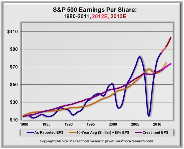
Note in Figure 6 that the current and forecast levels of earnings are becoming quite elevated above the normalized growth baseline. This is another indication that profit margins have become extreme. But how extreme?

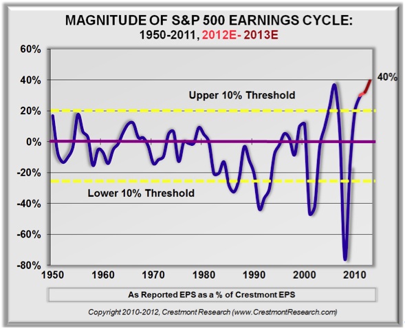
Figure 7 presents the percentage difference between actual and forecast reported earnings compared to Crestmont’s measure of normalized earnings. This enables us to see the relative difference as a percentage. That makes the chart comparable over longer periods of time when the actual dollar level of earnings is increasing.

Two yellow bands are included on the chart to mark the middle 80% and outlying 10% of the points on each side of the middle. Most of all, the chart highlights just how far beyond the normal range we have currently gone and are forecast to go. By the end of next year, we’re expected to be 40% above the normalized level of earnings. And since the trend tends to overshoot the baseline, the potential decline in reported earnings will certainly surprise a lot of analysts (but no longer will it surprise our readers!). Therefore, the current position in the earnings cycle is extended not only in terms of duration, but also in magnitude.

Figure 7. Magnitude of EPS Over/Under Baseline Trend

080312-07

Although the two methods for presenting profit margins in the business cycle are not directly comparable, we can overlay the information for some level of additional perspective. There are few well-followed forecasts for national profit margins. Figure 8 depicts national corporate profits, with a pro forma extension using the S&P 500 forecast for reported earnings growth in 2012 and 2013.

The press is now filled with stories about record profit margins. It’s clear that the current record goes back a long way. This, of course, means that there’s quite a long ways to fall, too.

Figure 8. Comparable Profit Margin Analysis

080312-08

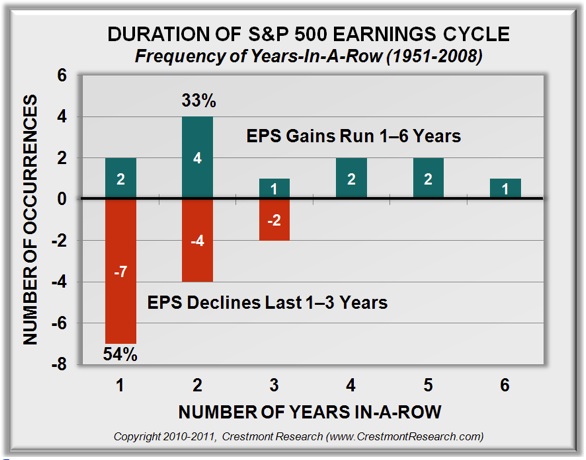
What about the duration of earnings cycles? Past EPS cycles have lasted one to six years. Over the past six decades, there have been twelve up-cycles. Six lasted one or two years (last year, 2011, was year three of the current cycle). We’re now in the second half of the game. As each upcoming year passes with an increase in EPS, the likelihood rises for the next decline in EPS … and potentially the stock market.

Conclusion #1: Reported earnings, based on history, should be expected to decline over the next two years (or they are increasingly likely to disappoint current expectations). That will put pressure on the stock market. If history is a guide, and if the blue line in Figure 8 only slightly retreats below the historical baseline, the implication is a decline in reported EPS of almost 40%! While growth could continue (as it has done in the past), it is clear that this cycle is getting a little weathered. And note that almost every downturn came as a surprise to the markets. Any analyst suggesting a downturn is labeled doom and gloom (as we can attest).

Conclusion #2: The measures of P/E that are based upon reported EPS are currently distorted by the business cycle. Whereas current reports have the market’s forward P/E near 13, a more rational measure for P/E based upon normalized baseline EPS is close to 20. P/E is not below average and is not ready to propel the market upward; it is well above average.

Figure 9 highlights the duration of EPS cycles. The chart will not include the current cycle until it is complete. Of the twelve up-cycles, half of them ended after one or two years of rising earnings. None of them exceeded six years, and only one went that long. Since 2011 was the third year of earnings gains for the current cycle, the likelihood of a decline is increasing. If a decline happens to not occur during the coming two years, then we’ll make history.

When declines have occurred in the past, they most often lasted only one year. But just under half of the time, the decline extended for two or three years. Given how far this cycle has extended in magnitude, it’s unclear whether the next decline will be a brisk annual event or a torturous few years.

Figure 9. Duration of EPS Cycles

080312-09

A Few Implications

The stock market and earnings analysts do not expect a decline in EPS over the next few years. The forecasts too often anchor on the recent past and extrapolate (in a burst of hope) current trends well into the future.

A broader view of history tells a different story. It is a story of a frequently erratic earnings cycle. The current cycle is now extended not only in duration but also in magnitude. It’s hard to deny that EPS is vulnerable to decline over the next few years.

When the decline in earnings occurs, it will not be minimal. The decline to the historical average would be 30% to 40%. These cycles, however, rarely stop at average. More often, they move well above and below the long-term trend line.

We’ve all seen that the stock market reacts to surprises quite negatively. There is no reason why investors should walk blindly into this storm. “Who knew?” will not a reasonable excuse.

Active portfolio management can position portfolios to participate in further upside until the downturn occurs, then it can provide protection from the full brunt of the ensuing losses.

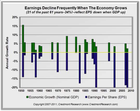
Some people will read the outlook for a decline in earnings to portend a recession, but earnings declines happen much more frequently than recessions. The business cycle is distinct from the economic cycle. As reflected in Figure 10, over one-third of the past 61 years have seen EPS declines despite growth in the economy. So, don’t be surprised that EPS might decline in spite of continued economic growth.

Figure 10. EPS Downturns Without Recessions

080312-10

A weak economy, however, adds to the pressure on earnings. The typical vulnerability at this level in the cycle is accentuated by the external forces of the economy. That makes the risks particularly worrisome.

It’s Time to Think About Absolute Returns

As described in chapter 10 of Probable Outcomes and chapters 9 and 10 of Unexpected Returns, the goal is to use absolute return-oriented “rowing” investments rather than more passive relative return “sailing” strategies. Although the stock market will provide shorter-term periods of solid returns over the next decade, it will also have offsetting periods of declines. Unlike secular bull markets, where the upswings far outweigh the downdrafts, the current environment is set for a much more modest (and likely disappointing) result. Rather than acquiesce to the mediocre returns on the horizon, investors can take action and develop their portfolios to profit regardless of the overall market direction. Although market timing may be an option for some, it is generally not a good option for most investors.

Conclusions About the Earnings Cycle

The business cycle has endured for well more than a century. It generally delivers two to five years of above-average EPS growth before experiencing a year or two of pullback. We have had a dramatic run over the past two years, and the forecast for the next two years now positions profits well above their historical relationship to the economy.

Several factors now indicate that a period of EPS decline may be upon us. It does not necessarily portend a decline in the market, although that vulnerability clearly exists. Beware nonetheless! For investors, this means that portfolios should be positioned through diversification and active risk and return management.

As an analogy, winter is not a time for gardeners to hibernate; rather it’s a time for different crops and techniques. Today’s investors have many tools available that let them actively “row” and invest like institutions, thereby achieving relatively consistent returns with a lot less disappointment risk.

Ed Easterling is the author of the recently released Probable Outcomes: Secular Stock Market Insights and the award-winning Unexpected Returns: Understanding Secular Stock Market Cycles. Further, he is President of Crestmont Research, an investment management and research firm, and a Senior Fellow with the Alternative Investment Center at SMU’s Cox School of Business, where he previously served on the adjunct faculty and taught the course on alternative investments and hedge funds for MBA students. Mr. Easterling publishes provocative research and graphical analyses on the financial markets at www.CrestmontResearch.com.

By John F. Mauldin
Outside the Box is a free weekly economic e-letter by best-selling author and renowned financial expert, John Mauldin. You can learn more and get your free subscription by visiting www.JohnMauldin.com.

Please write to johnmauldin@2000wave.com” target=”_blank”>johnmauldin@2000wave.com to inform us of any reproductions, including when and where copy will be reproduced. You must keep the letter intact, from introduction to disclaimers. If you would like to quote brief portions only, please reference www.JohnMauldin.com.

johnmauldin@investorsinsight.com” target=”_blank”>John Mauldin, Best-Selling author and recognized financial expert, is also editor of the free Thoughts From the Frontline that goes to over 1 million readers each week. For more information on John or his FREE weekly economic letter go to: http://www.frontlinethoughts.com/

To subscribe to John Mauldin’s E-Letter please click here:http://www.frontlinethoughts.com/subscribe.asp

Drought: Changing Climate Effects Food Production

As a general rule, the most successful man in life is the man who has the best information

The Earth’s climate has been continuously changing throughout its history. From ice covering large amounts of the globe to interglacial periods where there was ice only at the poles – our climate and biosphere has been in flux for millennia.

image001

geocraft.com

This temporary reprieve from the ice we are now experiencing is called an interglacial period – the respite from the cold locker began 18,000 years ago as the earth started heating up and warming its way out of the Pleistocene Ice Age.

image002

geocraft.com

Approximately every 100,000 years or so our climate warms up temporarily.

image003

These interglacial periods usually last somewhere between 15,000 to 20,000 years before another ice age starts. Presently we’re at year 18,000 of the current warm spell.

Serbian astrophysicist Milutin Milankovitch is best known for developing one of the most significant theories relating to Earths motions and long term climate change.

Milankovitch developed a mathematical theory of climate change based on the seasonal and latitudinal variations in the solar radiation received by the Earth from our Sun – it was the first truly plausible theory for how minor shifts of sunlight could make the entire planet’s temperature swing back and forth from cold to warm.

Milankovitch’s Theory states that as the Earth travels through space around the sun, cyclical variations in three elements of Earth/sun/geometry combine to produce variations in the amount of solar energy that reaches us. These three elements are:

  • Variations in the Earth’s orbital eccentricity – the shape of the orbit around the sun, a 100,000 year cycle
  • Changes in obliquity or tilt of the earth’s axis – changes in the angle that Earth’s axis makes with the plane of Earth’s orbit, a 41,000 year cycle
  • Precession – the change in the direction of the Earth’s axis of rotation, a 19,000 to 23,000 year cycle


These orbital processes are thought to be the most significant drivers of ice ages and, when combined, are known as Milankovitch Cycles.

Other Climate Change Drivers:

  • Changes occurring within the sun affects the intensity of sunlight that reaches the Earth’s surface. These changes in intensity can cause either warming – stronger solar intensity – or cooling when solar intensity is weaker.
  • Volcanoes often affect our climate by emitting aerosols and carbon dioxide into the atmosphere. Aerosols block sunlight and contribute to short term cooling, but do not stay in the atmosphere long enough to produce long term change. Carbon dioxide (CO2) has a warming effect. For about two-thirds of the last 400 million years, geologic evidence suggests CO2 levels and temperatures were considerably higher than present. Each year 186 billion tons of carbon from CO2 enters the earth’s atmosphere – six billion tons are from human activity, approximately 90 billion tons come from biologic activity in earth’s oceans and another 90 billion tons from such sources as volcanoes and decaying land plants


These climate change “drivers” often trigger additional changes or “feedbacks” within the climate system that can amplify or dampen the climate’s initial response to them:

  • The heating or cooling of the Earth’s surface can cause changes in greenhouse gas concentrations – when global temperatures become warmer, CO2 is released from the oceans and when temperatures become cooler, CO2 enters the ocean and contributes to additional cooling.


During at least the last 650,000 years, CO2 levels have tracked the glacial cycles – during warm interglacial periods, CO2 levels have been high and during cool glacial periods, CO2 levels have been low

  • The heating or cooling of the Earth’s surface can cause changes in ocean currents. Ocean currents play a significant role in distributing heat around the Earth so changes in these currents can bring about significant changes in climate from region to region

In 1985 the Russian Vostok Antarctic drill team pulled up cores of ice that stretched through a complete glacial cycle. During the cold period of the cycle CO2 levels were much lower than during the warm periods before and after. When plotted on a chart the curves of CO2 levels and temperature tracked one another very closely – methane, an even more potent greenhouse gas, showed a similar rise and fall to that of CO2.

image004

Small rises or falls in temperature – more, or less sunlight – seemed to cause a rise, or fall, in gas levels. Changing atmospheric CO2 and methane levels physically linked the Northern and Southern hemispheres, warming or cooling the planet as a whole. In the 1980s the consensus was that Milankovitch’s Cycles would bring a steady cooling over the next few thousand years.

As studies of past ice ages continued and climate models were improved worries about a near term re-entry into the cold locker died away – the models now said the next ice age would not come within the next ten thousand years.

It’s obvious that the orbital changes, as explained by Milankovitch’s Theory, initiate a powerful feedback loop. The close of a glacial era comes when a shift in sunlight causes a slight rise in temperature – this raises gas levels over the next few hundred years and the resultant greenhouse effect drives the planet’s temperature higher, which drives a further rise in the gas levels and so on.

How Higher Temperatures effect Food Production

The study Climate Trends and Global Crop Production Since 1980 compared yield figures from the Food and Agriculture Organization (FAO) with average temperatures and precipitation in major growing regions.

Results indicated average global yields for several of the crops studied responded negatively to warmer temperatures. From 1981 – 2002, warming reduced the combined production of wheat, corn, and barley – cereal grains that form the foundation of much of the world’s diet – by 40 million metric tons per year.

The authors said the main value of their study was that it demonstrated a clear and simple correlation between temperature increases and crop yields at the global scale.

Though the impacts are relatively small compared to the technological yield gains over the same period, the results demonstrate that negative impacts are already occurring.” David Lobell, lead researcher

Other researchers who focused on wheat, rice, corn, soybeans, barley and sorghum (these crops account for 55 percent of non-meat calories consumed by humans and contribute more than 70 percent of the world’s animal feed) reported that each had a critical temperature threshold above which yields started plummeting, for example: 29°C for corn and 30°C for soybeans. At the International Rice Research Institute in the Philippines scientists have found that the fertilization of rice seeds falls from 100 per cent at 34 degrees to near zero at 40 degrees.

Crop losses due to plant diseases could decline by as much as 30 percent with warmer and drier conditions.

Demand

By 2050, the world’s population is expected to reach around nine billion – minimum and maximum projections range from 7.4 billion to 10.6 billion.

Unfortunately the Green Revolutions high yield growth is tapering off and in some cases declining. So far this is mostly because of an increase in the price of fertilizers, other chemicals and fossil fuels, but also because the overuse of chemicals has exhausted the soil and irrigation has depleted water aquifers.

Yield

Future food-production increases will have to come from higher yields. And though I have no doubt yields will keep going up, whether they can go up enough to feed the population monster is another matter. Unless progress with agricultural yields remains very strong, the next century will experience sheer human misery that, on a numerical scale, will exceed the worst of everything that has come before“. Norman Borlaug, father of the Green Revolution

If average global temperatures rise just over one-half degree Centigrade the frost-free growing season in the corn belt would be lengthened by two weeks. But, as the previously mentioned study showed, if temperatures increase beyond a specific threshold, fertilization is effected, thus reducing the plants growing season and reducing yield.

Carbon dioxide does two things for plants – it is an essential compound in photosynthesis and it increases water use efficiency in plants – so a doubling of the pre-industrial carbon-dioxide levels, such as we’ve seen, should increase crop yields significantly right?

Well let’s not jump to conclusions – in laboratory tests yields do increase tremendously, but in real life field conditions other atmospheric gases surrounding the plant diminish the carbon dioxide’s photosynthesis enhancement and yield levels reached in the lab are cut drastically, as much as 75 percent.

All of the positive effects of carbon dioxide increases may be negated by the stress caused by low rainfall and high temperatures. Increased cloud cover – due to higher global temperatures – might limit photosynthesis and result in reduced crop production.

Higher levels of carbon dioxide help some plants tolerate less water and limited amounts of soil nitrogen but does not compensate for reduced levels of phosphorus or potassium.

If global warming raises the temperature just two degrees Centigrade insects numbers will increase becoming a major nuisance – also some insects will be able to extend their range as a result of the warming. Farmers in the US, depending on the crop, can expect a 25 to 100 percent increase in crop losses.

Conclusion

The heating and cooling of the Earth coincides with the activity of the sun – the sun determines the Earth’s temperature. Since man-made carbon dioxide emissions started in the 1850’s, the CO2 level has only risen 11 percent – a very small rise with a nearly negligible effect.

Science says the Earth is going to continue to warm. The warming is not manmade, to continue to spend precious resources fighting a battle you cannot win is a fruitless endeavor. The earth is our home and we need to take care of it best we can, there is no gain needlessly hurting the planet we live on. But let’s not be led astray by false prophets and Pied Pipers singing the wrong tune.

We need to spend money on advancing agricultural research, water infrastructure and supply lines – focus research on growing more food on less land while using less water and get food, supplies, to where it’s needed in an efficient and safe manner.

The truth regarding climate change, and how it effects our food production should be on all our radar screens. Is it on yours?

If not, maybe it should be.

Richard (Rick) Mills

rick@aheadoftheherd.com

www.aheadoftheherd.com

If you’re interested in learning more about the junior resource and bio-med sectors please come and visit us at www.aheadoftheherd.com

Site membership is free. No credit card or personal information is asked for.


Legal Notice / Disclaimer

This document is not and should not be construed as an offer to sell or the solicitation of an offer to purchase or subscribe for any investment.

Richard Mills has based this document on information obtained from sources he believes to be reliable but which has not been independently verified; Richard Mills makes no guarantee, representation or warranty and accepts no responsibility or liability as to its accuracy or completeness. Expressions of opinion are those of Richard Mills only and are subject to change without notice. Richard Mills assumes no warranty, liability or guarantee for the current relevance, correctness or completeness of any information provided within this Report and will not be held liable for the consequence of reliance upon any opinion or statement contained herein or any omission.

Furthermore, I, Richard Mills, assume no liability for any direct or indirect loss or damage or, in particular, for lost profit, which you may incur as a result of the use and existence of the information provided within this Report.


Chart of The Day

The latest jobs report came out today with the Labor Department reporting that nonfarm payrolls (jobs) increased by 163,000 in July. Today’s chart puts the latest data into perspective by comparing nonfarm payrolls following the end of the latest economic recession (i.e. the Great Recession — solid red line) to that of the prior recession (i.e. 2001 recession — dashed gold line) to that of the average post-recession from 1954-2000 (dashed blue line). As today’s chart illustrates, the current jobs recovery is much weaker than the average jobs recovery that follows the end of a recession. Today’s chart also illustrates that the jobs market continues to improve at a fairly steady pace — a pace very similar to what occurred following the recession of 2001.NA

20120803

Quote of the Day
“Four little words sum up what has lifted most successful individuals above the crowd: a little bit more. They did all that was expected of them and a little bit more.” – A. Lou Vickery

To Subscribe to Chart of the Day go HERE

The Top 10 Investor Errors Explained

1. Neglecting the Long Cycle


Societies, economies and markets all move in long secular eras. Sometimes these periods are positive (i.e., 1946-66; 1982-2000) and are called secular bull markets. Sometimes they are negative (1966-82; 2000-?) and are called secular bear markets.

Let’s use 1982-2000 era as an example. The rise of technology – everything from software to semiconductors, mobile to networking, storage to biotech et. al. drove the broader economy. This led to record low unemployment, strong wage gains and high corporate profits. As you would imagine, stocks did exceedingly well in this environment. Asset allocations that were Equity-heavy did much better than those that carried lots of bonds and cash in that period. Conversely, the cycle that began in 2000 has rewarded bond and cash heavy portfolios and punished more equity-heavy ones.

Think about the many long-lasting positive elements that drove the post WW2 period (1946-66). You can list all of the negative societal factors that were a drag on the next secular bear period (1966-82).

Not understanding this cyclical backdrop is a common error. You should be more equity oriented during secular bull cycles and more tactical (i.e. bond and cash)  during secular bear cycles.

It is an investor’s job to preserve capital and manage risk during secular bear markets. During secular bull markets, maximizing returns are the top priority.

All investors need to understand what the secular backdrop is and adjust their allocations accordingly.

adfsdfsd

adfsdfsd2

Chart Source: Source: Crestmont Research

Click on each Title below for an expanded explanation

2. EXCESS FEES

3. REACHING FOR YIELD

4. You Are Your Own Worst Enemy

5. Asset Allocation vs Stock Picking

6. Passive vs Active Management

7. Mutual Fund vs ETFs

8. Cognitive Deficits

9. Past Performance vs Future Results

10. Not Getting What You Pay FOR


Welcome to The Big Picture!

The blog is a compendium of what a professional money manager is looking at, thinking about, and writing on. It is written by me (& the crew) for people ranging from investment professionals to media to anyone else interested in investing, markets, and the economy.

It is, by design, laden with facts, statistics, and informed, data-driven opinions. We avoid the squishy, touchy-feely “I think/hope/want” type of fact-free analysis so prevalent in the media and on Wall Street.

I have been writing about these topics for ~15 years, and blogging since 2003. By sheer accident, TBP has become one of the best reviewed finance blogs on the web. We key in on what you should be thinking about when it comes to markets and the economy — and what you should not be doing with your money.

The writing is designed to be very accessible — no PhD required. Hell, no college degree needed. If I can make this stuff understandable to my right brain art teacher wife and my 74 year old retired real estate agent mom, then I can help you learn the basics of markets, investing and the economy

The Opportunity of the Decade

“After spending the previous fall and winter testing new nominal highs above $1800, future investors may come to view spring and summer 2012 as the opportunity of the decade. Gold has shown its strength and retreated. While most investors will take that as a signal that the market has topped, some will take advantage of the general trepidation to add to their positions at hundreds of dollars off the highs”.

Priced For Collapse

Where is the gold price today? If you’re like many Americans, you have no idea whether it went up, down, or sideways. Fortunately, I know my readers to be more informed – you likely know that after falling from almost $1900, gold has been trapped around $1600 since early May. But you may still be curious why despite continued money-printing and abysmal US economic reports, gold hasn’t been able to hit new highs.

Here’s the truth: gold is currently priced for collapse. Many investors believe the yellow metal has topped out and are selling into every rally.

Nerves of Tin 

Being a gold investor is tough business. The last thing any government or corrupt big bank wants is to have a bunch of people putting their savings into hard assets – and gold is one of the hardest of all. So we’re constantly up against tides of propaganda saying that gold has no value or is the refuge of doomsayers.

The effect of this is that even heavy gold investors are always waiting for the other shoe to drop. When house prices were rising, no one was worried that the market had peaked or prices were unsustainable. No one was asking whether all the thin-walled McMansions going up would actually be worth anything in a generation. But for gold, Wall Street has been shorting it all the way up!

Nowhere is this pessimism more evident that in gold mining stocks. Rising inflation has driven production costs higher, but the mistaken belief that inflation is contained and Treasuries are a safer haven is keeping a lid on gold prices. As such, many of the major producers have missed their earnings projections, and their share prices have been punished. This has placed a cloud over the entire sector. In fact, the P/E ratios of major gold miners are near record lows. Stock prices reflect future earning expectations, and judging by the low P/Es, Wall Street expects future earnings to plummet. This likely reflects their bearish outlook for gold, which is generally viewed as a bubble about to pop.

Chronic Memory Loss

Unfortunately, there is no public validation for those who have proved the gold doubters wrong. A couple of years ago, I predicted gold would cross $1500 and even my own staff thought the call was too risky, too extreme. But I knew then, as I know now, that at the end of the day the gold price is not a mystery – it’s a proxy for dollar weakness.

Since most investors do not truly understand gold’s economic role, they assume the 10-year bull market must be a mania. But manias show parabolic growth detached from any fundamental driver. The definition of a mania is the bidding up of an asset quickly and beyond all long-term justification.

Gold, however, has grown steadily in inverse correlation with real interest rates, as explained by Jeff Clark and Mark Motive in past issues of this newsletter. As a reminder, here’s a chart detailing the correlation:

8-2ps

The Opportunity of the Decade 

After spending the previous fall and winter testing new nominal highs above $1800, future investors may come to view spring and summer 2012 as the opportunity of the decade. Gold has shown its strength and retreated. While most investors will take that as a signal that the market has topped, some will take advantage of the general trepidation to add to their positions at hundreds of dollars off the highs.

While I think gold is a bargain at $1900 considering today’s circumstances, the market phobia of a price collapse is allowing us to buy at well under established highs. It’s as if you already wanted to go swimming, but you found out when you got there that the pool was heated.

What Happens Next

I’ve seen markets like this before, and by making some reasonable inferences, I have a good picture of how this could play out. Gold will continue testing the $1600 barrier until it surprises to the upside. This could be spurred by the announcement of QE III, a calming of fears in Europe, or any shock to the Treasury market. Treasuries have temporarily overtaken gold as the primary safe-haven asset. Once that dynamic is broken, I believe the counterflow into gold will be tremendous.

Right now, there is a haze over investors. Frightful news from Europe and a slowdown in Asia have shaken confidence in any asset that doesn’t have the steady track record of US debt. But as I often remind my clients, past performance doesn’t guarantee future results. Any news that wakes investors up to the coming collapse of the Treasury market will likely trigger a rush into the one asset with a track record as long as civilization itself.

Prepare For Collapse

The key to this market is to understand that a price collapse is coming – but not for gold. Instead, the market for US dollars and dollar-denominated debt is headed off a cliff, which will send the price of precious metals soaring.

Now is a time for uncommon confidence. Everyone knows Treasuries to be safe, just as they knew house prices would always rise. Then as now, gold’s value and utility are doubted. But my readers know better.

Peter Schiff is CEO of Euro Pacific Precious Metals, a gold and silver dealer selling reputable, well-known bullion coins and bars at competitive prices.

For the latest gold market news and analysis, sign up for Peter Schiff’s Gold Letter, a monthly newsletter featuring contributions from Peter Schiff, Doug Casey, and other leading experts. Click here for your free subscription.