
Energy & Commodities
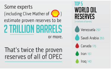
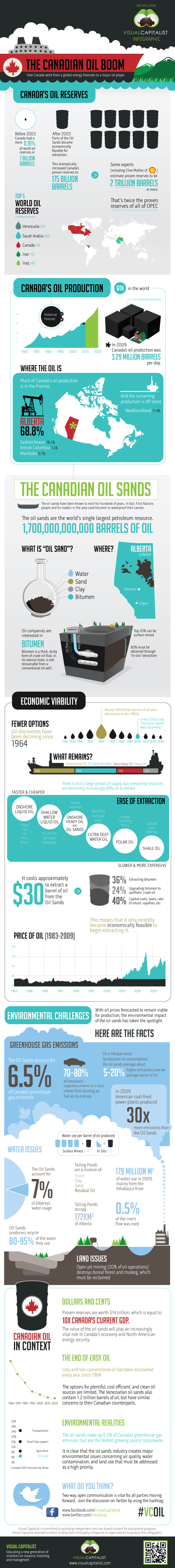
Canada is sitting on an Ocean of money. 2 Trillion Barrels of Oil! is a massively more than our current status 175 Billion Barrels proven, which now ranks us #3 in the World after Venezuala & Saudi Arabia. Let this visual story (main chart below) convince you of the Massive Wealth, practically unimaginable change, opportunity & Prosperous Future in the offing. 2 Trillion is more than twice the entire reserves of OPEC. Bottom line, Canada’s Developing Oil Wealth combined with hungry customers like China & the easy to ship to US…….makes the Shieks of the Middle East begin to look like homeless paupers by comparison.
To realize this wealth, all Canada has to do is clean up the Worlds largest Natural Oil Spill.
For Larger Image Click HERE or on the image itself below:

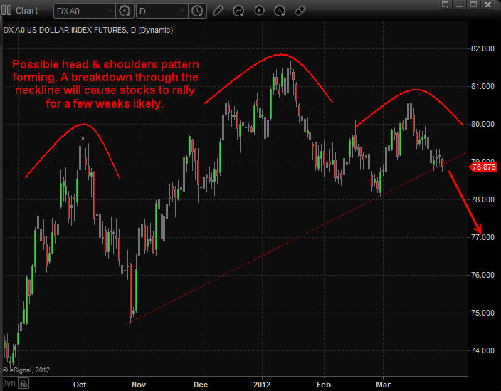
Daily Chart of US Dollar Index:
The US Dollar index has formed a possible large Head & Shoulders pattern meaning the dollar could fall sharply any day. The size of this chart pattern indicates that if the dollar breaks down below its support neckline the we should expect the dollar to fall for 2-3 weeks before finding support.
Keep in mind that a falling dollar typically means higher stock and commodity prices. If this senario plays out then we should see the market top late April which falls inline with the saying “Sell In May and Go Away”.
Via Chris Vermeulen @ www.GoldAndOilGuy.com Sign Up Today @ http://www.thegoldandoilguy.com/signup.php

The past couple months investors have been focusing on the equities market. And rightly so with stocks running higher and higher. Unfortunately most money managers and hedge funds are under performing or negative for the first quarter simply because of the way prices have advanced. New money has not been able to get involved unless some serious trading rules have been bent/broken (buying into an overbought market and chasing prices higher). This type of market is when aggressive/novice traders make a killing cause they cannot do anything wrong, but 9 times out of 10 that money is given back once the market starts trading sideways or reverses.
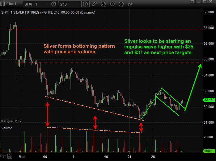
While everyone is currently focusing on stocks, its important to research areas of the market which are out of favor. The sector I like at the moment is precious metals. Gold and silver have been under pressure for several months falling out of the spot light which they once held for so long. After reviewing the charts it looks as though gold, silver and gold miner stocks are set to move higher for a few weeks or longer.
Below are the charts of gold and silver charts. Each candle stick is 4 hours allowing us to look back 1-2 months while still being able to see all the intraday price action (pivot highs, pivot lows, volume spikes and price patterns).
The 4 hour chart is one time frame most traders overlook but from my experience I find it to be the best one for spotting day trades, momentum trades and swing trades which pack a powerful and quick punch.
As you can see below with the annotated charts gold, silver and gold miner stocks are setting up for higher prices over the next 2-3 weeks. That being said we may see a couple days of weakness first before they start moving up again.
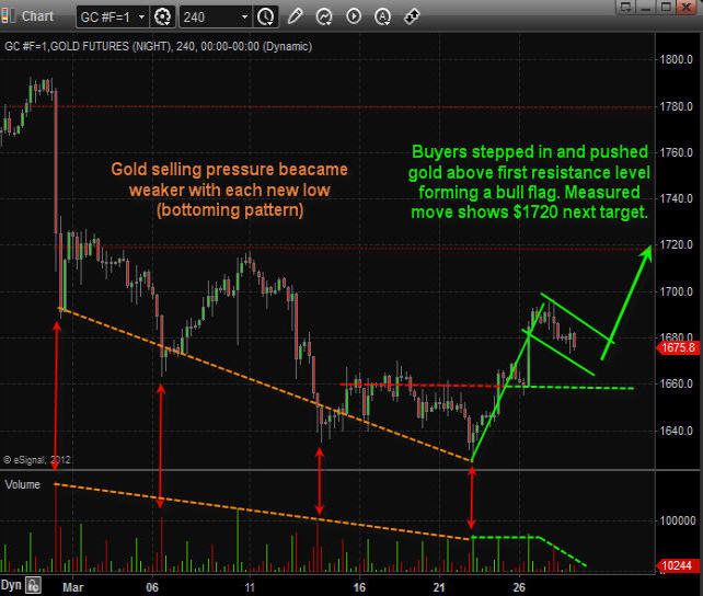
4 Hour Momentum Chart of Gold:
4 Hour Momentum Chart of Silver:
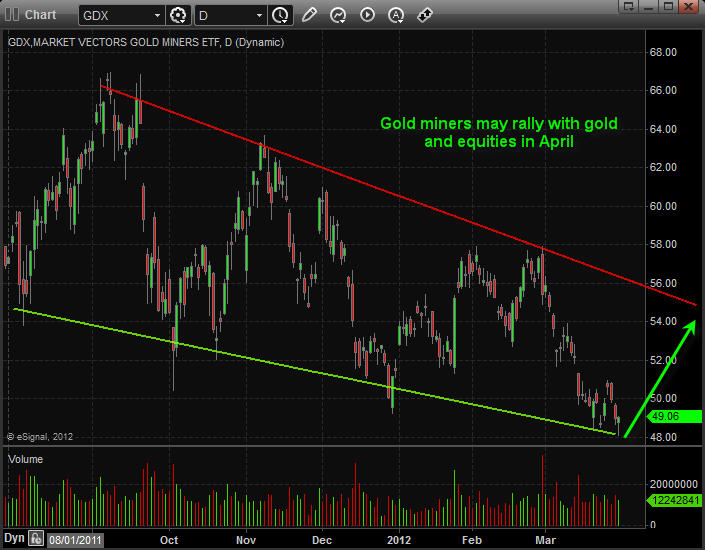
Daily Chart of Gold Miner Stocks:
Gold miner stocks have been under performing precious metals for over a year already. Looking at the daily chart we are starting to see signs that gold miner stocks could move up sharply at the trade down at support, oversold and with price/volume action signaling a possible bottom
Daily Chart of US Dollar Index:
The US Dollar index has formed a possible large Head & Shoulders pattern meaning the dollar could fall sharply any day. The size of this chart pattern indicates that if the dollar breaks down below its support neckline the we should expect the dollar to fall for 2-3 weeks before finding support.
Keep in mind that a falling dollar typically means higher stock and commodity prices. If this senario plays out then we should see the market top late April which falls inline with the saying “Sell In May and Go Away”.
Precious Metals Conclusion:
Looking forward 2-3 weeks precious metals seem to be setting up for higher prices as we go into earning season and May. Overall the market is close to a top so it could be a bumpy ride as the market works on forming a top in April.
Chris Vermeulen
www.GoldAndOilGuy.com

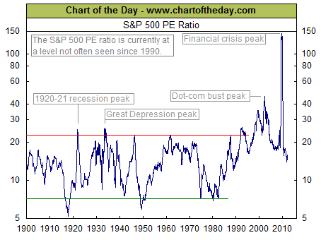
Today’s chart illustrates how the recent rise in earnings as well as recent stock market action has impacted the current valuation of the stock market as measured by the price to earnings ratio (PE ratio). Generally speaking, when the PE ratio is high, stocks are considered to be expensive. When the PE ratio is low, stocks are considered to be inexpensive. From 1900 into the mid-1990s, the PE ratio tended to peak in the low to mid-20s (red line) and trough somewhere around seven (green line). The price investors were willing to pay for a dollar of earnings increased during the dot-com boom (late 1990s), surged even higher during the dot-com bust (early 2000s), and spiked to extraordinary levels during the financial crisis (late 2000s). As a result of the continued surge in corporate earnings the PE ratio remains at a level not often seen since 1990 despite what has been a significant upward trend in stock prices so far this calendar year.
Notes:
Where’s the Dow headed? The answer may surprise you. Find out right now with the exclusive & Barron’s recommended charts of Chart of the Day Plus.
For Chart of the Day Homepage go HERE
Quote of the Day
“The value of a man should be seen in what he gives and not in what he is able to receive.” – Albert Einstein

Around this point in the fractal cycle in the late 70’s, Gold busted out of its channel to rise sharply higher, along with Silver. Silver’s channel top will lie up around $68 to $70 over the coming months which we believe will be reached in 2012. The next higher angled resistance bands for Silver run from $112 to $115, and then up at the $123 area. By the end of the Silver Bull, we expect to see Silver reach $500+.
Dollar Devaluation Drives The Fractal Relationships
The fractal relationships to the late 70’s are driven by the aggressive Dollar Devaluation in both periods, with the current period one Elliott Wave Degree higher.Both periods present as pure 5th wave parabolas in Dollar Devaluation, and thus, in the Gold and Silver Charts.We are seeing a price expansion in the current Vth wave versus the 5th wave of III in the late 70’s for Gold and for Silver.
We have noted for years that the Fed “owns” the psychology of the markets.The Fed is in the process of converting the Deflationary K-Winter into a period of Stagflation.“Stag” refers to the very sluggish economy, and “flation” refers to rising inflation created by the aggressive Dollar Devaluation.
The Fed and its banks blew out the loan multiplier system for providing new Dollars directly into the economy in 2007 and 2008.The 2nd round of Dollar Inflation is via the Fed printing new Dollars to buy US Government debt- pure debt monetization and default on debt.Thus, they are devaluing the huge load of debt by devaluing the US Dollar.
The Fed “shows inflation when it wants” and it “shows deflation when it wants.”It does so by suggesting that it will, or will not be printing Dollars, the liquidity that drives the markets.All of this jawboning is a joke since the Fed has no choice but to print Dollars at an accelerating rate yet, the markets and investors run a constant bi-polar gauntlet by taking the Fed at their “word.”
The big trading banks dominate the markets.They do the “bidding of the Fed at key junctures.”This is a process of rotating liquidity into the different asset classes that must be supported in the process of changing the cycle during the 2nd leg of debt monetization.
It is the devaluation of the US Dollar that ultimately creates the price rise in Gold, in Silver, and in the PM Stocks.The only true read on the Dollar Devaluation is through the rise of $Gold so the true devaluation of the Dollar can be hidden from the market at key times.In reality, it is the market that creates the devaluation of the Dollar against Gold creating the Gold Parabola so the psychological whims of the Fed can muddle the psychology of the markets.The Gold parabola rises in fits and momentum runs as the market devaluation of the US Dollar ebbs and flows around the psychological effects of what the Fed says; accompanied by the help the Fed receives from entities trading with the Fed’s words.
The spastic Gold market is also affected by a focus on the Dollar Index that has little to do with Dollar Value once Global Competitive Currency Devaluations start in earnest.
We Can Expect QE to Infinity
As Jim Sinclair says, this is complicated stuff.Per Mr. Sinclair we already have approximately $1.3 trillion that were printed and sent to Europe.The markets have not factored this into the price of Gold, yet.Once it does, we should see Gold rise sharply.Remember that it only took $600 Billion of new QE printing to drive Gold up to $1920 in 2011 as per my forecast back in January and April, 2011 in my article entitled Goldrunner: Gold on track to Reach $1860 to $1,920 by Mid-year(gold reached $1,917.20 in late August, 2011 and $1,923.70 in early September, 2011).
All of the US Debts must be on the US balance sheet before Gold goes completely parabolic, for full devaluation of the Dollar and the debts.This is the essence of the question that a Congressman asked Tim Geithner.Tim delayed until the Congressman tossed out the $20 Trillion and then $50 Trillion numbers.Mr. Geithner responded that the number would make the Congressman “uncomfortable.”GEITHNER IMPEACHED BERNANKE’S COMMENT ON “MAYBE NO MORE QE” WHEN HE BASICALLY ADMITTED WE NEED QE IN SPADES GOING FORWARD.Mr. Geithner confirmed that the number of Dollars that must be printed to cover off-balance sheet items is huge.This covers items like unfunded Social Security, unfunded Federal Pensions, future unemployment claims, and the losses of Fannie and Freddie through the end of 2012.
Unfortunately, investors generally keep looking at the trees on a short-term basis, rather than seeing the forest of Dollar Devaluation.As Jim Sinclair constantly notes, we will see QE to infinity.This means that Gold will go vastly higher than most expect in order to devalue the debt and to balance the US budget.
The current markets are completely managed by the Fed and its henchmen.The complete management is a complicated issue as Jim Sinclair has noted. For instance: the Fed and its helpers recently inhibited Gold and Silver at a time when the Greek debt issues were being worked out.It was the Fed’s helpers who had sold the OTC Derivative “insurance” on all of the failed Greek debt.It appears that they hammered inflation expectations to help the deal from go smoothly; and there were cycle timing issues that were already stretched a bit.In reality, most of the Greek Debt holders were forced to take on a different debt series before “default” was declared for a final few.This gives us “insight” that the time in the cycle is short, due to the necessary quick fix deal.
Mr. Sinclair has discussing how the US Dollar’s days as the World Reserve Currency are numbered.This begs the question of what effect this will have in terms of the Dollar’s “value.”Personally, I think that new Dollar Supply is most important, but freeing up huge numbers of Dollars with its loss of reserve status could be a reason for a sharp rise in US inflation if all of those Dollars head home – and a large number of those Dollars coming home to roost might find themselves “chasing Gold and Silver” which could add to the process of the markets re-valuing Gold and Silver much higher.
We are seeing a “price expansion” in the charts of Gold and Silver in the current period with little evidence of a “cycle time expansion” to go with it, other than the general increase in fractal time warranted at one higher Elliott Wave Degree.
In the late 70’s the top in the Gold Chart came as a momentum high into early 1980 with a lower final high coming later.It is possible that we will not see the momentum high before the final high this time, yet it is probable since the continuing deterioration in the economy demands a fairly quick devaluation of the debt before the economy completely rolls over.
THE SILVER CHARTS
The first chart of Silver is the current log chart where Silver is trading inside the black trend channel.We can see the exaggerated decline into the deflation scare bottom in late 2012.Silver appears to be correcting in a flag formation at this time.The measured target of a flag break-out to the upside would target the $65 to $70 area at the top of the black channel.We have break-outs on the RSI and the MACD with the RSI trying to hold the Bullish 50 mark.The Fed has already printed $1.3 Trillion to go to Europe, with more QE necessary to buy US Debt.As the markets factor the Dollar Devaluation in, we’d expect to see Silver explode upward on a fundamental basis.It only took $600 Billion in 2011 to drive Silver from around $20 up to around $50.Additional QE to buy US debt would suggest about 3 times the 2011 Dollar Devaluation from Dec. of 2011 to the end of 2012.The timing appears to be supported with this being a Presidential election year.
If you would like to have access to my detailed proprietary fractal analyses of what is likely to unfold for Silver, Gold, Copper, the HUI and a large number of specific mining company stocks in the months and years to come, the link to our subscription service at the bottom of the article (only $30/mo.). If you do not want specific information but would just like to keep abreast of my general views on the markets, you can send an email requesting to receive my coming free newsletter Goldrunner’s Fractal Corner. See the bottom of the article for further subscription and newsletter contact information.

The Late 70’s Fractal Silver Chart
The next chart of Silver is an arithmetic 70’s chart.There was no “deflationary bent” in the late 70’s that caused the steeper retracements we have seen in the current period to create increased volatility in the ever expanding environment of Dollar Devaluation, yet it is obvious that we have not seen the first wave of sharp price expansion in Silver that occurred in the late 70’s.Fractal Cycle timing suggests that it should be directly in front of us, and it appears that the next round of aggressive Dollar Inflation is already underway to fuel that type of move as soon as the market factors the aggressive round of Dollar Devaluation into Gold and Silver.
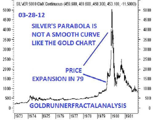
The Silver Parabola is not a smooth flowing form like the Gold Parabola is (as can be seen in a previous article here).We can see that the huge price rise in Silver came almost completely toward the tail end of the 70’s Bull.
We are still in a short-term period of potential cycle weakness until options expire for Silver and Gold futures into the end of this week – but the Fractal Cycle suggests that things will heat up soon to see Silver on its way to $70+ in the next up-leg. We have previously laid out our fractal expectations for Gold in 2012 via our article,Goldrunner: Fractal Gold Analysis Says Gold On Way to $3,500 Mid-year.
For the moment,
Goldrunner, THURSDAY, 03-29-12
NOTE: A link to the Goldrunner subscription service can be foundhere. If you would like to be added to Goldrunner’s mailing list to receive his new and Freenewsletter, Goldrunner’s Fractal Corner, send an e-mail toGOLDRUNNERBLOG44@AOL.COM“>GOLDRUNNERBLOG44@AOL.COM.
Please understand that the above is just the opinion of a small fish in a large sea.None of the above is intended as investment advice, but merely an opinion of the potential of what might be.Simply put: The above is a matter of opinion and is not intended as investment advice. Information and analysis above are derived from sources and utilizing methods believed reliable, but we cannot accept responsibility for any trading losses you may incur as a result of this analysis. Comments within the text should not be construed as specific recommendations to buy or sell securities. Individuals should consult with their broker and personal financial advisors before engaging in any trading activities. Do your own due diligence regarding personal investment decisions.In the interest of full disclosure, GOLDRUNNER is personally invested in the Precious Metals sector including various Precious Metals and other individual stocks.GOLDRUNNER reserves the right to modify or eliminate any or all positions at any point in time.


-
I know Mike is a very solid investor and respect his opinions very much. So if he says pay attention to this or that - I will.
~ Dale G.
-
I've started managing my own investments so view Michael's site as a one-stop shop from which to get information and perspectives.
~ Dave E.
-
Michael offers easy reading, honest, common sense information that anyone can use in a practical manner.
~ der_al.
-
A sane voice in a scrambled investment world.
~ Ed R.
Inside Edge Pro Contributors

Greg Weldon

Josef Schachter

Tyler Bollhorn

Ryan Irvine

Paul Beattie

Martin Straith

Patrick Ceresna

Mark Leibovit

James Thorne

Victor Adair