
Timing & trends
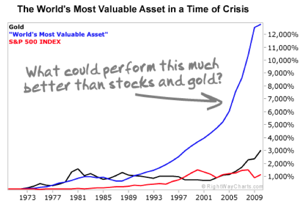
There’s one reliable, common and briliant investment that has proved to be even better than gold or silver in crisis. In fact, since 1970, a year before the U.S. went off the gold standard, this investment has easily outpaced both stocks and gold.
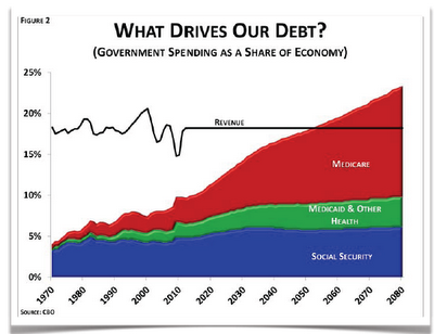
Its certainly reasonable to expect a crisis of the US losing Reserve Currency status and the ability to fund its spending/deficits too, given its borrowing 40 cents of every dollar it spends & Obama has added more debt than all of the Presidents in history:
Its FARMLAND: Click on either chart or HERE to read the full report

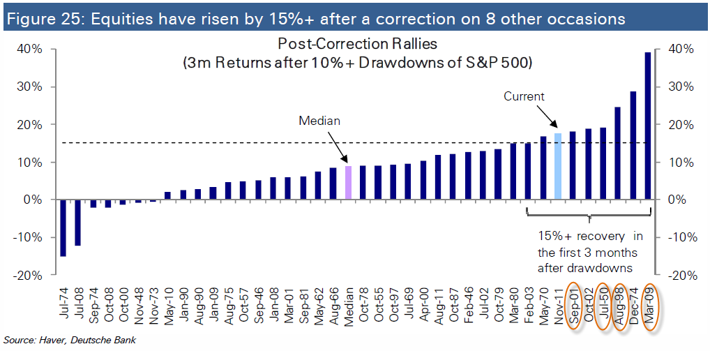 And the S&P 500 has only risen by more than this on six other occasions after a 10% drawdown…and many of those were during some of the most crisis prone periods this nation has ever experienced.

The GLDX chart looks extremely bullish. Almost every indicator and oscillator is flashing light or heavy buy signals, while price itself coils into a fabulous wedge pattern, like a king cobra poised to strike at the hearts of your dollarbug foes!
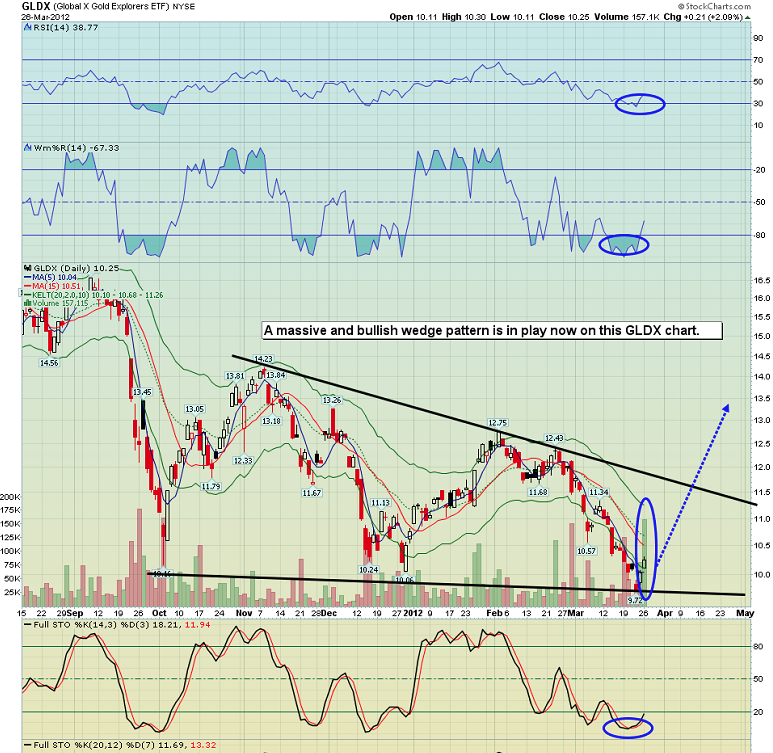
Mar 27, 2012
Mainstream media tells you that the Dow soared yesterday. Maybe it did, against the dollar. Against gold, the Dow fell. Please click here now. Gold is potentially set to outperform both the dollar and the Dow, in a very big way, in a very short amount of time.
The same is true for silver. I talked yesterday about what I’ve termed the “wedgification” of the gold chart. Wedgification is not a real word. It is a term I coined, like “head and shouldering”, to describe the process where one chart pattern displays fractal-like action, morphing repeatedly into ever-larger patterns of the same type.
A small head and shoulders pattern can become the head of a larger head and shoulders pattern. Likewise, the initial and very bullish gold wedge has just become overpowered by an even larger wedge.
In the case of silver, there is a process going on that I’ve termed “rectangularization”. Please click here now. Note the black supply line that I’ve highlighted at point “A” on the chart.
Now look at point “B”. That’s the price area that was rightfully called a “breakout” by most silver investors. Breakouts should never be bought by anyone other than gamblers. A breakout indicates the potential coming profits on positions already bought at much lower prices.
The breakout at point B was a very positive event for the silver market. Now, make note of point “C”. That’s the point where silver suddenly declined as the bond market began to fall. Now that the silver price has spent some time well below point C, you can draw in a new supply line across that point.
You can now see the “rectangularization” of the silver chart in play, as an even bigger drifting rectangle is now visible on the chart. Bigger price patterns have bigger price targets.
The reason I push the gold community so hard about building emotional strength to manage growing volatility in the gold price is because the upside is so enormous.
In this epic crisis, if you can’t endure gold dropping a few hundred dollars an ounce you’ll likely never make it to the “honeypot zone”.
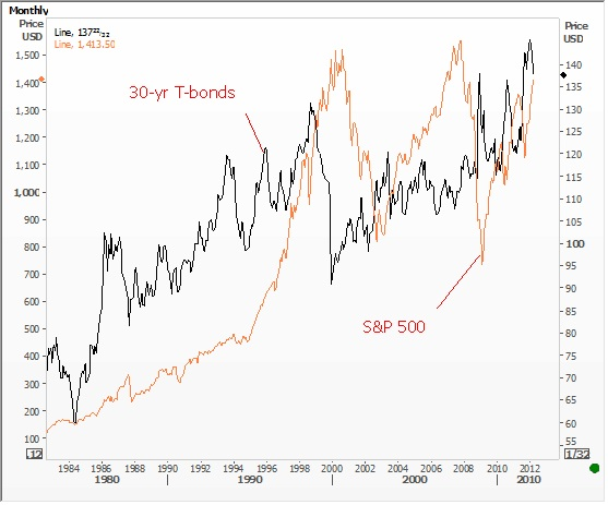
The t-bond has been put onto the radar screens of most institutional money managers. Rising interest rates can negatively affect gold in the short term. Yesterday, you received some good news, in the form of statements made by Ben Bernanke about the need to maintain “accommodative” monetary policy.
I’m not sure how many investors looked at the bond chart as Dr. Bernanke made those statements, but there was not much in the way of celebration, and that remains a concern. Please click here now. You can see that the bond did not exactly cheer as the head of the Fed spoke.
Note the price resistance in the 139 area on that chart. It’s going to be important to watch how the bond price acts if there is a rally towards 139.
One of the most bearish charts I see in any major market right now is the monthly bond chart. To view a veritable “landslide of sell signals”, please click here now.
How do you, the investor, reconcile the horrific picture on the bond chart against the ultra-bullish picture on the gold chart? You start by strengthening yourself emotionally to deal with the fact that surprise, not prediction, is the theme of this crisis.
Another “chart of horrors” that I’d like you to focus on is the US dollar monthly chart. Please click here now. The 14,3,3 Stochastics series has done a very good job of indicating tops in the dollar, and one such “top call” is in play now.
Bond market players appear to be very negative about the prospects for QE3, while gold market players seem to believe that a collapse in the bond will be quickly followed by an even bigger collapse in the dollar.
The appearance of both the gold and bond charts seem to indicate this is an accurate picture of the “liquidity flows posturing” of the largest major market players.
To view the “gold wedgification” chart, please click here now. Look at how the supply line drawn through high price of point “A” and the demand line combined to create a powerful wedge pattern.
Within the wedge there is head and shouldering action, but the overall picture is that of a wedge, not a head and shoulders pattern.
Now, make note of the supply line drawn through point “B”. Coupled with the same demand line, there is now an even larger wedge pattern in play, which I’ve termed a “super wedge”.
Investors need to understand that the gold price can move hundreds of dollars in either direction and all that movement may do is create an even larger wedge pattern.
Generally speaking, gold stock investors were a little glum yesterday, as once again bullion blasted higher while their stocks mostly meandered or failed to perform. I talked yesterday about the need to be selective in your stock picking.
Please click here now. That is the GLDX-nyse gold juniors fund. Many investors were disappointed that GLDX failed to perform to the degree that GDXJ-nyse did yesterday. Patience is required in a super-crisis, but I think your time to shine is finally here.
The GLDX chart looks extremely bullish. Almost every indicator and oscillator is flashing light or heavy buy signals, while price itself coils into a fabulous wedge pattern, like a king cobra poised to strike at the hearts of your dollarbug foes!
Mar 27, 2012
Stewart Thomson
Graceland Updates
website: www.gracelandupdates.com
email for questions: stewart@gracelandupdates.com” data-mce-href=”mailto:stewart@gracelandupdates.com“>stewart@gracelandupdates.com
email to request the free reports: freereports@gracelandupdates.com” data-mce-href=”mailto:freereports@gracelandupdates.com“>freereports@gracelandupdates.com
Tuesday Mar 27, 2012
Special Offer for 321Gold readers: Send an email to freereports@gracelandupdates.com” data-mce-href=”mailto:freereports@gracelandupdates.com“>freereports@gracelandupdates.com and I’ll send you my free “Batman!” report. I’ll show you the key “Batman” chart pattern in play now on the GDXJ daily chart, and where this pattern indicates prices are likely headed to against the “US dollar joker”!
Graceland Updates Subscription Service: Note we are privacy oriented. We accept cheques. And credit cards thru PayPal only on our website. For your protection we don’t see your credit card information. Only PayPal does.
Subscribe via major credit cards at Graceland Updates – or make checks payable to: “Stewart Thomson” Mail to: Stewart Thomson / 1276 Lakeview Drive / Oakville, Ontario L6H 2M8 / Canada
Stewart Thomson is a retired Merrill Lynch broker. Stewart writes the Graceland Updates daily between 4am-7am. They are sent out around 8am. The newsletter is attractively priced and the format is a unique numbered point form; giving clarity to each point and saving valuable reading time.

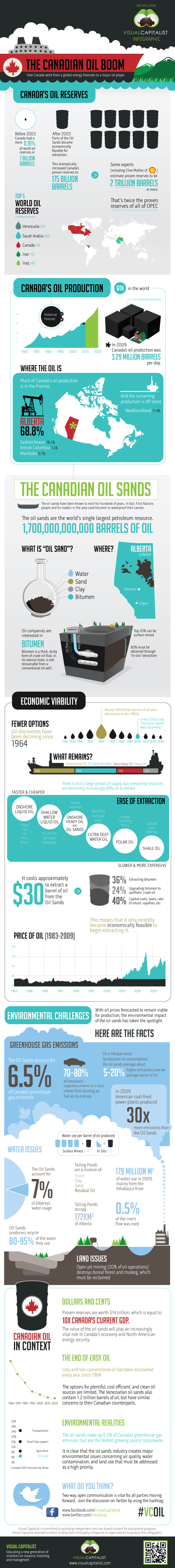
Canada #1 In Oil Reserves in The World – Amazing Graphics Showing 2 Trillion Barrels Of OilSands Oil
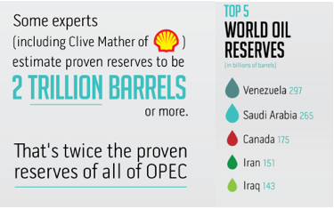
Canada is sitting on an Ocean of money. 2 Trillion Barrels of Oil! is a massively more than our current status 175 Billion Barrels proven, which now ranks us #3 in the World after Venezuala & Saudi Arabia. Let this visual story (main chart below) convince you of the Massive Wealth, practically unimaginable change, opportunity & Prosperous Future in the offing. 2 Trillion is more than twice the entire reserves of OPEC. Bottom line, Canada’s Developing Oil Wealth combined with hungry customers like China & the easy to ship to US…….makes the Shieks of the Middle East begin to look like homeless paupers by comparison.
To realize this wealth, all Canada has to do is clean up the Worlds largest Natural Oil Spill.
For Larger Image Click HERE or on the image itself below:

“He may look like an idiot and talk like an idiot, but don’t let that fool you — he really is an idiot.”
– Groucho Marx
John Ross asked me this morning if I could create a scenario whereby stocks fall. I laughed and said, “Well … no!” And maybe that is the point. No doubt ‘if you are not long, you are wrong’ is playing out in spades. But we’ve seen that sentiment many times before near tops.
The primary thematic shaping up seems the idea that bonds have topped and as this money leaves bonds it will power stocks higher—globally. The idea seems to make sense; but often it is never that easy. Taking a look at the chart below, there doesn’t seem a heck of a lot of correlation to hang your hat upon, only to say the long-term trend higher in bonds (lower in yields) has been met by a corresponding big run in stocks.
Let’s consider some reasons why US stocks might NOT go a lot higher and, for grins, maybe even, dare I say it, “correct.”
- A recovery in the US economy could mean finally financial assets will start competing for funds and the Bernanke Put, i.e. QE moral hazard liquidity juice, fades. Bonds would get hit here, but stocks might at least correct.
- Bernanke’s concern the job market is still not healed may play out because fiscal stimulus fades as the year progresses. Thus, we have well below trend growth and rising prices for energy and food leading to at least a mild case of stagflation; that isn’t good for either stocks or bonds.
- Germany decides to go “all in” and throws its full faith and credit behind a Eurobond for the Eurozone. Immediately, the risk profile improves in Europe. S&P and Moody’s decide it’s time to upgrade European paper and at the same time downgrade US paper given that Washington can make no real cuts amidst ideological squabbling. Lots of capital flows back to European bonds and stocks and out of the US; a possible triple-whammy out of US assets (stocks, bonds, and the dollar).
- China financial and social unrest ramp up and the Communist Party is at odds on stimulus given their concern about inflation; therefore it’s better to have security locally than worry about Western markets; the additional stimulus never arrives as growth and demand forecasts for China ratchet lower. Likely bad for stocks, but maybe good for bonds.
- Eurozone. ‘Nuff said!
- Rising emerging market capital controls a la Brazil (tacitly condoned by the IMF) are met with rising trade tariffs from developed countries. Money flows out of risk assets (stocks), quickly from the periphery, and back into bonds as global trade falls.
- Republicans win the White House and Congress, fire Ben Bernanke, and make Ron Paul Fed Chairman. They cut the budget deficit twice as much as what Paul Ryan is lobbying for. Ultimately it would be the best thing that happened to the US financial position in a hundred years, but there would be hell to pay as US credit drains from the global economy (and we have to listen to the moochers whining and crying about “fairness” day in, and day out). US bonds rally big time, so does the US dollar; stocks would likely be hit very hard initially, then stage a gargantuan rally. [I know; but a guy can dream.]
For now, “don’t fight the Fed” and “the trend is your friend” are winning the day. And if the bulls are right about US recovery, European healing, and new Chinese stimulus soon on the way, it could keep running. No doubt.
Tags: China, Federal Reserve, Ben Bernanke, US Dollar, US Treasuries, BRICS, US Bonds, eurozone, commodities


-
I know Mike is a very solid investor and respect his opinions very much. So if he says pay attention to this or that - I will.
~ Dale G.
-
I've started managing my own investments so view Michael's site as a one-stop shop from which to get information and perspectives.
~ Dave E.
-
Michael offers easy reading, honest, common sense information that anyone can use in a practical manner.
~ der_al.
-
A sane voice in a scrambled investment world.
~ Ed R.
Inside Edge Pro Contributors

Greg Weldon

Josef Schachter

Tyler Bollhorn

Ryan Irvine

Paul Beattie

Martin Straith

Patrick Ceresna

Mark Leibovit

James Thorne

Victor Adair