
Asset protection
Bottom line, Golds inability to break the $1360/70 barrier for nearly two years including multiple attempts recently, yesterday’s action indicates we sit on the precipice of a sizeable downswing – R. Zurrer for Money Talks
Gold soared yesterday, likely based on the escalation of the trade conflict between the U.S. and China, but after several hours the rally was over. The tensions didn’t really subside, but the price of gold is already about $10 below the price at which it was trading when yesterday’s rally had started. Is gold trying to say something? No. It’s not saying – it’s screaming.
There is a combination of two factors that makes the current situation particularly interesting and meaningful. The first factor is what we already discussed in the previous alerts – gold’s decline was delayed because new bullish fundamental news kept emerging. We wrote that eventually there would be no new bullish news and that the price of gold would move back to its default mode and resume its decline.
The second factor is that if a given market no longer reacts to factors that should trigger a specific kind of reaction, then it’s a clear sign that the market is about to move in the opposite direction. Yesterday’s session in gold showed exactly that – gold should have rallied, and it did – but only initially. There was not enough buying power to keep pushing gold higher. In fact, buyers were not even able to prevent gold’s decline in the final part of yesterday’s session. Today’s pre-market downswing (gold is at about $1,325 at the moment of writing these words) confirms that the buying power (at least temporarily) almost dried up.
Combining the two previous paragraphs gives us a picture in which gold is not only unwilling to rally substantially based on positive news – it’s not even likely to rally temporarily based on them. It means that both: gold’s next move is likely to be a sizable downswing and that the time for the consolidation is up or almost up.
Before we move to charts, we would like to explain how the market tends to react if it really wants to move in one way (here: decline), but the fundamentals keep interrupting it (here: bullish fundamental gold news – news that’s bullish from the fundamental point of view). We’ll not going to explain a sophisticated econometric model for this and we’ll not going to use terms as first derivative or diminishing marginal returns. Instead, we’ll use a simple analogy to something from real life. It will not be a pleasant analogy, but if it generates any emotions, then it’s more likely that it will be easier to keep in mind.
Think of a hardcore drug addict. They have to keep on getting more and more of their “stuff” to keep them happy. They have to constantly increase the amounts of drugs that they take to get the same effect. Even though the final effect is the same – they get their “enjoyment” – the cause is only the increase in dosage. If they didn’t increase it, they would get smaller effects up to the point when it would not be noticeable. If they stop taking the drug at all (eventually, they are likely to run out of it, or their health is too damaged), their “enjoyment” turns into a nightmare.
Similarly, the price needs more and more bullish news to keep on rallying and at some point, the same amount of news (or the same importance of them) will start to generate smaller and smaller rallies. It would take more dramatic and more bullish pieces of news to trigger the same upswings. If the bullish news dosage stays the same, the price will rally at a slower pace and finally stop to rally at all. Once the bullish news is gone (or we have bearish news), the rally turns into a decline.
Yesterday’s session in gold likely shows the final stages of the above cycle and the implications are very bearish.
Having said that, let’s take a look at the charts starting with gold (chart courtesy of http://stockcharts.com).
Gold’s Daily Reversal
(click all charts below for larger images)
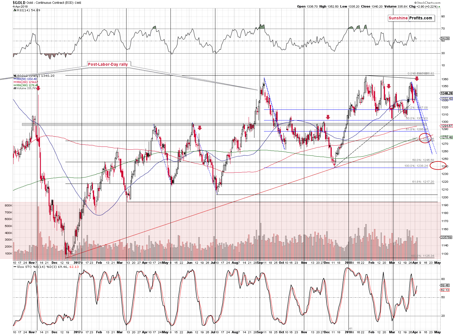
Technically speaking, gold reversed on significant volume, which is a classic sell signal. The implications are even greater than based on just the above, because we also have supporting analogies. Namely, this is the kind of reversal that we saw quite a few times before big slides, but after tops in terms of daily closing prices. We marked those cases with red arrows.
The most prominent example is early November 2016 and we can see the remaining ones (that are actually more similar to the current situation) in June 2017, on Dec 1, 2017 and in late February 2018. They were all followed by declines practically right away and it seems that today’s pre-market decline proves that history is repeating itself. It was not a good idea to be invested in gold back then, it’s doesn’t seem to be a good idea right now (except for the insurance capital, that is).
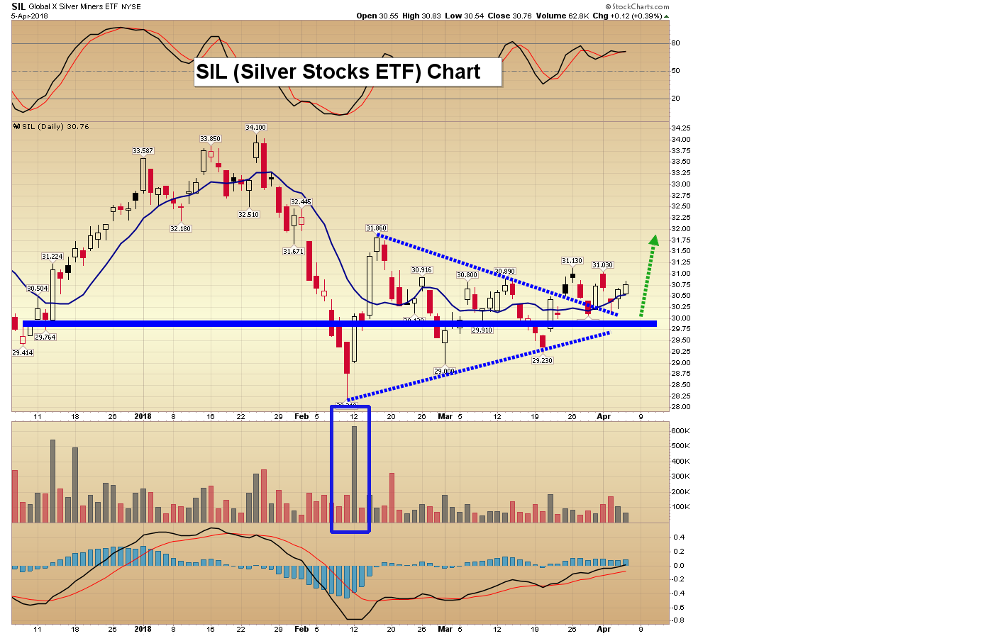
Silver’s Daily “Strength” Invalidated
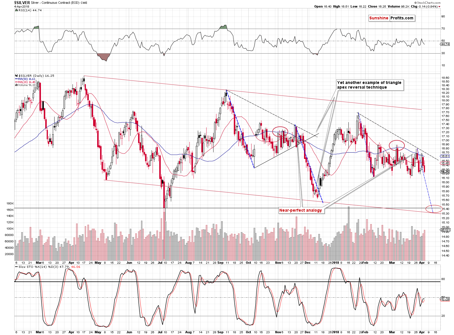
As you can see on the above silver chart, this week’s early strength is now fully invalidated. Actually, in today’s pre-market trading, silver even moved below the late-March low. In the previous articles, we warned you not to trust the silver upswing and it was indeed followed by lower prices practically immediately.
Please note that for more than a week, silver’s daily declines have been accompanied by volume that’s higher than what we have seen during daily upswings. The implications are bearish.
In terms of the analogy to the pattern that we saw from September 2017 to early December 2017, we are now likely in a situation similar to Nov. 28, 2017 – right before the decline.
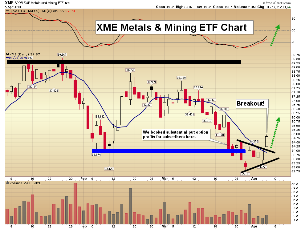
Miners’ Underperformance Continues
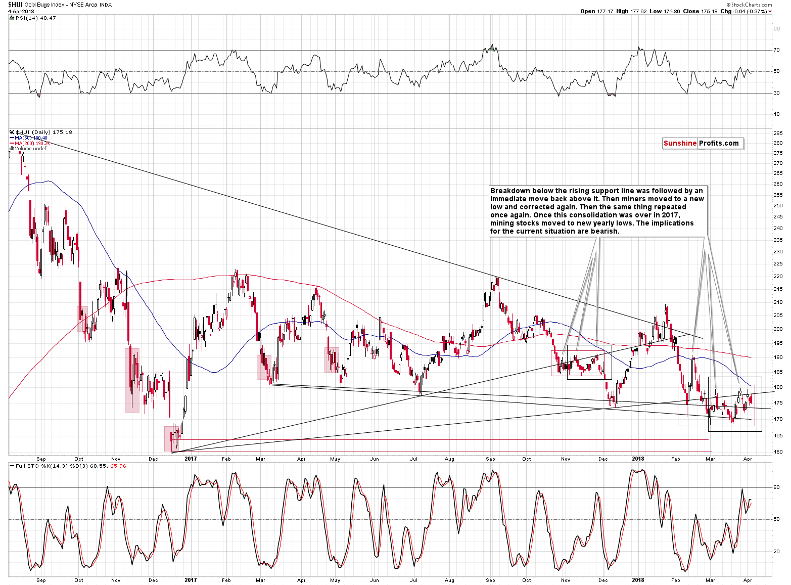
Even though gold moved a bit higher yesterday, gold stocks declined. That’s yet another clear sign of underperformance of the miners. The implications thereof remain bearish.
The EUR/USD Trigger
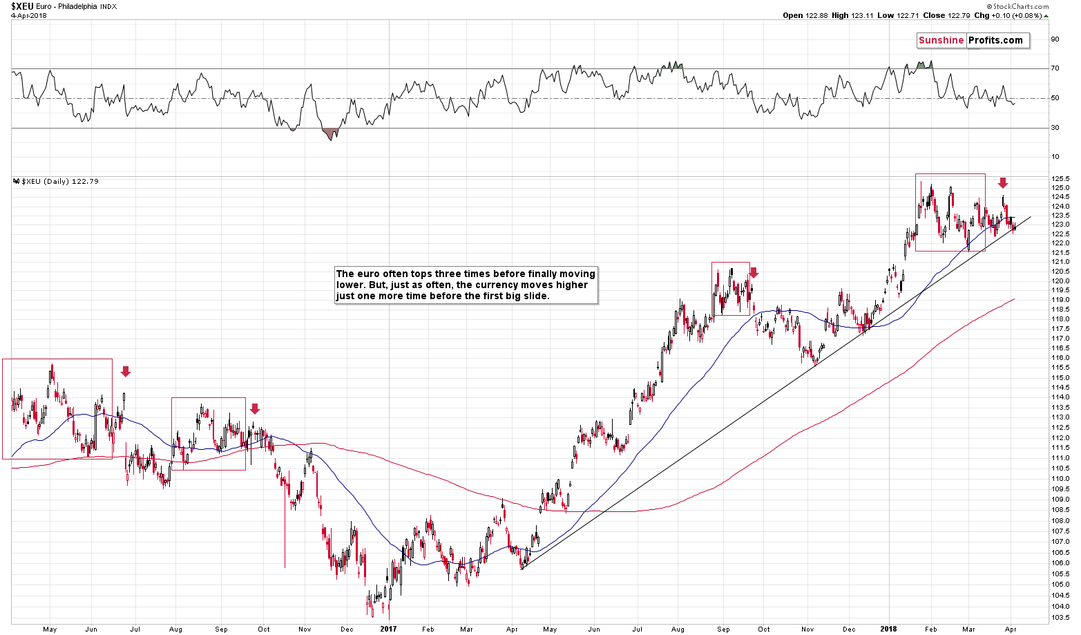
In yesterday’s alert we wrote that the situation in the EUR/USD currency pair remained tense and we wrote that it the pair was likely to break below its rising medium-term support line sooner rather than later. We wrote the following:
This support is what’s keeping the currency pair in check, which in turns keeps the USD Index in check. But, i.a. based on the triple-top formation it seems that we’ll see a big breakdown in the euro relatively soon. The implications are bullish for the USD Index and bearish for the precious metals sector.
The above remains up-to-date. The thing that we would like to add today is that despite the increased trade conflict tensions the USD’s value didn’t really decrease, which can be a sign that it really wants to move higher, not lower. That’s in perfect tune with our technical analysis of the USDX and also a factor supporting the scenario in which the EUR/USD pair breaks lower shortly.
Summary
Summing up, the fact that gold reversed its initial news-based rally is a very bearish sign for the following days and it suggests that the prolonged consolidation is over. Meanwhile, the next reversal date is looming, and it’s another reason that suggests that we’ll either see a decline shortly or that we’ll see more back-and-forth movement and a decline on April 9 or close to this date. The former is more likely at the moment. The Euro Index is on the verge of breaking lower, which is likely to push the USD higher and trigger a slide in the PMs. In other words, it doesn’t seem to be a good idea for one to keep a lot of gold in their portfolio at this moment.
Naturally, the above is up-to-date at the moment of publishing it and the situation may – and is likely to – change in the future. If you’d like to receive follow-ups to the above analysis (including the intraday ones, when things get hot), we invite you to subscribe to our Gold & Silver Trading Alerts.
Thank you.
Sincerely,
Przemyslaw Radomski, CFA

During the nearly 2 years Gold has been capped by the $1360 – $1370 level Morris Hubbartt thinks junior mining stocks have been tracing out some impressive patterns and several juniors are poised to move sharply higher. Analysis of the Dow and Nasdaq is also included below. Before pulling the trigger, read this missive Gold is not Saying Something – Its Screaming It– R. Zurrer for Money Talks
Here are today’s videos and charts (double click to enlarge):
SFS Key Charts & Video Update


SF60 Key Charts & Video Update


SF Juniors Key Charts & Video Analysis


SF Trader Time Key Charts & Video Analysis


Morris
website: www.superforcesignals.com


Last updated Apr 5 at 6:30pm
Even with the market rising 1000 points in 3 days investor sentiment is still extremely fearful and there are more bears than bulls. When there are this many bears and fearful people historically the chances are the market has seen, at the very least, a temporary bottom. R. Zurrer for Money Talks
Still More Bears Than Bulls
The weekly AAII bullish and bearish readings are meant to track individual investor sentiment towards the stock market. While bullish sentiment remained low for nearly all of 2017 (as the S&P 500 went up and up and up), it spiked up to the high 50s just as the market was peaking in January. The first 10%+ correction for the S&P 500 since early 2016 ensued, and like clockwork, the AAII bullish reading collapsed back down to the high 20s/low 30s.
AAII surveys individual investors on a weekly basis, and this week the bullish sentiment reading took a very small dip to 31.9%. At the same time, the AAII bearish sentiment ticked up very slightly to 36.64%. Given that sentiment readings are generally viewed as contrarian, it’s bullish to see more bears than bulls.

The attack on cryptocurrencies by centralized financial institutions in the name of “protecting investors from volatility” continues. Last week one of Canada’s largest banks blocked cryptocurrency purchases, a move that followed similar bans in the United States by large banks like JP Morgan. The Reserve Bank of India has issued a blanket ban on all cryptocurrency trading:
You will not be able to buy cryptocurrency via banks or e-wallets etc. in India anymore as Reserve Bank of India (RBI) has banned them with immediate effect from “dealing with or providing services to any individuals or business entities dealing with or settling virtual currencies”.
Whether it was the moves by Central Banks or that is just the excuse, a quick glance at these charts reveals the current state of the Crypto market – R. Zurrer for Money Talks
New Weekly Update: The Three Largest Cryptocurrencies
With all the focus on bitcoin lately, we’ve added a new weekly update that tracks the three largest cryptocurrencies by market share: bitcoin, Ether, and Ripple. According to Wikipedia, a cryptocurrency is “a digital asset designed to work as a medium of exchange that uses cryptography to secure its transactions, to control the creation of additional units, and to verify the transfer of assets.”
Bitcoin is the world’s first cryptocurrency and decentralized digital currency. The first bitcoin transaction occurred in early 2009 and has since grown worldwide. Ether is another cryptocurrency run on the Ethereum blockchain platform and has the second largest market share, despite being the newest of the three with its launch in July 2015. The third largest market share of cryptocurrency, XRP, is owned by Ripple and launched in 2012.
Here are all three cryptocurrency prices over time along with their trading volume. Data for all three is sourced from Coinbase.com and by request, we have shortened the time frame for a more recent picture.


We have also created an index in order to chart these together given their very different pricing history. Notice that Ether tops the chart – the price of an ether has changed the most out of all three cryptocurrencies.

….also from Jill:
The Four Totally Bad Bear Recoveries: Where Is Today’s Market?


Other markets that have already been thrashed, like Edmonton and Calgary, appear to be ready to take off now according to Ozzie Jurock in the interview below. Home sales in the red hot markets of Vancouver and Toronto (Toronto home sales tumbled 39.5 percent in March from the previous year) have succumbed in part to persistent attempts by Governments through tax and regulation to solve the housng shortage. (Note, the audio is rough in a few spots). There are some statistics below – R. Zurrer for Money Talks
Toronto home sales tumbled 39.5 percent in March from the previous year, while Vancouver sales fell 29.7 percent, according to data from the Toronto Real Estate Board (TREB) and the Real Estate Board of Greater Vancouver (REBGV).
Together, the Vancouver and Toronto regions account for about half of house sales by volume in Canada.
Sales of detached homes in Vancouver fell 37 percent, while condo sales were down 26.7 percent, as demand cooled and fewer homes were listed, REBGV said.
In Toronto, sales of detached homes plunged 46.3 percent and condo sales dropped 32.7 percent, as many would-be buyers put their plans on hold, TREB said.
The average selling price in the Toronto area was C$784,558($613,799), down 14.3 percent from C$915,126 in March 2017, though up 2.1 percent from February 2018.
The average selling price for a detached home, the most expensive segment of the market, plunged 17.1 percent, while the average condo price rose 6.1 percent.
In Vancouver, the average selling price for a detached home slid 6.2 percent, while the average selling price in the red hot condo segment was up 22.8 percent.
Demand for expensive detached homes has been cool in both cities as tax measures, along with stricter lending requirements and higher mortgage rates, have weighed.
At the same time, demand in the cheaper condo segment has remained strong, as buyers scramble to gain a foothold amid rapidly escalating prices and limited supply.
New listings fell 12.4 percent in Toronto and 6.6 percent in Vancouver.
“Even with lower demand, upward pressure on prices will continue as long as the supply of homes for sale remains low,” said REBGV president Phil Moore in a statement.
The Bank of Canada has raised interest rates three times since last July and another hike is expected later this year, and stricter lending rules took effect on Jan. 1.
The benchmark price, preferred by analysts because it smoothes out the composition of sales, was up 1.5 percent year-over-year in Toronto, and up 16.1 percent in Vancouver.
($1 = 1.2782 Canadian dollars)

-
I know Mike is a very solid investor and respect his opinions very much. So if he says pay attention to this or that - I will.
~ Dale G.
-
I've started managing my own investments so view Michael's site as a one-stop shop from which to get information and perspectives.
~ Dave E.
-
Michael offers easy reading, honest, common sense information that anyone can use in a practical manner.
~ der_al.
-
A sane voice in a scrambled investment world.
~ Ed R.
Inside Edge Pro Contributors

Greg Weldon

Josef Schachter

Tyler Bollhorn

Ryan Irvine

Paul Beattie

Martin Straith

Patrick Ceresna

Mark Leibovit

James Thorne

Victor Adair