
Wealth Building Strategies
Over a week ago, in my analysis to my members, I noted that, ideally, I was looking for the market to pullback and test the 2800SPX region. And, the market certainly dropped down to the 2800 region, but also broke the 2796SPX support upon which I was focused. That had me begin to focus on the 2700SPX region of support. And, today, we dropped and broke my next level of support at 2700SPX. But, this is the pullback I have been looking for over the last several months which had not materialized. Now, it has come in with a bang.
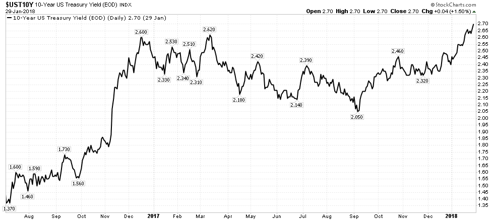
While this pullback took many by surprise, the common reason attributed to the decline last week was the rise in interest rates. I need help understanding this “reason.” Allow me to explain.
Back on June 27th, 2016, we published analysis to our members entitled “Beware of Bonds Blowing Up.” That was the first long term top call we made on bonds in the 5 years we had been open to that point. And, as we now know, the bond market topped a little less than two weeks later.
So, since July of 2016, rates have been rising. Most interestingly, the heart of the strongest segment of the drop in the bond market in 2016 coincided with the bottoming of the equity market at the time of the election, which began an extraordinarily strong rally in the equity market. Therefore, it is quite clear that the market rallied quite strongly while rates were rallying strongly at the same time.
Today, with the market dropping even stronger than last week, rates went down. Now, isn’t that a head scratcher?
So, shall we now review the common reason we read about the “cause” of the decline in the stock market last week? When we shine the light of facts on these reasons, do they really hold water? Of course not. Yet, that does not stop almost every analyst and their mother from making their specious claims.
Do you know why they make these claims? It is because they see the market dropping, and then look for what else is happening at the same time for what they can blame as the obvious cause. First, they saw good jobs numbers Friday morning, so that clearly cannot be the reason for the market dropping almost 2%. Then, they see rates rising on the same day, so they assume that this must be the cause since there is no other reason they can come up with. In truth, one could claim that the drop was due to the good jobs report, and it would make just as much as sense as blaming it on the rise in rates.
And, if rates were not rising, I can assure you they would have blamed the decline on Friday to the release of the Congressional memo (and I even heard some make this ridiculous claim). Maybe they will now claim that the drop was due to the release of the GOP memo, and then we rally when the Dems release their Memo?
In fact, why not claim that today’s drop was due to the Eagles win?
Is this really an intellectually honest way to analyze the markets? Clearly, it is not. So, how accurate do you think prognostication can be based upon the common manner in which these people view the market? Yet, this is what you look to read day in and day out to make your assessment about market direction?
Now, don’t get me wrong. I clearly missed the market’s direct move to 2800SPX this early in the cycle, as I did not expect us to strike 2800 until the end of 2018. Rather, I expected we would only reach 2611SPX from the 1800 region based upon my market call back in 2015, after which I expected a pullback before we head up to the 2800+ region. However, because I miss an extension which resides in the category of a probabilistic anomaly does not suggest that the methodology I use is intellectually dishonest. Yet, I think it is quite clear that these common perspectives on what moves the market is clearly intellectually dishonest.
Now, when the market provides us with an upside move which is a statistical anomaly, it puts itself in a very dangerous posture. And, today, we saw the result of the unwinding of that dangerous posture. In fact, we saw another statistic anomaly, but on the way down.
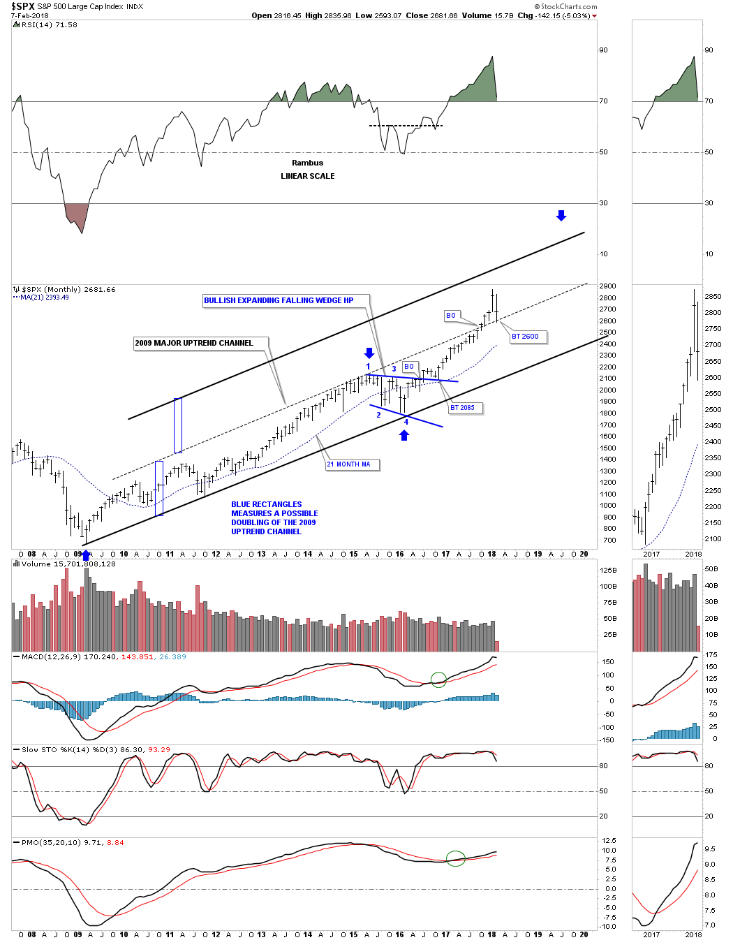
 I am certain you will now hear constant talk about how this is the end to the bull market. But, I think the probability of that potential is still quite low. Rather, this is the wave (4) pullback for which I have been awaiting. And, as you saw in my last article on the market, I provided you with a chart showing that we were completing wave (3) of v of 3 off the 2009 lows. That meant we were expecting a wave (4) to be overdue. As you can see on my attached chart updated below, we are looking for the market to hold support between 2424-2539SPX, and then start a rally into year end which will target at least the 3011 region, but with strong potential to extend to the 3223SPX region.
So, while you will undoubtedly hear about how this bull market has now come to an end, I am still thinking we are going to set up another rally over 3000 into the end of the year. But, once we complete this next rally, that will likely set us up for a 20% (maybe more) correction taking us into 2019.
See chart illustrating the wave counts on the S&P 500.
Avi Gilburt is a widely followed Elliott Wave technical analyst and author of ElliottWaveTrader.net (www.elliottwavetrader.net), a live Trading Room featuring his intraday market analysis (including emini S&P 500, metals, oil, USD & VXX), interactive member-analyst forum, and detailed library of Elliott Wave education.

While U.S. oil production reached a new peak of 10.25 million barrels per day, the higher it goes, the more breathtaking will be the inevitable collapse. Thus, as the mainstream media touts the glorious new record in U.S. production that has both surpassed its previous peak in 1970 and Saudi Arabia’s current oil production, it’s a bittersweet victory.
Why? There are two critical reasons the current record level of U.S. oil production won’t last and is also, a house of cards. First of all, oil production profiles tend to be somewhat symmetrical. They rise and fall in the same manner. While this doesn’t happen in every country or every oil field, we do see similar patterns. For example, this similar trend is taking place in both Argentina and Norway:

Here we can see that oil production increased, peaked and declined in a similar pattern in both Argentina and Norway. However, many countries had their domestic oil industries impacted by wars, geopolitical events, and or enhanced oil recovery techniques that have resulted in altered production profiles. Regardless, the United States experienced a symmetrical oil production profile from 1930 to 2007:

As we can see in the chart, U.S. oil production from 1930 to 2007 increased and then declined in the same fashion. On the other hand, the new Shale Oil Production trend is much different. What took 23 years for U.S. oil production to double from 5 million barrels per day (mbd) in 1947 to a peak of nearly 10 mbd in 1970, was accomplished in less than a decade with the new shale oil industry. Total U.S. oil production doubled from 5 mbd in 2009 to over 10 mbd currently.
For those Americans or delusional individuals who believe the U.S. oil industry will be able to continue producing a record amount of oil for the next several decades, you have no idea about the financial carnage taking place in the U.S. shale oil industry. This leads me to the second reason. The U.S. Shale Industry hasn’t made any money producing oil since the industry took off in 2008. And it’s even worse than that. Not only have they not made any money, but they have also spent a lot of investor money (most that will never be returned) and added a massive amount of debt to their balance sheets.
According to the Financial Times article, In Charts: Has The US Shale Drilling Revolution Peaked?, they provided the following chart on the negative free cash flow in the U.S. Exploration and Production Industry:

Because the U.S. Shale Oil Industry was a Ponzi Scheme from day one, the shale oil companies had to design clever investor relations presentations to bamboozle, hoodwink, swindle and hornswoggle investors from their money. And boy did it work. Even though two-thirds of the U.S. shale energy companies are still losing money, investors continue to flood the energy sector with gobs of Dollars and Pennies from Heaven. Without these much-needed funds, the U.S. Shale oil industry would go belly-up.
Now, there’s another downside to the U.S. Shale Oil Industry that I haven’t yet mentioned. Because shale energy industry is producing a grade of oil that has a very high API gravity (very light oil), we have to export more and more of it as our refiners can’t use it all. The notion that the U.S. decided to start export oil because we have become a leading oil producer is pure BOLLOCKS. The real reason the U.S. Government allowed the exporting of oil in 2015 was that our refining industry couldn’t use it all…LOL.
If you have your thinking cap on, why would we have to export oil if we could use it ourselves?? Well, again… the answer is that we cannot use all of our “light tight” shale oil. Here is a chart from one of the members of the PeakOilBarrel.com site:

According to the U.S. Energy Information Agency (EIA), the majority of growth in U.S. oil production is in the very light API gravity oils above 40. Unfortunately, there is a glut of high API Gravity oils (light oil) in the United States and the world. In the Petroleum Economist article, U.S. Tight Oil: Too Light, Too Sweet, stated the following:
While the US runs on light products, with gasoline making up nearly 48% of the demand barrel, the rest of the world has a stronger taste for middle distillates. The global demand barrel is 36% middle distillates and only 32% gasoline. European and Eurasian middle-distillate demand is an enormous 49.3% of the barrel, according to the latest BP Statistical Review. Middle-distillate demand is widely expected to grow as worldwide trucking volumes increase and maritime fuels begin a major shift to marine gasoil from heavy fuel oil so they comply with new sulphur-emissions limits. Product consumption patterns outside the US argue for processing middle-gravity crudes such as Arab Light, Iranian Light and Russian Urals, rather than extra-light barrels such as 48°API gravity Eagle Ford.
The weighted average API gravity of EU crude imports in 2016 was 35.2°, according to Eurostat. Refinery inputs look similar: the current average API gravity of the crude entering American refineries is approximately 32.3°, nearly unchanged for the past 30 years despite the recent rise in light oil output. Worldwide investments into more complex, higher conversion refineries have eroded very light sweet oils’ long-prized light-distillate yield advantage.
As the article states, the rest of the world demands more middle distillate fuels that come from medium grade oil stock. Furthermore, the weighted average API gravity of EU (European Union) crude oil imports in 2016 was 35.2°. However, the majority of U.S. Shale oil API gravity is 40-50°+.
Thus, as the U.S. shale oil industry continues to produce more light oil, exports will likely increase. And we already see this taking place. The U.S. net oil imports have risen from 2 mbd in Oct 2017 to 4.4 mbd currently. It is difficult to tell how much net oil imports will be over the next six months, but it is quite interesting to see the U.S. importing more oil even though we just hit a record of 10.25 mbd.
In conclusion, U.S. oil production in the future will collapse just as fast as it increased. It is hard to forecast when U.S. oil production will finally peak for good because there is so much fraud, leverage, and debt propping up the system. But, when the Greatest Financial Ponzi Scheme finally pops… I believe U.S. oil production will collapse much faster than we realize.
Check back for new articles and updates at the SRSrocco Report.

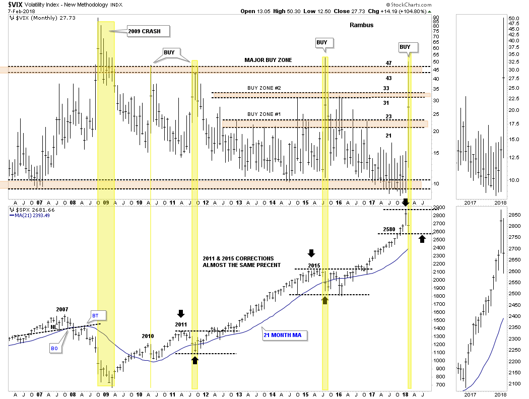
Before we look at tonight’s chart I would like to reiterate once more that we have traded one of the best bull markets runs in history. There was hardly a time over the last year or so that the stock markets were down more than 2 or 3 days in a row. It seemed like everyday I would log on to Stock Charts in the morning the SPX would always be up 3 to 5 points. It was just a steady move higher with little volatility.
Last Friday that nice gentle uptrend we had grown accustomed to came to an exciting climax. What we are experiencing right now is the beginning of some volatility that is going to take some time to get back under control. Think of dropping a super ball off the top of the Empire State building. First you get a really big bounce followed by a big decline then another bounce that is less strong with the next bounce getting weaker. At some point the initial volatility will be reduced back into normal price action.
During those volatile swings we should see some type of consolidation pattern build out that will be unrecognizable in the beginning, but as time passes it will slowly show itself. We know where the top of the new trading range is, but the bottom still needs some confirmation that Tuesday’s low is in fact the low for this next consolidation phase.
Lets start by looking at the 12 year monthly combo chart which has the VIX on top and the SPX on the bottom. When we looked at this chart on Monday night the VIX still hadn’t reached the 43 to 47 area which has shown us in the past where an important low on the SPX was. Tuesday we got the spike into the major buy zone which is strongly suggesting an important low is in place.
That being said a new trading range should develop to consolidate our previous impulse move up similar to what happened in 2011 and 2015. As you can see the VIX spike nailed the low, but there was a lot of chopping action before then next impulse leg up began which is how markets are supposed to work. The spike in the VIX marked the low in 2010, but it still took several months of bouncing along the bottom before the SPX rallied into the 2011 high. Even the 2011 VIX spike took the SPX three months of chopping around the bottom before the next impulse started.
It’s possible that the SPX could just reverse back up and takeout January’s high, but that would be the exception and not the rule. The horizontal black dashed lines show the 2011, 2015 and now our 2018 trading range that are all the same height. At this point in time I think it’s going to be more of a time thing than anything else as far the sideways price action goes.
This next chart is a daily combo chart we’ve been following for some of the US stock market indexes which is showing some interesting price action. I have mentioned many times in the past that an important trendline never dies, it just slowly fades away. From February to September of last year most of the US stock market indexes built out a bullish rising wedge formation. Normally during a corrective phase support can be found on top of a preceding consolidation pattern.
What I did on this combo chart was to extend the top rail of the rising wedges to see if they were still hot. In most cases they held initial support. Currently all the US stock market indexes are all trading above their top rails with the RUT being the weakest which is trading right on top of its top rail extension. It would be painful, but I wouldn’t be surprised if the top rails were backtested once more for good measure. If they held again that would be a very bullish setup.
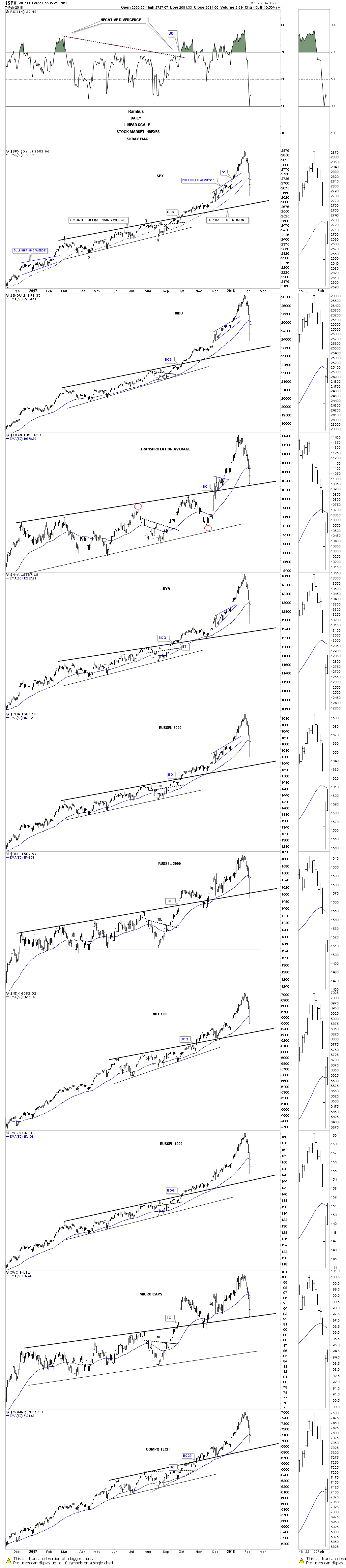
This next chart is the weekly combo chart we’ve also been following which has the all important 30 week ema on it. This week the 30 week ema was tested on all the indexes except for the tech indexes, the COMPQ and the NDX, which came very close to testing their 30 week ema. It’s been well over a year on many of these stock market indexes when the 30 week ema was last tested. So we can now add two more layers of support, the 30 week ema, the top rail of the bullish rising wedges to go with the spike on the VIX above 47.

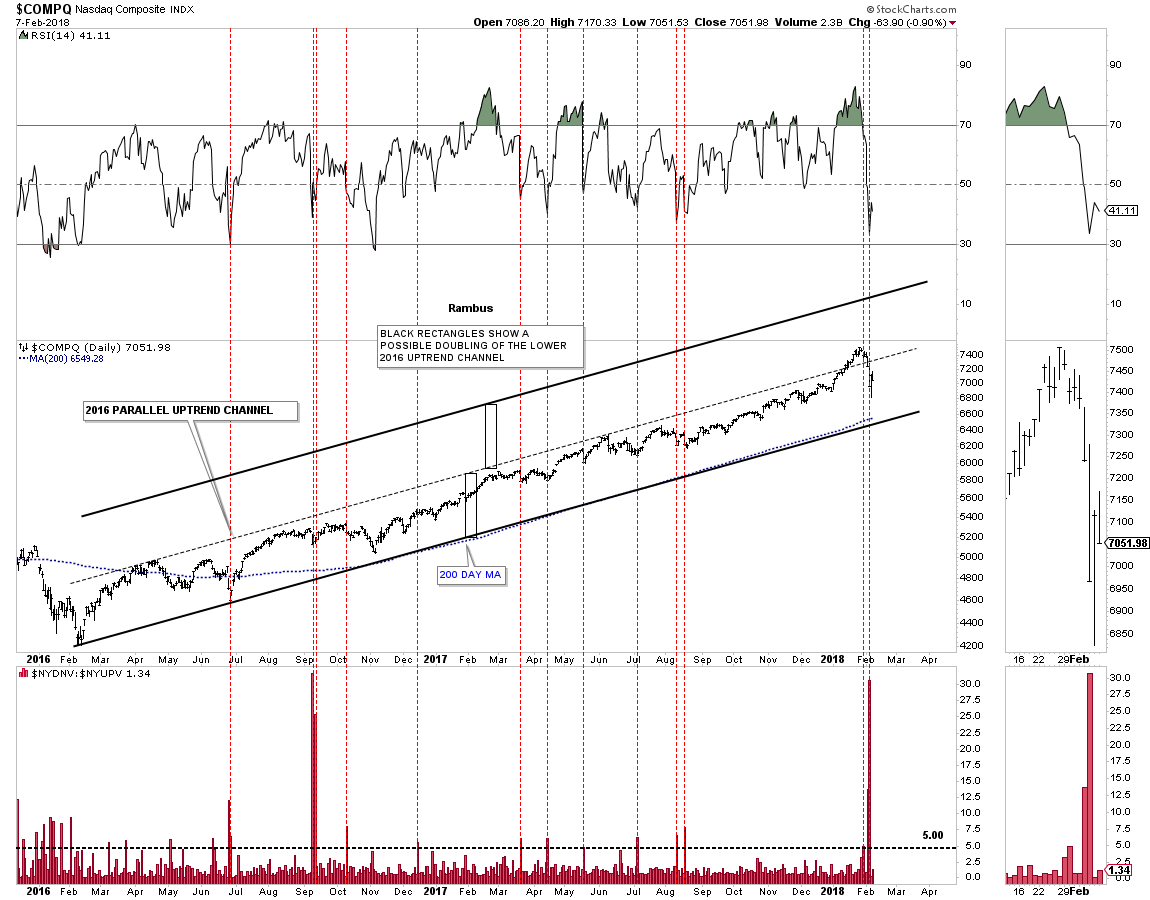
Next, lets look at some of the 2016 uptrend channels with the down to up volume chart below it, starting with the COMPQ. Normally when the down to up volume rises to 5.00 we are beginning to see some strong selling taking place which can start the bottoming process. The last time we had a massive spike in the down to up volume chart like we had on Monday was way back in September of 2015, which began the sideways trading range. Note how the 200 day moving average has formed the bottom trendline of the 2016 uptrend channel. Also note how the down to up volume spike looks on the RSI at the top of the chart.
Below is the 2 year daily chart for the SPX which shows its 2016 bull market uptrend channel with the price action testing the bottom rail with the high, down to up volume spike on Monday.
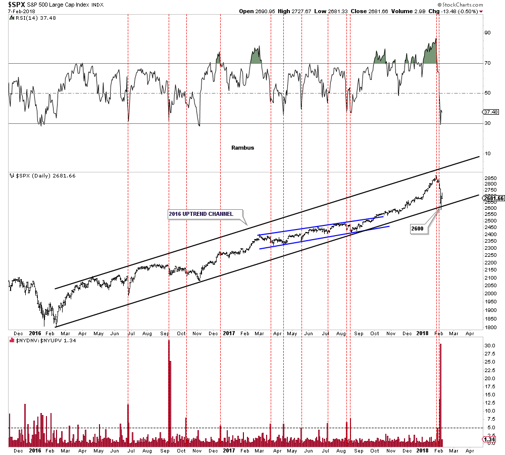
Below is a long term monthly chart for the SPX which shows its 2009 bull market uptrend channel. If the original 2009 bull market uptrend channel below the dashed mid line is in the process of doubling then I would like to see the dashed mid line hold support around the 2600 area.
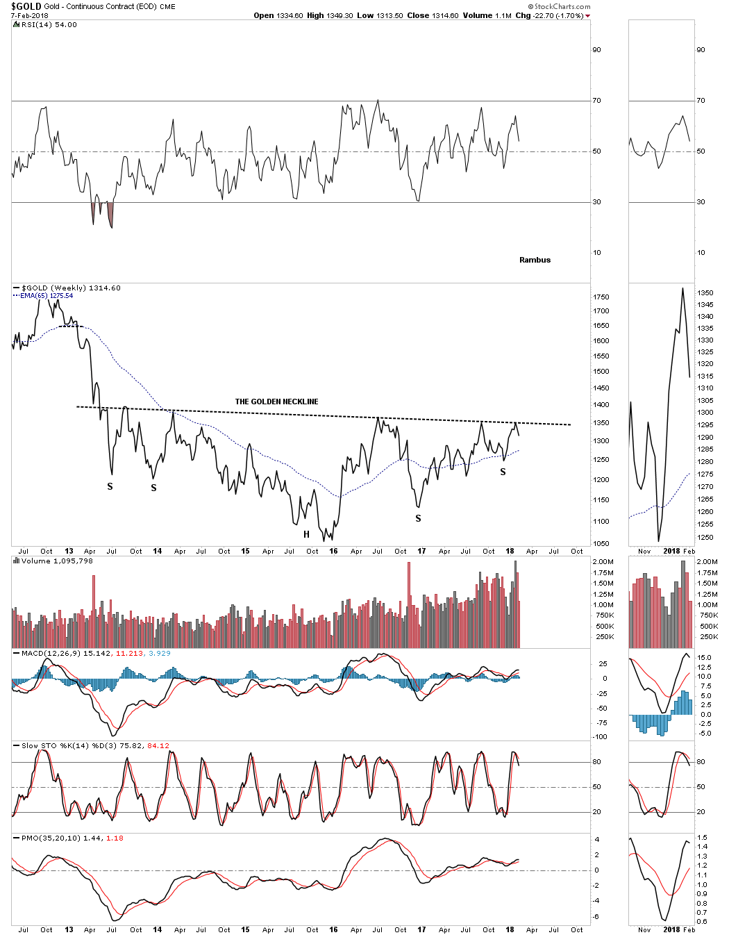
I’ve been so focused on the stock markets I haven’t had much time to look at the PM complex. Until gold can take out the golden neckline the bear market is still in force. That neckline is still holding resistance this week.
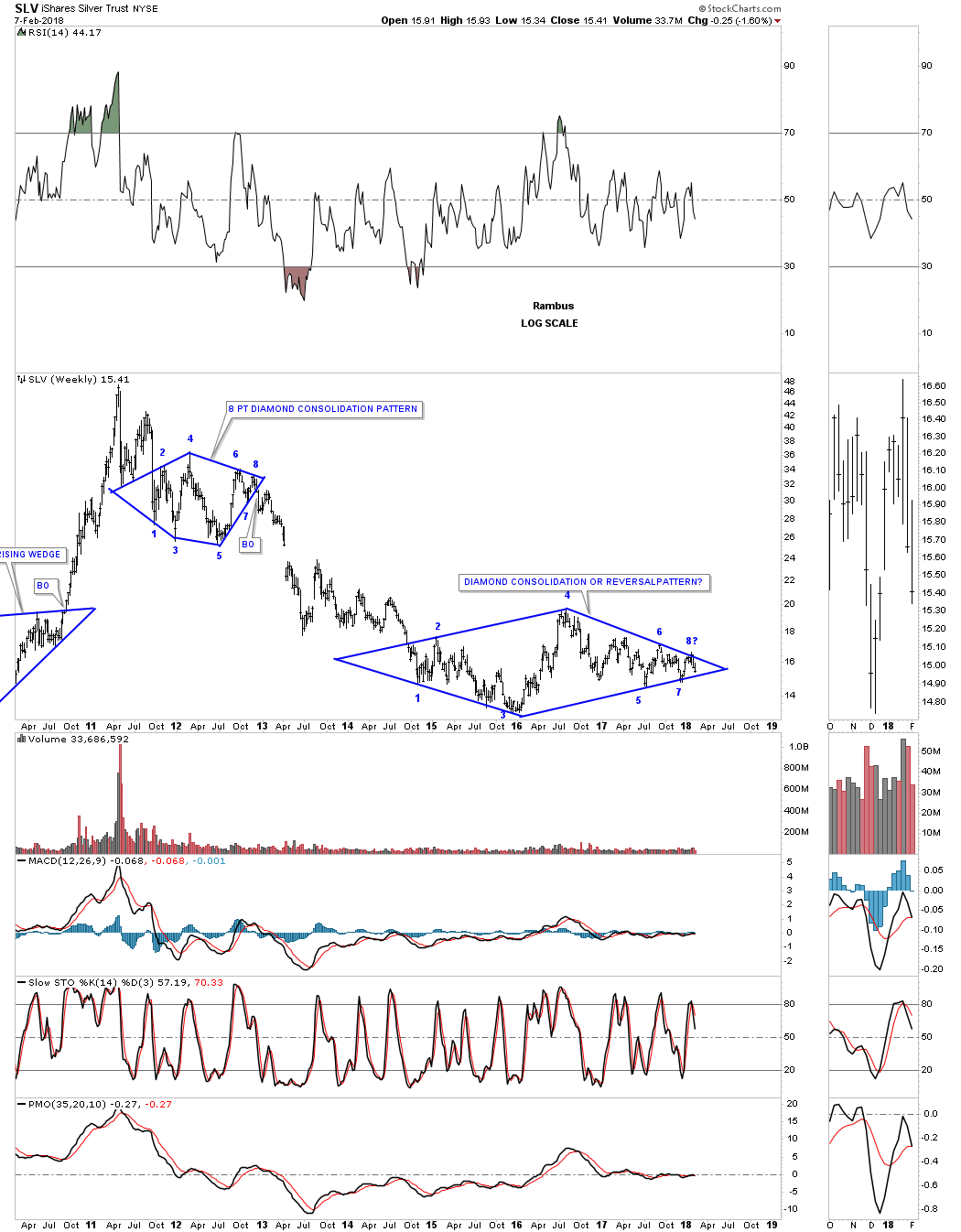
Three weeks ago it looked like SLV had a decent chance to finally breakout from that three plus year diamond pattern. When the price action hit the top rail that completed the seventh reversal point which would have put the diamond into the reversal category to the upside. The failure to breakout now put the price action into a possible 8th reversal point which would be a consolidation pattern to the downside if the bottom rail gives way. As you can see the price action is getting more compressed as the chopping action into the apex continues.
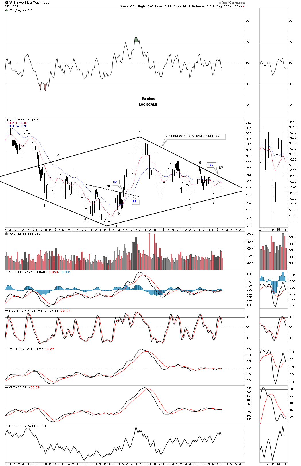
This long term weekly chart puts our current diamond in perspective. The million dollar question is what direction will the diamond breakout?
The easy part of our bull market in stocks is now over. Now the hard part starts. The volatility is going to be insane for awhile and that will drive most investors nuts. Understanding what is happening can relieve some of the pressure, but the markets are made up of emotions which is hard to control for most investors. Greed will trump fear every time. All the best…Rambus
“When is the cheapest time to buy a Christmas tree?” I asked my kids.
My kids guessed that the earlier you bought it, the better.
Trees should be cheaper if you bought them earlier because, well, they have little use until Christmas, according to them.
For them, a Christmas tree means Santa and presents.
So it’s of little value to them until Christmas Eve, when its value spikes up.
It took a bit of explaining to get them to see that trees crash in price as Christmas approaches.
If you’re in the business of selling Christmas trees, you know there is no market for trees after Christmas Eve.
Though my way of looking at it is less exciting than my kids’ way of seeing things, it’s the way things actually work for Christmas trees — and in financial markets.
In simple terms, it means looking at supply and demand.
Right now, demand for certain investments is set to plummet. When that happens, you’ll see the prices of all these things drop through the floor.
Here’s why this is going to happen starting now…
Supply and Demand and Corporate Bonds
You see, the Federal Reserve started raising interest rates regularly starting late in 2015.
Since then, the interest rate for one-month government bonds has rocketed up from essentially zero to a high of 1.33%. And these interest rates are continuing to go up.

It took a bit for these short-term rates to start affecting bonds that go out longer. However, by late 2016, interest rates on longer-term bonds like 10-year government bonds started to go up too.
The 10-year bond is used by professional investors to gauge the attractiveness of all investments and set the price of all assets.
That’s because worldwide, governments, big companies and rich people are willing to buy the bonds of the U.S. government at all times. They see these bonds as safe, knowing they’ll get their interest and the money back when they’re due.
Now, when you can get higher interest rates on something that’s seen as safe, the demand for things that are less safe goes down. And with demand lower, the prices of other assets that people hold for safety and income go down.
So, for example, many people have bought corporate bonds issued by companies at very low rates over the last 10 years.
These corporate bonds are less safe because unlike the U.S. government, companies can’t print money, and they can go bankrupt.
These bonds benefited when interest rates were very low because investors were willing to take on more risk.
Now these corporate bonds are a worse deal because you can get the same interest rate on government bonds. Because of this, prices of these bonds are going down and are going to continue to go down.
A Global Recovery
People who bought the stocks of no-/low-growth companies like Kellogg Co. (NYSE: K) and Campbell Soup Co. (NYSE: CPB) for their dividends are seeing losses. That’s because fewer people want these stocks now. These two stocks are down 20% to 30% from their highs, and they’re going to keep going down.
Next, many people have bought into gold, collectibles and tangible assets like diamonds because they believe the U.S. and global economy are going to go through another Great Depression. I believe the mania in cryptocurrencies like bitcoin began because of a similar reason.
Many people distrust the government and stocks after the 2008 financial crisis, and cryptocurrencies are another place that people have put money into as a safe haven against another crisis.
However, the U.S. and global economy are growing today. In fact, there is a synchronized global recovery going on right now. Every major economy in the world is showing growth, and I believe this is going to continue for some time.
Very low interest rates were used by governments and central banks to soften the blow of the financial crisis. And now economies around the world are growing again.
That’s good for almost everyone … except for investments that depend on another Great Depression.
You see, the likelihood of a financial crisis is how corporate bonds, slow-growth dividend stocks, gold and bitcoin are priced today.
Now, with economic growth happening worldwide and interest rates rising, the prices of these investments are going to get clobbered as people sell them.
One More Thing…
You might be thinking: What about stocks?
Stocks that are the beneficiaries of economic growth are going to keep going up.
I believe that the benefits of economic growth are going to be big enough and go on for long enough that the stocks of growing companies are going to keep rising even as interest rates rise.
Regards,

Paul Mampilly
Editor, Profits Unlimited
 QUESTION: You do not believe in wide diversification?
ANSWER: No. Wide diversification is only required when the investor does not have a clue about what is going on in the markets. We have asset allocation models for Institutions who simply believe they must have some diversification. The main objective is to limit the areas they will take losses on because of diversification. Why buy government bonds when you know we are at a 5,000 low? I am sorry, but sometimes the allocation to a particular segment should be ZERO!
….also from Martin:

-
I know Mike is a very solid investor and respect his opinions very much. So if he says pay attention to this or that - I will.
~ Dale G.
-
I've started managing my own investments so view Michael's site as a one-stop shop from which to get information and perspectives.
~ Dave E.
-
Michael offers easy reading, honest, common sense information that anyone can use in a practical manner.
~ der_al.
-
A sane voice in a scrambled investment world.
~ Ed R.
Inside Edge Pro Contributors

Greg Weldon

Josef Schachter

Tyler Bollhorn

Ryan Irvine

Paul Beattie

Martin Straith

Patrick Ceresna

Mark Leibovit

James Thorne

Victor Adair