
Stocks & Equities
This video explores a provocative hypothesis that stock’s current parabolic move will end much differently than anyone imagines.
Gary make the case that the market is only 1 month into its parabolic move and that when the correction comes it won’t be a collapse but a prelude to a further move higher.


The key message of this update is that gold is getting closer and closer to breaking out of a giant Head-and-Shoulders base pattern that started to form back in the middle of 2013 and to point out that it won’t be stopped from doing so by any minor short-term reaction, especially as the dollar has just broken down from a giant top pattern and looks set to plummet, notwithstanding any near-term rally to alleviate its oversold condition.
We’ll start by looking at the latest 8-year chart for gold which shows a fine flat-topped Head-and-Shoulders bottom. We can observe how a large and lengthy Right Shoulder has formed following the mid-2016 peak, that complements the large and lengthy Left Shoulder, making the pattern symmetrical, even if its component parts are a rather messy. We see how the price has risen up in recent months to challenge the resistance at the upper boundary of the pattern, and most importantly these runs at the resistance have been accompanied by a quite dramatic volume buildup, that has now driven both volume indicators to new all-time highs. This action by both volume indicators concurrently is very bullish indeed – it means that gold is destined to break out upside from this pattern into a bullmarket soon, regardless of what efforts the supposed “cartel” with their paper shenanigans make to stop it, and it’s not hard to see why given how much physical has been mopped up in recent years by countries such as China, that understand gold’s true value. Upon breaking above the nearby band of resistance, the 1st target for gold is the quite strong resistance in the $1520 – $1560 area.

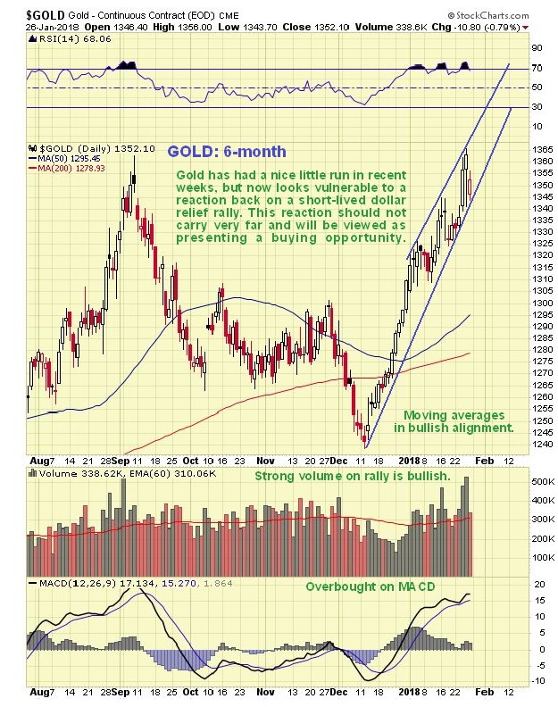
On gold’s 6-month chart, however, we can see that it has had a nice run in recent weeks that has resulted in it becoming rather extended, and with sentiment readings now very bullish, we should not be surprised to see a modest pullback that would probably be occasioned by a relief rally in the dollar to alleviate its oversold condition. We can use any such pullback to do additional buying, especially of gold and silver stocks.
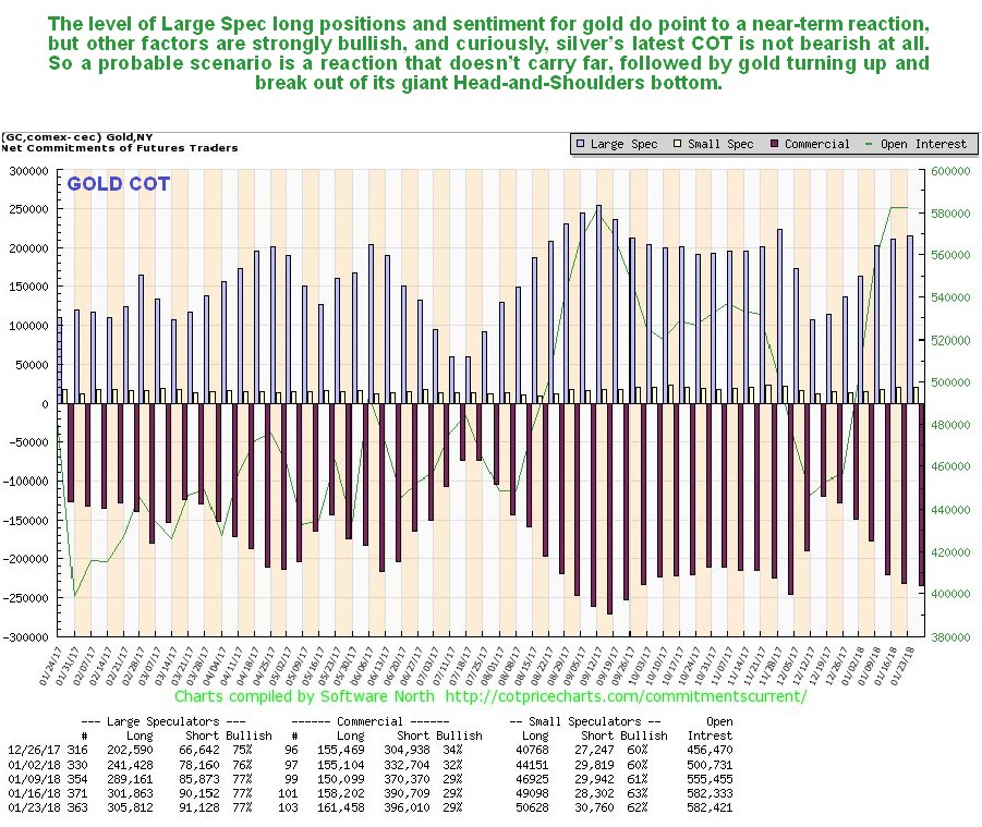
Gold’s latest COT shows that Large Spec long positions have risen to quite a high level, not enough to prevent it rallying further, but to a level that makes a reaction back more likely, and any such reaction would put gold in a stronger position to mount a sustainable breakout a little later.
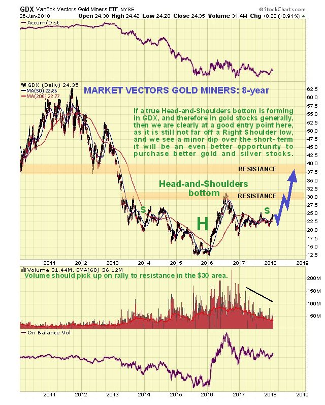
Click on chart to popup a larger clearer version. The 8-year chart for the GDX shows a large Head-and-Shoulders bottom completing that parallels the one in gold itself, the main difference being that GDX is still a lot closer to its Right Shoulder lows than gold itself, which means that we are still at a good point to accumulate gold and silver stocks, and it will be even better if we see a minor dip over the short-term as shown.
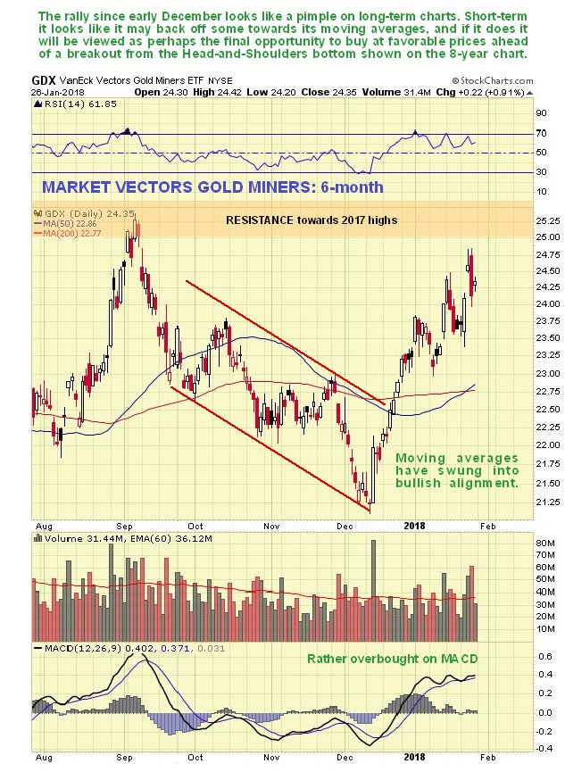
On the 6-month for GDX we can see that it has had a good run since mod-December, like gold itself, but being close to resistance now and starting to roll over, there is fair chance of its dropping back some towards its moving averages, and if it does it will present an even better opportunity to buy mining stocks at better prices.
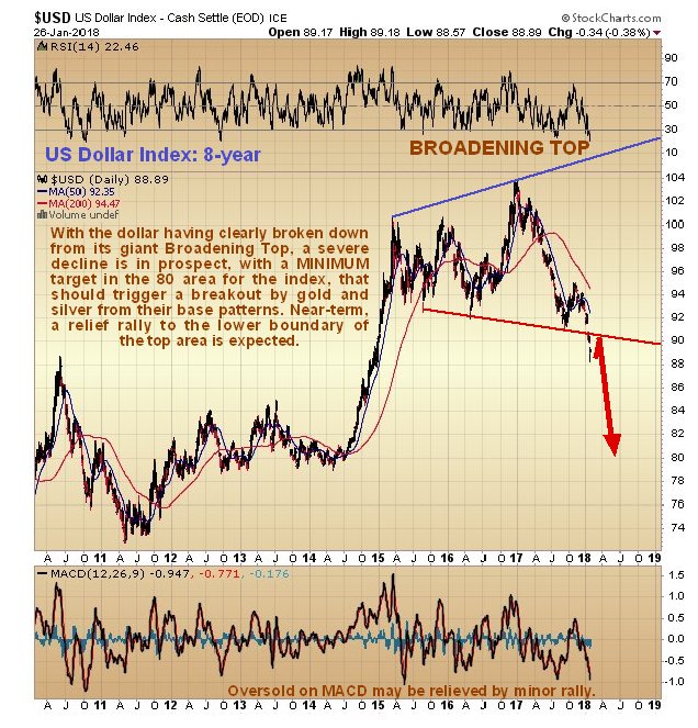
A big reason for gold getting ready to break out is the dollar having just broken down from its large Broadening Top formation, which happened over the past 2 weeks. On the 8-year chart for the dollar index we can see that this looks like a clear and decisive breakdown, and while it will be normal for it to now rally back in a deceptive manner over the near-term to the lower boundary of the Broadening Top, it should then go into decline again and drop swiftly to its initial downside target in the 80 area, as shown by the red arrow on the chart. Obviously, such a drop is very big and will have major ramifications for most markets, not least of which is the Precious Metals market.
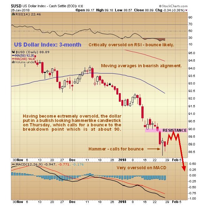
On the latest dollar index 3-month chart we can see its breakdown move this month in detail, and we can also see how it has become very oversold on short-term oscillators, making a near-term rally to relieve this oversold condition likely. Thus it is interesting to observe that a bullish looking hammerlike candlestick formed on Thursday, and we now want to see the volume associated with this candle which we can do via a proxy, but first we should note how far any rally is likely to get – it will probably get no further than the resistance at the underside of the bear Flag that formed about a week ago, as shown on the chart, which should coincide with a minor dip by the Precious Metals sector.
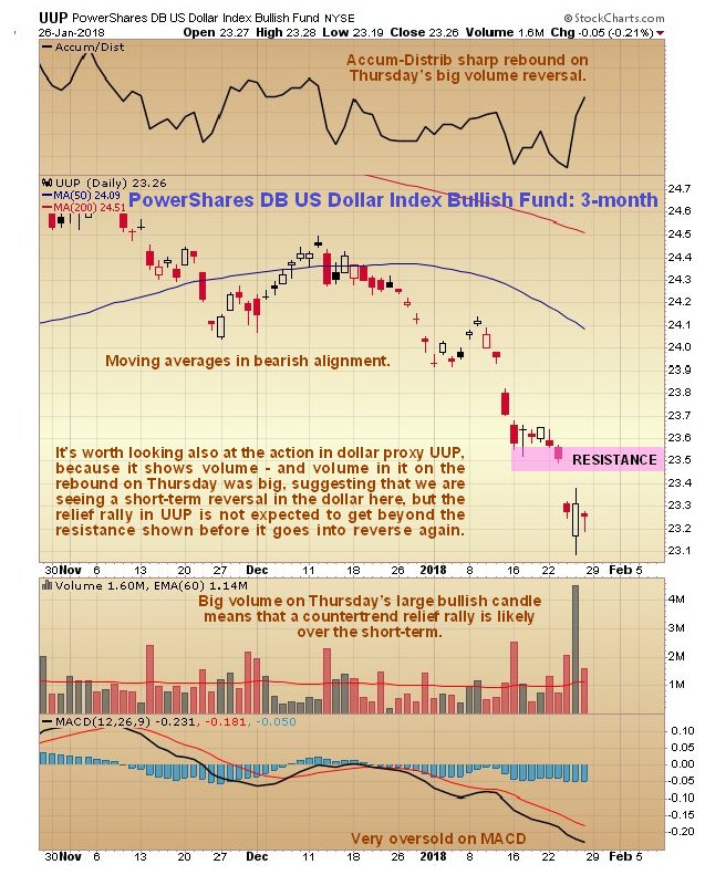
The 3-month chart for dollar proxy PowerShares DB US Dollar Index Bullish Fund (UUP) shoed that at the time that hammerlike candle formed on the dollar index chart on Thursday, a large white candle formed in UUP on very strong volume, driving it Accum-Distrib line steeply higher. This is a strong sign that a relief rally is about to start in the dollar, although as detailed above, it shouldn’t get very far before the larger downtrend reasserts itself.
So there we have it – a very bullish picture for gold indeed, notwithstanding any short-term dip, and it is worth pointing out in closing that rising interest rates are good for gold, and that a reversal in the stockmarket will also be good for it, as gold will be in demand again as a safehaven, especially as Treasuries are no longer an option, and with everyone bullish on the stockmarket now, and everyone who wants in in, a reversal looks imminent.

 1. Back to the Norm – Equity vs Real Estate
by Brent Woyat
At the end of last year, the Federal Reserve Bank of San Francisco published a paper* on historical rates of return of major assets. The report also shows that average returns from real estate and equities have been roughly similar, but equity volatility has been twice that of real estate (Figure 1)
2. Don Vialoux Calls For Sold Out Commodities To Rally
with Michael Campbell
Featured Guest Don Vialoux on his favorite winter trades. One, commodities, has Don excited because that market sector that is very sold out & rising from a low point
3. Buckle Up For a Major Sea Change
Michael Campbell & Victor Adair
The CRB Index hit its All Time High in 2011 and, relative to the S+P 500 Stock Index it has fallen ~74% in the past 7 years to an 18 year low!

It’s deja vu all over again as the dollar resumed its decline against all major peers on Friday amid concerns over U.S. trade policy, after a brief rally that followed Trump’s comment on favoring a stronger dollar, setting the Bloomberg Dollar Spot Index heading for its seventh weekly loss. That would be the longest losing streak since 2010.

…also from ZeroHedge:
Will The ‘Buck’ Stop Here? The dropping Dollar is trying to hang onto a potentially important line of support.
We’ve all watched in amazement, while the equities markets around the world have risen to new highs. On Wall Street hardly a week goes by without a new record. There comes a time however when a sector becomes so overbought, that smart money begins to leave and search for a sector that has been overlooked. That moment is now at hand, as can be seen in our first chart – courtesy sources listed.

This chart compares equities to commodities. In 1970, 2000 and today, equities have become overpriced, while commodities are oversold and cheap by comparison. In 1973, 1990 and 2008, oil and commodities became overbought and investors sold commodities and bought stocks. If history repeats (and it often does), we are about to witness a massive switching from equities into commodities. This trend may or may not include oil, since it is already in a bull market, but because of ongoing demand in Asia it will include such items as natural gas, copper, lithium, vanadium, zinc, and cobalt, and the stocks of the companies that mine and produce these commodities will be in great demand.

This chart courtesy Zerohedge.com shows the average number of days in the US stock market between occasions where the index drops 5% or more is 92 days, all the way back to 1929. In the mid-1960s there was a stretch without a 5% correction for 386 days. In the mid 1990s the index went 394 days without a 5% correction. And now (as of Thursday Jan 25th) we have gone a record 399 days without a 5% pullback. So The S&P has NEVER been this over-valued, NEVER been this overbought, and NEVER gone this long without even a minor correction. Odds are…..

This chart courtesy goldchartsrus.com shows US Money Supply continues to rise, across all measures. This money needs a destination, and with the stock market in bubble territory, a lot of this money is destined for commodities.

This S&P GSCI Commodity Index chart courtesy sources listed shows an inflation gauge that is used by the NY FED. It is called the Underlying Inflation Gauge, and you can see it here as a light blue line. It is warning that price inflation is underway. At www.pdegraaf you’ll see that the Model Portfolio (which reflects live transactions) is currently ahead by 38% – well above the rate of inflation. It is very important that our investments stay ahead of the rate of inflation.

Featured is GNX the commodity index. Price is breaking out above lateral resistance, after already having broken out from beneath the 200WMA. The target for this breakout is at the green arrow. The supporting indicators are positive.

This chart courtesy Mark J. Lundeen will be a surprise to some. It compares US bonds, stocks, silver and gold to currency in circulation. The surprise is that since year 2000, gold has outperformed equities by 4.60 to 2.27. Even silver, – in an 18 year span, – has outperformed the stock market. It was inflation that propelled gold and silver to rocket higher in the late 1970s. Is history about to repeat? Whenever commodities are in a bull market, gold and silver tend to shine.
Peter Degraaf is an investor with over 50 years of experience. Google him, or visit www.pdegraaf.com
DISCLAIMER: Please do your own due diligence. Peter Degraaf is NOT responsible for your trading decisions.

-
I know Mike is a very solid investor and respect his opinions very much. So if he says pay attention to this or that - I will.
~ Dale G.
-
I've started managing my own investments so view Michael's site as a one-stop shop from which to get information and perspectives.
~ Dave E.
-
Michael offers easy reading, honest, common sense information that anyone can use in a practical manner.
~ der_al.
-
A sane voice in a scrambled investment world.
~ Ed R.
Inside Edge Pro Contributors

Greg Weldon

Josef Schachter

Tyler Bollhorn

Ryan Irvine

Paul Beattie

Martin Straith

Patrick Ceresna

Mark Leibovit

James Thorne

Victor Adair