
Stocks & Equities

As investors’ bullish sentiment moves up to euphoric levels, the markets are reaching extreme leverage. This is terrible news because a lot of people are going to lose one heck of a lot of money. According to CNN Money’s Fear & Greed Index, the market is now at the “extreme greed” level and if we go by Yardeni Research on “Investor Intelligence Bull-Bear Ratio,” it’s also at the highest ratio in 30 years.
But, of course… this time is different. Or is it? I continue to receive emails and comments on my blog that the Fed will continue to prop up the markets forever. Unfortunately, there is only so much the Fed can do to rig the markets. Furthermore, the Fed can’t do much to mitigate investor insanity in record NYSE margin debt or the massive $2 trillion in the global short volatility trade.
The $600 billion in NYSE margin debt suggests traders have racked up a record amount of margin debt (33% more since 2007) and the largest short volatility trade in history. By shorting volatility, investors are betting that the VIX Index (Volatility Index) will continue to move lower. A falling volatility index suggests more calm and complacency in the markets.
So, the market will likely continue higher and higher, until it finally POPS. And when it does, watch out.
I’ve put together some charts showing the extreme amount of leverage in the markets. While this leverage may increase for a while, at some point the insanity will end in one hell of a market correction-crash.
The Commercial Banks Are Betting On Much Lower Oil Prices
As I mentioned in previous articles and my Youtube video, Coming Big Oil Price Drop & Market Crash, the Commercial banks have the highest net short positions in the oil market in over 20 years. In the video, I explained how the Commercial net short position in oil increased from 648,000 to 678,000 contracts in just one week. Well, according to the most recent COT Report (Commitment of Traders), the Commercials outdid themselves this week by adding an even larger amount of short contracts.
The Commercial net short position in the oil increased by a stunning 58,0000 contracts to another record high of 732,000:

If we look at the “Commercial” long and short positions at the bottom of the chart, we can see that the total short contracts increased to 1,486,922 while their longs fell to 755,208. So, the Commercials added a 46,000 more shorts and reduced their longs by roughly 12,000 contracts. Furthermore, the Commercials are only 34% Bullish about the current oil price while the Large Speculators are 85% Bullish.
When the Commercials hold a very large net short position in commodity, metal or asset, that normally indicates a correction will shortly take place. Especially, when the Commercials hold the largest short position in oil, going back for more than 20 years:

The BLACK line represents the oil price, and the BLUE line is the Commercial net short positions. Right before the oil price fell from $105 in mid-2014 to a low of $30 at the beginning of 2016, the Commercials held nearly 500,000 net short positions. However, as the oil price increased from $42 at the end of September to $64 currently, the Commercials net short position increased from 350,000 to a massive 732,000 contracts:

In my video linked above, I mentioned that the technical analysis indicator of a shooting star suggested that the oil price may have peaked. Well, it looks as if this may be true, but time will tell. However, we can clearly see that the Commercials record net short positions provide us with evidence of extreme leverage against the oil price. I would not be surprised to see a $20+ decline in the oil price as the Commercials liquidate their short positions back toward more normal levels.
A $40 oil price is not good for the U.S. Shale Oil Industry. I will be publishing a new video shortly on the ongoing U.S. Shale Energy Ponzi Scheme and the financial disaster taking place in the U.S. shale oil and gas industry.
Regardless, if the leverage in the oil market is reaching record levels, you should see what is taking place in some of the Dow Jones Industrial stocks.
WARNING: EXTREME MARKET LEVERAGE, Dow Jones Stocks Are Well Beyond Bubble Territory

I get a laugh when I receive emails from individuals who write me stating, “This time is different” in the stock market. They let me know that my calls for a bubble market and a crash have been overblown, severely overdue or simply, not true. While I am quite surprised at the longevity of this present bull market, my warning remains the same… THE HIGHER IT GOES, THE BIGGER THE CRASH.
Let’s take a look at some of the Dow Jones Industrial stocks and their price changes in just the past two weeks. As the overall market increased significantly since the beginning of the year, Caterpillar’s stock price increased from $161 to $170:

And if we remember my chart on Caterpillar from my first video, Stock Market Bubble vs. Gold & Silver, Caterpillar’s price was $137 on Nov 5th. So, in just two and a half months, Caterpillar’s stock price is up a staggering 24%:

You will notice that Caterpillar’s stock price experienced several short-term peaks, but nothing quite like what is taking place now. Another impressive mover in the Dow Jones Index is Home Depot. While Home Depot’s stock price chart isn’t as remarkable as Caterpillar, it is also moving beyond bubble territory:

From 2000 to 2012, Home Depot’s share price averaged approximately $25 a share. However, on Jan 5th it was trading nearly eight times higher at $192. But, if we look at its current price, it is NOW trading more than eight times higher at $201:

Now, could have Home Depot’s revenues and profits increased tremendously since 2012 to suggest a price of $201? According to Home Depot’s financial reports, their revenues grew from $70 billion in 2012 to over $100 billion in 2017. Furthermore, Home Depot’s net income has increased from $3.8 billion in 2012 to $6.8 billion in the first three quarters of 2017. But does a $30 billion increase in revenues and $6 billion increase in profits translate to a 700% increase in Home Depot’s stock price over the past five years?
Okay, let’s look at Boeing Airlines. What’s going on with Boeing’s share price? On Jan 5th, Boeing was trading at $308… nearly three times higher than what it was trading at $112 at the beginning of 2016:

As we can see, Boeing’s share price is up 9,200+% over the past 34 years. If we go by Boeing’s 2007 peak of $80, it’s up nearly four times. However, if we check the trading activity over the past two weeks, Boeing’s stock price is moving well beyond bubble territory to a new record high of $337:

Gosh, Boeing’s severely pointy price chart resembles the antenna on the Empire State Building in New York City. Good heavens, Boeing’s stock has gone up 10% in just two weeks. If investors don’t see anything wrong with this chart, you probably have been hanging around too many “Cryptocurrency Aficionados.” People, if you think the only direction is UP with stocks or cryptocurrencies, you need to get your head examined.
Here’s another chart worthy to compete with the tremendous gains in Bitcoin, Ethereum, and Ripple. However, this is one those industries that should NOT BEHAVE like a high-flying tech stock or cryptocurrency. Why, because it’s a healthcare stock. United HealthCare’s stock has surged from $53 in 2012 to $223 on Jan 5th:

If you were clever and started buying United HealthCare’s stock in 1990, you would be enjoying cryptocurrency type gains of nearly 43,000%. But that is all history now. United HealthCare’s price is up another 6% to $243 in just the past two weeks. If you look at the chart below carefully, you will see that its current two-week trend is virtually a STRAIGHT LINE higher:

United HealthCare and Boeing’s stocks represent a market that has gone completely insane. Unfortunately, the leverage in the market will likely increase from the current extreme levels to “outrageously” extreme… if there is such a term… LOL.
Investors need to understand that the Fed and Central Banks realize by rigging the market higher, it can only go in that direction. Ever since the 2008 U.S. Housing and Banking Market collapse, the world has been living on borrowed time, money and a massive amount of debt. By increasing the value of Stocks, Bonds, and Real Estate, the Fed and Central Banks not only give investors the impression that they are wealthier, so they spend more, it also allows governments to collect more taxes.
While inflated asset values allow governments to collect more taxes, they still aren’t enough to keep the economic and financial systems from collapsing. Yes, I know I am a broken record, but the FUNDAMENTALS DON’T LIE…. only humans do. So, a lie or a Ponzi Scheme can continue for quite a while. A perfect example is the Bernie Madoff 20-year Ponzi Scheme that defrauded investors by $65 billion.
If the Fed and Central Banks lose control over the markets (Yes, they will), then the ensuing collapse will make 1930’s Depression and the 2008 economic meltdown look quite tame indeed. As I have mentioned in several interviews, when the markets were crashing in 2008, the U.S. Oil Industry was still in relatively good shape. However, today the shale energy industry has debt up to its eyeballs and two-thirds to three-quarters of the shale energy companies are losing money:

The chart above by energy analyst, Art Berman, shows that the majority of U.S. shale energy companies lost money in the first three quarters of 2017. While Chevron, ConocoPhillips, and Statoil made money, they are not heavily invested in shale oil or gas as are the companies are shown in the RED.
Lastly, the oil price is getting ready to experience one hell of a correction-crash as the Commercials hold the largest number of net short positions in history. Furthermore, the NYSE margin debt and the Volatility Index are at extreme levels. This has allowed the stock prices of many companies to surge to completely insane prices.
While the leverage in the market will move from extreme to outrageously extreme before it crashes, the timing of this event is not years or decades away as some more WISHFULL thinking investors have deluded themselves into believing. Huge market corrections are normal, and stock market crashes have occurred many times in the past.
However, the present leverage in the market is now beyond bubble territory. When the markets finally crack, if you own some physical gold and silver, you will be one of the few 1% that will have protected your wealth as most individuals watch their investment bubbles pop.
Check back for new articles and updates at the SRSrocco Report.

While Gold is very close to a major breakout (in price) its strength has not filtered down to Silver yet. Gold is 3% away from a major breakout and comfortably above its long-term moving averages. However, Silver is well below its 2016 high and is currently battling its 200-day moving average. But that is okay. Silver typically lags and underperforms Gold until Gold gains momentum or breaks key resistance. A major breakout in Gold this year and its effect on Silver is just one reason why Silver could have a big year.
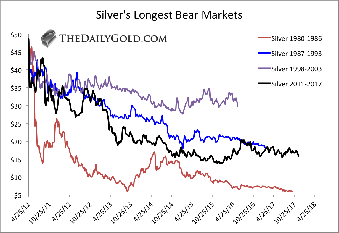
If and when Silver breaks above its 2017 highs, we can declare its bear market over (in terms of time). The chart below plots all of the major bear markets in Silver. They all end at the point when Silver begins to make higher highs and rises in an impulsive fashion. Silver’s bear market was the second worst by price and potentially the worst in terms of time.
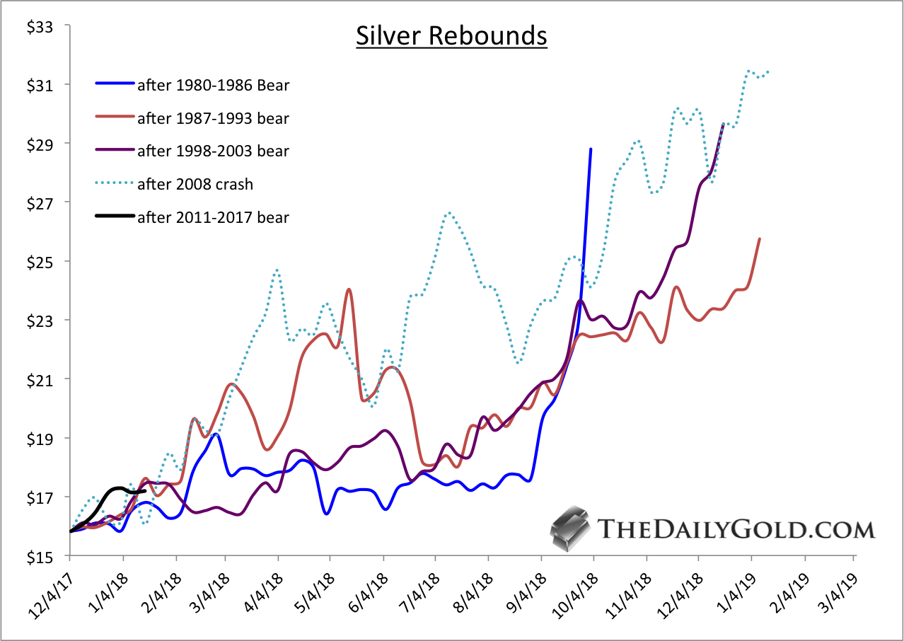
The next chart shows the rebounds in Silver from the endpoints in the previous chart. From the three endpoints Silver rebounded significantly in the next 12-15 months. We also included the 2008 crash from which Silver rebounded 100% in the following 13 months.
Turning back to the present, we find $20 on a monthly closing basis to be the most significant resistance for Silver. The chart below is a plot of monthly closing prices. It is quite clear that a monthly close above $20 (the 2016 high) could kickstart a good run for Silver.

Moving from the very long-term to the present, we note that Silver faces initial resistance at trendline 2 as well as the 2017 highs near $18/oz. That stands between Silver at present and the important $20 resistance (which is also shown at trendline 1).

Silver has often rebounded nearly 100% within 12-15 months after bad and long bear markets. History says Silver is ripe for a similar move over the next 12 to 18 months. Since Silver follows Gold, a breakout in Gold could be a huge catalyst for Silver to test and break resistance at $20/oz. If that happens, Silver would be on its way to another, typical substantial rebound. It has happened before and we expect it will happen again. We already own a few juniors with the best silver deposits but we continue to look for junior explorers and silver plays with 5 to 10-fold potential that could benefit from a breakout in precious metals.
Good Luck
 1. How Regular Canadians Would Benefit From Slashed Taxes
by Michael Campbell
The evidence is in. The significant drop in Corporate Tax rates in the US is going to generate more tax revenue, jobs, capital investment and employee bonuses.
2. Recipe Calls for a Broad Commodities Rally in 2018
With US Dollar breaking to multi-year lows and the 37 Year old Bull Market in Bonds set to go bearish there is going to be dramatic changes in where money flows. Based on previous booms and busts, the S&P GSCI Total Return Index-to-S&P 500 Index ratio above is now at its lowest point since the dotcom bubble, meaning commodities and mining companies are highly undervalued relative to large-cap stocks.
3.Optimum Entry Point for Gold and Silver Stocks
So with the “everything bubble” getting closer to bursting, leading to universal mess and mayhem, there could not be a better time to look at the long-term picture for gold and silver,

Ttoday’s videos and charts (double click to enlarge):
SFS Key Charts & Video Update


SF60 Key Charts & Video Update


SF Juniors Key Charts & Video Analysis


SF Trader Time Key Charts & Video Analysis


Morris
Frank Johnson: Executive Editor, Macro Risk Manager.
Morris Hubbartt: Chief Market Analyst, Trading Risk Specialist.
website: www.superforcesignals.com
email: trading@superforcesignals.com
email: trading@superforce60.com
Who Will Take Control in Oil Market? #2
Although the EIA weekly report showed that crude oil inventories dropped for a ninth straight week and distillate stockpiles fell more than expected, U.S. production outweighed positive news. But did yesterday price action change anything in the technical picture of black gold?
Yesterday’s report showed that crude inventories dropped by 6.9 million barrels easily beating expectations for a decrease of 3.5 million barrels. This significant decline was mainly led by a record drawdown of 4.2 million barrels at the U.S. storage hub in Cushing, Oklahoma. What’s interesting, it was the largest weekly draw since 2004. Despite this bullish fact and a decline in distillate stockpiles, U.S. crude oil production rose 258,000 barrels per day to 9.75 million bpd last week, which means that the barrier of 10 million bpd could be broke quite easily in the coming week.
This also suggests that we may see short-lived moves in both directions before the release of another government report as investors may want to wait for a significant fundamental factor that would sink the price of black gold before opening big short positions.
Nevertheless, such a pro-bearish signal that could trigger a move to the downside may also be today’s Baker Hughes report. If it shows a bigger increase in the number of oil rigs, oil bears will likely react before today’s market closure or on Monday – similarly to what we saw in the past.
Before we see how the number of oil rigs changed in the recent week, let’s check how yesterday’s price action influenced the technical picture of crude oil.
Crude Oil’s Technical Picture
The long-term hasn’t changed much since our Wednesday alert was posted, therefore, if you haven’t had the chance to read about the broader perspective, we encourage you to do so today. Today, just like yesterday, we’ll focus on the daily chart (charts courtesy of http://stockcharts.com).
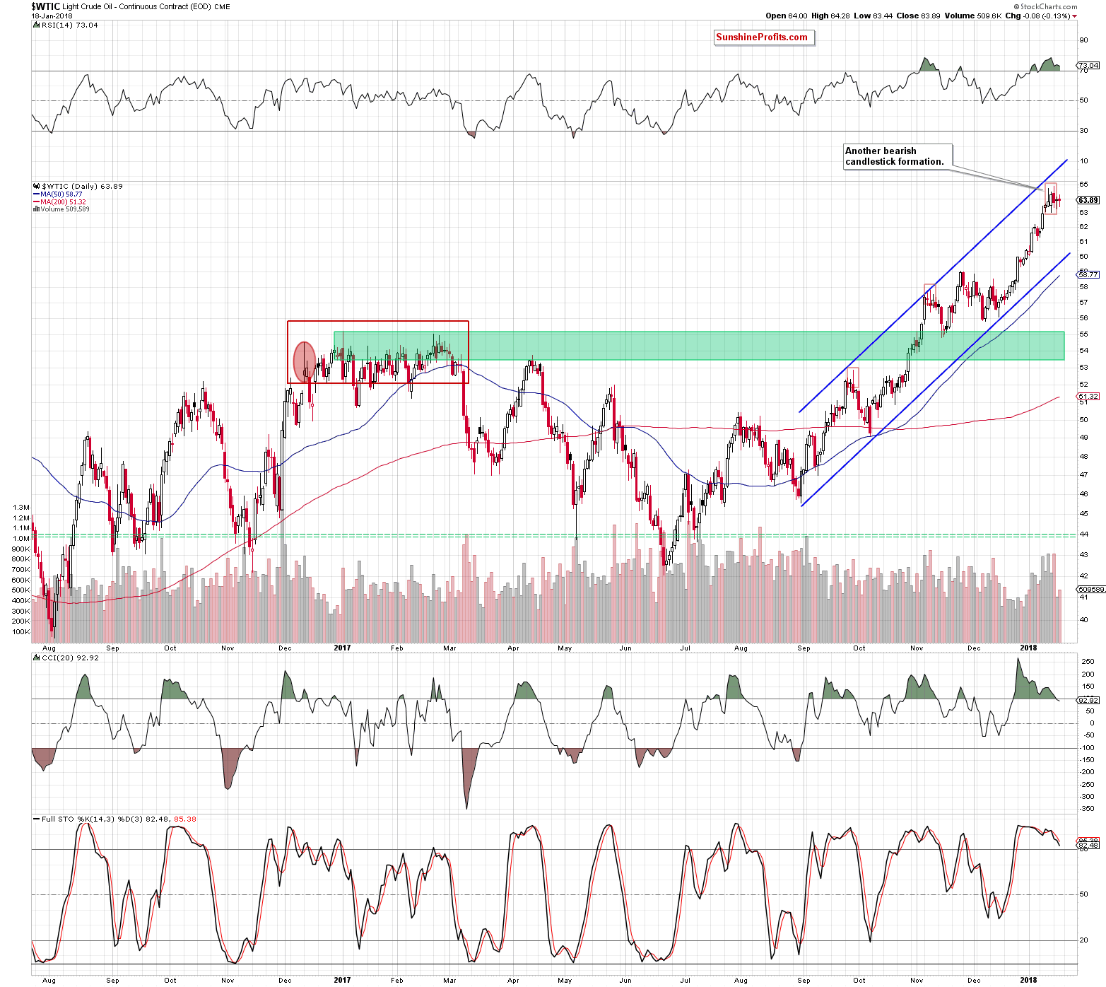
From today’s point of view, we clearly see that the overall situation in the very short term also hasn’t changed much, because crude oil wavered the second day in a row, which resulted in another doji candle. Taking this fact into account, we believe that what we wrote yesterday remains up-to-date also today:
(…) Although neither oil bulls nor oil bears show an advantage yesterday, two bearish candlestick formations remain in the cards, strengthening the resistance zone created by the 200-month moving average at $65.09. Additionally, the CCI joined the Stochastic Oscillator and generated a sale signal, giving oil bears another reason to act.
On top of that, volume was tiny compared to what we saw in the previous days, which confirms oil investors’ indecision regarding the direction of the next move. Therefore, waiting at the sidelines for more clear signals without open positions seems to be the best decision (…)
Taking into account the technical picture of crude oil, we think that oil bears have more arguments on their side to take control on the market. Nevertheless, it seems to us that as long as investors do not see a strong bearish fundamental factor (…), the price of black gold will be wavering in a narrow range under the 200-month moving average.
Finishing today’s alert, we would like to add two more comments to the technical picture of the commodity after yesterday’s session.
Firstly, the size of volume that accompanied yesterday’s price action was slightly higher than the day before, which suggests that investors could return to the market to start closing their long positions. It was not a hard sell off, because crude oil lost only 0.13% compared to the previous session, however, such price action raises doubts about the continuation of the upward move in the coming week.
Secondly, we would like to share a short note about the doji candle with you. If the market moves in a horizontal trend or potential decreases (just like in our case) are only in the initial phase, the doji candle is not very important. However, if the doji appears on the chart after a long upward or downward trend, there is a high probability that we will see a pullback or even a reversal of the current trend in the near future.
If you enjoyed the above analysis and would like to receive daily premium follow-ups, we encourage you to sign up for our Oil Trading Alerts. Sign up today.
Thank you.
Nadia Simmons
Forex & Oil Trading Strategist
Przemyslaw Radomski, CFA
Founder, Editor-in-chief, Gold & Silver Fund Manager

-
I know Mike is a very solid investor and respect his opinions very much. So if he says pay attention to this or that - I will.
~ Dale G.
-
I've started managing my own investments so view Michael's site as a one-stop shop from which to get information and perspectives.
~ Dave E.
-
Michael offers easy reading, honest, common sense information that anyone can use in a practical manner.
~ der_al.
-
A sane voice in a scrambled investment world.
~ Ed R.
Inside Edge Pro Contributors

Greg Weldon

Josef Schachter

Tyler Bollhorn

Ryan Irvine

Paul Beattie

Martin Straith

Patrick Ceresna

Mark Leibovit

James Thorne

Victor Adair