
Gold & Precious Metals
Gold moved visibly higher during the first session of the year and this time mining stocks accompanied it. In fact, it seems that they are back on the track after a short pause. What’s the likely reason behind this year’s rally and what does it imply going forward?
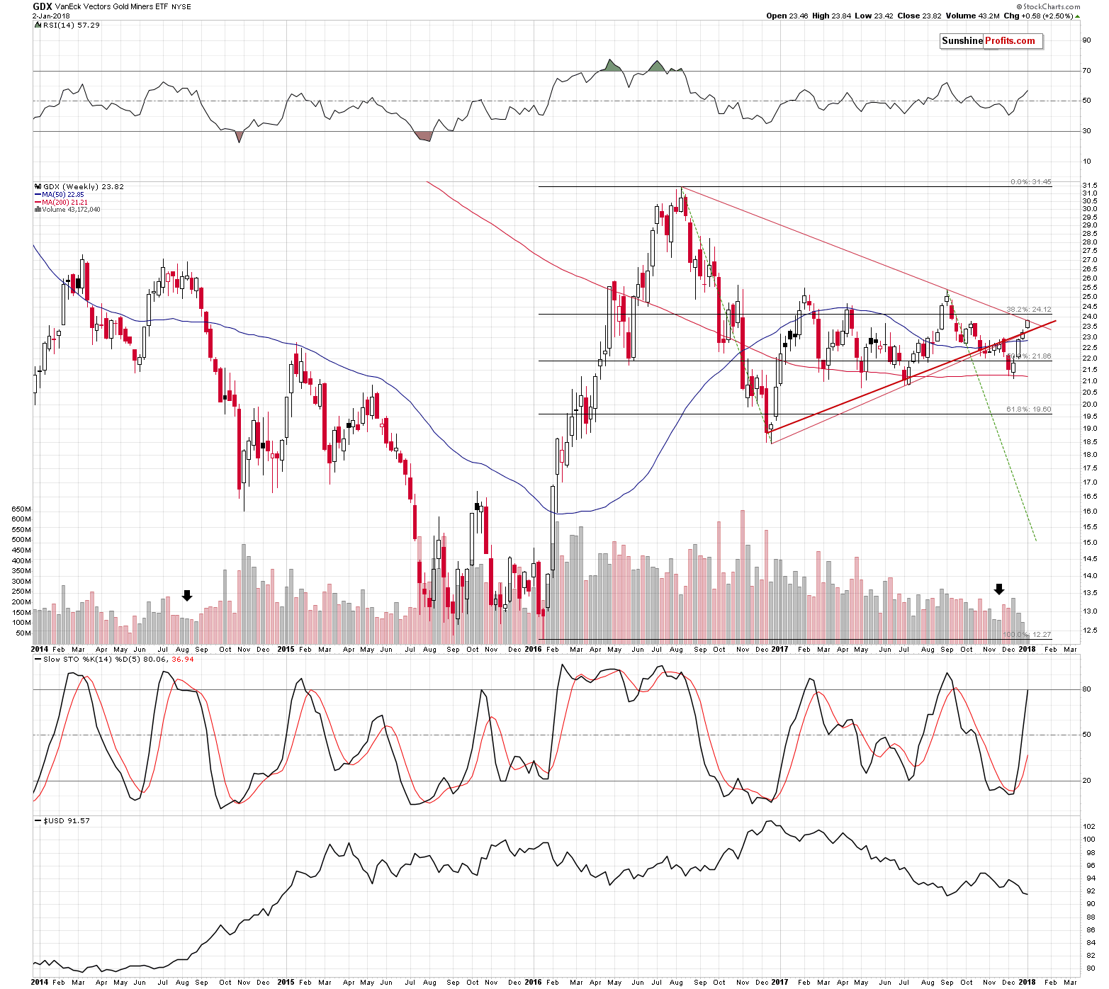
Let’s jump right into the mining stock charts (chart courtesy of http://stockcharts.com).
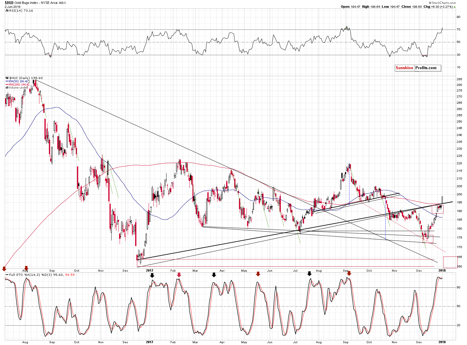
Gold stocks indeed broke above the rising support lines, but since that was only one close above them, the breakout is unconfirmed. There are several reasons to think that it will not be confirmed without even considering the apex-based reversal or gold’s cyclical turning point.
The two things that we would like to discuss with regard to the above chart are: the 200-day moving average, and the RSI above the 70 level.
The former was broken rather insignificantly and this doesn’t invalidate the bearish analogy to the previous similar patterns. For instance, in February, the day when the HUI Index closed above the 200-day MA was the day of the final top. In fact, higher HUI values have never been seen since that time. The June rally also ended above the MA, but the follow-up action was very bearish.
As far as the second factor is concerned, there was only one case in the previous months, when the RSI indicator moved as high as it did yesterday – in early September. Mining stocks started an almost 50-index point-decline shortly thereafter.
Moreover, the moments when the RSI moved only to 70 level, without breaking above it, were almost always times when it was a good idea to be short the precious metals market. July 2016, February 2017, and the August-September 2017 top were all confirmed by the RSI at or above the 70 level. Naturally, the implications are bearish.
Plus, while the rising support line was broken (again, the breakout was not confirmed), the declining, even more long-term line, held. So, did we really saw a major breakout yesterday that changed the outlook? Not necessarily.
The key reason why we shouldn’t trust yesterday’s move is not visible on the above charts.
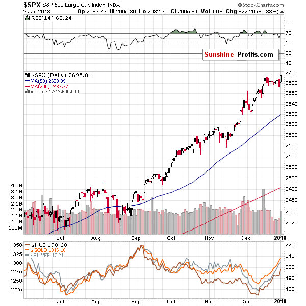
It’s partially visible on the general stock market chart. In fact, it’s the likely reason that all stocks soared yesterday, not just miners. The reason is selling during the year or at its end due to tax reasons and then buying back at the beginning of the year. In this way, investors are able to book the losses, which often leads to a decrease in one’s taxes on investments. Those who want to keep the exposure to a given stock, often buy back in the first day of the following year.
Consequently, yesterday’s “strength” in mining stocks is likely no strength at all – it’s likely just a result of applying one of the tax-optimizing investment ideas.
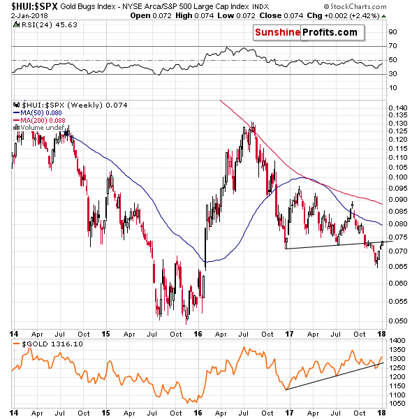
The above chart showing the golds stock ratio to the general stock market shows that there was no major breakout yesterday. Why? Because by looking at the ratio, we’re looking at the chart that “takes out” the factors that impact the entire stock market in the same way. In math, when we do the same multiplication for the numerator and the denominator of a faction, we are left with the same fraction. So, since there was no major move in the ratio, it seems that the same thing caused the rally in both markets and thus, what we saw yesterday was not a sign of strength in the precious metals sector.
Summing up, even though it seems that this year’s daily rally was a big deal, it most likely isn’t. There is a good explanation for mining stocks upswing in the form of the tax-optimizing technique. In other words, miners didn’t really show strength this week and the outlook for gold price in January didn’t really improve.
We hope you enjoyed today’s analysis. If you’d like to receive follow-ups (including the intraday ones, when things get hot), we invite you to subscribe to our Gold & Silver Trading Alerts.
Thank you.
Sincerely,
Przemyslaw Radomski, CFA
Founder, Editor-in-chief, Gold & Silver Fund Manager

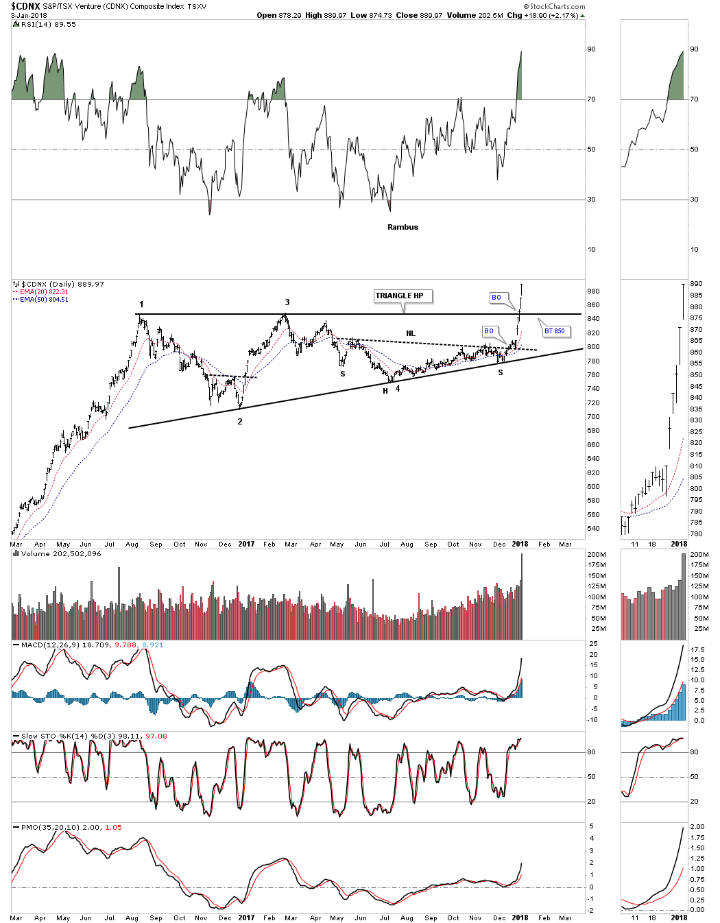
Tonight I would like to start out by looking at the $CDNX, Canadian Venture Composite Index, which blasted higher last week and is following through this week. The reason this index is so important is because it not only has many junior precious metals stocks, but also many small cap energy related stocks as well as other speculative venture capital stocks from other sectors. This is a very good sign for the overall stock markets and commodities in general, as it shows risk capital is finding a home in which to park. This is another important clue that there is no top in the stock markets yet, because the risk on trade is still healthy.
CDNX Companies ftp://ftp.cdnx.com/SPCDNXIndex/Constituents.txt
This first chart for the CDNX is a daily look which shows an eight month H&S bottom in place. This chart shows the principal of Chartology at work. Remember a stock does one of three things. It is either building out a reversal pattern, a consolidation pattern or is in an impulse move. After eight months of base building you can see what happens when all the energy is released. There was no way anyone could have predicted that the current impulse move would start out like this one, but we did know that an impulse move would take place once the neckline was broken to the upside.

I have shown you many examples of how a big pattern can be made up of smaller patterns before a pattern is completed. Below is another daily chart for the CDNX that you should be familiar with which shows the nearly one and a half year flat top expanding triangle consolidation pattern. Not only did the price action breakout above the neckline, but also the top rail of the large triangle consolidation pattern. The bears were so exhausted they couldn’t defend the neckline, let alone the top rail of the flat top expanding triangle. A backtest, if we get one, would come into play around the 850 area.
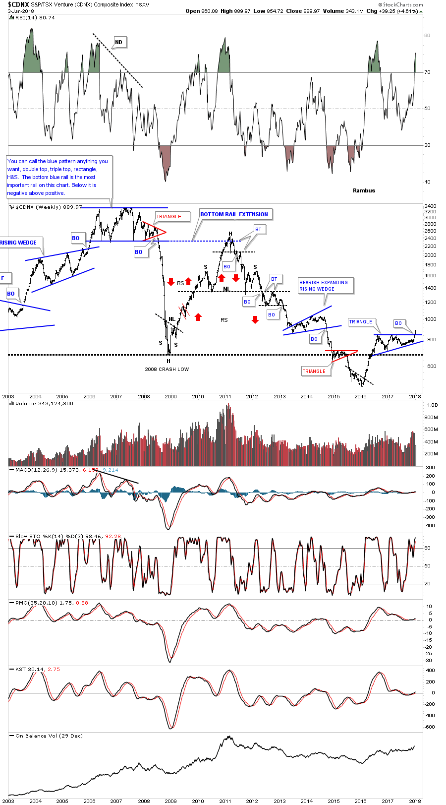
This next chart for the CDNX is a long term weekly look which helped me find the top, back in late 2007. At the time, I called that huge trading range anything you wanted, because there were several pattens that could work out. The bottom line was, whichever way the price action broke out, a big move would follow. Keep in mind that was at the height of the bull market up until that point, and no one wanted to believe that big trading range could be a top.
The big clue came when the small red triangle formed on the right side of the trading range. Until it broke down I still couldn’t say with any confidence which way the big trading range would breakout, but once the price action broke below the bottom rail of that red triangle the writing was on the wall. Again, there was no way to know the magnitude of the collapse only that an important top was in place and an impulse move to the downside would follow. This was also about the time I had to quit posting at the original Goldtent because so many gold bugs were getting angry with my bearish posts.
The CDNX is a good producer of chart patterns as the monthly chart below shows. Our current triangle consolidation pattern has formed just above the 2008 crash low and is now making a multi year high.
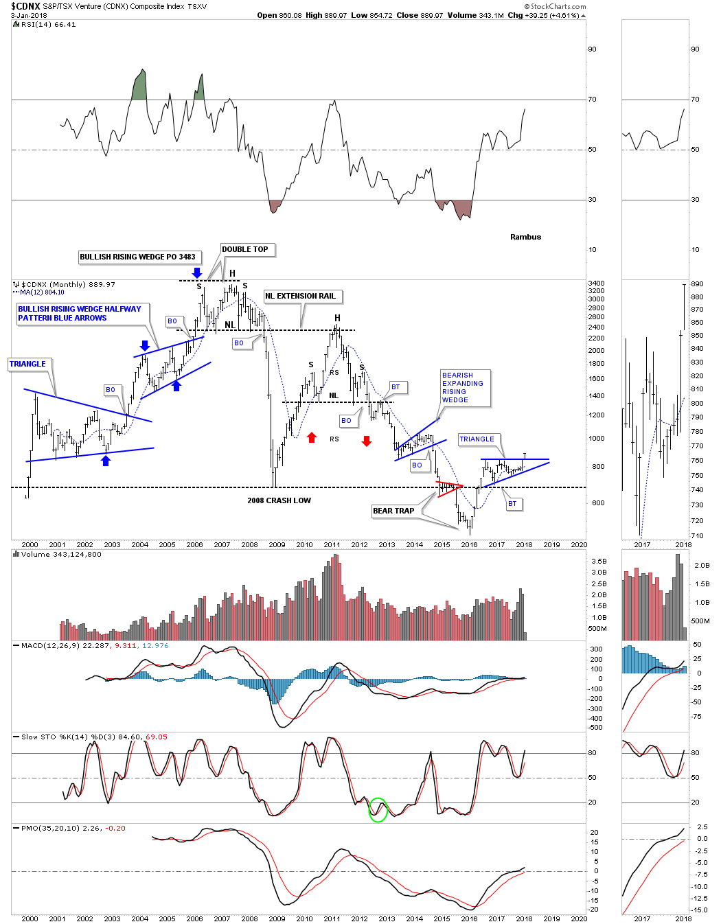
I believe the breakout on this chart is potentially very significant for all the markets we cover here at Rambus Chartology.
All the best
Rambus

 Throughout history, political, financial, and military leaders have sought to create empires. Westerners often think of ancient Rome as the first empire. Later, other empires formed for a time. Spain became an empire, courtesy of its Armada, its conquest of the New World, and the gold and silver extracted from the West. Great Britain owned the 19th century but lost its empire due largely to costly wars. The US took over in the 20th century and, like Rome, rose as a republic, with minimal central control, but is now crumbling under its own governmental weight.
Invariably, the last people to understand the collapse of an empire are those who live within it. As a British subject, I remember my younger years, when, even though the British Empire was well and truly over, many of my fellow Brits were still behaving in a pompous manner as though British “superiority” still existed. Not so, today. (You can only pretend for so long.)
But this does suggest that those who live within the present empire—the US—will be the last to truly understand that the game is all but over. Americans seem to be hopeful that the dramatic decline is a temporary setback from which they will rebound.

As Ecclesiastes notes, “There is nothing new under the sun.” This, too, applies to the stock market.
The average investor trap is the same throughout whatever period you wish to review. Markets become overexuberant, see a correction, sentiment resets, and markets rally on to their next phase of overexuberance. It is really that simple. Yet, we overcomplicate matters by relying on economics and fundamentals, which have proven to be relatively useless at major market turning points.
Whatever occurred in the prior year is often not going to be instructive as to what will occur in the upcoming year, and that is what you do when you rely on fundamentals and economics to linearly forecast 2018. Life is not linear, and neither is the stock market.
Also, many of the old market adages I hear year after year will not help you in 2018 either. Remember the old market saying that as January goes, so goes the rest of the year? How did that turn out in 2016? Even in 2017, January was a sideways month, yet the market went on to major gains. How did sell in May and go away work for you in 2017? Well, don’t say I did not warn you at the time. This is what I wrote on Seeking Alpha:
Sentiment Speaks: If You Sell In May, Be Prepared To Buy Back What You Sell
Markets are really quite simple if you take a broad perspective approach. Society generally progresses through history, so we should expect that our financial markets would follow society’s general path of progression. However, there are periods of time of regression which make us forget that we are generally on a path of progression. This is why I continually try to point out that those who are able to rise above all the noise presented to you on a daily basis will likely do much better than the average investor.
During the last two years, we have heard a significant amount of bearish “noise.” There were a myriad of reasons presented as to why this market was going to imminently collapse, and I have listed them for you many times in the past. I guess someone forgot to tell Mr. Market. Yet, market participants continue to pour over old economic data or news events in wasted efforts to glean the next stock market directional cue. And, if the last two years has not taught you this lesson, then nothing likely will. Sometimes, it is hard to recognize that we wear blinders, as they become too comfortable to take them off. In fact, the story of the stock market is not much different than the movie The Matrix. But, I digress.
So, let’s look back at 2016-2017, and then consider how we see 2018 within that context.
While I was strongly bullish the SPX as we came into 2017, as we certainly had much higher to achieve before we struck the long-term targets we set years ago for this degree of wave structure, the SPX has surpassed our targets during the last few months of the year by approximately 4%.
Whereas we were looking for a rally from the 1800 region to as high as the 2611 region, which would have provided a 45% gain, the market actually provided closer to a 49% gain from the lows struck in 2016. While I certainly wish we were able to be perfect, unfortunately, there is no such thing as perfection when dealing with non-linear systems such as the stock market.
Yet, if I told you two years ago that I would be confident about a 45% rally in the stock market over the coming two years, but I may miss the last 4-5% of the market move, I think you would be quite happy with analysis that guided you confidently for 90% of that market move. And, when you consider that we caught that last 9% move in the IWM, well, I think we did quite well for 2016-2017 when most seemed to be looking down.
As for looking to the future, please recognize that by no means are we looking for the end of the bull market which began in 2009. Rather, we are now within wave (3) of the 5th wave of the larger degree 3rd wave within a 5-wave Elliott structure off the 2009 lows (as you can see on the monthly SPX chart).

Double Click Chart for Larger Version
And, as I have tried to relate this to baseball terms, it is akin to being in the 6th inning of a baseball game. We likely still have several years to go before we complete this bull market run off the 2009 lows, and we will not likely see the 7th inning stretch until 2019, after we complete all of wave 3.
Since we use Elliott Wave analysis to “count” how mass sentiment moves through bullish and bearish periods of progression and regression, our perspective is that we are completing a wave (3) in the equity markets, which often ushers in a wave (4), as long as the number 4 comes after the number 3. And, since our numeric system has not changed since I learned it as a child, I am going to expect that we will see wave (4) in 2018.
But, as I have noted in prior weekend analysis to my members, the market may continue to levitate until March. You see, some indices have potentially completed their respective wave (3), such as the IWM, but others suggest that we still need a smaller degree 4th and 5th wave before all of wave (3) completes, such as the XLF.
This would mean that we can see a pullback into early 2018 in all indices, with some counting as a smaller degree 4th wave (XLF), whereas others would be an (A) wave of their wave (4) already (IWM). Moreover, this would make the expected rally into the March time frame a 5th wave in some indices (XLF), whereas it may be a lagging b-wave in others (IWM). Ultimately, it seems to suggest that the bigger pullback we want to see in a wave (4) may not occur until the late Spring or early Summer.
As I have noted many times before, the drop I expect in 2018 will likely be considered the end of the bull market by many, so I still suggest you ignore the noise in 2018. Our analysis suggests that it will likely be another buying opportunity for the next phase of the rally which will likely be targeting the 2800-3000 region next. In fact, if we are able to complete the full structure I have outlined on my monthly chart, we will not likely complete this bull market off the 2009 lows until the early 2020’s. So, if you are going to dust off your bear suit for 2018, please make sure to recognize that it will only be for a short-term engagement.
I would like to take this opportunity to wish everyone a happy, healthy and prosperous new year to you and your families.
See charts illustrating the wave counts on the S&P 500, IWM and XLF.
Avi Gilburt is a widely followed Elliott Wave technical analyst and author of ElliottWaveTrader.net (www.elliottwavetrader.net), a live Trading Room featuring his intraday market analysis (including emini S&P 500, metals, oil, USD & VXX), interactive member-analyst forum, and detailed library of Elliott Wave education.
Before I publish my market outlook for 2018 in the days ahead I thought it might be useful to recap some lessons learned from 2017. While I want to focus on technical considerations some larger market context first is equally important.
The biggest mistake bears always make, myself included, is underestimate the sheer recklessness of bulls. They keep raising the bar higher and higher, get everyone positioned long and when the construct ultimately fails they beg for bailouts and artificial liquidity comes in to save an industry that is 100% reliant on convincing retail to put money into the system. This may seem a harsh assessment, but this has been the script for the last 30 years as we’ve transitioned from one market bubble to the next.
Bubbles are notorious for getting people sucked into believing things that are absolutely unrealistic. Multiples get expanded to high heaven on projections that never pan out. Every. single. time.
In this context it’s actually quite easy to be a bull. Keep raising targets, always be optimistic, and when something breaks shrug your shoulders and say: Hey what are you gonna do? Stuff happens, but the Fed will bail us out. And the cycle begins anew.
It’s a dangerous game for investors as Wall Street will look right for years and complacency breeds more complacency as bearish voices are ignored as they look wrong precisely at the time when they are the most right.
Take 1999. Bears were completely wrong, but also entirely correct. The bubble run-up was pure fantasy, but it kept going and going until the rug got pulled:

Similarly in 2007 nobody gave you warnings, and Wall Street kept pushing price targets higher for 2008:

And people got hurt big time every time.
The then predictable response: We need bailouts, must get rid of mark to market and the Fed obliged with QE 1, 2, 3 and global central banks joined the foray. And this has been the running game for over 8 years now:

-
I know Mike is a very solid investor and respect his opinions very much. So if he says pay attention to this or that - I will.
~ Dale G.
-
I've started managing my own investments so view Michael's site as a one-stop shop from which to get information and perspectives.
~ Dave E.
-
Michael offers easy reading, honest, common sense information that anyone can use in a practical manner.
~ der_al.
-
A sane voice in a scrambled investment world.
~ Ed R.
Inside Edge Pro Contributors

Greg Weldon

Josef Schachter

Tyler Bollhorn

Ryan Irvine

Paul Beattie

Martin Straith

Patrick Ceresna

Mark Leibovit

James Thorne

Victor Adair