

In my previous articles, I talked about the surprising correlation between the supply of Tether and the price of Bitcoin. I encourage you to read both of them for some background. In essence, there are good reasons to believe that Tether Limited is issuing Tethers that are not backed by USD as promised in order to purchase Bitcoin through Bitfinex. After examining the flow of Tethers, which originate from Tether Limited and are then subsequently distributed to various other exchange all through Bitfinex, I believe that Tether’s correlation to Bitcoin is no simple coincidence.
Currency
Summary
– Tethers are being issued at a pace of 13 billion per year.
– No one knows where the money is, but no one seems to care.
– Bitfinex halted new accounts registrations.
– Bitfinex employee’s profile suggests that he or the company is being investigated.
– Tether Limited runs the Bitfinex playbook by imposing redemption minimums, effectively freezing customer funds.
– This idea was discussed in more depth with members of my private investing community, Core Value Portfolio.

Over the short to medium-term gold is likely to be buffeted by conflicting cross currents as we will proceed to see a little later, so it is important to keep a handle on the big picture, and for this reason we will start by reminding ourselves how bullish the big picture is for gold by looking at its long-term chart.
On its 10-year chart we see that gold is in the late stages of a large Head-and-Shoulders bottom, which it is expected to break out of not far into 2018. This is a huge base pattern that can support major bullmarket. Points worth noting on this chart are the marked volume buildup during the last half of the year and the steady rise in volume indicators this year, especially the On-balance Volume line – these developments suggest that gold is building up to something, after being a sideshow during 2017 due to rising stockmarkets and the cryptocurrency mania. The key level to note is $1400 – a breakout above this level will signify that gold is leaving behind the base pattern to enter a new bullmarket phase.

The 30-month chart enables us to see in detail the period from the low of the base pattern late in 2015. Following this low, which was the low point of the Head of the Head-and-Shoulders bottom, the gold price rallied quite steeply, which coincided with a spectacular rally in Precious Metals stocks, but then dropped back to mark out the Right Shoulder low in December of last year, almost exactly a year after marking out the low of the Head of the pattern. Since that low gold has advanced in a rather sedate manner this year as it gradually readies to break out of the entire base pattern. At this point the trend is best described as neutral and it will remain so until it breaks above $1400, although that is not a reason not to buy it at opportune times, since we can be pretty sure that a breakout is looming.
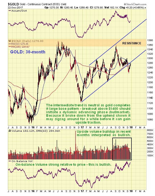
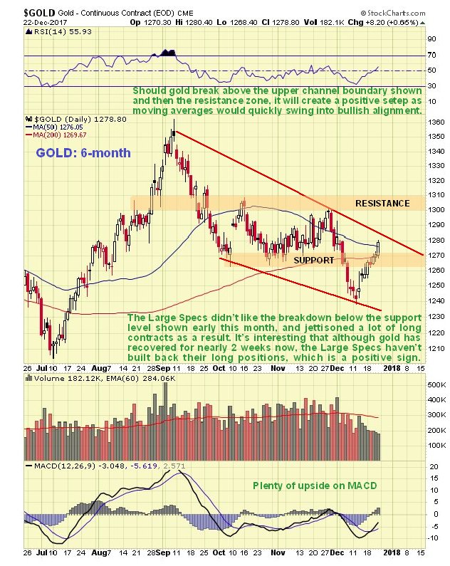
On the 6-month chart we can see recent action in detail. The breach of support in the $1260’s and drop below the 200-day moving average early this month seems to have freaked out a lot of traders, who overreacted by rushing to dump long positions. After this drop the gold price has recovered over the past week or two, and has now risen into a zone of resistance.
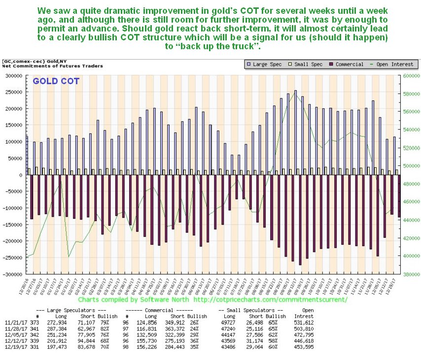
We have been wary of the Precious Metals sector for many weeks because of the persistent high Large Spec long positions, as we can see on the latest COT chart below, but this last drop by gold unnerved the Large Specs, who dumped a sizeable portion of their long positions, which action has improved gold’s COT structure considerably, although there is room for further improvement. The situation in silver was rather different, because the Large Specs bailed out of almost all their long positions, creating a flat out bullish COT structure for silver now. Overall, we would have to say that the COT structure for gold is now modestly bullish, with the chances of gold holding up or advancing further improved by the positive outlook for silver.
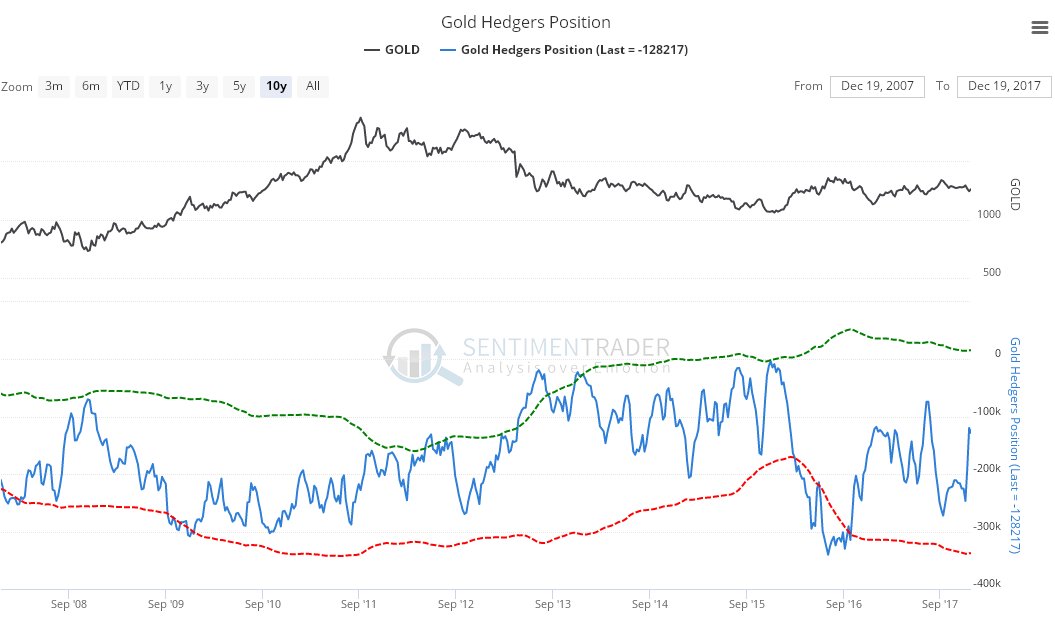
Click on chart to popup a larger clearer version. The latest gold Hedgers chart shows Hedgers positions to be squarely in neutral territory, and this chart thus provides no guidance one way or the other…
Click on chart to popup a larger clearer version. Chart courtesy of sentimentrader.comThe following chart shows that seasonal factors are quite bullish for gold in January, after being rather negative in December…
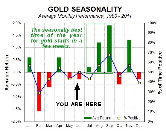
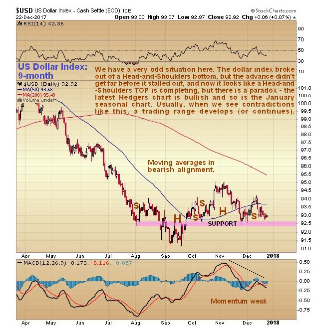
Chart courtesy of sentimentrader.comAs ever, when considering the outlook for gold, we have to factor in the likely impact of dollar movements, so how does the dollar look? The 9-month chart for the dollar index presents a rather ambiguous picture. We did get a dollar rally between September and November as we were expecting, but it didn’t get as far as we thought it would before it turned down again, and what looked like a Head-and-Shoulders bottom from August through October morphed into an apparent Head-and-Shoulders top from October through December, and with momentum weak and moving averages in bearish alignment, the dollar increasingly looks sets to break lower on this chart.
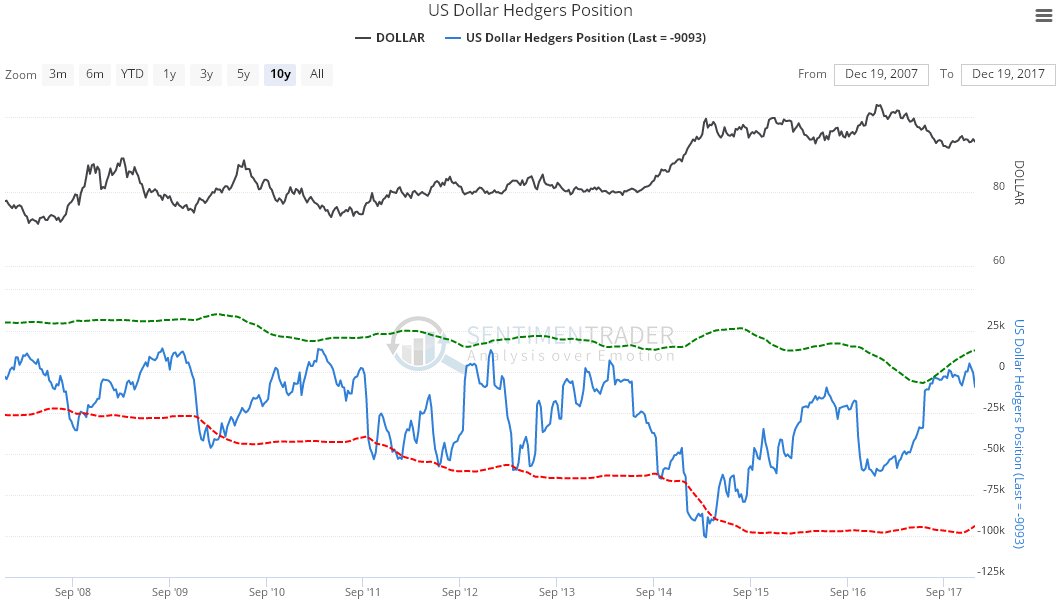
However, there are two opposing factors on the other side of the scales that we must weigh against the bearish looking dollar index chart. One is the latest dollar Hedgers chart, which shows that Hedgers’ positions are at levels that have in the past led to rallies…
Click on chart to popup a larger clearer version. Chart courtesy of sentimentrader.comAnd in addition the dollar is about to enter its most seasonally bullish month of the year, although it must be emphasized that this is a background factor…
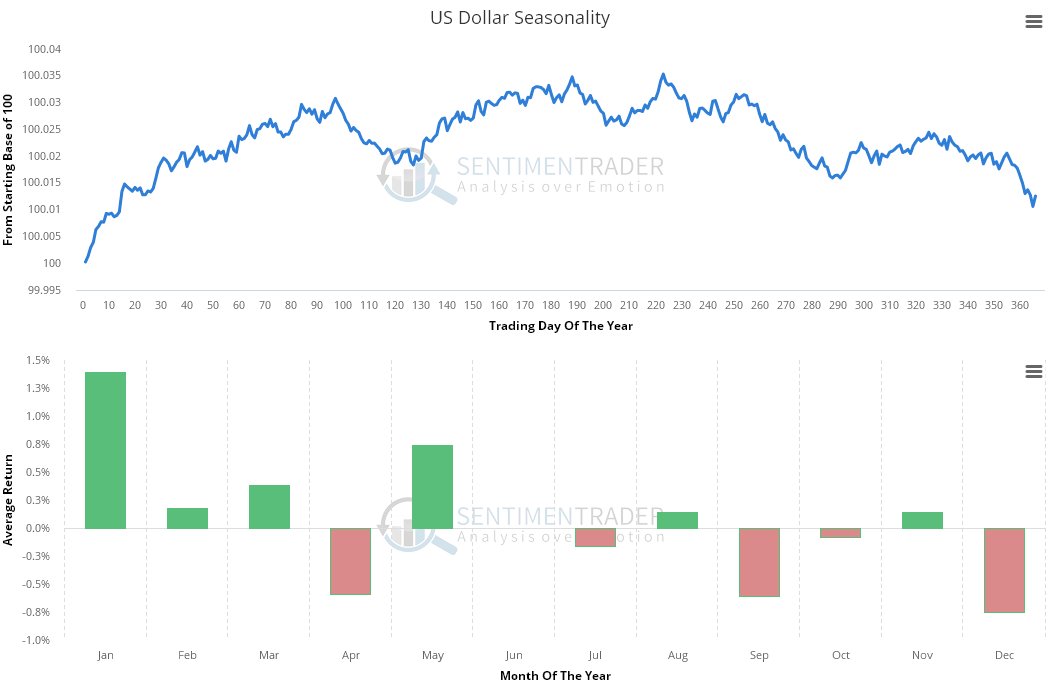
Chart courtesy of sentimentrader.comThis is a difficult set of opposing factors to weigh up, but experience shows that when one has a set of conflicting indications like this, it usually leads to rangebound behavior, until the conflicting factors resolve and the picture becomes clearer.
The conclusion to all this is that gold is building up to breaking out of its giant Head-and-Shoulders bottom to enter a major bullmarket phase, the start of which will be marked by gold breaking above $1400. In the meantime, before this breakout occurs, we can expect to see more erratic rangebound sideways trading behavior, with dips providing the opportunity to accumulate gold and especially undervalued PM stocks, since the risk of a more serious decline is considered to be very low.
While the U.S. Shale Energy Industry continues to borrow money to produce uneconomical oil and gas, there is another important phenomenon that is not understood by the analyst community. The critical factor overlooked by the media is the fact that the U.S. shale industry is swindling and stealing energy from other areas to stay alive. Let me explain.
First, let’s take a look at some interesting graphs done by the Bloomberg Gadfly. The first chart below shows how the U.S. shale industry continues to burn through investor cash regardless of $100 or $50 oil prices:

The chart above shows the negative free cash flow for 33 shale-weighted E&P companies. Even at $100 oil prices in 2012 and 2013, these companies spent more money producing shale energy in the top four U.S. shale fields than they made from operations. While costs to produce shale oil and gas came down in 2015 and 2016 (due to lower energy input prices), these companies still spent more money than they made. As we can see, the Permian basin (in black) gets the first place award for losing the most money in the group.
Now, burning through investor money to produce low-quality, subpar oil is only part of the story. The shale energy companies utilized another tactic to bring in additional funds from the POOR SLOBS in the retail investment community… it’s called equity issuance. This next chart reveals the annual equity issuance by the U.S. E&P companies:

According to the information in the chart, the U.S. E&P companies will have raised over $100 billion between 2012 and 2017 by issuing new stock to investors. If we add up the funds borrowed by the U.S. E&P companies (negative free cash flow), plus the stock issuance, we have the following chart:

Thus, the U.S. E&P companies tapped into an additional $212 billion worth of funding over the last six years to produce uneconomical shale oil and gas. Now, this chart is an approximation based on the negative free cash flow (RED color) from the four top U.S. shale fields and the shale equity issuance (OLIVE color). So, how much money would these U.S. E&P companies need to make to pay back these funds?
Good question. If we assume that the U.S. shale oil companies will be able to produce another 10 billion barrels of oil, they would need to make $21 a barrel profit to pay back that $212 billion. However, they haven’t made any profits in at least the past six years, so why would they make any profits in the next six years?
Okay, now that we understand that the U.S. shale industry has been burning through cash and issuing stock to continue an unprofitable business model, let’s take it a step further. If we understand that the U.S. shale energy industry is not making enough money from producing the oil and gas, then it also means that it takes more energy to produce it then we are getting from it. Sounds strange… but true.
We must remember, investors, furnishing U.S. shale energy companies with funds are another way of providing ENERGY. These U.S. shale energy companies are taking that extra $212 billion (2012-2017) and burning the energy equivalent to produce their oil and gas. For example, it takes a lot more water to frack oil and gas wells. To transport the water, we either do it by truck or by pipeline. While this extra water usage is a Dollar Cost to the shale energy industry, it is really an ENERGY COST. Think about all the energy it took to either transport the water by truck, or the energy it took to make the pipelines, install them and the energy to pump the water.

Moreover, if we add up all of the additional costs to produce U.S. shale oil and gas, the majority of it comes from burning energy, in one form or another. Again, investor funds translate to burning energy. Thus, the U.S. shale industry needs more energy to produce the oil and gas than we get from it in the first place.
Unfortunately, investors don’t see it this way because they do not realize they will never receive their investment back. It was spent and burned years ago to continue the Great U.S. Shale Energy Ponzi Scheme.
Let me put it in another way. The U.S. and world economies are based on burning energy. When we burn energy, we create economic activity and hopefully growth. If the U.S. shale energy industry needed $212 billion more to produce the oil than they made from operations, then it means it burned more energy than it sent to the market. Do you see that now??
So, the U.S. shale energy industry is STEALING & SWINDLING energy wherever it can to stay alive. This is the perfect example of the Falling EROI (Energy Returned On Investment) forcing an industry to CANNABLIZE itself (and the public) to keep from going bankrupt.
Lastly, as time goes by the U.S. shale energy industry will behave like a BLACK HOLE, by sucking more and more energy in to produce even lower and lower quality oil and gas. At some point, the shale energy industry will collapse upon itself leaving one hell of a mess behind. While it’s hard to predict the timing of the event, it will likely occur within the next 2-5 years.
Check back for new articles and updates at the SRSrocco Report.
| Holiday |
Date |
Markets Closed |
|---|
| Christmas | Monday, December 25 | TSX – TSX VENTURE – MX NYSE – NASDAQ – AMEX |
| Boxing Day | Tuesday, December 26 | TSX – TSX VENTURE – MX |
| New Year’s Day | Monday, January 2 | TSX – TSX VENTURE – MX NYSE – NASDAQ – AMEX |


-
I know Mike is a very solid investor and respect his opinions very much. So if he says pay attention to this or that - I will.
~ Dale G.
-
I've started managing my own investments so view Michael's site as a one-stop shop from which to get information and perspectives.
~ Dave E.
-
Michael offers easy reading, honest, common sense information that anyone can use in a practical manner.
~ der_al.
-
A sane voice in a scrambled investment world.
~ Ed R.
Inside Edge Pro Contributors

Greg Weldon

Josef Schachter

Tyler Bollhorn

Ryan Irvine

Paul Beattie

Martin Straith

Patrick Ceresna

Mark Leibovit

James Thorne

Victor Adair