
Energy & Commodities
The rate at which global silver production increased over the past century is quite astonishing. When Columbus arrived in America (1492), the world was only producing 7 million oz of silver a year. Today, the world’s largest primary silver mine, Fresnillo’s Sauicto Mine, produced three times that amount in just one year (22 million oz, 2016). Yes, we have come along way in 500 years.
Just think about that for a minute. One silver mine last year produced three times the global amount in 1493. According to the U.S. Bureau of Mines 1930 Report on Summarized Data of Silver Production, the average annual silver production in the world from 1493 to 1600 was 6.9 million oz (Moz). If we look at the following chart, we can see how world silver production increased over the past 500+ years:

As we can see, average annual world silver production increased from 6.9 Moz during 1493-1600, to 13 Moz from 1600-1700, 18 Moz from 1700-1800, 51 Moz from 1800-1900, 274 Moz from 1900-2000 and a stunning 722 Moz from 2000-2017. Again, these figures represent the average annual silver production for each time period.
In the current period, 2000-2017, the world has produced 103 times more silver per year than from 1493-1600. However, the next chart shows the total silver production for each period. From 1493-1600, the world produced a total of 747 Moz of silver, compared to 13,000 Moz (13 billion oz) in just 18 years from 2000-2017:

Now, the reason the last silver bar on the right of the chart is lower than the previous one has to do with comparing 18 years worth of silver production (2000-2017) versus 50 years (1950-2000). It took 50 years to produce 17,061 Moz during 1950-2000 versus 13,000 Moz in the 18 years from 2000-2017.
If we compare world silver production from the different periods, here is the result:
Percentage Of World Silver Production (1493-2017)
2000-2017 = 26.4%
1950-2017 = 61%
1900-2017 = 82%
While a little more than a quarter of all world silver production (1493-2017) was produced in the past 18 years, 82% were produced since 1900. That is a lot of silver. It turns out that 40.4 billion oz was produced from 1900-2017 out of the total 49.3 billion oz produced since 1493. Interestingly, more than half of that silver was consumed in industrial silver applications. I will be writing more about that in future articles.
The last chart I find quite interesting. If we go back a little more than a century, the United States was the largest silver producer in the world. In 1915, the U.S. produced 75 Moz of silver out of the total 189 Moz mined in the world that year:

Thus, in 1915, the U.S. produced 40% of all world silver production. Mexico came in second in 1915 by producing 39.3 Moz. However, U.S. silver production in 2017 will only be 34 Moz versus the estimated 870 Moz globally. Thus, U.S. silver production only accounts for 4% of world mine supply versus 40% back in 1915. What a change in 100 years.
Lastly, the U.S. imports approximately 22% of world mine production each year. That is 193 Moz of the total 870 Moz in 2017. While domestic mine supply is only 34 Moz, the United States has to import more than a fifth of global mine production to meet its silver market demand.

For the last couple of weeks we have been tracking improving gold and silver Commitments of Traders (CoT) data, noting that a seasonal low (on historical average) is in the offing and also ongoing tax loss selling as reasons to expect a bounce or even a significant rally in precious metals sector.
Last week the CoT played ball as it slammed to a bullish alignment in both metals. This was especially so in silver, which is the metal that would lead a sector rally. We saw significant Commercial short covering and large Speculative long capitulation in silver.
For a more dramatic look at the quick snapback to a bullish orientation in the would-be leader, let’s use this graphic from snalaska.com:


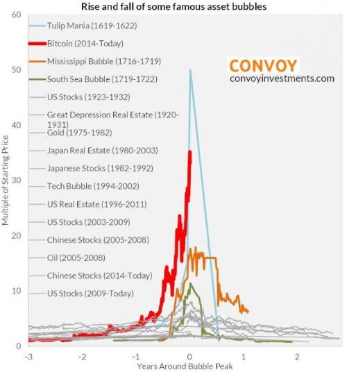 1. Bitcoin Total Wipeout Alert
I have lain in wait before writing this stark a warning on Bitcoin, because if you “cry wolf” too often with something like this, you are simply written off as a fool within days if it carries on up and up. It could yet do so, but now we are seeing really extreme manifestations of mania suggesting that the top is at hand, and if not we are very close to it.
2. Albert Edwards: “Why The Current Situation Is Even Worse Than The 2008 Crisis”
“Back in May, we first reported that Goldman became the first bank to dare to ask if the Fed has lost control of the market, if in slightly more polite terms of course. This is how Jan Hatzius phrased it: “Despite two rate hikes and indications of impending balance sheet runoff, financial conditions have continued to loosen in recent months.
Our financial conditions index is now….
3. Canada’s Latest 6 City Housing Prices & The Plunge-o-Meter
In December 2017 Toronto metro SFD prices, 8 months since the March 2017 spike and peak price, continued slipping and to date have lost $207,895 or 18%. Vancouver prices are still defying gravity;
FOMO and speculative pricing is still on.
Josef Schachter has made and saved MoneyTalks listeners a ton of money in the last four years with incredibly good forecasts on oil and gas prices, and with well timed buy and sell recommendations on energy stocks. Become a subscriber to his Schachter Energy Report and get his latest Action Alerts, including nine brand new recommendations. This service is one of our favourite reads right now.
SPECIAL OFFER – get $50 off the annual subscription fee for Schachter Energy Report and $75 off the Black Gold Service. Just use the respective promo codes below. CLICK HERE to ORDER:
SER50
BG75
** Remember to enter the code and click the APPLY COUPON button before proceeding to checkout.

Here is a table showing the annualized change in Headline and Core CPI, not seasonally adjusted, for each of the past six months. Also included are the eight components of Headline CPI and a separate entry for Energy, which is a collection of sub-indexes in Housing and Transportation.
We can make some inferences about how inflation is impacting our personal expenses depending on our relative exposure to the individual components. Some of us have higher transportation costs, others medical costs, etc.
Listen to Inflation Spike at Current Valuations Could Be Ugly, Says Nevins
A conspicuous feature in the year-over-year table is the volatility in energy, significantly a result of gasoline prices, which is also reflected in Transportation.

Here is the same table with month-over-month numbers (not seasonally adjusted).

The Trends in Headline and Core CPI
The chart below shows Headline and Core CPI for urban consumers since 2007. Core CPI excludes the two most volatile components: food and energy. We’ve highlighted the 2% level that the Federal Reserve is targeting for inflation, although the Fed traditionally uses the Personal Consumption Expenditure (PCE) price index as their preferred inflation gauge.

Year-over-year Core CPI (the blue line) was above 2% from the end of 2015 through April and is now below that benchmark. The more volatile Headline CPI has spent most of the previous five years under the 2% lower benchmark, and much of the volatility in this metric has been the result of broad swings in gasoline prices (more on gasoline here).
For a longer-term perspective, here is a column-style breakdown of the inflation categories showing the change since 2000.

Note: For additional information on the component composition of the Consumer Price Index, see our Inside the Consumer Price Index.


-
I know Mike is a very solid investor and respect his opinions very much. So if he says pay attention to this or that - I will.
~ Dale G.
-
I've started managing my own investments so view Michael's site as a one-stop shop from which to get information and perspectives.
~ Dave E.
-
Michael offers easy reading, honest, common sense information that anyone can use in a practical manner.
~ der_al.
-
A sane voice in a scrambled investment world.
~ Ed R.
Inside Edge Pro Contributors

Greg Weldon

Josef Schachter

Tyler Bollhorn

Ryan Irvine

Paul Beattie

Martin Straith

Patrick Ceresna

Mark Leibovit

James Thorne

Victor Adair