
Asset protection
Since the election, markets have accelerated the pace of the advance, as shown in the chart below.

The advance has had two main story lines to support the bullish narrative.
- It’s an earnings recovery story, and;
- It’s all about tax cuts.
There is much to debate about the earnings recovery story, but as I showed previously, and to steal a line from my friend Doug Kass, this “new meme increasingly resembles ‘Group Stink.'” To wit:
“Despite many who are suggesting this has been a ‘rational rise’ due to strong earnings growth, that is simply not the case as shown below. (I only use ‘reported earnings’ which includes all the ‘bad stuff.’ Any analysis using “operating earnings” is misleading.)”
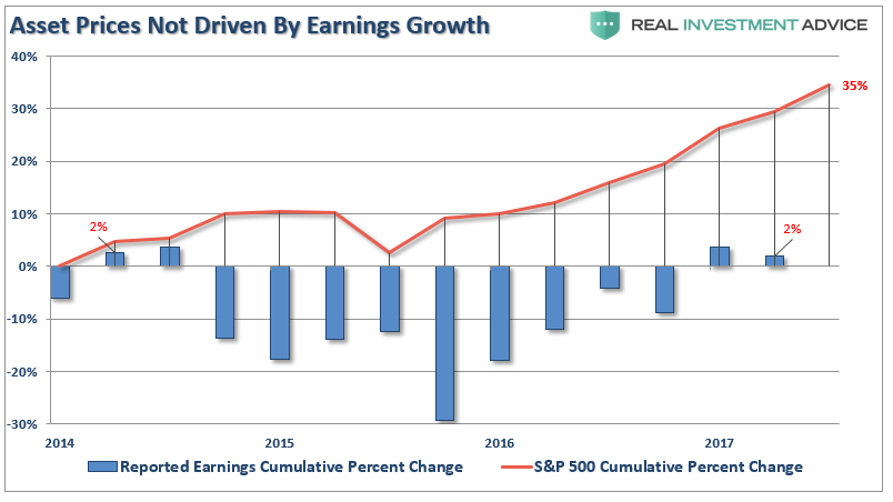
“Since 2014, the stock market has risen (capital appreciation only) by 35% while reported earnings growth has risen by a whopping 2%. A 2% growth in earnings over the last 3-years hardly justifies a 33% premium over earnings.
Of course, even reported earnings is somewhat misleading due to the heavy use of share repurchases to artificially inflate reported earnings on a per share basis. However, corporate profits after tax give us a better idea of what profits actually were since that is the amount left over after those taxes were paid.”
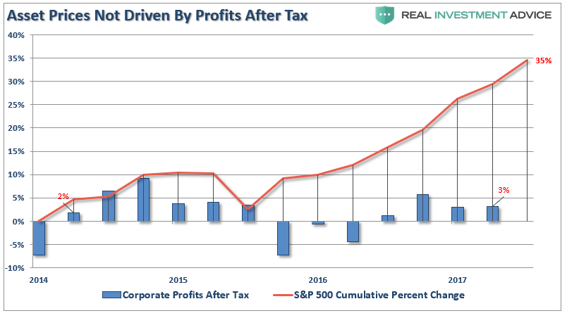
“Again we see the same picture of a 32% premium over a 3% cumulative growth in corporate profits after tax. There is little justification to be found to support the idea that earnings growth is the main driver behind asset prices currently.
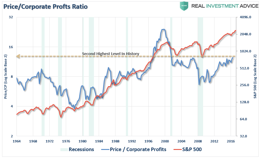
We can also use the data above to construct a valuation measure of price divided by corporate profits after tax. As with all valuation measures we have discussed as of late, and forward return expectations from such levels, the P/CPATAX ratio just hit the second highest level in history.”
The reality, of course, is that investors are simply chasing asset prices higher as exuberance overtakes logic.
The second meme of “it’s all about tax cuts” is also not entirely accurate. The current rally, following the nearly 20% decline in early 2016, is actually an extension from the transition of “quantitative easing” from the Federal Reserve to the global Central Banks. What is clearly seen in the chart below is that as the Fed signaled the end of its QE program and begin hiking interest rates, global Central banks took the lead.
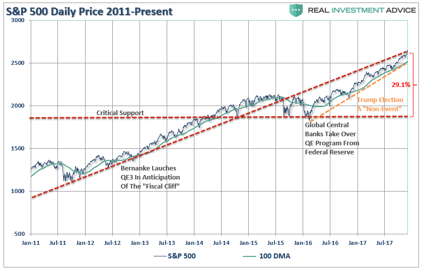
As noted, a correction back to critical support, the 2016 lows, would entail a 29.1% decline from current levels. More importantly, a decline of such magnitude will threaten to trigger “margin calls,” which, as discussed previously, is the “time bomb” waiting to happen.
Here is the point. The “excuses” driving the rally are just that. The election of President Trump has had no material effect on the market outside of the liquidity injections which have exceeded $2 trillion.
Importantly, on a weekly basis, the market has pushed into the highest level of overbought conditions on record since 2005. I have marked on the chart below each previous peak above 80 which has correlated to a subsequent decline in the near future.

The problem for investors is not being able to tell whether the next correction will be just a “correction” within an ongoing bull market advance or something materially worse. Unfortunately, by the time most investors figure it out, it is generally far too late to do anything meaningful about it.
As shown below, price deviations from the 50-week moving average has been important markers for the sustainability of an advance historically. Prices can only deviate so far from their underlying moving average before a reversion will eventually occur. (You can’t have an “average” unless price trades above and below the average during a given time frame.)
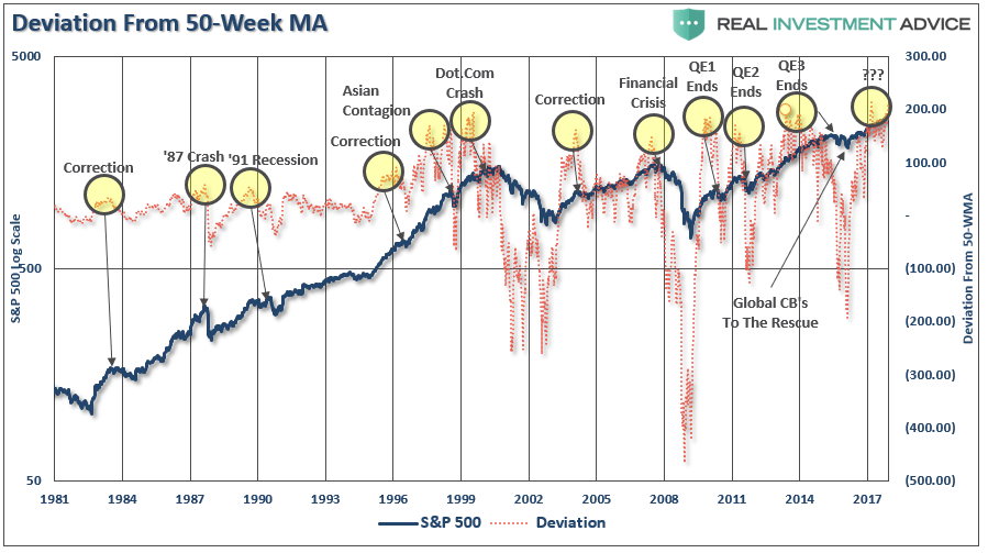
Notice that price deviations became much more augmented heading into 2000 as electronic trading came online and Wall Street turned the markets into a “casino” for Main Street.
At each major deviation of price from the 50-week moving average, there has either been a significant correction or something materially worse.
This time is unlikely to be different.
Just how big could the next correction be?
As stated above, just a correction back to the initial “critical support” set at the 2016 lows would equate to a 29.1% decline.
However, the risk, as noted above, is that a correction of that magnitude would begin to trigger margin calls, junk bond defaults, blow up the “VIX” short-carry and trigger a wave of automated selling as the algorithms begin to sell in tandem. Such a combination of events could conceivably push markets to either strong support at the previous two bull market peaks or to support at the 2011 peak, which coincides with the topping formations of 2000 and 2007.
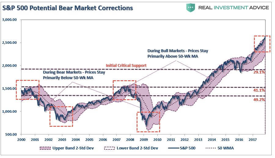
Such a correction would entail either a 41.1% to 49.2% decline.
I won’t even mention the remote, but real, possibility of a nearly 75% retracement to the previous lows of the last two “bear markets.”
That can’t happen, you say?
It wouldn’t even match the decline following the 1929 crash of 85%.
Furthermore, as technical analyst J. Brett Freeze, CFA, recently noted:
“The Wave Principle suggests that the S&P 500 Index is completing a 60-year, five-wave motive structure. If this analysis is correct, it also suggests that a multi-year, three-wave corrective structure is immediately ahead. We do not make explicit price forecasts, but the Wave Principle proposes to us that, at a minimum, the lows of 2009 will be surpassed as the corrective structure completes.“
Anything is possible.
There are probabilities and possibilities.
Both can happen. You play the probabilities, but prepare for the possibilities.
No one knows with certainty what the future holds, which is why we must manage portfolio risk accordingly and be prepared to react when conditions change.
While I am often tagged as “bearish” due to my analysis of economic and fundamental data for “what it is” rather than “what I hope it to be,” I am actually neither bullish or bearish. I follow a very simple set of rules which are the core of my portfolio management philosophy, which focus on capital preservation and long-term “risk-adjusted” returns.
As such, let me remind you of the 15-Risk Management Rules I have learned over the past 30 years:
- Cut losers short and let winners run. (Be a scale-up buyer into strength.)
- Set goals and be actionable. (Without specific goals, trades become arbitrary and increase overall portfolio risk.)
- Emotionally driven decisions void the investment process. (Buy high/sell low.)
- Follow the trend. (80% of portfolio performance is determined by the long-term, monthly trend. While a “rising tide lifts all boats,” the opposite is also true.)
- Never let a “trading opportunity” turn into a long-term investment. (Refer to rule #1. All initial purchases are “trades” until your investment thesis is proved correct.)
- An investment discipline does not work if it is not followed.
- “Losing money” is part of the investment process. (If you are not prepared to take losses when they occur, you should not be investing.)
- The odds of success improve greatly when the fundamental analysis is confirmed by the technical price action. (This applies to both bull and bear markets.)
- Never, under any circumstances, add to a losing position. (As Paul Tudor Jones once quipped: “Only losers add to losers.”)
- Market are either “bullish” or “bearish.” During a “bull market,” be only long or neutral. During a “bear market,” be only neutral or short. (Bull and bear markets are determined by their long-term trends, as shown in the chart below.)
- When markets are trading at, or near, extremes, do the opposite of the “herd.”
- Do more of what works and less of what doesn’t. (Traditional rebalancing takes money from winners and adds it to losers. Rebalance by reducing losers and adding to winners.)
- “Buy” and “Sell” signals are only useful if they are implemented. (Managing a portfolio without a “Buy/Sell” discipline is designed to fail.)
- Strive to be a .700 “at bat” player. (No strategy works 100% of the time. However, being consistent, controlling errors, and capitalizing on opportunity is what wins games.)
- Manage risk and volatility. (Controlling the variables that lead to investment mistakes is what generates returns as a byproduct.)

The current market advance both looks and feels like the last leg of a market “melt-up” as we previously witnessed at the end of 1999. How long it can last is anyone’s guess. However, importantly, it should be remembered that all good things do come to an end. Sometimes, those endings can be very disastrous to long-term investing objectives. This is why by focusing on “risk controls” in the short term and avoiding subsequent major drawdowns, the long-term returns tend to take care of themselves.
Everyone approaches money management differently. This is just the way I do it.
All I am suggesting is that you do “something,” as the alternative will be much less beneficial.

Dec 5, 2017
- For the past few weeks I’ve suggested that a modest US dollar rally against the yen (and thus gold) was due, and now it’s here.
- Please double click chart below.Double-click to enlarge.The dollar’s right shoulder rally fits with the US senate’s decision to finally pass some corporate tax cuts. That’s modestly good news for “risk-on” investors.

- It’s modest because it comes at a late stage in the business cycle.Many institutional money managers are trimming US stock market holdings. They are investing the proceeds into key Asian markets where corporate profits are rising but P/E ratios are lower.
- Please click here now. This is typical market action in the late stages of the US business cycle; the Dow stocks keep rallying, and the growth stocks stumble.
- Please click here now. I’m pretty comfortable with my Chinese stock market holdings. If there is a crash, I’ll simply buy more and urge savvy investors to do so too.
- Please click here now. In the big picture, American citizens are outnumbered by Asians. There are about eight Chindians for every American.
- Cars are turning into moving offices. Business owners will be happy to sit in rush hour in their electric self-driving cars, because they will be able to work.
- Many workers will get paid the moment they leave their house and start their car engines. They will work in self-driving company cars on the way to their workplace.
- Car accidents should decline by 95% or more.
- Please click here now. Gold is in “mellow” mode here, but some (Western) investors are disheartened.
- New surveys show that institutional money managers now expect three rate hikes in 2018, yet gold barely swoons on the news. In India and China, investors buy gold in both good times and bad. Rate hikes are viewed as almost irrelevant to gold price discovery.
- Price discovery continues to move from the West to the East, and that means rate hikes will soon become even more irrelevant to gold than they are now.
- I expect a surge in private equity deals as rate hikes cause institutional investors to look outside of the US stock market arena for capital gains.
- Tax cuts are inflationary and good for small business. The new Fed chair stands ready to chop the red tape that has handcuffed small bank lending.
- Regardless, just as wise equity market investors hold gold as a hedge, gold investors should hold some alternative assets as their hedge.
- Please click here now: Double-click to enlarge. Litecoin is a great hedge, especially for gold stock investors who can handle some market volatility.
- Litecoin is my third largest blockchain currency holding. It’s soared from about $1 to $100 in a very short period of time. My long term target is $1200 per coin.
- If it hits the target, that would make it a “twelve hundred bagger”. Gold stock investors who need some blockchain currency to diversify can use my wealth building www.gublockchain.com newsletter to get started.
- Please click here now. GDX continues to consolidate in the $25 – $21 price zone.
- The market feels solid, but gold stocks are well below their February high, while gold bullion sits near the levels it acquired then.
- It’s disappointing that the market has not rewarded shareholders for backing companies that have achieved significant cuts in AISC (all-in sustaining costs).
- In a perfect world, GDX would be trading at about $30 (or higher) right now. Unfortunately, it’s not a perfect world. The good news is that from a technical perspective, the odds of a move above $25 to $28 are about 67%, while the odds of a move under $21 to $18 are about 33%.
- GDX and associated gold stocks are quite firm given that strong Chinese New Year buying has yet to commence. That buying should start soon after the Fed’s next rate hike. In this hiking cycle, gold has staged fabulous rallies after almost all the hikes.
- Will the next rally be the biggest of them all? Perhaps, but if it happens, only investors with substantial “skin in the gold stocks game” will get to smile!

Thanks!
Cheers
st
Dec 5, 2017
Stewart Thomson
Graceland Updates
website: www.gracelandupdates.com
 When you read the title of this article, I am sure you assumed this article would be all about the latest event of fake news which supposedly rocked the market this past Friday. Well, I am sorry to disappoint you.
You see, many investors have been following fake news for much longer than you realize. Well, more accurately, the news has been real, but the expectations held by analysts and investors has been fake.
As I have been presenting for quite some time now, we have seen many expectations of negative reactions to news being presented by analysts over the last two years. They have pointed to news events like Brexit, Frexit, terrorist attacks, rise in interest rates, cessation of QE, the Trump election, and many other reasons as to why the stock market will start heading south in a big way. So, while they have all pointed to real news events, their expectations have been fake.
So, maybe its time to consider that fake news and fake expectations have potentially been hurting investors these last few years!?
And, rather than maintaining fake expectations about how the next news event is going to “cause” a move in the market, at some point, investors may have to accept that the substance of these news events do not cause anything. Rather, it is the investor reaction to the news events which cause movements in the market. And, investor reactions are driven by investor sentiment.
When investor sentiment is positive, seemingly negative news events are discounted (terrorist attacks, North Korea, rising interest rates, cessation of QE, etc.) as the market continues on its northern trajectory. However, as the market completes its natural path of progression, we reach a point at which it is time we can begin to expect that investor sentiment has reached a pinnacle, and will likely turn south for a time.
If you are being an honest observer of the stock market for these last two years, then you can admit that this is the simplest and most accurate explanation for what you have seen with your own eyes. There is no other reasonable explanation as to why the market has shrugged off news that most have expected to not only stop the market in its tracks, but also potentially cause a huge sell off in the market.
Now, the question you must ask yourself is if you have the tools to be able to identify when investor sentiment is positive, when it is negative, and when we are approaching a potential turn in sentiment?
Price pattern sentiment indications and upcoming expectations
Everything I have written above should force you to think critically whenever you chose to read analysis being published about the market. And, even the analysis I present is often misread.
Recently, I have seen a number of people quote me as saying that I expected the stock market to certainly top at 2611SPX.
It is certainly true that, back in 2015 and early 2016, I was looking for the SPX to rally from the 1800 region to an ideal target of 2537-2611. But, it did not mean that the market was certainly going to top at 2611. Rather, this was a standard target region which my analysis pointed towards for this rally, and one which we set two years ago, well before this rally even began. And, it meant I was expecting a 40%+ rally in the SPX, while many others at the time were expecting a stock market crash. Now, since we have exceeded the upper end of the target region I set two years ago by 2%, it certainly suggests to me that the market is quite stretched up here, and I am turning much more cautious on the macro scale.
However, for those that have read my analysis since early November, you would know that I was clearly noting that the IWM was setting up for a strong rally. Moreover, I stated quite clearly that we could not see a potential market top until the IWM completed this last segment of its rally. While I was unsure as to whether the SPX would be able to rally alongside and in lockstep with the IWM, I certainly was not expecting a top in the overall equity market until the IWM completed the rally I expected off the mid-November lows.
So, ultimately, when one market presents an unclear picture to me, I try to look at the other charts within the market to see if a clearer picture is presented. This time, while the SPX was not terribly clear to me, the IWM was certainly telling me to not get too bearish too soon, as it still was pointing to further rally potential for the market. Yet, it also suggested that, once we completed that segment of the rally in the IWM, we were likely approaching a larger degree top.
This past week, the SPX played a little catch up to the IWM, but certainly lagged the IWM by almost half in terms of percentage moves since the mid-November lows, with the IWM rallying approximately 7% since its mid-November lows, and the SPX bringing up the rear with almost 4%. So, while I was unsure if the SPX would provide us with a rally, I think it should be quite evident that moving over to the IWM was the prudent move for investors since mid-November.
And, until the IWM is able to break back below the low we struck on Friday, I still think there can be further highs to which the IWM can push in the coming week or two. So, while I am getting much more cautious in the equity market, I am not quite yet bearish.
Remember, the larger picture suggests that the SPX will likely see levels exceeding the 3000 region in the coming years before a major bear market takes hold. Yet, I am expecting a sizeable pullback to begin once the IWM completes this rally phase.
See charts illustrating the wave counts on IWM and S&P 500.
Avi Gilburt is a widely followed Elliott Wave technical analyst and author of ElliottWaveTrader.net (www.elliottwavetrader.net), a live Trading Room featuring his intraday market analysis (including emini S&P 500, metals, oil, USD & VXX), interactive member-analyst forum, and detailed library of Elliott Wave education.

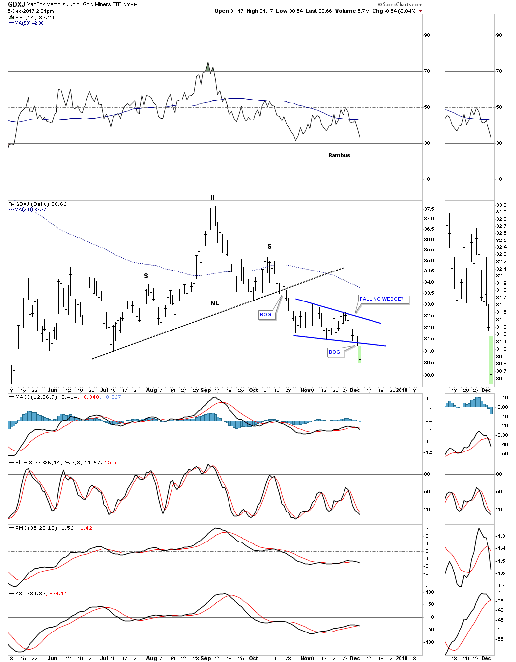
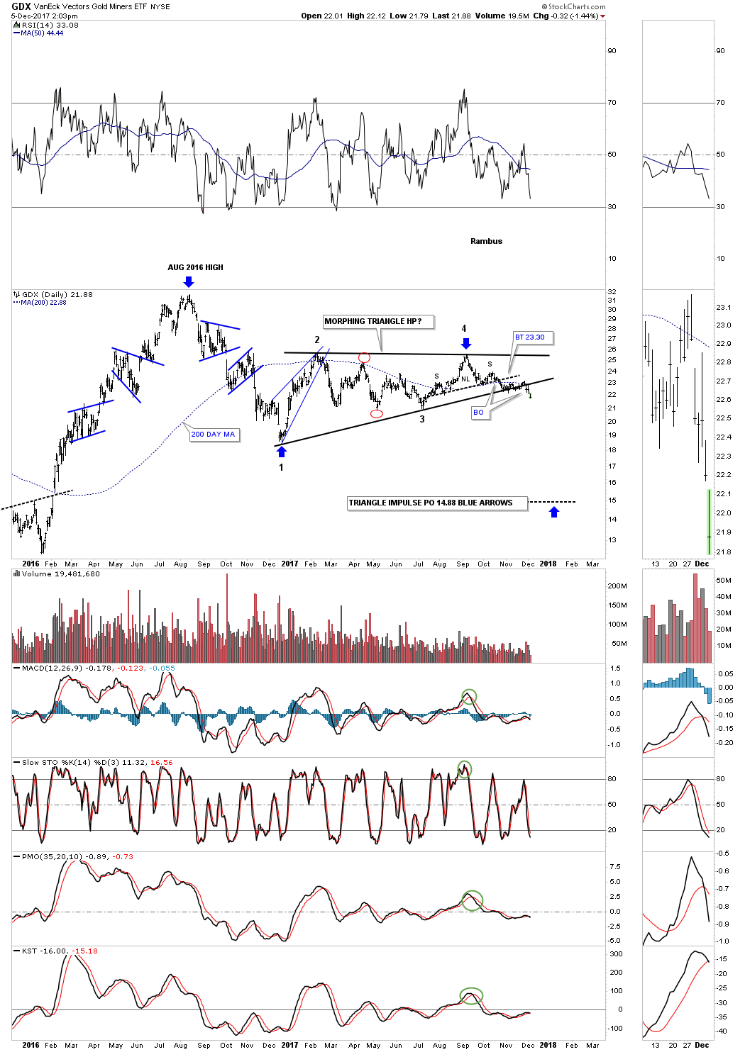
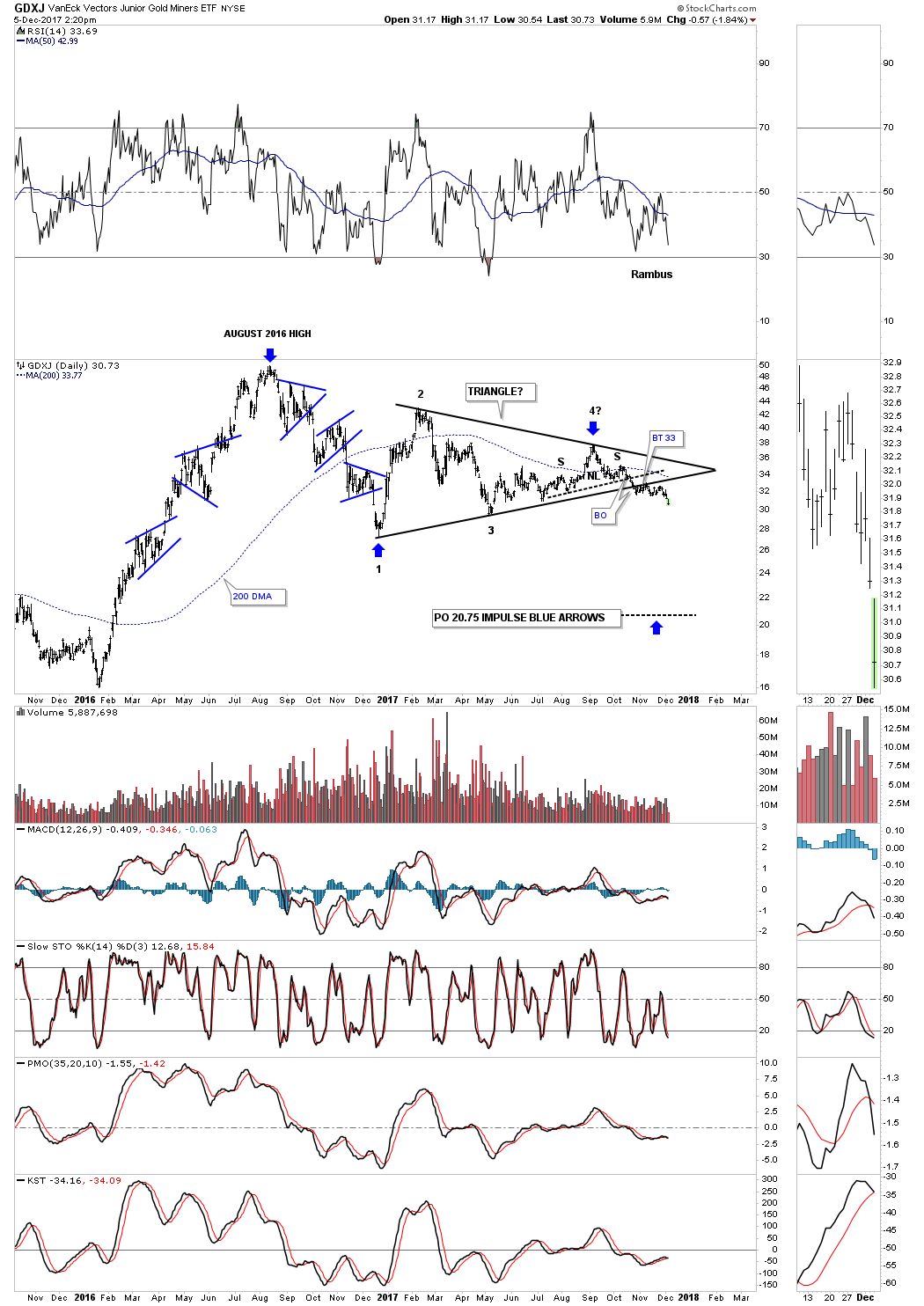
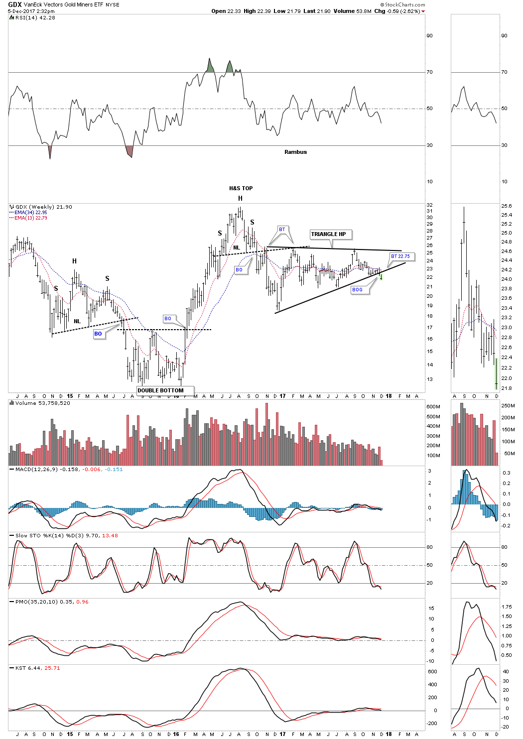
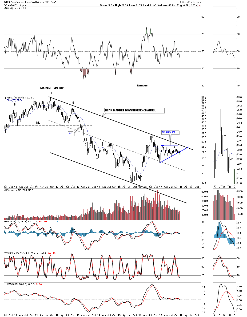
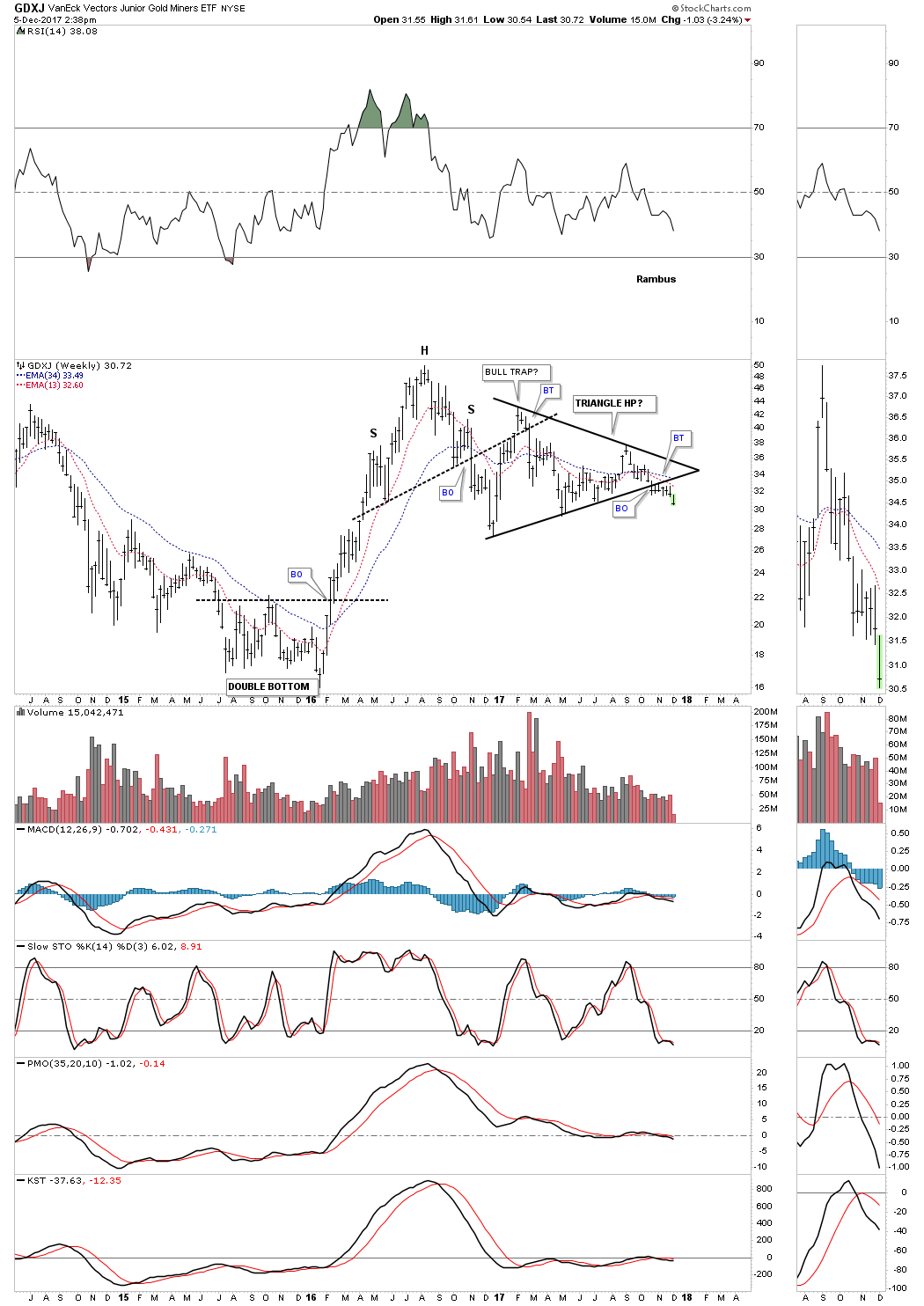
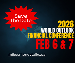
I’m going to use the GDX and GDXJ as a proxy for the rest of the PM stock indexes which are very similar to these two. Last Wednesday we looked at the short term daily charts to the longer term weekly charts to see how things were setting in the PM complex.
We first looked at the short term daily chart which was showing the H&S top and the smaller blue consolidation pattern that was building out below the neckline. The smaller blue patterns were kind of morphing, but were giving us a hint of what they would eventually look like when they competed.
Below is the short term daily chart for the GDX which shows the H&S top with the completed bearish rising flag. The breakout was a little sloppy, but today we are getting some follow through to the downside.

This short term daily chart for the GDXJ shows it broke out below the bottom rail of its bearish falling wedge this morning with a breakout gap.
Now lets look at the longer term daily chart for the GDX which shows the one year triangle consolidation pattern with the breakout now visible. The chances are high that the triangle consolidation pattern will be a halfway pattern to the downside with a price objective to the 14.88 area as shown by the blue arrows.
Below is the long term daily chart for the GDXJ which shows the H&S top on the short term daily chart as the 4th reversal point in its one year triangle consolidation pattern. The impulse measured move would be down to the 20.75 area as shown by the blue arrows.
This four year weekly chart for the GDX puts the triangle in perspective as a possible halfway pattern to the downside. It’s still possible we could see a backtest to the underside of the bottom rail of the triangle which would come into play around the 22.75 area.
Until the bulls can take out the top rail of the downtrend channel the bears are still in charge.
This short term weekly chart for the GDXJ puts its one year triangle in perspective as a possible halfway pattern to the downside.
This long term weekly chart shows how the triangle fits into the very big picture. Again all the bulls need to do is take out the top rail of the bear market downtrend channel and all will be right with the world again. As you can see they have tried three times in the last year and a half, but so far haven’t been able to do it.

Tuesday 5 December 2017
Quotable
“ It is better for you to be free of fear lying upon a pallet, than to have a golden couch and a rich table and be full of trouble. ”
— Epicurus
Gold quiet period about to end?

From today’s Wall Street Journal:
“Major U.S. stock indexes have been historically quiet this year. Now, that inactivity has spreadto the precious metals market. Gold stayed in a $34.50 trading range in November, the lowest gap between its high and low in any month since October 2005, according to the Journal’s Market Data Group.”
We believe this low volatility period is about to change for the shiny metal.
Gold pays no interest. Thus, gold prices tend to be negatively correlated to interest rates; i.e. higher interest rates and lower gold prices, vice versa. So, if one accepts as probable the following we gleaned from this week’s Barron’s magazine…
‘But a major risk for the market is the potential for a rise in US inflation,’ says Mark Haefele, the giant Swiss bank’s (UBS) global chief investment officer. That concern, which could push the Federal Reserve to tighten more aggressively, is shared by Deutsche Bank’s strategists, along with the impact of the European Central Bank’s tapering of its massive bond purchases.
Deutsche last week joined the small but growing list of major banks that think the Fed could raise its interest-rate target four times in 2018, in addition to the quarter-point hike that seems to be a lock at the Dec. 12-13 meeting of the Federal Open Market Committee.”
…then one should be very concerned about the price of gold. We are short. In the chart below, you can see a clear negative correlation between gold and US benchmark 10-year yields

We expect gold to breakdown out of its currency range; the chart below shows our technical view. The next swing support comes in at 1,124; then 1,046.

And if we have seen a bottom in 10-year benchmark yields, and are in the midst of a new secular bull-trend higher in interest rates, gold could really get clobbered–$700 anyone?
Jack Crooks,
President, Black Swan Capital
www.blackswantrading.com
772-349-6883/ Twitter: bswancap

-
I know Mike is a very solid investor and respect his opinions very much. So if he says pay attention to this or that - I will.
~ Dale G.
-
I've started managing my own investments so view Michael's site as a one-stop shop from which to get information and perspectives.
~ Dave E.
-
Michael offers easy reading, honest, common sense information that anyone can use in a practical manner.
~ der_al.
-
A sane voice in a scrambled investment world.
~ Ed R.
Inside Edge Pro Contributors

Greg Weldon

Josef Schachter

Tyler Bollhorn

Ryan Irvine

Paul Beattie

Martin Straith

Patrick Ceresna

Mark Leibovit

James Thorne

Victor Adair