
Gold & Precious Metals
Every now and then we see some kind of anomaly on the precious metals market. Sometimes it’s particularly useful and sometimes it’s just something random. Yesterday was one of those days when something didn’t seem right. The USD Index rallied, silver declined, mining stocks declined and yet, gold closed the session higher. What can we infer from this uncommon event?
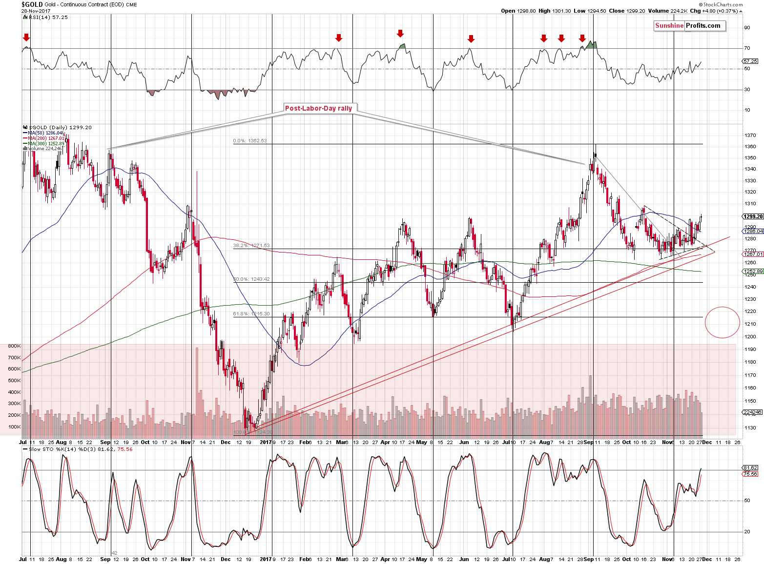
Unfortunately, not much. It was just one day when gold behaved in this way, so at this time we have no reasons to believe that gold’s one-metal rally was anything important. One thing that was visible in the gold market and that wasn’t visible in other parts of the precious metals market was gold’s breakoutabove the triangle pattern. Consequently, yesterday’s strength might have simply been a consequence of the breakout and we already described it yesterday. We wrote that we could see an upswing, but we don’t think it will be anything major, for instance a move to the October high. So, in a way, nothing changed, even though the relative moves during yesterday’s session might have raised many eyebrows.
Let’s take a closer look at the gold chart for details (chart courtesy of http://stockcharts.com).
In yesterday’s alert, we wrote the following:
Gold moved higher on declining volume yesterday, but overall it continues to move back and forth below the $1,300 level. Its move above the 50-day moving average and then 2 closes above are somewhat similar to the October top. The Stochastic and RSI levels are similar as well. The above is a weak, but still, bearish sign. Even though Stochastic is at similar levels, we can see that the current reading is higher. In a way, even though the price of gold is lower, the above means that gold is closer to being overbought now, than it was in October.
On a bullish note, gold confirmed the breakout above the triangle pattern, which could result in a short-term rally. Still, we don’t expect the upswing to take gold much higher – the October high seems to be a likely target if gold’s rally continues. Again, that’s a big if, as based i.a. on the 61.8% Fibonacci retracement in the USD, the latter could rally immediately and gold could decline immediately as a result.
While Monday’s volume during the upswing was relatively low, the volume that we saw yesterday was very low. This, plus the fact that both silver and mining stocks declined, suggests that gold’s rally was most likely accidental – not an indication of a looming rally.
Having said the above, let’s discuss the situation in gold’s main adversary (after all, they tend to move in the opposite ways), the USD Index. If the latter was about to take a dive, we might still expect gold to soar. But is it likely?
No.
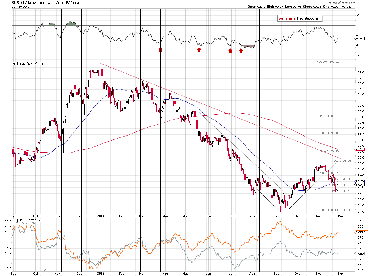
The USD Index moved lower in the past few weeks, but not in the past few days. In Monday’s alert, we wrote about a possible move below the 61.8% Fibonacci retracement level and a subsequent invalidation – that’s exactly what we saw during Monday’s session. The reversal took place quite close to the cyclical turning point, which further increases the odds that the bottom is really in and yesterday’s rally further confirmed it.
This is likely also based on the analogy in terms of time to the previous corrections in the early parts of major rallies in the USD.
One of the reasons due to which we expect the USD Index to rally in the coming months is the analogy to its behavior during previous series of rate hikes. The USD didn’t start to rally immediately after the rates were increased in the recent past and while it may seem surprising, this is exactly how things developed in the past. There was a specific delay in the USD’s reaction and it seems that it will also be the case this time. If the history is to repeat itself, it seems that the series of rate hikes is going to trigger a massive rally in the USD Index any week now.
But didn’t USD Index just decline for a few weeks? Doesn’t it invalidate any bullish implications here?
That’s a very good question and we decided to take a closer look at the analogy to the previous major bottoms and the early parts of major rallies. It is often said that time is more important than price and we analyzed the previous upswings and the early corrections with the above in mind. Namely, we checked how long the initial rallies lasted and how long the USD was correcting. You will find the details below:
- 1998 – 1999: the initial rally: 6 weeks, followed by 2 weeks of declines
- 1999 – 2000 the initial rally: 7 weeks, followed by 5 weeks of declines
- 2005 – the initial rally: 6 weeks, followed by 4 weeks of declines
- 2008 – the initial rally: 7 weeks, followed by 5 weeks of declines
- 2009 – 2010 – the initial rally: 4 weeks, followed by 3 weeks of declines
- 2011 – the initial rally: 10 weeks, followed by 2-5 (unclear) weeks of declines
- 2014 – 2015 – the initial rally: 4 weeks, followed by 4 weeks of declines
- 2016 – the initial rally: 4 weeks, followed by 3 weeks of declines
- 2017 (current upswing) – the initial rally: 7? weeks, followed by 4? weeks of declines
The initial rallies lasted between 4 and 10 weeks with the 10 number being the outlier. The average is 6, while the most recent rally either took 7 weeks (quite in tune with the past patterns) or it’s not over yet with 10 weeks so far. If it’s not over, then it would need to rally for an additional week or two, thus making the entire rally even longer than the previous outlier at 11 or 12 weeks (or longer).
Is it therefore possible that the rally will still continue before a bigger correction is seen? Yes. Is it likely? No. Based on the above time analogies it’s more likely that the initial rally is already over and we are after 3 weeks of declines.
Is the above good or bad? Both. It’s good, because we’re likely closer to the big decline in the precious metals market than it first appeared, but it’s bad because we may not get a meaningful and tradable corrective upswing in the precious metals sector after the USD Index moves close to the 96 level. Ultimately, it’s not really a matter of deciding whether the current environment is better or worse, but adapting to it and tweaking the strategy so that it remains up-to-date with the most recent observations. After all, trading is like a game of poker – at times you will get a good hand and at times you will get a back hand, but by having a good strategy toward both situations you’ll likely come out ahead over time.
So, what’s the likely follow-up action from here? If we are indeed after 3 weeks of declines, then if we can estimate how long the rally is likely to last, we could check how long it should take, additionally, for the USD to bottom.
The average length of the correction is between 3.5 and 3.875 weeks depending on the interpretation of the 2011 action. We are already after 4 weeks.
What if instead of using the average, we take into account the most similar cases – where the initial rallies took 6 or 7 weeks. In this case we get an average of 4 weeks (based on 2, 5, 4, and 5 weeks). 5 weeks is the most common analogy (half of the cases), though.
Finally, what if we assume that the most recent rally (2016) is most likely to be repeated as it’s most similar fundamental-wise? In this case, we should expect the decline to take 3 weeks. In other words, it could be over.
All in all, if we average the above approaches, it seems likely that we have either already seen the final bottom in the USD or we’re going to see it this week. Next week is also a possible time target, but it’s not as likely.
Summing up, gold’s rally that we saw yesterday is either inconsequential, if we focus on its performance relative to the rest of the precious metals market, or actually bearish, if we focus on it on a stand-alone basis and compare it to the size of the volume. Moreover, let’s not forget that even though the USD Index declined visibly in the past weeks, mining stocks were unable to invalidate the breakdown below the rising resistance line and the implications remain bearish. There are many signs pointing to a big move lower in the coming weeks and it seems that any short-term strength will be reversed sooner rather than later, especially if the decline in the USD Index is already over. The odds for the latter increased based on yesterday’s rally and the analogy to the previous early parts of major upswings.
Thank you.
Sincerely,
Przemyslaw Radomski
We hope you enjoyed today’s analysis, even though it might appear controversial. If you’d like to receive follow-ups, we invite you to subscribe to our Gold & Silver Trading Alerts.

Last week, as traders were all on vacation, the market surged to 2600 as the “inmates ran the asylum.” The expectation of a better than anticipated shopping holiday season and ongoing hopes of “tax cuts and reform” lifted stocks higher. The current advance, is still working the general year-end pattern I laid out three weeks ago as shown below.

With earnings season nearing its conclusion, the markets will begin to focus more heavily on the economic data which has been weak as of late. Furthermore, with the Fed continuing to hike rates, and professional investors waiting to take gains until January, the risk of a Q1 sell-off has risen markedly in recent weeks. This is particularly the case given the short-term deviation from longer-term trends in the market.
The chart below shows the percentage deviation above the 3-year monthly moving average. Previous deviations have resulted in an eventual reversion to, or beyond, the 3-year moving average. A reversion to the monthly moving average currently would entail a -15.8% decline. While such a decline would not register as a “bear market,” which would require a 20% decline, given the record length of time without so much as a 3% correction, such a decline will certainly “feel” like a bear market.

 Well, it’s hard to believe that it’s been a year since Donald Trump got elected, and at least the good news is that we’re still alive. All kidding aside, the question I’ve been fielding ever since November 8th of last year and to this day is how we are investing around Donald Trump, and the answer has not changed one iota, which is that we are not investing around Trumponomics at all.
That often raises eyebrows because we all know that the U.S. stock market indices have continued to hit new record highs almost daily, but I would claim that this has had little to do with the President. Actually, if you had owned the basket of Trump stocks the so-called experts told you to own after last year’s election, you would have woefully lagged behind.
And of course, it goes without saying that the top performing sector by a country mile, and I am talking about technology, was the area we were all supposed to avoid since Silicon Valley would pay the price for not supporting The Donald. And yet the tech universe is up 40% for the year and has nearly doubled the rest of the market. There may be some hope out there that we will see tax reform south of the border, but there are an array of other factors influencing investor sentiment right now. Ongoing supportive global liquidity growth and the vast majority of companies beating their profits and sales estimates are among the reasons.
That said, excessive valuations and the Fed now coupling its rate hikes with balance sheet reduction I think are going to produce some speed bumps for risk appetite in coming months. Between that and the tapering by the ECB and the fact that the Bank of England joined the Fed on the rate-hiking front, are all very likely going to generate a less calm and more choppy market. Though this actually would be a good thing in terms of opening up some buying opportunities, taking advantage of these opportunities will require having some dry powder on hand.
In terms of our highest conviction calls, given that we are coming off the 100th month anniversary of this economic cycle, the third longest ever and almost double what is normal, it is safe to say that we are pretty late in the game. The question is just how late, and we did some research looking at an array of market and macro variables, and concluded that we are about 90% through, which means we are somewhere past the 7th inning stretch in baseball parlance but not yet the bottom of the 9th. The high-conviction message here is that we have entered a phase of the cycle to be very mindful of risk, to be bolstering the quality of the portfolio, to be focusing on strong balance sheets, minimal refinancing risk and companies with high earnings visibility and predictability, and with low correlations to U.S. GDP. In other words, the exact opposite of how to be positioned in the early innings of the cycle where it is perfectly appropriate to be extremely pro-cyclical.
So it’s either about investing around late-cycle thematics in North America or it is about heading to other geographies that are closer to mid cycle — and that would include Europe, segments of the Emerging Market space where the fundamentals have really improved, and also primarily in Japan. These markets are not only mid cycle and as such have a longer runway for growth, but also trade relatively inexpensively in a world where value is scarce, and for the most part, still have friendly central banks keeping liquidity conditions flush.
I would have to say that if there is a market that has broken out of a 25-year secular downtrend, and where the economic and political tailwinds are significant, it is in Japan. I get told all the time that Japan’s population is declining, but we are buying companies, not bodies, and the bottom line is that even with this declining population, earnings momentum is on the rise and profit margins in Japan are on an impressive expansion phase, and not nearly priced in. In fact, Japan is one of the few markets globally that is not trading at premium multiples relative to its history and is an under-owned market both globally and locally.
Turning to Canada, there is some visibility here in the oil price given: the high degree of OPEC compliance and the strong likelihood of an extension to the output cut agreement; the drawdown in US inventories; declines in global storage; solid world demand especially from oil-hungry emerging markets; and a geopolitical risk premium coming back into the market because of the uncertainties now over the Iran deal which sits in Congress and these tensions between Iraq and the Kurds. The shape of the curve doesn’t lie and the recent move from contango to backwardation is an added sign of how tight the crude market has become. The beauty here is that the Canadian E&P stocks are not priced for where oil is today, and over the near term there is more upside potential than downside risk. So they look attractively priced here, once again in a world where inexpensive assets are in short supply. And given the correlations between energy and the Canadian banks, this is good news for this sector as well.
It also seems to me that with the Bank of Canada now on hold and with the Fed likely to raise rates, that there are increased odds of the Canadian dollar faltering further. And if it breaks C$1.30 which is the 200-day moving average, then we are talking about the next test being C$1.35 where there is a ton of technical support.
And let’s face it, the economy here is going to need another dose of some currency-related stimulus because of the combination of NAFTA uncertainty, the tightened B20 mortgage regulations (which is sure to bite into the housing market next year), and a clouded fiscal picture in terms of the outlook for taxation (I have no clue as to why the Federal government is adding more complexity to this situation, but it is just another reason for the Bank of Canada to stay on the sidelines).
In any event, the resultant weakening in the loonie is a positive underpinning for many of our sectors, and again, that includes energy where the Western Canada Select price has surged in local currency terms by just under 20% over the past two months whereas the TSX energy sector has rebounded by 7%. I should add that there are a host of other Canadian companies in our portfolio that have U.S. dollar revenue streams in areas like real estate, banks, insurers and forest products, that are going to benefit from this renewed period of Canadian dollar weakness.
Since the 2008 financial crisis, there’s been a growing number of ridiculous, inane, and otherwise nonsensical economic interventions from our central bankers that fill the daily economic headlines.
I have gone from the occasional smile to scratching my head now and then to “WTF” moments.
All that said, the economists who designed these interventions had their reasons. They thought lower interest rates and liquidity injections would create jobs, spur investment, and eventually produce inflation.
Then the idea was to reduce the stimulus before inflation got out of control. The problem is that none of these wishes came true.
The Philips Curve That Doesn’t Work Anymore
The key gauge of central bankers for assessing this tricky process is the unemployment rate.
An economy at “full employment” is one in which inflation is right around the corner. The theoretical relationship looks something like this – chart from Gary Shilling.
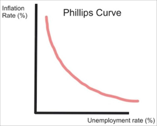
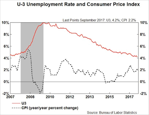
In fact, we now have very low unemployment, accompanied by stubbornly low inflation.
Why is that? No one really knows.
All sorts of theories are floating around, but none have yet proven helpful in restoring the Phillips Curve.
Here’s reality, via Gary Shilling:
The Median Household Is Back Where It Was in the 1990s
The result is a strange economy in which the people who want jobs mostly have them—but remain deeply dissatisfied, stressed, overleveraged, and often angry. See this graph of real median household income, from my friend Murat Koprulu.
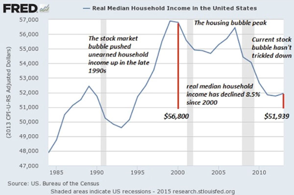
This is median, not average, household income. That means half of households are doing better and half worse. It’s also inflation-adjusted, so the amounts are consistent over time.
We see that the median family is roughly back where it was 20 years ago, in the mid-1990s. Worse, it’s still far below where it was ten years ago before the financial crisis. Is it any wonder people are mad?
Education Has Become a Risk Rather Than an Opportunity
One more absurdity.
In the US, we often think education is the key to getting ahead. That’s not necessarily the case anymore. Here’s another chart Murat sent me, showing real average hourly wages by education level.
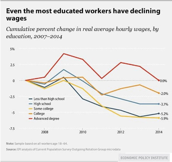
From 2007–2014, possessing an advanced degree enabled you to “get ahead” only in a relative sense. Your wages stayed flat while those of the less-educated fell.
Notice how having “some college” was actually more negative for wages than having only a high school education. How can that be?
Possibly because going to college without obtaining a degree leaves you in debt with less practical experience than your peers who went straight to work after high school.
To that point, student debt is quickly becoming a problem for everyone. Look at this chart from Grant Williams on student loan debt held by the federal government. Do we add that to our national debt?
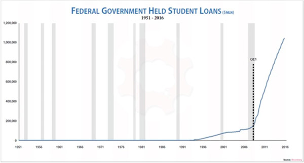
Taxpayers are on the hook for over a trillion dollars in student debt. Unlike mortgage or business debt, student debt is backed by no tangible asset you can repossess. It bought knowledge that now hopefully resides in the student’s brain, but it may have just gone in one ear and out the other.
That makes this debt uniquely risky. You and I are taking that risk, like it or not.
Stock Market Cap Is Near the Dot-Com Peak
And here’s another chart from Grant Williams, showing stock market capitalization to GDP. We are only another healthy bull market run away from being back to dot-com bubble levels. A run that many of my friends firmly believe awaits us.
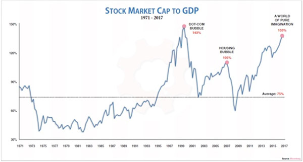
The US stock market as a percentage of GDP is now far bigger than it was at the housing bubble’s peak, and it’s rapidly approaching the dot-com bubble peak. That ought to make us a little nervous as we watch the Dow hit new all-time highs.
Insane Currency Pegs and the Global Market Driven by False Beliefs
And we will close this series of anomalies with a note I got from Louis Gave this morning. Rather than just looking for absurdities in the developed world, Louis’ research team at GaveKal scours the entire world in depth every day.
So he gives us a few lesser-known absurdities. [My comments will be in brackets.]
Usually currency pegs are not a bad place to start when looking for absurdities.
What are the odds of Lebanon keeping its peg now that Saudi won’t bankroll it? After all, you have a pegged currency with current account deficit in double digits relative to GDP:
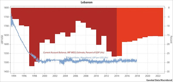
And once the Lebanese peg goes, will it be like Thailand in 1997 with Bahrein, Qatar, Oman, Egypt, Pakistan and ultimately Saudi all following suit?
If so, you can kiss goodbye to those large defense orders…
There are many other ideas. A lot of them linked to the craziness in the bond market (negative swiss yields, Italian junk below UST, etc…). But how about this one:
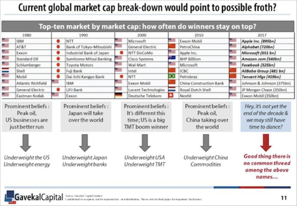
Okay, John back. Please note the serious level of sarcasm in the right-hand column above: “Good thing there is no common thread in the above names…” It’s all tech and all digital in the top seven. Note, however, that Exxon Mobil keeps hanging in there.
The above is why I love Louis and read his analysis every time I get a chance.
Get one of the world’s most widely read investment newsletters… free
Sharp macroeconomic analysis, big market calls, and shrewd predictions are all in a week’s work for visionary thinker and acclaimed financial expert John Mauldin. Since 2001, investors have turned to his Thoughts from the Frontline to be informed about what’s really going on in the economy. Join hundreds of thousands of readers, and get it free in your inbox every week.


The price of one full Bitcoin (BTC), the original decentralized digital currency, officially hit 10,000 U.S. dollars early Tuesday morning, according to data from CoinMarketCap.
The blockchain “coin” began its latest rally after Black Friday, hitting an all-time high of $9,000 on Saturday, November 25, only to surge past 10k only three days later.
Soon after, the price dipped down to around $9900. At the time of this writing, BTC has risen back to $10499.00.
Why so high?
There are several likely reasons for this massive price surge.
First, a host of big financial players recently announced they will get in on the action. Most prominently, CME Group, the largest futures exchange in the United States, has signaled that it will allow BTC futures trading as early as mid-December. While it bodes well that many traditional investors may make the jump to digital currencies, a considerable number of them seem poised for a big short. The current price spike may indicate a buying frenzy to get in ahead of the short.
-
I know Mike is a very solid investor and respect his opinions very much. So if he says pay attention to this or that - I will.
~ Dale G.
-
I've started managing my own investments so view Michael's site as a one-stop shop from which to get information and perspectives.
~ Dave E.
-
Michael offers easy reading, honest, common sense information that anyone can use in a practical manner.
~ der_al.
-
A sane voice in a scrambled investment world.
~ Ed R.
Inside Edge Pro Contributors

Greg Weldon

Josef Schachter

Tyler Bollhorn

Ryan Irvine

Paul Beattie

Martin Straith

Patrick Ceresna

Mark Leibovit

James Thorne

Victor Adair