
Wealth Building Strategies
This is a better question to ask than the typical “magic number” formula that most “first-level” thinking firms tout. Let’s review why their approach is fatally flawed, so that we can derive a more reliable method of our own based in actual reality (and funded by actual dividend payments.)
Fidelity Says What?
You should aim to have 10 times your final salary in savings.
But why? I suppose they are claiming that, if you earned $100,000 in your final year working, that you’ll want to earn this much in income every year for the rest of your life.
So, Fidelity says save a million bucks and you’re in good shape.
But how exactly is $1,000,000 supposed to throw off $100,000 in excess income annually?
Fidelity’s Strategic Dividend & Income Fund (FSDIX) pays 2.38% today. Which means, if you follow their advice to a tee, and buy their flagship income fund, you are earning $23,800 per year in income from your million-dollar stake.
That’s a start. But where exactly is the other 76.2% of you income supposed to come from?
Apparently this is up to us to figure out, because we’ve run out of sage advice from this respected investment firm. So let’s see if we can piece together a full retirement ourselves.
Shall We Also Withdraw 4% Annually?
We saved a million like they said, and we’re earning less than our neighborhood coffee barista. I presume we’re now supposed to sell shares to make up the difference. Most mainstream-following financial advisors say that we can sell 4% of our portfolio annually for income, so let’s try this.
FSDIX has returned 7.54% annually since inception, so a 4% yearly drawdown appears sustainable. However, we see three glaring pitfalls.
First, another 4% means another $40,000 per million for a total of $63,800. Still not what we are looking for.
Second, this particular fund has underperformed the S&P 500 over the last year, three years, five years and ten years. It’s also underperformed the broader market since inception (2003).
So what exactly was the point of buying a dividend fund when we were going to have to sell shares anyway? And see them appreciate less than a dumber, cheaper index fund?
FSDIX (Purple Bar) Underperforms – Always
More concerning than mere mediocrity, however, is the threat of “reverse dollar cost averaging.” Peak to trough in 2008, FSDIX lost 59% of its value. If you’re selling stock for income, you’re selling more and more at lower and lower levels:
You Don’t Want to Be Selling Here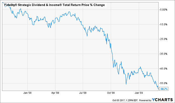
By July 2012, FSDIX investors who bought at the 2007 peak – and held 100% of their shares – had grinded their way back to even.
Buy who actually buys and holds? In reality, there are two types of investors:
- Those who bought during 2008, 2009, and 2010. They made money much sooner, because they were able to buy low.
- Those who sold during the downturn. Whether they had to sell for income, or simply got scared – many of these portfolios have still not recovered.
Back to Even (But Most Did Much Better, or Much Worse)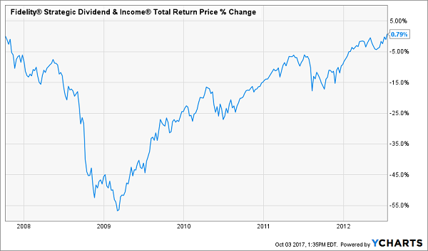
Dollar cost averaging is a powerful force. Make sure it’s working for you, rather than against you. Here’s how.
Fade the 4% Fallacy for a Smarter “Magic Dividend Number”
Our retirement approach is grounded in reality versus fantasy and false math. So, let’s begin with the value of your actual portfolio.
Back to the $1 million example. Let’s say we saved that money like Fidelity said to, and we still want $100,000 per year.
We’ll ditch the flawed notion of selling capital for income, and live on dividends alone. This means our portfolio’s “magic yield” is 10% annually.
But today, there’s only one safe 10% yield left on the board. And I wouldn’t recommend putting your entire portfolio in only one issue, no matter how sound its payout seems.
So, we’re faced with a decision. We can:
- Settle for less income, or
- Save (or make) more money.
While I wouldn’t recommend an entire portfolio of double-digit payers, I do like seven stocks (and funds) yielding an average of 8.3% today.
Their dividends are safe, and believe it or not, their prices are a bit undervalued to boot. This means we should enjoy price upside as well, and achieve 10%+ annual returns on these dividend machines.
Let’s talk more about these income plays, because you should be tuning out the “first-level” pundits – those who do little or no original thinking – and replacing your underperforming payers with these meaningful (and safe) 8.3% yields.
3 Ways to Safely Bank 8.3% Dividends
Most of the stocks you read about in the mainstream media that pay 5% or better are train wrecks. They have big stated yields for the wrong reason – namely, because their prices have been axed in half or worse over the past year!
For example, retailer Macy’s (M) pays 7.2% on paper. But its business model is toast. Next quarter’s payment may happen, but that’s a risky game I’m not willing to play.
Instead, I’d rather look in corners of the income world that aren’t combed over as regularly. There are three in particular that I like today. You won’t hear about them on CNBC, or read about them in the Wall Street Journal, because they don’t buy advertising like Fidelity and other firms.
Their relative obscurity is great news for us 8.3% dividend seekers.
Play #1: Closed-End Funds
If you feel trapped “grinding out” dividend income with classic 3% payers (like dividend aristocrats), you can double or even triple your payouts immediately by moving to closed-end funds, or CEFs. In fact, you can often make the switch without actually switching investments.
I’ll discuss my favorite CEFs in a minute.
Play #2: Preferred Shares
Not familiar with preferred shares? You’re not alone – most investors only consider “common” shares of stock when they look for income.
But preferreds are a great way to earn 7% and even 8% yields from the same blue chips that only pay 2% or 3% on their “common shares.”
I’ll explain preferreds – and my favorite tickers to buy – after we finish our high yield hat trick.
Play #3: Recession-Proof REITs
The IRS lets real estate investment trusts, or REITs, avoid paying income taxes if they pay out most of their earnings to shareholders. As a result these firms tend to collect rent checks, pay their bills and send most of the rest to us as a dividend. It’s a sweet deal.
Not all REITs are buys today, however – landlords with exposure to retail space should be avoided.
That’s easy enough to do. I prefer to focus on REITs that operate in recession-proof industries only. I want to receive my rent check powered dividends no matter what happens in the broader economy.
Now let’s discuss how you can get a hold of my complete “8.3% No Withdrawal Portfolio” research today, along with stock names, tickers and buy prices. Click here and I’ll share the specifics – and all of my research – with you right now.

 Famed Swiss investor Marc Faber, known as ‘Dr. Doom’ for his bearish views on the economy and equity markets, has sparked outrage after suggesting the US only prospered because it is ruled by white people.
Thank God white people populated America, not the blacks. Otherwise, the US would look like Zimbabwe, which it might look like one day anyway, but at least America enjoyed 200 years in the economic and political sun under a white majority,” the financial analyst wrote in a newsletter in the October edition of his The Gloom, Boom & Doom Report.
The comment, branded as racist, has led to a public backlash with major US media outlets rejecting Faber as a guest commentator.
“We do not intend to book him in the future,” said a CNBC spokesperson, as quoted by Reuters.
“Faber has not appeared on the network often, and will not be on in the future,” spokesperson for Fox Business Network said.
In response, the disgraced analyst told Reuters in an email: “What else would you expect? If stating some historical facts makes me a racist, then I suppose that I am a racist. Maybe I am wrong, and the US would be far more prosperous if the blacks had populated it, but then please explain to me why you would think so.”
Faber has reportedly left the board of a global asset manager Sprott. Mining companies NovaGold Resources and Ivanhoe Mines announced the departure of Faber from their boards of directors as well.
“The recent comments by Dr. Faber are deeply disappointing and are completely contradictory with the views of Sprott and its employees. We pride ourselves on being a diverse organization and comments of this sort will not be tolerated,” Sprott Chief Executive Peter Grosskopf said in a statement.
“Ivanhoe Mines disagrees with, and deplores, the personally-held views about race that Marc Faber has published in his current investment newsletter,” Ivanhoe said in a statement.
….also from Marc Faber: Stock Market Party Coming To An End Warns Marc Faber

 Many will simply read the headline to this article, and use it as support for their belief in the market striking a multi-year top right now. I mean, aren’t headlines like this proof that the market is overheated?
Well, the answer is a definite “sometimes.” You see, back in 2015 and 2016 I was writing articles with headlines saying that we are going to target the 2500SPX region. And, if you thought that those headlines were portending the end of the bull market, then you were clearly wrong. So, consider, maybe this headline is prescient rather than a contrarian signal. double click larger chart
While it is quite profitable at times to be a contrarian in the market, at other times it is downright dangerous. When you are standing in front of a bull who is charging ahead at full speed, you either get gored or trampled. The key is to know when the time is ripe to be a contrarian rather than simply being a contrarian because you “feel” the market is too high.
And, I am quite certain you have read all the articles constantly being published about one matrix or another that presents the “bear case” as to why the market will top today. The problem is that those articles have been published EVERY day for the last year and a half. But, since bearishness sells, we can understand why they are such click-bait, and will garner heavy hits for those writing such articles. And, Seeking Alpha is clearly not immune from such writers. The problem is that they do not serve investors well.
Remember what Keynes said: “The market can remain irrational longer than you can remain solvent.” But, more correctly, the market is always irrational. It is not based upon “logic,” or else one would engage the services of a logician to prognosticate market direction. Consider when was the last time you saw a logician identify a turning point in the market?
Currently, I am seeing more and more people believing that this current rally will simply continue unabated. As the market continues higher, their bullish calls become stronger and stronger. This is simply how market sentiment works. So, rather than expecting a crash, many are moving towards the belief that nothing will stop this stock market, since no negative “news” has been able to put a dent in this rally.
“From a purely technical point of view, if a bear market is born this month it would have to be considered the result of some sort of ‘immaculate conception,’” wrote Doug Ramsey, chief investment officer of the Leuthold Group.
Ramsey cited a “remarkable level of bullish ‘agreement’ across the U.S. stock market” for his positive views on the market, which he said “stacks the odds heavily against an imminent cyclical top,” although he said that it was still possible that stocks saw a “short-term setback.”
Well, when was the last time that a remarkable level of bullish agreement has led to a major rally continuation? If the money managers are “all-in,” I am not sure there is a lot of upside left in this market before we finally see a multi-month pullback or larger consolidation.
Several years ago, we set our target for the S&P500 between 2537-2611. While it may not seem like such a stretch of the imagination right now, consider that the market was in the 1800 region at the time we set this target, and most market participants were awaiting the certain market crash just around the corner. In fact, we maintained our strong conviction for this rally to 2500+ no matter who won the election in 2016. And, the fact that Trump won and we still rallied, despite most expectations to the contrary, supports our larger degree perspective.
But, now, we are in what we consider a “topping” zone. While the market can still push higher by another 50 points or so, I think we will be moving into a multi-month pullback as we move into 2018.
I have attached my long-term chart, which I have posted publicly on occasion over the last several years. And, for those that recognize it, you will know it has been quite an excellent road map for the US stock market. In fact, while many were calling for the “crash” back in early 2016, this chart was pointing straight up towards the 2500+ region.
Ultimately, this chart suggests that we will not likely see a 15%+ correction in the market until we complete waves (4) and (5). But, even after a 15%+ correction, which seems to be setting up for 2019 (just in time for our next Presidential election), the market will likely be heading higher into the early 2020’s, and will likely eclipse the 3000 region no matter who is elected President in 2020.
See charts illustrating the wave counts on the S&P 500.
Avi Gilburt is a widely followed Elliott Wave technical analyst and author of ElliottWaveTrader.net (www.elliottwavetrader.net), a live Trading Room featuring his intraday market analysis (including emini S&P 500, metals, oil, USD & VXX), interactive member-analyst forum, and detailed library of Elliott Wave education.
Of late, I have seen many articles postulating what moves gold up or down. We have heard all the old reasons being put forth from GDP, to a hedge against market volatility to interest rates, to the US Dollar, and many more. Unfortunately, market history simply does not support these reasons as a consistent driver of gold, as I have detailed in many past articles:
Sentiment Speaks: Time To Buy Gold To Prepare For A Stock Market Crash?
In fact, a recent article on gold suggested that “[w]e all know that gold is negatively correlated to GDP growth.” Well, since gold rose between 2000-2008, and as you can see from this attached chart that REAL GDP did as well, are we really sure that we “all know that gold is negatively correlated to GDP growth?”

In fact, take note that the stock market also rose strongly during this same period of time. Moreover, I have seen many other charts presented which offer no evidence that there is any real relationship between gold and GDP.
I have discussed this many times in the past. Correlations cannot be wholly relied upon unless you understand when those seeming correlations will end. And, since most correlation analysis does not present any indication of when those correlations will end, they are no better than using a ruler to determine your projections for any chart.
Such linear analysis will be of no use in determining when a change of trend may occur. And, one does not need such analysis to assume the current trend for anything will continue. In fact, this is likely why so many intra-market analysts have done so poorly in the last 5 years as they failed to see the coming break down in the correlations they follow (even though we were warning about these impending break downs back in 2015).
Morgan Stanley: “We Haven’t Seen A Shift This Severe In Over A Decade”
Price pattern sentiment indications and upcoming expectations
For those following us for the last six years, you would remember that we were not only accurate in our assessment for a top being struck in the metals complex in 2011, but we were also accurate in our assessment for a bottom being struck at the end of 2015.
Since that time, the market has provided us with what looks like a very nice 5-wave structure off the 2015 low, followed by a corrective pullback. Now, when I see a larger degree 5-wave structure (wave 1) being made off a multi-year bottom, followed by a corrective pullback (wave 2), I am on alert for the heart of a 3rd wave to take hold. And, in the metals complex, those are quite breathtaking rallies. For this reason, I have erred on the bullish side of the market as the market was looking like it was setting up for that 3rd wave in 2017.
However, rather than providing us the 3rd wave rally for which I was seeking confirmation, 2017 has been exceptionally frustrating as the market has invalidated several set-ups for that major 3rd wave break out.
Yet, when presented with the same opportunities on any chart, I would have probably reacted in the exact same fashion. Most of the time, the market will follow through on such set ups, while in a minority of circumstances we would see the market continue on a much larger degree 2nd wave pullback. Clearly, the market has decided that 2017 was going to be a year of consolidation.
Even though we have not had the 3rd wave break out, we have not yet broken any of the lows we identified throughout the year. And, for those that have heeded my warnings about not using leverage until the market proved itself to be within its 3rd wave, you could have still made money on each of these rallies. In fact, the GDX is approximately 10% over the lows we identified this year, even though it may not “feel” that way due to the frustration we have all felt with this current consolidation.
However, as I have been warning for the last few weeks, the GDX may be signaling it could break below those pullback lows we have struck this year. But, much depends on how high the rally I am expecting in the complex takes us.
If the GDX is able to make a higher high in the 26 region in the coming weeks, then it leaves the door open that green wave (2) may not break below the July lows. However, if the market is unable to develop a higher high over that struck in September, and then breaks below the low made before the current rally began, it opens the door to the GDX dropping down towards the 17 region before year end to complete a much more protracted wave ii, as presented in yellow on the daily GDX chart.
My preference still remains that GDX, silver and GLD all make a higher high in the coming weeks, which would put a more bullish stance upon the complex (even though another drop will likely take us into the end of the years), I really have nothing to which I can point that would suggest this will occur within a high degree of probability.
So, I have turned extremely cautious of the complex, at least until it proves itself with a higher high being struck in the coming weeks. Until such time, I am going to be more protective of my positions.
And for those who are still viewing this market from an extremely bullish perspective, I will be honest with you and tell you that I do not see any high probability set-up which would suggest the market is going to imminently break out in the heart of a 3rd wave just yet.
For this reason, I think that one can maintain a certain amount of patience (as if 2017 has not forced you to be patient enough), as even if we see a rally to a higher high, it will likely be followed by another pullback (as a wave (2) in GDX and a c-wave in GLD and silver) before we are finally ready to break out over the 2016 market highs.
Ultimately, this leads me to the conclusion that the 2016 market highs will not likely be broken until 2018, and this will remain as my primary expectation whether the GDX sees a larger break down or not. But, until we see how the next rally takes shape, we will not be able to ascertain with more certainty whether a bigger decline is in the cards into the end of the year, or if we will simply remain in the same consolidation region until then. But, caution for the next few months is clearly warranted.
See charts illustrating the wave counts on the GDX, GLD & Silver (YI).
Avi Gilburt is a widely followed Elliott Wave technical analyst and author of ElliottWaveTrader.net (www.elliottwavetrader.net), a live Trading Room featuring his intraday market analysis (including emini S&P 500, metals, oil, USD & VXX), interactive member-analyst forum, and detailed library of Elliott Wave education.

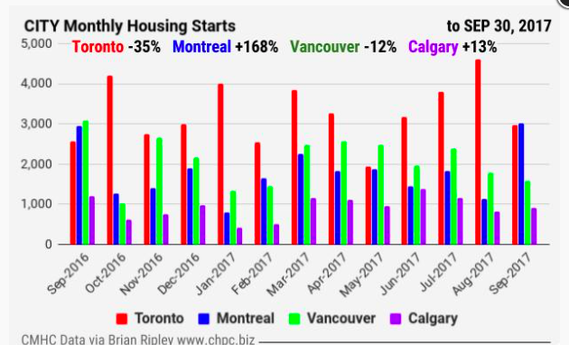
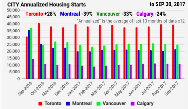
“So far this year, all regions are on pace to surpass construction levels from 2016 except for British Columbia, where starts have declined year-to-date after reaching near-record levels last summer.” “The trend in housing starts for Canada reached its highest level in almost five years”, said Bob Dugan, CMHC’s chief economist.
ANNUAL COUNT of CANADIAN HOUSING STARTS
|
|
Projected Year End 2017 Totals
Canada = 195,269(-1% Y/Y) ON = 74,999 (0% Y/Y) QC = 37,581 (-4% Y/Y) BC = 38,792 (-7% Y/Y) AB = 26,970 (+10% Y/Y) |
NOTE: The chart below shows the actual annual totals count from 1956 through 2016.

CLICK CHART TO ENLARGE
The 2017 data points on the chart are derived from the “annualized” provincial data set in the charts above and are therefor a projection of what year end 2017 might look like.


-
I know Mike is a very solid investor and respect his opinions very much. So if he says pay attention to this or that - I will.
~ Dale G.
-
I've started managing my own investments so view Michael's site as a one-stop shop from which to get information and perspectives.
~ Dave E.
-
Michael offers easy reading, honest, common sense information that anyone can use in a practical manner.
~ der_al.
-
A sane voice in a scrambled investment world.
~ Ed R.
Inside Edge Pro Contributors

Greg Weldon

Josef Schachter

Tyler Bollhorn

Ryan Irvine

Paul Beattie

Martin Straith

Patrick Ceresna

Mark Leibovit

James Thorne

Victor Adair