
Economic Outlook
 The Canadian Prime Minister Justin Trudeau is doing his best to send Canada into the Dark Age. He is clearly a Marxist and has targeted small business which creates 70% of all employment. He said “I want to be clear,” at the Liberal party’s recent caucus gathering in Kelowna. “People who make $50,000 a year should not pay higher taxes than people who make $250,000 a year.”
These people who always seek to run governments have ZERO real world experience and totally fail to understand the economy no less how society functions. They believe that they can just decree some law and everything will function to the desires.
Trudeau has been defending the his outrageous tax increase on small business that will impose double taxation as owners will no longer be able to pay themselves dividends, neither will they be able to sprinkle income among family members, or holding certain investments — such as real estate — through a corporation.
The Hunt for Taxes in Canada is in full swing. This is only part of the economic decline we see coming into play starting in 2018.
….also from Martin:

 Highlights
-
Reeling from Tropical Storm Irma, Bob Hoye of Institutional Advisors rejoins the show with an in impromptu discussion.
-
Bob Hoye reviews the PMs sector including gold, silver and shares, noting his expectations for increased demand for gold / silver late this year or early 2018.
-
The technical outlook for Bitcoin and related cryptocurrencies – cryptos have joined virtually all financial markets in a speculative financial bubble.
-
The universal mantra of central bankers, that credit expansion equals economic prosperity will end poorly for all but the elite.
-
Inflation was absorbed by residential house prices and financial assets, in particular share prices.
Reeling from Tropical Storm Irma, Bob Hoye of Institutional Advisors rejoins the show with an in impromptu discussion via only power from a rusty gas-powered generator. Bob Hoye reviews the PMs sector including gold, silver and shares, noting his expectations for increased demand for gold / silver late this year or early 2018, mostly in non-US dollar currencies. The technical position of Bitcoin and related cryptocurrencies – cryptos have joined virtually all financial markets in a speculative financial bubble of epic proportions. The universal mantra of central bankers, that credit expansion equals economic prosperitywill end poorly for all but the elite. The inflation was absorbed by residential house prices and financial assets, in particular share prices.


The Next Phase in Gold’s Seasonality
Once again gold is entering an important seasonal juncture. In the best of years gold picked up momentum coming out of August (1977, ’78, ’79, ’80, ’82, ’86, ’01, ’02, ’03, ’04, ’05, ’07, ’09, ’10 & ’12). The rallies generally took prices higher into October and occasionally beyond.
Every instance since 1975 that September exceeded the high of the last complete week of August (i.e. last week; Aug 21st-25th) it needed to hold that week’s low. Any breakout that reversed through that support went on to make lower lows (2000, 2006, 2011 & 2016). Last year is a prime example. Prices made new highs on the week of September 9th, violated the $1321 low on September 13th and then dropped to $1125 by December.
Although prices are through the resistance line from the all-time high, any movement through last week’s high means that it is time for traders to place tight stops below last Friday’s low.

CHARTWORKS – 8/27/2017

Opinions in this report are solely those of the author. The information herein was obtained from various sources; however, we do not guarantee its accuracy or completeness. This research report is prepared for general circulation and is circulated for general information only. It does not have regard to the specific investment objectives, financial situation, and the needs regarding the appropriateness of investing in any securities or investment strategies discussed or recommended in this report and should understand that statements regarding future prospects may not be realized.
Investors should note that income from such securities, if any, may fluctuate and that each security’s price or value may rise or fall. Accordingly, investors may receive back less than originally invested. Past performance is not necessarily a guide to future performance. Neither the information nor any opinion expressed constitutes an offer to buy or sell any securities or options or futures contracts. Foreign currency rates of exchange may adversely affect the value, price or income of any security or related investment mentioned in this report. In addition, investors in securities such as ADRs, whose values are influenced by the currency of the underlying security, effectively assume currency risk. Moreover, from time to time, members of the Institutional Advisors team may be long or short positions discussed in our publications.
BOB HOYE, INSTITUTIONAL ADVISORS EMAIL bhoye.institutionaladvisors@telus.net WEBSITE www.institutionaladvisors.com
CHARTWORKS – 8/27/2017

This is the Short version:
On the 2 hour charts I’ve spotted several small H&S bottoms building out on some of the stock market indexes. It wasn’t until Monday of this week that they began to show themselves when several broke out above their necklines. Some of these small H&S bottoms are part of a bigger pattern that has been building out for most of this year. At a minimum their price objectives should get some of the stock market indexes back up to the top of their 2016 uptrend channels.
Lets start with a 2 hour chart for the SPX which shows it gapped above its neckline on Monday of this week and closed at a new all time high today. A backtest to the neckline would come in around the 2482 area.
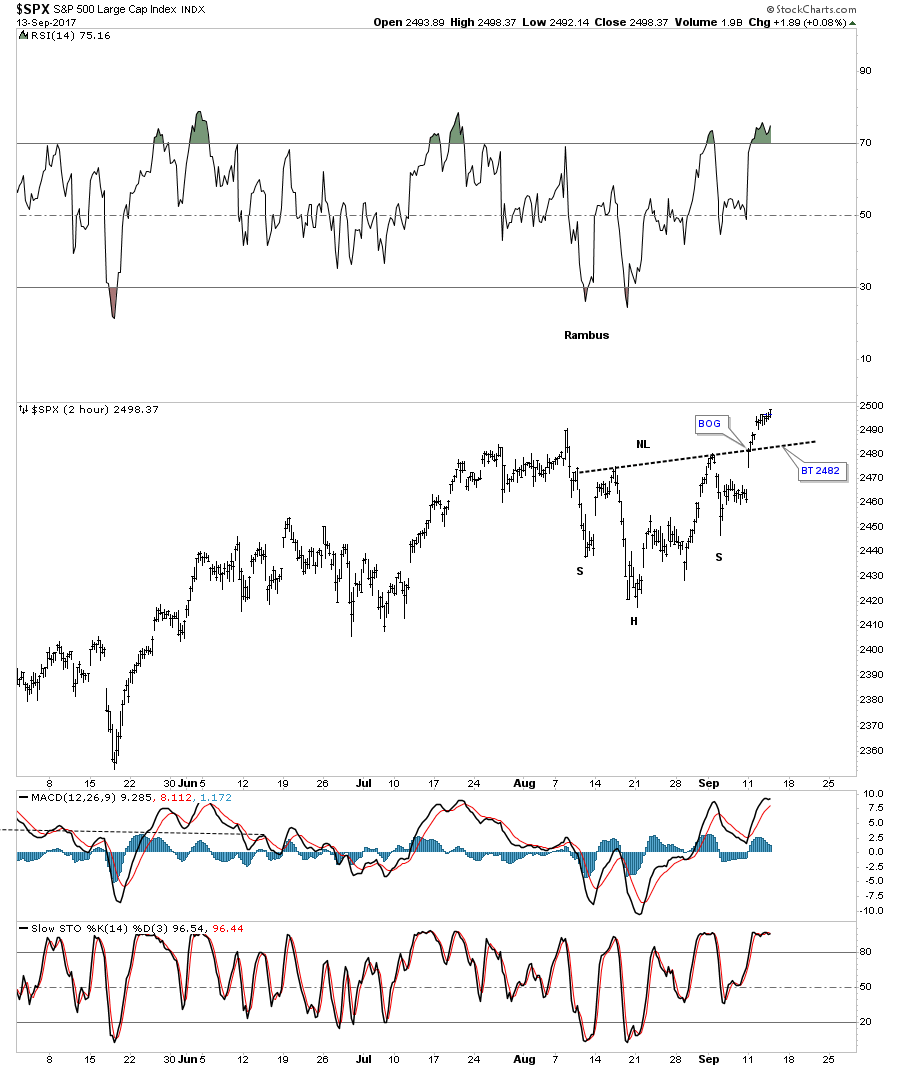
Several weeks ago I posted this chart which was showing how the original rising wedge, blue dashed trendiness, was morphing into a bigger pattern as shown by the red circles with a symmetry false breakout of the top and bottom blue dashed rails. It’s getting pretty busy in the apex, but you can see how the small H&S bottom fits into the bigger pattern that began building out back in February of this year. If that little H&S bottom plays out it strongly suggests the SPX is going to breakout topside from that 7 month morphing rising wedge in a new impulse leg up.
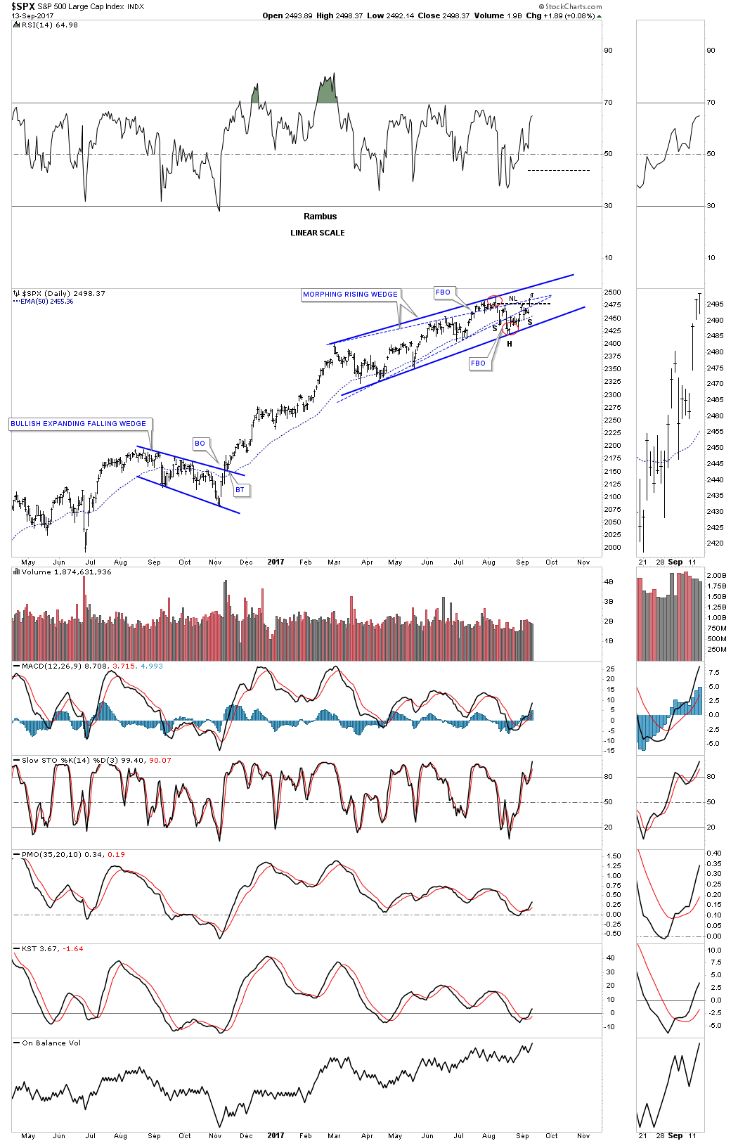
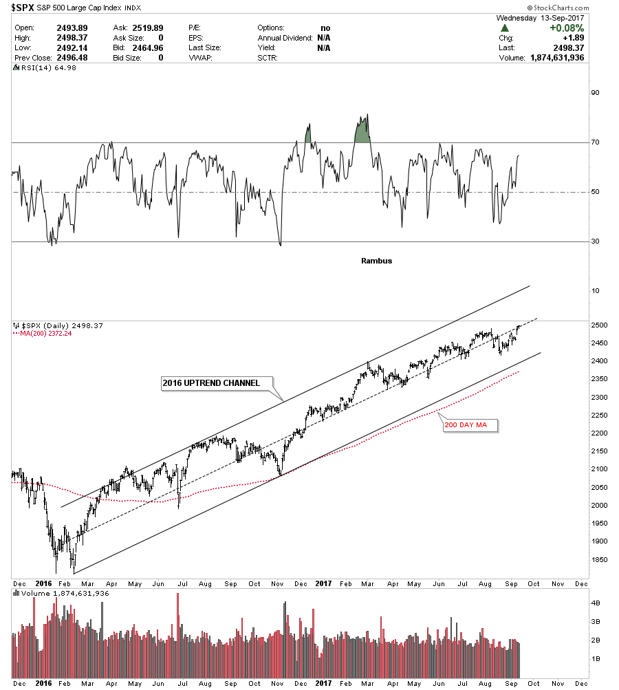
Below is a 2 year daily chart for the SPX which just shows its 2016 uptrend channel. On many of the stock market indexes the 200 day moving average does a good job of showing you the angle of the uptrend channel.
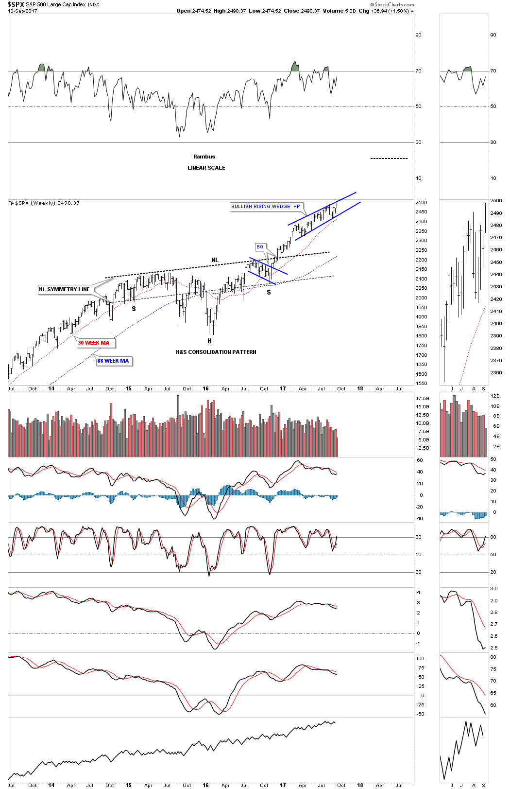
Perspective is everything when you discover what may be an important chart pattern. The weekly chart below shows the 2 year H&S consolidation pattern that corrected the last impulse move up. Now you can see how the blue morphing rising wedge fits into the very big picture. Keep in mind the rising wedge hasn’t broken out yet so the pattern isn’t complete. The reason I think the rising wedge is going to breakout topside is because we are in a bull market and patterns like this tend to form in strong bull markets. If we do get the upside breakout from the rising wedge I would view it as a halfway pattern that would have formed between the neckline and the ultimate price objective.
As I mentioned earlier perspective is everything. Below is a 20 year monthly chart for the SPX which we’ve been following before the top rail of the 13 year expanding flat top triangle consolidation pattern was broken. On this chart I’m showing the 2014 and 2015 consolidation period as a bullish expanding falling wedge halfway pattern. I have to tell you that it has been pretty lonely being a long term bull, but it has even been harder over the last several months as the rising wedge has been developing on the daily charts above. It’s these long term charts that take out all the noise that give me the confidence to hang in there when most say the bull market can’t keep going up. This chart shows you the wall of worry since the breakout from the blue bullish expanding falling wedge.
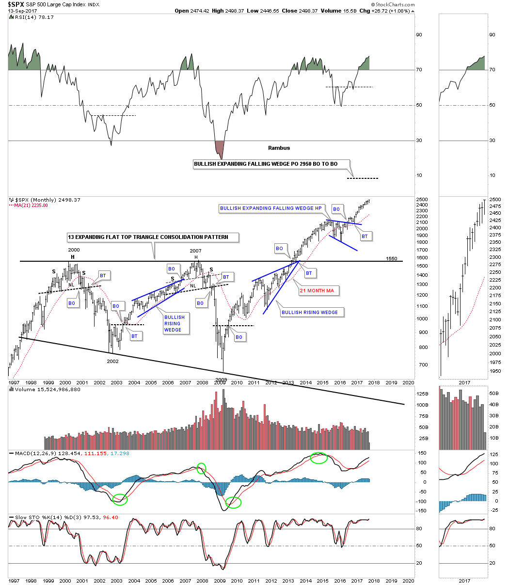
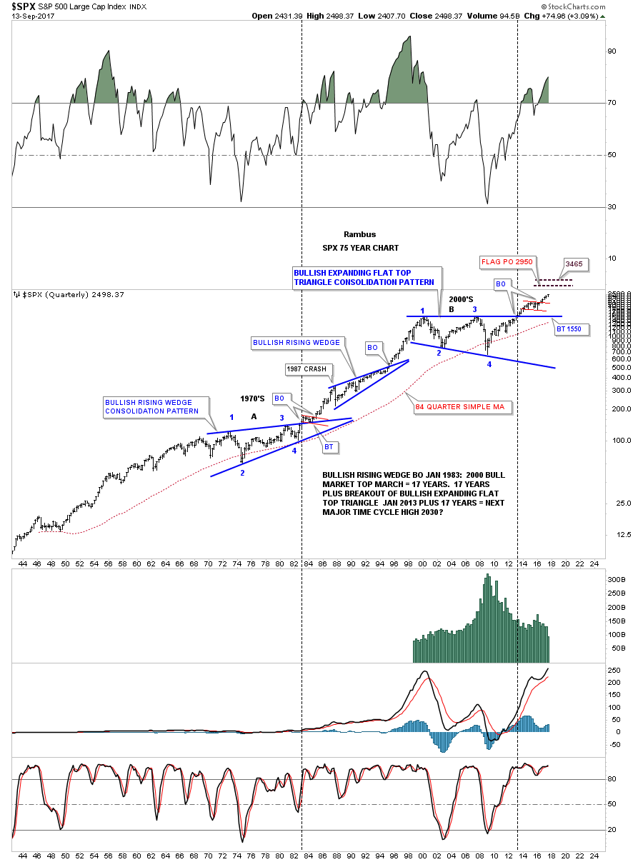
Again perspective is everything when you look at this 75 year quarterly chart for the SPX. The blue expanding falling wedge on the chart above is the small red consolidation pattern at the top of this chart. This chart along with the Jaws of Life on the INDU has given us a look into the future that few want to believe. For whatever reason investors love to hear bad news or that the markets are going to crash. Fear sells where bullish scenarios go by the wayside. For all the reasons this bull market that began in March of 2009 can’t keep going up, it keeps going up regardless of all the reasons it can’t, and there are a millions reasons why it can’t keep going up. The price action above all else has the final say when everything else is boiled away.
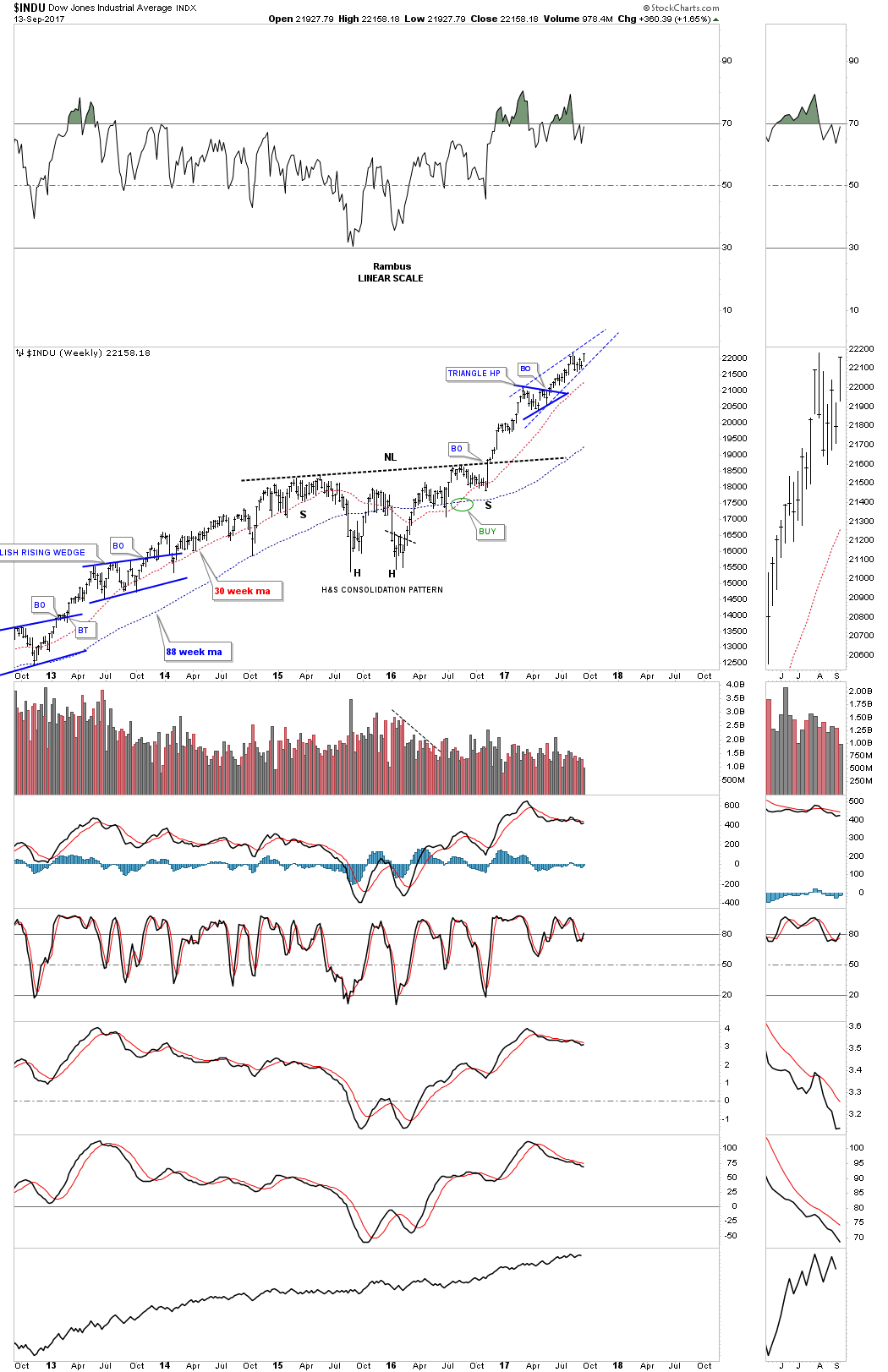
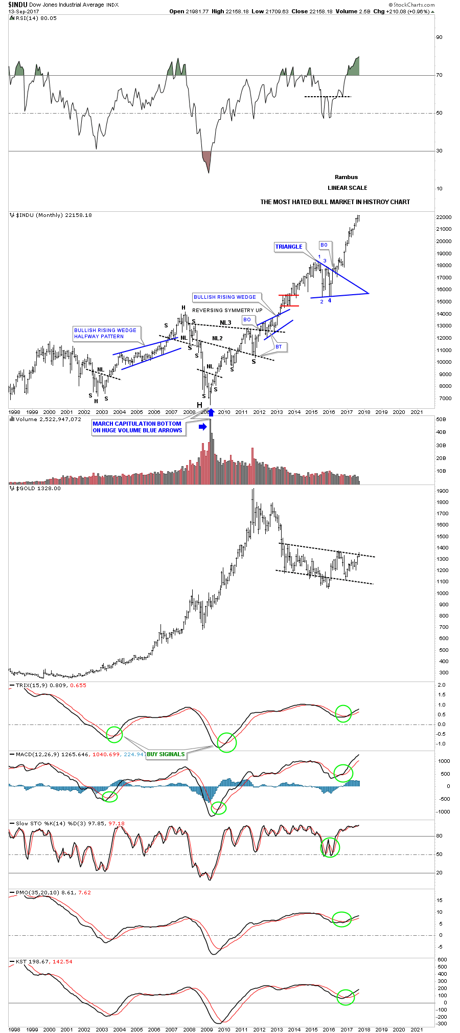
This weekly chart shows the INDU’s H&S consolidation pattern with the breakout and impulse move higher.
The monthly line chart for the Jaws of Life.
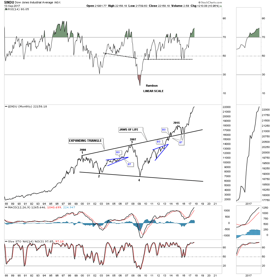
Below is the 75 year chart for the INDU which shows the Jaws of Life and a glimpse into the future.
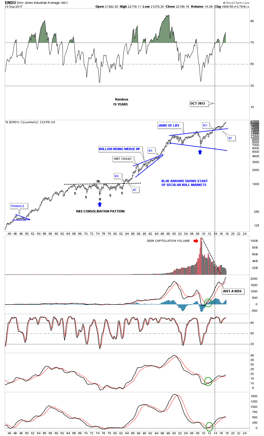
The Most Hated Bull Market in History chart for the INDU.
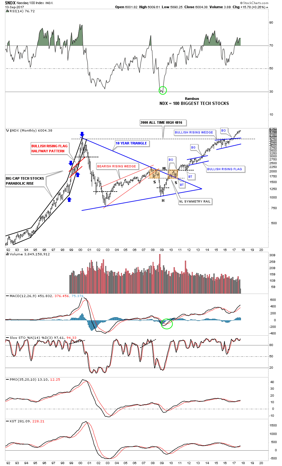
Below is a 25 year look at the NDX which shows some beautiful Chartology. Note the bullish rising wedge which formed just below the all time highs that gave the NDX the energy it needed to finally move on to all time highs. Classic Chartology
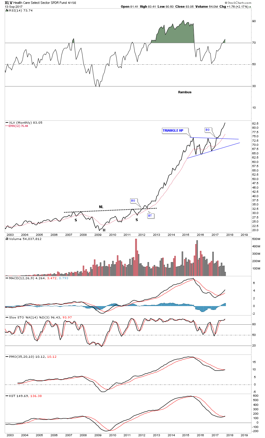
There’s always a bull market In healthcare
This next chart is for our many long term holders that don’t like to trade every little wiggle a stock makes and are looking for something to hold on to. This was one of the big leaders during the first leg up and then built out the blue triangle consolidation pattern.

The long term monthly line chart. Think of the blue triangle as a halfway pattern
I had planed on showing you some charts on oil, but I’ve run out of time. The bottom line is that until something changes the bull market, it is what it is and all the negativity about the economy or fundamentals or whatever one uses to gauge the health of the stock markets is not going to make you a dime. Trying to short a bull market is one of the hardest things to do as many have found out. Realize that everybody who has tried to catch THE Top of the Most Hated Bull Market in History since 2009 has lost money.
It’s much easier to go with the price action and what it’s telling you to do than to fight it. Maybe we crash into October like so many are predicting, but on the other hand what if we don’t? All the best…Rambus

-
I know Mike is a very solid investor and respect his opinions very much. So if he says pay attention to this or that - I will.
~ Dale G.
-
I've started managing my own investments so view Michael's site as a one-stop shop from which to get information and perspectives.
~ Dave E.
-
Michael offers easy reading, honest, common sense information that anyone can use in a practical manner.
~ der_al.
-
A sane voice in a scrambled investment world.
~ Ed R.
Inside Edge Pro Contributors

Greg Weldon

Josef Schachter

Tyler Bollhorn

Ryan Irvine

Paul Beattie

Martin Straith

Patrick Ceresna

Mark Leibovit

James Thorne

Victor Adair