
Stocks & Equities
It’s about time that I share with you all a little secret. The situation in the markets is much worse than you realize. While that may sound like someone who has been crying “wolf” for the past several years, in all honesty, the public has no idea just how dire our present situation has become.
The amount of debt, leverage, deceit, corruption, and fraud in the economic markets, financial system, and in the energy industry are off the charts. Unfortunately, the present condition is even much worse when we consider “INSIDER INFORMATION.”
What do I mean by insider information… I will explain that in a minute. However, I receive a lot of comments on my site and emails stating that the U.S. Dollar is A-okay and our domestic oil industry will continue pumping out cheap oil for quite some time. They say… “No need to worry. Business, as usual, will continue for the next 2-3 decades.”
I really wish that were true. Believe me, when I say this, I am not rooting for a collapse or breakdown of our economic and financial markets. However, the information, data, and facts that I have come across suggest that the U.S. and global economy will hit a brick wall within the next few years.
How I Acquire My Information, Data & Facts
To put out the original information in my articles and reports, I spend a great deal of time researching the internet on official websites, alternative media outlets, and various blogs. Some of the blogs that I read, I find more interesting information in the comment section than in the article. For example, the Peakoilbarrel.com site is visited by a lot of engineers and geologists in the oil and gas industry. Their comments provide important “on-hands insight” in the energy sector not found on the Mainstream Media.
I also have a lot of contacts in the various industries that either forward information via email or share during phone conversations. Some of the information that I receive from these contacts, I include in my articles and reports. However, there is a good bit of information that I can’t share, because it was done with the understanding that I would not reveal the source or intelligence.
Of course, some readers may find that a bit cryptic, but it’s the truth. Individuals have contacted me from all over the world and in different levels of industry and business. Some people are the working staff who understand th reality taking place in the plant or field, while others are higher ranking officers. Even though I have been receiving this sort of contact for the past 4-5 years, the number has increased significantly over the past year and a half.
That being said, these individuals contacted me after coming across my site because they wanted to share valuable information and their insight of what was going on in their respective industires. The common theme from most of these contacts was…. GOSH STEVE, IT’S MUCH WORSE THAN YOU REALIZE. Yes, that is what I heard over and over again.
If my readers and followers believe I am overly pessimistic or cynical, your hair will stand up on your neck if you knew just how bad the situation was BEHIND THE SCENES.
Unfortunately, we in the Alternative Media have been lobotomized to a certain degree due to the constant propaganda from the Mainstream Media and market intervention by the Fed and Central Banks. A perfect example of the massive market rigging is found in Zerohedge’s recent article; Central Banks Have Purchased $2 Trillion In Assets In 2017 :
….. so far in 2017 there has been $1.96 trillion of central bank purchases of financial assets in 2017 alone, as central bank balance sheets have grown by $11.26 trillion since Lehman to $15.6 trillion.
What is interesting about the nearly $2 trillion in Central Bank purchases so far in 2017, is that the average for each year was only $1.5 trillion. We can plainly see that the Central Banks had to ramp up asset purchases as the Ponzi Scheme seems to be getting out of hand.
So, how bad is the current economic and financial situation in the world today? If we take a look at the chart in the next section, it may give you a clue.
THE DEATH OF BEAR STEARNS: A Warning For Things To Come
It seems like a lot of people already forgot about the gut-wrenching 2008-2009 economic and financial crash. During the U.S. Banking collapse, two of the country’s largest investment banks, Lehman Brothers, and Bear Stearns went belly up. Lehman Brothers was founded in 1850 and Bear Stearns in 1923. In just one year, both of those top Wall Street Investment Banks ceased to exist.
Now, during the 2001-2007 U.S. housing boom heyday, it seemed like virtually no one had a clue just how rotten of a company Bear Stearns had become. Looking at the chart below, we can see the incredible RISE & FALL of Bear Stearns:

As Bear Stearns added more and more crappy MBS – Mortgage Backed Securities to its portfolio, the company share price rose towards the heavens. At the beginning of 2007 and the peak of the U.S. housing boom, Bear Stearns stock price hit a record $171. Unfortunately, at some point, all highly leveraged garbage assets or Ponzi Schemes come to an end. While the PARTY LIFE at Bear Stearns lasted for quite a while, DEATH came suddenly.
In just a little more than a year, Bear Stearns stock fell to a mere $2… a staggering 98% decline. Of course, the financial networks and analysts were providing guidance and forecasts that Bear Stearns was a fine and healthy company. For example, when Bear was dealing with some negative issues in March 2008, CBNC’s Mad Money, Jim Cramer made the following statement in response to a caller on his show (Source):
Tuesday, March 11, 2008, On Mad Money
Dear Jim: “Should I be worried about Bear Stearns in terms of liquidity and get my money out of there?” – Peter
Jim Cramer: “No! No! No! Bear Stearns is fine. Do not take your money out. Bear sterns is not in trouble. If anything, they’re more likely to be taken over. Don’t move your money from Bear. That’s just being silly. Don’t be silly.”
Thanks to Jim, many investors took his advice. So, what happened to Bear Stearns after Jim Cramer gave the company a clean bill of health?

On Tuesday, March 11, the price of Bear Stearns was trading at $60, but five days later it was down 85%. The source (linked above) where I found the quote in which Jim Cramer provided his financial advice, said that there was a chance Jim was replying to the person in regards to the money he had deposited in the bank and not as an investment. However, Jim was not clear in stating whether he was talking about bank deposits or the company health and stock price.
Regardless, Bear Stearns stock price was worth ZERO many years before it collapsed in 2008. If financial analysts had seriously looked into the fundamentals in the Mortgage Backed Security market and the bank’s financial balance sheet several years before 2008, they would have realized Bear Stearns was rotten to the core. But, this is the way of Wall Street and Central Banks. Everything is fine, until the day it isn’t.
And that day is close at hand.
THE RECORD LOW VOLATILITY INDEX: Signals Big Market Trouble Ahead
Even though I have presented a few charts on the VIX – Volatility Index in past articles, I thought this one would provide a better picture of the coming disaster in the U.S. stock markets:

The VIX – Volatility Index (RED) is shown to be at its lowest level ever when compared to the S&P 500 Index (GREY) which is at its all-time high. If we take a look at the VIX Index in 2007, it fell to another extreme low right at the same time Bear Stearns stock price reached a new record high of $171. Isn’t that a neat coincidence?
As a reminder, the VIX Index measures the amount of fear in the markets. When the VIX Index is at a low, the market believes everything is A-OKAY. However, when the VIX surges higher, then it means that fear and panic have over-taken investment sentiment, as blood runs in the streets.
As the Fed and Central Banks continue playing the game of Monopoly with Trillions of Dollars of money printing and asset purchases, the party won’t last for long as DEATH comes to all highly leveraged garbage assets and Ponzi Schemes.
To get an idea just how much worse the situation has become than we realize, let’s take a look at the energy fundamental that is gutting everything in its path.
WHY THE BIG MARKET COLLAPSE IS COMING: It’s The Energy, Stupid
Even though I belong to the Alternative Media Community, I am amazed at the lack of understanding by most of the precious metals analysts when it comes to energy. While I respect what many of these gold and silver analysts have to say, they exclude the most important factor in their forecasts. This critical factor is the Falling EROI – Energy Returned On Investment.
As I mentioned earlier in the article, I speak to many people on the phone from various industries. Yesterday, I was fortunate enough to chat with Bedford Hill of the Hill’s Groupfor over 90 minutes. What an interesting conversation. Ole Bedford knows we are toast. Unfortunately, only 0.01% of the population may understand the details of the Hill’s Group work.
Here is an explanation of the Hill’s Group:
The Hill’s Group is an association of consulting engineers and professional project managers. Our goal is to support our clients by providing them with the most relevant, and up to-date skill sets needed to manage their organizations. Depletion: A determination for the world’s petroleum reserve provides organizational long range planners, and policy makers with the essential information they will need in today’s rapidly changing environment.
I asked Bedford if he agreed with me that the hyperinflationary collapse of Venezuela was due to the falling oil price rather than its corrupt Communist Government. He concurred. Bedford stated that the total BTU energy cost to extract Venezuela’s heavy oil was higher than the BTU’s the market could afford. Bedford went on to say that when the oil price was at $80, Venezuela could still make enough profit to continue running its inefficient, corrupt government. However, now that the price of oil is trading below $50, it’s gutting the entire Venezuelan economy.
During our phone call, Bedford discussed his ETP Oil model, shown in his chart below. If there is one chart that totally screws up the typical Austrian School of Economics student or follower, it’s this baby:

Bedford along with a group of engineers spent thousands and thousands of hours inputting the data that produced the “ETP Cost Curve” (BLACK LINE). The ETP Cost Curve is the average cost to produce oil by the industry. The RED dots represent the actual average annual West Texas Oil price. As you can see, the oil price corresponded with the ETP Cost Curve. This correlation suggests that the market price of oil is determined by its cost of production, rather than supply and demand market forces.
The ETP Cost Curve goes up until it reached an inflection point in 2012… then IT PEAKED. The black line coming down on the right-hand side of the chart represents “Maximum Consumer Price.” This line is the maximum price that the end consumer can afford. Again, it has nothing to do with supply and demand rather, it has everything to do with the cost of production and the remaining net energy in the barrel of oil.
I decided to add the RED dots for years 2014-2016. These additional annual oil price figures remain in or near the Maximum Consumer Price line. According to Bedford, the oil price will continue lower by 2020. However, the actual annual oil price in 2015 and 2016 was much lower than the estimated figures Bedford, and his group had calculated. Thus, we could see some volatility in the price over the next few years.
Regardless, the oil price trend will be lower. And as the oil price continues to fall, it will gut the U.S. and global oil industry. There is nothing the Fed and Central Banks can do to stop it. Yes, it’s true that the U.S. government could step in and bail out the U.S. shale oil industry, but this would not be a long-term solution.
Why? Let me explain with the following chart:

I have published this graph at least five times in my articles, but it is essential to understand. This chart represents the amount of below investment grade debt due by the U.S. energy industry each year. Not only does this debt rise to $200 billion by 2020, but it also represents that the quality of oil produced by the mighty U.S. shale oil industry WAS UNECONOMICAL even at $100 a barrel.
Furthermore, this massive amount of debt came from the stored economic energy via the various investors who provided the U.S. shale energy industry with the funds to continue producing oil at a loss. We must remember, INVESTMENT is stored economic energy. Thus, pension plans, mutual funds, insurance funds, etc., had taken investments gained over the years and gave it to the lousy U.S. shale oil industry for a short-term high yield.
Okay, this is very important to understand. Don’t look at those bars in the chart above as money or debt, rather look at them as energy. If you can do that, you will understand the terrible predicament we are facing. Years ago, these large investors saved up capital that came from burning energy. They took this stored economic energy (capital) and gave it to the U.S. shale oil industry. Without that capital, the U.S. shale oil industry would have gone belly up years ago.
So, what does that mean? It means… IT TOOK MORE ENERGY TO PRODUCE THE SHALE OIL than was DELIVERED TO THE MARKET. Regrettably, the overwhelming majority of shale oil debt will never be repaid. As the oil price continues to head lower, the supposed shale oil break-even price will be crushed. Without profits, debts pile up even higher.
Do you all see what is going on here? And let me say this. What I have explained in this article, DOES NOT INCLUDE INSIDER INFORMATION, which suggests “The situation is even much worse than you realize… LOL.”
For all my followers who believe business, as usual, will continue for another 2-3 decades, YOU HAVE BEEN WARNED. The energy situation is in far worse shape than you can imagine.
PRECIOUS METALS: Are Stores Of Economic Energy.. Stocks, Bonds & Real Estate Are Energy IOU’s
If you want to lose all your money (most of it), I suggest that you keep it invested in most STOCKS, BONDS and REAL ESTATE. I still receive emails from individuals who try to convince me that real estate is a safe-haven during economic distress. Yes, real estate was good to own in the past, but we are living in much different times today.
Years after the markets finally crack, I see thousands and thousands of suburban homes, commercial and industrial properties empty… never to be used again. We just won’t have the energy to run them. Thus, there will be Trillions of Dollars of sunk investment capital gone forever.
So, if you are still watching late night infomercials on how to become RICH buying Real Estate, you have my sympathies.
Lastly, if you are one of the few Americans not suffering from BRAIN DAMAGE, I suggest that you consider owning some physical precious metals to protect your wealth. Once the markets finally implode, there will be few bids for most STOCKS, BONDS and REAL ESTATE.
The time to get out of highly-inflated garbage assets is before everyone else tries to.
GOD HATH A SENSE OF HUMOR….
Check back for new articles and updates at the SRSrocco Report.

Gold continues to build towards its breakout from a massive 4-year long base pattern. This is likely to occur when the dollar breaks down from its topping pattern, and is expected to lead to a bullmarket that will dwarf the last one from 2001 through 2011, and may be given a tailwind when the cryptocurrency Ponzi scheme implodes. In some quarters gold is being described as having broken out already, as are gold stocks, but they haven’t yet, as we will see, and we will also look at evidence that points to the probability of a short to medium-term dollar bounce and a pullback in the Precious Metals sector before the big breakout occurs.
On gold’s 10-year chart we can see its fine giant 4-year long Head-and-Shoulders bottom approaching completion, with the price rising up in recent weeks to the broad band of quite strong resistance at the top of the pattern, partly due to tensions over N Korea. These are expected to ease, which will make a short-term correction back more likely. Before leaving this chart note the volume build on the rally out of the Right Shoulder low of the pattern, and the strength of the volume indicators shown, especially the Accum-Distrib line, which rather amazingly is already at new highs. This certainly bodes well for the longer-term outlook.

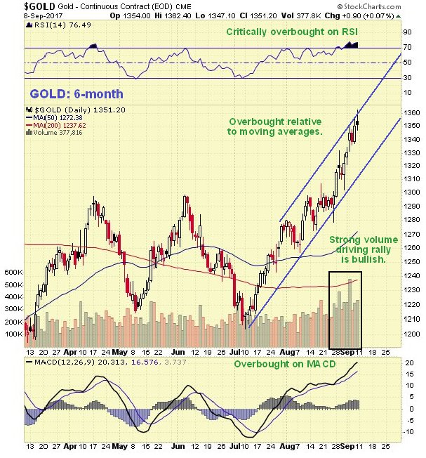
Over the near-term, however, various factors indicate that the probability of a reaction back is high. On the 6-month chart we can see that last week the price rose up to the top of its uptrend channel where a prominent “spinning top” candlestick formed on Friday, with the RSI indicator critically overbought, making it likely that gold will react back at least to the lower boundary of this channel. The overbought MACD and sizeable gap with the moving averages also increase the risk of a reaction.
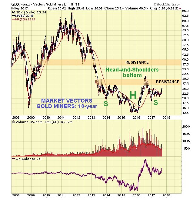
Like gold itself, gold stocks are preparing to break out of a giant 4-year long Head-and-Shoulders bottom. They are still quite a way from having broken out, as we can see on the 10-year chart for GDX shown below, and vulnerable to a near-term reaction on a dollar rebound, that should not see them lose much ground. The big volume on the rally during the 1st half of last year showed that the bottom was in and that a major new bullmarket is in prospect. The formation of the Right Shoulder of this H&S bottom served to correct this strong advance.
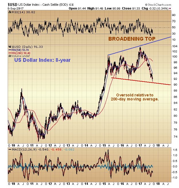
A big reason for gold to react back again soon would a rebound by the dollar, which is made more likely by the fact that a lot of commentators are reading it its “last rites” – it’s not that they are wrong, it’s just that there are a lot of people of one side of the boat now, so they may prove to be wrong short-term but right longer-term. We will now look at some of the big reasons that the dollar could rally soon. On the 8-year chart for the dollar index we can immediately see one of them – the dollar has now arrived at the lower boundary of a large Broadening Top pattern in an oversold state, and while it is believed to be destined to break down from this pattern in due course, it looks likely that it will bounce of its lower boundary over the short to medium-term to correct the oversold condition before going on to break down later.
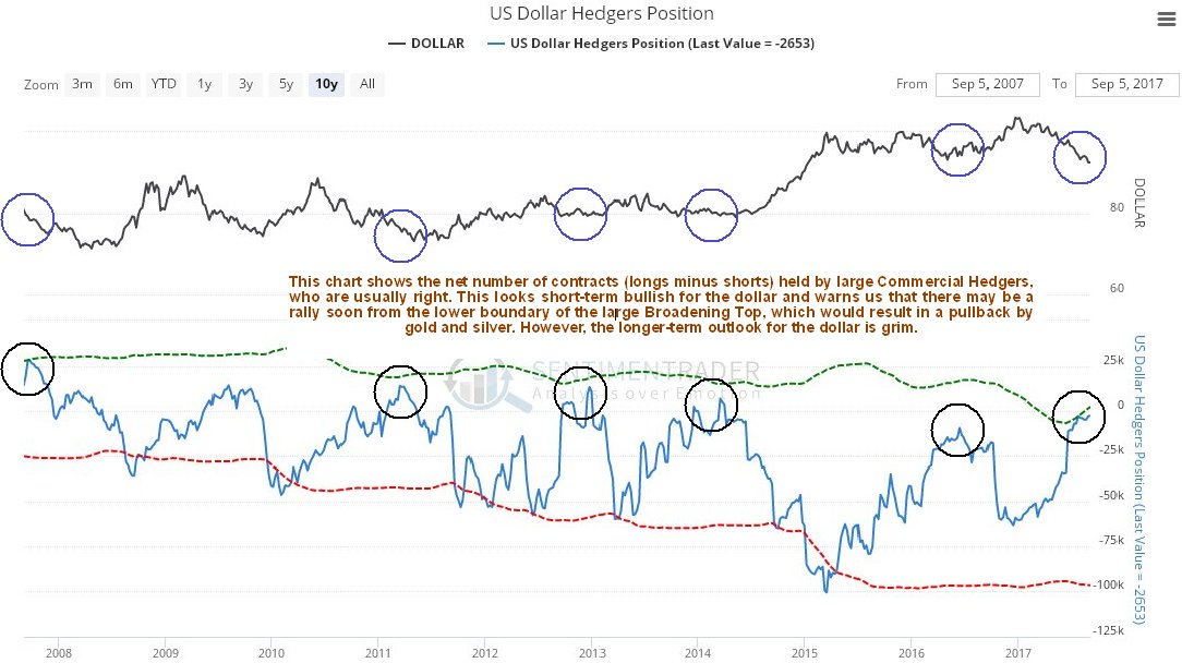
Another important factor suggesting that the dollar is likely to rally short-term is the latest dollar Hedgers chart, which is now quite strongly bullish. On this chart we see that large Commercial Hedgers, who are almost always right, have cashed in nearly all of their net short positions for a nice fat profit, so that they are now at a very low level, and they would be unlikely to do this if the dollar was set to drop much further. On this chart we also have the benefit of seeing what happened to the dollar soon after they did this on earlier occasions. As we can see it usually rose.
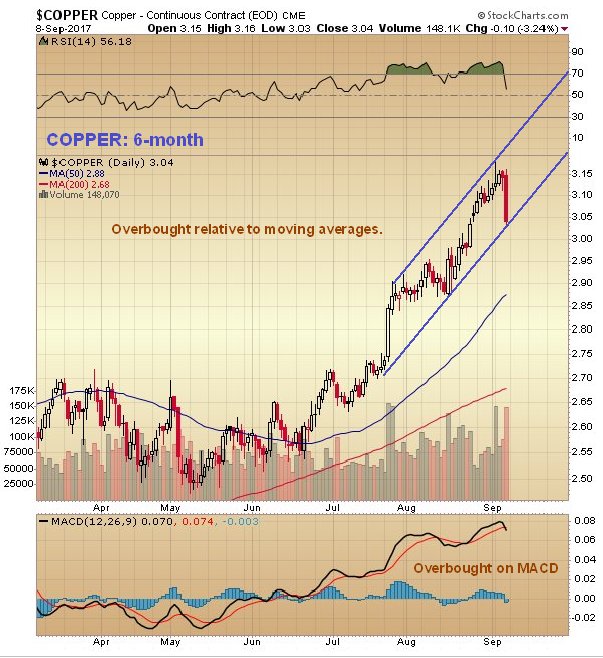
Click on chart to popup a larger, clearer version. Those who think that the dollar will plunge because Nicolas Maduro of Venezuela has announced that his beleaguered country will stop selling in oil in dollars are likely to be disappointed. President Maduro would be well advised to look up what happened to Saddam Hussein after he proposed doing the same, and we must assume that either he doesn’t know his history, or is tired of being President of a failed State and is contriving a way to be forcibly removed from office. We have seen how copper, known as Dr Copper because it tends to lead the economy and lead the metals, has been in the vanguard of the recent metals rally. Thus it is interesting to observe on its 6-month chart below how it suddenly dropped hard on Friday having become overbought, which is thought to presage a dollar rebound and a near-term drop by other metals, like gold and silver.
Conclusion: the long-term outlook for gold couldn’t be better with it looking destined to break out from a giant 4-year long base pattern to enter a bullmarket that promises to dwarf the last one, as the dollar collapses and China (and possibly Russia and other countries) backs its currency with gold, and the cryptocurrency Ponzi scheme implodes, with the liberated funds (or what’s left of them) flowing into gold and silver. Cryptos got a shock late last week when China reportedly revealed that it was set to close local exchanges. From China’s standpoint cryptos are a needless risk to their citizen’s capital, and represent potential competition for their future gold-backed Yuan, albeit not for any intelligent person, and are a nuisance that they can deal with simply by banning them, which as a Command Economy that can ignore criticism, they have the power to do. Near-term gold is looking set to react back as the dollar bounces off support with tensions over N Korea easing as the US has no choice but to accept that N Korea has graduated to the nuclear club, even if it cannot be described as one of its august members.
 1. US Oil Imports Drop Off a Cliff
by Michael Campbell
This Weeks Shocking Stat – US Oil imports have collapsed from 60% to a just reported 22%. Tough on Canada, that relies so heavily on US Oil Exports!
2. The Coming Run on Banks and Pensions
by Dave Kranzler
“There are folks that are saying you know what, I don’t care, I’m going to lock in my retirement now and get out while I can and fight it as a retiree if they go and change the retiree benefits,” he said. – Executive Director for the Kentucky Association of State Employees, Proposed Pension Changes Bring Fears Of State Worker Exodus
3. Gold: Book Profits Now
by Stewart Thomson
Gold has staged a fabulous rally from about $1220 to $1245. Using the December futures price chart, I’ve defined the $1300 – $1350 area as a spectacular profit booking opportunity for investors.

First published on Sun Sep 3 for members: While the metals refused to offer much in the way of a pullback last week, they sure did provide us some nice sideways consolidations. In fact, they held support almost to the penny, and then continued higher on Friday (Sep 1).
And, while everyone seems so skittish to be bullish, the metals are still setting up to leave the station with many disbelievers watching on the sidelines. But, as I noted in my trading room this past week (of (Aug 28-Sep1), “In metals, you may get scared, you may freak out, you may lose your mind . . . but as long as support holds, there is no reason to lose your position.”
Allow me to show you what I mean from the example of our trading support and resistance over the prior week using the GDX. Once the GDX broke out, I put out a chart showing the support we then had to hold to keep pressure to the upside (GDX1). Moreover, I even highlighted the next target should support hold. In GDX2, you will see that the market held the top part of the support box, and then continued to our higher target, and even slightly exceeded our target by a few cents. So, in GDX3, I raised our support region to point to where I thought the market will likely pull back after striking our target.
Well, for the next two days the market tested our support region, the initial test shown in GDX4, wherein I added our next target for the smaller degree move. And, as we can see in GDX5, the GDX rallied to our next target on Friday, before beginning another pullback, as expected, during the rest of the day on Friday. And, we basically had the same tracking we did on a micro basis with the GLD all week, as it held our noted support in the 124 region.
Thus far, metals have been holding upper support, and not providing the bigger pullback I had ideally wanted to see. So, it does look like the GDX may have left the station.
However, silver is the chart that is still suggestive of a potential pullback, as even in the best-case scenario that I am following, I see it only completing wave i of (3), which means that I am expecting at least a wave ii consolidation/pullback in the coming week or two. In fact, it still has not taken out our resistance box, as it spent most of Friday pushing on the top part of the resistance box.
But, to be honest, most people should not be trying to follow these charts from a micro perspective due to what 2017 has done to the psychology of most investors. Most investors have been trained by the 2017 price action to not believe the metals are able to break out. Everyone seems to be waiting for the next downside shoe to drop, and any small pullback is viewed as the end of the rally. So, my suggestion to those who feel like that is to zoom out and view the market from the larger degree perspective.
As I have been saying since the lows in July, the daily charts are looking incredibly good for upside potential continuation into the fall of 2017. The Elliott Wave patterns are suggestive of significant upside, whereas the technical indicators are supporting that perspective. While that does not preclude another pullback that may be seen over the next two weeks, I would suggest you maintain a larger degree perspective so you are not shaken out if the metals do pullback to support before continuing the rally I expected into the fall.
For this region, I have added a bigger support box on the 8-minute chart, which MUST hold price action or else this rally can potentially fail and head down to lows below those struck in July. We will continually raise this support as we move into the “main event” fight above with the 28 region (discussed below). But, for now, my primary expectation is to see a rally up towards the 26 region, with extensions to the 27 region working out even better for the bigger bullish count.
As far as the GLD is concerned, I really would not want to see it drop below the 124 region. Rather, I would like to see it maintain over 124 and continue to subdivide higher as we head up towards the 130 region next.
Silver is the one chart that is suggestive of a pullback/consolidation in a wave ii, as it seems to be a few wave degrees behind its brethren. So, at this point in time, the yellow count placed on the 144 minute chart seems to be a much lower probability.
Now, let’s move on to the main event, which is presented as the alternative count on the daily GDX chart. Since we have now broken out of the lower consolidation, we are heading higher to test what will be a major turning point in the market. The greatest probability chance that I see this market has in making a low below that seen in July is presented in yellow. That means that the 28 region is going to be the main event “fight” which will decide if this market has truly begun its long term bullish run or not. We will have further confirmation points along the way even higher, but this one will be the main event for 2017. This is the 2017 title bout.
As I have added a market pivot box to the chart, I want to explain that should the market hit the top of the box – or even break through it – it should NEVER break below the bottom of the box again if the long term bull market has truly begun in earnest. That means that once the 28 region is struck, you can simply place your stops at 25, and not worry. Either the market will have begun its long term bull market run to currently unimaginable levels in the coming decade, or you will be stopped out, with an opportunity to re-enter the market in the 17 region. But, before we get ahead of ourselves, I am simply preparing you in advance as to what I will be watching once the 28 region is struck or exceeded.
So, as I have said throughout 2017, I still maintain a bullish bias, but one more pullback/consolidation may still be seen in the coming week or so, as suggested by silver, but silver should then catch up to its brethren. And, later this month, or sometime in October, we will be watching the title bout in this market between the 25 and 28 levels in the GDX.
See charts illustrating the wave counts on the GDX, GLD, and Silver Futures (YI).
Avi Gilburt is a widely followed Elliott Wave technical analyst and author of ElliottWaveTrader.net (www.elliottwavetrader.net), a live Trading Room featuring his intraday market analysis (including emini S&P 500, metals, oil, USD & VXX), interactive member-analyst forum, and detailed library of Elliott Wave education.
If you ask me about the world, I think we had a very strong performance of technology and internet-related stocks, e-commerce and so forth. They had a super performance until recently. Now, more recently in the U.S., Facebook, Amazon, Apple, Google, Netflix are the kind of stocks that will not provide you a high return going forward. They will go down as they are quite vulnerable. First of all, there will be more international competition and secondly, the valuations are really high. When we look at sectors that have low valuations, I would say oil and oil-related stocks are relatively low. European stocks are relatively low compared to the U.S. Some Asian markets – Singapore, Thailand, Vietnam are relatively low compare to everything else, as well as Japan. Then we have the mining sector which had a horrific performance since 2011 and the speculators are now-a-days are no longer in gold, silver and platinum. They all migrated to cryptocurrencies. But the gold sector is bottoming out. It is a very different type of asset class to own physical gold than to own bitcoins and other cryptocurrencies. I think that this sector will come back, as well as the underlying shares.


-
I know Mike is a very solid investor and respect his opinions very much. So if he says pay attention to this or that - I will.
~ Dale G.
-
I've started managing my own investments so view Michael's site as a one-stop shop from which to get information and perspectives.
~ Dave E.
-
Michael offers easy reading, honest, common sense information that anyone can use in a practical manner.
~ der_al.
-
A sane voice in a scrambled investment world.
~ Ed R.
Inside Edge Pro Contributors

Greg Weldon

Josef Schachter

Tyler Bollhorn

Ryan Irvine

Paul Beattie

Martin Straith

Patrick Ceresna

Mark Leibovit

James Thorne

Victor Adair