
Bonds & Interest Rates
 Citigroup’s Economic Surprise Index just hit its lowest level since August 2011. But this level of disappointment has ironically emboldened the Fed to step up its hawkish monetary rhetoric. The truth is that the hard economic data is grossly missing analyst estimates to the downside as the economy inexorably grinds towards recession. This anemic growth and inflation data should have been sufficient to stay the Fed’s hand for the rest of this year and cause it to forgo the unwinding of its balance sheet.
But that’s not what’s happening. Ms. Yellen and Co. are threatening at least one more rate hike and to start selling what will end up to be around $2 trillion worth of MBS and Treasuries before the end of the year–starting at $10 billion each month and slowly growing to a maximum of $60 billion per month.
But why is the Fed suddenly in such a rush to normalize interest rates and its balance sheet? Perhaps it is because Ms. Yellen wants to fire Trump before she hears his favorite mantra, “you’re fired,” when her term expires in early 2018. It isn’t a coincidence that these Keynesian liberals at the Fed started to ignore the weak data concurrently with the election of the new President.
A Q1 GDP print of just 1.4% has not dissuaded the FOMC from a hawkish stance. And a lack of evidence for a Q2 rebound in the data hasn’t done so either. April housing data was very weak: New home sales in the single family category were down 11.4%, existing home sales were also down 2.5%. And even though there was a small bounce back in housing data in May, Pending Home Sales have fallen three months in a row and were down 0.8% in May. Retail sales dropped, 0.3% and durable goods declined 1.1% during May; while the key metric for business productivity, core capital goods orders, fell 0.2%.
It’s not just economic growth indicators that are disappointing, but also evidence of disinflation abound everywhere. Measures of Consumer Price Inflation and the Personal Consumption Expenditure price indexes are falling further away from Fed’s 2% target. Commodity prices are also illustrating signs of deflation. The CRB Index is down 14% so far this year and WTI crude oil is in a bear market. Further evidence of deflation is seen in the fact that the spread between long and short-term Treasury Yields are contracting. There has been a six-month decline in C&I loan growth and the household survey within the Non-farm Payroll report turned negative in May. The Household Survey is a leading indicator for the Establishment Survey and the overall employment condition.
Wall Street’s currently favorite narrative is one of strong earnings growth. But according to FactSet, nearly half of Q2’s projected 6.5% EPS growth is from energy. Excluding this sector, EPS growth is projected to be just 3.6%. The projected average price of WTI crude for Q3 is $54.29. With the oil price now hovering around $43 per barrel, the hoped-for boost to EPS growth from energy will turn into a big drag unless crude turns around quickly.
The economy should continue to move further away from the Fed’s growth, and inflation targets as its previous monetary tightening starts to bite. But one last nail in the coffin for Fed hawks will be an NFP report sub 50K. The odds are very high that such a weak print on jobs will occur before the next hiking opportunity on Sept. 20th. In addition, if the S&P falls more than 15% from its high the turn in Fed policy from hawkish to dovish is virtually assured. From there it will turn to panic as the economy and stock market meltdown.
I say meltdown because, at 25x reported earnings, the S&P 500 is the 2nd most expensive in history. But this particular overvalued market exists in the context of a weak and slowing economy; coupled with a tightening monetary policy that has been in place since the Fed started to reduce the amount of its $85 billion per month worth of bond purchases back in Dec 2013. And, most importantly, the coming market crash and recession will occur with the balance sheets of the Treasury and Fed already extremely stretched. Hence, an extrication from this recession will not happen quickly or easily.
All of the above makes this the most dangerous market ever. This crash and ensuing economic downturn, which given history, logic and the data should happen soon; will alter the Fed’s current stance on monetary policy. But it will happen too late to preclude a very steep decline in GDP.
Therefore, if Mr. Trump cannot push through his tax cutting agenda rather quickly it may be both Ms. Yellen and the Republicans that find themselves moving out of D.C. in 2018; and move the Donald back to the Apprentice after just one term.
By Michael Pento

The biggest frustration to many precious metals investors, is why have the gold and silver prices under-performed the market since 2011? Actually, for gold it was since 2012. Even though gold hit a new record high of $1,900 in September 2011, its average annual price was higher in 2012 at $1,669 compared to $1,571 the prior year.
Regardless, the precious metals analysts back in 2012 were forecasting the market was going to experience even higher gold and silver prices, especially after the Fed announced QE 3 at the end of 2012. However, the precious metals community was taken by surprise as the gold and silver prices were hammered at the end of 2012 and into the beginning of 2013:

During this period, the gold price fell 30% and the silver price declined nearly 50%. Did something fundamental change in the markets for investors to suddenly ditch precious metals? Actually, something really big happened….. THE MARKETS BROKE. Of course, many in the alternative media believe the financial market died in 2008, but when we look at another indicator… it clearly shows that the markets drastically changed even further in 2012.
The following charts (below) from the article, Deutsche: The Market Broke In 2012, “This Is What Everyone Is Talking About”, show that the market is totally under-pricing RISK by orders of magnitude never seen before. Now, when I say “under-pricing risk”, all that means is that the market has no idea of the dangers ahead. It is similar to someone driving a car that doesn’t realize the engine is burning up and the brakes don’t work because the WARNING LIGHTS aren’t functioning. So, the poor slob continues to speed down the road, without out a care in the world… until the car blows up or he heads over a cliff.
In the Deutsche Bank article linked above, analyst Aleksandar Kocic providing actual evidence that the WARNING LIGHTS in the market are no longer working:
Regular readers are familiar with the Economic Policy Uncertainty (EPU) index which is constructed by counting the frequency of articles in ten leading US newspapers that contain three of the target terms: economy, uncertainty; and one or more of Congress, deficit, Federal Reserve, legislation, regulation or White House. These numbers are then properly normalized by their means and standard deviations of occurrence and combined into an aggregate index. As such, EPU is completely market independent (in the same way the mechanics of a coin toss is relative to any particular gamble).
Okay… the description of the indicator above may be a bit difficult to understand, so I will simplify it. The BLUE LINE represents the “Economic Uncertainty Policy” (EPU index) shown by the frequency of articles in the MainStream media. The BLACK LINE is the VIX index, the volatility index (S&P 500). Basically, economic uncertainty printed in articles in the Mainstream Media should correspond with the volatility indicator of the markets (the VIX).
And… this is precisely what took place from 1996 to 2011. The blue and black lines moved up and down in tandem. However, after 2011, something changed. According to Kocic:
Intuitively, when VIX is in tune with EPU, the market is acknowledging the levels of risk through the prices. However, when VIX is low and EPU high, markets are complacent – they are underpricing risk.
After 2011, the two measures of risk decouple with VIX consistently low despite growing uncertainty. The breakdown is structural, and it is visible across all market sectors, not only equities.
What Kocic is saying is that the market has become highly complacent and is seriously underpricing risk. In the next two charts, Kocic takes the difference between EPU Index and the VIX to get the second chart at the bottom. As we can see, something changed after 2011, and especially after 2016

This chart is showing the level of COMPLACENCY in the market. From 1996 to 2011, the market complacency level fluctuated around the base line. However, after 2011, market complacency is now trended much higher.
According to the article:
This is where things get even more interesting, because by this measure, “it appears that the markets have made a structural shift towards higher levels of complacency in the last six years.” Here, Kocic reverts back to his old, cautious self, warning that this decoupling will end in tears. This is how he frames it:
Current levels of complacency are alarming. This is what everyone is talking about. Despite growing uncertainties and tensions, the market volatility refuses to rise. Persistence of low volatility is increasing the penalty for potential dissent and reinforces one sided positioning. As a consequence, the risk of disorderly unwind is growing.
Because market volatility is so low, investors have been brainwashed to believe EVERYTHING IS OKAY. Unfortunately, the situation is quite dire because the market’s “Warning Lights” have been turned off.
I decided to take that chart above and show at what point the gold price peaked:
This chart is showing the level of COMPLACENCY in the market. From 1996 to 2011, the market complacency level fluctuated around the base line. However, after 2011, market complacency is now trended much higher. According to the article: This is where things get even more interesting, because by this measure, “it appears that the markets have made a structural shift towards higher levels of complacency in the last six years.” Here, Kocic reverts back to his old, cautious self, warning that this decoupling will end in tears. This is how he frames it: Current levels of complacency are alarming. This is what everyone is talking about. Despite growing uncertainties and tensions, the market volatility refuses to rise. Persistence of low volatility is increasing the penalty for potential dissent and reinforces one sided positioning. As a consequence, the risk of disorderly unwind is growing. Because market volatility is so low, investors have been brainwashed to believe EVERYTHING IS OKAY. Unfortunately, the situation is quite dire because the market’s “Warning Lights” have been turned off. I decided to take that chart above and show at what point the gold price peaked:

There’s no coincidence that the gold price peaked at the same time the EPU – Economic Policy Uncertainty index decoupled from the VIX, shown at the end of 2011. The market has been deluded to believe that GOLD DOESN’T MATTER anymore. This is shown in VIX index, as it continues to trend lower to the same level in 2007… before all hell broke lose in the markets:

Again, the EPU Index just shows how much “Uncertainty” is taking place in the markets via articles on the MainStream media. According to Kocic, the EPU Index below, has been at a record high level since 2016:

However, the VIX Index (volatility) is now at the same level it was in 2007. Which means, the market is totally disregarding ALL THE BAD NEWS coming out of the Mainstream Financial Media. Again, it is just like a speeding car heading down the road with an engine ready to blow and with no brakes, but the driver doesn’t know anything is wrong because the warning lights aren’t working.
So, for all the frustrated precious metals investors out there who continue to BELLY-ACHE and COMPLAIN that the “Analysts Got It Wrong” about gold and silver since 2011… have also been BAMBOOZLED, like the rest of the market, that EVERYTHING IS FINE. Well, it isn’t.
Lastly, the question I receive the most in my INBOX is “WHEN will the markets collapse?” Before I answer that, I want to say the following. The amount of contact email I receive now from my website is off the charts. I used to be able to reply to everyone within a few days, but now it has become impossible as the amount of requests for information have now become a part-time job. I apologize for not being able to respond to everyone over the past few weeks (month)…. but it has been a very busy time for me.
Furthermore, the SRSrocco Report site is a ONE MAN SHOW. Those who run their own websites understand what I am talking about because there is a great deal of work and logistics just to keep the site running. Many of the alternative media sites have more staff to deal with maintaining the site and etc, so they are free to spend most of their time on research, writing and doing interviews. Unfortunately, I don’t have that luxury, which is keeping me from writing even more articles and publishing new Reports.
That being said, I want to thank all the individuals who have been very generous in sending donations to the site. These donations have allowed me to maintain and upgrade the site. Gosh, last year before my excellent webmaster, Peter, upgraded the site, it was very slow and at times generated site errors which kept some visitors from being able to access it. Some followers let me know that it was taking upwards of 15-20 seconds to load.
Now, the site loads exceptionally fast as we have upgraded to a Virtual Private Server. Also, my webmaster has done a lot of additional programming to make the site even more efficient and fast. I can tell there is a big difference in the performance of the site now when I visit some of the other alternative media sites that take a long time to load. Unfortunately, it is hard to find a good webmaster, but I was very lucky to come across Peter.
When I first started the site, I decided not to do a subscription service because I wanted to make sure the information got out to the public. However, I have received several emails from followers who have suggested that I should start up a PATREON site, like Sean at SGT Report and James Kunstler and Kunster.com. While the site will still be open to the public, this is a service that allows people to become a PATREON contributor to the site.
So, I will be working with my webmaster over the next week to consider implementing this option. Again, I appreciate the generous support by many of you all as I try to put out original information that is not found elsewhere on the internet.
Okay… so, WHEN does COLLAPSE happen?? If I had that answer, I would be able to pick the winning numbers on the lottery ticket. However, the indicators, like the ones shown in this article, point out that the situation in the markets are deteriorated much quicker than before. The Central Banks asset purchases of $1.5 trillion in the first five months of 2017, are more than double the annual trend since 2011.
The U.S. and Global Oil Industry is being GUTTED from the inside out due to the current low oil price. As Chris Martenson stated during my interview with him, the global oil and gas industry’s total debt is now closer to $3 trillion versus $1 trillion in 2006. These energy companies have to pay a lot of INTEREST EXPENSE just to service their massive debt. Once the energy industry starts to really disintegrate, then it will take down the entire market.
My gut tells me that this will likely start to occur within the next 6 months to 2 years. It could happen sooner, or it could take a bit longer. However, there is no way to TIME THIS EVENT. So, don’t try to. It would be prudent to own some physical precious metals before the market cracks, or it may be difficult to access any…. or if so, only at much higher prices.
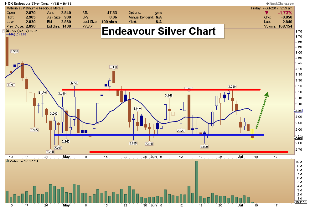
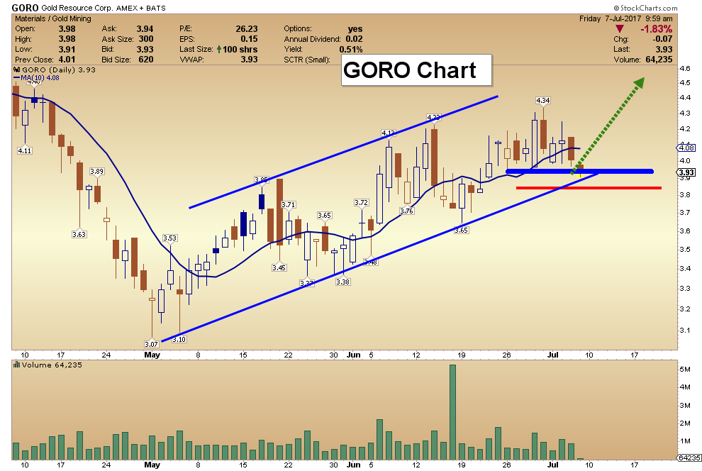
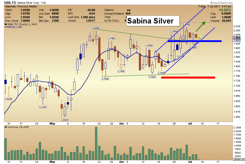
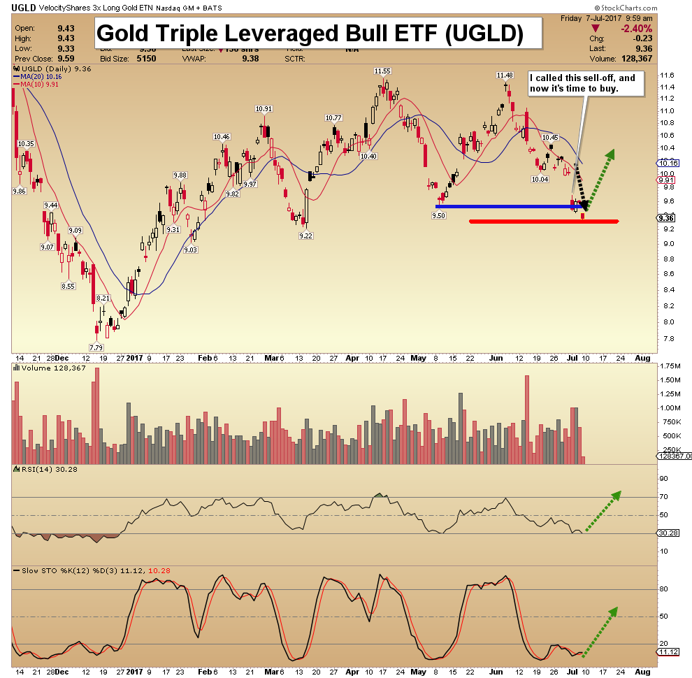
For those who continue to be frustrated by the low precious metals price, silver is down another 20 cents as I write this article, take a GOOD LOOK at the charts in this article. The market WARNING LIGHTS are no longer working, so when the CRASH happens, it will be a complete surprise.
Check back for new articles and updates at the SRSrocco Report.
So, for all the frustrated precious metals investors out there who continue to BELLY-ACHE and COMPLAIN that the “Analysts Got It Wrong” about gold and silver since 2011… have also been BAMBOOZLED, like the rest of the market, that EVERYTHING IS FINE. Well, it isn’t.
Lastly, the question I receive the most in my INBOX is “WHEN will the markets collapse?” Before I answer that, I want to say the following. The amount of contact email I receive now from my website is off the charts. I used to be able to reply to everyone within a few days, but now it has become impossible as the amount of requests for information have now become a part-time job. I apologize for not being able to respond to everyone over the past few weeks (month)…. but it has been a very busy time for me.
Furthermore, the SRSrocco Report site is a ONE MAN SHOW. Those who run their own websites understand what I am talking about because there is a great deal of work and logistics just to keep the site running. Many of the alternative media sites have more staff to deal with maintaining the site and etc, so they are free to spend most of their time on research, writing and doing interviews. Unfortunately, I don’t have that luxury, which is keeping me from writing even more articles and publishing new Reports.
That being said, I want to thank all the individuals who have been very generous in sending donations to the site. These donations have allowed me to maintain and upgrade the site. Gosh, last year before my excellent webmaster, Peter, upgraded the site, it was very slow and at times generated site errors which kept some visitors from being able to access it. Some followers let me know that it was taking upwards of 15-20 seconds to load. Now, the site loads exceptionally fast as we have upgraded to a Virtual Private Server.
Also, my webmaster has done a lot of additional programming to make the site even more efficient and fast. I can tell there is a big difference in the performance of the site now when I visit some of the other alternative media sites that take a long time to load.
Unfortunately, it is hard to find a good webmaster, but I was very lucky to come across Peter. When I first started the site, I decided not to do a subscription service because I wanted to make sure the information got out to the public. However, I have received several emails from followers who have suggested that I should start up a PATREON site, like Sean at SGT Report and James Kunstler and Kunster.com. While the site will still be open to the public, this is a service that allows people to become a PATREON contributor to the site.
So, I will be working with my webmaster over the next week to consider implementing this option. Again, I appreciate the generous support by many of you all as I try to put out original information that is not found elsewhere on the internet. Okay… so, WHEN does COLLAPSE happen?? If I had that answer, I would be able to pick the winning numbers on the lottery ticket.
However, the indicators, like the ones shown in this article, point out that the situation in the markets are deteriorated much quicker than before. The Central Banks asset purchases of $1.5 trillion in the first five months of 2017, are more than double the annual trend since 2011.
The U.S. and Global Oil Industry is being GUTTED from the inside out due to the current low oil price. As Chris Martenson stated during my interview with him, the global oil and gas industry’s total debt is now closer to $3 trillion versus $1 trillion in 2006. These energy companies have to pay a lot of INTEREST EXPENSE just to service their massive debt. Once the energy industry starts to really disintegrate, then it will take down the entire market.
My gut tells me that this will likely start to occur within the next 6 months to 2 years. It could happen sooner, or it could take a bit longer. However, there is no way to TIME THIS EVENT. So, don’t try to. It would be prudent to own some physical precious metals before the market cracks, or it may be difficult to access any…. or if so, only at much higher prices. For those who continue to be frustrated by the low precious metals price, silver is down another 20 cents as I write this article, take a GOOD LOOK at the charts in this article. The market WARNING LIGHTS are no longer working, so when the CRASH happens, it will be a complete surprise. Check back for new articles and updates at the SRSrocco Report.

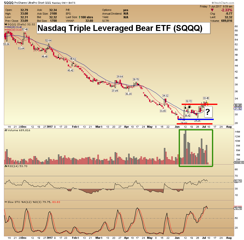
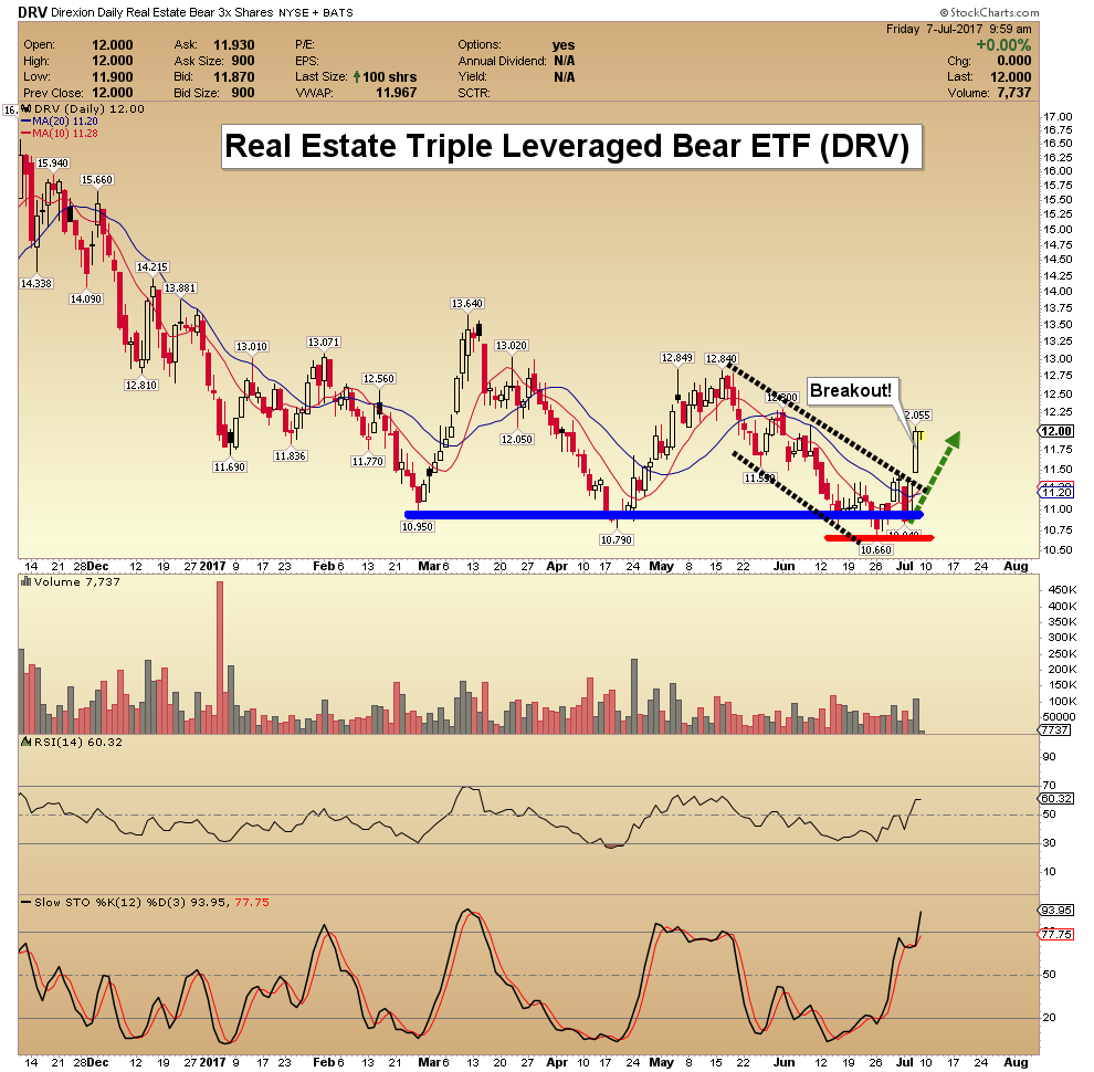
Here are today’s videos and charts (double click to enlarge):
SFS Key Tactics & Video Update


SF60 Key Tactics & Video Update

SF Juniors Key Tactics & Video Analysis

SF Trader Time Key Tactics & Video Analysis

Morris

wo weeks ago, I took a shot and called the top of the stock market. If you are a newsletter writer and you aren’t trying to call major turns in the market, you are not really doing your job.
If you missed that issue, I suggest you go back and take a look at it. My argument is that speculation is getting out of control. And not just on stocks—on bitcoin, comic books, all kinds of stuff.
When you have one bubble, you usually have others, concurrently.
But the one that people are most focused on is the bubble (if you want to call it that) involving Facebook, Amazon, Netflix, and Google. Throw in Apple and Tesla for good measure, and maybe a few more.
A handful of tech stocks have gone bananas. So, let’s do some basic blocking and tackling.
I actually spend almost no time on charts in The 10th Man, but I think technical analysis is really important. The quality of the analysis often depends on the abilities of the analyst, and one of the best is Frank Cappelleri at Instinet.
He has pointed out that on a short-term basis, the NDX (which largely tracks large-cap tech stocks) has formed a head-and-shoulders top and is breaking trend.

Source: Instinet
This is the first real weakness we’ve seen in tech in a really long time…
Though Frank is quick to point out that on a longer time horizon, the trend is still firmly intact:

Source: Instinet
I don’t think it is a coincidence that the short-term breakdown is happening concurrently with tumultuous times in Silicon Valley.
Uber is disintegrating before our eyes. Unless they go public (which they can’t), they’re going to have to do a down round, and it’s not out of the question to think the company might cease to exist one day. That likely has implications for private valuations everywhere.
Also, the news broke of some pretty big sexual harassment allegations recently in tech-land. This is significant because public opinion matters—I can foresee a time when tech executives are viewed about as favorably as Wall Street was in 2011, when Occupy Wall Street began.
The Longest Bull Market… Ever
Keep in mind that Silicon Valley never really had a recession like the rest of the country did in 2008.
Sure, the VC business slowed down, but do you remember what was happening in 2008? Facebook had about a $15 billion private valuation, and it was spawning a whole ecosystem of tech startups that latched on to Facebook, like Zynga.
Silicon Valley went down the cleantech path for a few years, which was a dead end, but moved on to apps like Yo!, which apparently was not.
So Silicon Valley hasn’t had a real, honest-to-goodness downturn since the dot-com bust. That was 17 years ago! Probably less than a quarter of people currently working in the valley were even around when that happened.
That’s the funny thing about cycles—they usually repeat when nobody remembers the last one.
Most people have no idea the sorts of excesses that are happening in tech world. I don’t either, but I have spies.
About a year ago, a friend of mind visited LinkedIn headquarters, went to their cafeteria, and told me of the incredible opulence there. The types of luxuries that are available to people in Northern California—you or I cannot even conceive of it.
Quick story. I went to graduate school at the University of San Francisco, and took a Venture Capital class, which was basically a series of lectures from executives in the VC industry. These were very important people. I was surprised that they were taking time to come speak at USF. Stanford sure, but USF?
It was April of 2000. The stock market had just crested. A very senior guy from New Enterprise Associates came to talk to the class about optical networking.
He spoke of the great promise of optical networking. He drew a nearly vertical line shooting off into space, and called it “Moore’s Law Squared.”
He might have been the most bullish person I have ever seen in my entire life.
The next day I went out and bought a bunch of put spreads on optical networking stocks. They were some of the greatest trades I ever made.
Nobody believes their own bullshit quite like venture capitalists.
Having Said That
I wrote a piece a year or two ago in The 10th Man about how tech was overpriced. Tech responded by going straight up.
Plus, if you shorted tech when things started getting stupid a few years ago (think Yo!) you would have been carried out.
But it’s hard to argue that things haven’t gotten excessive, especially in startup financing (seed and pre-seed). Seems like all you need is a pitch deck and a dream, and you have yourself a $10 million valuation.
The old-timers know that’s not normal.
The old-timers know there is a cycle.
The Fed keeping interest rates at emergency levels has allowed this to go on a lot longer than it should have. The down part of this cycle will be instructive, for a lot of people.
And I hate to pick on the FANG stocks, because at least they make money (more or less).

Source: CNN Money
But dreams are always biggest on the highs. I’m sure some of you saw the patent application for Amazon’s drone beehive fulfillment center. Now, companies apply for patents for all kinds of crazy things, but come on.
Even if you’re not bearish on the overall market, I would bet strongly on tech underperformance. It seems likely that value will strongly outperform growth, for the foreseeable future.
That one is easy enough to implement.

Jared Dillian
Editor, The 10th Man![]()

Quotable
“The most difficult thing in markets is knowing how to wait for a big move that you know is going to come.”
–Woody Dorsey
Commentary & Analysis
Buy Commodities? Why? Well, because the stocks/commodities ratio says so…
Based on the Stocks/Commodities ratio chart we have been following and sharing for the last several years, it’s now time to start buying commodities; at least in a greater proportion to stocks. Why? Well, because the Stocks/Commodities ration just made a round trip and interestingly even the timing is symmetrical. The visuals below should help explain….
It is rarely this simple and no-one rings a bell at the top or bottom.

There are a lot of moving parts in the chart above. Here are the key points we perceive:
- A nine-year (489 weeks) relative bull market in commodities; i.e. commodities stronger than stocks, has been met now with a nine-year (468 weeks) relative bear market in commodities.
- The Stocks/Commodities Ratio (calculated by dividing the S&P 500 by the Thomson ReutersCommodities Index) peaked back in early 1999 at 14.4; and it has been almost exactly retraced back to 14.4—an eighteen year round trip.
- We would suggest two drivers for the commodities bull move from 1999-2008: 1) the symbiotic relationship between China’s huge demand for all things commodities to build stuff to support the massive US consumer demand funded by the belief debt was painless (aka one’s house became their personal ATM); and 2) the weakening of the US dollar (blue dotted line on the chart) which pushed up the dollar price of real stuff (commodities). [Self-reinforcing circle; aka feedback loop]
- The sea change event in the global economy has been the Credit Crunch; it triggered two events: 1) a new bull market in the US dollar; and 2) massive amount of liquidity to driver up financial assets as the things real lost investment appeal in a slow growth environment and became cheaper in US dollar terms. [Self-reinforcing circle; aka feedback loop] What might be some of the reasons we might see a reversal in this ratio, or put another way—what might make commodities relatively more attractive than they have been over the past nine years? A couple of inter-related rationales include:
- Global economic growth rebounds sharply. Already we are seeing a surprisingly strong recovery in Europe, if the numbers can be believed. China, despite all the disaster scenarios, is keeping the balls in the air. Canada is improving. And despite having been declared “dead and buried,” the Trump Reflation trade could rise again.
- The US dollar enters a new bear market phase—the US dollar index topped in January and has looked quite sickly for months despite the fact for many of those months the Fed seemed as if it would be the only central bank in rate hike mode. Now we have the European, Canadian, and UK central banks in the game and the US dollar will likely give back its rising yield spread. Couple that with money flow potentially heading out to the commodity-based countries and you have the making of a big push lower in the dollar (thus bidding up dollar price of real goods as most are still denominated in US dollars).
We are deep in the realm of guesswork here and there are plenty of solid rationales to suggest this trend higher in the Stocks/Commodities ration will continue (continued global deflation as the world struggles with too much supply capacity and the cold blanket of debt would be a good one).
Also, keep in mind that a shift in the Stocks/Commodities ratio doesn’t necessarily mean the stock market goes down and the commodities index goes up; the two price series often move in the same direction. For the S/C ratio to turn down from here, it means the commodities index is rising faster than the stock index—that is all. In the chart on the next page I have overlaid the S&P 500 Index and Commodities Index over the S/C ratio so you can see these relationships.

Click Chart for larger version
The trend is your friend until it’s not, as they say. But given the incredible symmetry in this ratio alone, it may be time to start looking in the other direction, even if it’s too early to act.
Jack Crooks
President,
Black Swan Capital
772-349-6883

-
I know Mike is a very solid investor and respect his opinions very much. So if he says pay attention to this or that - I will.
~ Dale G.
-
I've started managing my own investments so view Michael's site as a one-stop shop from which to get information and perspectives.
~ Dave E.
-
Michael offers easy reading, honest, common sense information that anyone can use in a practical manner.
~ der_al.
-
A sane voice in a scrambled investment world.
~ Ed R.
Inside Edge Pro Contributors

Greg Weldon

Josef Schachter

Tyler Bollhorn

Ryan Irvine

Paul Beattie

Martin Straith

Patrick Ceresna

Mark Leibovit

James Thorne

Victor Adair