Wealth Building Strategies

10 Steps to More Cash Flow

Cash-FlowConcrete steps you can take today to improve your cash flow tomorrow!

“Business opportunities are like buses, there is always another one coming.” – Richard Branson
 

Step 1. Know your numbers. 

The best business leaders are able to describe their business, market and future plans, numerically. Exceptional growth comes from the precise understanding of all aspects of your business, including key metrics (e.g. sales funnel health, CAGR, and gross margins) and the status of current resources such as cash.  I am not suggesting you lack emotion or passion, but rather complement it with objectivity.

Step 2. Embrace low cash growth strategies.

Often a company in growth mode will get a rude awakening when the sales plan actually succeeds, only to discover cash consumption, for working capital, can vastly outstrip cash generation.  One of the better problems to have, but don’t let it become fatal. Build low cash growth strategies upfront such as: non-core outsourcing, well negotiated deal terms, low cost technology platforms, and scalable, multi-channel business models

Step 3. Maintain control of your financial systems at all times.

Build strong and robust financial systems lead by competent and trusted financial managers.  Never, ever lose control of your financial systems.  When in growth mode review your financial statements frequently (monthly) and cash position weekly.  Audit your systems regularly and keep a constant lookout for incompetence, deception, and fraud.  Leave nothing to chance here. 

Step 4. Deeply understand your sources and uses of cash.

If your understanding of accounting is weak, get up to speed fast. Learn how cash flows in your accounting system, and what drives cash generation and consumption. For instance, if revenue increases, but accounts payables or inventory increase to service that revenue, cash will initially be consumed, not produced. You run the business, not the accountants.

Step 5. Be fanatical about improving margins.

Top line growth must be converted into cash through effective margin management.  Know your margins to one decimal point, set targets for each product and sector, cull the lowest 10% margin customers per year, and constantly test and iterate your offers to improve future margins.

Step 6. Manage working capital well.

Run an aggressive accounts receivables strategy (i.e. prepayment, large deposits, automated billing, and improved collections) and mitigate payables.  Work strategically to reduce working capital through new business models, and outsourced fulfillment.

Step 7. Play cash offense by driving sales.

 Start by selling more of your current offers to existing customers, then new offers to current customers, and finally develop new offers to sell to everyone.  Selling more to your existing base is one of the best ways to juice up cash flow, since it requires modest new investment and can be ramped up quickly.

Step 8. Play cash defense through cost containment.

Implement a system like Lean, which focuses on the functions that deliver value directly to the customer.  Invest in those steps and massively reduce the non-value added activity and waste.  Reduce discretionary spending by creating a culture of frugality and always ask, “How will the customer benefit from this expenditure?”

Step 9. Be ROI driven.

Focus all your key investment and time in the areas that will give you the biggest cash return.  This usually starts with more sales, so as CEO you should be spending 50% of your time on sales. Also invest in hiring employees that create value for the customer, restructuring processes to reduce cost or cycle time, and new capital projects that build future cash streams.

Step 10. Use cash to dominate your sector.

Use your newly minted cash to dominate a sector, not just compete in it.  Sectors with too much competition will drain cash resources.  Do this by regularly reviewing your strategic growth options and ensuring cash is diverted to the most promising areas.  Don’t get complacent by the status quo and invest strategically to dominate.

About Eamonn Percy

Eamonn Percy is the Principal of The Percy Group, a business advisory + capital firm focused on helping business leaders of mid-sized companies accelerate the growth of sales and profit. Subscribe to his newsletter at www.percygroup.ca8


Sell EUR/NOK when (if) oil stops falling…

Quotable

“Suiting the correct tactics and strategies to each situation may be considered the mystery of life.” — Victor Niederhoffer, The Education of a Speculator

Commentary & Analysis

Sell EUR/NOK when (if) oil stops falling… 

Screen Shot 2017-06-21 at 6.59.27 AM

Working from the following simple model below, the Norwegian krone should be trading much better against the euro:

Screen Shot 2017-06-21 at 7.00.28 AM

Assume we cannot forecast the future exchange rate in the equation, it leaves us with nominal interest rates and inflation to work with (but nominal interest rates and inflation are all wrapped up in the same feedback loop with expected economic growth); therefore we simplify for this purpose

Screen Shot 2017-06-21 at 7.02.42 AM

Thus, the real yield available from Norwegian 2-year paper is 0.61% (or 61 basis points) greater than owning 2-year Eurozone paper. Given that, theoretically, speculative capital should be flowing to Norway in greater relative proportion, from hot money investors, than what is flowing into the Eurozone. In a world of zero bound interest rates, a 61 basis point pickup on relatively short-term paper is a big deal.

But theory and reality are two different things of course.

Despite economists tidy exclamations of ceteris paribus (roughly translated as other conditions remaining the same), in the real world of pseudo free market prices, all relationships which are embodied by said prices are continuously fluctuating; conditions never remain the same. To add to complexity, there are continuous feedback loops everywhere (von Mises taught us that). So, we make forecasts (dressed up guesses); but we must understand our guesses, and those of others, impact future prices, which in turn engenders updated forecasts, into infinitum really [see Reflexivity]. I hope that made a modicum of sense.

In the graphic on page 3 it shows the price action of three different variables overlaid: EUR/NOK, oil, and the Eurozone-Norway 2-year interest rate spread. And despite the importance of yield spread on relative currency prices, the biggest driver in EUR/NOK relationship seems to be oil. It makes sense, given the huge component to Norway’s economy; lower oil prices should mute growth expectations.

However, according to Trading Markets growth expectations for Q3 and Q4 2017 are the same for Norway and the Eurozone. And in fact, Q1 and Q2 for 2018 are higher for Norway (as you can see in the

chart below). 

Screen Shot 2017-06-21 at 7.04.20 AM

EUR/NOK (gold) vs. Oil Inverted (green) vs. 2-yr Yield Spread (purple) Daily: As you can see, despite yield and growth, the tighter correlation between EUR/NOK is oil; i.e. as oil prices fall (green line going higher in this chart) EUR/NOK goes higher (or put another way, the Norwegian krone weakens relative to the euro). 

Screen Shot 2017-06-21 at 7.06.02 AM

But, as indicated above, the dynamic may be more than what we see in this chart.

For instance, whenever you think about the variables that impact currency prices, keep in mind that the relationship is often circular. What I mean is that the variables tend to serve as both cause and effect in relation to other variables…a rising currency can improve the economic fundamentals and improving economic fundamentals tend to improve the outlook for the underlying currency. It leads to the mind numbing question: “What leads and what follows?” 

Yet there another consideration: The Norwegian central bank (aka Norges Bank) is expect to raise interest rates before the European Central Bank gets into the game (see Financial Times, Norway’s Norges Bank set to turn ‘cautiously hawkish’, 19 June 2017.) Thus, the yield spread favoring the krone over the euro is poised to rise as some unknown time in the not too distant future.

Bottom line: The current yield spread favors Norway; expected yield spread favors Norway; and growth expectations favor Norway. It strongly suggest once oil prices stop going down (we don’t know when that will be; but we do know they will stop going down at some point) one of the best intermediate-term trade setups should be short EUR/NOK.

Stay tuned.

Jack Crooks
President, Black Swan Capital

jcrooks@blackswantrading.com

www.blackswantrading.com

772-349-6883 


Small-Cap Mining Stocks, Big-Time Opportunity

a

Last month I told you about the upcoming rebalance of the hugely popular VanEck Vectors Junior Gold Miners ETF (GDXJ), and how it would distress shares of junior, small-cap mining stocks. I said then that the rebalance could create some excellent opportunities for astute investors to accumulate high-quality, well-managed producers at discount prices.

That day has finally arrived, bringing with it a tsunami in the junior resource space, as I told Collin Kettell on Palisade Radio the week before. It’s a buyer’s market—if you know what you’re looking for. The last time the GDXJ underwent a rebalance of this magnitude was in December 2014, so I see this as a rare event savvy investors shouldn’t miss out on.

But first a reminder of what’s been happening with the GDXJ. Basically, it had become too massive for its underlying index—composed mostly of Canadian junior gold producers—with assets rising close to $5.5 billion earlier this year, up from $1 billion only last year. 

Mo Money Mo Problems


Normally this wouldn’t be such a concern. But the GDXJ was getting precariously close to owning a 20 percent share of several names in its index, which would have triggered all sorts of regulatory and tax conundrums in Canada and the U.S.

So the fund made several adjustments to its methodology, including raising the market cap threshold of allowable companies to $2.9 billion, up sharply from $1.6 billion. This means it can now hold large producers that don’t appear in its index, the MVIS Global Junior Gold Miners Index. It also means that a number of smaller constituents were down-weighted or divested altogether, giving investors less exposure to junior miners than what the fund’s name implies. 

Before any of this took effect, though, many investors, hedge funds and other market participants acted on the rebalance news by indiscriminately selling down their junior mining assets. This introduced fresh volatility to underlying stocks and depreciated prices. 

The selloff, I might add, was done mostly without regard for the phenomenal fundamentals and growth profiles some of these companies reported.

These Miners Get High Grades

Take one of our favorite names, Wesdome Gold Mines. The Toronto-based producer has been operating in Canada for 30 straight years as of 2017 and currently carries no debt. Two of its mines, Eagle River and Mishi, are among Canada’s highest-grade gold mines. Last summer, the company made headlines when it discovered gold at its Kiena property in Quebec, sending its stock up an amazing 49 percent to $2.24 on August 25.

2.jpg (600×315)

When Wesdome was added to the GDXJ in March, it cast newfound attention on the $417 million company. Only a month later, the rebalance was announced, and since then, its stock has eased about 19 percent.     

3.png (600×362)

I see this as a can’t-miss opportunity for retail and institutional investors to start nibbling on Wesdome and other junior miners that have been similarly knocked down only because of fund flows.

That includes Gran Colombia Gold, the largest gold and silver producer in Colombia, and Klondex Mines, whose Fire Creek Mine in Nevada was estimated to be the highest-grade underground gold mine in the world. (According to IntelligenceMine, Fire Creek averaged 44.1 grams per metric ton (g/t) in 2015, double the ore grade of the world’s number two project, Kirkland Lake Gold’s Macassa Mine, at 22.2 g/t.)

Gran Colombia announced last week that it produced 15,444 ounces of gold in May, representing a new monthly record for the company. This brings the total amount for the first five months of the year to 68,783 ounces, an impressive 21 percent increase over the same period last year. The Canadian-based producer has a very attractive convertible bond that pays monthly.

I’ve frequently praised Klondex for its frugality, strong revenue growth and exceptional management team. The last time I visited Vancouver, I had the opportunity to chat one-on-one with its president and CEO, Paul Andre Hurt, who has 30 years of experience in high-grade mining. Not only is Paul a highly-respected chief executive in the mining space, he’s also a devoted father of five.

 A Golden Opportunity

The GDXJ rebalance represents a rare opportunity to accumulate high-quality junior producers at discount prices. I always recommend a 10 percent weighting in gold—5 percent in gold stocks or mutual funds, 5 percent in bars, coins and jewelry.

Commodity prices have lately underperformed equities mostly on subdued oil demand growth, with the S&P GSCI commodity index falling about 4 percent over the last month. If we separate the index components, however, we see that precious metals have posted positive gains year-to-date along with industrial metals.  

4.png (600×407)

As I mentioned recently, gold imports in China and India, the world’s top two consumers of the yellow metal, have advanced strongly this year on safe haven demand. China boosted its gold purchases from Hong Kong as much as 50 percent this year to 1,000 metric tons, the most since 2013. India’s imports rose fourfold in May compared to the same month last year as traders fear a higher tax rate on jewelry.

With the GDXJ down-weighting junior producers, investors might wonder how they can get broad exposure to small-cap mining stocks. 

Explore one such opportunity by clicking here!


Global Blast-Off Trade Setup

Asia Custom Monthly F-290x130Our analysis of the global markets and metals markets are prompting us to issue a warning that may not shock a number of our followers – but may surprise others.  We use a number of custom indicators, custom indexes and other specialized features to try to keep our valued members aware of moves before they happen at ActiveTradingPartners.com.  You may recall our recent article warning of a VIX spike between June 9th and June 13th in correlation with a US market correction (NASDAQ).  We nailed this and predicted another VIX spike on June 29th, 2017.

Are you ready for what might become the most opportunistic setup we’ve seen in over a decade?  Well, before we get to the guts of our incredible setup, let’s go over some other data to support our predictions – the global markets.

On May 3rd, 2017, we authored an article regarding Global Economic Shifts that were taking place as a result of Capital Migration and renewed risk factors throughout the global markets.  Our hypothesis was that capital will always attempt to locate and migrate to financial environments where risk is mitigated and returns are sufficient.  We consider this an active and intrinsic role of global capital – the hunt for the ability to thrive and develop success/profits.

Since this research was completed, a number of new and interesting facets have evolved.  Two of the most interesting are the shifts within the Arabic nations with regards to Qatar and the almost total isolation recently enacted on this wealthy nation and the news from Europe that a number of smaller, regional banks are collapsing with broader, tangible relations to the EU banking system.  This type of disruption within a financial environment (think globally) causes capital to migrate rather quickly to more stable locations for self-preservation.

China/Asian markets appear to be developing a level of “moderately healthy financial environment” in terms of global market capital migration.  In the past, I would have warned that Asia/China could become a temporary safe-harbor for capital as it migrates out of riskier environments and I would still support that claim simple because China/Asia are less of a mature market compared to other.  Thus, the likelihood that China/Asia could see dramatic asset revaluation or some type of unexpected market function issues is still near the top of my list.  Yet, we can’t accurately predict when this will happen and until extended signs of weakness cause us to adopt a more concerned stance, we have to understand that capital will move to environments that seem suitable for success.  At this time, we believe China/Asia are viewed as just that – moderately suitable for capital deployment and investment (till things change).

Asia Chart

You will see from our chart that a defined support channel is in place and resistance bands appears to be setting up near the end of June and throughout September 2017.

Asia_Custom_Monthly_F

BRICs Chart

BRICS markets appear to have “rolled over”, as predicted, near resistance bands that indicate pricing levels may be setup for some level of correction.  It is our opinion that an 8~18% correction may be near as capital will likely migrate away from perceived increased risk and towards healthier environments.  This would put a downside target on this chart near $13k~$12.5k.

BRICS_Custom_Monthly_F


Europe Chart

The European markets appear to be at a critical juncture near a classic Fibonacci retracement pattern.  Many people do not understand one of the basic concepts of Fibonacci theory that is; price will always attempt to develop new higher highs or lower lows.  Keeping this in mind, any failure to develop higher highs in the European markets within the next 2~3 months will likely result in perceptions being that these markets are developing greater risk.  Thus, capital may migrate away from the uncertainty and risk towards healthier alternatives.

The European markets chart shows clear price channels that originated near July 2016 – the date Theresa May assumed the Prime Minister role.  It is interesting how the perception of an environment of strength, protection, leadership and opportunity can change the way capital migrates from different environments.  In this case, the disruption in Europe with May’s election victory changed the way people saw the future opportunities in Europe.

Now, with recent elections, banking issues, further debt issues and uncertainty with leadership, we can only assume that perception will change, again, towards an environment that is more risky and unstable – prompting capital migration away from these markets.


EU_Custom_Monthly_F

US charts

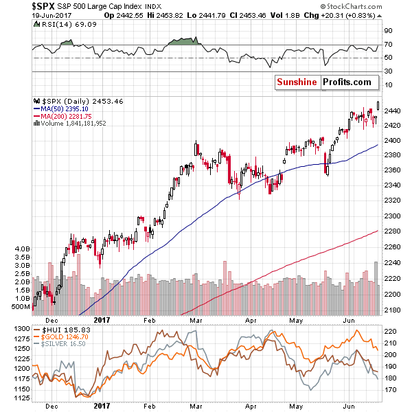
Meanwhile, on another continent…  The US markets appear to be the “Garden of Eden” in terms of capital migration.  It is true that the entire US/Canadian/Mexican conglomerate market is suitable and in perfect financial health, but it is also true that compared to many others, these market present the potential for the best and safest deployment of capital.  The charts show that capital appreciation has been tremendous since the US Presidential Elections and may launch much higher if extended risk exists in other global markets.

Again, capital is always searching for a safe and suitable environment for deployment.  Taken in global terms, there are really only two suitable locations for capital and the others are inherently more risky.  These conditions may change over the next few months, but our analysis points to one critical factor that could disrupt many aspects of this global capital environment.  One thing that could be related to a massively disruptive event.

US_Custom_Weekly_F 768w,
We are now at the point that you have been waiting for.  The incredibly disruptive and opportunistic setup that could change everything in the global markets (or so we hypothesize).  Before we get to the details, we want to make certain that you understand this type of research if far from 100% guaranteed or set in stone.  We develop our analysis based on a number of massively moving components within the global economy and are predicting price moves that may be weeks of month in advance.  We advise you to consider this a learning experiment in the sense that there is absolutely no way we can state with 100% certainty our research/analysis or conclusions will play out exactly as we suggest.  It is impossible for anyone to know what will or may happen, accurately, in the future.  That is what trading is all about – making an educated guess and protecting your trade.

Well, here it is, folks.  

The setup/opportunity that may turn into 

the biggest move in the markets for the next century.  METALS.

Think about this for just one minute. Given the knowledge that capital will migrate to sources of safety and investment return while avoiding environments that are risky.  And, given that we’ve made fairly clear points that much of the global is setting up for some levels of disruption, uncertainty and greater risk – leaving only China/Asia and the US as the safe-harbor capital environments.  We’ve also detailed how the China/Asia markets are setting up for disruption with technical resistance levels and exposure to other global environments.  We’ve highlighted that Europe may enter a period of disruption and uncertainty with recent elections, debt, banking issues and more and illustrated that BRICs markets are rolling over as an early warning that emerging markets might contract as global capital migrates towards safer environments.  This is not doom and gloom stuff, this is just what happens when markets are disrupted.

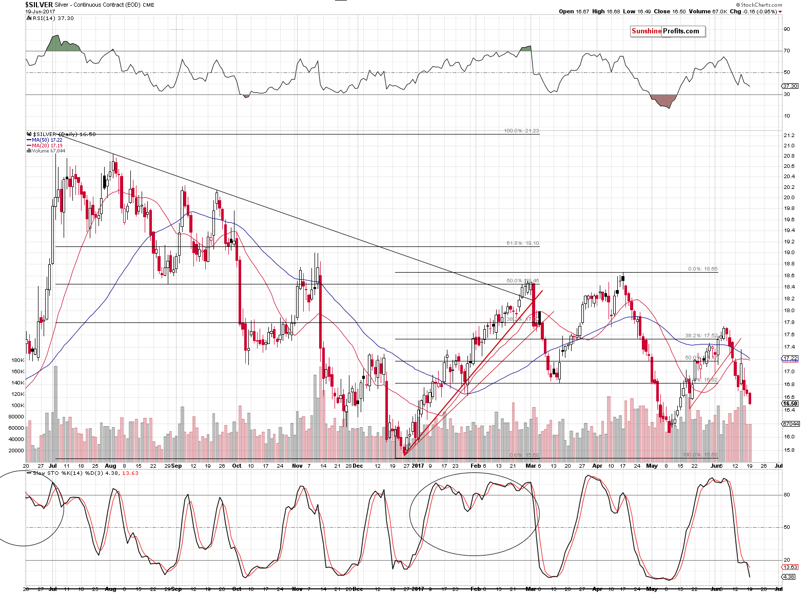
Now, look at the setup in these custom metals index charts.  A clear Flag formation has setup near historical lows that is nearing the Pinnacle.  My analysis of this pattern shows that we are setup for one more lower price rotation before the rally begins.  One more attempt at buying near ultimate lows before we could see a massive, explosive rally capable of at least a 50%+ run.  Long term, this run could be much bigger..  much, much bigger.  Fibonacci theory shows the potential for 125% or 225% gains are easily possible.

Oddly enough, our research shows that this lower wave of metals prices should complete near or before June 29th.  Remember that date from the beginning of this article?  That’s right, this is the date that we predict would initiate a volatility spike (VIX Spike).  Just how big will this VIX spike be?  If our analysis is correct, the real VIX/volatility expansion won’t begin to happen till near the end of August or near the middle of September, 2017.

Our analysis shows that the Metals will begin to make a move near the end of June or early July 2017.  Our analysis also shows that the US and global markets will begin to see increased volatility near Aug/Sept 2017.  We also believe that any move in Metals will likely be the result of extended risk factors globally.

Metals_Custom_Daily_F 

Chris Vermeulen

If you like receiving this type of analysis and want to continue to receive these advanced research reports, detailed trading signals and more, then visit www.ActiveTradingPartners.com and become a member. 

Strength in Mining Stocks and Its Implications

Yesterday’s session was not like the previous ones – in the previous days, the precious metals sector moved lower together and mining stocks were leading the way. Yesterday, gold and silver declined, but miners were barely affected. Does this strength indicate a likely turnaround?

Miner’s Outperformance

In short, that’s not likely. Miners had a very good reason to rally. The general stock market soared yesterday and mining stocks, being stocks themselves were positively affected by this development. This is something that happens quite often, but let’s keep in mind that this effect is usually temporary. Ultimately, the gold stocks’ profits depend on the price of gold and thus this is the key driver of the miners’ prices. Let’s see exactly how much the mentioned markets moved (chart courtesy of http://stockcharts.com).

1 O0ZV8bP

The GDX ETF was down by 13 cents which is next to nothing. The volume was rather average and the entire session was yet another day of a post-decline pause.

Short-term Gold price chart - Gold spot price

Short-term Silver price chart - Silver spot price

Gold and silver both declined quite visibly, so the pause in mining stocks is no longer neutral by itself – it might appear bullish as the miners’ lack of decline despite gold and silver’s declines means that the former outperformed.

Likely Reason Behind Miners’ Strength

SPX - S&P500 Large Cap Index

The action in the S&P 500 Index, however, makes the action in mining stocks neutral once again. The broad market moved sharply higher to new highs, which is both: important and very visible. Consequently, it’s no wonder that this tide lifted also the boat with mining stocks and the miners’ “strength” is therefore not a true sign of strength. This, in turn, means that there are generally no bullish implications of the mining stocks’ lack of decline, despite it might look so at first sight.

Summing up, the lack of decline in mining stocks doesn’t seem to have any bullish implications as miners had a very good reason for it in the form or a rallying stock market – the lack of decline in the former is therefore not a sign of strength and not a bullish development. Naturally, the above could change in the coming days and we’ll keep our subscribers informed, but that’s what appears likely based on the data that we have right now. If you enjoyed reading our analysis, we encourage you to subscribe to our daily Gold & Silver Trading Alerts.

Thank you.

Sincerely,
Przemyslaw Radomski, CFA
Founder, Editor-in-chief, Gold & Silver Fund Manager