
Wealth Building Strategies
 GUALFIN, ARGENTINA – As longtime Diary sufferers know, we don’t do real stock analysis.
We just look for Really Simple Patterns (RSPs).
The simplest we’ve discovered so far: If a market is cheap now, it will probably be less cheap before you get around to investing in it. If it is very expensive, it will probably be less expensive before you get out.
Simple Strategy
This RSP came to mind when Bonner & Partners analyst Chris Mayer, who advises us on our family portfolio, reminded us how much money we made on his latest recommendation.
For our family account, we keep one portfolio made up of country stock market ETFs. We select the countries based on this RSP: We look for the cheapest ones.
As recently as March 30, Chris advised us to put money into five cheap country stock market ETFs. And yesterday, imagining our delight, he sent us the following email update:
Amazing, it’s such a simple a strategy and yet works so well…
So far (since March 30), you are up almost 10% in Turkey, almost 9% in Spain, 8% in Italy, and 5% in South Korea. The only downer is China, down 1%.
Overall, you’re up over 6%… since March.
The only trouble is… we never got ourselves together to make the investment. And on April 15, we suddenly needed the money we had set aside for it to pay the IRS.
Trade of the Decade
But let’s look at another trade, our Trade of the Decade.
This had nothing to do with careful analysis, study, or insight. Just another RSP: Markets that go down for a long time have a good chance of going back up over the next 10 years.
At the debut of the 21st century, we had no trouble identifying a promising setup. Gold had been going down, more or less, for nearly two decades. U.S. stocks had been going up.
So our Trade of the Decade was simple: Sell stocks, buy gold.
It turned out that both sides went our way. Between 2000 and 2010, gold rose about 143%, making it the best-performing major asset class of the decade. And the S&P 500 fell about 25%.
Our next Trade of the Decade was not so simple.
By 2010, gold was no longer a bargain. And U.S. stocks had been beaten down by the 2008 crisis. There was little to be gained by squeezing that orange any further, we reasoned.
What then?
Goofy Program
By the second decade of the 21st century, Japanese stock prices had been falling for 20 years.
Japanese government bond prices, on the other hand, had gone nowhere but up. Why not bet on a reversal?
And so we did in our new Trade of the Decade: Sell Japanese bonds, buy Japanese stocks.
This was based on two other RSPs: (1) Markets that go down a lot tend to go up a lot later, and (2) over time, governments will always destroy the value of their paper currencies.
How has it done so far?
Well, before we get to that, we would like to thank the Japanese government – or, more specifically, the Bank of Japan (BoJ) – for this result.
The Japanese feds have worked tirelessly to boost prices on their stock exchange and send investors fleeing from their bond market.
Why?
It’s just part of their goofy program that is supposed to improve the economy. If they can get the rate of inflation up, they will devalue the yen and make Japanese exports more competitive.
This, in turn, will improve exporters’ sales… leading them to buy more, hire more, and stay in line behind the ruling party.
Claptrap Policies
Accordingly, the familiar claptrap policies were brought on stage.
Shinzō Abe, the country’s prime minister, explained how more “stimulus” – both fiscal and monetary – would surely light a fire under the economy.
It did not. Instead of falling, the yen rose, leaving the Japanese economy soggier than ever.
It must have been then that Mr. Abe and the BoJ decided to go full retard.
They wouldn’t wait for Japanese companies to sell more products and earn more profits. They would simply buy stocks themselves.
Financial blog Zero Hedge:
A year ago, we noted that The Bank of Japan (BoJ) was a Top 10 holder in 90% of Japanese stocks. In December, we showed that BoJ was the biggest buyer of Japanese stocks in 2016. And now, as The FT [the Financial Times] reports, the real “whale” of the Japanese markets is stepping up its buying (up over 70% YoY [year over year]), entering the market on down days more than half the time in the last four years.
Since the end of 2010, The FT notes that the BoJ has been buying exchange traded funds (ETFs) as part of its quantitative and qualitative easing programme. The biggest action began last July, when its annual acquisition target was doubled to ¥6 tn [$8.7 billion].
Since then, the whale designation has seemed pretty obvious: the central bank swallows a minimum of ¥1.2 bn [$10.5 million] of ETFs every single trading day (tailored to support stocks that further “Abenomics” policies), and lumbers in with buying bursts of ¥72 bn [$632.5 million] roughly once every three sessions.
Since the Bank of Japan began this program, investment bank Nomura estimates that it has boosted the Nikkei 225 Index – Japan’s equivalent of the S&P 500 – some 1,400 points.
Thank you very much.
So how are we doing?
Since the start of 2010, the Japanese stock market is up about 33% in U.S. dollar terms… and about three times as much for yen-based investors. As for Japanese government bonds, they have not cooperated.
Try as he may, Shinzō Abe has still not been able to destroy his nation’s currency or degrade its credit.
But we will not despair. The Trade of the Decade still has three years to run. And Mr. Abe is still trying!
Regards,
Bill

Summary
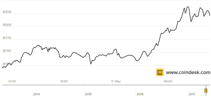
Shares of the Grayscale Bitcoin Trust traded at an 80% premium at one point this week.
The GBTC is still the only brokerage-tradable asset to transact Bitcoin, putting it in demand.
The price of BTC has also soared this past week.
Don’t buy one BTC for the cost of two BTC. Here’s how to avoid this premium and get exposure to BTC.
The bitcoin craze has really picked up steam over the last couple of weeks. The price of the digital currency has skyrocketed from previous all-time highs around $1,300 to an additional almost 40% on top of that, trading over $1,700 at several points this past week and over $1,800 this morning.


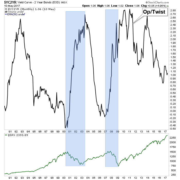
Let’s take a closer look at recent activity in US Treasuries. The yield on the 10-year note ended the day at 2.39% and the 30-year bond closed at 3.02%, well off their interim highs.
Here is a table showing the yields highs and lows and the FFR since 2007 as of today’s close.
The 2-10 yield spread is now at 1.06%.
The chart below shows the daily performance of several Treasuries and the Fed Funds Rate (FFR) since the pre-recession days of equity market peaks in 2007.


An email from a reader (of the eLetter, I think) calling me out on trying to make too many correlations in a dysfunctional market (I think that was his bottom line point, and he’s got a good point) got me thinking about the Silver/Gold ratio and some pretty interesting post-2011 dysfunction (so it seems) in the markets.
Markets that made sense in certain ways prior to 2011 no longer make sense in the same ways. For instance, the S&P 500 used to be correlated to the Silver/Gold ratio, which itself was positively correlated to inflation and/or inflationary economic growth. Gold also liked for silver to be leading it, not the other way around.

But in 2011 a Goldilocks environment was rammed home by Ben Bernanke’s decree (in September of that year) that the Fed would “sanitize” (his word for manipulate, coerce and completely screw up bond market signals that had been tried and true) inflation and its indicator signaling right out of the picture. The Fed’s ‘Operation Twist’ buying of long-term Treasury bonds and selling of short-term Treasury bonds forced a yield curve that had been out of control to the upside, downward. Brilliant!
In 2017 it’s the gift that keeps on giving, from dear old Ben as the resultant yield curve downtrend has been relentless and it has been stock bulls that have benefited despite the 2015 disturbance that temporarily shook a lot of people out of stocks. To be sure, Goldilocks has not only been Fed-induced, but also has benefited from global deflationary forces that now appear to be resolving toward an inflation phase in many global regions (here we again note Kevin Muir’s sound thought process about Europe potentially doing the US monetary policy thing).
Gold and silver, followed by commodities had once been obvious choices for inflationary phases, but now with the Fed out of tricks in its bag (leaving the heavy lifting to the Trump administration’s fiscal/reflation policy making), trying take back previous inflationary monetary policy (by slowly tightening) and the yield curve declining, it’s all good for now.
On this cycle (2011- ?) the inflation has clearly manifested in stocks. Funny money on the run, after all, is not discriminating money. It seeks assets… period. With gold having been harpooned due to the lethal combo of over-speculation and Bernanke’s not so gentle twisted shove in 2011, the stock market was a layup (in hindsight, at least) in 2011; it was the path of least resistance.
Will the next turn up in the curve be inflationary or of the deflationary liquidation variety? That will likely be determined by what nominal yields are doing at the time. Either way, a rise in the yield curve could be supportive for gold simply because a) gold often works well during inflation and b) because gold is currently wearing it risk ‘off’ suit, in the event an upturn in the curve is deflationary. In that latter event its price might not move up much, and could decline, but it would sure as hell retain value better than the stuff that has received the inflationary bid, post-2011.
Subscribe to NFTRH Premium for your 40-55 page weekly report, interim updates and NFTRH+ chart and trade ideas or the free eLetter for an introduction to our work. Or simply keep up to date with plenty of public content at NFTRH.com and Biiwii.com. Also, you can follow via Twitter @BiiwiiNFTRH, StockTwits, RSS or sign up to receive posts directly by email (right sidebar).

Here are today’s videos and charts (double click to enlarge):
Super Force Signals Key Charts & Video Analysis
SF Juniors Key Charts & Video Analysis
SF60 Key Charts & Tactics Video Analysis
SF Trader Time Key Charts Video Analysis
Thanks,
Morris


-
I know Mike is a very solid investor and respect his opinions very much. So if he says pay attention to this or that - I will.
~ Dale G.
-
I've started managing my own investments so view Michael's site as a one-stop shop from which to get information and perspectives.
~ Dave E.
-
Michael offers easy reading, honest, common sense information that anyone can use in a practical manner.
~ der_al.
-
A sane voice in a scrambled investment world.
~ Ed R.
Inside Edge Pro Contributors

Greg Weldon

Josef Schachter

Tyler Bollhorn

Ryan Irvine

Paul Beattie

Martin Straith

Patrick Ceresna

Mark Leibovit

James Thorne

Victor Adair