
Bonds & Interest Rates
The popular financial press is making a big deal about the Fed’s almost-certain 25-basis-point hike in the discount rate that is set to occur at next week’s Federal Open Market Committee meeting. But don’t get lost in all the bluster and hoopla.
Why?
Because the Fed’s decision will have very little impact on your portfolio.
Since a picture is worth a thousand words, I am going to use four easy-to-follow charts to make my point.
To get a true picture of what’s going on, we first need to step back and take a macro view of what the Fed is up against. The chart below shows the history of Federal debt held by the public since the nation’s founding.

As you can see for yourself, when the financial crisis hit in 2008, federal debt exploded to its current level of $14 trillion. And get this — the $14 trillion doesn’t even count the federal agency debt supporting farm loans, home mortgages and a variety of other programs, which total another $5 trillion and puts the total official debt level at about $19 trillion.
And then when you throw in the government debt related to unfunded liabilities for federal social service programs, like Social Security and Medicare, the total debt skyrockets to an estimated $130 trillion. No matter how you slice it, total federal debt has become a BIG number.
To make matters worse, at the same time the U.S. government was levering up … so was corporate America. This chart from the Federal Reserve Bank of St. Louis shows that corporate debt in the U.S. has risen about 60% since the first quarter of 2009.

Next, let’s drill in and see what all this newly issued debt means to the Federal operating budget. The CBO has made projections on how the budget will evolve over time at current interest rates as shown below.

As this chart reports, interest expense is currently 6% of total expenditures — which amounts to a lot of dollars ($240 billion) — but is a relatively small piece of the federal budget pie. Now, look at how the interest on the debt is projected to grow over the next 30 years to a level where it absorbs 21% of the total budget, with no shrinkage in sight.
And that’s at current interest rate levels — imagine what happens if interest rates go up considerably! The equation just won’t work!
It’s the same for corporate America too: As interest rates go higher, interest expense goes up and there’s less money available for productive spending, which then results in slower private sector growth. Slower growth means lower interest rates. That’s why, as I’ve pointed out previously, it becomes an endless feedback loop where interest rates can only go up so much.
And Wall Street knows this too!
What’s my proof?
Well, here’s a chart that shows the yield on the benchmark 10–year U.S. Treasury over the past four years.

As you can see at its current level, the 10-year U.S. Treasury is within 12 measly basis points of where it started the year. Sure, the Fed can hike the short-term end of the curve. But investors around the world, including those on Wall Street, set the rate on the 10-year. And Wall Street is telling us that there’s no big increase that they see on the horizon.
This means — given current economic conditions — the Fed can only go so high on short-term rates without flattening the yield curve and causing a recession or without risking a stock market sell-off. But they can — and will — talk a lot about raising rates. That’s because it’s all part of the nine-step plan that the Trump administration and the Fed have for the U.S. economy that I outlined in last week’s Money and Market’s column.
What should investors do?
As I’ve written extensively about, the current environment favors stocks.
But — and pay attention because this is a big BUT …
One of the biggest myths on Wall Street is that activity is often correlated with results … meaning the more activity there is in a portfolio, the better the results. But that’s just not true.
The best investors on the planet follow this rule: What you don’t do is just as important as what you do.
So following this golden principle, in this environment, what you don’t do is go out and load up on a bunch of expensive stocks. On the other hand, and just as importantly, what you don’t do is run out and short a whole host of stocks that look to be overpriced either.
As world-renowned investor Jim Rogers would say: “Now and then a time comes when doing nothing and waiting is the wisest course of action.”
That’s why, as the editor of the Safe Money Report, I’m following Jim’s advice for now and suggest that you do the same.
Best wishes,
Bill Hall

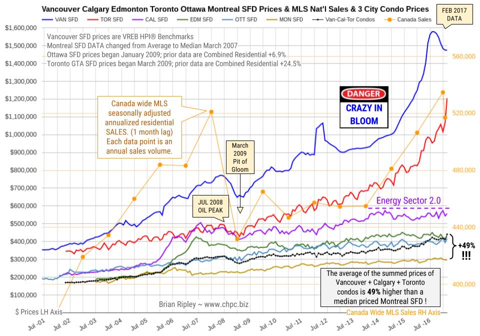
The chart above shows the average detached housing prices for Vancouver*, Calgary, Edmonton, Toronto*, Ottawa* and Montréal* (the six Canadian cities with over a million people each) as well as the average of the sum of Vancouver, Calgary and Toronto condo (apartment) prices on the left axis. On the right axis is the seasonally adjusted annualized rate (SAAR) of MLS® Residential Sales across Canada (one month lag).
In February 2017 Canada’s big city metro SFD prices coiled about or slid off their near term highs except in Toronto where detached houses,town houses and condos fetched new peak prices. Anyone owning a house in the scorching hot Toronto market is sitting on an unredeemed lottery ticket. In Vancouver scorched earth ruins are beginning to appear. Notice Calgary prices are labouring under the new Energy Sector 2.0 which could be anticipating the Trumpster’s U.S. energy independence.
CMHC is not so sure. In November 2015 CMHC had a private audience in New York City and brought along a stress test of $35/bbl oil and its potential effect on Canada. I covered the bullet points here. The Department of Finance is also worried:
The age-related deceleration in economic growth in Canada will take place amidst other powerful, slow-moving global forces. As in Canada, the world population is aging and productivity growth (Canadian Productivity Chart bottom of this page) has slowed across OECD countries. These structural forces are paving the way to slower global growth for the next number of years. Slower nominal GDP growth will thus reduce the growth rate of government revenues, thereby limiting the capacity of governments to continue to maintain the growth rates of public expenditure at levels as high as in the past. At the same time, population aging is also expected to put upward pressure on public expenditure, notably for age-related programs such as elderly benefits. Department of Finance Canada December 2016
It remains interesting to note that the combined average sum price of a Vancouver, Calgary & Toronto condo is currently 49% (no typo) more expensive than a median priced Montreal SFD. The record previously was 41% in July 2016 (the Vancouver peak).
- *Toronto GTA SFD prices began March 2009. Prior data are Combined Residential +24.5%.
- *Ottawa SFD prices began January 2009. Prior data are Combined Residential +6.9%.
- *Montreal SFD DATA changed from Average to Median in March 2007
- *Vancouver SFD data are HPI®, not Average.
….also:

With all the oil-related headlines we’re exposed to each day, you might assume that “black gold,” along with other fossil fuels like coal and natural gas, matter to humanity’s future. You’d be wrong. Like Keynesian economics and fiat currencies, fossil fuels are near the end of their run. From here on out, solar is the story.
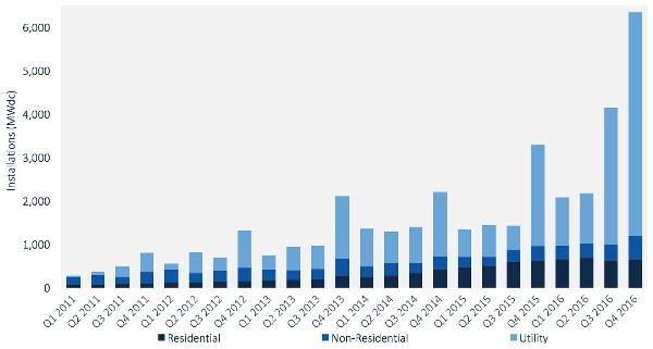
The following chart shows the decline in the cost of solar power and the resulting surge in solar installations through 2015. The relationship is clear: as prices plunge demand surges — in both cases exponentially.

Pretty impressive, right? But nothing compared to what happened in 2016:
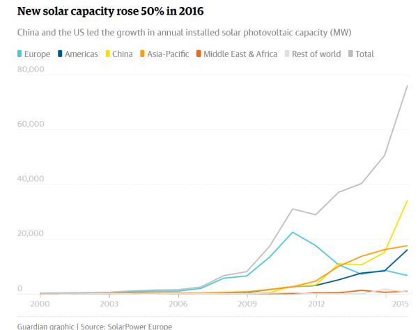
And here’s one more chart showing how China — that insanely polluted coal burning urban dystopia — is leading the way on solar:
This is shocking to people who A) are dependent on fossil fuels through work or investing or B) don’t understand the way exponential growth can change a market in an eye blink. So let’s hear from the father of exponential analysis, Google’s director of engineering Ray Kurzweil:
Ray Kurzweil: Here’s Why Solar Will Dominate Energy Within 12 Years
(Fortune) – Ray Kurzweil has made a bold prediction about the future of solar energy, saying in remarks at a recent medical technology conference that it could become the dominant force in energy production in a little over a decade. That may be tough to swallow, given that solar currently only supplies around 2% of global energy — but Kurzweil’s predictions have been overwhelmingly correct over the last two decades, so he’s worth listening to.
Kurzweil’s basic point, as reported by Solar Power World, was that while solar is still tiny, it has begun to reliably double its market share every two years — today’s 2% share is up from just 0.5% in 2012.
Many analysts extend growth linearly from that sort of pattern, concluding that we’ll see 0.5% annual growth in solar for the foreseeable future, reaching just 12% solar share in 20 years. But linear analysis ignores what Kurzweil calls the Law of Accelerating Returns — that as new technologies get smaller and cheaper, their growth becomes exponential.
So instead of looking at year over year growth in percentage terms, Kurzweil says we should look at the rate of growth—the fact that solar market share is doubling every two years. If the current 2% share doubles every two years, solar should have a 100% share of the market in 12 years.
Okay, technically, that would suggest solar would have a 128% share of the market in 12 years. Some might love that — but it highlights the fact that Kurzweil’s prediction is only partially grounded in the real world. Even 100% share is extremely unlikely — fossil fuel giants are definitely not going down without a fight.
But even those giants ignore Kurzweil at their own peril. He predicted the mobile Internet, cloud computing, and wearable tech nearly 20 years ago — all on the basis of the same principle of accelerating returns that’s behind his solar call.
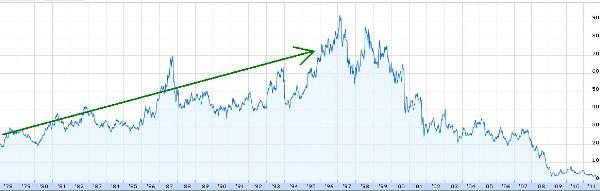
If this sounds outrageously aggressive, consider what happened to Kodak, the dominant player in film photography for most of the 20th century. Early digital cameras were expensive and complicated and therefore not an obvious threat. But their prices plunged and film photography died. Here’s that process translated into Kodak’s share price:
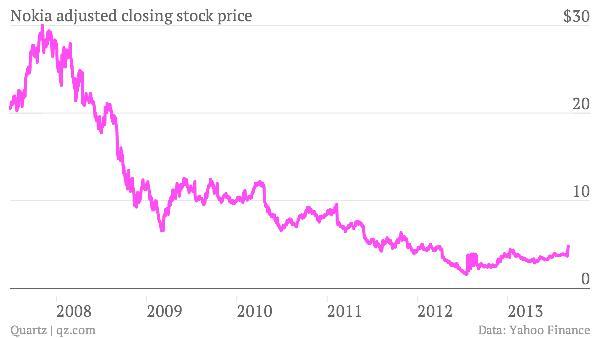
Also recall that Nokia was once the dominant maker of cell phones. Then Apple introduced the iphone and phones that just made calls were pushed off the stage.
This fate awaits most of today’s fossil fuel companies. The only question is when the death spiral begins.
Why is something like this appearing on a gloom-and-doom blog? Because one of the basic tenets of sound-money investing is that during periods in which society is destroying its fiat currencies, real assets will tend to outperform financial assets. So swap your government bonds (and certainly your bank stocks!) for farmland, well-chosen rental houses, gold, silver, and energy assets.
For the past century that last category was dominated by oil wells, coal mines and the stocks of the companies that owned them. But if the above trends continue – and it’s a near certainty that they will, given the torrent of advances in solar panels and batteries pouring out of labs around the world – then “energy assets” of the future will likely be solar and wind farms, advanced battery makers and the like. So the thesis remains the same while technology causes the names to change.

The Silver Market is going to experience a big reversal when the Hedge Funds and Institutional investors rotate out of highly inflated stocks and into precious metals investments. This is not a matter of if, it’s a matter of when. And the when, could be much sooner than we expect due to the huge problems with the U.S. debt ceiling deadline on March 15, 2017.
As I mentioned in my previous article, POWERFUL GOLD & SILVER COILED SPRINGS: Important Charts You Have To See, I posted this chart of the 2,000 point drop in the Dow Jones early in 2016 versus a huge spike up in gold and silver:
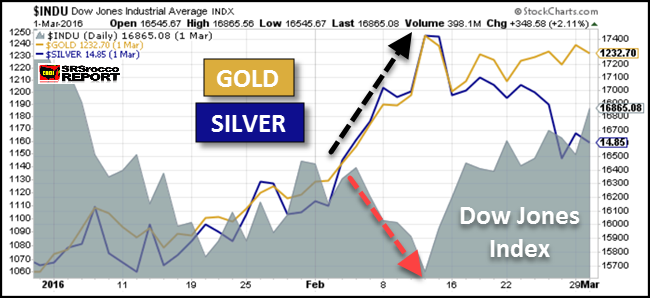
At the beginning of 2016, the Dow Jones Index fell to a low at 15,600 level, 5,000+ points lower than what it is trading currently,while the gold and silver price surged higher. The fundamentals of the Dow Jones Index is more rotten than ever. Wolf Richter wrote about this in his article, Dow Companies Report Worst Revenues since 2010, Dow Rises To 20,000 (LOL).
Furthermore, the Dow Jones Index is seriously overdue for a correction:
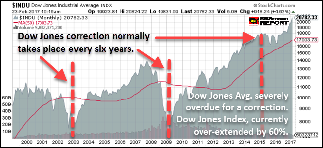
According to the economic contraction cycle that occurs about every six years, the Dow Jones Index is severely overdue for a good ‘ole fashion beating. If we assume that a normal correction for the Dow Jones would be for it to fall to about 8,000 points, the index is overvalued by at least 60%. And that is just for starters.
So, when the Dow Jones Index and the broader stock markets finally crack, we are going to finally see Hedge Funds and Institutional investors rotate out of the majority of highly inflated stocks and into the precious metals and mining sector. This will have a profound impact on the price of gold and silver as well as their mining companies share prices.
To get an idea how this will impact the Primary Silver Mining sector, I compared it to the largest U.S. oil company in country, ExxonMobil. ExxonMobil is listed on the Dow Jones Index as one of 30 industrial stocks and has the highest market cap of all the energy companies in the United States.
What Will The Impact Be When Hedge Funds & Institutional Investors Move Into The Silver Market?
According to Michael Belkin of the Belkin Report, he put out a buy signal on his top Primary Silver mining companies during an interview on King World News last month. Now, Michael was one of the few who made a call back at the end of 2015 advising his clients (and those who subscribe to his new gold stock newsletter) to get into the gold mining sector. And at the beginning of the year, the price of gold and the gold shares shot up considerably. Then a month later, he made a call advising his clients to get into his group of Primary Silver mining stocks. Over the next several months, the Dow Jones Index crashed while the price of silver and the silver stocks surged higher.
Belkin, who has large institutional clients is now advising them to get out of the most of the broader market stocks and into other assets such as the precious metals, especially the silver stocks. He is one of the few analysts that I respect as he does not get paid by the mining companies to promote their stocks. He suggests certain stocks through his own analysis and models. Belkin believes the broader markets are going to finally correct BIG TIME this year and that one of the few sectors to move into will be the precious metals.
If we look at the market cap of ExxonMobil versus the ten top primary silver mining companies in the world, we can plainly see how much potential there is in the primary silver mining sector:
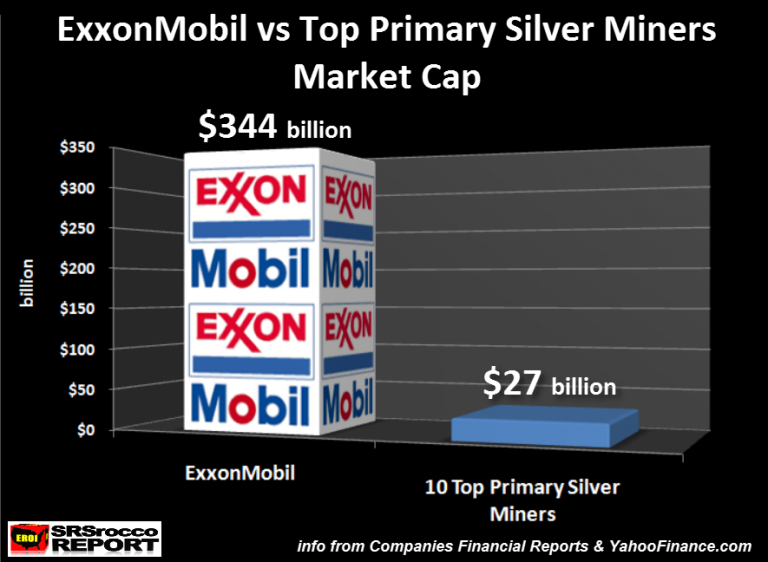
ExxonMobil has a market cap of $344 billion (at the time when the chart was created) compared to $27 billion for the top ten primary silver mining companies. These top ten primary silver miners include, Fresnillo PLC, Pan American Silver, Tahoe Resources, Hecla, Coeur, First Majestic, Silver Standard, Fortuna, Endeavour Silver, and SilverCorp Metals.
Actually, half of the total market cap of the group was from Fresnillo PLC which is $13 billion. This means, ExxonMobil’s market cap is nearly 13 times greater than the total of the top primary silver mining companies in the world.
NOTE: There are other large silver producing companies in the world such as Hochschild out of Peru. However, I wanted to focus on the largest (Fresnillo) and those mainly trading on the U.S. exchanges.
Next, lets compare the total outstanding shares between ExxonMobil and these top primary silver miners:
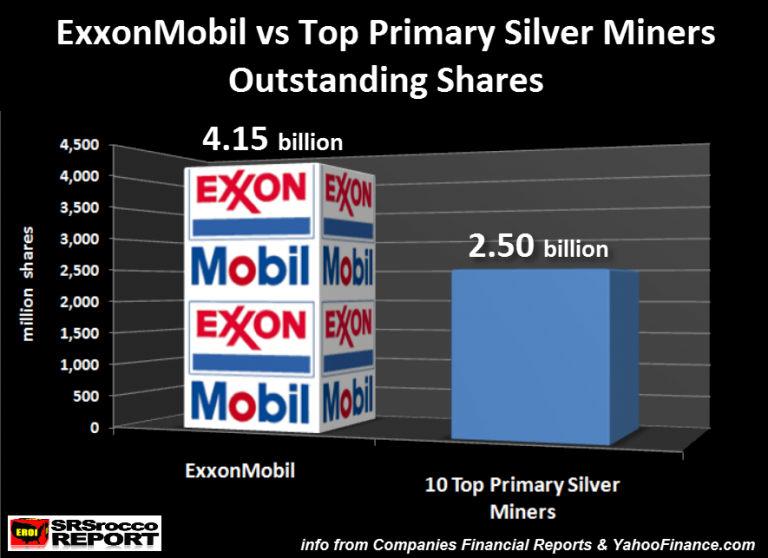
Currently, ExxonMobil has 4.15 billion outstanding shares versus a total of 2.5 billion for the top ten primary silver miners. Thus, the largest oil and gas company in the U.S. and on the Dow Jones Index has two-thirds more outstanding shares then the top 10 primary silver miners put together.
So, how do the stock prices of these two compare to each other? When I put together these charts last week, ExxonMobil’s share price was $82.90 versus an average $10.90 a share for the top ten primary silver miners:
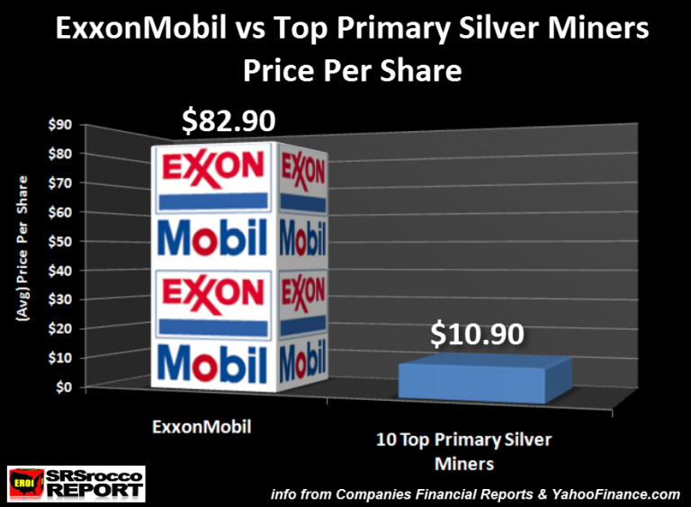
With the oil and silver price lower this week, these figures shown above are lower, but still reflect about the same ratio. Regardless, the top primary silver miners average share price for the group is about eight times less than ExxonMobil. However, the interesting thing to understand is that any significant amount of funds flowing into the primary silver miners will cause their share prices to move up a lot higher and faster than ExxonMobil.
If the market cap of each doubled, this would be the result on their share prices:
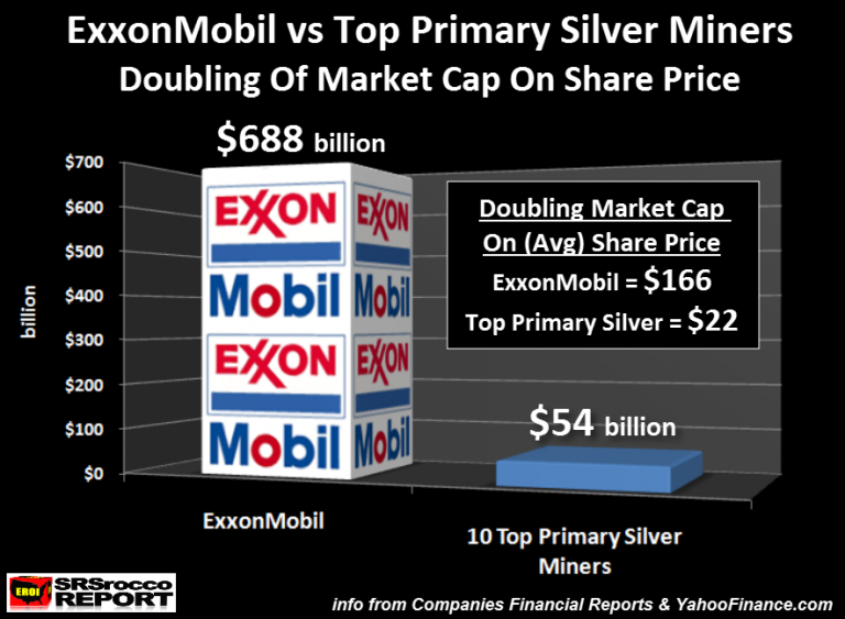
It would take $344 billion to double the market cap of ExxonMobil to $688 versus just $27 billion (to $54 billion) for the top ten primary silver miners. Which means, it wouldn’t take much in the way of funds moving into the primary silver mining sector to double its market cap, and share price compared to ExxonMobil. While it is impossible to know how much money or trading volume would be needed to double the market caps of the two listed above, logic suggests that the primary silver miners will experience a much higher surge in share price with much less in the way of total funds versus ExxonMobil.
Furthermore, a weakening economy and falling Dow Jones Index would likely result in lower oil prices. This will be bad news for ExxonMobil and the energy sector shares.
Now, one of the most fascinating comparisons between ExxonMobil and the top ten primary silver miners is their percentage on total production in their various industries. ExxonMobil produced approximately 2.5% of total global liquid oil production in 2016, compared to the top primary silver miners producing 18% of total world silver supply:
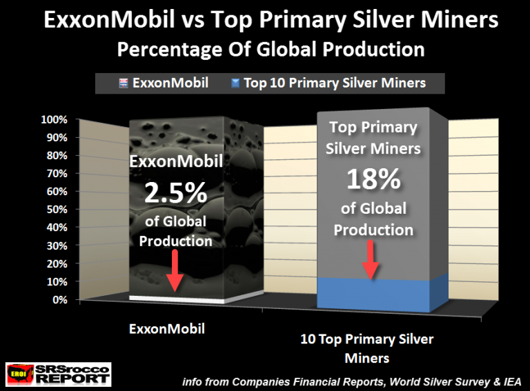
As we can see in the chart above, ExxonMobil’s portion of total world liquid oil production is that tiny sliver of white at the bottom of the bar graph. However, these top 10 primary silver mining companies produced 18% of total global silver mine supply last year.
Yes, it is true that the value of liquid petroleum that ExxonMobil produced last year was much higher than the total value of silver produced by these top ten primary silver mines… but guess what??? All that oil has been either burned or consumed by the market, while a good portion of that silver was acquired by investors or is used as jewelry or silverware that could be brought back into the market as a high quality STORE OF VALUE.
While oil is strategically important to our modern society, it is nothing more than a mere commodity, burned and consumed. Gone forever. On the other hand, while silver does act as a commodity due to its industrial uses, a large portion of its demand is based on investment demand. Which means, silver still functions as a store of wealth… just like it did 2,000+ years ago.
When the markets finally crack and the Dow Jones Index falls off a cliff, Hedge Funds and Institutional investors will move into the precious metals with even more leverage and a greater amount of funds than what took place during the beginning of 2016. Of course, the Fed and Central Banks could postpone the market correction for a while, but the longer they do so, the harder and faster the inevitable decline.
I believe Michael Belkin’s analysis is correct that there will be few decent stocks or sectors to move into when the highly inflated markets finally tank. Thus, when BIG MONEY moves in the silver market, it will cause the silver price and the silver mining shares to surge. How high will be anyone’s guess.
Lastly, I wanted to compare some of the top U.S. oil and gas producers market cap versus the same ten primary silver mining companies:
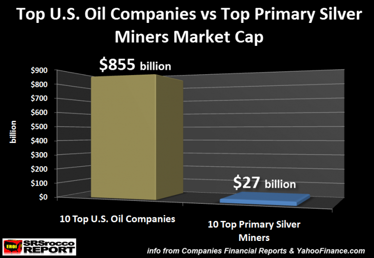
These top ten U.S. oil companies market cap was $855 billion compared to the top ten primary silver miners at $27 billion. The combined market cap of the top U.S. oil and gas producers is nearly 32 times higher than the top primary silver miners.
In the future when demand for physical silver overwhelms supply, investors will move into the next best thing.. the primary silver mining shares. Because there are so few primary silver miners, any significant amount of funds moving into this sector could reach insane levels never imagined today.
IMPORTANT NOTE: I appreciate everyone’s patience during our new site upgrade. My webmaster Peter has finally upgraded the site and it should be now seen by most across the world. It could take a bit longer for some as the propagation is complete.
You all will notice that the site is not much different than the old site, but there are some small changes and additions. However, the most important upgrade was the LOAD TIME. My site has been suffering problems in the past (including many different ERROR codes) that impacted its load time. A few months ago, it would take upwards 15 or more seconds to load. Now, it loads very quickly in 3-4 seconds.
I would enjoy hearing and comments or replies on what you all think of the new site.
best regards,
steve
Check back for new articles and updates at the SRSrocco Report.
….related: 13 Stunning Visualizations of Silver Put Global Debt Into Perspective

 The latest Investment Outlook from Janus Capital’s Bill Gross
“School days” inexorably continue at the Gross household, not just because of grandchildren, but because of the necessity to teach my own kids the complexities and pitfalls of investing. As I get older, I fear I may unduly introduce them to a 1930s Will Rogers warning about losing money: “I’m not so much concerned about the return on my money,” he wrote, “but the return of my money.” “Don’t lose it” is my first and most important conceptual lesson for them despite the Trump bull market and the current “animal spirits” that encourage risk, as opposed to the preservation of capital.
Recently I also explored with them the concept of financial leverage -.….continue reading HERE
….also:


-
I know Mike is a very solid investor and respect his opinions very much. So if he says pay attention to this or that - I will.
~ Dale G.
-
I've started managing my own investments so view Michael's site as a one-stop shop from which to get information and perspectives.
~ Dave E.
-
Michael offers easy reading, honest, common sense information that anyone can use in a practical manner.
~ der_al.
-
A sane voice in a scrambled investment world.
~ Ed R.
Inside Edge Pro Contributors

Greg Weldon

Josef Schachter

Tyler Bollhorn

Ryan Irvine

Paul Beattie

Martin Straith

Patrick Ceresna

Mark Leibovit

James Thorne

Victor Adair