
Currency
Geopolitical Futures’ forecast for 2017 says the following: “In hindsight, the coming year will be an inflection point in the long-term destabilization of Russia that we predict will reach a boiling point by 2040.” This may seem counterintuitive in light of the Russia hysteria following the US presidential election. Yet in the first six weeks of 2017, it is already possible to observe indicators that this forecast is on track.
These indicators fall roughly into four separate categories of instability: the distribution and prevalence of wage arrears, pressure on the Russian banking system, low-level social and economic unrest, and government purges. The map below summarizes these developments.

Show Me the Money
The bottom part of the Russia map shows wage arrears as reported by region. “Wage arrears” is a fancy term for workers not being paid. In December 2016 (the last month for which Russia’s Federal State Statistics Service has data), total wage arrears amounted to 2.7 billion rubles (roughly $46.4 million in USD).
The regions with the largest wage arrears can be divided into two categories. The first is port regions. Primorsky region, whose capital Vladivostok is Russia’s largest port on the Pacific, has by far the worst incidence of wage arrears. It accounts for 21.2% of the country’s total. The area where it is the second most prevalent is Siberia (in places like Irkutsk and Novosibirsk).
The importance of these wage arrears is not their size in absolute figures. It is where Russian workers are not getting their paychecks. Russia’s economy is highly regionalized. More than a fifth of Russia’s wealth is generated in Moscow and its surrounding areas. The central government keeps the Russian Federation together by redistributing wealth to interior regions.
The first places to expect economic trouble are port and interior regions. The port regions will struggle because trade is the oxygen that port cities need to breathe, and Russia’s main export, oil, is facing prolonged low prices. The interior will struggle because the central government will have less money to allocate. This forces a lose-lose choice between austerity and cutting military spending
The wage arrears map is an indication that GPF’s model for Russia is accurate. If the model is accurate, the probability of the forecast coming to fruition greatly increases.
Russia’s Banking System
The decline in the price of oil has had a predictably negative effect on the Russian banking system. Incidents of Russian depositors applying for deposit insurance have increased markedly.
Some regions are suffering from banking crises. In Tatarstan, for example, the region’s leading bank suspended operations in December, depriving both individual depositors and businesses of access to funds. This led to workers not being paid and to bankruptcies. It also required intervention from the central government.
The above map identifies regions where over 100 banks have had their licenses revoked. By itself, this indicator does not present a clear picture. Russia’s banks could be under severe pressure. The fact that the main fund used by Russia’s Deposit Insurance Agency has decreased in value by 75% in two years gives this argument some weight. Russia could also be cleaning up its banking system and shutting down banks involved in illegal or irresponsible activity. In view of the other negative indicators about the current state of Russia’s economy, the former is a more likely explanation.
Protests in the Countryside
The logical consequence of economic difficulty is social unrest. The world is not always logical, but in this case, what logic would dictate appears to hold true. Small-scale protests have been observed throughout the Russian countryside. Small incidents have also occurred in major cities like Moscow and St. Petersburg. The map plots areas where protests have been observed.
It is important to note two things. First, none of these protests have indicated any sort of wider national organization. Second, they are relatively small (often in the low hundreds). They are important, but they should not be over-exaggerated. The Russian countryside is not singing the songs of angry men, nor is it close to doing so.
There are, though, concrete signs of dissatisfaction bubbling to the surface. These are tangible indicators of frustration with salary cuts, unpaid wages, and social services reduced by Moscow. These small events are the canary in the coal mine and spell trouble down the line for the Russian government.
Purges
The remaining two items on the map show political and security purges ordered by President Vladimir Putin. Russian media have described these moves as a “major political reshuffle.” That is a euphemism for what it really is.
The point of a purge is to get rid of potential challengers and install loyalists in their place. On Feb. 6–7, two governors from Perm and Buryatia regions were forced to resign. Vedomosti, a leading Russian-language business daily, reported that additional resignations and removals are expected in the regions identified in the map.
Unlike wage arrears, these purges are not confined to any one geographic area. Some are in Siberia to the east, some are in the regions toward the Caucasus, and others are in the immediate vicinity of Moscow. That Putin feels unsure enough of his own position to carry out these kinds of political changes reveals a great deal about the position in which he currently stands.
Presidential elections are coming for Russia. They will likely be held in 2018 (though there have been rumors they could happen in 2017). Like President Xi Jinping in China, who is using “anti-corruption” as a pretense to remove rivals ahead of his reappointment at this fall’s Communist Party Congress, Putin is securing his political position in the name of fighting corruption.
The purges are not limited to governors who have significant powers in the Russian Federation’s political system. Putin has also removed generals from the Interior Ministry as well as the Ministry of Civil Defense, Emergencies and Elimination of Consequences of National Disasters. These ministries are responsible for forces that are used to control domestic social order and quell protests. Ensuring the loyalty of such ministries is essential and must be done before serious problems emerge. A total of 16 generals have been removed, according to RIA Novosti, and two of those were also removed from military service.
Writing on the Wall?
This report is not meant to be alarmist. It is not GPF’s forecast that the Russian Federation is in danger of imminent collapse. None of these data points by themselves indicate that GPF’s forecast has been confirmed. They simply highlight Russia’s underlying weakness and explain why Putin, who just a few months ago was strutting on the world stage, has gone somewhat quiet. Important things need to be done at home. This is where Moscow’s focus is right now, and in choosing that focus, GPF and Russia have something in common.

George Friedman
Editor, This Week in Geopolitics![]()

When did the distortion start occurring in the markets when increasing UNCERTAINTY can come with an increase in COMPLACENCY and SENTIMENT?

The short answer is: When Wall Street and its media maven lap dogs began controlling the public narrative. I place our newly minted Twitter King, “the Donald” at the intersection of both!
…related:
Stock Trading Alert: Stocks At Record Highs – Will Uptrend Accelerate?
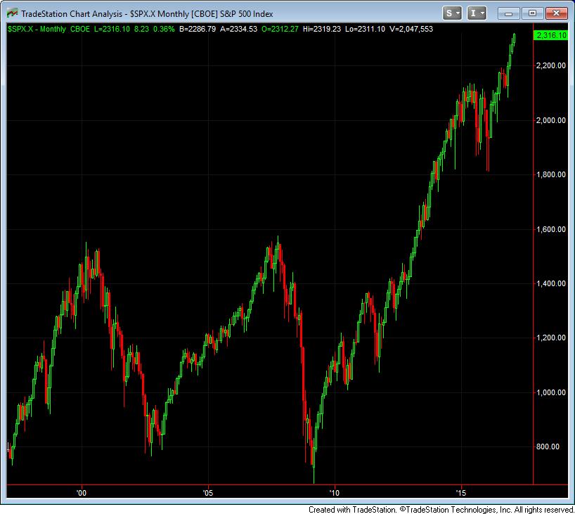
If there’s any point in U.S. stock market history, next to the market peaks of 1929 and 2000, that has deserved a time-stamp of speculative euphoria that will be bewildering in hindsight, now is that moment. Perhaps there’s room for this burning wick to shorten further, but across every effective, value-conscious, historically-informed classification method we use, the estimated downside risk of the market overwhelms its upside potential. The chart below shows monthly candlesticks for the S&P 500 Index since 1996, including the tech bubble and collapse, the Fed-induced mortgage bubble and collapse, and the speculative first half of the current, wholly uncompleted cycle. I believe the equity market now faces the likelihood of deeper losses over the completion of this cycle than any other in history, save for the collapse that followed the 1929 peak.
….also from Martin Armstrong: Eastern Europe & World War III


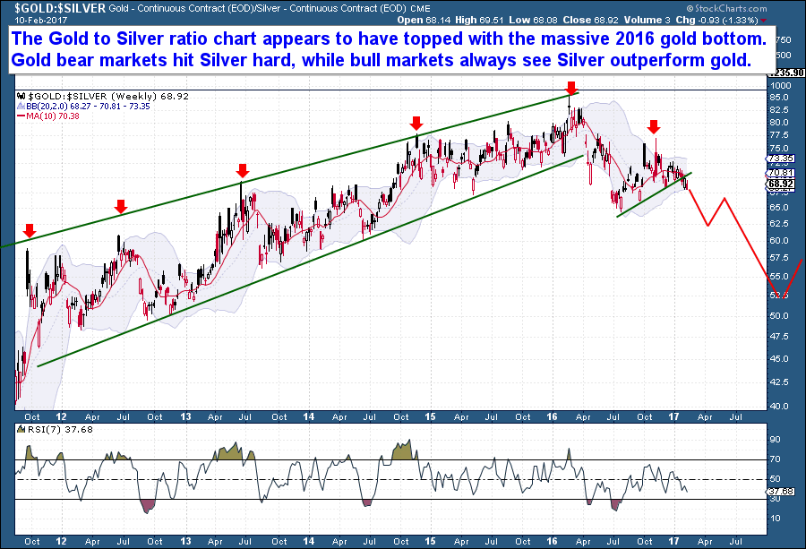
One aspect of the precious metals market today that I like is the Gold Silver Ratio. It appears to have topped, right along with the 2016 gold bottom, and for all gold bull followers out there this is certainly a welcomed development. Precious metals bear markets always hit silver hard, while bull markets always see Silver outperform gold. As a result, the Gold Silver Ratio rises during bear markets and then falls during bull markets.
On the chart below, the long rising channel represents the precious metals bear market when gold/silver were both sold aggressively. Each peak in the ratio, as seen with the red arrows, correspond with major Cycle price lows. Meaning that as gold sold and collapsed into each yearly low, Silver as a ratio was hammered further.
But that trend has reversed, and silver has for the first time in five years outperformed gold. The chart shows the Gold Silver Ratio has turned lower, meaning that with the last big gold selloff, Silver actually outperformed gold, on a relative basis. It’s not proof of a bear market low, but we do know that every precious metals bull market saw silver dramatically outperform gold. In every case, the Gold Silver ratio turn lower as the entire metals complex went higher. From my perspective, it would appear that the ratio has broken lower and that a new downtrend has been established.

-
I know Mike is a very solid investor and respect his opinions very much. So if he says pay attention to this or that - I will.
~ Dale G.
-
I've started managing my own investments so view Michael's site as a one-stop shop from which to get information and perspectives.
~ Dave E.
-
Michael offers easy reading, honest, common sense information that anyone can use in a practical manner.
~ der_al.
-
A sane voice in a scrambled investment world.
~ Ed R.
Inside Edge Pro Contributors

Greg Weldon

Josef Schachter

Tyler Bollhorn

Ryan Irvine

Paul Beattie

Martin Straith

Patrick Ceresna

Mark Leibovit

James Thorne

Victor Adair