
Gold & Precious Metals
 U.S. Economy Weakest Since 2008 Collapse
John Embry: “With all of the chaos regarding the immigration decrees, I think most observers have lost track of what is really happening with the U.S. economy. Instead they are focusing on the turmoil in the country and the record highs on the Dow…
….continue reading about the Comex drop HERE
….also:

After many false promises and one false start, it is becoming evident that 2017 will be the year the Federal Reserve finally begins down the road towards interest rate normalization. Therefore, it is likely that Ms. Yellen will cause bond yields to rise this year on the short-end of the yield curve. In addition, soaring debt and deficits, along with the lack of central bank bond-buying, should send long-term rates much higher as well.
Wall Street soothsayers, who viewed every Fed rate cut as a buying opportunity for stocks, are now busily assuring investors that the potential dramatic and protracted move higher in bond yields will be bullish for stocks as well.
Their theory holds that the price of stocks and bonds are negatively correlated, as one moves up the other moves down. Hence, the nirvana of a safely balanced portfolio is achieved by simply owning a fairly even distribution of both. Therefore, according to Wall Street, the end of the thirty-five-year bull market in bonds will be a welcomed event for equities. This myth has a name, and it’s known as “the great rotation from bonds into stocks.”
The concept suggests that the investible market works like a balanced fund; as money moves out of bonds, it moves into stocks. And of course, you could cherry pick cycles over the past few decades that would provide support for this opinion. For instance, the biggest rise in interest rates (fall in price) was from February 1978 to November 1980. During this time the yield on the Ten-Year Treasury rose from 8.04% to 12.80%, while stock market averages enjoyed a healthy gain.
But when you take a step further back and look at the correlation between stock prices and bond yields since Nixon broke the gold window in 1971, you quickly realize that there is no such positive relationship. In fact, most of the time stock prices and bond yields move in the opposite direction. As bond yields increased (prices down) during the stagflation of the 70’s, stock prices went lower or simply stagnated. Then, after Fed Chair Paul Volcker vanquished inflation in the early ’80s, bond yields fell (prices increased) and stock prices went along for the ride.
This relationship makes perfect sense. An unstable economic environment of rising inflation and rising borrowing costs causes equities to suffer. Conversely, a healthy economic environment of steady growth and low inflation is beneficial for stocks.
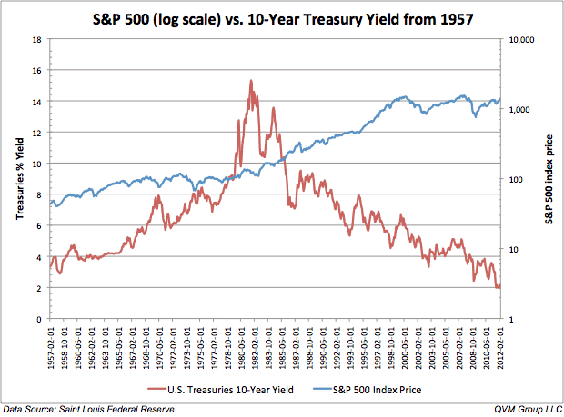
Focusing more closely on the period where the U.S. went completely off the gold standard we can easily see the flaw in the “great rotation theory.” Throughout the 1970’s bond prices plummeted as yields soared. But during that same ten-year period, for the most part, stock prices simply stagnated. In March of 1971, the S&P 500 was trading at 100, and the 10-Year yield was 5.53%. By the end of the decade, the yield on the Benchmark yield had soared to 12.64%, but the S&P 500 was still trading near 100. After losing nearly 40% of its value by 1974, the market managed to climb back to par by March 1980. Where did investors rotate their money during the 1970’s? The “great rotation theory” would suggest all that money should have flowed into stocks. But, as money gushed out of bonds it went into commodities and cash.
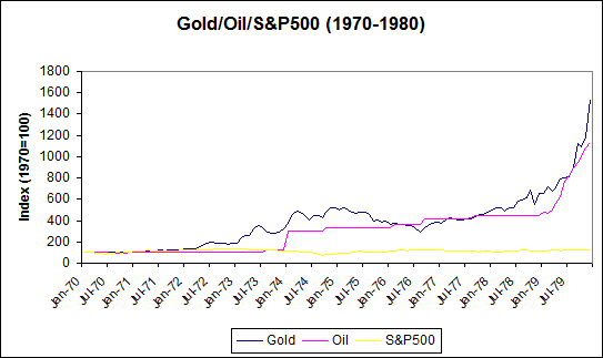
During the high inflation/low growth decade of the 1970’s, investors sought protection in gold and oil. Attesting that as money flowed out of bonds, it didn’t compulsively move into stocks.
Therefore, a better way to think about the long-term relationship between stocks and bonds is that the bull market in bond prices helped to foster the bull market in the major stock averages. Or, that on average the stock market does better in a period of falling bond yields. Yet, Wall Street chooses to make the opposite argument to allay investors’ fears as interest rates begin this huge secular move higher.
Escalating bond yields will finally break the 35-year trajectory of falling interest rates that has led to the decades-long bull market in the major stock market averages. At what yield this line officially breaks is up for debate. Bond King Bill Gross has indicated that 2.6% on the Ten-Year Treasury will end the bull market in bonds. DoubleLine Capital’s Jeff Gundlach argues that 3% is the level to watch. But both believe that 2017 will mark the end of the secular bull market in bonds; with Gundlach going out on a limb assuring it is “almost for sure” that the 10-Year is going to take out 3% this year.
This time around bond yields will initially rise for three reasons: the first because the credit quality of the government has been severely damaged as a result of the unprecedented amount of borrowing undertaken following the Great Recession, the second due to the fiscal profligacy proposed by President Trump, and third because our central bank has spring loaded interest rates by artificially holding them at record lows for the past eight years.
And that sets us up for the real surge in bond yields — yes, we haven’t seen anything yet.
Rising borrowing costs should send our debt-saturated economy into a recession, which by the way is already way overdue. That recession, coupled with the massive fiscal and monetary response to it from President Trump — think massive deficit spending and helicopter money — should engender the second phase of soaring rates that will result from spiking inflation and soaring debt levels. This unprecedented period of turmoil will once again prove that rising bond yields are seldom good for stocks, especially in real terms. And the bursting of this historic bond bubble certainly won’t be the exception.

 There is a global push by lawmakers to eliminate the use of physical cash around the world. This movement is often referred to as “The War on Cash”, and there are three major players involved:
1. The Initiators
Who?
Governments, central banks.
Why?
The elimination of cash will make it easier to track all types of transactions – including those made by criminals.
2. The Enemy
Who?
Criminals, terrorists
Why?
Large denominations of bank notes make illegal transactions easier to perform, and increase anonymity.
3. The Crossfire
Who?
Citizens
Why?
The coercive elimination of physical cash will have potential repercussions on the economy and social liberties.
Is Cash Still King?
Cash has always been king – but starting in the late 1990s, the convenience of new technologies have helped make non-cash transactions to become more viable:
- Online banking
- Smartphones
- Payment technologies
- Encryption
By 2015, there were 426 billion cashless transactions worldwide – a 50% increase from five years before.
| Year | # of cashless transactions |
|---|---|
| 2010 | 285.2 billion |
| 2015 | 426.3 billion |
And today, there are multiple ways to pay digitally, including:
- Online banking (Visa, Mastercard, Interac)
- Smartphones (Apple Pay)
- Intermediaries ( Paypal , Square)
- Cryptocurrencies (Bitcoin)
The First Shots Fired
The success of these new technologies have prompted lawmakers to posit that all transactions should now be digital.
Here is their case for a cashless society:
Removing high denominations of bills from circulation makes it harder for terrorists, drug dealers, money launderers, and tax evaders.
- $1 million in $100 bills weighs only one kilogram (2.2 lbs).
- Criminals move $2 trillion per year around the world each year.
- The U.S. $100 bill is the most popular note in the world, with 10 billion of them in circulation.
This also gives regulators more control over the economy.
- More traceable money means higher tax revenues.
- It means there is a third-party for all transactions.
- Central banks can dictate interest rates that encourage (or discourage) spending to try to manage inflation. This includes ZIRP or NIRP policies.
Cashless transactions are faster and more efficient.
- Banks would incur less costs by not having to handle cash.
- It also makes compliance and reporting easier.
- The “burden” of cash can be up to 1.5% of GDP, according to some experts.
But for this to be possible, they say that cash – especially large denomination bills – must be eliminated. After all, cash is still used for about 85% of all transactions worldwide.
A Declaration of War
Governments and central banks have moved swiftly in dozens of countries to start eliminating cash.
Some key examples of this? Australia, Singapore, Venezuela, the U.S., and the European Central Bank have all eliminated (or have proposed to eliminate) high denomination notes. Other countries like France, Sweden and Greece have targeted adding restrictions on the size of cash transactions, reducing the amount of ATMs in the countryside, or limiting the amount of cash that can be held outside of the banking system. Finally, some countries have taken things a full step further – South Korea aims to eliminate paper currency in its entirety by 2020.
But right now, the “War on Cash” can’t be mentioned without invoking images of day-long lineups in India. In November 2016, Indian Prime Minister Narendra Modi demonetized 500 and 1000 rupee notes, eliminating 86% of the country’s notes overnight. While Indians could theoretically exchange 500 and 1,000 rupee notes for higher denominations, it was only up to a limit of 4,000 rupees per person. Sums above that had to be routed through a bank account in a country where only 50% of Indians have such access.
The Hindu has reported that there have now been 112 reported deaths associated with the Indian demonetization. Some people have committed suicide, but most deaths come from elderly people waiting in bank queues for hours or days to exchange money.
Caught in the Crossfire
The shots fired by governments to fight its war on cash may have several unintended casualties:
1. Privacy
- Cashless transactions would always include some intermediary or third-party.
- Increased government access to personal transactions and records.
- Certain types of transactions (gambling, etc.) could be barred or frozen by governments.
- Decentralized cryptocurrency could be an alternative for such transactions
2. Savings
- Savers could no longer have the individual freedom to store wealth “outside” of the system.
- Eliminating cash makes negative interest rates (NIRP) a feasible option for policymakers.
- A cashless society also means all savers would be “on the hook” for bank bail-in scenarios.
- Savers would have limited abilities to react to extreme monetary events like deflation or inflation.
3. Human Rights
- Rapid demonetization has violated people’s rights to life and food.
- In India, removing the 500 and 1,000 rupee notes has caused multiple human tragedies, including patients being denied treatment and people not being able to afford food.
- Demonetization also hurts people and small businesses that make their livelihoods in the informal sectors of the economy.
4. Cybersecurity
- With all wealth stored digitally, the potential risk and impact of cybercrime increases.
- Hacking or identity theft could destroy people’s entire life savings.
- The cost of online data breaches is already expected to reach $2.1 trillion by 2019, according to Juniper Research
As the War on Cash accelerates, many shots will be fired. The question is: who will take the majority of the damage?

Are you among those who believe that index funds/ETFs have proven themselves to be better performers than managed funds?
Like any in debate in which actual factual data can be examined to either help prove or disprove something, in the following article, extensive comparative performance results will be presented that will be hard for people who believe in the presumed inferiority of managed funds to explain. In fact, the results presented below, upon careful consideration, should be regarded as perhaps game-changing to what many investors have come to believe. So let’s jump right into this data.
If index funds are superior performers to managed funds, the average mutual fund which includes all diversified funds should, when examined over a long period, obviously tend to do more poorly performance-wise. So is this true?
While I can’t examine all index funds, I selected two of the most popular ones, the Vanguard Total Stock Market Index (VTSMX) which represents the entire US stock market, and the Vanguard Total International Stock Index (VGTSX) which represents the entire rest of the world excluding US stocks. In fact, most other broad stock market index funds as well as ETFs should achieve just about the same performance results, less very minor difference in expense ratios.
On the other hand, there is available published data on the average performance of all diversified US stock funds as well as all International (non-US) stock funds. This data is published monthly in the Wall Street Journal.
By comparing the returns of each of these two index funds with the returns of the average US and International fund, one can determine, over the course of any given year, which did better, the index or the average of all similar types of funds.
To prove the superiority of index funds, one would expect to see a pattern of better performance vs. the average fund of its comparable type.
But, to be convincing, such comparisons, would need to encompass a long stretch of time. This is because while one measure might be superior for a relatively short number of years, the other might be superior over another stretch. With that in mind, examine the following:
Comparing Yearly Broad US Stock Market Index Performance with That of Average US Diversified Fund
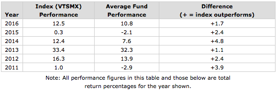
Indeed, each year between 2011 and 2016, the US stock index fund did consistently better than the average US stock fund. The average difference was +2.7%. Given this wide degree of outperformance for the index, it starts to become understandable why many investors are now convinced that index funds are clearly superior in performance to the average fund, many of which are managed funds, not passive indexes.
But data from the past six years alone are not sufficient to conclude that an index fund will almost always come out ahead over other time periods. If we examine the same data going further back to 2000, we find a somewhat different pattern, with the average fund actually coming out a little ahead of the index, although on an irregular basis depending on the specific year. In this period from 2000 to 2010, encompassing 11 years, the index fund comes out behind the average fund by an average of -0.8% per year. The following table shows the comparisons:
| Year | Index (VTSMX) Performance |
Average Fund Performance |
Difference (+ = index outperforms) (- = average fund outperforms) (0 = neither measure outperforms) |
| 2010 | 17.1 | 17.1 | 0 |
| 2009 | 28.7 | 32.0 | -3.3 |
| 2008 | -37.0 | -38.7 | +1.7 |
| 2007 | 5.5 | 6.6 | -1.1 |
| 2006 | 15.5 | 12.6 | +2.9 |
| 2005 | 6 | 6.7 | -0.7 |
| 2004 | 12.5 | 12 | +0.5 |
| 2003 | 31.4 | 32.4 | -1.0 |
| 2002 | -21 | -22.4 | +1.4 |
| 2001 | -11 | -10.9 | -0.1 |
| 2000 | -10.6 | -1.7 | -8.9 |
What this appears to suggest is that outperformance by a broad index may be cyclical, that is, the index may excel over some years, or even over a number of years running, but one can hardly assume that the index won’t underperform the average return of diversified funds for a number of years either.
Nevertheless, if one averages the differences over the entire 17 year period, the index fund still comes out ahead of the average fund by +0.5%. For advocates of index funds, this is just what they would expect. However, the relatively small margin of difference tells us that the result should be considered as entirely predictable, considering that the average fund charges quite a bit more than the index, accounting for all of the difference and even more. So, no real surprise here yet.
How much more does the average fund charge? According to a recent Morningstar article, the average most apparent cost, that is, the expense ratio, across all funds was about 1.2% in 2014, although higher in earlier years. The most recent cost of VTSMX is less than 0.2%. Thus, one is looking, at a very minimum, at about a 1% difference. Additionally, there likely will be another hidden cost within managed funds, namely the trading commissions whenever a fund manager buys or sells. Also excluded are instances if a managed fund charges an initial cost (load) when you buy or sell that fund.
Therefore, were it not for these higher costs subtracted from the average fund’s pre-expense performance, the average fund might have actually beaten the index by a minimum of approximately 0.5% per year. In other words, it appears that, on average, the average mutual fund would clearly be as good or better in picking stocks than a broad market index except for the extra drag caused by the higher expenses. This could, incidentally, help to dispel the notion that the average fund manager, in spite of his presumed expertise, is actually a worse selector of stocks than those in the passive index.
Unfortunately though, these expenses do exist for the “average” fund, and at least for the above comparisons, we must declare the index fund the winner. I also found similar results when comparing the performance of the Vanguard Total International Stock Index (VGTSX) with that of the average International stock fund, with some small variations. (These results will be reported at the end of this article.)
Now that the above data appear to have made a pretty convincing case for index funds giving better end results than managed funds, I will now present data that can lead to a very different conclusion.
How can this be? If one can identify managed mutual funds whose expense ratios (and possibly, other costs) are significantly less than the above average 1.2%, they, as shown by the above 17 years worth of data, should have a good chance of beating the passively managed broad indexes. So, for example, if the above data are indeed representative, by merely choosing managed funds that chop this average expense ratio in half (to 0.60), such funds, on average, should be able to beat the index, erasing the average 0.5 deficit.
These days such lower cost managed funds are not that hard to find. At least several fund companies have good lineups of funds with a much lower than average expense ratio. For example, Vanguard is well known not only for its low-cost index funds and ETFs, but for its nearly as low cost managed funds.
So how much better can low cost managed funds do than the above two index funds? While obviously not all low cost managed funds will do better than the index, Vanguard funds have a long-standing reputation for being excellent choices.
To answer this question, I searched the complete lineup of Vanguard managed funds to find all those that have been around since at least the start of 2000. There were 20 such funds. (Note: Just one generally available stock fund shut down over this period, which if excluded due to poor performance, might make the results for the remaining funds look better. However, the shutdown was due to other factors, not poor performance.) I then researched the yearly average performance of each of these funds and compared each to the yearly average performance of either VTSMX or VGTSX, depending on whether the particular fund’s main focus was domestic or international stocks. The following table shows the results:
Comparing Average Yearly Performance Returns for Vanguard Managed Funds Vs. Those of US or International Index Funds
| Fund Name (Symbol) (US) = US Focus (I) = International Focus |
Average Yearly Performance |
Current Expense Ratio |
Average Difference Per Year (+ = managed fund outperforms) (- = index fund outperforms) |
| Energy (VGENX) (US) | 13.55 | .37 | +6.90 |
| Precious Metals and Mining (VGPMX) (I) | 13.19 | .35 | +8.12 |
| Health Care (VGHCX) (US) | 12.92 | .36 | +6.27 |
| Selected Value (VASVX) (US) | 12.06 | .39 | +5.41 |
| Capital Opportunity (VHCOX)* (US) | 11.49 | .45 | +4.84 |
| Strategic Equity (VSEQX) (US) | 11.15 | .21 | +4.50 |
| International Explorer (VINEX) (I) | 9.50 | .42 | +4.43 |
| Explorer (VEXPX) (US) | 9.41 | .49 | +2.76 |
| PRIMECAP (VPMCX) (US) | 9.12 | .40 | +2.47 |
| Global Equity (VHGEX) (I) | 9.03 | .57 | +3.96 |
| Windsor (VWNDX) (US) | 9.01 | .39 | +2.36 |
| Equity Income (VEIPX) (US) | 8.60 | .26 | +1.85 |
| Windsor II (VWNFX) (US) | 8.53 | .34 | +1.88 |
| Mid-Cap Growth (VMGRX) (US) | 7.89 | .43 | +1.24 |
| Dividend Growth (VDIGX)* (US) | 7.52 | .33 | +0.87 |
| Morgan Growth (VMRGX)* (US) | 6.34 | .40 | -0.31 |
| International Value (VTRIX) (I) | 6.09 | .46 | +1.02 |
| International Growth (VWIGX) (I) | 6.01 | .46 | +0.94 |
| Growth and Income (VQNPX) (US) | 5.93 | .34 | -0.72 |
| U.S. Growth (VWUSX) (US) | 3.02 | .46 | -3.63 |
Now, here are the same results for the above two Vanguard index funds
| Fund Name (Symbol) |
Average Yearly Performance |
Current Expense Ratio |
| Total Stock Market Index (VTSMX) | 6.65 | .16 |
| Total International Stock Index (VGTSX) | 5.07 | .19 |
As you can see in the last column of the bigger table, 17 out of the 20 managed funds delivered better 1 year average performance than the appropriate broad market index. The average per year better performance was 2.76%. You can observe that the 20 funds included three funds that were not diversified across the broad market, so-called sector funds; these funds proved to have the best average yearly performance of the 20. Therefore, to beat the indexes to this degree, one would have needed to select not just the typical diversified types of funds, but also included some other relatively low cost funds within the Vanguard lineup that would not at all closely reflect the entire market as the indexes did.
Just in case you’re wondering whether the above results would remain valid if one merely considered the average annualized returns over the entire 17 year period instead of averaging each fund’s one year returns over 17 yearly periods, data shows that the answer is emphatically yes. According to that analysis, the entire 20 funds averaged an annual return of 7.16%, beating the “buy and hold” annualized returns of VTSMX at 4.92% and VGTSX at 2.72%. The analysis of 20 funds over 17 separate time periods involved 340 separate data points, highly unlikely to introduce chance into the result vs. analyzing just 20 data points when using just the 17 year total return. And, additionally, while most investors undoubtedly don’t hold most of their funds for an uninterrupted 17 years, most will eventually drop underperforming managed funds out of their portfolio, likely making the one-year start and stop points more realistic.
Comparing Yearly Broad International Stock Market Index Performance with That of Average International Fund
Here are the International stock fund results mentioned above:
| Year | Index (VGTSX) Performance |
Average Fund Performance |
Difference (+ = index outperforms) (- = average fund outperforms) |
| 2016 | 4.7 | 0.7 | +4.0 |
| 2015 | -4.4 | -1.3 | -3.1 |
| 2014 | -4.2 | -5.0 | +0.8 |
| 2013 | 15.0 | 19.6 | -4.6 |
| 2012 | 18.1 | 17.7 | +0.4 |
| 2011 | -14.6 | -13.4 | -1.2 |
The table shows that over the last 6 calendar years, it was the index fund that has underperformedthe average International stock fund on average by 0.6% per year.
However, as shown below, for the 11 yearly periods between 2000 and 2010, the average International fund did very frequently underperform the index fund; the average yearly shortfall was 1.9%.
| Year | Index (VGTSX) Performance |
Average Fund Performance |
Difference (+ = index outperforms) (- = average fund outperforms) (0 = neither measure outperforms) |
| 2010 | 11.1 | 10.7 | +0.4 |
| 2009 | 36.7 | 32.7 | +4.0 |
| 2008 | -44.1 | -44.2 | -0.1 |
| 2007 | 15.5 | 12.4 | +3.1 |
| 2006 | 26.6 | 24.9 | +1.7 |
| 2005 | 15.6 | 14.7 | +0.9 |
| 2004 | 20.8 | 18.1 | +2.7 |
| 2003 | 40.3 | 34.7 | +5.6 |
| 2002 | -15.1 | -16.2 | +1.1 |
| 2001 | -20.2 | -21.7 | +1.5 |
| 2000 | -15.6 | -15.6 | 0 |
Over the entire 17 yearly periods, the International index fund came out beating the average International fund by 1.0%. However, as with the US focused funds above, the difference was not a surprise considering that the average fund charges quite a bit more than the index. (According to data from Morningstar, the average International fund charges an expense ratio that is about 0.2 more than domestic funds, or about 1.4% in 2014, and even higher in earlier years).
Therefore, a well-established, managed, internationally focused fund which charges considerably less than 1.4%, such as the five such funds included in the 20 listed above, should have a reasonable chance to come out as well as, or ahead of, the International index fund, assuming the above results are at all representative of many years of comparisons. Specifically, the five averaged a yearly average return of 8.8% vs. the yearly average of 5.1% for the index fund.


If pleasures are greatest in anticipation, just remember that this is also true of trouble.
Elbert Hubbard
Throughout 2016, we stated we did not expect much from Gold, and we stuck to this forecast, even though many experts went out of their way to report that Gold was ready to soar to the Moon or even to the next Galaxy. In fact, since 2011, we have continuously said that until the Trend turns positive, it would be best to play other lucrative markets, such as the general equities market, the US dollar, etc. During this time several experts stated that Gold was ready to surge and some issued insane targets ranging from $20,000-$50,000. Under no circumstance can we ever see Gold going to $20,000 or $50,000 and even if drank a whole bottle of scotch or any other toxic compound it would still be very hard to visualise such a target. Issuing such targets is perfect for fear mongering, and we find that tactic to be unpleasant and distasteful.
You would think that experts would try to release targets that made some sense. After all, Gold has not even traded past $2,000, so it makes one wonder how any individuals with a shred of common sense could issue a target of over $5,000. Even this target is quite high, and we only envision it being struck under extreme conditions. Don’t fixate on these preposterous targets for such targets are only for those who live in Lala land and have plenty of time to ponder over rubbish. Gold would need to trade past $1990 on a monthly basis to indicate significantly higher prices. Until that occurs, focus on targets that are below $2,000.
Having said that Gold has for the time in many years issued a confluence of bullish signals. The trend is still neutral but moving closer and closer to the bullish zone.
Let’s examine these bullish factors
Panic in the Gold Camp; we spotted a surge in frustration in the Gold camp when Gold traded below 1200 after creating the illusion that It was ready to take off in Nov 2016; this frustration soared when it broke below 1150, and it reached a screeching point when it traded below 1130
Many Technical Indicators, including several of our custom indicators are trading in the extremely oversold ranges on the weekly charts. Weekly charts, infers that each bar on the chart represents one week’s worth of data
8 out of the top 10 sectors based on relative strength are commodity based industries; Gold comes in at number 10.
Some speculative stocks such as GSS have taken off; GSS, for example, is several hundred percentage points since Jan of 2016. GSS did its own thing completely ignoring the price of Gold. Individually, this is not a big deal, but collectively it takes on more weight.
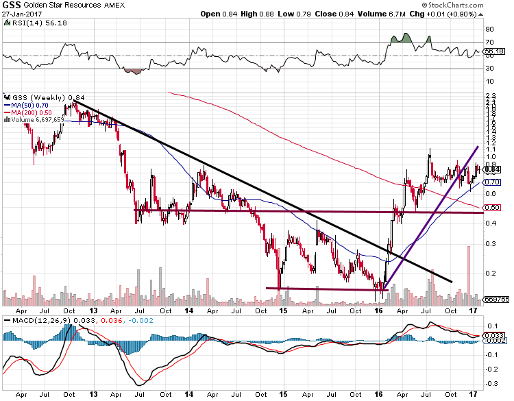
If you look at the weekly chart of GSS, you would not think this stock is in the Gold sector given the strong performance. When small caps stocks start to take off before the metal, it is usually a sign of good things to come. Markets are forwarded looking beasts so stocks like GSS could be pricing a future that is more favourable to Gold.
Technical outlook
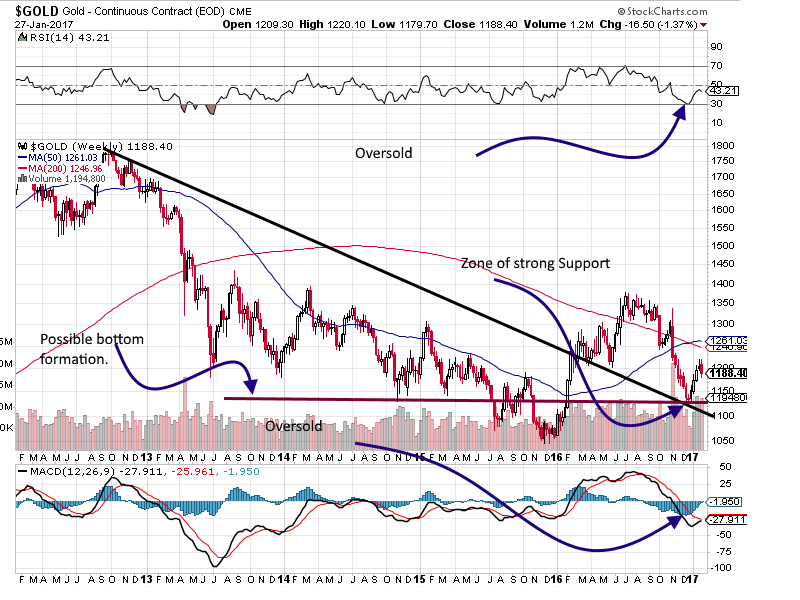
This is a weekly chart of Gold, and there are several interesting developments
-
Gold appears to have put in a double bottom formation.
-
Gold bottomed almost precisely where the downward trending line and the line of support intersect. This is a case of former resistance turning into support, and when combined with aforementioned factors, it has to be viewed through a bullish lens.
-
MACD’s are trading in the oversold ranges and are close to experiencing a bullish crossover
-
Gold has a strong layer of support in the $1130-$1140 ranges, and as long as it does not close below this level on a weekly basis, the outlook will remain favourable
Very strong intra Market Positive divergence signal
Gold bottomed on the 15th of Dec 2016, but the dollar continued to trend higher for several more days and Gold reacted in a positive way to this development. The dollar has been on a tear since Trump won, so Gold should have continued trending lower, but it did not. In Dec 2015, Gold dropped to the $1050 ranges, but the dollar was trading below 100, but in 2016 the dollar was trading well above 100 and Gold refused to take out the lows set back in 2015. This is a very strong intra-market positive divergence signal and has to be viewed through a bullish lens.
Conclusion
Gold has now given the first signal that it is getting ready to test the $1360 ranges with a possible overshoot to the $1380 ranges. A weekly close above $1380 will set up the path for a test of and potential challenge of the 2011 highs. As a result of these developments, Gold no longer needs to trade down to the mid to high $1000 ranges. The downside risk is limited from here, and if you do not have a position in bullion, it might be prudent to deploy some funds into Gold and or Silver bullion.
We do not try to predict tops or bottoms; we focus on trends. We are not concerned with getting in at the absolute bottom or top because that is endeavour best reserved for fools with plenty of time. For every top or bottom you might catch, there are ten that you will miss. When there is a trend change, you have plenty of time to get in. Most of the bottom fishers will close their positions very early in the game as they will be so happy with the quick gains they locked in after years of suffering. Only when the markets take off and soar to heights they once imagined but did not have the courage to play will they realise the folly of their actions.
This is the first time since 2011 that we are viewing the Gold market through a positive lens. Keep in mind; there is no such thing as the perfect investment. The market by nature is imperfect; therefore you should never put all your eggs in one basket.
Despair, in short, seeks its own environment as surely as water finds its own level.
A. Alvarez

-
I know Mike is a very solid investor and respect his opinions very much. So if he says pay attention to this or that - I will.
~ Dale G.
-
I've started managing my own investments so view Michael's site as a one-stop shop from which to get information and perspectives.
~ Dave E.
-
Michael offers easy reading, honest, common sense information that anyone can use in a practical manner.
~ der_al.
-
A sane voice in a scrambled investment world.
~ Ed R.
Inside Edge Pro Contributors

Greg Weldon

Josef Schachter

Tyler Bollhorn

Ryan Irvine

Paul Beattie

Martin Straith

Patrick Ceresna

Mark Leibovit

James Thorne

Victor Adair