
Stocks & Equities

![]()
In This Week’s Issue ending December 12, 2016:
- Weekly Commentary
- Strategy of the Week
- Stocks That Meet The Featured Strategy
- Stockscores’ Market Minutes Video – Why Trade Normal
- Stockscores Trader Training – How Much Can a Day Trader Make
- Stock Features of the Week – Intraday Pullback Day Trade
Note: some of you have received a course email from us by mistake today, please ignore.
Stockscores Market Minutes – Why Trade Normal?
Stocks that go up consistently over time usually start their trends with abnormal price and volume action. This week, I describe this concept and how it can help you trade better. Plus my regular weekly market analysis and the trade of the week on $NE. Click Here to Watch
To get instant updates when I upload a new video, subscribe to the Stockscores YouTube Channel
Trader Training – How Much Can a Day Trader Make?
How much can you make trading the stock market? This is the question I get asked the most. It is not a whole lot different to how much does a doctor or lawyer make? How much does a professional athlete make? The answers to these questions have a huge variance depending on the situation and it is no different for traders. The short answer is that it depends on market conditions, trader skill and capital available. However, I can give you some greater detail to help you understand the economics for my approach to active trading.
To give you the long answer to the question, there are a few concepts that have to be defined. First is reward for risk, the metric that I use to measure profitability.
Here is how reward for risk works. First you have risk tolerance, how much you are willing to lose on any one trade. Since trading is game of uncertainty, we must play the game knowing that we will lose some of the time. There is some randomness to the market so you can’t control when you will lose but you can have some control over how much you will lose when you are wrong. By exiting a position when the loss level gets to a certain point, you put a cap on the size of the loss.
Suppose you buy a stock at $10 and from your analysis of the chart, you think it is appropriate to plan to lose if the stock falls to $9. In this case, your risk per share is $1. If your risk tolerance is $100, then you should buy 100 shares. If your risk tolerance is $1000 then you should buy 1000 shares.
If you then sell the stock at $15, you will have earned a reward of $5 per share and a reward for risk of 5. With a risk tolerance of $100, you make $500 while a risk tolerance of $1000 gives you a reward of $5000. The reward for risk of 5 is the same whether you risked $100 or $1000.
Next, we have to consider the capital required for a level of risk tolerance. Using the same example, a $100 risk tolerance required the purchase of 100 shares of a stock that cost $10 per share. The position size is $1000. If you take $1000 of risk, you buy more shares and the total cost is $10,000.
It is possible to use margin when trading which means you put up a portion of the cost of the position and the brokerage will loan you the rest. Using margin carries more risk since it increases the potential percentage loss you can incur but it also increases the percentage gain. In general, brokerages will lend you up to 2/3 of the position size when day trading and half of the position size when you hold the position overnight. Holding stocks over night or for multiple days is riskier than getting in and out in the same day.
So, if we assume in our example that we are day trading the stock, we will only have put up one third of the capital to take the position. For $100 of risk, we buy 100 shares at $10 which is a position size of $1000. With 3 to 1 margin, we have to use $333 of our own capital with the brokerage carrying the rest of the cost. With $1000 of risk, we would need $3333 in capital for this position.
A very general rule is that you can take your risk tolerance and multiply it by 100 to determine how much capital you will need to trade (assuming you can use 3 to 1 margin). So, a $100 risk tolerance requires at least $10,000 in capital to carry the 3 – 5 positions that I would typically carry each day.
This rule is dependent on market conditions, there are times when the action in the market is in lower priced stocks which require much less capital than when the action is in the high priced stocks which tend to be less volatile, and therefore require more capital.
For example, November was a more capital intensive month. The US election caused a good rally larger cap companies that are higher priced and take more capital. In November, my quick calculation was that you needed more like 200 times your risk tolerance to take the trades that I found.
I will use November to answers the question of how much you can make day trading. To keep it honest, I will use the trades that I identified in real time for subscribers to my live trading webinars that I ran for two hours each morning. These trades were called out as I found them with an audience of traders who watched my screen via webcast (this is a service that anyone who has completed my Active Trader course on Stockscores can subscribe to). For simplicity, the results I recorded were simply holding the positions taken in the first two hours of the day until the close. I did not include trades that I took after the first two hours or positions that I sold before the close. Doing so would have improved the overall performance.
In November, these trades earned a cumulative reward for risk of about 115. This means $100 of risk should have earned a gain of $11,500. $1000 of risk earns $115,000. It would take about $20,000 to make $11,500 and $200,000 to make $115,000 (since the capital requirement in November was about 200 times the risk). This capital requirement is a rough estimate, I did not look at each day to figure out the exact amount of capital required. Trading commissions and slippage would have some cost but are not a large impact on this performance.
So, on a percentage basis, this is a very nice return. However, a few caveats. First, these economics work so long as your risk tolerance does not get too high. The market has to absorb your buy and sell orders in a short amount of time so trying to apply my strategies with $10,000 of risk per trade gets more difficult since it is harder to move in and out of larger positions. Basically, these economics make sense using $1 million or less of capital.
Second, market conditions have a big effect on the amount of trading opportunities and the profitability of each trade. November was poor the first week leading up to the US election, good after the election, then slow for a few days and then good going in to December. It was not a great month overall but pretty good.
By contrast, October was probably the worst month I have seen in years. Traders were nervous ahead of the US election which meant there was a lack of commitment by them. This lowered the success rate of my strategies but also the profit per trade. Overall, October had a losing reward for risk of 11. Not really a big loss for a bad month but still a loss.
This highlights an important point. Trading is not like other jobs where you expect a consistent stream of income. It tends to be streaky, meaning you can have a slow period followed by a strong period. There are times when one sector is strong and then it will go very cold.
This means you have to be flexible and willing to go where the action is. My approach is to always focus on abnormal activity so I am always trading where there is action. A trader who focuses on trading a certain industry group or price range of stocks may find their performance very volatile compared to what I might do.
Trading is a skill that, like anything else, takes time to develop. I can teach anyone willing to work hard my strategies and processes but that does not mean they will be successful. It is no different than taking piano lessons, going to medical school or playing hockey. You only get good at it with time and practice. Getting good training will help you learn quicker and be more effective but you still have to do the work.
Need some motivation? Financially, traders are the highest earners of any profession – traders managing large funds can earn over a $billion a year. From a lifestyle perspective, you can do it anywhere that has a reliable internet connection. Trading does not require you be good looking, charismatic or physically capable. There is no racism or sexism, the market does not care what your background is whether you went to a fancy school. All that matters is how you buy and sell. I think it is the perfect career but remember one very important thing.
Trading is simple, but it is not easy.

This week, I highlight an example of the kind of day trades that I look for. Too late to consider this now, just an example of what I was doing in the November study that I reference this week.
1. AKAO
Entry on AKAO at 10:40ET. Entry price is $8.79, support at $8.43 for a risk per share of $0.36. At time of writing the stock is at $11.50 for a gain of $2.71, an RR of 7,5 ($2.71/$0.36).

References
- Get the Stockscore on any of over 20,000 North American stocks.
- Background on the theories used by Stockscores.
- Strategies that can help you find new opportunities.
- Scan the market using extensive filter criteria.
- Build a portfolio of stocks and view a slide show of their charts.
- See which sectors are leading the market, and their components.
Disclaimer
This is not an investment advisory, and should not be used to make investment decisions. Information in Stockscores Perspectives is often opinionated and should be considered for information purposes only. No stock exchange anywhere has approved or disapproved of the information contained herein. There is no express or implied solicitation to buy or sell securities. The writers and editors of Perspectives may have positions in the stocks discussed above and may trade in the stocks mentioned. Don’t consider buying or selling any stock without conducting your own due diligence.

No, it’s not the so-called massive government debt problem in China. Like the stories of the ghost cities there, China’s debt problems are largely a myth, in the sense that it’s still largely a closed economy and monetary system. A communist economy where it’s largely the state owing the state … debts can be extinguished by the stroke of a pen.
I’m talking about the brewing U.S. pension crisis and Washington’s sovereign debt crisis, which is now here in spades.
I have been ramping up the warnings in these columns and in my new E-wave columns that now publish every Monday, Wednesday and Friday afternoons.
You know about the U.S. sovereign debt crisis. Washington is officially in debt to the tune of $20 trillion PLUS as much as another $200 trillion in “unofficial debts and IOUs.”
Things like raided Medicare accounts, Social Security Trust Funds, and more.
 It’s so bad already that the 30-year U.S. Treasury has already had its worst decline in 26 years, shedding as much as 19% of its value in just the past five months, with the yield soaring from 2.099 to 3.16, a huge 50.5% jump in the same time period.
So much pain is coming in the sovereign debt markets of Europe, Japan and the U.S. …
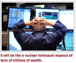
It will be like a nuclear holocaust wipeout of tens of trillions of wealth.
But there’s also the more personal hit of watching y our state and municipal pensions get gutted.
Currently in deficit by at least $1.3 trillion, the state and local pensions deficits are headed into their deathbeds and it will take nothing short of a miracle to turn them around.
Based on assumptions of achieving returns of roughly 6% to 8% for years on end now, they’ve been returning less than 1% in reality. The “gap” between those figures is bleeding pensions to death and will soon cause a massive coronary heart attack that will reverberate through state and local pensions …
Wiping out police retirements, teacher retirements, public service retirements of all kinds.
Want a sneak peek at what it’s going to look like and cause? Simply look at the ongoing Greek labor unions and their protests over wages, pension and labor agreements which are now ramping up again big time.
Or look at California and Illinois where withdrawals from pensions and employees exiting the system are taking what money they can get now and heading for the hills and in record numbers.
Is it any wonder Americans have gotten angry? Is it any wonder Europeans are doing the same?
I don’t think so, and if I were you I would do everything in my power to protect whatever funds I have in a state or local — and even corporate pension.
And I certainly would not rely on Social Security and Medicare. It’s not going to be there for you. Those programs will start breaking down late next year.
My view: Use the power of large macro-economic cycles that can foretell of these events well ahead of time.
Just like they did for those who profited enormously by correctly timing the Great Depression. They were, yes, in the minority — but it doesn’t have to be that way.
Stay safe and best wishes, as always …
Larry
Larry makes an offer HERE
…related article: Violent Bond Selloff: An Eye-Opening Perspective


The word “collapse” instantly conjures primal feelings of both fear and excitement whenever we hear it. We fear it because it evokes our collective belief that collapse is fatal and final, yet it excites our imagination to the possibility, however, remote, that perhaps we’ll be among the lucky few to survive and even prosper from it.
Whether in reference to a financial market crash or the collapse of government, the very idea has given birth to a plethora of writings on the subject. Indeed, some of the top selling books in the financial literature category in recent years have had collapse as the subject matter, for writers instinctively know they can always count on a visceral reaction from their readers whenever they write of it.
Interview Clif Droke on Safe-Haven Selloff, Muni Bond Crash
Laying aside the fear it evokes, the study of collapse is a fascinating and rewarding endeavor. Historians have long known what financial writers have only recently discovered, viz. that writing about collapse is a lucrative industry. Consider the hundreds of books dedicated to the decline and fall of the Roman Empire, or to any number of past civilizations (Aztec, Egyptian, Babylonian, etc.). One of the great preoccupations of writers of this genre is the guessing game of what exactly causes a society or an economy, to collapse. There is invariably no consensus among historians as to how, or even when exactly, it happens.
Consider the famous example of ancient Rome. What was it that actually precipitated the decline and fall of this mighty empire? While there have been hundreds of reasons offered by specialists as to the cause(s), the most commonly assigned factors can be generally summarized as follows: 1.) Immigration and assimilation of foreigners (i.e. barbarians), 2.) Failure to continue expanding the frontiers via military conquest, 3.) Loss of personal discipline and liberty; 4.) Corruption on both the administrative and personal levels.
Even if we accept any, or all, of these reasons as being legitimate, it still doesn’t answer the perennial question of what led the Romans to decide on making such a fateful decision. In other words, what was the ultimate reason for the decline and fall?
Financial writers are plagued by the same lack of agreement as to what causes markets to collapse. The reasons they offer range from the prosaic to the profound. Most commonly they assume that a market collapse is the result of asset prices being “too high” or unsustainably expensive relative to valuation. What many don’t realize is that demand for any given asset can extend well beyond the boundaries of normal valuation for years, or even decades, at a time. We need to look no further than the Treasury bond market to see an example of this.
It has become fashionable among collapse historians to assume that collapse often occurs without warning out of a clear blue sky as it were. Nothing could be further from the truth. Collapses are invariably preceded by long periods of internal weakness, whether it’s the financial market or any other social system. This explains why strong societies, much like strong markets, can withstand any number of external shocks without toppling. It’s only when weakness is entrenched that one can expect external pressure to cause serious damage to a structure.
An example of this is the stock market plunge of late 2015/early 2016. In the months leading up to it there was a sustained period of internal weakness and technical erosion in the NYSE broad market. The number of stocks making new 52-week lows was well over 40, and often in the triple digits, which was a clear sign of distribution taking place in some key industry groups. This weakness was evident in the NYSE Hi-Lo Momentum (HILMO) indicators, which depicted a downward path of least resistance for stocks. The following graph is a snapshot of what the HILMO indicators looked like in the weeks just prior to the January 2016 market plunge.

This is also what stock market internal momentum looked like prior to the 2008 credit crash. In fact, it’s what precedes every major collapse and it’s also a good representation of the internal weakness which takes place before markets, societies and empires collapse. Look below the surface and you’ll always see the internal decay which paves the way for the coming destruction. A healthy and thriving system, by contrast, is simply not conducive for a collapse to occur.
When we view the internal structure of the current NYSE stock market through the lens of the HILMO indicator, what do we see? A market ripe for collapse? Far from it, we see overall signs of technical health – even if the market isn’t firing on all cylinders. Below are all six major components of HILMO. The orange line is the longer-term momentum indicator, which is one of the most important one for discerning whether or not the market has been undergoing major distribution (i.e. internal selling). It has been rising for several months now and is the polar opposite of what it looked like heading into 2016.

It would appear then that a collapse isn’t on the menu right now, at least not in the intermediate term outlook. If it happens at all it will require a significant reversal of the market’s longer-term internal momentum currents, which in turn would likely take several months. The weight of evidence suggests that the doom-and-gloomers who are predicting collapse are much too early and should save their apocalyptic warnings for a more propitious time.
…related: The Yield That Breaks the Trump Rally’s Back
Mastering Moving Averages
The moving average is one of the most versatile of all trading tools and should be a part of every investor’s arsenal. Far more than a simple trend line, it’s a dynamic momentum indicator as well as a means of identifying support and resistance across variable time frames. It can also be used in place of an overbought/oversold oscillator when used in relationship to the price of the stock or ETF you’re trading in.
In my latest book, Mastering Moving Averages, I remove the mystique behind stock and ETF trading and reveal a completely simple and reliable system that allows retail traders to profit from both up and down moves in the market. The trading techniques discussed in the book have been carefully calibrated to match today’s fast-moving and sometimes volatile market environment. If you’re interested in moving average trading techniques, you’ll want to read this book.
Order today and receive an autographed copy along with a copy of the book, The Best Strategies For Momentum Traders. Your order also includes a FREE 1-month trial subscription to the Momentum Strategies Report newsletter: http://www.clifdroke.com/books/masteringma.html
 During my morning reading, I ran across an interesting article from Paul Lim via Time giving several reasons why the stock market will “rise for a ninth straight year.”
“For ordinary Americans, 2017 is likely to feel like the best year economically since the Great Recession.
The recovery is finally expected to trickle down to you in the form of an improved job market, higher wages, and growing spending power.
And, despite the advanced age of this bull, your improving fortunes just may keep U.S. stocks chugging along too, as consumers represent 70% of the U.S. economy.“
While his points are valid, but very debatable, it is critical to remember the stock market and the economy are two different things. GDP growth and stock returns are not highly correlated. In fact, some analysis suggests that they are negatively correlated and perhaps fairly strongly so (-0.40).
However, it isn’t just Paul pushing the bullish commentary, but virtually the entirety of the media press. The siren’s song of “stay long my friends” has risen as of late as the market has soared following the election. But here is the interesting takeaway:
The reasoning for the continuance of the “bull rally” over the last several years has been footed by the common threads of:

-
I know Mike is a very solid investor and respect his opinions very much. So if he says pay attention to this or that - I will.
~ Dale G.
-
I've started managing my own investments so view Michael's site as a one-stop shop from which to get information and perspectives.
~ Dave E.
-
Michael offers easy reading, honest, common sense information that anyone can use in a practical manner.
~ der_al.
-
A sane voice in a scrambled investment world.
~ Ed R.
Inside Edge Pro Contributors

Greg Weldon

Josef Schachter

Tyler Bollhorn

Ryan Irvine

Paul Beattie

Martin Straith

Patrick Ceresna

Mark Leibovit

James Thorne

Victor Adair