
Stocks & Equities
Stock Trading Alert originally sent to subscribers on February 9, 2017, 6:56 AM.
Briefly: In our opinion, speculative short positions are favored (with stop-loss at 2,330, and profit target at 2,150, S&P 500 index).
Our intraday outlook remains bearish, and our short-term outlook is bearish. Our medium-term outlook remains neutral, following S&P 500 index breakout above last year’s all-time high:
Intraday outlook (next 24 hours): bearish
Short-term outlook (next 1-2 weeks): bearish
Medium-term outlook (next 1-3 months): neutral
Long-term outlook (next year): neutral
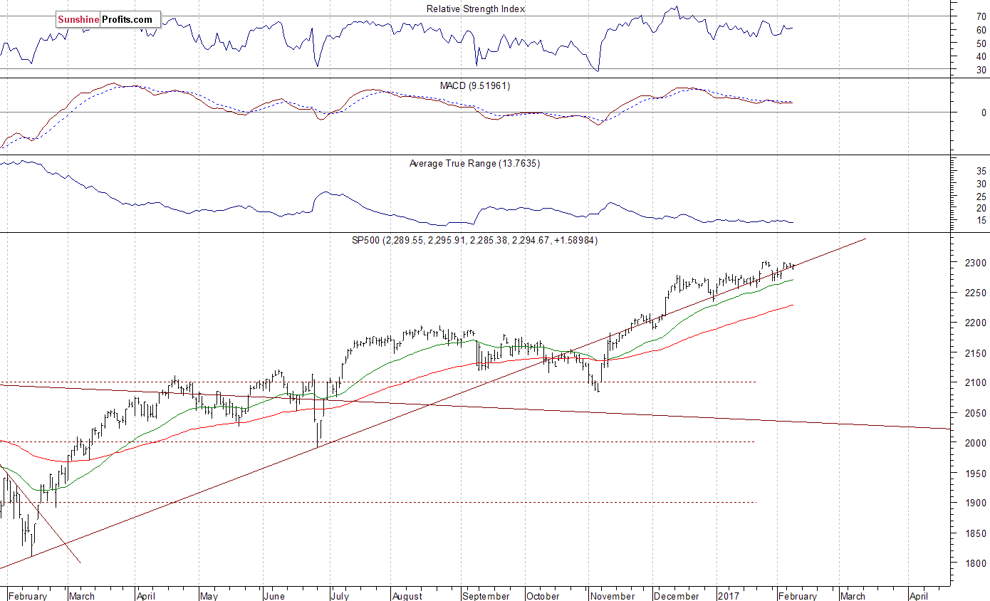
The U.S. stock market indexes were mixed between -0.2% and +0.2% on Wednesday, extending their short-term consolidation along record highs, as investors continued to hesitate following last week’s Friday’s rally. The S&P 500 index remains close to its January 26 all-time high of 2,300.99. It is also above its last week’s Monday’s daily gap down of 2,286.01-2,291.62. The Dow Jones Industrial Average is above 20,000 mark, and the technology Nasdaq Composite Index is close to the level of 5,700. Will the market extend its year-long medium-term uptrend even further before some more meaningful downward correction? The nearest important resistance level of the S&P 500 index is currently at around 2,300 marked by record high. On the other hand, level of support is at around 2,285-2,290, marked by Friday’s daily gap up of 2,283.97-2,287.88. The next support level is at 2,260-2,270, among others. We can see some short-term volatility following November – January move up. Is this a topping pattern before downward reversal? The S&P 500 index still trades along medium-term upward trend line, as we can see on the daily chart:
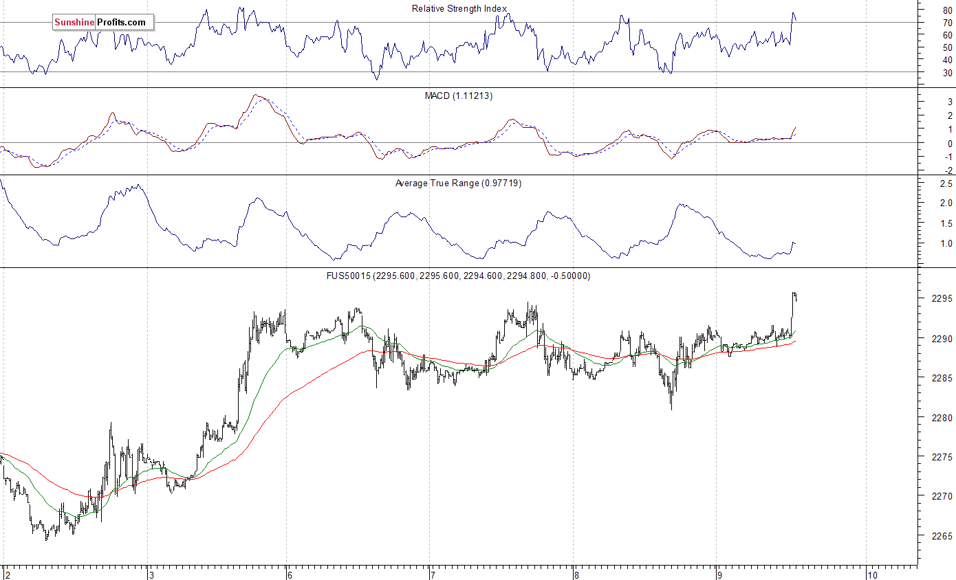
Expectations before the opening of today’s trading session are positive, with index futures currently up 0.2%. The European stock market have gained 0.3-0.9% so far. Investors will wait for more quarterly corporate earnings releases. They will also wait for some economic data announcements: Initial Claims at 8:30 a.m., Wholesale Inventories at 10:00 a.m. The market expects that the Wholesale Inventories grew 1.0% in December. The S&P 500 futures contract trades within an intraday uptrend, as it breaks above its short-term consolidation, following overnight fluctuations along the level of 2,290. The nearest important level of resistance is at around 2,300, marked by record high. On the other hand, support level is at around 2,280-2,285, and the next support level is at 2,260-2,270, marked by previous consolidation. The market is getting close to new all-time highs. The futures contract broke above its recent consolidation along the level of 2,270, as the 15-minute chart shows:
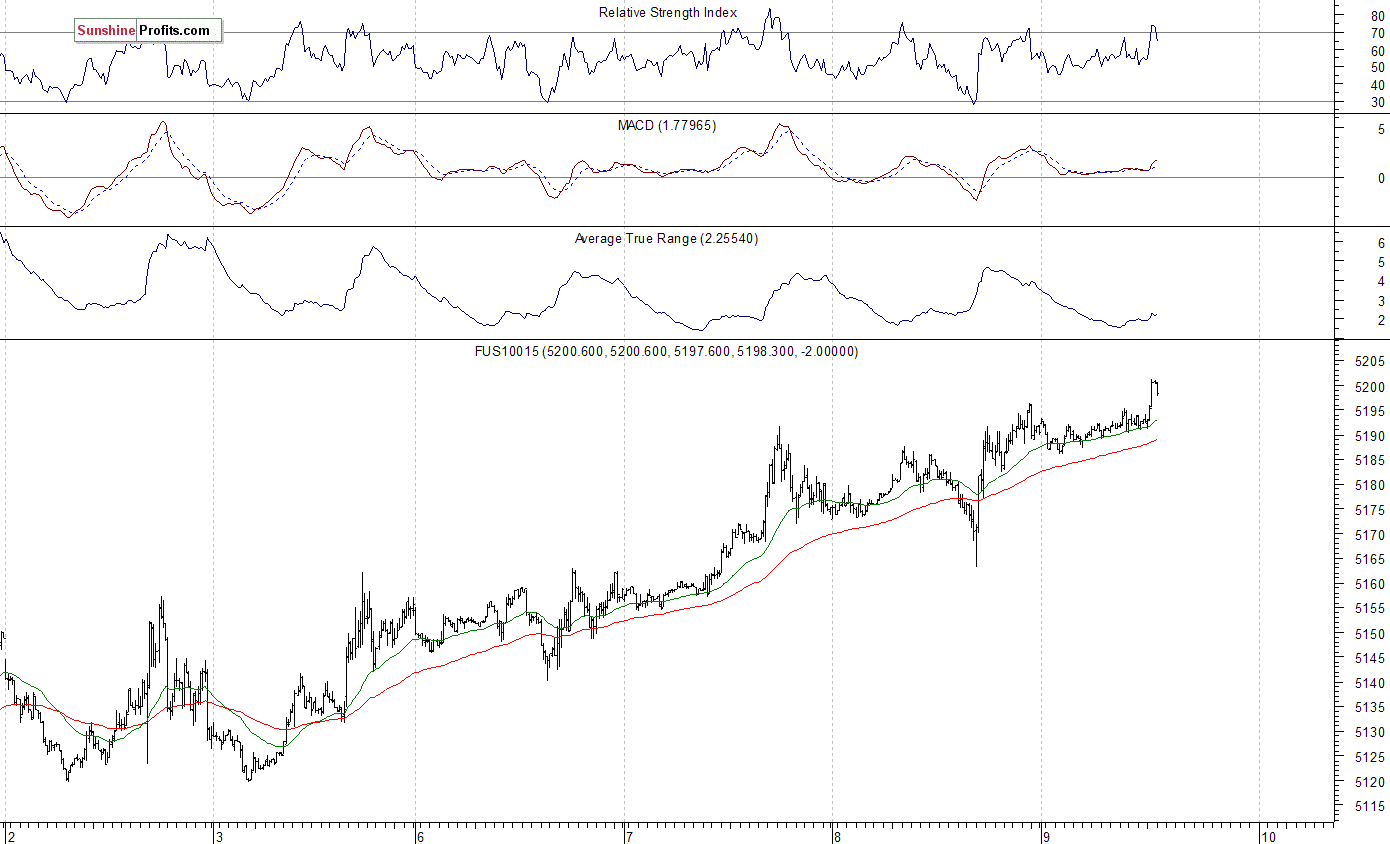
The technology Nasdaq 100 futures contract follows a similar path, as it currently trades within an intraday uptrend after an overnight consolidation. It reaches new all-time high above the level of 5,200. The technology sector stocks have been relatively stronger than the broad stock market recently following better-than-expected quarterly earnings releases. The nearest important support level is at 5,180-5,185, marked by previous level of resistance, and the next support level is at around 5,170, among others. There have been no confirmed negative signals so far. However, we can see short-term overbought conditions.
Concluding, the broad stock market remained within its short-term consolidation on Wednesday, following last week’s Friday’s move up. Will the index continue higher today? Is this just a short-term consolidation after three-month long rally from Presidential Elections’ local low in November of 2016? Or is this some topping pattern ahead of some more meaningful downward correction? Potential upside seems limited, and the S&P 500 index may retrace some of its November – January uptrend. It may even reverse its year-long uptrend, as investors’ sentiment readings remain very bullish. We still can see medium-term overbought conditions accompanied by negative technical divergences. Therefore, we continue to maintain our speculative short position (opened on December 14 at 2,268.35 – daily opening price of the S&P 500 index). Stop-loss level remains at 2,330 and potential profit target is at 2,150 (S&P 500 index). You can trade S&P 500 index using futures contracts (S&P 500 futures contract – SP, E-mini S&P 500 futures contract – ES) or an ETF like the SPDR S&P 500 ETF – SPY. It is always important to set some exit price level in case some events cause the price to move in the unlikely direction. Having safety measures in place helps limit potential losses while letting the gains grow.
To summarize: short position in S&P 500 index is justified from the risk/reward perspective with the following entry prices, stop-loss orders and profit target price levels:
S&P 500 index – short position: profit target level: 2,150; stop-loss level: 2,330
S&P 500 futures contract (March 2017) – short position: profit target level: 2,145; stop-loss level: 2,325
SPY ETF (SPDR S&P 500, not leveraged) – short position: profit target level: $214; stop-loss level: $232
SDS ETF (ProShares UltraShort S&P500, leveraged: -2x) – long position: profit target level: $16.35; stop-loss level: $14.00 (calculated using trade’s opening price on Dec 14 at $14.78).
Thank you.
Paul Rejczak
Stock Trading Strategist
Stock Trading Alerts
….related: VIX Update: Has Volatility Bottomed?

Summary
– Even after a small gain last week, the VIX is still near its lows.
– Long and short VIX strategies both have arguments in their favor.
– A Long VIX bias may be warranted, but active risk management is a must.
– Investors need to be nimble to take advantage of VIX spikes and switch to a short bias.

Fund manager John Hussman is always good for dramatic charts. Here’s a recent one:

This ratio is even scarier than it looks, says Hussman:
Historically-reliable valuation measures now approach those observed at the 2000 bubble peak. Yet even this comparison overlooks the fact that in 2000, the overvaluation featured a subset of very large-capitalization stocks that were breathtakingly overvalued, while most stocks were more reasonably valued (see Sizing Up the Bubble for details). In many ways, the current speculative episode is worse, because it has extended to virtually all risk-assets. To offer some idea of the precipice the market has reached, this chart shows the median price/revenue ratio of individual S&P 500 component stocks. This median now stands just over 2.45, easily the highest level in history. The longer-term norm for the S&P 500 price/revenue ratio is less than 1.0. Even a retreat to 1.3, which we’ve observed at many points even in recent cycles, would take the stock market to nearly half of present levels.
One of the reasons share prices have risen so dramatically relative to revenues is that corporations are earning a lot more on each dollar of sales these days. How are they doing that? By squeezing their workers. The following chart, from the Economic Policy Institute shows labor’s share of corporate income plunging recently.

The next chart illustrates the same point from a different angle. Workers, it seems, have been producing more per hour but their pay hasn’t kept up as their bosses held onto more of the resulting profit.

A big part of this has been due to offshoring. If you close a factory where the workers make $30 an hour and set up in a place where your new workers make $5, then the $25 difference flows to the bottom line. Other contributors are automation, which is both inexorable and hugely favorable for the guys who own the robots, and the fact that the minimum wage in many states has kept up with neither the true inflation rate nor the increase in free-trade driven corporate earnings.
As EPI’s Josh Bivens puts it:
This 6.8 percentage-point decline in labor’s share of corporate income might not seem like a lot, but if labor’s share had not fallen, employees in the corporate sector would have $535 billion more in their paychecks today. If this amount was spread over the entire labor force (not just corporate sector employees) this would translate into a $3,770 raise for each worker.
For stock market investors, the scary thing about this imbalance between capital and labor is that it’s only temporary. As the details and magnitude of the scam have been exposed, the political tide has shifted. At the national level, fed-up US workers have installed an anti-free trade administration that is already tilting the playing field towards domestic workers. At the state and local level, calls for a higher minimum wage are being heard and acted upon. A major French party has even nominated a presidential candidate who wants to tax robots.
So it’s safe to assume that the above charts will develop serious inflection points going forward, as a rising share of profits flow to the nether regions of the org chart and investors respond by lowering the value they place on a given dollar of corporate revenues.
As Hussman notes, just a return to 1990s valuation levels would cut the average US stock in half.
 We see the forensic “finger prints” all over the economic and financial data that the Federal Reserve through a proxy likely Citadel Capital (or the Fed’s CBOE Volume Options Agreement) has highly likely been buying the US equity market since its QE 3 “TAPER” ended in October 2014. We do know for a fact that the BOJ, SNB, PBOC, Norwegian and other central banks have been doing this as matter of normal monetary policy for some time and that 80% of all these central banks said they plan on buying more stocks this year. Why not the Federal Reserve? To see the forensic economic evidence more clearly, consider the following US indicators:
Ratio of Capital Goods To Consumer Production
Pater Tenebrarum via Acting-Man.com points out, the ratio of capital goods to consumer goods production is a reflection of the policy-driven credit bubbles of recent decades. We have annotated his chart below to show more clearly both the “control channel” underway since the Greenspan era, as well as the late 2014 QE “TAPER” ending “inflection point”. Tenebrarum reports:

Currently the ratio is in a sideways channel at an extremely high level, as strong money supply growth and credit expansion have continued almost unabated since 2008. There is a natural limit to this trend though, provided the central bank does not opt for extreme inflation (we currently assume that it won’t, but this assessment may have to be changed in the future).
There is a strong and not exactly unreasonable suspicion that most of the economic policies favored by the Trump administration (at least some of which will presumably be backed by the Republican-controlled legislature) are likely to push price inflation up. Higher government spending, tariff hikes, the possible deportation of cheap illegal workers, etc., are all deemed to lead to higher consumer prices.
Keep in mind in this context that the inter-temporal price distortions along the production structure triggered by the Fed’s loose monetary policy in recent years are fated to eventually shift and reverse anyway.
Resources have been miscalculated as too much has been invested in the higher stages of the economy’s capital structure relative to the lower stages.
Eventually a bottleneck should emerge in terms of the demand for and supply of final goods, in conjunction with hitherto suppressed natural interest rates reasserting their influence on market rates.
The problem is that the real savings needed to support and maintain a lengthened production structure never existed – they were an illusion created by the printing press. The same holds for the decline in consumer demand implied by an increase in savings – it simply hasn’t happened (at least not to the extent indicated by market interest rates). The real funding for long term investment projects still needs to come from somewhere though.
It such investments are not supported by an increase in real savings, capital will be consumed. The falsification of economic calculation engendered by prices that have been distorted by credit expansion inter alia leads to the reporting of illusory accounting profits – later it turns out that capital maintenance has been lacking and the previously reported profits turn into very large losses (think about 2008/2009 as the most recent example of such an “unmasking”). At some point the capital consumption will be reflected by a surge in market interest rates and a shift in prices. Many of Trump’s policy proposals (if implemented) are likely to hasten this process, ceteris paribus.
Economic Output Composite Index
The following chart is from Lance Roberts which we have also taken the liberty to mark-up. here we can see the impact of the Fed ending its various programs and then being forced to start yet another program to keep the US Economic engine from stalling and plunging the US into a recession — or worse! On the surface it would appear that after QE “TAPER” ended the Fed completely moved to the sidelines.
But is this in fact the case?

Earning Divergence
At precisely the end of the QE “TAPER” program we again witness another inflection point. This time it is the divergence of the S&P 500 from earnings as measured by the 12 month trailing EPS.
Something or someone began supporting and lifting the market at the end of the Fed’s QE “TAPER” program.
Who would have had the motive, money and means to do this – and also chose this timing to do it???

Circumstantial evidence? I suspect the court of public opinion would return a conviction.
Federal Reserve Programs
We have been expecting this type of Fed action and suspected it was occurring for some time, especially after Janet Yellen suggested this as a real possibility and “benefit” in September 2016.
If this is in fact the case, it will become more pronounced going forward and drive the markets potentially into “Minsky” type melt-up.

Signup for notification of the next MATASII Macro Insights
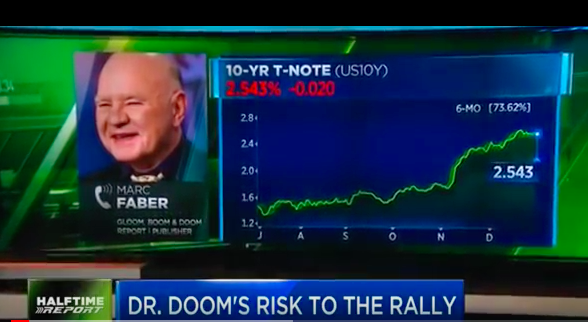
Dr Marc Faber: NEW BULL MARKET 2017 . Dr. Faber is famous for his contrarian approach to investing, Marc Faber does not run with the bulls or bait the bears but steers his own course through the maelstrom of international finance markets…
Marc Faber Warns Higher Yields May Disrupt Rally Says to Sell

-
I know Mike is a very solid investor and respect his opinions very much. So if he says pay attention to this or that - I will.
~ Dale G.
-
I've started managing my own investments so view Michael's site as a one-stop shop from which to get information and perspectives.
~ Dave E.
-
Michael offers easy reading, honest, common sense information that anyone can use in a practical manner.
~ der_al.
-
A sane voice in a scrambled investment world.
~ Ed R.
Inside Edge Pro Contributors

Greg Weldon

Josef Schachter

Tyler Bollhorn

Ryan Irvine

Paul Beattie

Martin Straith

Patrick Ceresna

Mark Leibovit

James Thorne

Victor Adair