


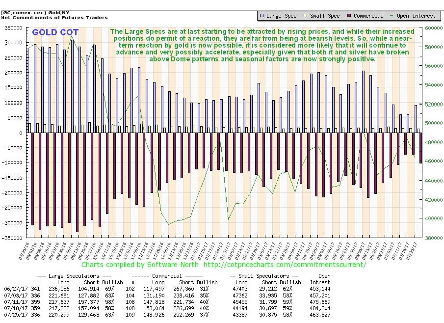
The significant increase in Large Spec long positions this past week in gold and silver from a very low level might be cause of concern to some, since it of course increases the risk of a reaction in these metals, but there is another much more positive way of looking at it, which is that, in the face of a continued albeit incremental rise in the prices of gold and silver, the Large Specs have suddenly realized their mistake in bailing out over the past couple of months, and are scrambling to get back on board.
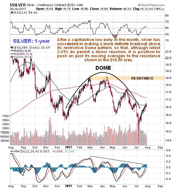
On gold’s 1-year chart we can see that it actually made an important breakout last week, from the Dome pattern shown. So far the breakout is marginal, and there is still no confirmation by momentum, which has not broken out of its downtrend, but that is not the case with silver, which as we will see HAS broken out above a similar Dome pattern. Gold is approaching a zone of considerable resistance approaching its April and June highs at the top of the Dome, and once it breaks out above this it should really get moving.

While there was a considerable increase in Commercial short and Large Spec long positions in gold last week, they are still at modest levels that permit a big rally by gold from here. Certainly they are a long way from being bearish.
Click on chart to popup a larger clearer version.
Silver, meanwhile has made a more decisive breakout from its Dome pattern, after putting in a capitulative low a few weeks ago, and is in position to push on past its moving averages towards resistance in the $18.50 near to its February and April highs. Like gold there is still no momentum breakout (MACD) but it is close to it.
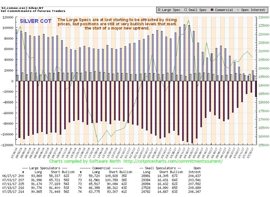
After falling to extremely bullish levels a week ago, there was an uptick in Commercial short and Large Spec long positions in silver last week, shown on the latest COT chart below, which is taken the mark the dawn of the realization of their mistake by Large Specs in dumping all of their long positions over the past couple of months, and such an uptick often occurs at the start of a major uptrend.
Click on chart to popup a larger clearer version.
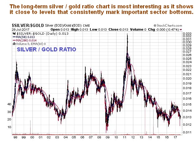
It is enlightening and useful to observe the long-term silver to gold ratio chart at this juncture, as it shows that the ratio is still close to levels that typically mark an important sector bottom. This chart by itself clearly says there is plenty of room for a major bull market to develop from here.
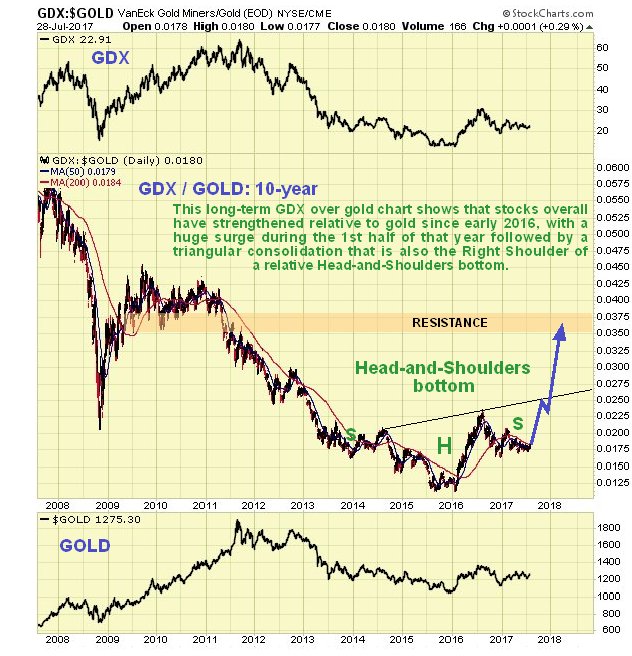
Lastly we will look at the important gold stocks to gold ratio, with stocks being represented by GDX. This ratio is at its lowest at bear market bottoms, because that is when fear is at its peak, and when investors are fearful they choose bullion over stocks, as they regard it as a more solid investment. At the end of 2015 we saw an extreme low in this ratio which marked the final bottom, and what has been happening since as far back as mid-2013 is that a giant relative Head-and-Shoulders bottom has been forming, and right now we appear to be at a great entry point for stocks, because the ratio is very close to the Right Shoulder low of this relative Head-and-Shoulders bottom. The huge surge by the ratio out of the Head of this pattern that occurred during the 1st half of last year was a game changing move, which showed that the tide was turning and that a new bull market was being birthed. Note that the ratio has to get to 0.26 before it even breaks out of the H&S bottom, which is quite a way above its current level, and once it does break out of the base pattern it is likely to push on quickly to the resistance level shown in the 0.36 – 0.38 zone, which will mean BIG gains for stocks.
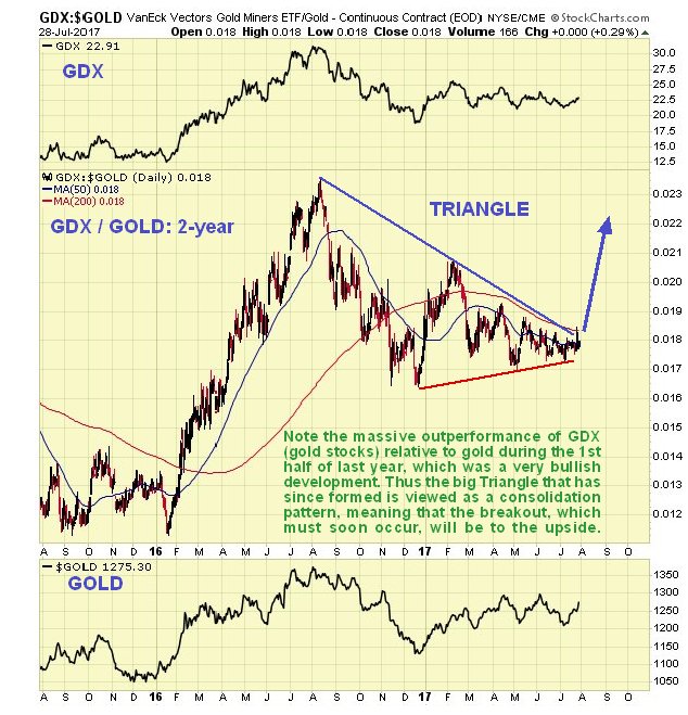
We will now look at the GDX to gold ratio in more detail on its 2-year chart, for important guidance re timing. The 2-year chart is quite dramatic as it shows the massive advance in the ratio during the first half of last year, and remember that gold was rising at the same time, so this chart is showing the outperformance by gold stocks during that period, which was certainly very impressive and marked the birthing of a new bull market. After such a huge outperformance, stocks were certainly in need of a rest and that’s why the ratio bedded down into a big consolidation Triangle, but as we can see this Triangle is now fast closing up, which is why we have been buying the sector aggressively in recent weeks, because breakout should be to the upside and lead to a big uptrend, an outcome which is made much more probable by the now strongly bullish gold and silver COTs following the Large Specs giving up and bailing out at the worst possible time in recent months as they are always prone to do.
Conclusion: it couldn’t look better for the sector, which suits us, because we are bullish and now heavily long.
Clive Maund has been president of www.clivemaund.com, a successful resource sector website, since its inception in 2003. He has 30 years’ experience in technical analysis and has worked for banks, commodity brokers and stockbrokers in the City of London. He holds a Diploma in Technical Analysis from the UK Society of Technical Analysts.
Want to read more Gold Report articles like this? Sign up for our free e-newsletter, and you’ll learn when new articles have been published. To see recent articles with industry analysts and commentators, visit our Streetwise Interviews page.
Related Articles
- Technical Analysis Toolkit for Energy Investors: Clive Maund
- Undervalued Companies for the Precious Metal Portfolio
- Where the ‘Smart Money’ of the Gold Space Is Going
Disclosure:
1) Statements and opinions expressed are the opinions of Clive Maund and not of Streetwise Reports or its officers. Clive Maund is wholly responsible for the validity of the statements. Streetwise Reports was not involved in the content preparation. Clive Maund was not paid by Streetwise Reports LLC for this article. Streetwise Reports was not paid by the author to publish or syndicate this article.
2) This article does not constitute investment advice. Each reader is encouraged to consult with his or her individual financial professional and any action a reader takes as a result of information presented here is his or her own responsibility. By opening this page, each reader accepts and agrees to Streetwise Reports’ terms of use and full legal disclaimer. This article is not a solicitation for investment. Streetwise Reports does not render general or specific investment advice and the information on Streetwise Reports should not be considered a recommendation to buy or sell any security. Streetwise Reports does not endorse or recommend the business, products, services or securities of any company mentioned on Streetwise Reports.
Charts courtesy of Clive Maund.
 1. SILVER GREEN ALERT – One of the Best Buying Opportunities in Years…
 What do they like best? Highflying growth stocks such as Netflix, Facebook and Amazon


