
Timing & trends
3:00pm Pacific Thursday May 18, 2017
DOW + 56 on 50 net advances
NASDAQ COMP + 44 on 400 net advances
SHORT TERM TREND Bullish
INTERMEDIATE TERM Bullish
STOCKS: The market stabilized today after yesterday’s hissy fit and our best estimate is that we have seen a trading bottom.
That’s the way the market frequently acts. It gets overbought, investors buy every little dip and it won’t go down. Then finally a catalyst or some sort of unexpected news development takes it down hard and then it’s already oversold.
GOLD: Gold was down $5. Profit taking with a little help from a rebounding dollar.
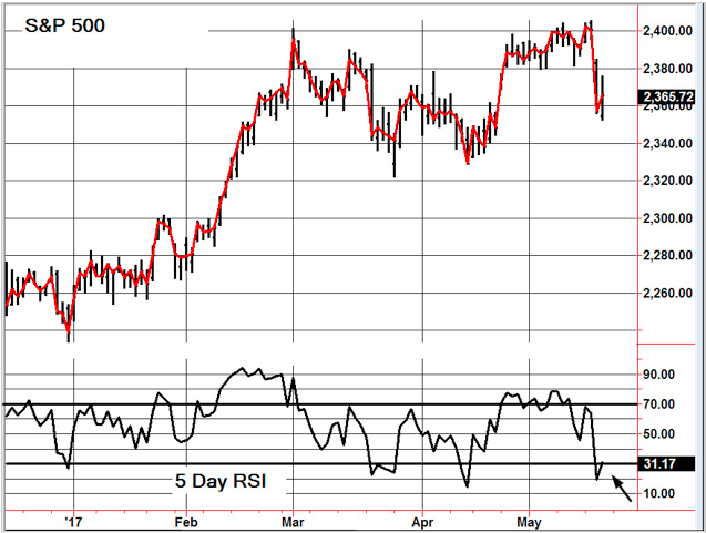
CHART The S&P 500 is just bouncing off an oversold 5 Day RSI (arrow). When this happens we normally have a few days on the upside.
BOTTOM LINE: (Trading)
Our intermediate term system is on a buy.
System 7 We are long the SSO from 86.27. Let’s put a stop in at 84.27 and remain long through Friday.
System 8 We are in cash. Stay there.
System 9 We are in cash. Stay there.
NEWS AND FUNDAMENTALS: Jobless claims were 232,000, less than the expected 240,000. The Philadelphia Fed Business Outlook Survey came in at 38.8, better than the expected 19.6. There are no important releases on Friday.
INTERESTING STUFF Wise men speak because they have something to say; Fools because they have to say something.— Plato
TORONTO EXCHANGE: Toronto stabilized, gaining 4.
BONDS: Bonds were flat.
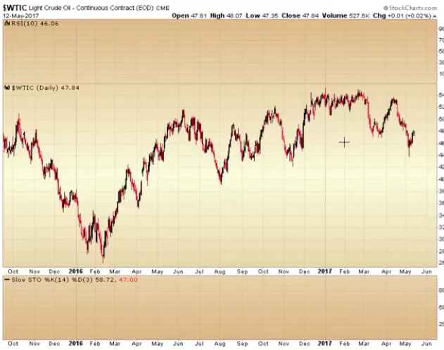
THE REST: The dollar had a decent rebound. Crude oil managed a small rise.
Bonds –Bullish as of May 12.
U.S. Dollar -Bearish as of May 4.
Euro — Bullish as of May 4.
Gold —-Bullish as of May 12.
Silver—- Bullish as of May 12.
Crude oil —- Bullish as of May 5.
Toronto Stock Exchange—- Bullish from January 22, 2016
We are on a long term buy signal for the markets of the U.S., Canada, Britain, Germany and France – www.toddmarketforecast.com
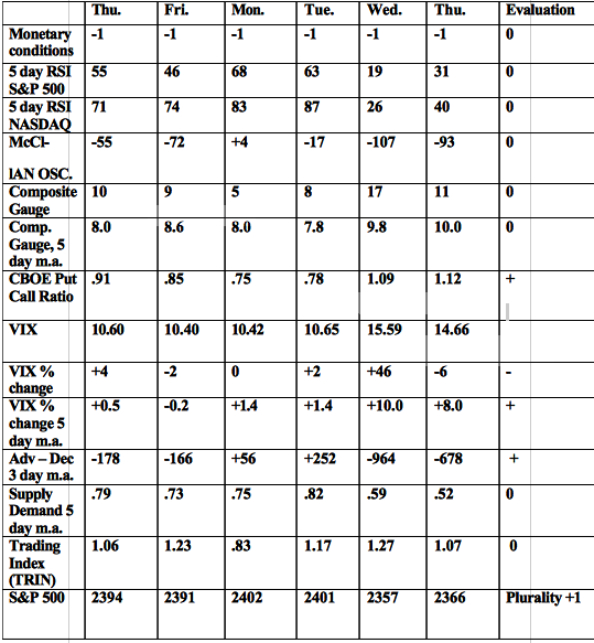
Monetary conditions (+2 means the Fed is actively dropping rates; +1 means a bias toward easing. 0 means neutral, -1 means a bias toward tightening, -2 means actively raising rates). RSI (30 or below is oversold, 80 or above is overbought). McClellan Oscillator ( minus 100 is oversold. Plus 100 is overbought). Composite Gauge (5 or below is negative, 13 or above is positive). Composite Gauge five day m.a. (8.0 or below is overbought. 13.0 or above is oversold). CBOE Put Call Ratio ( .80 or below is a negative. 1.00 or above is a positive). Volatility Index, VIX (low teens bearish, high twenties bullish), VIX % single day change. + 5 or greater bullish. -5 or less, bearish. VIX % change 5 day m.a. +3.0 or above bullish, -3.0 or below, bearish. Advances minus declines three day m.a.( +500 is bearish. – 500 is bullish). Supply Demand 5 day m.a. (.45 or below is a positive. .80 or above is a negative). Trading Index (TRIN) 1.40 or above bullish. No level for bearish.
No guarantees are made. Traders can and do lose money. The publisher may take positions in recommended securities.

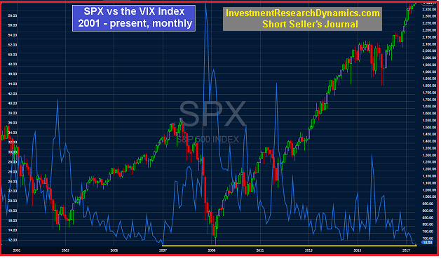
You’ve probably heard/read a lot lately about the VIX index. The VIX index is a measure of the implied volatility of S&P 500 index options. The VIX is popularly known as a market “fear” index. The concept underlying the VIX is that it measures the theoretical expected annualized change in the S&P 500 over the next year. It’s measured in percentage terms. A VIX reading of 10 would imply an expectation that the S&P 500 could move up or down 10% or less over the next year with a 68% degree of probability. The calculation for the VIX is complicated but it basically “extracts” the implied volatility from all out of the money current-month and next month put and call options on the SPX.
The graph above plots the S&P 500 (candles) vs. the VIX (blue line) on a monthly basis going back to 2001. As you can see, the last time the VIX trended sideways around the 11 level was from 2005 to early 2007. On Monday (May 8) the VIX traded below 10. The last time it closed below 10 was February 2007. The VIX often functions as a contrarian indicator. As for the predictive value of a low VIX reading, there is a high correlation between an extremely low VIX level and large market declines. However, the VIX does not give us any information about the timing of a big sell-off other than indicate that one will likely (not definitely) occur.
In my opinion, an extremely low VIX level, like the current one, is signaling an eventual sell-off that I believe will be quite extreme.
The true fundamentals underlying the U.S. economy – as opposed the “fake news” propaganda that emanates from uncovered manholes at the Fed, Wall Street and Capitol Hill – are beginning to slide rapidly. The primary reason for this is that the illusion of wealth creation was facilitated by the inflation of a massive systemic debt and derivatives bubble. Government and corporate debt is at all-time highs. The rate of debt issuance by these two entities accelerated in 2010. Household debt not including mortgages is at an all-time high. Total household debt including mortgages was near an all-time high as of the latest quarter (Q4 2016) for which the all-inclusive data is available. I would be shocked if total household was not at an all-time high as I write this.
The fall-out from this record level of U.S. systemic debt is beginning to hit and it will accelerate in 2017. In 2016 corporate bankruptcies were up 25% from from 2015. So far in 2017, 10 big retailers have filed for bankruptcy, with a couple of them completely shutting down and liquidating. Currently there’s at least 9 more large retailers expected to file this year. In addition to big corporate bankruptcies, the State of Connecticut is said to be preparing a bankruptcy filing.
The household debt statistics show a consumer that is buried in debt and will likely begin to default on this debt – credit card, auto, personal, student loan and mortgage – at an accelerated rate this year. The delinquency and charge-off statistics from credit card and auto finance companies are already confirming this supposition.
In the latest issue of the Short Seller’s Journal, I review the VIX and the deteriorating consumer debt statistics in detail and explain why the brewing financial crisis will be much worse than the one that hit in 2008.

The next big trending move will occur in the energy markets. All the technical and cyclical signs are in place to suggest a major bottom is forming. In the precious metals market we have the exact opposite setup. This video will clarify how these two markets are likely to behave in the next several months.
https://blog.smartmoneytrackerpremium.com/
1. Gold: A Tsunami of Selling
A chain reaction is forming the last great gold stock buying opportunity of the decade, says Lior Gantz, editor of Wealth Research Group.
2. Is Canada The Next Hot Money Victim?
One of the interesting things about the Great Recession was how Canada’s financial system sailed through it largely unscathed. Its banks were regulated wisely and behaved prudently, its citizens avoided the extreme stupidity of their credit-addicted neighbors to the south, and its government refrained from doubling its debt every eight years.
But instead of Americans learning from Canada, Canadians appear to have concluded that we had it right after all.
2. The Oracle Speaks … and Here’s What We Learned
Over the weekend, the annual Berkshire Hathaway shareholder meeting took place, an event sometimes described as the “Woodstock for Capitalists.”
This event always generates a lot of press, and this year’s event was no exception. Here are a few of what I think are the most-interesting takeaways from Berkshire meeting.
An email from a reader (of the eLetter, I think) calling me out on trying to make too many correlations in a dysfunctional market (I think that was his bottom line point, and he’s got a good point) got me thinking about the Silver/Gold ratio and some pretty interesting post-2011 dysfunction (so it seems) in the markets.
Markets that made sense in certain ways prior to 2011 no longer make sense in the same ways. For instance, the S&P 500 used to be correlated to the Silver/Gold ratio, which itself was positively correlated to inflation and/or inflationary economic growth. Gold also liked for silver to be leading it, not the other way around.

But in 2011 a Goldilocks environment was rammed home by Ben Bernanke’s decree (in September of that year) that the Fed would “sanitize” (his word for manipulate, coerce and completely screw up bond market signals that had been tried and true) inflation and its indicator signaling right out of the picture. The Fed’s ‘Operation Twist’ buying of long-term Treasury bonds and selling of short-term Treasury bonds forced a yield curve that had been out of control to the upside, downward. Brilliant!
In 2017 it’s the gift that keeps on giving, from dear old Ben as the resultant yield curve downtrend has been relentless and it has been stock bulls that have benefited despite the 2015 disturbance that temporarily shook a lot of people out of stocks. To be sure, Goldilocks has not only been Fed-induced, but also has benefited from global deflationary forces that now appear to be resolving toward an inflation phase in many global regions (here we again note Kevin Muir’s sound thought process about Europe potentially doing the US monetary policy thing).
Gold and silver, followed by commodities had once been obvious choices for inflationary phases, but now with the Fed out of tricks in its bag (leaving the heavy lifting to the Trump administration’s fiscal/reflation policy making), trying take back previous inflationary monetary policy (by slowly tightening) and the yield curve declining, it’s all good for now.
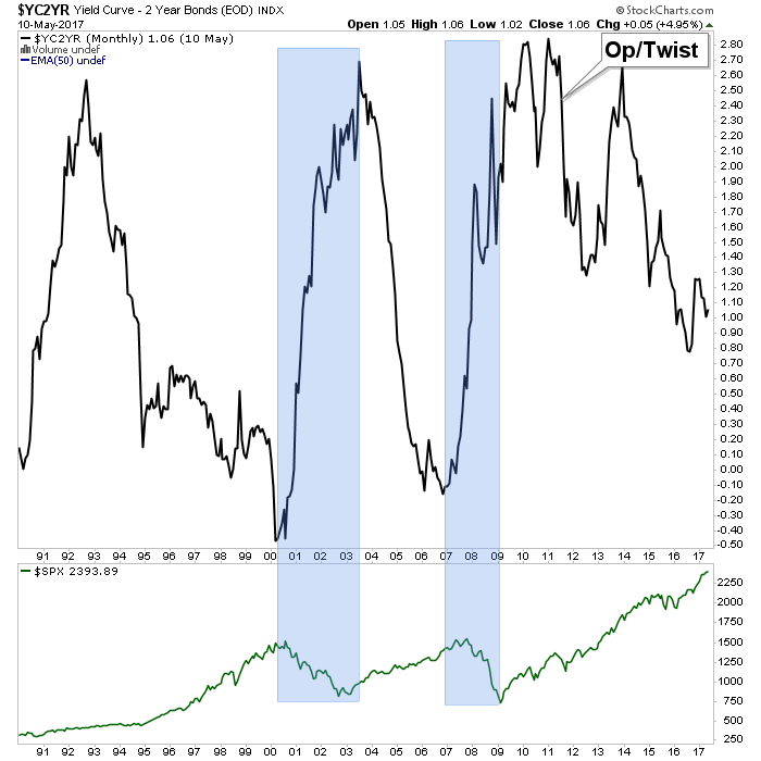
On this cycle (2011- ?) the inflation has clearly manifested in stocks. Funny money on the run, after all, is not discriminating money. It seeks assets… period. With gold having been harpooned due to the lethal combo of over-speculation and Bernanke’s not so gentle twisted shove in 2011, the stock market was a layup (in hindsight, at least) in 2011; it was the path of least resistance.
Will the next turn up in the curve be inflationary or of the deflationary liquidation variety? That will likely be determined by what nominal yields are doing at the time. Either way, a rise in the yield curve could be supportive for gold simply because a) gold often works well during inflation and b) because gold is currently wearing it risk ‘off’ suit, in the event an upturn in the curve is deflationary. In that latter event its price might not move up much, and could decline, but it would sure as hell retain value better than the stuff that has received the inflationary bid, post-2011.
Subscribe to NFTRH Premium for your 40-55 page weekly report, interim updates and NFTRH+ chart and trade ideas or the free eLetter for an introduction to our work. Or simply keep up to date with plenty of public content at NFTRH.com and Biiwii.com. Also, you can follow via Twitter @BiiwiiNFTRH, StockTwits, RSS or sign up to receive posts directly by email (right sidebar).

-
I know Mike is a very solid investor and respect his opinions very much. So if he says pay attention to this or that - I will.
~ Dale G.
-
I've started managing my own investments so view Michael's site as a one-stop shop from which to get information and perspectives.
~ Dave E.
-
Michael offers easy reading, honest, common sense information that anyone can use in a practical manner.
~ der_al.
-
A sane voice in a scrambled investment world.
~ Ed R.
Inside Edge Pro Contributors

Greg Weldon

Josef Schachter

Tyler Bollhorn

Ryan Irvine

Paul Beattie

Martin Straith

Patrick Ceresna

Mark Leibovit

James Thorne

Victor Adair