
Timing & trends
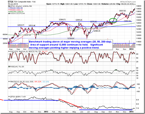
“A notable breakout was recorded in the Canadian market on Thursday. The S&P/TSX Capped Financial Services Index broke above the neckline of an apparent head-and-shoulders bottoming pattern, which suggests a move back toward resistance around 265, or just over 5% above Thursday’s close. Technical indicators and the 50-day moving average are all pointing higher, suggesting improving intermediate-term momentum. Seasonally, Canadian financial services stocks strengthen between January and the end of May, just prior to the reporting of earnings for the second quarter.”
To read the entire report on current market action and seasonal’s read Jon Vialoux’s entire report HERE


Larger Image – Source: www.sharelynx.com
One of the best ways to gain some perspective on stock markets and gold is to look at the Dow Jones Industrials (DJI)/Gold ratio. The Dow/Gold ratio has a long history as the 200-year chart above attests to. The ratio has had considerable movement over the years, which is an accomplishment in itself since gold was until August 1971 fixed first roughly at $20.67 and then at $35 in April 1933 when the Roosevelt administration revalued gold up in order to devalue the US$. The devaluation of the US$ was a part of the currency wars of the 1930’s. The Roosevelt administration also forbid the hoarding of gold, gold bullion and gold certificates and gold was purchased by the US administration at the then fixed rate of $20.67. The resulting profit was used to fund the Exchange Stabilization Fund (ESF) a fund that was established by the Gold Reserve Act of 1934.
One thing that stands out with the above chart is that following the creation of the Fed in 1913 the Dow/Gold ratio has become a lot more volatile. Sharp peaks (favouring stocks) were seen in 1929 at 19, 1966 at 29 and 1999 at 45. Deep troughs (favouring gold) were seen in 1933 near 2 and in 1980 near 1. Prior to the formation of the Fed, the Dow/Gold ratio ranged from roughly 0.2 to 5. Sharp lows were seen in the 1840’s and again in the 1870’s. Economic depressions were a feature of both those periods. If the broadening pattern that appears to have formed following the formation of the Fed were to hold to form, the Dow/Gold ratio could fall to the bottom of the channel that is currently below 1.
To give some further perspective to the ratio one should look at gold’s two bull markets – 1966-1980 and 1999-2011.
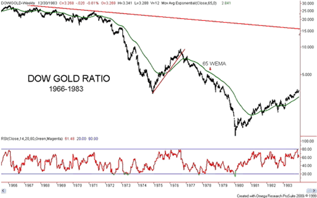
Charts created using Omega TradeStation 2000i. Chart data supplied by Dial Data
The Dow/Gold ratio peaked near 29 in February 1966. The ratio began a slow steady decline and made its final peak in April 1971 just under 25. By the time of the 1974 stock market bottom in December 1974 the ratio had fallen to near 3. The period that followed was the one that saw gold prices almost cut in half while the stock market started a recovery. By September 1976, the ratio was almost back to 10. It was at that point that gold began its sharp rise to $878 by January 1980. The stock market continued its range trading and in January 1980, the Dow Jones Industrials closed at 875. The ratio had fallen to roughly 1:1.
That turned out to be the low for the ratio and the Dow/Gold ratio began a long climb back in favour of stocks. It was not until 1995, however, that the Dow/Gold ratio finally broke the down trendline from the 1966 top. What followed was a swift rise in the stock market and a long period of weak gold prices. From 1995 to the top in 1999, the Dow/Gold ratio rose from roughly 10 to 45 as the DJI exploded from 5,100 to almost 12,000 while gold was falling from $388 to $252.
Source: www.bmgbullion.com
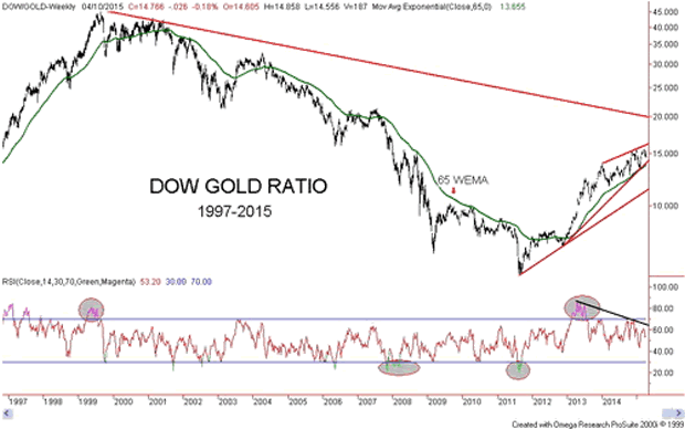
Charts created using Omega TradeStation 2000i. Chart data supplied by Dial Data
The last major peak for the Dow/Gold ratio was in August 1999 near 45. As with the market following the 1966 peak, the initial decline was gentle. The collapse got under way following the events of 9/11. There were brief rallies in favour of the Dow in 2003/2004 and again in 2006/2007 otherwise the trend of the Dow/Gold ratio was relentlessly down in favour of gold. There was another brief rebound for the Dow during the 2008 financial crisis but by 2009, the trend resumed in favour of gold. The ratio bottomed in August/September 2011 just under 6.
Since then a strong rally has been underway in favour of the Dow. Despite the strong rally in favour of the Dow, the Dow/Gold ratio remains well below its peak of 45 only recently hitting a high just above 15. The key downtrend line from the 1999 peak is currently near 20. A break of that level would signal that the trend has shifted firmly in favour of stocks as represented by the DJI. The current period from September 2011 is the first strong rally in favour of stocks since the gold bull market began back in 2001. Some have compared this period to 1974-1976 another time that stocks were favoured over gold during a gold bull market.
The Dow/Gold ratio appears to be forming what may be an ascending wedge triangle pattern. This pattern is normally bearish. A similar pattern is being seen on the S&P 500. A breakdown of the Dow/Gold ratio below 14 would be negative. Confirmation of a breakdown underway would be a decline below 13.50. Final confirmation of a breakdown would come when the ratio breaks under 11.30. Note the declining RSI that has been making lower highs even as the Dow/Gold ratio has been making higher highs. This suggests a deterioration in the Dow/Gold ratio even as it has been moving higher. The question now is not so much as to will the tide turn in favour of gold to when will the tide turn in favour of gold.
The next chart is an alternative way of looking at the record of the Dow/Gold ratio. The chart is courtesy of Bullion Management Group (www.bmgbullion.com). The chart sub-divides into three periods 1966-1982, 1983-2000 and 2001-2014. The former period largely covers the 1966-1983 Dow/Gold ratio chart above while the latter period covers primarily the 1997-2015 Dow/Gold ratio chart shown above. The 1966-1982 period was one of a bull commodity market while stocks were primarily in a long term bear market. The situation reversed itself from 1983-2000 as stocks soared while commodities were a bust. Since 2001, commodities have generally outperformed once again while stocks have suffered.
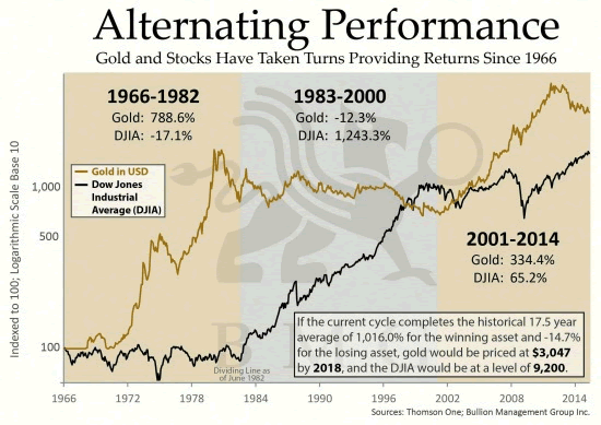
Source: www.bmgbullion.com
What stands out that setting aside the periods where gold outperforms stocks or stocks outperform gold, since 1966 gold has gained 3,328% ($35 to $1,200) while the DJI has gained 2,177% (785 close December 31, 1966 to 17,920 close April 8, 2015). Further, despite the bear market experienced by gold since September 2011, gold has gained 328% since 2001 vs. 79% for the DJI. Since gold became free trading in 1971 gold has proven to be the superior investment despite periods of underperformance.
This outperformance is dependent on where one wishes to start. I have seen studies suggesting gold’s gross underperformance. Those studies invariably started with the top in 1980 and a time when the Dow/Gold ratio was about 1:1. Argumentively I could also be criticised for starting back in 1966 at a time when stocks were high relative to gold. A more reasonable measurement of gold’s performance vs. the DJI might be to start in August 1971 when the gold standard ended and the current fiat system commenced. Except the DJI was higher in August 1971 then it was at the end of 1966. The Dow/Gold ratio was around 25.6:1.
Maybe where it should truly be measured from is the inception of the Federal Reserve that was founded on December 23, 1913. On that day, gold was fixed at $20.67 while the DJI closed at 78.11. The Dow/Gold ratio was 3.8:1. On that basis, the DJI wins with a gain of 22,819% vs. gold’s gain of 5706%. The DJI’s gains are before dividends. But then an ounce of gold back in 1913 is still an ounce of gold today whereas the DJI has undergone numerous changes over the years with weak companies removed and new strong companies added.
Probably the best reason for following the Dow/Gold ratio is to help in determining as to whether one should be in gold or stocks. While gold topped in September 2011 the confirmation that the tide had shifted in favour of stocks did not happen until 2013. It was on April 12 and 15, 2013 that the gold market broke down when parties unknown offered the equivalent of 400 tonnes of gold in the futures market at the open all at once. It was a definitive statement that the futures market or paper gold dominates the gold market and not physical gold. The question now is can paper gold continue to dominate? The slow shift of the physical gold market from London/New York to Shanghai suggests that physical gold may soon dominate once again.
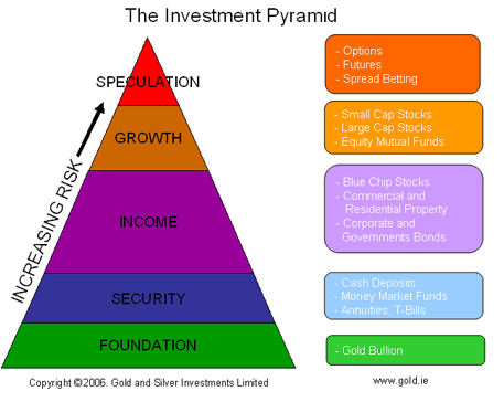
Physical gold has no liability unlike derivatives (futures), stocks and bonds. It is for this reason that some investment analysts place physical bullion as the foundation of any investment portfolio. This is the opposite of where traditional investment analysis places bullion. Following the Dow/Gold ratio can help one stay on the right side of the market.
 Remember 1999? What a great time to be alive! Mankind stood on the threshold of Olympus, ready to join the assembly of gods, rollicking, frolicking and generally misbehaving without regret.
The internet was gaining velocity. It was widely believed that breakthroughs in communications had ‘removed the speed limits’ to economic growth. Information was now readily and easily available to everyone.
Any dope in Peoria could go on the internet and find out how to manufacture a bomb in his basement, or make a cherry pie in his kitchen.
And the genius in Kuala Lumpur or Kabul was now liberated from the low-bred, backward, and benighted people around him; he could see what fun it would be to have a Beverly Hills zip code. And he could reach across the worldwide web and get a chisel and a steel file – to create a ‘killer app’ – and free himself from his miserable circumstances.
The End of History
So many people… in so many places… all yearning for home-delivered pizza and fortunes from day trading stocks – this was supposed to lead to rates of progress never before seen by human eyes.
The evidence could be witnessed in the stock market. Shares of start-ups promising breakthroughs in all areas – from transportation to medicine to home entertainment – were selling at earnings multiples utterly disconnected from the norms that had ruled investing hitherto fore.
What price was too high for a technology that revealed the secrets of the cosmos and unleashed its hidden power?
Progress in statecraft and politics, too, seemed unstoppable. China took the capitalist road in 1979. Russia followed a decade later. Turkey, India, Brazil – all the big “Third World” countries – became “emerging markets”… aping the US capitalist-democratic model.
This model – of democracy and state-aided capitalism – looked like a winner. In 1989, American political scientist Francis Fukuyama wrote his famous “The End of History” essay, arguing that political and economic perfection may have been achieved:
What we may be witnessing is not just the end of the Cold War, or the passing of a particular period of post-war history, but the end of history as such: that is, the end point of mankind’s ideological evolution and the universalization of Western liberal democracy as the final form of human government.
And in 2005, New York Times columnist Thomas Friedman published The World Is Flat. It hallucinated that all the world’s economies competed on the same level ground… according to the same rules and same principles (shown to them by the US, of course).
Amid this giddy euphoria came the crash of the Nasdaq… and bursting of the dot-com bubble.
Central Bankers to the Rescue
“Well, maybe we got carried away by those dot-coms,” was the general response. “But now we have real heroes in the public sector who can save us.”
In February 1999, the “Committee to Save the World” – Alan Greenspan, Robert Rubin and Larry Summers – appeared on the cover of Time. The trio was purportedly saving the world from the Asian financial crisis.
Six years later, President Bush awarded Alan Greenspan America’s highest civilian award, the Presidential Medal of Freedom, for his work in goosing up the economy following the recession of 2001.
And in 2009, Time named Greenspan’s successor, Ben Shalom Bernanke, its “Person of the Year” for taking “extreme measures” to “stop the panic” of 2008.
In the 20th century, a relative handful of inventors, tinkers and scientists – working in relative isolation, often with little funding – had given the world the automobile, radio, atomic power, painless dentistry, the Pill, moving pictures, antibiotics, airplanes, air-conditioning and the Internet.
Now, in the 21st century, millions of scientists, entrepreneurs and engineers – all connected by the Internet – are on the job. They should be able to set the world on fire. Instead, at least so far, it has been a cold shower.
This Century Has Been a Flop
Today, we will focus on the proof: This century, for America at least, has been a flop. Tomorrow and next week we will explain why.
We are 15 years into the 21st century. Can you think of a single innovation that is equal to the automobile or the airplane? Or air-conditioning?
We can’t. All we can think of is Facebook, Twitter, WhatsApp, Snapchat and other frivolities that are more trouble than they are worth.
But the most damning evidence of a failed century comes from the realm we study every day: the economy.
And here, we are much obliged to President Reagan’s former budget adviser and author of The Great Deformation David Stockman for rehearsing the many failures of 21st-century economic policy. (You can follow David at his website: David Stockman’s Contra Corner.)
What, he asks, have “$700 billion in TARP, $800 billion worth of fiscal stimulus, upward of $4 trillion of QE money printing and 165 months out of 1,890 months in which interest rates were cut or were held at rock bottom levels” wrought?
“The number of breadwinner jobs is still 2 million below where it was when Bill Clinton” was in the White House, says David. Jobs in manufacturing, construction and mining/energy are down 21% so far this century.
You’d think that all these scientists and engineers would mean a big increase in productivity and wages.
Nope.
Since 2007, nonfinancial business productivity growth has fallen to just half the rate experienced between 1953 and 2000.
This is a big part of the reason that real median US household income has fallen from $57,000 in 2000 to $53,000 today. If incomes continue to fall at that rate, the typical American family will have only $25,000 of income by the end of the century.
The Part-Time Economy
In the 20th century, more and more people joined the workforce and earned money.
According to Stockman’s site, 56% of Americans aged 16-54 had work in 2000. Since then, Americans have been falling out of the labor force. Today, just 45% of the working-age population is employed.
Part-time work is increasing, however. The part-time economy is where people work an average of 26 hours a week and earn an average of less than $10 an hour (not even $15,000 a year).
The only sectors that have seen net new job creation are in the “HES complex” (health, education and social services) – the parts of the non-military economy most heavily controlled and financed by government.
In all other sectors, more jobs have been lost than gained.
GDP growth, jobs, productivity and incomes – all the things that matter to regular people – have slowed, or fallen, in the 21st century.
So far, the century is a dud. A disappointment. And a barely contained disaster.
Why?
Tune in tomorrow
Regards,
Bill
Market Insight:
Emerging Markets Still On Sale
by Chris Hunter, Editor-in-Chief, Bonner & Partners
Yesterday, we reported that European blue-chip stocks had left the Dow in their dust since the start of the year.
Also, outperforming US stocks this year are the emerging markets.
As you can see from today’s chart, the iShares MSCI Emerging Markets Index ETF (NYSE:EEM) – which tracks prices of 800 stocks in 23 emerging markets – is up 8% this year.
By contrast, the S&P 500 is up just 1.2%.
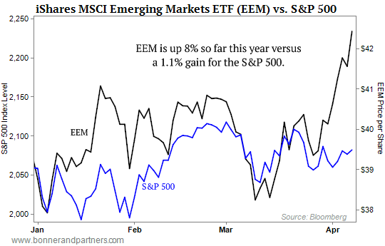
Even better, the MSCI Emerging Markets Index continues to trade at a steep discount.
It trades at just 13.5 times reported earnings versus a 20.3 multiple for the S&P 500.
Put another way… you can pick up a dollar of reported emerging market earnings for one-third less than a dollar of reported S&P 500 earnings.
P.S. If you haven’t already claimed your copy of Bill’s latest book, Hormegeddon, don’t delay. Right now, you can get the book and a subscription to Bill’s new monthly publication, The Bill Bonner Letter… as well as special bonus materials… for just $4.95. Read a full review of Hormegeddon and access your special bonuses here.
Everyone is looking for the holy grail of the financial market which will tell what will happen next in stocks, commodities, bonds etc… Knowing that the holy grail of trading does not exist I am going to step out on a limb and share my four month stock market forecast along with commodities and bonds.
It is vital that you understand this is a 2-4 month forecast only and as the market evolves my outlook will change as I follow price action as closely as possible.
Here are some key points you need to know:
- Bonds should perform well for a few months and possibly a long time until the bear market in US stocks takes hold and is well under way. BUT, the bond bubble will burst eventually when rates start to climb. This could be June, or much later in the year but until then I expect them to rise as the safe haven.
- Commodities typically outperform equities during the late staged of the bull market which is what I feel the US stock market is. Resource stocks and resource rich countries like Canada should hold up well, and possibly make new highs going into summer.
- Notice how gold and oil have moved from opposite corners of the chart compared to the US and Canadian stock indexes.
- During the 2000 and 2008 bear market we saw gold, silver, oil and mining stocks get hit very hard in the second half of the bear market. Will this happen again? I do not think it will because this time rates are at zero and there is only one way to go when they are at the bottom… Up!. This means stocks and bonds will likely both enter a bear market, maybe not at the same time, but they will eventually. This means the only places to protect your capital will be commodities, resource based investments, or simply cash CAD & USD.

Take a look at this 10 year bond price overlaid on the S&P 500 index. So far this year bonds have popped and
rallied above short term resistance which we have seen in the past. Big money is rotating into bonds for the time being and this is a warning sign of a stock market top. If you want to learn more about the technical and fundamentals in motion about what is about to happen, why, and when read my ebook “The Global Economic Collapse Of 2015”

Market Forecast Conclusion:
In short, safe havens for investor’s capital will be more of a dance during the next bear market in US equities.
With many countries devaluing their currencies and a potential bull market in commodities I expect the Canadian Loonie and US Green Back to hold the value if not rise over the next year or two.
Chris Vermeulen
If you want my long term investing signals my ETF swing trades so you can protect your capital and profit during the next bear market – Sign Up Today!

The headlines are filled with news of the visit by Greek prime minister Alexis Tsipras to Moscow today.
The Greek government has to find roughly €460 million ($500 million) to pay back a loan to the International Monetary Fund that comes due tomorrow.
It’s highly unlikely that Russian president Vladimir Putin will pony up the cash. Thanks to the big fall in oil prices and economic sanctions, Russia’s state coffers are hardly overflowing.
But Tsipras is keen to give the impression that, unless Brussels unblocks emergency funding earmarked for Greece, he’s happy to cozy up to Russia.
And the last thing other European leaders want is Russia meddling in their affairs.
As we’ve been telling paid-up Bonner & Partners subscribers in their three-times-weekly bonus letter, The B&P Briefing, Greece is a major distraction from the real story in Europe.
And that’s the outperformance of European blue-chip stocks versus their US counterparts.

As you can see from today’s chart, since the start of 2015, the SPDR Euro Stoxx 50 ETF (NYSE:FEZ) – which tracks 50 European blue-chip stocks – is up by almost 8% so far in 2015 versus a 0% gain for the Dow.

-
I know Mike is a very solid investor and respect his opinions very much. So if he says pay attention to this or that - I will.
~ Dale G.
-
I've started managing my own investments so view Michael's site as a one-stop shop from which to get information and perspectives.
~ Dave E.
-
Michael offers easy reading, honest, common sense information that anyone can use in a practical manner.
~ der_al.
-
A sane voice in a scrambled investment world.
~ Ed R.
Inside Edge Pro Contributors

Greg Weldon

Josef Schachter

Tyler Bollhorn

Ryan Irvine

Paul Beattie

Martin Straith

Patrick Ceresna

Mark Leibovit

James Thorne

Victor Adair