
Timing & trends
Going into 2015 the economic outlook held by the U.S. investment establishment could not have been much more positive, and more unified. Pundits saw all the variables aligning to create the best of all investment worlds, a virtual “no-brainer” of optimism. Many believed that the 5.0% annualized growth in 3rd quarter would stay strong in the 4th Quarter and then usher in a strong 2015, which many believed would be the best economic year since the crash of 2008. The only question that divided most forecasters was how good the year would be.
High degrees of certainty can be dangerous. Herd mentality can cause investors to chase returns en masse and pile into positions that may already be overvalued. But herds can be spooked, most often by unexpected developments which can catch the herd wrong-footed and spark major movements when the masses scatter at the same time. When that occurs, those who resisted the herd may find themselves rewarded. We believe that we are approaching such a point.
Although the employment reports continue to bathe the economy in the diffuse light of recovery, many of the less followed economic indicators have further diverged from expectations in the opening months of 2015. Many economists initially believed that GDP in the 4th quarter 2014 would come in at an annualized pace north of 3.0%. But, in January the actual number came in at 2.6% (which was revised down to 2.2%). Recent data in such categories as consumer spending (which after falling in December, declined again in January – the first consecutive monthly declines since 2009), factory orders, trade, manufacturing, and business investment have missed on the downside. But these lesser reports are often explained away and have not made much of a dent on overall optimism.
In the six years since the Great Recession began in 2008, the economy has been boosted by both monetary and fiscal stimuli. The Federal Reserve has held its overnight rate at 0% while expanding its balance sheet by almost $4 trillion, and the Federal government had run four consecutive $1 trillion plus budget deficits (before pulling back to less than half a trillion annually more recently). But despite these unprecedented levels of stimulus, real GDP growth in the U.S. averaged just 2.2% from 2010 through 2014, which compares with an average of almost 3.5% in the post-WWII period. If this substandard growth is all we could achieve with the floodgates wide open, why should we expect that the economy will improve in 2015 if the stimulus doesn’t return, as few expect it will?
Despite the records being set almost daily on Wall Street, (today the NASDAQ eclipsed 5,000 for the first time in almost 15 years), optimists claim that the market is not overvalued because the current S&P 500 price-to-earnings ratio, of about 19 times trailing 12 months earnings, is not too far above the historical norm of about 14. But most investors have not considered the extraordinary factors that helped push up earnings, artificially we believe, in 2014.
According to Bloomberg, in 2014 S&P 500 companies spent an estimated $565 billion (or 58% of corporate earnings) on share buybacks, a figure that is extremely high by historical standards. Money spent on buybacks is not available to purchase new plant and equipment, to fund research and development, or to spend on marketing and logistics. In that sense, buyback spending generates current earnings at the expense of future earnings. Corporate results have also been boosted by zero percent interest rates, which have allowed businesses to borrow cheaply.
To factor out these short-term earnings distortions, we suggest that investors should look past current P/E ratios and instead look at Cyclically-Adjusted-Price-to-Earnings (CAPE), which is also known as the Shiller Ratio, a metric that looks at earnings over a 10-year period thereby smoothing out cyclical and economic anomalies. Looked through a lens of CAPE ratios, the U.S. markets begin to look very expensive in comparison to other global markets. The graph below tells the tale:
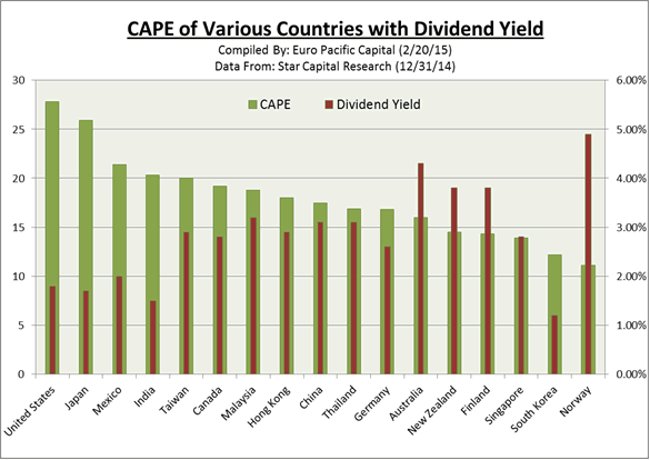
In addition, U.S. stocks currently offer some of the lowest dividend yields to compensate investors for the higher valuations (see chart above). The current estimated 1.87% annual dividend yield for the S&P 500 puts it far below the annual dividend yields of Australia, New Zealand, Finland and Norway.
In 2014 the S&P 500 outperformed stocks in the rest of the world (as represented by the MSCI Index of non-U.S. global markets) by an astounding 20%. This was by far the largest gap in the past 13 years. But on Wall Street, investors generally chase returns. After six consecutive years of positive gains in the S&P 500 (and more than 200% return since March of 2009), few forecasters see any reason to suspect that the upward run of U.S. stocks will end anytime soon.
But should we really expect another year of such results? Would it not be more logical to suggest that the slowing economy will crimp potential over-performance of U.S. markets in 2014? Given that the S&P 500 has not been among the top performers over a 10-year timeframe [see 2015 Global Investor Newsletter] news, would we not at least expect the index to begin moving back to trend, and perhaps underperform world markets in coming years?
Don’t be fooled by the madness of the crowd. The U.S. is not the sole remaining engine of world growth as the talking heads would seem to have you believe.
The good news is that unloved assets may be attractively priced. At a time when energy and labor costs are at multi-year lows, and gold priced in some non-dollar currencies is approaching all-time highs, there are overseas gold mining stocks trading at levels consistent with lower gold prices. The fall in oil has pushed many energy stocks down by 50% or more. In addition, currencies issued by fiscally solvent nations are at fresh multi-year lows.
The above is an abridged version of a longer article that appears in the Winter 2015 Euro Pacific Global Investor Newsletter

 Today King World News is pleased to share a fantastic piece that warns a major danger signal is now flashing RED after one of the largest increases in history! This piece also includes a key illustration that all KWN readers around the world must see.
By Jason Goepfert Founder & CEO Of SentimenTrader
March 1 (King World News) – We’ve discussed in previous reports over the past two years how traders in volatility products have tended to be the smart money, at least to the best of our limited knowledge in how they are using the products.
The three main exchange-traded funds based on the VIX “fear gauge” (VXX, UVXY and TVIX) have seen their shares outstanding ebb and flow over the past three years based on demand from traders.
….read more HERE

 As the world continues to digest breaking news out of Greece and Ukraine, the Godfather of newsletter writers, 90-year old Richard Russell, also warned the world is completely unprepared for this and told investors how to position themselves..
Richard Russell:
The Disease – Deflation And A World Drowing In Debt
“The world’s balance sheet is heavily skewed toward debt and loans. On the asset side of the balance sheet we have gold and silver currencies.
The Cure That Will Shock The World – Reset Gold Price To $5,000 or $10,000!
What would make the balance sheet look saner and increase the asset side? It would be to reset gold to a much higher price. Why is it that nobody is writing about this? Resetting the price of gold to $5,000 or $10,000 an ounce would be a mighty step against deflation.
Reset Happened Before – Buy Gold & Silver While They Are Cheap And Available
I find it odd that no media has mentioned this. If the price of gold is reset it will be sudden and when nobody is expecting it. The price of gold was reset in 1933, in the depths of the Great Depression. Advice — buy physical silver and gold while they are cheap and available.
Exter’s Pyramid And Gold
I recently read a long article on deflation versus hyperinflation. The piece drew attention to my old friend John Exter’s inverted pyramid of asset classes. At the bottom of the pyramid is gold, the safest of all investments. The problem is that the world choking on too much credit. The giant mass of credit and loans is deflationary and is causing deflation

Gold Repricing And Hyperinflation
Nobody is talking about increasing the gold portion of the inverted pyramid (see above). To do that would simply require a reset of the gold price to some higher number. Strangely, nobody mentions the price of gold. Raising the price of gold would overnight expand the basis of the inverted pyramid. This would allow the world to continue on its current path. Ultimately I see hyperinflation in our future; my advice is to buy physical gold while it’s cheap and available.”
….the above is the summary of two articles on King World News, Feb 23rdl HERE & Feb 26th HERE
ChartoftheDay: The Dow just made another all-time record high. To provide some further perspective to the current Dow rally, all major market rallies of the last 115 years are plotted on today’s chart. Each dot represents a major stock market rally as measured by the Dow with the majority of rallies referred to by a label which states the year in which the rally began. For today’s chart, a rally is being defined as an advance that follows a 30% decline (i.e. a major bear market). As today’s chart illustrates, the Dow has begun a major rally 13 times over the past 115 years which equates to an average of one rally every 8.8 years. It is also interesting to note that the duration and magnitude of each rally correlated fairly well with the linear regression line (gray upward sloping line). As it stands right now, the current Dow rally that began in March 2009 (blue dot labeled you are here) would be classified as below average in both duration and magnitude.

Quote of the Day
“The stock market never really changes that much. What happened before will happen again and again and again.” – Jesse Livermore
Events of the Day
March 07, 2015 – Iditarod begins
Stocks of the Day
— Find out which stocks investors are focused on with the most active stocks today.
— Which stocks are making big money? Find out with the biggest stock gainers today.
— What are the largest companies? Find out with the largest companies by market cap.
— Which stocks are the biggest dividend payers? Find out with the highest dividend paying stocks.
— You can also quickly review the performance, dividend yield and market capitalization for each of the Dow Jones Industrial Average Companies as well as the performance of the Dogs of the Dow.
Mailing List Info
Chart of the Day is FREE to anyone who subscribes.
Notes:
Where’s the Dow headed? The answer may surprise you. Find out right now with the exclusive & Barron’s recommended charts of Chart of the Day Plus.
Stocks inched further into record territory today before fading slightly in the afternoon. The market is interpreting Yellen’s remarks before Congress as dovish—keeping rates lower for longer—and recent experts on our show, like Mizuho’s Chief US Economist Steven Ricchiuto, believe Fed forecasts for a pickup in growth and inflation later this year are unlikely to pan out (see interview).

Using a Renko trend following model, let’s identify whether the trend is positive or negative on a short-term, intermediate-term, and long-term basis for stocks (SPY), bonds (TLT), gold (GLD), the US dollar (UUP), and oil (USO).
(Note: For tracking purposes, I will be using the underlying indices when available rather than the ETFs for each of the above categories since there is a slight divergence between the two, with the underlying asset or index being the most important to watch.)
Stocks: The trend for U.S. stocks using the S&P 500 is positive on all timeframes and pushed higher on a short-term basis this week. The short-term trend turned positive (issued a buy signal) earlier this month on 2/5/2015. The intermediate-term trend has remained positive (on a buy signal) since 10/24/2011. The long-term trend has been positive (on a buy signal) since 2/1/2012.
Here is a Renko daily chart (showing support and resistance levels) of the S&P 500 over the last six months with white and red boxes indicating the direction of the short-term trend. Renko “buy” and “sell” signals only appear when price changes and volatility exceed a certain threshold and, thus, attempt to eliminate noise by focusing only on changes in the underlying trend.

Bonds: Using the iShares Barclays 20+ Year Treasury Bond Fund (TLT), the short-term trend for bonds has been negative since 2/6/2015. The intermediate-term trend also turned negative this month on 2/9/2015. The long-term trend has remained positive since 8/1/2014.
Here is the short-term trend chart.

Gold: The short-term trend for gold turned negative on 2/6/2015. The intermediate-term trend turned positive on 1/12/2015 and the long-term trend has been negative (on a sell signal) since 12/1/2011.
Here is the short-term trend chart.

Dollar: The short-term trend for the dollar turned negative on 2/3/2015 and is unchanged given the consolidation since. The intermediate-term trend turned positive on 8/25/2014 and the long-term trend turned positive on 12/1/2011. (Note: To read Chris Puplava’s recent analysis on the US dollar and the potential for a further correction, click here.)
Here is the short-term chart showing the recent sell signal issued earlier this month.

Oil: Using West Texas Intermediate Crude, the short-term trend for oil turned positive on 2/3/2015. Both the intermediate- and long-term trends are still negative.
Here is the short-term chart going back over a year, which shows the continuous sell signal in place since 7/30/2014 that only recently reversed direction this month.


-
I know Mike is a very solid investor and respect his opinions very much. So if he says pay attention to this or that - I will.
~ Dale G.
-
I've started managing my own investments so view Michael's site as a one-stop shop from which to get information and perspectives.
~ Dave E.
-
Michael offers easy reading, honest, common sense information that anyone can use in a practical manner.
~ der_al.
-
A sane voice in a scrambled investment world.
~ Ed R.
Inside Edge Pro Contributors

Greg Weldon

Josef Schachter

Tyler Bollhorn

Ryan Irvine

Paul Beattie

Martin Straith

Patrick Ceresna

Mark Leibovit

James Thorne

Victor Adair