
Timing & trends
Great perspective in a glance – MT Ed
I thought I would review the year in point form, over 12 simple charts. Obviously I cannot and will not cover everything that has happened, but lets give it a best shot:
Chart 1: US stock market has outperformed this year & over last 5 years

Source: Short Side of Long
- MSCI World Index had a decent, but unglamorous year in 2014. Majority of global equity markets were very weak in the second half of the year, while the US outperformed. Not only has the United States outperformed this year, but it has been the best performer since the bull market began in March 2009. Close behind the US, we find Hong Kong shares. This is mainly due to the fact that HK Dollar is pegged to the US Dollar.
Chart 2: Short term market breadth has rebounded from oversold levels

Source: Short Side of Long
- Despite the fact US has outperformed rest of the world, there has been quite a lot of volatility since September of 2014. S&P 500 suffered its first 10% (intra day) correction in several quarters, while small caps sold down by about 20% (typical bear market territory). Internals suggest that over the short term perspective, 52 week new highs continue to dominate new lows while we have over 80% of stocks trading above the 50 day moving average. Meanwhile monthly AD Line remains quite low.
Chart 3: After a decent correction, small caps are ready for a break out!

Source: Short Side of Long
- As already mentioned, volatility was high during the second half of 2014. US small caps felt the brunt of that correction and sold of by almost 20% into middle of October low. The index was trading about 10% below its 200 day moving average… nothing serious from a bear market perspective, but nonetheless a decent correction. In recent posts, I’ve been hinting at the strong tape, which now indicates a move towards record highs.
Chart 4: In 2014, Treasuries outperformed stocks as the curve flattened
 Source: Short Side of Long
- Even thought it has been mentioned before, one interesting fact about 2014 is that US Treasury Long Bond outperformed the S&P 500 stock index. Not only that, but the outperformance was quite direct in the sense that the longer maturity bond markets rallied for almost the whole of 2014, with barley a pullback. At the same time, shorter maturity bonds sold off creating a strongest flattening since the Fed’s tightening cycle in 2005.
Chart 5: Bond market is telling us about low inflation expectations…
 Source: Short Side of Long
- One of the main reasons bonds outperformed in 2014, was due to the fact that just about everyone believed interest rates will rise. The reason consensus was completely wrong was due to the fact that not one major forecaster correctly anticipated a crash in Crude Oil prices. As energy prices almost halved, inflation expectations have now dropped to levels where the Federal Reserve could remain more dovish, as it worries about deflation. Let us remember that at current level, previous stimulus programs were started.
Chart 6: Hedge funds remain net long the Dollar, as prices rise vertically
 Source: Short Side of Long
- A slowdown in the global economy has pushed many other central banks to cut interest rates and even enter into various forms of quantitative easing measures. In recent months we have seen Mario Draghi telegraph that ECB is ready to start a bond buying program, while Bank of Japan doubled down on its own QE. All of this has pushed the US Dollar Index to an 8 year high. However, word of caution should be advised as just about every hedge fund remains net long the greenback. Possibility of a shake out is high.
Chart 7: After an impressive run, Sing Dollar seems to have topped out
 Source: Short Side of Long
- Singapore Dollar has been one of the strongest currencies during the decade long US Dollar weakness. Despite a powerful set back in 2008, as the Global Financial Crisis unfolded, the Sing managed to recover and achieve impressive gains rising from $1.85 per USD in 2001, all the way to almost $1.20 per USD in 2011. However, that seems to have come to an end, and if we were to break a major support seen in Chart 7, there could be more downside to come.
Chart 8: Equal-weighted GEM currency index is breaking to new lows…
 Source: Short Side of Long
- US Dollar hasn’t only been strong against the Euro, Yen and the Aussie. It has absolutely hammered some of the emerging market currencies in recent months. The obvious one that comes to mind is the Russian Ruble, but many others have also suffered to a lesser extent. The equal-weighted emerging market currency index is currently breaking below its 2002 and 2009 bottoms. This has really impacted GEM equities (and ETFs such as EEM), when priced in US Dollars.
Chart 9: Recent US Dollar strength has not impacted Gold all that much
 Source: Short Side of Long
- Consensus outlook is that Gold goes lower, much lower and that US Dollar goes higher, much higher. Maybe consensus is right. However, consider for a minute that USD Index has gone through the roof since July of this year and Gold still remains at around $1,200 per ounce – same level that it traded exactly 18 months ago. If and when greenback takes a breather and pulls back, maybe Gold could surprise on the upside. Technically, the price remains compressed in a wedge, which should see a break in either direction sometime in earlier 2015.
Chart 10: Gold mining shares are oversold & rest on major support level
 Source: Short Side of Long
- One of the reasons why I think Gold might break upwards is because US Dollar rally is overstretched and overbought. Another reason is because Gold Mining shares are incredibly oversold, recently trading as far as 30% below its 200 day moving average. These producers also sit on an important support zone, where market participants have a strong memory of buying. Upside surprise is possible during early parts of 2015.
Chart 11: Brent Crude Oil has crashed from $115 all the way below $60!
 Source: Short Side of Long
- North Sea Brent Crude Oil prices have almost halved in the second part of 2014. Now, who would have predicted that in January of 2014? Just about nobody. While I mentioned that the strong US Dollar has not had that much of an impact on Gold, it certainly has pushed other commodities such as Oil down… and down a whole lot! Sentiment is now incredibly bearish and positioning extremely short, so a rebound is definitely possible. Nevertheless, it is important to let the selling completely exhaust itself first.
Chart 12: Agricultural prices are currently rebounding from major sell off
 Source: Short Side of Long
- Finally, we look at the agricultural prices. For majority of 2013 and 2014, agriculture has been in a major downtrend. However, since early October grains such as Wheat (seen in Chart 12), Corn and Soybeans have gone through a short squeeze rebound. Wheat prices have rallied by over 40% in only a space of a few months, a phenomenon that is not all to uncommon when shorts build to over 60,000 contracts.

 The sudden fall in the price of oil provides a unique opportunity to examine the widely held belief that deflation is economic poison. As many governments and central banks have vowed to fight deflation at all costs in 2015, the question could hardly be more significant.
While falling prices may strike the layman as cause for celebration, economists believe that it can kick off a nasty, and often inescapable, negative cycle, which many believe leads inevitably to a prolonged recession, or even a depression. However, these same economists acknowledge that falling energy prices may offer a stimulus, equivalent to an enormous “tax cut,” particularly for lower and middle income consumers for whom energy costs represent a major portion of disposable income. They suggest that the money consumers and businesses no longer spend on gasoline and heating oil could be spent on other goods and services thereby creating demand in other areas of the economy. Even Fed Chair Janet Yellen, a staunch advocate of the economic benefits of rising consumer prices, has extolled the benefits of falling oil prices.
After considering these competing tensions, most economists agree that falling energy prices are a net positive for an economy (except for oil exporting countries like Russia and Venezuela). But the fact that there is even a debate is shocking. It should be clear to anyone that consumers individually, and an economy collectively, benefit from lower energy prices. As I mentioned in a column late last month, no one buys energy for energy’s sake. We simply use it to do or get the things that we want. The lower the cost of energy, the cheaper and more abundant the things we want become.
But if we all can agree that lower energy prices offer a benefit, why can’t we make the same conclusion about food prices? Wouldn’t consumers get a huge “tax cut” if their grocery bills fell as dramatically? How about health care? Wouldn’t we all be better off if our hospital and insurance bills fell dramatically from their currently insane levels? Come to think of it, why wouldn’t we be better off if the price of everything fell? When does too much of a good thing become too much?
Modern economists tell us that while it’s okay for one or two sectors to see price dips, the danger comes when prices decline across the board. Their theory is that if consumers believe that prices will fall over time that they will curtail their purchases to get better deals down the road. Even if the overall dip is relatively small, just 1% annually for example, they believe any amount of deflation will eviscerate demand and kick off a cycle where depressed demand leads to weak sales, which leads to business contraction, layoffs, and further depression in demand thereby renewing the downward cycle.
But the truth is that deflation is not the menace to consumers and businesses that governments would like us to believe. Common sense and basic economics tell us that prices fall for two reasons: Either an excess of supply or a lack of demand. In both cases falling prices are helpful, not harmful
For much of our history, increased productivity increased the supply of goods and forced prices lower. Falling prices made former luxuries affordable to the masses, and in so doing made possible the American middle class. Based on data from the Historical Statistics of the United States, the many periods of sustained deflation did not halt American economic growth in the first 150 years of the Republic. (Sustained inflation did not become the normal state of affairs until 1913, when the Federal Reserve was created).
Prices can also drop when demand falls due to economic contraction. Any store owner will tell you that if customers stop buying and inventories get too high, the best way to create new demand is to mark down prices. This is basic supply and demand. Demand rises as prices fall. In this sense, falling prices are not the cause of economic contraction, but the market solution to depressed demand.
But today’s economists are rewriting this fundamental law. In their eyes, demand rises as prices rise. This is the equivalent of a physicist suggesting that the law of gravity forces objects to repel from one another, and that a stone dropped from a rooftop will fall upward. They further stand logic on its head by concluding that falling prices are the cause of the reduced demand. (It’s like blaming rain on wet sidewalks, and concluding that the showers will stop if the sidewalks can be dried.)
Economists also argue that falling prices will harm business and lead to unemployment. They forget that falling prices also mean falling costs and increased sales, which lead to higher profits, more capital investment, greater production, and higher real wages. Henry Ford succeeded, and his workers prospered, not because he raised prices, but because he lowered them. Cheaper Model T’s did not impose a burden on the public or compel Ford to lower wages. More recently, the tech industry has prospered, and has paid its workers well, by consistently lowering prices.
As a result of these ideas, economists advocate for policies that push up prices. But all this does is kill off more demand and prolong the slump they are trying to cure.
Since Janet Yellen acknowledged the beneficial effects of falling gas prices to consumers, I wonder if she could name even a single category of goods that would impose a burden on consumers if it were to fall in price? My guess is that she can’t. If a decline in the price of any individual product is good, then a decline in the price of all products simultaneously is even better. Am I the only one who notices the inconsistency in this logic?
Perhaps this disconnect can shed some light on a topic that central bankers are desperately trying to keep hidden in the shadows: Falling consumer prices are good for the consumer and the economy, but they are bad for central banks looking to maintain asset bubbles and for governments looking for a graceful way to renege on their debts.
If we continue to insist that falling prices are the cause of economic malaise, we will continue to produce economies where malaise is the only possible outcome.
Best Selling author Peter Schiff is the CEO and Chief Global Strategist of Euro Pacific Capital. His podcasts are available on The Peter Schiff Channel on Youtube
 Congratulations to Janice D. of Alberta, this week’s winner of two (2) VIP tickets to the 2015 World Outlook Financial Conference + one (1) night accommodation at the Westin Bayshore Hotel in Vancouver on Friday, January 30th courtesy of Solara Club and MoneyTalks.
Tune in every Saturday in January for your chance to win!
*N.B. The prize has no cash value but is fully transferrable.

 Imagine a self-learning robot that can enrich its knowledge about fine-grained manipulation actions (such as preparing food)simply by “watching” demo videos. That’s the idea behind a new robot-training system based on recent developments of “deep neural networks” in computer vision, developed by researchers at the University of Maryland and NICTA in Australia.
The objective of the system is to improve performance, improving on previous automated robot-training systems such as Robobrain, discussed on KurzweilAI last August. Robobrain, which has been downloading and processing about 1 billion images, 120,000 YouTube videos, and 100 million how-to documents and appliance manuals, is designed to deduce where and how to grasp grasp an object from its appearance.
The with it and other system: there’s a large variation in exactly where (which frames) the action appears in the videos, and without 3D information, its hard for the robot to infer what part of the image to model and how to associate a specific action such as a hand movement (cracking on egg on a dish, for example) with a specific object (“hmm, did the human just crack the egg on the dish, or did it break open magically from an arm movement, or do spheroid objects spontaneously implode?”).

The researchers took a crack, if you will, at this problem by developing a deep-learning system that uses object recognition (it’s an egg) and grasping-type recognition (it’s using a “precision large diameter” grasping type) and can also learn what tool to use and how to grasp it.
Their system handles all of that with recognition modules based on a “convolutional neural network” (CNN), which also predicts the most likely action to take using language derived by mining a large database. The robot also needs to understand the hierarchical and recursive structure of an action. For that, the researchers used a parsing module based on a manipulation action grammar.

The system will be presented Jan. 29 at the AAAI conference in Austin (open-access paper is available online).
Hat tip: “Spikosauropod”
Abstract of Robot Learning Manipulation Action Plans by “Watching” Unconstrained Videos
from the World Wide Web
In order to advance action generation and creation in robots
beyond simple learned schemas we need computational tools
that allow us to automatically interpret and represent human
actions. This paper presents a system that learns manipulation
action plans by processing unconstrained videos from
the World Wide Web. Its goal is to robustly generate the sequence
of atomic actions of seen longer actions in video in
order to acquire knowledge for robots. The lower level of the
system consists of two convolutional neural network (CNN)
based recognition modules, one for classifying the hand grasp
type and the other for object recognition. The higher level
is a probabilistic manipulation action grammar based parsing
module that aims at generating visual sentences for robot
manipulation. Experiments conducted on a publicly available
unconstrained video dataset show that the system is able
to learn manipulation actions by “watching” unconstrained
videos with high accuracy

Crude oil is not the only commodity that is crashing. Iron ore is on a similar trajectory and for a common reason. Namely, the two-decade-long economic boom fueled by the money printing rampage of the world’s central banks is beginning to cool rapidly. What the old-time Austrians called “malinvestment” and what Warren Buffet once referred to as the “naked swimmers” exposed by a receding tide is now becoming all too apparent.
This cooling phase is graphically evident in the cliff-diving movement of most industrial commodities. But it is important to recognize that these are not indicative of some timeless and repetitive cycle—–or an example merely of the old adage that high prices are their own best cure.
Instead, today’s plunging commodity prices represent something new under the sun. That is, they are the product of a fracturing monetary supernova that was a unique and never before experienced aberration caused by the 1990s rise, and then the subsequent lunatic expansion after the 2008 crisis, of a cancerous regime of Keynesian central banking.
Stated differently, the worldwide economic and industrial boom since the early 1990s was not indicative of sublime human progress or the break-out of a newly energetic market capitalism on a global basis. Instead, the approximate $50 trillion gain in the reported global GDP over the past two decades was an unhealthy and unsustainable economic deformation financed by a vast outpouring of fiat credit and false prices in the capital markets.
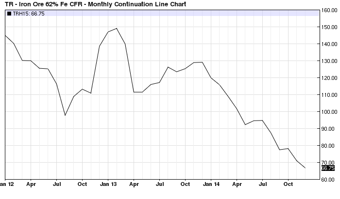
For that reason, the radical swings in commodity prices during the last two decades mark the path of a central bank generated macro-economic bubble, not merely the unique local supply and demand factors which pertain to crude oil, copper, iron ore, or the rest. Accordingly, the chart below which shows that iron ore prices have plunged from $150 per ton in early 2013 to about $65 per ton at present only captures the tail end of the cycle.
….continue reading HERE

-
I know Mike is a very solid investor and respect his opinions very much. So if he says pay attention to this or that - I will.
~ Dale G.
-
I've started managing my own investments so view Michael's site as a one-stop shop from which to get information and perspectives.
~ Dave E.
-
Michael offers easy reading, honest, common sense information that anyone can use in a practical manner.
~ der_al.
-
A sane voice in a scrambled investment world.
~ Ed R.
Inside Edge Pro Contributors

Greg Weldon

Josef Schachter

Tyler Bollhorn

Ryan Irvine

Paul Beattie

Martin Straith

Patrick Ceresna

Mark Leibovit

James Thorne

Victor Adair