
Timing & trends
Asset bubbles go as far back as finance and speculation themselves. In the past, there have been bubbles in everything from tulips to railroads that have made or broke fortunes.
In today’s insanely connected world, the ability to create and burst market bubbles is even more amplified. For those uninitiated, a bubble is when speculation in a type of security inflates the price far beyond the fundamentals allow. While they can go for years or even decades, eventually reality takes hold and the bubble can crash in a much shorter time frame. In just the last 15 years, two notable bubbles were popped in the Dot-Com and housing markets.
Right now, market analysts think that there may be asset bubbles in other places as well. Student loans and bonds are some areas that people have pointed to. Even more notably, the US stock market in October has recently corrected and then subsequently climbed back in value. Some pundits thought it was the beginning of a major bubble burst and others are still calling for it, saying that asset prices are artificially inflated through Fed tampering.
However, bubbles are nothing new. As the infographic below points out, bubbles go as far back as finance and speculation themselves. In the past, there have been bubbles in everything from real estate to railroads that have made fortunes and decimated people’s finances. It is important to learn about these events because there are lessons associated with each one. History doesn’t repeat, but it often rhymes.
Of particular interest is the Tulip Mania bubble in Holland in the 17th century. Wikipedia has a great summary of it here, and also even has a price index of tulip bulbs. It’s a reminder of how something without any intrinsic value can get inflated in price beyond all sensibility. Note: fiat money also technically has no intrinsic value, as it is just paper that governments legislate must be used. (*Note: For a Larger Image go Is The Next Bubble About To Burst? – MT Ed)


Expect An Avalanche Of Fiat Money Creation. The Fed and the central banks of the world will not tolerate deflation.
Already several members of the Fed have released feelers to the effect that QE should be extended into the future, and interest rates must be kept at zero.
This is what’s holding gold up in the face of global deflationary pressures. As I see it, we’ve arrived at the moment of truth. Will the central banks be successful in avoiding a deflationary depression? Or will manmade monetary creation keep us prosperous?
As I write, gold continues to advance. Technically, gold is on the handle of a cup and handle pattern. Gold is trading at 1244, with 1253 the point for an upside breakout…..continue Reading HERE
Gold at 6:37am PST 10/21/14 H=1254 L=1251.8 C=1253.3

…continue Reading HERE

Central bank credibility is at all-time highs. As a consequence, we suggest, equities are near all-time highs too while gold is scraping multi-year lows. A change though may be in the offing with all three. Not today, nor tomorrow. But perhaps sooner than most think.
So here we are…
Here’s how we see it…continue reading HERE
 Russell: Gold – I can’t prove it yet but I believe the last decline in gold knocked out the last of the gold bugs and gave gold, technically, a clean slate. I believe we saw the ultimate bottom of the gold bear market on Friday (Oct. 10th Ed.)
I believe this is the time to invest in gold and silver if you have not done so already.
If I am correct, gold should act like the release of a compressed spring. Gold above 1300 would make me even more certain of my opinion, and gold above 1350 would represent a major buy signal…..continue reading HERE
Martin Armstrong: Sell Signal Elected: US Share Market for Week of Oct 13, 2014
 We have elected a Weekly sell signal in the Dow and this is warning that we may yet see that November low during the week of November 3rd.
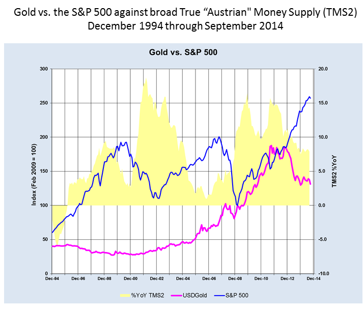
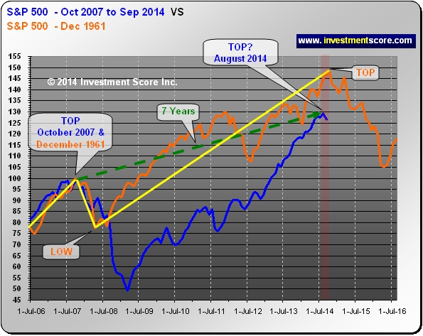
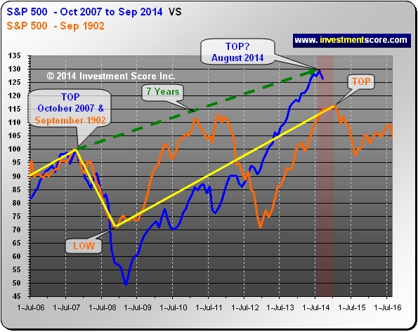
From a duration perspective, is the current uptrend in today’s stock market getting risky? Based on history, should one assume that a correction may be nearing? Our main consideration of the following charts of the S&P 500 is the duration of the turning points.
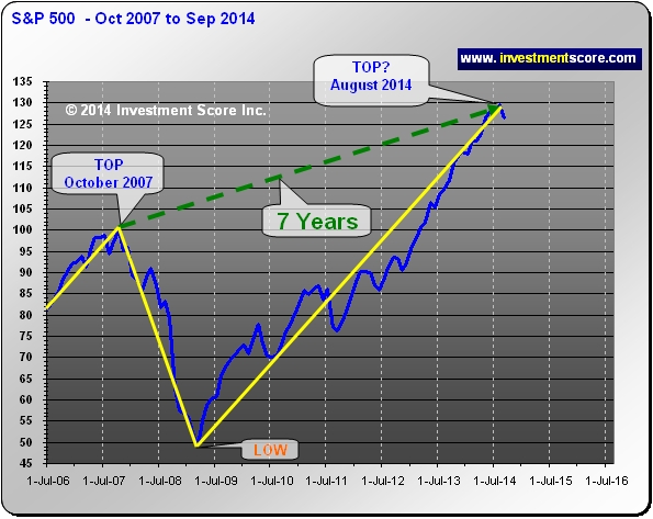
In the next set of charts we took a historical “Top” and the October 2007 “Top” and indexed them to 100 so that we could compare the price action.
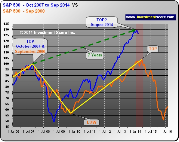
In the above chart, notice the orange line formed a top about seven years from the September 2000 Top. It would appear that this seven year ‘top to top’ cycle is not that uncommon.
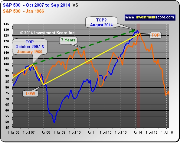
Although the pattern after the 2007 correction and 1966 correction are not identical, the consistent seven year timeframe from peak to peak is important to note in the above chart.
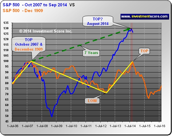
In the above chart the orange line (1909) does not climb nearly as high as the blue line (2007) after advancing to August 2014; however in 1909 (orange line) the United States was tied to a “Gold Standard”, likely resulting in less inflationary effects.
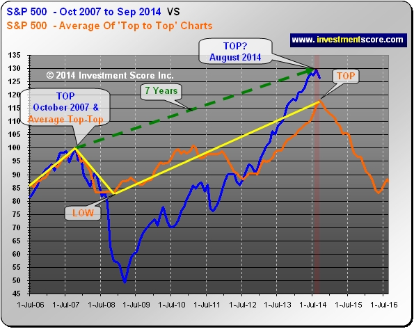
The above chart is an average of the other indexes that illustrates a seven year top to top market formation. Of course it would be easy to find any data point that starts seven years prior to a historical top; the observation that we find fascinating is how actual market tops can regularly occur in seven year intervals.
The following charts are even more fascinating as they outline fourteen years of market action.
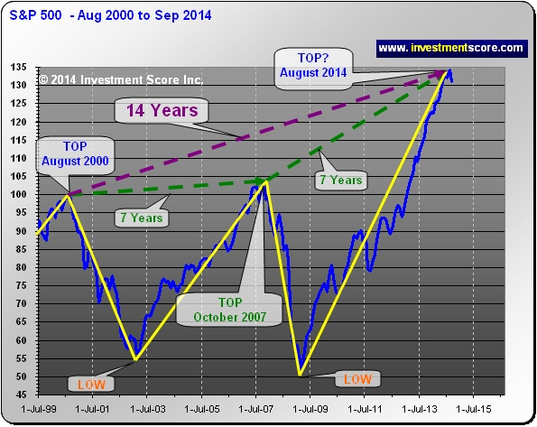
Notice how the August 2000 top has resulted in a seven year correction and advance followed by another potential seven year correction and advance. Fourteen years for any market pattern to repeat even remotely closely seems to be worth noting, and yet we have found a handful of other examples. (1902, 1906 and 1959).

Perhaps if the Gold Standard were still in effect in the United States, the current market action would mimic the 1902 market more closely. Either way, this example of seven year tops is fascinating, and the above charts may be a reasonable indication that a top may be nearing. However, we would like to note that there are always exceptions and nothing “has” to change one way or the other. It may also be possible that the stock market is at the start of spectacular new bull market that will last for many years to come. According to our research and market fundamentals, it is our opinion that a correction may be more likely.
About Investmentscore.com
At investmentscore.com we take a unique look at the market so that we can determine when to average into or out of bull markets. Through our custom built, Scoring and Timing Charts, we offer a one of a kind perspective on the markets.
Our contrarian views help us remain focused on locating undervalued assets based on major macro market moves. Instead of comparing a single market to a continuously moving currency, we directly compare multiple major markets to one another. We expect this direct market to market comparison will help us locate the beginning and end of major bull markets and thereby capitalize on the largest, most profitable trades. We pride ourselves on cutting through the “noise” of popular opinion, media hype, investing myths, standard over used analysis tools and other distractions and try to offer a unique, clear perspective for investing.
Our System for investing is simple and unique. We hope you join us and profit from what we believe is the current commodities mega bull market. To learn more or to sign up for our free newsletter please visit www.investmentscore.com.
To better understand our service and philosophies we recommend you read:
- The Learn More section of this website.
- Our Free Editorials.

-
I know Mike is a very solid investor and respect his opinions very much. So if he says pay attention to this or that - I will.
~ Dale G.
-
I've started managing my own investments so view Michael's site as a one-stop shop from which to get information and perspectives.
~ Dave E.
-
Michael offers easy reading, honest, common sense information that anyone can use in a practical manner.
~ der_al.
-
A sane voice in a scrambled investment world.
~ Ed R.
Inside Edge Pro Contributors

Greg Weldon

Josef Schachter

Tyler Bollhorn

Ryan Irvine

Paul Beattie

Martin Straith

Patrick Ceresna

Mark Leibovit

James Thorne

Victor Adair