Interested in some data that may shed some light on the future direction of both stock as well as bond prices?
An analysis of the relationship between the annual rate of return between long-term treasury bonds and the return of the S&P 500 index during 1999 and 2013 shows a huge inverse relationship over the period.
Specifically, when long-term government bonds have done very well, the S&P has done very poorly, and vice versa. Consistent with this, somewhat average returns for bonds corresponded to near average returns for stocks. Such a strong degree of negative correspondence between stocks and bonds could have only happened by chance one time in a thousand, according to statistics.
Since long-term bonds are doing extremely well this year, if this relationship continues to hold true in 2014, one would expect that by year’s end, stocks may have lost much of their gains this year thus far. Of course, the reverse might happen as well. That is, if stocks continue to do well, it may be bonds that lose much of their gains.
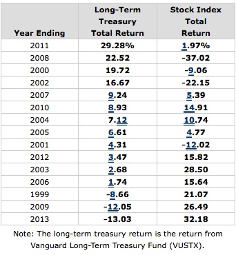
Let’s cite a few examples of this negative relationship. In 2013, a Vanguard bond fund investing in long-term treasuries returned about -13% while the S&P returned over 32%. However, in 2011, while the same bond fund returned over +29%, the stock index returned about only 2%. This high-low, low-high, (and average-average) pattern was generally characteristic of the entire 15 year period with perhaps the only exception occurring in 2001.
Data for the entire period is shown in the following chart which shows the yearly returns for the bond fund from best to worst along with the corresponding return for the Vanguard 500 index fund:
How can you explain these results? And more importantly, do these results perhaps suggest something about where to invest in the future?
During this 15 year period, it appears that whenever investors felt they would get good on-going returns from stocks, they would dump their long-term bonds/bond funds/ETFs. Conversely, whenever it became clear the S&P was likely in a prolonged slump, investors seemed to take refuge in long-term government bonds. The pattern was so strong that whenever stocks were doing well, it could be taken as a highly reliable sign that treasury bonds would do poorly. Likewise, deep drops in stocks could be interpreted as suggesting there would be excellent bond returns.
Consequently, if one believed that it was going to be a bad year for long-term bonds, they could do well by increasing their allocation to stocks. Alternately, a good year thought to be upcoming for such bonds likely meant one might want to reduce their commitment to stocks.
If you plotted the return of stocks at the end of each year from very low (as during bear market years) to very high (as during bull markets) against the return for the bond fund, one would see close to a straight line relationship between low returns in one of these asset categories and high returns in the other, as shown in the accompanying graph, confirming the above correlational data.

If there were no relationship between the two sets of graphed returns, each of the yearly return data points shown would appear more or less in a random fashion on the graph, not in close proximity to the sloping line depicted.
Narrowing down the time frame to just the last 5 years, the strong inverse relationship between stocks and bond returns can also readily be seen in a graph that overlays the ongoing price performance of both of the above two funds. Such a graph, which is updated daily, can be seen here.
As the graph shows, the two lines representing net asset values almost appear to be mirror images of each other; when one goes up, the other goes down.
But if you observe the graph more closely, you will see that since Jan. of this year, unlike the rest of the graph, both lines are not going in opposite directions, but are going up together. What this suggests is that the prior pattern going back to mid-2009 (and even to 1999) may be changing. We’ll return to why this may be the case shortly.
The Relationship Between Bond and Stock Prices Before 1999
It might seem, then, that the relationship between long-term treasury bond prices and stock prices would always run in opposition to each other, making it perhaps relatively easy to forecast stock returns assuming you could correctly anticipate bond returns. But unfortunately, like many other measures that seem to offer an important insight into how to forecast stock prices, or even allocate between stocks and bonds, things that are true over one extended period of time often fail to show the same relationships over other long periods.
The relationship between stock and bond prices offers just such a disparity.
As above, let’s look at a table comparing the same two funds’ total returns for the period 1987 through 1998, again ordered from best annual returns for the bond fund to the worst along with the corresponding returns for the Vanguard 500 index fund:
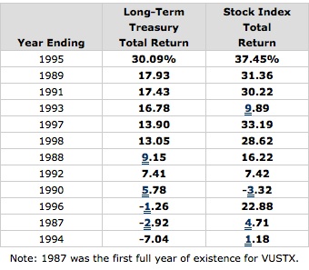
Once again, we can see a strong correspondence between the two sets of funds’ yearly performances, only this time the relationship between the two total returns results nicely line up in a positive wayrather than a negative one. Over the 12 year period, only one or two years proved to be an exception to the rule, mainly in 1996, and perhaps in 1990. In fact, the relationship between the two sets of returns prove to be almost nearly as strong as the 1999 to 2013 results, with such a lined-up occurrence likely to occur merely by chance statistically in only 1 out of 100 cases.
Clearly, it would be helpful to have a more detailed explanation of why these funds’ performances line up at all, but even more so, why in a positive way between 1987 and 1998 but in a negative way from 1999 to 2013.
Why the Change?
I’m not sure anyone knows for sure why the relationship between long-term bond and stock prices changed so drastically over the last 15 years or so from, at a minimum, the prior 12 years. But let’s look at a possible explanation.
Normally, based on historical data, one would expect there to be a positive relationship between bond prices and stock prices. Why? Bond prices are very sensitive to the direction of interest rates and to subsequent inflation which tends to be highly related to this upward or downward direction. When rates are falling (or perceived to be about to soon), long-term bonds should do well. On the other hand, if rising (or perceived to be about to soon), bond performance should start to suffer.
Stock prices are also sensitive to interest rates and by consequence inflation. Stocks, like bonds, usually thrive in a low interest rate environment. Therefore, it would make sense that bonds’ and stocks’ performance should be positively related. This may have been what was happening between 1987 and 1998. That is, in the decade of the 1980s long-term interest rates were much higher as compared to more recently. In 1987, they rose anew but the high yields available helped to offset the following year’s returns. But as they began to fall in earnest starting in 1989 for the following 5 years, both stocks and bonds responded positively. As rates vacillated over the rest of the period, stock and bond prices tended to move as predicted by either rising or falling interest rates.
But starting around 1999, a pattern resembling what has been called “risk on/risk off” emerged. As stock prices became highly volatile and lurching toward extreme outcomes, investors would either embrace risky investments when they sensed that stocks were “the place to be,” or avoid them when their fear level was stoked by turmoil in the markets. Under such conditions, although still sensitive to interest rates and inflation which were both becoming very subdued, rather than keying mainly off interest rates and inflation, they tended to be influenced more by potential gains (as represented by stocks) vs. the desire for safety (as represented by bonds).
The two stock market plunges of the 2000s helped to fan fears, while market bouncebacks, especially over the last 5 years, were accentuated further by the Fed maintaining extremely low interest rates and easy policies which served to push investors out of treasuries and into stocks. This, of course, would have exacerbated the high stocks, low bond pattern. During 2011, however, as long-term interest rates dropped precipitously, investors couldn’t help but seek out the huge returns being generated in longer-term treasuries. Meanwhile, investors worried that deflation, not inflation, would hurt the economy and thus became much more cautious about stocks. Since then longer rates leveled out and subsequently began rising again through the end of 2013.
Another Change Starting in 2014?
But perhaps now over 10 years after the dot-com implosion and five years after the financial crisis, investors have begun to sense that things are finally getting back to normal. With some sense of stability returning, encouraged by the notion that the extremely easy credit conditions offered by the Federal Reserve will start to be withdrawn, investors can start focusing again on the fundamentals of interest rates and inflation as important gauges of both future stock and bond prices.
With inflation, and especially, interest rates remaining at rock bottom levels, investors are right now attracted to both stocks and long-term bonds and no longer are the two types of investments pitted so much against each other. So long as rates and inflation expectations remain this low, bonds and stocks may continue to thrive together.
But what happens when the inevitable does happen? The Fed will almost certainly start raising rates some time next year. The chances are increased that a rise in inflation is also in the wings which will certainly be one of the reasons the Fed will choose to act.
Under such conditions, bond prices are likely to react negatively. If stock investors perceive that interest rates, and especially inflation, are likely to move up faster than anticipated, they may use this occasion as a reason to take money out of the stock market, particularly in light of the extreme profits many have enjoyed and the fact that many authorities concur with my view that stocks are, by most reckoning, highly overvalued.
On the other hand, stocks might possibly continue to rise due to the assessment that rates and inflation remain well below average and economic growth prospects remain good. And if so, long-term bond prices although not likely short-term ones, could continue to do well until such time that interest rates and inflation expectations jump significantly higher than they are now.
However, I feel that the most likely scenario is that with the principle of risk on/risk off no longer in play, stocks and bonds will continue the “new” relationship that they have reverted to starting this year. That is, the correlation between stocks and bonds will likely remain positive. (This “new” relationship corresponds much more to the long-term history of the relationship between stock and bond prices prior to the data included in this article.)
This would mean that we have now re-entered the pre-1999 phase in the relationship between stocks and bonds. Thus, when bond prices start to move down, as they very likely will in response to rising interest rates and inflation, so will stock prices.
About Tom Madell
Mutual Fund Research Newsletter is a free newsletter which began publication in 1999. It has become one of the most popular mutual fund newsletters on the Internet, as shown on the Alexa.com “Top Sites” page for Mutual Funds News and Media Newsletter websites. Tom Madell, the Publisher, is a researcher/writer whose investing articles have appeared on hundreds of websites, including the Wall Street Journal and USA Today, and in the international media.