
Timing & trends
 You don’t need to be a professional investor to appreciate that the S&P 500 chart below has extreme danger written all over it, and yet the VIX fear index trades at close to a record low. That means it is still very cheap to buy downside insurance against a crash in the stock market from these elevated levels.
Many professional investors are starting to do that now by shorting the SPY exchange traded fund for the S&P 500 using options (click here). This is more efficient than using one of the widely criticised inverse ETFs that reset daily and amplify losses faster than gains.
…continue reading & view large charts HERE

Eventually, every finance geek learns that calling market tops — at least publicly — is so hard that it’s not worth the reputation risk. This is especially true in an era of pervasive government manipulation, where price distortions can persist for far longer than any kind of rational analysis can justify.
And yet. For US stocks — and by implication most other equity markets — the danger signals are piling up to the point where a case can be made that the end is, at last, near. To take just a few examples of indicators that should scare the hell out of anyone with a big stock portfolio:
Margin debt has peaked
In good times, optimistic investors tend to borrow money against their stocks to buy more stocks. This “buying on margin” generally goes hand in hand with rising share prices, and tends to peak and then decline just before the markets turn down. As the following chart illustrates, margin debt hit a record in January, turned down in February, and is now falling hard.

Interest rates are plunging
Rising interest rates are generally seen as a sign of a growing economy in which the demand for money is strong. Falling rates point to the opposite. Since equities are valued on future cash flows which in turn depend on future growth, falling interest rates are generally associated with weak equity markets. From Wall Street On Parade:
Is the Market Crazy? Treasurys Are Screaming Crisis While Stocks Yawn
The U.S. Treasury market, which is experiencing a flight to safety (that suggests a slowing economy, lower corporate earnings and thus a lower stock market in the future) is essentially saying that the current composite wisdom of the stock market is either nuts or the market is, indeed, rigged.
Stocks have been setting new highs of late while the yields on the benchmark 10-year and 30-year Treasurys decline. The 10-year Treasury began the year at a yield of approximately 3 percent and closed on Friday at a yield of 2.49. The 30-year Treasury started the year at a yield of approximately 4 percent and closed last week with a yield of 3.33 percent.
Market breadth is contracting
In a healthy bull market most stocks move up. This indicator — the percentage of stocks that rise along with the overall market — is known as market breadth, and lately it has turned highly negative. From the above Wall Street On Parade article:
Joseph Ciolli and Lu Wang of Bloomberg News report today that only “1.8 billion shares traded each day in S&P 500 companies last month, the fewest since 2008.” Equally worrying, say the reporters, is that when the S&P 500 index “hit an all-time high on May 23, only about 20 of its 500 companies reached 52-week highs…”
A market index setting new highs while only 20 of its 500 components set new highs, i.e. less than 5 percent, is sounding the same alarm bell as the bond market. The rising tide is not lifting all boats or to put it in Wall Street parlance, this is decidedly weak breadth.
The velocity of money is still plunging
This is an measure of how many times a typical dollar is spent in a given time period. Theoretically, in an optimistic, growing economy, dollars are spent frequently and therefore the velocity of money is high, while in a shrinking economy worried citizens tend to hoard their cash, resulting in a low money velocity. The following chart definitely paints the latter picture, though it has admittedly done so since the 1990s. The question today is whether there’s a point at which all the new dollars being pumped into the system fail to offset consumers’ reluctance to spend their dollars, and where that point might be. The answer is unclear, but the chart still looks ominous.

Now, do these and the many other bear market signals mean the current run is over? Not necessarily, because such indicators apply to normal markets, which this one clearly is not. The world’s governments are actively trying to inflate asset bubbles to make the average person feel rich enough to start spending again (thus sending the velocity of money back up to more traditional levels), and their effectively-unlimited printing presses give them plenty of ammunition. The European Central Bank, for instance is about to start monetizing eurozone debt on a scale that, if it’s to have an appreciable effect, will be huge. China is easing bank lending standards and talking about other stimulus measures, while Japan’s central bank is buying bonds and encouraging the national pension plan to start buying riskier assets.
One could make the case that the financial markets are responding rationally to the prospect of trillions of new dollars looking for a home in stocks and bonds (and high-end real estate and fine art and the other preferred assets of the 1%). But the case can also be made that all of this manipulation hasn’t really affected fundamentals and that more of the same is unlikely to make much of a difference.
What we’re witnessing, in short, is a truly fascinating attempt by the world’s major governments to suspend the laws that have, thus far in human history, governed economics. And the signs of their imminent failure are spreading.

As the stock market continues to trade around all-time record highs, today’s chart provides some perspective by illustrating the inflation-adjusted Dow since 1900 — there are several points of interest. For one, while most major US stock market indices trade well within record territory (e.g. the Dow is currently trading 45% above its 1999 peak), when adjusted for inflation, the story changes. For example, the inflation-adjusted Dow trades only 3.2% above its 1999 all-time, inflation-adjusted record high. On a positive note, the inflation-adjusted Dow has just punched through the 16,000 level — a level at which the Dow put in major peaks on its previous two attempts back in 1999 and 2007.

Notes:
Where’s the Dow headed? The answer may surprise you. Find out right now with the exclusive & Barron’s recommended charts of Chart of the Day Plus.
Quote of the Day
“Fish see the bait, but not the hook; men see the profit, but not the peril.” – Chinese Proverb
Events of the Day
June 07, 2014 – Belmont Stakes
June 09, 2014 – US Open golf tournament begins (ends June 15th)
June 14, 2014 – Flag Day
June 15, 2014 – Father’s Day
Stocks of the Day
— Find out which stocks investors are focused on with the most active stocks today.
— Which stocks are making big money? Find out with the biggest stock gainers today.
— What are the largest companies? Find out with the largest companies by market cap.
— Which stocks are the biggest dividend payers? Find out with the highest dividend paying stocks.
— You can also quickly review the performance, dividend yield and market capitalization for each of the Dow Jones Industrial Average Companies as well as for each of the S&P 500 Companies.
SUBSCRIBE FOR FREE HERE
The newest publication from Global Gold Switzerland “The Clean Slate” focuses on the theory and practice of economic cycles. In just 12 pages (download pdf), the “Austrian Business Cycle Theory” (ABCT) is explained in a simple and accessible way. Subscribe here to receive similar updates in the future via e-mail.
The key of the ABCT is that economies operate in cycles, they go through ‘booms’ and ‘busts’, ‘expansions’ and ‘recessions.’ A ‘crisis’ should not come as a surprise. Austrian School economists argue that central banks don’t help in smoothing the amplitude of the cycles, but are actually the root cause of the business cycle. While some may view that the expansionary monetary policy can mitigate the adverse effects of a crisis, the Austrian School begs to differ.
The paper does an outstanding job in explaining the ABCT and applying it on the major business cycles of the modern US economy. It also answers the question whether we have seen the end of the current crisis (“bust”). Although Barack Obama believes that “we have cleared away the rubble from the financial crisis and begun to lay a new foundation for stronger, more durable economic growth”, this report will tell you otherwise.
The Austrian Business Cycle Theory
Mises and Hayek believed that business cycles are a direct cause of excessive credit flow into the market, which is facilitated by an intentionally low interest rate set by the government. The supply of credit gives the false impression that money originally saved for investment has increased. By doing so, banks mislead borrowers into believing that the pool of investible funds is bigger, and therefore they tend to do what entrepreneurs do: invest in larger production facilities or projects they originally could not afford to finance. These investments bear what economists describe as a “longer process of production”, or capital good industries that stimulate a shift of investment away from consumer goods. This shift is unsustainable, and eventually a correction ensues. The reason is that you have a market that is out of balance and falsely directed to a level of investments that is far from reality. In other words, the state has instigated unsustainable growth.

What happens when the central bank comes in and artificially lowers the interest rate? To explain we take a look at the chart below prepared by Roger Garrison. In this chart, which relies on the Hayekian triangle depicting the different stages of production, Garrison illustrates how a change in the economy’s money supply affects its structure of production. The curve of the Production Possibility Frontier (PPF) shows different combinations of consumption and investment for any given economy (chart on the top right). Any point on the PPF curve is a sustainable mix between consumption and investment (savings).
There are three main scenarios:
- In a pro-savings economy: Investments go up, encouraged by a drop in interest rates. This point on the PPF corresponding to this lower interest rate shows that the economy directs its investments to earlier stages of production. As a result, the triangle expands horizontally.
- In a pro-consumption economy: Savings and investments (discouraged by the rise in interest rates) decrease. As a result, the triangle becomes shorter from the horizontal axis as investments go to lower order consumer goods.
- In the case of a policy-induced credit expansion: This scenario is depicted in the graph as Saug.Here we have two opposing factors at play as a result of the drop in interest rate. As it appears in the graph, the new interest rate encourages both an increase in investment as well as discouraging savings. The low interest rate intersects with both S (the real supply of money by savers given that low interest rate) and Saug (the supply induced by the central bank). These are basically the “mixed signals” we were talking about earlier. Both points are located on the PPF, but meet outside the curve, implying this level is neither efficient nor sustainable.

Who is behind the boom and hence responsible for the bust?
According to the ABCT and the Austrians, it all starts with the primary engineer of the cycle: the government. Any form of state intervention is an attempt to influence markets to prolong the process of needed adjustment and reallocation of resources to more productive uses. Therefore, by manipulating interest rates, governments negatively impact the economy as creators of the growth bubble– which in essence is artificial, distorted and imbalanced.
The illusion behind the boom
The illusion lies in the misallocation of investments or ‘malinvestment’, using Mises’ terminology. This mismanagement involves two concepts: “time preference” and “forced savings”. We recommend readers to go through the explanation of these concepts in the paper (embedded at the bottom). But for now, we highlight the following: It is a play on consumer behavior: Present consumption carries more value to individuals than future consumption. When interest rates are intentionally lowered, consumers are misled to thinking more money is available, and ready to be spent – when in fact their purchasing power, as per forced saving, has weakened. In this inflationary environment, everything is an illusion. Everything has become more expensive, whether wages, commodities, services, even assets and real estate.

From boom to bust
Because the thrust of ABCT is that credit inflation is a distortion and illusion of what is actually available to support current production and consumption levels – a correction is inevitable. Mises warned, however, the longer the state of malinvestment continues, the longer and more aggressive the correction becomes. This is when everything goes down; it is a reversal of the inflationary pick up during the boom. These funds that will be accumulated will then go to future investments rather than consumption and in turn will increase the supply of goods in the future available for consumption.
So, what is the way out?
According to Mises, there is no way out of this and no way to fix this except by going through the correction process, as the economy will be undoing what caused this situation altogether.
Empirical evidence and where we are in the current cycle
Critics suggest that the lack of empirical evidence reflects the lack of explanatory power of the Austrian theory. However, many believe that the ABCT best serves to illustrate the real cause behind the boom and bust cycles of the past. One of these economists was Murray Rothbard, who traced the historical evidence of the Great Depression . In addition to the Great Depression, this paper explores the recession of 1990, the dot-com bust, and the subprime mortgage crisis. Each of these examples, we find, provide interesting perspectives and underline the validity of the ABCT.
Readers are recommended to read the analysis of the aforementioned cases in the paper, which is embedded at the bottom. In this article, we pick out the current cycle.
Since the 2007/08 global financial crisis we have seen government intervention at its peak trying to save the day. The current policy is considered the largest monetary policy actions seen in world history. We cannot really pin point our position in the cycle, but as we stated earlier in this paper, if it weren’t for state intervention in 2007/08, the correction would have been hard but short. Whether with bailouts, expansionary monetary policies, stimulus programs… the names differ but they all offer the same “temporary fix”: inject more cash into the system. The Austrian School further suggests that current governments will not reverse the situation, but rather resort to further inflationary and expansionary credit policies as damage control measures. After the collapse of Lehman Brothers and other financial institutions, we were on the verge of a bust, had it not been for the stimulus packages of US and European central banks – to postpone hitting rock bottom.
To give you a rough indication where we think we are in this cycle we would like to refer to the image below by Ray Dalio. Three lines are visible in this chart. The straight line indicates GDP growth over time if there where no credit induced growth. The other two lines show the business cycles (or debt cycles as Dalio calls them): one depicts short-term cycles and the other the long term trend. We believe that the recessions mentioned above all fall into the category of short-term variations (cycles).

Since 1971, when Nixon closed the Gold Window, we believe that we are in a booming phase in the long-term economic cycle. We believe we are reaching the top (boom phase) of this long-term cycle, meaning we are slowly but surely approaching a devastating bust. Pin pointing the tipping point is impossible in our view! This cycle has started over 40 years ago and can easily continue for years to come. Looking at where we stand on a short-term cycle basis, we think that we are approaching a top as well (possibly not the last one, before the devastating bust). We expect a sharp correction in the US economy and stock markets in the next 2-3 years. We consider the 1990 recession, the dot-com bubble and the financial crisis, which we discussed in this paper as busts of short-term cycles.
Concluding remarks
The ABCT teaches us that the government, or the central bank, is largely responsible for the boom-and-bust cycles we encounter on a regular basis. Contrary to the belief that the expansionary monetary policy through QE mitigates some of the adverse effects of the crisis, the ABCT says there is no way out. If you want to rectify the situation, you have to endure the correction process and allow the market to readjust itself.
Global Gold offers some preserving wealth tactics for down-to-earth investors:
Diversify your portfolio NOW
The risk of a bust that is unprecedented in both scope and scale is worth consideration. Even the ABCT says it is impossible to predict when the bust will happen. Timing is of the essence! We, therefore, believe that those unprepared will be the most affected. We find that a prudent portfolio structure and diversification is critical, along with appropriate risk mechanisms.
Beware of asset pricing distortions
There are numerous investment options to choose from, and one should take advantage of good opportunities when they arise. However, the manipulation of interest rates has led to substantial “illusions” and dangerous misallocations. Projects that would be considered unattractive at higher interest rates appear very attractive when interest rates are close to zero. When evaluating investments, we believe it is wise to always take this into consideration. In general, the lower the interest rates, the higher the asset prices!
Hold a part of your wealth in gold as your insurance – it’s essential
When the kind of “bust” described above eventually arrives, we consider gold a precious counter-balance to other asset classes. Holding a scarce asset with absolutely no counterparty risk affords investors a “hedge” against a crisis!
It is possible that our current monetary experiment, called QE, will end in a currency reform or hyperinflation instead of a bust. But even under such a scenario, gold and silver offer the protection needed. Gold, in particular, will remain the purest form of monetary insurance and the purest real asset which offers protection in a crisis scenario, but only if it is held physically, outside the banking system, in a jurisdiction which respects property rights.
Read the full paper: download the paper (pdf format) on the Global Gold website.
Subscribe here to receive similar updates in the future via e-mail.
“Mid-June is seasonally one of the weaker times of the year for stocks as investors begin to take summer vacations, leading to a drop in equity volumes and a rise in volatility.”
Upcoming US Events for Today:
- Chain Store Sales for May will be released throughout the day.
- Weekly Jobless Claims will be released at 8:30am. The market expects Initial Claims to show 310K versus 300K previous.
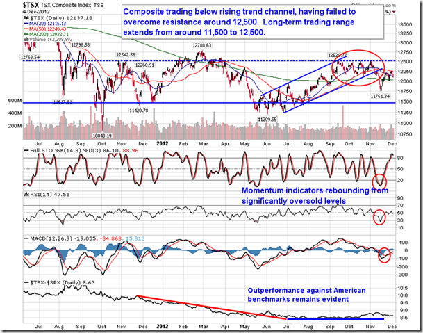
The quote above is reflected in the TSE seasonality chart below, part of a comprehensive report that also identifies periods of reoccurring strength in the S&P 500, Sector & individual stock analysis. Read & view the report in full HERE – Editor Money Talks


-
I know Mike is a very solid investor and respect his opinions very much. So if he says pay attention to this or that - I will.
~ Dale G.
-
I've started managing my own investments so view Michael's site as a one-stop shop from which to get information and perspectives.
~ Dave E.
-
Michael offers easy reading, honest, common sense information that anyone can use in a practical manner.
~ der_al.
-
A sane voice in a scrambled investment world.
~ Ed R.
Inside Edge Pro Contributors

Greg Weldon

Josef Schachter

Tyler Bollhorn

Ryan Irvine

Paul Beattie

Martin Straith

Patrick Ceresna

Mark Leibovit

James Thorne

Victor Adair