(Ed Note: Be sure to scroll down below this first article)
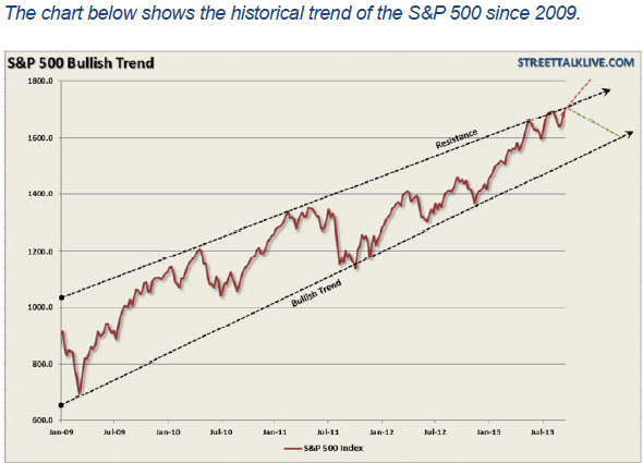
Almost everything is at record highs right now. Dow is above 16,000. S&P is above 1800. All of the S&P Sectors are higher year-to-date with Health Care being the strongest (+40.3%) and Utilities being the weakest (+13.9%). Is it exuberance? It is a bubble? As technical investors, we shouldn’t care. We identify and ride trends – and the current trend is up.
Check out John, Arthur, Greg, Carl, Tom and Richard’s articles below for more on the current state of the market. I, on the other hand, want to tell you about our latest new feature!
Tis the Season… for Seasonality Charts!
Some stocks work like clockwork. At a certain point each year, their business picks up and their stock perks up. Many of these stocks are tied to the retail holiday season. Others are tied to people’s heating/cooling needs. Others are tied to the planting cycle. Etc. etc. etc.
Finding and analyzing these seasonal situations requires a new kind of chart – one that overlays each year’s performance for a stock so that monthly up/down patterns can be seen. A chart like this:
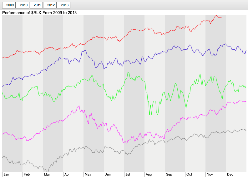
This is a snapshot from our new Interactive Seasonality Charting tool. Each line represents a different year of $RLX’s values. The grey background shading shows you the divisions for each month of the year. Do you notice any months where things are moving higher/lower consistantly? Check out March and April.
Did you know that every year for the past five years, the Retail Index has moved higher in March and April? That’s pretty useful to know!
The Seasonality Charting tool lets you look at this kind of data in three different ways:
- “Separate” Line Mode – Each year is represented by a different colored line and the lines are separated vertically on the chart. This is the default mode for the tool.
- “Same Scale” Line Mode – Each year is represented by a different colored line but the lines are start at the same point and use the same vertical scale.
- “Histogram” Mode – Each month is represented by a histogram bar that shows the percentage of times the stock moved higher (and the average move).
You can use the buttons in the lower left corner of the chart to switch between those three modes. Here is an example of Histogram Mode for $RLX:
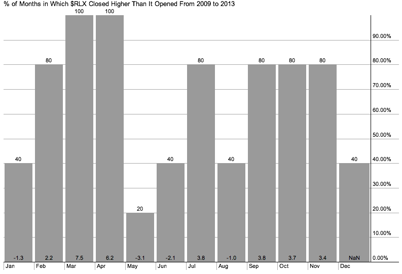
Boy, March and April really stand out. (So does May, but for a different reason. Interesting…)
Histogram mode also allows you to enter a second, optional “Comparison” ticker symbol so that you can see how your main ticker symbol did compared to that second symbol. Much of the time, that second symbol will be an index like $SPX (the S&P 500).
There’s also a slider at the bottom of the charts that works just like the slider in our popular PerfCharts tool. You can use it to select the number of years you’d like to compare. You can also click on the “Year” buttons at the top of the chart to turn off a year that might be skewing your analysis.
For now, you’ll find a links to our Seasonality Charts on our homepage in the “What’s New” area and on the “Free Charts” page. Soon, we’ll also have it linked in to the “Create a Chart” dropdown at the top of every page.
So now you have the gift of Seasonality for this upcoming Holiday Season. Enjoy!
– Chip
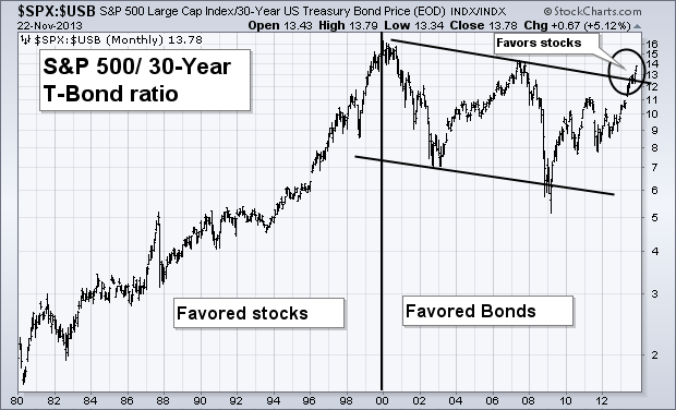
There’s a positive side effect to rising bond yields. When bond yields rise, bond prices fall. When bond prices fall, investors start moving money into stocks. That sequence supports the view that higher bond yields are already causing a generational shift in favor of stocks. Chart 1 plots a “ratio” of the S&P 500 divided by the price of the 30-Year T-bond. [A ratio is created by inserting a colon (:) between the two symbols ($SPX:$USB)]. The rising ratio between 1980 and 2000 favored stocks over bonds. The last decade favored bonds over stocks. Until now. The ratio actually bottomed during 2009. To the upper right, however, you can the stock/bond ratio exceeding its upper “channel line” drawn over its 2000/2007 (circle). That suggests that a generational shift is taking place in favor of stocks over bonds. In other words, the “great rotation” out of bonds and into stocks is well underway.
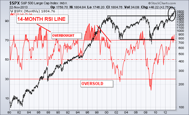
OVERBOUGHT READINGS IN A SECULAR BULL AREN’T AS RELIABLE… Momentum oscillators tell us whether the stock market is overbought or oversold. But they have to be kept in perspective. During a secular bull market (a long term uptrend), the market can stay overbought for long periods of time. Chart 2 applies the 14-month RSI (red) line to the S&P 500 since 1980. The market reached overbought territory several times during the secular bull market between 1982 and 2000 and stayed there for years. The RSI line remained overbought during 1985 and 1986 as the market rose. During 1987, a major “negative divergence” in the RSI line (falling trendline) warned of a dangerous market condition which led to major stock selloff. [A negative divergence is present when the oscillator forms lower peaks while stocks are rising]. The RSI line also stayed overbought between 1995 and 1999 as the market rose. It took another major “negative divergence” during 2000 (falling trendline) to warn of a possible market top. During a secular bear market, which began in 2000, oscillators become more useful. Major oversold conditions in the RSI (below 30) during 2002 and early 2009 suggested major market bottoms. An overbought reading during 2007 led to a major market collapse. The circle to the upper right, however, shows the S&P 500 breaking out of its decade-long trading range which signals the start of a new secular bull market in stocks. In that environment, overbought oscillator readings are less relevant. First of all, the current RSI reading (while overbought) is still well below overbought levels reached during 2007, the late 1990s, and 1987. Secondly, there’s no sign of a negative divergence. That doesn’t mean that the market is immune from a downside correction (which is more likely during 2014 than this year). It does means, however, that overbought readings are less meaningful in a secular bull market. In a secular bull market (like the one we’re currently in), the stock market can get overbought and stay there for a long time.
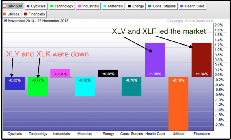
Three of the nine sector SPDRs hit new highs this week with the Finance SPDR (XLF) leading the way. The Energy SPDR (XLE) and the Healthcare SPDR (XLV) also recorded new highs. Even though XLF has been underperforming the S&P 500 since summer, this key sector is showing new signs of life since the flag breakout in early November. Note that XLF was the second best performing SPDR over the past week and over the last four weeks. XLV gets top honors as strength in pharmaceuticals, hospitals and healthcare providers lifted this sector. Admittedly though, offensive sector performance was not that great this week because the Consumer Discretionary SPDR (XLY) and Technology SPDR (XLK) actually fell and did not partake in Dow 16000. Looks like the finance, industrials and healthcare sectors are carrying the torch for the bulls.
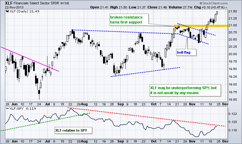
Turning to the XLF price chart, the ETF broke flag resistance with a big move two weeks ago (8-Nov). After a few days of backing and filling, the advance resumed as XLF moved to new highs. Broken resistance in the 21 area turns into first support. The indicator window shows the price relative, which measures the performance of XLF relative to SPY. Even though XLF has underperformed SPY since the July, it is not that weak because the ETF scored a fresh 52-week high this week. As one of three sector SPDRs to score 52-week highs, XLF is showing “chart” strength and leading the market in this regard.
Good Trading and Good Weekend!
Arthur Hill CMT
IS CRUDE OIL READY TO RALLY
by Greg Schnell | The Canadian Technician
Crude oil has had a huge setback. It has fallen below all of the common moving averages.
Is it ready for a bounce? Here is why I think it will retest the $100 level soon.
For the live link to the chart. $WTIC

Notice the uptrend line on crude oil off the 2012 lows. This blue line sloping upwards has been a support for the last year and a half and we would look for crude to get a bounce. The 92.5 level is also significant as the May June and July 2013 lows continually tested there. $WTIC was supported there for three months in a row. If you look up to the 98.5 dollar level you will notice the firm resistance at that level all the way through 2012 and 2013 before finally breaking out in the summer of 2013. That resistance level will probably be retested as the 40 Week moving average and the 10 week moving average look ready to meet there as crude retests this from the bottom side. That decision point will be a major decision for technicians. If crude oil fails at the 40 WMA, I would expect a significant move down to the $85 level next. This would create a downtrending 40 WMA which is not good news. Should crude bounce off this 92.5 level and push back through the moving averages, that should be a bull train getting on board for. So I would expect crude to get a bounce here and watch closely up above for resistance.
Good Trading,
Greg Schnell, CMT
STOCKS OVERVALUED BUT NO BUBBLE
by Carl Swenlin | DecisionPoint.com
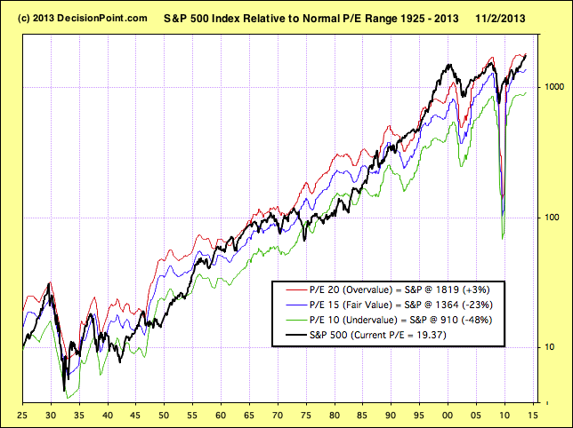
As usual we are hearing many claims regarding market valuation, mostly that stocks are undervalued based upon future earnings projections. We are also seeing a lot of headlines about stocks being in a bubble. Using twelve-month trailing earnings for the S&P 500 Index, we find that stocks are overvalued, but not in a bubble.
The chart below shows the S&P 500 Index (black line) in relation to its normal P/E range. A P/E of 10 isundervalue, a P/E of 20 is overvalue, and a P/E of 15 is considered to be fair value. The chart is very long-term, beginning in the 1920s, and we can see that prices are generally contained within the undervalue/overvalue range, but they do occasionally move outside the range, presenting rare opportunities or periods of grave danger. The unusual down spike in 2009 is the result of Q4 2009 earnings being hammered by the financial crisis, when companies took the opportunity to clean up their balance sheets with the intent of improving future earnings.
Currently we see that prices have reached the top of the range and are therefore overvalued. While prices don’t always turn down when they reach these levels, there is no question that stocks are clearly vulnerable to a corrective decline based upon valuation and historical performance. Are they in a bubble? Not based upon what we see on this chart. In 2000 prices were well above the normal range (with a P/E of 45!). Now that’s a bubble.
All that is not to say that underlying problems are absent. It is true that prices are merely overvalued, but many assert that prices are being maintained artificially by the Fed’s ongoing QE operations. I strongly recommend that you read Tom McClellan’s latest article which contains a very compelling chart linking the current bull market to the Fed’s efforts.
Conclusion: Based upon valuations alone, stock prices are vulnerable to correction or bear market, and the probability for QE tapering provides the trigger for beginning that decline.
by Tom Bowley | InvestEd Central
I rarely question a market move to the upside when banks are leading the charge. And if you’re wondering how the banks performed last week as the S&P 500 broke to a fresh all-time high, check out the Dow Jones US Bank Index chart:
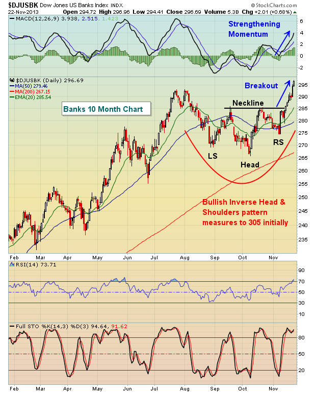
Banks consolidated since late summer while money rotated to other areas of the market, like industrials. Over just the past three months, industrials have outperformed financials, gaining 12.1% while financials have risen just 7.6%. Banks have been even weaker, rising just above 5.0% over the past three months. But technically, that all changed over the past couple weeks. Banks, while underperforming, had been consolidating in a very bullish inverse head & shoulders continuation pattern. That pattern broke to the upside – as expected – and suggests this current rally has further to run.
In addition, the small cap Russell 2000 index had lagged for the past several weeks. But surprisingly, just as the Fed minutes were released on Wednesday, and tapering was back on the table, small caps began outperforming. From Wednesday’s low through Friday’s close, our major indices performed as follows:
Russell 2000: +2.60%
NASDAQ: +2.05%
S&P 500: +1.55%
Dow Jones: +1.26%
2-3 days do not constitute a trend, but it’s at least suggests the possibility that traders have moved back to a “risk on” mode, a mode that generally accompanies sustainable market advances. Given the release of the Fed minutes showing that tapering is back on the table, this is not the response I would have expected from the market. If anything, this is suggesting that the ultimate tapering may not have the negative impact that many are expecting. After all, if the Fed’s candy store (quantitative easing) helped lead the equity markets higher, it only makes sense that closing the candy store will have the opposite effect, right? Well, maybe not. Improving economic conditions may trump the ultimate tapering of asset purchases. And money flowing into riskier asset classes is all the proof I need – at least until it changes.
One last thing. The Russell 2000 closed at an all-time high on Friday after lagging its larger counterparts since early- to mid-October. This breakout is occurring just as we approach December, the strongest month historically for small caps since 1988. The average annualized return for the Russell 2000 during the month of December over the past 25 years is 43.25%, more than double any other calendar month.
That leads me to feature one small cap stock as my Chart of the Day for Monday, November 25th. It recently posted quarterly earnings that handily beat both top line and bottom line Wall Street estimates. That earnings report resulted in a powerful, breakaway gap on massive volume that could result in significant gains in the weeks ahead. If you’d like more information, CLICK HERE
by Richard Rhodes | The Rhodes Report
With the equity markets hitting all-time highs in many cases, we think it prudent to look around the world and determine if there are any better risk-reward countries into which one can invest or park money for the long-term. To this end, we believe that the multi-decade decline of Japan’s NIKKEI versus the US’s SPX has come to an end, and a multi-year bull market has begun.
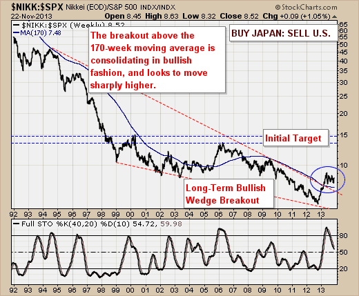
Our reasoning is technically simple: a bullish wedge breakout has occurred in tandem with a breakout of the long-term 170-week moving average. Moreover, this breakout is consolidating in sideways fashion – which we deem to be bullish. And over time, we expect the NIKKEI to outperform SPX by roughly +50% as the ratio above moves from 8.5 to resistance at 15.
Now, this isn’t a short to move to be sure, but one that has merit over many years. Adjust accordingly. And may everyone enjoy as Happy Thanksgiving!
Good luck and good trading,
Richard
Recent StockCharts Articles You Might Have Missed
|
|
|