After 12 years of gains, gold has fallen nearly 20% this year. The price of gold has been pressured for much of this year by the view that the Fed would end its stimulus program soon because of strength in the U.S. economy. However, some recent (weaker than expected) economic data, along with the 16-day U.S. government shutdown, have suggested that the central bank may keep its bond purchase in place for longer and increased gold’s safe-haven appeal.
What impact did these circumstances have on the yellow metal?
In less than two weeks, gold has rallied 8% (nearly $100 an ounce) and it seems that the shiny metal will end higher for a second straight week.
On Thursday, the price of gold climbed to a one-month high after preliminary data showed that U.S. manufacturing activity fell to a 12-month low of 51.1 in October from a reading of 52.8 in September. Additionally analysts had expected U.S. jobless claims to fall by 22,000 to 340,000 last week. Meanwhile, a separate report from the U.S. Department of Labor showed that the number of individuals filing for initial jobless benefits declined by 12,000 last week to a seasonally adjusted 350,000. The above (weaker than expected) numbers raised expectations for continued easy-money policies from the Federal Reserve.
Taking into account the fact that yesterday gold reached its highest level since Sept. 20., the big question is: will it keep rallying?
Today, we’ll examine the US Dollar Index from many perspectives and take a look at the long-term S&P 500 chart to see if there’s anything on the horizon that could drive gold prices higher or lower in the near future. We’ll start with the long-term USD Index chart (charts courtesy by http://stockcharts.com)
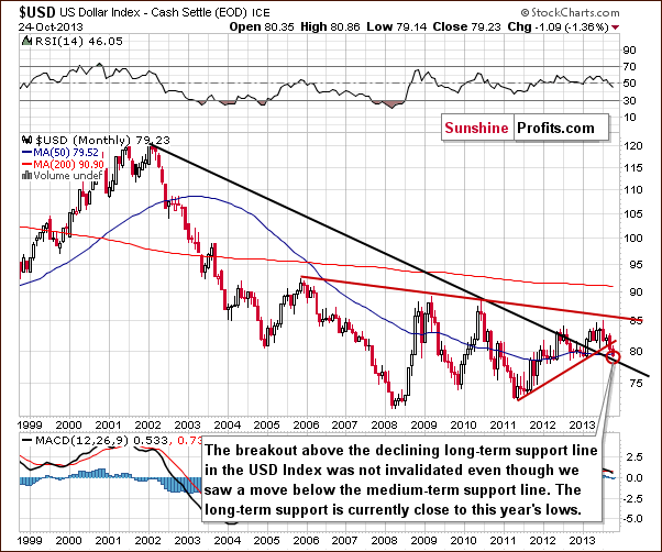
The situation in the long-term chart hasn’t changed much recently. The long-term breakout above the declining long-term support line was not invalidated. Therefore, even if we see further deterioration in the USD Index it will still remain in an uptrend in the long-term. From this perspective, it seems that the downward move will be quite limited because the long-term support line will likely stop the decline.
Now, let’s examine the weekly chart.
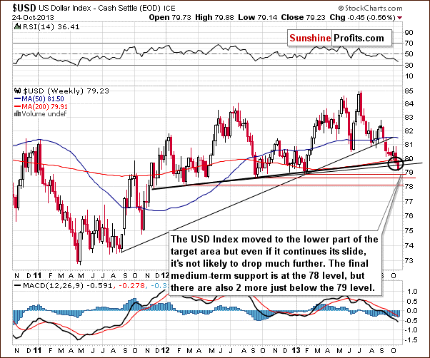
On the above chart, we see that the USD Index broke below the medium-term support line based on the February 2012, September 2012 and January 2013 lows (a bold black line) and reached the lower part of the target area. Additionally, the dollar slipped below the medium-term line based on the September 2012 and the January 2013 lows. In spite of this drop, the next support zone is quite close – slightly below the 79 level. From this perspective, it seems that the USD Index will not drop much further. Even if we see another downward move, the dollar will remain above the final medium-term support at the 78 level.
Naturally, what’s small on a long- or medium-term chart can be quite a visible move on the short-term chart. Let’s check the short-term outlook.
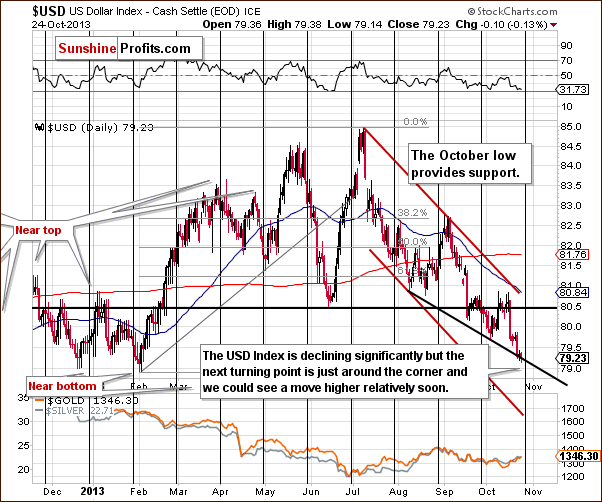
On the daily chart, we see that the USD Index broke below the previous October’s low and reached the short-term support line based on the August 8 and the October 3 lows.
As can be seen on the above chart, there is a cyclical turning point just around the corner. Therefore, we could see a reversal of the current bearish tendency in coming weeks. This can lead to a bigger pullback, especially when we take into account the fact that the USD Index remains in a short-term downtrend. On the other hand, let’s also keep in mind that the cyclical turning points work on a “near to” basis, so the bottom could be a week away and it would still be in tune with those indications. Given the current momentum, one week of declines could mean visibly lower USD values.
Summing up, the outlook for the USD Index is a bit unclear on the short-term basis (with a bearish bias), but it’s bullish on a medium-term basis. The short-term implications for the precious metals market are mildly bullish and bearish in the medium term.
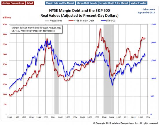
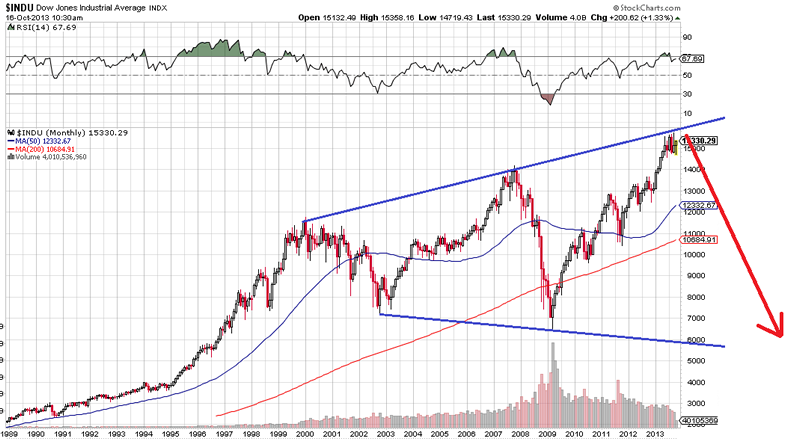
Having discussed the current situation in the U.S currency, let’s now move on to the general stock market and try to find out what kind of impact stocks can have on gold’s future price.
Click HERE or on image for larger view
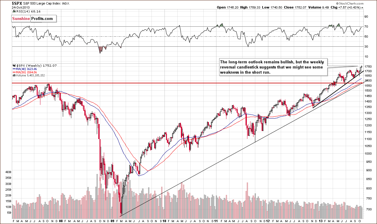
Looking at the above chart, we see that the situation hasn’t changed much recently as far as medium-term trends are concerned – the medium-term trend remains bullish. Earlier this week, stocks moved higher, but they erased gains in the following days and reached levels that we saw at the beginning of the week. In this way stocks formed a bearish gravestone candlestick pattern. Therefore we might see some weakness in the short term.
Taking into account the fact that the S&P 500 is up 23% so far this year, investors are probably wondering what’s next? Can the True Seasonal patterns give us any clues? Let’s check.
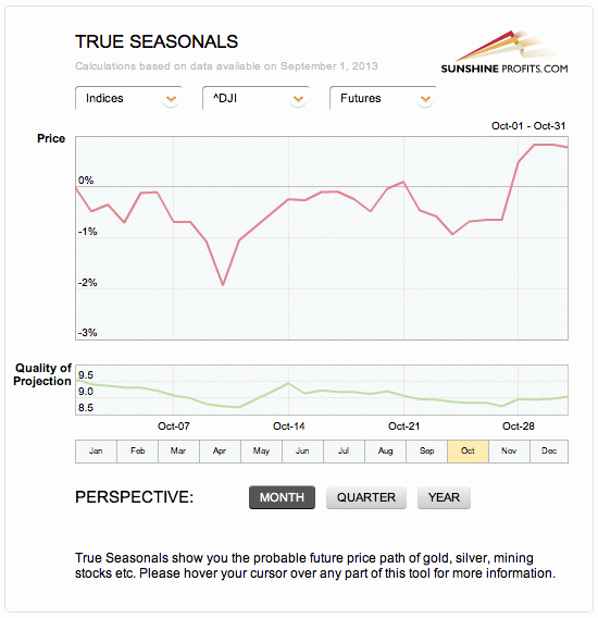
Taking a look at the True Seasonal patterns for the stock market reveals that the situation has been developing quite in tune with them this year. We saw a correction at the beginning of October which was followed by a sharp move back up. The rally now continues. What’s next? Please note that there are no clear short-term indications from the seasonality and derivatives’ expiration effect (two things that are combined on the above chart), but the overall trend is higher. The quality of projection starts to increase in the final part of the month along with the projected price, which means that the price at the end of the month is likely to be higher than where it was at the beginning of the month (and where it is now), but it’s rather unclear how it gets there. It seems that one would need to use other techniques to detect the very short-term price moves.
Overall, even though we could see some weakness on a short-term basis, the medium-term outlook is bullish for the general stock market and – as you will see in our Correlation Matrix the implications for gold are bearish for the medium term.
The Correlation Matrix is an interactive tool designed to measure, present and provide interpretations of correlations between various parts of the precious metals sector and key markets that impact it – specifically, the USD Index and the general stock market. You will find an up-to-date screenshot from this tool below.
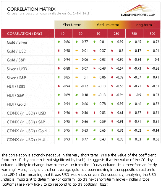
On a short-term basis (the 30-day column) the coefficients are quite insignificant and declining. Looking at the 10-day column, we see that they are moving back to their regular values, but it is too early to discuss these implications, as the 30-day coefficients haven’t changed so far. This means that the negative link between the U.S. dollar and the precious metals could be just a temporary phenomenon and not a change in the short-term tendency (gold responded to dollar’s strenght but not to dollar’s weakness). That’s why we described the USD impact on the precious metals as only mildly bullish for the short term.
As far as the medium term is concerned (taking the 250-day column into account), we see that the implications of medium-term trends in the USD Index in the S&P 500 Index for the precious metals market are bearish.
Summing up, the impact that the USD Index and the general stock markets are likely to have on the precious metals market is weak and bullish on a short-term basis, but more meaningful and bearish in the medium term.
Thank you for reading. Have a great and profitable week!
Przemyslaw Radomski, CFA
Founder, Editor-in-chief
Gold Price Prediction Website – SunshineProfits.com
* * * * *
Disclaimer
All essays, research and information found above represent analyses and opinions of Przemyslaw Radomski, CFA and Sunshine Profits’ associates only. As such, it may prove wrong and be a subject to change without notice. Opinions and analyses were based on data available to authors of respective essays at the time of writing. Although the information provided above is based on careful research and sources that are believed to be accurate, Przemyslaw Radomski, CFA and his associates do not guarantee the accuracy or thoroughness of the data or information reported. The opinions published above are neither an offer nor a recommendation to purchase or sell any securities. Mr. Radomski is not a Registered Securities Advisor. By reading Przemyslaw Radomski’s, CFA reports you fully agree that he will not be held responsible or liable for any decisions you make regarding any information provided in these reports. Investing, trading and speculation in any financial markets may involve high risk of loss. Przemyslaw Radomski, CFA, Sunshine Profits’ employees and affiliates as well as members of their families may have a short or long position in any securities, including those mentioned in any of the reports or essays, and may make additional purchases and/or sales of those securities without notice.