Timing & trends

Dividend Payers Drop Down Into Buy Zones

perspectives strategy

The market has pulled back over the past two weeks taking many strong, dividend paying stocks back to their upward trends lines where they should bounce. To find stocks that are suitable for buying at their upward trend line, scan for stock using the following characteristics:

Sentiment Stockscore > 50 < 70
Short term moving average – bearish
Medium term moving average – bullish
Long term moving average – bullish
Pays Dividends filter turned on

I did this on the Canadian market with a minimum number of trades set to 500 and the Market Scan found 26 stocks. I inspected the charts and found the following to be in linear upward trends and at or near their upward trend lines where they should bounce:

perspectives stocksthatmeet

1. T.WCP

charts1

2. T.CIX

charts2

3. T.MX

charts3

Ed Note: the Trading Lesson below explains the methodolgy that Tyler used to select the Dividend Stocks above, specifically :

Sentiment Stockscore > 50 < 70
Short term moving average – bearish
Medium term moving average – bullish
Long term moving average – bullish
Pays Dividends filter turned on

Trading the Channel

 Perspectives for the week ending June 11, 2013

perspectives commentary

This week’s Market Minutes video show the simplicity of evaluating charts with rising bottoms and falling tops. Watch it on YouTube by clicking here.

This Week’s Trading Lesson
The majority of strong price trends will begin with abnormal price action. A catalyst for a positive shift in the market’s perception of fundamentals ignites buyer interest and starts the stock higher. As the trend develops, improving fundamentals and the law of upticks help the trend to continue moving from the lower left to the upper right of the chart. An uptrend is in place.

It’s inevitable that the upward move will see pullbacks against the trend. There will be shareholders who want to take profits as the stock’s price climbs, and this causes shorter downward moves inside the upward trend. There is an increased chance of these pullbacks early in the trend because investors tend to doubt strength when it’s just getting started. As the trend progresses, stock owners grow more confident, believing that the upward climb legitimizes the company’s story.

The pullbacks are healthy. They work to shake out weak owners and build a more solid base of shareowners who will be committed to holding the stock. It’s the pullbacks that allow us to buy strong companies when they are on sale-the one time it makes sense to buy weakness.

Defining a Trend
To take advantage of the opportunity that trends provide requires the ability to define the trend. This is as simple as drawing a line across at least two inflection points in the trend. Typically, the first is the low before the trend starts, and the second is the low of the first pullback. Once defined, it is quite remarkable how well trend lines act as support and resistance for a stock.

There is a bit of an art to defining a trend line. You begin by highlighting the inflection points and then look for a line that best fits as many of those inflection points as possible. For an upward trend, the focus is on the inflection point lows, which will be rising over time. Downward trends will have a line that cuts across the inflection point tops as they fall from left to right.

Price trends usually develop as a company goes through a period of improving fundamentals. This is what carries the general rise higher in the stock, allowing it to outperform the overall market. In upward trends the tendency is for stocks to run away from their trend line and then come back to them. These fluctuations are primarily attributed to emotion. As investors feel greed and excitement about the improving fundamentals, they chase the stock higher, causing it to go up too fast. At some point, the sellers step in and limit the enthusiasm of the buyers by acting with strength, causing the stock to pull back through a round of profit-taking.

These pullbacks are shorter than the trend that came into them, allowing the stock to maintain its cycle of rising bottoms. It’s the pullbacks, and the resulting rising bottoms, that define the trend line. As chart watchers, we just have to pick out the lows of the rising bottoms and connect the dots, drawing a straight line that best fits the trend.

References


Disclaimer
This is not an investment advisory, and should not be used to make investment decisions. Information in Stockscores Perspectives is often opinionated and should be considered for information purposes only. No stock exchange anywhere has approved or disapproved of the information contained herein. There is no express or implied solicitation to buy or sell securities. The writers and editors of Perspectives may have positions in the stocks discussed above and may trade in the stocks mentioned. Don’t consider buying or selling any stock without conducting your own due diligence.


John P. Hussman, Ph.D: Market Comment

logo-1

Let’s begin with a reminder of where we are in the market cycle. At present, the stock market is in a mature, heavily bullish, overbought, overvalued bull market advance, near a multi-year high in the S&P 500, with consumer confidence at similar multi-year highs, with the broad perception that downside risk is insignificant, and that “tail risk” has been eliminated. This is a dangerous place to be, because it is precisely where risk aversion is scarce and hated most by investors, and where risk aversion is most likely to be rewarded in the future.

Consider the opposite. Recall the points in time where the stock market has been in a mature, heavily bearish, oversold, undervalued (or at least moderately valued) bear market decline, near a multi-year low in the S&P 500, with consumer confidence at similar multi-year lows, with the broad perception that downside risk is enormous, and that “tail risk” is growing. This is a wonderful place to be, because it is precisely where the willingness to accept risk is scarce and hated most by investors, and where the willingness to accept risk is most likely to be rewarded in the future.

Which market environment is the one where investors should generally be optimistic about multi-year market prospects? Clearly, the second. It’s a description that applies well to the 1974, 1982, 2002 and 2009 bear market lows. In contrast, the present description applies equally well to the 1972, 1987, 2000 and 2007 bull market peaks. It should be utterly obvious here that risk aversion is appropriate in present conditions.

…..read more about 2009 versus 2013 HERE

Key Turn Date – Amazing Moves & 7 Key Charts

Global stock markets have generated lots of headlines…and rightly so with the Nikkei crashing 20% in two weeks…but we’ve also had amazing moves in currencies, interest rates and precious metals…May 22 is looking more and more like an important Key Turn Date…when Market Psychology reverses across several markets…let’s have a look at the charts from my trading perspective:

The Nikkei rallied nearly 100% in 6 months in celebration of Abe’s bold programs to end two decades of deflation in Japan. But the Japanese stock market got  WAY overbought and Market Psychology (MP) was primed for a “spark” to ignite a reversal…and we got that “spark” in spades on May 22 when Bernanke hinted that he might begin to “taper” the Q program.

NIY

……read more HERE

Grandich: Market Update

megaphone

U.S. Stock Market – Because the most recent highs in the DJIA were within a fair range of the top I anticipated when I first noted this megaphone technical chart last January, I’ve stated there isn’t that much upside potential left to warrant staying aggressively long general U.S. equities. While not suggesting a crash or dramatic decline anytime soon, it’s my best guess (because guessing is all any of us really do no matter how sophisticated we try and make our work look) that very limited exposure to general U.S. equities is the way to go until further notice.

I do want to stress however (however is a word many strategists can’t live without), U.S. equities are likely to be the lesser of two evils over bonds for some time to come and therefore can be anticipated to find support after meaningful declines. Knowing virtually all financial advisers have some sort of membership and/or allegiance to the “Don’t Worry, Be Happy” crowd that makes-up and controls Wall Street, you should always realizing that these folks will  never ever abandoned stocks or bonds or both in any meaningful matter. Remember, you can toss the lot of them off the top of the Empire State Building and all the way down they shall all say the same thing – “so far so good!”

……read more on US Bonds, US Dollar & Gold HERE

What Does the Lack of Gold’s Reaction to the USD’s Plunge Tell Us?

The U.S. Mint has resumed selling its 2013 American Eagle One-Tenth Ounce Gold Proof Coin at a hefty $195 per coin as of last week. The Mint has set a 20,000-coin production limit for the coin. Sales of its smallest gold coin was suspended by the Mint in late April as year-to-date demand had increased by more than 118% until inventories could be replenished.

Here are some interesting statistics. So far at close to the half-way point of the year, the U.S. mint has sold more one-tenth ounce gold coins than it did in all of 2012.  About 50,000 such coins have been sold thus far for this month, with a total of 350,000 sold so far this year. This compares to total sales of 315,000 such coins sold for the entire year of 2012. The U.S. Mint will continue to limit purchases of the American Eagle one-ounce silver coins. Sales were suspended earlier this year due to record-breaking demand.

Reuters reported Wednesday that the appetite for U.S. American Eagle gold and silver bullion coins is still at unprecedentedly high levels almost two months after the historic sell-off in gold. The U.S. Mint’s acting director told Reuters that the mint is buying all the coin blanks they can get their hands on to fulfill the pent up demand for gold coins unleashed by the decline in price.

The facts above suggest that there is fundamental strength in the gold market. On the other hand, some developments this week hint at its short- and medium-term weakness.Let’s move on to today’s chart section to see how the situation looks like. We’ll start with the USD Index short-term chart as we believe that what has happened on the U.S. currency market is the most important event this week (charts courtesy byhttp://stockcharts.com).

radomski june72013 1

The reason for this is the price action seen on Thursday when the index declined sharply, pulling back a bit before the session closed to end the day very close to the level of the May low. In fact, it is possible that we have seen the final bottom for this correction. The breakdown which we see here below the rising support line was so dramatic that it just might be the decline that the breakdown was supposed to generate.

The most important and interesting implications are seen when we look at the reaction of the precious metals to Thursday’s decline in USD Index. Specifically, it is the lack of reaction in these markets that is most striking, even though the dollar index declined by about 1.5 index point and closed the day about 1 point lower. A huge rally in gold, silver, and the precious metals mining stocks would normally accompany such a significant move in the USD Index (say, a $30 – $50 rally in gold), but barely any move to the upside was seen. This is a very bearish indication for the precious metals sector.

Let’s see how the euro reacted to Thursday’s developments in the USD.

radomski june72013 2

In the short-term Euro Index chart, recall that we have had a head-and-shoulders pattern underway and not yet completed. The question now is “Was this pattern invalided on Thursday with the decline in the USD Index and the move to the upside which was seen here?” Quite simply the answer is no. The move higher did not take the index above the final Fibonacci retracement level. Drawing parallel lines based on the local bottoms, we see that the upper line has not been reached and it emphasizes that the shape of the head-and-shoulders is still intact.

The index level is not too high above the last shoulder as the formation is skewed. This is due to both higher lows and higher highs. The last shoulder (September-October) has a double top pattern so it’s really not so striking that the right shoulder just formed a second top. All-in-all, this pattern could still be completed and if it is, it will have bearish implications for the euro and the precious metals and bullish implications for the dollar.

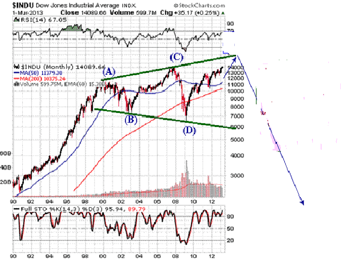
Now, let us take a look at the yellow metal to see whether any reaction to the dollar’s weakness was seen. (click image for larger view)

radomski june72013 3

We see that gold has rallied a bit more than $20 this week, really not much of a rally at all. The outlook continues to be bearish and the trend remains down. Gold could still decline heavily based on the long-term cyclical turning point, which is due approximately next week. In both 2008 and 2009, local tops formed slightly after the cyclical turning point, so it is possible that the reversal in the downtrend won’t be seen until after the cyclical turning point once again, leaving a number of days in which further declines could be seen.

Summing up, the most important development in the currency markets was the heavy decline of the USD Index on Thursday and the striking lack of reaction in the precious metals sector. The implications are bearish for gold, silver and the precious metals mining stocks and we think that this sector will need to decline once again before another big rally begins.

To make sure that you are notified once the new features are implemented, and get immediate access to our free thoughts on the market, including information not available publicly, we urge you to sign up for our free gold newsletter. Sign up today and you’ll also get free, 7-day access to the Premium Sections on our website, including valuable tools and charts dedicated to serious Precious Metals Investors and Traders along with our 14 best gold investment practices. It’s free and you may unsubscribe at any time.

Thank you for reading. Have a great and profitable week!


Przemyslaw Radomski, CFA

Founder, Editor-in-chief

Gold Investment & Silver Investment Website – Sunshine Profits

* * * * *


About Sunshine Profits

Sunshine Profits enables anyone to forecast market changes with a level of accuracy that was once only available to closed-door institutions. It provides free trial access to its best investment tools (including lists of best gold stocks and silver stocks), proprietary gold & silver indicators, buy & sell signals, weekly newsletter, and more. Seeing is believing


Disclaimer


All essays, research and information found above represent analyses and opinions of Przemyslaw Radomski, CFA and Sunshine Profits’ associates only. As such, it may prove wrong and be a subject to change without notice. Opinions and analyses were based on data available to authors of respective essays at the time of writing. Although the information provided above is based on careful research and sources that are believed to be accurate, Przemyslaw Radomski, CFA and his associates do not guarantee the accuracy or thoroughness of the data or information reported. The opinions published above are neither an offer nor a recommendation to purchase or sell any securities. Mr. Radomski is not a Registered Securities Advisor. By reading Przemyslaw Radomski’s, CFA reports you fully agree that he will not be held responsible or liable for any decisions you make regarding any information provided in these reports. Investing, trading and speculation in any financial markets may involve high risk of loss. Przemyslaw Radomski, CFA, Sunshine Profits’ employees and affiliates as well as members of their families may have a short or long position in any securities, including those mentioned in any of the reports or essays, and may make additional purchases and/or sales of those securities without notice.