
Timing & trends
The $NDX keeps moving from new highs to new highs driven by a narrow group of stocks. Nothing new about that as this trend has been ongoing for some time and headlines of new record prices for such stocks such as $FB, $AMZN, $GOOGL, $MSFT are now a daily occurrence. The untouchables. Jeff Bezos is worth $140B, no that was so last week, now he’s worth $150B.
How do you quantify risk in a market that prices in no risk?
While most people are focused on stocks prices one underlying issue that appears to be largely ignored by participants is the unprecedented market capitalization expansion we are witnessing in these few select stocks.
The numbers are simply staggering. Magic money out of thin air.
$FB, $GOOGL, $AMZN, $MSFT and $AAPL. These 5 stocks now worth nearly $4.1 trillion. That makes these 5 companies the 4th largest economy of the world if you use GDP as a reference. Not bad for less than a million people employed at these 5 companies.
Now check this out: Their combined market cap increase? $260,000,000,000. That’s $260B. In just the past ELEVEN trading DAYS!
No seriously:


Oh it gets better.
2018 year to date? EIGHT HUNDRED TWELVE BILLION DOLLARS market cap expansion in just 6.5 months. $812,000,000,000. That’s a company the size of a $MSFT or $GOOGL in its own right.


Now all these companies are growing revenues and earnings, but have they have expanded revenues, never mind earnings, in the past 6.5 months that justify an $812B increase in market cap? Buyers at these levels must think so.
Now let’s put this market expansion in context of charts.
$MSFT yearly:

$MSFT is now 29% above its yearly Bollinger band and 42% above its yearly 5EMA. Its touched its yearly 5 EMA every year since inception except 2000.
$AMZN:

$AMZN is now 49% above its yearly Bollinger band and 67% above its yearly 5EMA.
Doesn’t matter whether you show linear or log charts, the percentages are the same, but the linear charts highlight the historic perspective.
This is the kind of price expansion and technical disconnect that reminds of $CSCO in 2000:

$NDX is now on its 10th uninterrupted year up:

17% above its yearly Bollinger band and 31% above its yearly 5 EMA.
My premise remains: Eventual technical reconnects are coming with all of these and this defines the correction risk in this market. As the larger indices are now very much dependent on its largest market cap components continuing to ascent.
And for now this trend continues.
$NDX made another all time human history high yesterday also far disconnected from its quarterly 5 EMA again:

And it’s all about the magic 5 as the larger Nasdaq continues to show lower highs for new highs vs new lows as $NDX keeps marching on to new highs:

Yesterday 4 of the fab 5 had outside reversal days on the gap down and registered all time highs on negative divergences:


And of course $NDX also had negative divergence on multiple time frames from short to long:
On the 2 hour chart:

On the monthly chart:

I could go on, but you get my drift.
Massively extended charts with extreme market cap appreciations concentrated in a handful of stocks.
Are investors concerned?
It does not appear so as the $VIX has retreated back to below 12 yesterday and today, ironically retesting the broken trend line again:

I submit the combination of the factors above suggest that investors are greatly under appreciating risk in tech, hence the tech alert here. $812B in market cap appreciation came in 5 stocks in just 6.5 months. History suggests that vastly extended charts making new highs on negative divergences at points of extreme low volatility are subject to risk reversion and large market appreciations can disappear more quickly than investors are usually prepared for.
Fro now they keep on chugging along and perhaps will make further highs. But the warning signs are very pronounced.

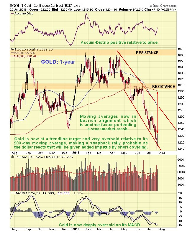
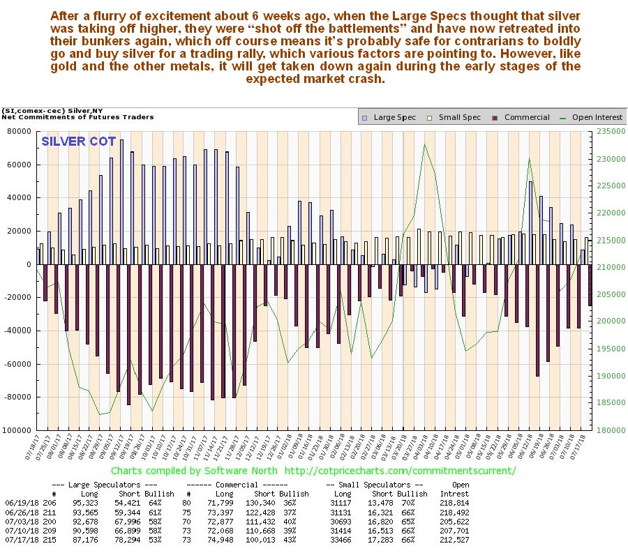
Commodities, including gold and silver, have plunged to become so deeply oversold that a snapback rally looks likely soon, that could be sharp as if they turn up here it will trigger a wave of short covering. Such a rally is likely to be sparked by a dollar reaction, as we will see, but it is likely to be followed by further heavy losses across the sector if a general market crash ensues as expected.
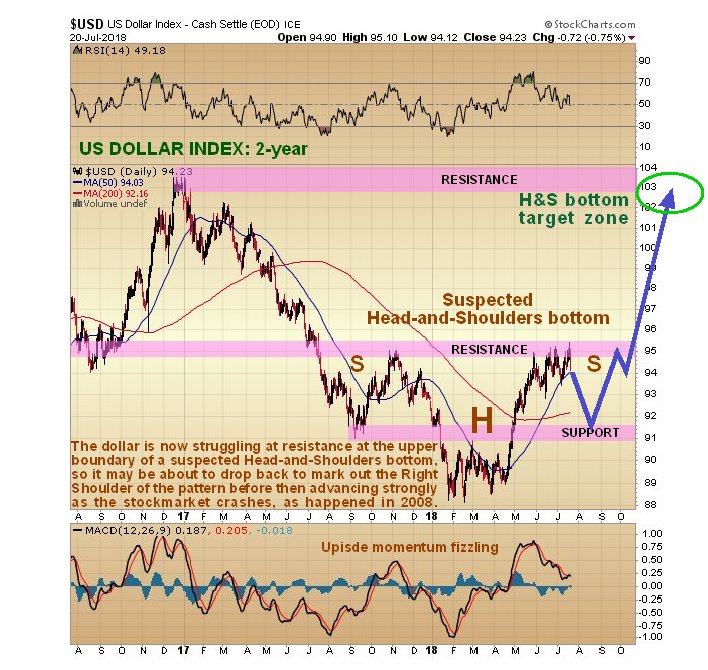
We will start by looking at the latest dollar index chart, as a dollar reaction here will be what ignites a commodity rally. The 2-year chart for the dollar index shows that the dollar is rounding over beneath a zone of resistance that dates back to a reversal that occurred at this level last October and November. The pattern that has formed from last July looks like a large Head-and-Shoulders bottom with the Right Shoulder of the pattern about to form. If this is what it is, it implies that the dollar will in due course go considerably higher to the 102 – 104 area, which we can expect to happen during the market crash phase, but first there is the little matter of the Right Shoulder forming to balance the pattern, and if a more or less symmetrical Right Shoulder forms then we are looking at the dollar dropping to the 91 – 92 zone over the near-term, which will be sufficient to generate a significant snapback rally in commodities, that, as mentioned above, is likely to be magnified by short covering. That is the theory that I have and which is mine and what it is too.
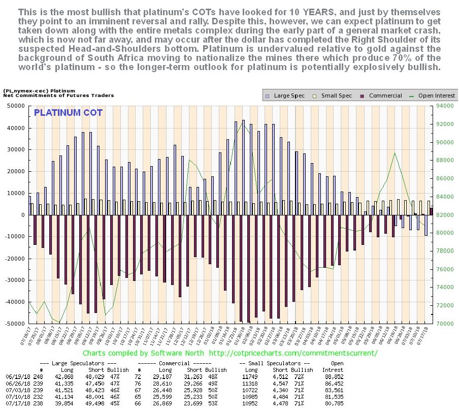
So now let’s proceed to review the charts of a range of important commodities – copper, gold, silver, and platinum and their respective COT charts, which will give us more of an idea regarding how likely it is that they will soon rally. 1-year charts are selected to enable us to relate them directly to the COT charts which are also for 1-year. Starting with gold we see that it has accelerated into a deeply oversold state on its MACD indicator and relative to its moving averages, with the drop from its April peak clipping $150 off its price at its April peak. Clearly gold didn’t take kindly to the dollar’s latest rally. Gold’s accumulation line has held up well, however, which increases the chances of a snapback rally imminently, which will be augmented by sudden short covering as mentioned above.
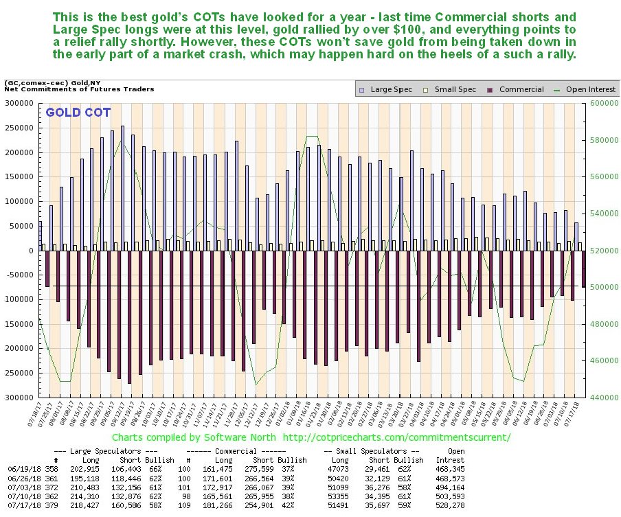
Not surprisingly, Gold’s COTs have improved substantially as this drop has unfolded, and this past week arrived at a level that is construed as bullish, as the manic – depressive and wrong Large Specs gave up on gold in increasingly numbers. These are the best readings we have seen for a year, and while they don’t guarantee an immediate rally, they make one highly likely.
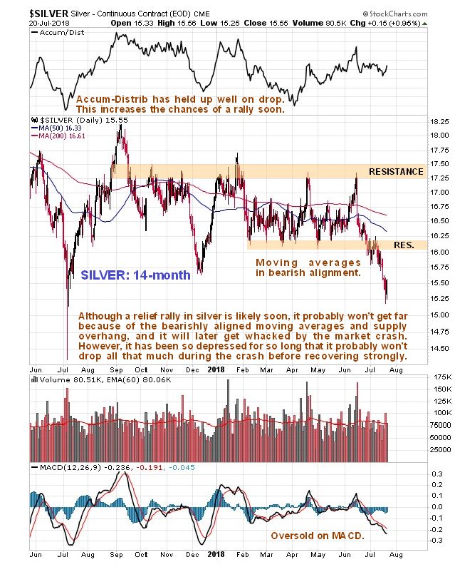
Silver has also dropped, albeit rather grudgingly, because it is already so depressed, and it is noteworthy that it is approaching but has not dropped below its lows of last July, as we can see on its latest 14-month chart, with this timeframe being selected to show this low. Whilst not as oversold as gold, it too looks set to bounce back with it, although it will encounter significant resistance above $16. As with gold, silver’s accumulation line has held up well and supports a rally soon.
Silver’s latest COT chart shows that the Large Specs suddenly got enthused with it some weeks back before they were shot off the parapets and finally crawled back into their hole in a capitulative manner last week when their long positions plunged to a low level. While Commercial short positions could drop a bit more (Small Specs are still quite bullish), they have certainly dropped enough to permit a rally to develop.
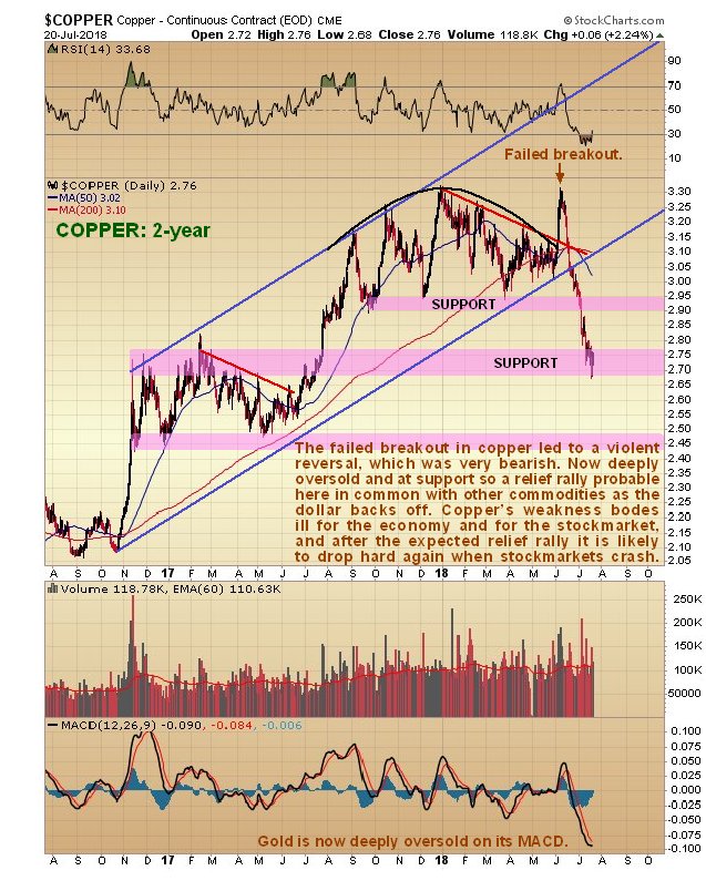
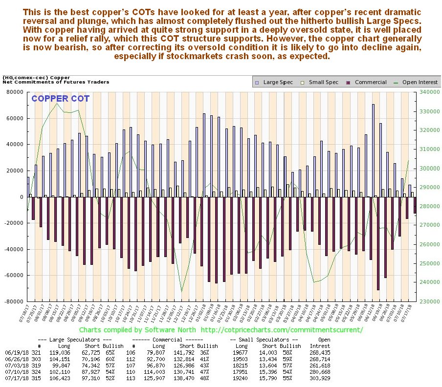
Moving on we see that poor old Dr Copper has “taken it on the chin” in recent weeks, after a failed attempt to break out into a 3rd upwave was followed by a violent reversal and breakdown from its long-term uptrend. This alone has bearish implications for the entire world economy. However, it is now deeply oversold, at support, and thus in position to stage a relief rally. We are looking at a 2-year chart for copper in order to see the origin of its long-term uptrend and also the significant support that exists at and just below current levels that arises from the considerable trading in this area in the trading range that formed from November 2016 through July 2017.
Copper’s COTs now look decidedly bullish for the near-term, with the Large Specs, having taken a severe beating, giving up and heading for the hills, which of course greatly increases the chances that it will now rally.
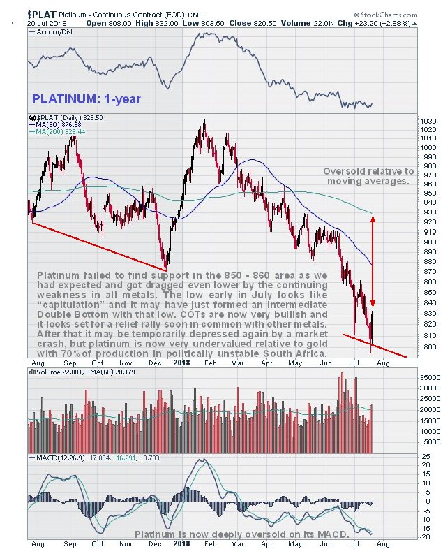
You may recall that we had thought that platinum had hit bottom some weeks back, largely on account of the collapse in Large Spec long positions, but it has since dropped even further in sympathy with the sector, and we now have a situation where the Large Specs are short to a significant degree, which is considered to be very foolish given how undervalued platinum is relative to gold, and given the South African government’s plans to take over the mining industry and kick out the whites running it, which, needless to say, will lead to a shambles and probably a supply shortage. Of all the metals, platinum looks like the best value here. The spike down to a low early in July looks like a capitulative move, and the low of a few days back looks like a Double Bottom with that low that will probably lead to a significant snapback rally – at least until the markets crash.


Rio Tinto has employed the first fully autonomous train, which many are calling the world’s largest robot. Rio Tinto’s project has eliminated humans and that saves on pensions and salaries. This is the way of the future because of exponentially rising human costs. The train completed its first delivery of iron ore between the company’s Australian Mount Tom Price mine and the port of Cape Lambert on the Western coast.

Rio Tinto spent $940 million to develop this project. The train consists of three locomotives and carries around 28,000 tonnes of iron ore making a journey of 280km with no human driver. The trip was monitored remotely by operators at Rio’s Operations Centre in Perth more than 1,500km away. Effectively, this is not so dissimilar from the drone used in the military that is also being monitored from a far away location.
The high cost of socialism is driving the field of robotics. The higher the costs of pensions and their lack of feasibility when central banks play with interest rates pretending to be managing the economy has driven the technology into the hands of automation. Governments are in a state of denial and they will continue to raise taxes to try to cover their costs. They fail to look at this crisis straight in the eyes. There is no hope of maintaining socialism and more than there was communism.
…also from Martin: Why CONFIDENCE is the Backbone of the New Monetary System
and
Violence from the Left is Starting – It will be Their Way or No Way

Sales of electric vehicles (EVs) and plug-in hybrids in Europe’s top car markets rose by just 33 percent in the first half this year, compared to a 54-percent surge in the same period last year, as customers are still wary of limited driving ranges of the models and an insufficient…..CLICK for the complete article
The yield curve measures the difference between short- and long-term interest rates.
Long-term rates are usually higher than short-term rates. That’s because there’s more risk in the long term.
When short-term rates exceed long-term rates, the yield curve inverts. That’s a rare and ominous signal that has been an early warning sign for every recession in the past 60 years.
But this time is different.
The chart below shows long-term interest rates issued by the U.S., Germany and Japan. It shows why the yield curve is set to invert.
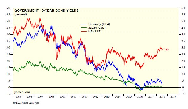
(Source: Yardeni.com)
Germany is paying only 0.24%. Japan offers investors just 0.03%. Meanwhile, the U.S. offers 2.87%.
Global investors chase the highest yield. So, they’re buying U.S. bonds.
When foreign investors buy bonds, they drive long-term interest rates down. This sets up the potential inversion that’s worrying so many analysts.
But this time, the yield curve isn’t signaling a recession. That’s because of the unique circumstance of yields around the world being so low.
Normally, the inversion would result from investors selling stocks as the economy weakens. Large investors need to put their money somewhere, so they buy bonds.
That pushes interest rates down, and the yield curve eventually inverts. At least that’s what happened in the past.
Right now, earnings growth is strong, and stocks are doing well. The yield curve is rising because global investors are also chasing yields and seeking safety in long-term bonds.
This time, if the yield curve inverts, it will be a short-term time of strength for U.S. stocks and the dollar. It won’t be a reason to worry, at least not at first.
This will be a signal to buy since stocks are likely to shoot higher as dollars rush into the U.S. from around the world.
Regards,

Michael Carr, CMT
Editor, Peak Velocity Trader

-
I know Mike is a very solid investor and respect his opinions very much. So if he says pay attention to this or that - I will.
~ Dale G.
-
I've started managing my own investments so view Michael's site as a one-stop shop from which to get information and perspectives.
~ Dave E.
-
Michael offers easy reading, honest, common sense information that anyone can use in a practical manner.
~ der_al.
-
A sane voice in a scrambled investment world.
~ Ed R.
Inside Edge Pro Contributors

Greg Weldon

Josef Schachter

Tyler Bollhorn

Ryan Irvine

Paul Beattie

Martin Straith

Patrick Ceresna

Mark Leibovit

James Thorne

Victor Adair