
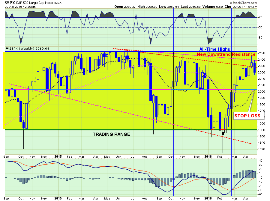
Over the last couple of week’s, I have written extensively about the breakout of the market above the downtrend resistance line that traced back to the 2015 highs. To wit:
“With the breakout of the market yesterday, and given that ‘short-term buy signals’ are in place I began adding exposure back into portfolios. This is probably the most difficult ‘buy’ I can ever remember making.”
I also stated that it was probably a trap and that I will be stopped out in fairly short order. But that is the risk of managing money.
It was only a matter of time before the extreme short-term extension of the market begins to correct. Like stretching a rubber band to its limits, it must be relaxed before it is stretched again. The question is whether this is simply a “relaxation of the extension” OR is this a resumption of the ongoing topping and correction process?
Let’s take a look at a few charts to try and derive some clues as to what actions we should be taking next.

related:
NYSE Dangerous Technical Action Chart


