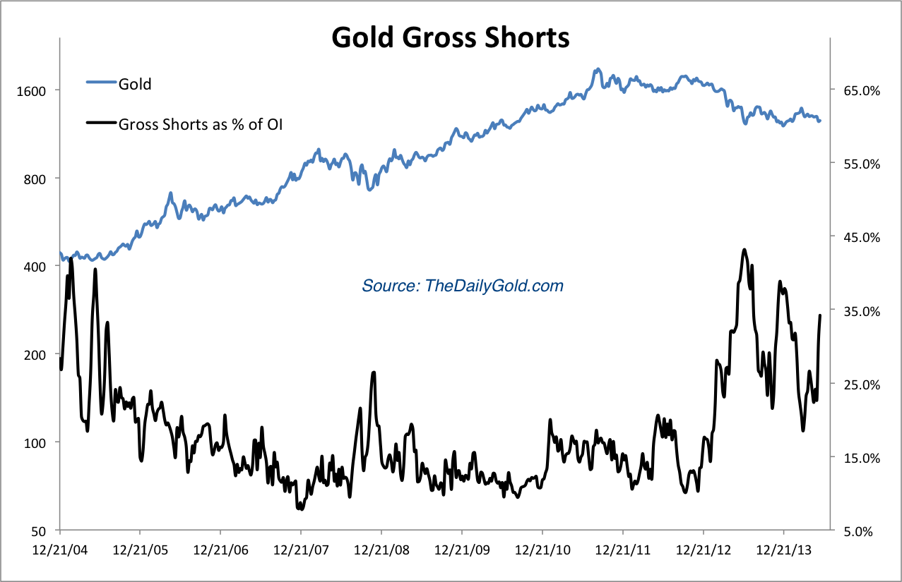
The first chart is the gross short positions in Gold (as a percentage of open interest). This has accelerated in recent weeks. It was quite low a month ago.

Sticking with Gold, here is a look at our junior gold stock index against Gold. The index contains 20 stocks and most of the stocks are part of GDXJ. Gold is plotted in black and the ratio is plotted in blue. We know that the stocks versus the metals can be an important leading indicator for the sector. The stocks led the metal higher in 2006 and then turned down in spring 2007. Also note that the ratio kept rising in 2009 as Gold consolidated before breaking $1000/oz. The ratio declined sharply as Gold went parabolic. The ratio bottomed in summer 2013 and made a higher low before reaching a 14-month high.

Next here is our silver stock index against Silver. Silver is plotted in black and the index is plotted in blue. The stocks have consistently led Silver at key turning points. The stocks have been weak during the recent decline. The ratio has declined quite a bit. However, it was just at a 16-month high and appears to have bottomed.

Anyway, the stocks/metals relationship is a leading indicator but it isn’t necessarily an imminent leading indicator. It’s one of many things we like to keep an eye on. Nevertheless, we are nearing the end of the bear market and it’s a positive sign that these ratios are showing a positive divergence. That wasn’t the case at the last two bottoms. The stocks showed quite a bit of relative strength during the December to March period, reaching 14 and 16 month highs respectively (against the metals). It’s a reason to think that when the metals finally do bottom, look out above!
Thanks for reading. I wish you all great health and prosperity in 2014.
-Jordan
These are just three of many charts included in premium update #364 which was 30 pages. These charts are an example of the kind of charts we provide. We like to provide charts from which you can draw an insight or conclusion from. When we provide top-notch research and analysis, our subscribers can become better educated and empowered. They don’t need us to voice our opinions because we are providing actionable charts, information and analysis.
As we’ve noted in recent weeks, we’ve made some changes to our premium service that I’m very excited about. I think the quality of our premium service is now higher and with subscribers able to follow our trades (knowing our plans in advance) in the new portfolio, I expect our and their performance to be better. Click below to learn more about our service and watch the new video for details.
Disclaimer: Sponsor Companies are paid sponsor companies of TheDailyGold.com website and this free newsletter. Do not construe sponsorship with a recommendation. The author of this newsletter is not a registered investment advisor. This newsletter is intended for informational and educational purposes only and should not be considered personalized and individualized investment advice. Investment in the precious metals sector contains significant risks. You should consult with an investment advisor and due your own due diligence before making any investment decisions. This email may contain certain forward looking statements which are subject to risks, uncertainties and a multitude of factors that can cause results and outcomes to differ materially from those discussed herein.